Wbcom Designs BuddyX Pro Docs
Back to product Buy Now

Getting Started

Install BuddyX Pro, run the demo importer, and pick the kind of community you want to build.

Choose Your Path

Select your goal to get a customized setup guide.


Community Website

Building a social network with member profiles and groups?

Required Plugins

  • BuddyPress or BuddyBoss Platform
  • Kirki Customizer Framework

Setup Steps

  1. Install BuddyX Pro
  2. Install and activate BuddyPress
  3. Configure BuddyPress Settings
  4. Set Up Member Profiles
  5. Configure Member Directory
  6. Set Up Groups
  7. Configure Activity Stream

Recommended Settings

  • Header Layout: Layout 1 or 2
  • Member Header: Left View
  • Enable: Online status, notifications, messaging

E-Commerce Store

Selling products online?

Required Plugins

  • WooCommerce or FluentCart
  • Kirki Customizer Framework

Setup Steps

  1. Install BuddyX Pro
  2. Install and activate WooCommerce
  3. Run WooCommerce setup wizard
  4. Configure Shop Settings
  5. Add products
  6. Configure payment gateways
  7. Set up shipping

Recommended Settings

  • Enable cart icon in header
  • Shop layout: Grid view
  • Enable product quick view

Online Learning Platform

Selling courses with LearnDash?

Required Plugins

  • LearnDash LMS
  • Kirki Customizer Framework
  • Optional: WooCommerce (for selling courses)

Setup Steps

  1. Install BuddyX Pro
  2. Install and activate LearnDash
  3. Configure LearnDash Settings
  4. Create your first course
  5. Add lessons and topics
  6. Set up course pricing
  7. Customize Course Pages

Recommended Settings

  • Course layout: Grid
  • Enable progress tracking
  • Show course sidebar

Blog or Magazine

Publishing articles and content?

Required Plugins

  • Kirki Customizer Framework
  • Optional: Jepack, Yoast SEO

Setup Steps

  1. Install BuddyX Pro
  2. Configure Blog Settings
  3. Set Up Single Post Layout
  4. Create categories and tags
  5. Configure Sidebar
  6. Add widgets

Recommended Settings

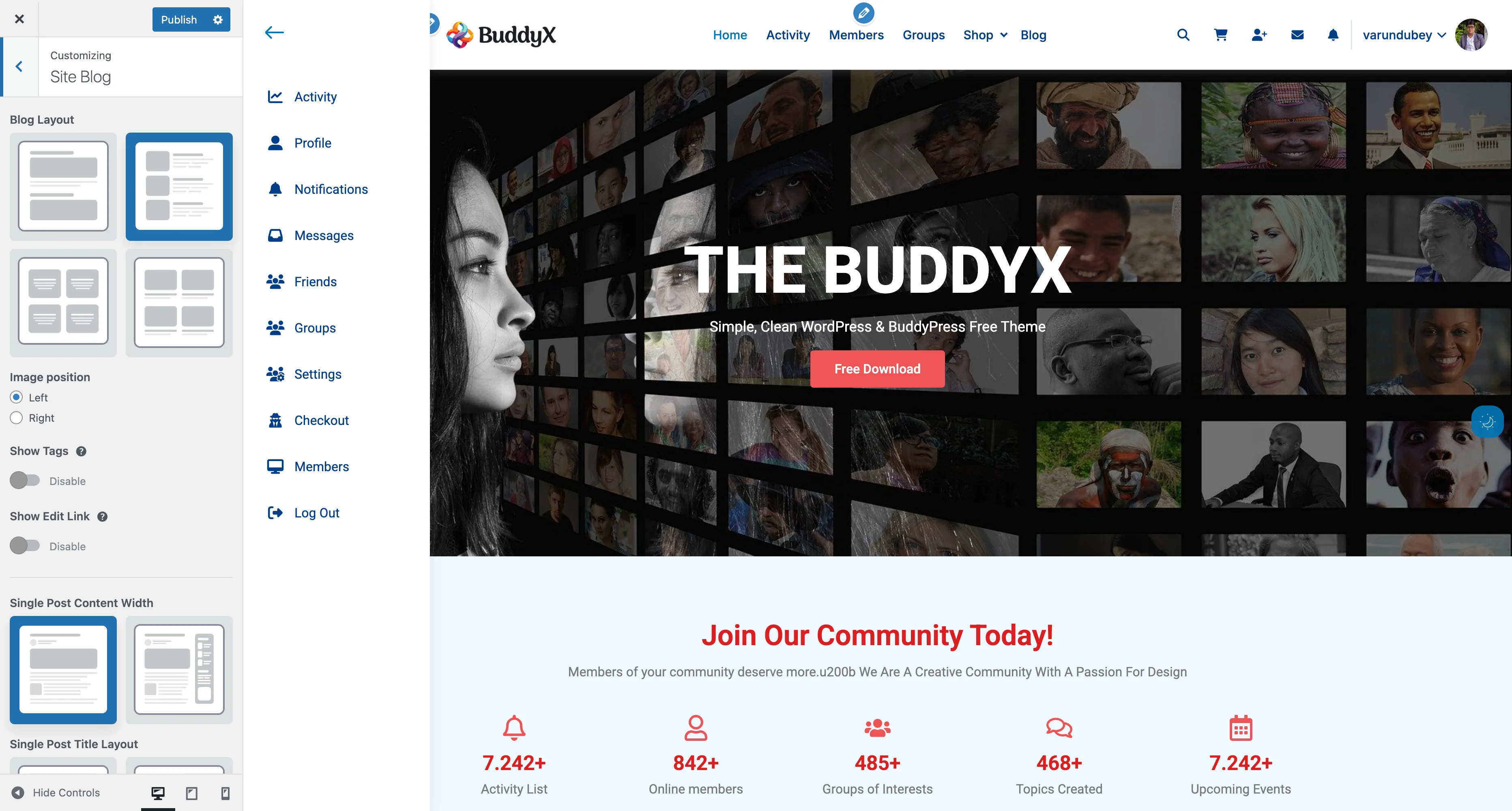
  • Blog layout: Grid or List
  • Enable related posts
  • Show author bio
  • Enable social sharing

Community + E-Commerce

Building a community marketplace?

Required Plugins

  • BuddyPress or BuddyBoss Platform
  • WooCommerce
  • Kirki Customizer Framework
  • Optional: Dokan (for multi-vendor)

Setup Steps

  1. Complete Community Website steps above
  2. Complete E-Commerce Store steps above
  3. Connect WooCommerce to BuddyPress profiles
  4. Configure Community Shop Settings

Community + Learning

Building a learning community?

Required Plugins

  • BuddyPress or BuddyBoss Platform
  • LearnDash LMS
  • Kirki Customizer Framework

Setup Steps

  1. Complete Community Website steps above
  2. Complete Online Learning Platform steps above
  3. Connect LearnDash to BuddyPress
  4. Enable course groups
  5. Set up course forums (optional)

Next Steps

After completing your path:

  1. Customize Colors
  2. Set Up Header
  3. Configure Footer
  4. Add Menus
  5. Test on mobile devices
  6. Review Pre-Launch Checklist

Need Help?

Demo Content Importer

Import pre-built demo content to quickly set up your BuddyX Pro website with professionally designed pages, layouts, and sample content.

What Is Demo Import?

The BuddyX Pro Demo Importer lets you replicate our demo websites with a single click. Instead of starting from scratch, you get:

  • Pre-designed homepage layouts
  • Sample pages (About, Contact, Services, etc.)
  • Menu structures already configured
  • Widget areas populated
  • Customizer settings applied
  • Sample blog posts and categories
  • BuddyPress sample data (if applicable)

Requirements

Before importing demo content:

Requirement Details
BuddyX Pro Theme Must be installed and active
PHP Memory At least 256MB (512MB recommended)
Max Upload Size At least 64MB
Max Execution Time At least 300 seconds
Required Plugins Varies by demo (installer will prompt)

Accessing the Demo Importer

Step 1: Navigate to Importer

  1. Go to Appearance → BuddyX Pro Options in your WordPress admin
  2. Or go to Appearance → Demo Import
  3. You'll see available demo layouts

Step 2: Choose Your Demo

Available demos include:

Demo Best For Required Plugins
Community Social networks, BuddyPress sites BuddyPress/BuddyBoss
Business Corporate, agency websites None
E-Commerce Online stores WooCommerce or FluentCart
Learning Course platforms LearnDash/LearnPress
Forum Discussion communities bbPress
Magazine News, blog sites None
Membership Member-only sites Paid Memberships Pro

Import Process

Step 1: Select Demo

  1. Browse available demos
  2. Click Preview to see live demo
  3. Click Import on your chosen demo

Step 2: Install Required Plugins

The importer will:

  1. Detect required plugins
  2. Prompt you to install missing plugins
  3. Automatically activate plugins (with your permission)

Tip: Install recommended plugins before importing for best results.

Step 3: Choose Import Options

Option Description Recommended
All Content Everything: pages, posts, media, settings Fresh installs
Content Only Pages, posts, media (no settings) Existing sites
Customizer Only Theme settings only Design refresh
Widgets Only Widget configurations Layout updates

Step 4: Start Import

  1. Click Import Now
  2. Wait for the process to complete (2-10 minutes)
  3. Don't close the browser tab
  4. You'll see a success message when complete

What Gets Imported

Content

Content Type Imported
Pages Homepage, About, Contact, etc.
Posts Sample blog posts
Categories Blog categories
Tags Sample tags
Media Demo images and icons
Menus Navigation menus
Menu Locations Primary, footer, mobile menus

Settings

Setting Type Imported
Customizer All theme customizer options
Widgets Sidebar and footer widgets
Homepage Static front page setting
Reading Posts per page, etc.
Permalinks URL structure

Plugin Data (If Applicable)

Plugin Data Imported
BuddyPress Sample groups, activity types
WooCommerce Shop pages, sample products
LearnDash Sample courses structure
bbPress Forum categories, sample topics
FluentCart Product categories, sample products

After Import

Step 1: Review Content

  1. Visit your homepage
  2. Check all menu links
  3. Review imported pages
  4. Test navigation

Step 2: Replace Demo Content

Pages to customize:

  • Homepage: Replace hero images and text
  • About: Update with your company info
  • Contact: Add your contact details
  • Services/Products: Replace with your offerings

Images to replace:

  • Logo and favicon
  • Hero/banner images
  • Team photos
  • Product images

Step 3: Configure Settings

Setting Location Action
Site Title Settings → General Update
Logo Customize → Site Identity Upload yours
Colors Customize → Skin Settings Adjust to brand
Contact Info Customize or Widgets Update
Social Links Customize → Header Add yours

Step 4: Set Up Integrations

If using plugins:

  1. WooCommerce: Configure payment gateways
  2. BuddyPress: Set registration options
  3. LearnDash: Configure course settings
  4. Contact Form: Update email addresses

Troubleshooting

Import Failed or Stuck

Problem: Import process stops or fails.

Solutions:

  1. Increase PHP limits:

    // Add to wp-config.php
    define( 'WP_MEMORY_LIMIT', '512M' );
    ini_set( 'max_execution_time', 600 );
    
  2. Contact hosting provider:

    • Ask to increase PHP memory
    • Increase max_execution_time
    • Increase upload limits
  3. Try partial import:

    • Import content only first
    • Then import settings separately
  4. Disable conflicting plugins:

    • Security plugins may block imports
    • Temporarily disable and retry

Images Not Importing

Problem: Pages import but images are missing.

Solutions:

  1. Check server has write permissions to wp-content/uploads/
  2. Increase upload_max_filesize in PHP settings
  3. Try reimporting media only
  4. Manually upload images from demo package

Menus Not Working

Problem: Navigation links are broken after import.

Solutions:

  1. Go to Appearance → Menus
  2. Check menu locations are assigned
  3. Update permalinks: Settings → Permalinks → Save Changes
  4. Clear any caching plugins

Customizer Settings Not Applied

Problem: Colors, fonts, or layouts didn't import.

Solutions:

  1. Clear browser cache (Ctrl+F5)
  2. Clear WordPress cache
  3. Reimport customizer settings only
  4. Manually adjust in Customizer

Plugin Data Not Imported

Problem: BuddyPress/WooCommerce data missing.

Solutions:

  1. Ensure plugins are active BEFORE import
  2. Check if demo includes plugin data
  3. Some data requires manual setup (products, courses)
  4. Reinstall plugin and reimport

Reset and Start Over

If you need to start fresh:

Option 1: Reset Customizer

  1. Go to Appearance → Customize
  2. Find Reset option (if available)
  3. Or manually change settings back

Option 2: Delete Imported Content

  1. Pages: Pages → All Pages → Bulk Delete
  2. Posts: Posts → All Posts → Bulk Delete
  3. Media: Media → Library → Bulk Delete
  4. Menus: Appearance → Menus → Delete Menu

Option 3: Database Reset (Advanced)

Use a plugin like WP Reset to completely reset:

  1. Install WP Reset plugin
  2. Create backup first
  3. Reset database
  4. Reimport demo

Warning: This deletes ALL content, not just demo content.

Best Practices

Before Importing

  • Backup existing content (if any)
  • Note current theme settings
  • Install required plugins first
  • Check server requirements
  • Read demo-specific notes

During Import

  • Don't close browser tab
  • Don't navigate away
  • Wait for completion message
  • Note any warnings or errors

After Importing

  • Review all pages
  • Test navigation
  • Check responsive design
  • Replace demo content
  • Update contact information
  • Configure integrations
  • Set up backups

Partial Import Options

Import Only What You Need

Scenario 1: Just want the design

  • Import: Customizer settings only
  • Skip: Content, widgets, menus
  • Result: Your content with demo styling

Scenario 2: Need page layouts

  • Import: Pages and widgets
  • Skip: Blog posts, customizer
  • Result: Page structure without styling changes

Scenario 3: Starting fresh

  • Import: Everything
  • Result: Complete demo replica

Selective Content Import

Some importers allow selecting:

  • Specific pages
  • Certain post categories
  • Individual widgets
  • Specific menu locations

Demo-Specific Notes

Community Demo (BuddyPress)

Pre-requisites:

  • BuddyPress or BuddyBoss Platform
  • rtMedia (optional for media uploads)

Includes:

  • Sample member profiles
  • Sample groups
  • Activity stream content
  • Member and group directories

Post-import:

  • Enable registration
  • Configure email settings
  • Set up member types (optional)

E-Commerce Demo (WooCommerce/FluentCart)

Pre-requisites:

  • WooCommerce or FluentCart
  • Payment gateway plugins

Includes:

  • Sample products
  • Product categories
  • Shop page layout
  • Cart and checkout pages

Post-import:

  • Configure payment methods
  • Set shipping options
  • Add real products
  • Configure tax settings

Learning Demo (LearnDash)

Pre-requisites:

  • LearnDash LMS
  • LearnDash Course Grid (optional)

Includes:

  • Sample courses
  • Lessons and topics
  • Course grid layout
  • Student dashboard

Post-import:

  • Add real courses
  • Configure pricing
  • Set up certificates
  • Enable course reviews

Common Questions

Will importing overwrite my existing content?

It depends on your settings:

  • New installs: No risk, nothing to overwrite
  • Existing sites: Some settings may be replaced
  • Recommendation: Backup first, then import

Can I import multiple demos?

Yes, but:

  • Each import adds more content
  • Settings will be overwritten
  • Better to reset between imports
  • Pick one demo to start

How long does import take?

Site Size Typical Time
Small demo 1-3 minutes
Medium demo 3-5 minutes
Large demo 5-10 minutes

Factors: Server speed, image sizes, plugin data.

Can I undo an import?

Not automatically. You can:

  • Restore from backup
  • Manually delete content
  • Use database reset plugin

Do I need to activate all plugins first?

Recommended: Yes, activate required plugins before import.

Why: Import can set up plugin-specific pages and settings.

Will my site be identical to the demo?

Very close! Differences may include:

  • Your logo vs. demo logo
  • Your domain vs. demo domain
  • Some dynamic content
  • Plugin version differences

Support

If you encounter issues:

  1. Check documentation: You're here!
  2. Search knowledge base: docs.wbcomdesigns.com
  3. Contact support: support@wbcomdesigns.com
  4. Community forum: wbcomdesigns.com/support

When contacting support, include:

  • Demo name you're importing
  • Error messages (screenshots)
  • Server PHP version
  • List of active plugins
  • WordPress version

Related Documentation


Need Help?

Installation Guide

This guide walks you through installing and activating BuddyX Pro on your WordPress site.

Before You Begin

Pre-Installation Checklist

  • WordPress 6.0 or higher installed
  • PHP 8.0 or higher on your server
  • MySQL 5.7+ or MariaDB 10.3+
  • At least 128MB PHP memory limit (256MB recommended)
  • Valid BuddyX Pro license key
  • Backup of your current site (recommended)

Download the Theme

  1. Log in to your WBCom Designs account
  2. Navigate to Downloads
  3. Find BuddyX Pro and click Download
  4. Save the .zip file to your computer

Installation Methods

Method 1: WordPress Admin Upload (Recommended)

  1. Log in to your WordPress admin dashboard
  2. Navigate to Appearance > Themes
  3. Click Add New at the top of the page
  4. Click Upload Theme
  5. Click Choose File and select the buddyx-pro.zip file
  6. Click Install Now
  7. Wait for the installation to complete
  8. Click Activate to enable the theme

Method 2: FTP Upload

Use this method if the upload fails due to server limitations:

  1. Extract the buddyx-pro.zip file on your computer
  2. Connect to your server via FTP client (FileZilla, Cyberduck, etc.)
  3. Navigate to /wp-content/themes/
  4. Upload the extracted buddyx-pro folder
  5. Go to Appearance > Themes in WordPress admin
  6. Find BuddyX Pro and click Activate

Method 3: cPanel File Manager

  1. Log in to your hosting cPanel
  2. Open File Manager
  3. Navigate to public_html/wp-content/themes/
  4. Click Upload and select the buddyx-pro.zip file
  5. After upload, right-click the zip file and select Extract
  6. Go to WordPress admin > Appearance > Themes
  7. Activate BuddyX Pro

Post-Installation Setup

Step 1: Install Required Plugins

After activating BuddyX Pro, you may see a notice about recommended plugins:

  1. Click the notification or go to Appearance > Install Plugins
  2. Select the plugins you need:
    • Starter Templates - For demo import
    • BuddyPress or BuddyBoss Platform - For community features
    • Kirki Customizer Framework - For advanced customizer options
  3. Click Install and then Activate

Step 2: Import Demo Content (Optional)

To quickly set up your site with pre-designed content:

  1. Install and activate the Starter Templates plugin
  2. Navigate to Starter Templates in the admin menu
  3. Browse available demos for BuddyX Pro
  4. Click Import on your preferred demo
  5. Select import options (content, widgets, customizer settings)
  6. Complete the import process

Step 3: Configure Basic Settings

  1. Go to Appearance > Customize
  2. Set your Site Identity (logo, site title, tagline)
  3. Configure Header options (layout, menu position)
  4. Set your Colors in the Skin panel
  5. Click Publish to save changes

Step 4: Set Up Menus

  1. Navigate to Appearance > Menus
  2. Create a new menu or edit existing
  3. Add pages, categories, or custom links
  4. Assign to menu locations:
    • Primary Menu - Main navigation
    • Footer Menu - Footer links
    • Topbar Menu - Top bar links (if enabled)
  5. Save your menu

Step 5: Configure Widgets

  1. Go to Appearance > Widgets
  2. Add widgets to available sidebar areas:
    • Primary Sidebar
    • BuddyPress Sidebars (if BuddyPress active)
    • Footer Widget Areas
  3. Configure widget settings as needed

Updating the Theme

Automatic Updates

BuddyX Pro supports automatic updates through WordPress:

  1. Go to Appearance > Themes
  2. If an update is available, you'll see a notification
  3. Click Update Now
  4. Wait for the update to complete

Manual Update

If automatic updates don't work:

  1. Download the latest version from your account
  2. Deactivate the current BuddyX Pro theme
  3. Delete the old theme folder via FTP
  4. Upload and install the new version
  5. Reactivate the theme

Important: Your customizer settings are stored in the database and will be preserved during updates.

Troubleshooting Installation

Upload Failed: File Size Limit

Problem: The theme file is too large to upload.

Solutions:

  1. Increase PHP upload limits in php.ini:
    upload_max_filesize = 64M
    post_max_size = 64M
    
  2. Use FTP upload method instead
  3. Contact your hosting provider to increase limits

Theme Is Missing stylesheet

Problem: "The theme is missing the style.css stylesheet" error.

Solutions:

  1. Ensure you're uploading the correct zip file (not the download wrapper)
  2. The zip should contain the buddyx-pro folder directly
  3. Try extracting and re-zipping with only the theme folder

White Screen After Activation

Problem: Site shows blank white screen after theme activation.

Solutions:

  1. Increase PHP memory limit:
    define('WP_MEMORY_LIMIT', '256M');
    
  2. Enable WordPress debug mode to see errors:
    define('WP_DEBUG', true);
    define('WP_DEBUG_LOG', true);
    
  3. Check for plugin conflicts by deactivating all plugins

Customizer Not Loading

Problem: Customizer shows loading spinner indefinitely.

Solutions:

  1. Clear browser cache
  2. Try a different browser
  3. Deactivate caching plugins temporarily
  4. Check for JavaScript errors in browser console

Child Theme Installation

For customizations that survive theme updates:

  1. Download the BuddyX Pro child theme from your account
  2. Install via Appearance > Themes > Add New > Upload Theme
  3. Activate the child theme instead of the parent theme
  4. Make customizations in the child theme files

See Creating a Child Theme for detailed instructions.

Next Steps

After successful installation:


Need Help?

Introduction to BuddyX Pro

Build community websites with WordPress.


What BuddyX Pro Does

BuddyX Pro is a WordPress theme for community websites. It provides:

  • Member Profiles - User profiles, avatars, cover images
  • Social Activity - Activity feeds, likes, comments
  • Groups - Public/private groups with discussions
  • Messaging - Private messaging between members
  • E-Commerce - WooCommerce shop integration
  • Online Courses - LearnDash/LMS support
  • Dark Mode - Light/dark theme toggle

Who Should Use This

You Are BuddyX Pro Helps You
Community Builder Create social networks, membership sites
Course Creator Sell courses with community features
Marketplace Owner Multi-vendor stores with Dokan
Business Owner Member directories, professional networks

Plugin Integrations

BuddyX Pro works with:

Plugin Purpose
BuddyPress / BuddyBoss Community features
WooCommerce E-commerce
LearnDash Online courses
bbPress Forums
Dokan Multi-vendor marketplace
Elementor Page building

Requirements

Requirement Minimum
WordPress 6.0+
PHP 8.1+
MySQL 5.7+

Required Plugin: Kirki Customizer Framework


Get Started

Quick Start (15 minutes)

  1. Install theme - Upload and activate
  2. Install Kirki - Required for customizer
  3. Set logo - Customize > Site Identity
  4. Choose colors - Customize > Site Skin
  5. Create menu - Appearance > Menus

Full Quick Start Guide →

Choose Your Path

Not sure where to start?


Customizer Overview

All settings are in Appearance > Customize:

Main Customizer Panels

Panel What It Controls
Site Identity Logo, site title
Site Header Header layout, menu, icons
Site Skin Colors, dark mode
Typography Fonts, sizes
Sidebar Sidebar positions
Site Footer Footer widgets, copyright
BuddyPress Community settings
WooCommerce Shop settings

Next Steps


Need Help?

Quick Start Guide

Get BuddyX Pro running in 5 steps.


Step 1: Install the Theme (2 minutes)

  1. Download buddyx-pro.zip from your account
  2. Go to Appearance > Themes > Add New > Upload Theme
  3. Choose the ZIP file
  4. Click Install Now
  5. Click Activate

Troubleshooting: If upload fails, see Installation Guide


Step 2: Install Required Plugins (2 minutes)

After activation, you'll see a notice about required plugins.

  1. Click the notice or go to Appearance > Install Plugins
  2. Select all required plugins
  3. Choose Install from dropdown
  4. Click Apply
  5. After installation, select all and choose Activate

Required:

  • Kirki Customizer Framework

Recommended (based on your needs):

  • BuddyPress (for community features)
  • WooCommerce (for e-commerce)
  • LearnDash (for courses)

Step 3: Set Your Logo and Colors (3 minutes)

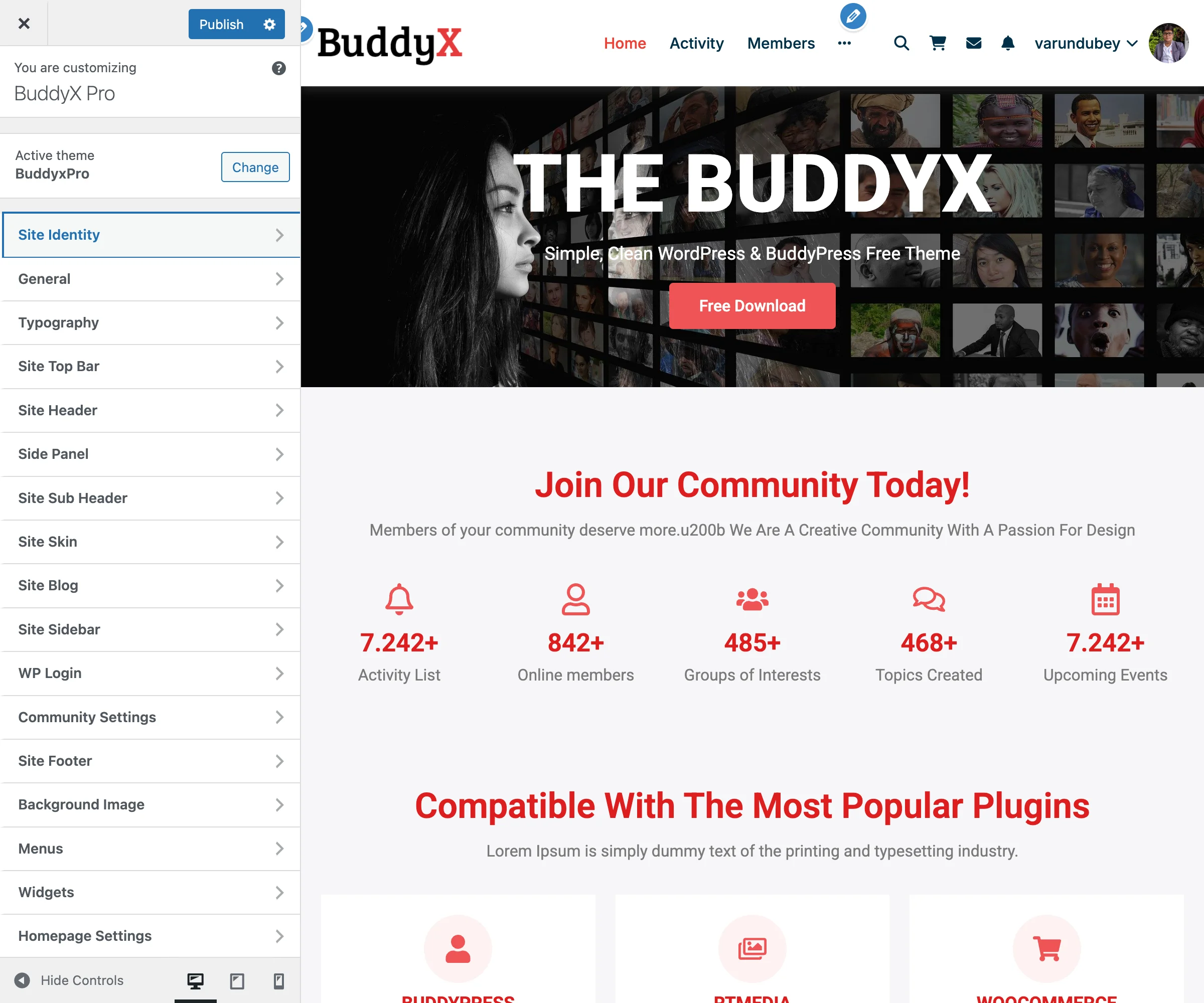
Customizer Main Panel The WordPress Customizer main panel showing all BuddyX Pro customization options

Add Your Logo

  1. Go to Appearance > Customize > Site Identity
  2. Click Select Logo
  3. Upload your logo
  4. Adjust width if needed
  5. Click Publish

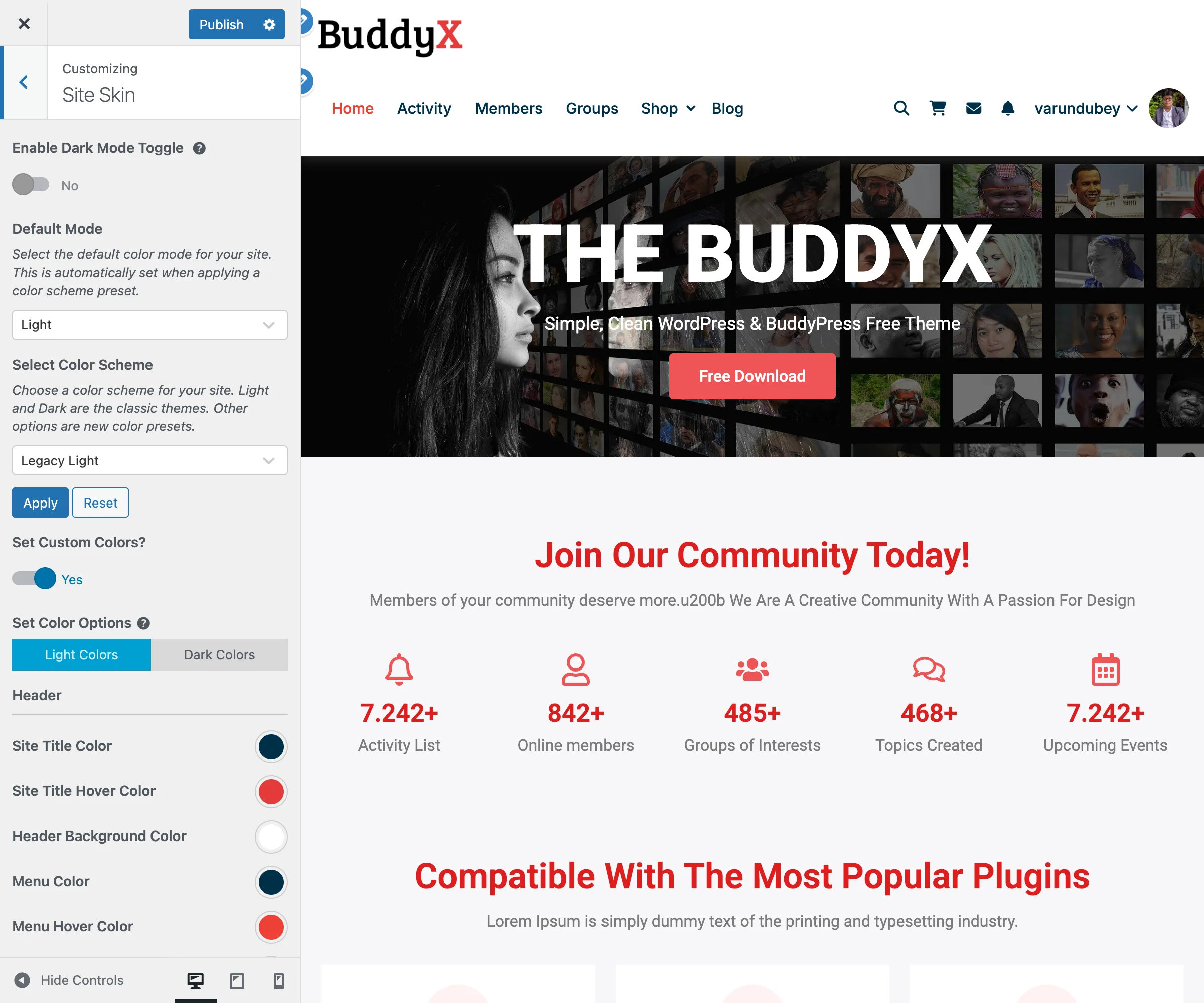
Choose Colors

  1. Go to Appearance > Customize > Site Skin
  2. Pick a color preset OR set custom colors
  3. Click Publish

Step 4: Create Your Menu (3 minutes)

  1. Go to Appearance > Menus
  2. Click Create a new menu
  3. Name it "Primary Menu"
  4. Add pages from the left panel
  5. Check Primary Menu in Menu Settings
  6. Click Save Menu

Step 5: Set Your Homepage (2 minutes)

Option A: Use a Page as Homepage

  1. Create a page called "Home"
  2. Go to Settings > Reading
  3. Select A static page
  4. Choose your Home page
  5. Click Save Changes

Option B: Show Latest Posts

  1. Go to Settings > Reading
  2. Select Your latest posts
  3. Click Save Changes

You're Done!

Visit your site to see BuddyX Pro in action.

What's Next?

Customize Further:

Add Features:

Get Help:


Quick Reference

Task Location
Change logo Customize > Site Identity
Change colors Customize > Site Skin
Edit header Customize > Header
Edit footer Customize > Site Footer
Change fonts Customize > Typography
Add widgets Appearance > Widgets
Create menus Appearance > Menus

Need Help?

System Requirements

This document outlines the minimum and recommended requirements for running BuddyX Pro.

Server Requirements

Minimum Requirements

Requirement Minimum Recommended
PHP Version 8.0 8.2+
MySQL Version 5.7 8.0+
MariaDB Version 10.3 10.6+
WordPress Version 6.0 6.4+
PHP Memory Limit 128MB 256MB+
Max Upload Size 32MB 64MB+
Max Execution Time 60 seconds 300 seconds

PHP Extensions Required

The following PHP extensions must be enabled:

  • curl - For API requests and updates
  • dom - For XML/HTML processing
  • fileinfo - For file type detection
  • hash - For security functions
  • json - For JSON data handling
  • mbstring - For multibyte string handling
  • openssl - For secure connections
  • pcre - For regular expressions
  • xml - For XML processing
  • zip - For file compression

Recommended PHP Settings

Add these to your php.ini or .htaccess:

upload_max_filesize = 64M
post_max_size = 64M
max_execution_time = 300
max_input_vars = 3000
memory_limit = 256M

WordPress Requirements

Core Requirements

  • WordPress 6.0 or higher
  • Pretty permalinks enabled (Settings > Permalinks)
  • wp-content directory writable
  • uploads directory writable

Database Requirements

  • UTF-8 character set (utf8mb4 recommended)
  • InnoDB storage engine
  • Adequate database size for your content

Browser Compatibility

BuddyX Pro supports all modern browsers:

Browser Minimum Version
Chrome 90+
Firefox 88+
Safari 14+
Edge 90+
Opera 76+

Note: Internet Explorer is not supported.

Plugin Compatibility

Fully Supported Plugins

These plugins have full template and styling integration:

Plugin Minimum Version Notes
BuddyPress 11.0 Full template override
BuddyBoss Platform 2.0 Complete compatibility
WooCommerce 8.0 Shop, cart, checkout styling
LearnDash 4.0 Course templates, dashboard
bbPress 2.6 Forum templates
FluentCart 1.0 Product pages, checkout
Dokan 3.7 Marketplace templates
LearnPress 4.2 Course templates
Tutor LMS 2.0 Course styling
LifterLMS 7.0 Course templates
GamiPress 2.0 Badge display
Elementor 3.15 Page builder support
Elementor Pro 3.15 Theme builder support

Recommended Plugins

  • Starter Templates - For importing demo content
  • Kirki Customizer Framework - For advanced customizer fields
  • WP Fastest Cache or LiteSpeed Cache - For performance

Known Incompatibilities

Some plugins may cause conflicts:

  • Other BuddyPress themes with template overrides
  • Plugins that heavily modify the WordPress customizer
  • Legacy page builders (Visual Composer, Divi Builder)

Hosting Recommendations

Shared Hosting

Minimum for small communities (under 500 members):

  • 2GB+ disk space
  • 256MB+ PHP memory
  • Adequate monthly bandwidth
  • PHP 8.0+ support

Recommended Providers: SiteGround, Bluehost, A2 Hosting

VPS/Cloud Hosting

For medium communities (500-5,000 members):

  • 2+ CPU cores
  • 4GB+ RAM
  • SSD storage
  • Managed WordPress optimization

Recommended Providers: Cloudways, DigitalOcean, Vultr

Dedicated/Enterprise

For large communities (5,000+ members):

  • 4+ CPU cores
  • 8GB+ RAM
  • Object caching (Redis/Memcached)
  • CDN integration
  • Database optimization

Recommended Providers: WP Engine, Kinsta, Pagely

Performance Considerations

Caching

Enable caching for optimal performance:

  1. Page Caching - WP Fastest Cache, LiteSpeed Cache
  2. Object Caching - Redis or Memcached
  3. Browser Caching - Configured via .htaccess
  4. CDN - Cloudflare, StackPath, KeyCDN

Database Optimization

  • Regular cleanup of post revisions
  • Optimize database tables monthly
  • Use object caching for complex queries
  • Consider database indexing for large sites

Image Optimization

  • Use WebP format when possible
  • Implement lazy loading (built into theme)
  • Optimize images before upload
  • Consider image CDN (Cloudinary, imgix)

Checking Your Environment

Using Site Health

WordPress includes a Site Health tool:

  1. Go to Tools > Site Health
  2. Review Status tab for issues
  3. Check Info tab for server details
  4. Address any critical issues shown

Manual PHP Info Check

Create a file phpinfo.php in your root:

<?php phpinfo(); ?>

Access it via browser, then delete after checking.

WP-CLI Commands

If you have WP-CLI access:

# Check PHP version
wp cli info

# Check WordPress version
wp core version

# Check plugin versions
wp plugin list

# Check theme status
wp theme status

Upgrading Requirements

From Older PHP Versions

If upgrading from PHP 7.x:

  1. Test on a staging site first
  2. Update all plugins to latest versions
  3. Check for deprecated function warnings
  4. Verify all functionality after upgrade

From Older WordPress Versions

If upgrading from WordPress 5.x:

  1. Back up your database and files
  2. Update all plugins first
  3. Update WordPress core
  4. Test thoroughly after upgrade

Troubleshooting Environment Issues

PHP Memory Exhausted

Add to wp-config.php:

define('WP_MEMORY_LIMIT', '256M');

Upload Size Too Small

Add to .htaccess:

php_value upload_max_filesize 64M
php_value post_max_size 64M

Execution Time Exceeded

Add to wp-config.php:

set_time_limit(300);

Or in .htaccess:

php_value max_execution_time 300

Next Steps

Once your environment meets requirements:


Need Help?

Translate Strings with Loco Translate

BuddyX Pro is fully translation-ready and works seamlessly with the Loco Translate plugin. This guide walks you through translating theme strings into your preferred language.

What You'll Need

  • WordPress 5.0 or higher
  • Loco Translate plugin (free)
  • BuddyX Pro theme installed and active

Why Use Loco Translate?

Loco Translate provides several advantages:

Feature Benefit
In-Dashboard Editing Translate directly in WordPress admin
Safe Location Stores translations outside theme folder
Update-Proof Translations survive theme updates
No Coding Required Visual interface for all strings
PO/MO Generation Automatically creates translation files

Step-by-Step Translation Guide

Step 1: Install Loco Translate

  1. Go to Plugins > Add New
  2. Search for "Loco Translate"
  3. Click Install Now then Activate

Step 2: Set Your Site Language

  1. Navigate to Settings > General
  2. Scroll to the Site Language dropdown
  3. Select your target language (e.g., French, German, Spanish)
  4. Click Save Changes

Note: If your language isn't listed, you may need to install language packs manually. You can temporarily set it to English while preparing translations.

Step 3: Verify Folder Structure

Before translating, ensure this directory exists and is writable:

wp-content/languages/loco/themes/

Why this matters:

  • Translations saved here are protected from theme updates
  • WordPress automatic updates won't delete your work
  • This is the recommended "Custom" location in Loco Translate

To create the folder:

  1. Connect via FTP or use File Manager in cPanel
  2. Navigate to wp-content/languages/
  3. Create folder loco if it doesn't exist
  4. Inside loco, create folder themes
  5. Ensure folders have write permissions (755)

Warning: Never save translations directly in the theme folder (wp-content/themes/buddyx-pro/languages/) as theme updates will delete them.

Step 4: Access Translation Dashboard

  1. Click Loco Translate in the admin menu
  2. Select Themes from the submenu
  3. Find and click BuddyX Pro from the theme list

You'll see a list of existing translations and available languages.

Step 5: Add a New Language

  1. Click the New language button (has a + icon)
  2. Select your target language from the dropdown
  3. Important: Choose Custom as the location
    • This saves to wp-content/languages/loco/themes/
    • Protects translations from updates
  4. Click Start translating

Step 6: Translate Theme Strings

The translation editor shows all translatable strings:

Understanding the Interface:

Element Meaning
Bold blue text Untranslated strings
Regular text Already translated
Star icon (*) Unsaved changes
Filter box Search for specific phrases

How to Translate:

  1. Click on a string in the upper pane
  2. The original English text appears in the Source text area
  3. Enter your translation in the Translation area below
  4. Move to the next string (use Tab or click)
  5. Repeat for all strings you want to translate

Tips for Efficient Translation:

  • Use the Filter to find specific words (e.g., "Login", "Profile")
  • Focus on user-facing strings first (buttons, menus, messages)
  • Keep placeholder variables intact (e.g., %s, %d, {name})
  • Match the tone and formality of your site

Step 7: Save Your Work

  1. Click the Save icon in the editor toolbar (or press Ctrl+S)
  2. Loco Translate creates/updates the .po and .mo files
  3. Your translations are immediately active on the frontend

Common Strings to Translate

Here are frequently translated BuddyX Pro strings:

Navigation & Menus

English Purpose
Home Main navigation
Activity BuddyPress activity stream
Members Member directory
Groups Group directory
Log In / Log Out Authentication
Register New user signup

Profile & Members

English Purpose
Profile User profile page
Edit Profile Profile editing
Messages Private messaging
Notifications User alerts
Friends Friend connections
Following / Followers Social follow system

Activity Stream

English Purpose
What's new? Activity post box
Post Update Submit button
commented Activity action
liked Reaction action

Groups

English Purpose
Create a Group Group creation
Join Group Membership action
Leave Group Exit action
Group Settings Admin area

Updating Translations After Theme Updates

When BuddyX Pro is updated, new strings may be added:

  1. Go to Loco Translate > Themes > BuddyX Pro
  2. Click on your language
  3. Click Sync to detect new strings
  4. New untranslated strings appear in bold blue
  5. Translate the new strings
  6. Save your work

Troubleshooting

Translations Not Showing

Problem: Frontend still shows English text.

Solutions:

  1. Clear any caching plugins
  2. Verify site language is set correctly
  3. Check that .mo file was generated (not just .po)
  4. Ensure file permissions allow writing

Permission Denied Error

Problem: Cannot save translations.

Solutions:

  1. Check folder permissions (should be 755)
  2. Verify wp-content/languages/loco/themes/ exists
  3. Contact hosting provider if using managed WordPress

Missing Strings

Problem: Some strings don't appear in Loco Translate.

Causes:

  • Strings may be from plugins (BuddyPress, WooCommerce)
  • JavaScript strings may need separate translation
  • Custom code may have hardcoded text

Solution: Translate plugin strings separately via Loco Translate > Plugins

Placeholder Variables

Problem: Translation shows broken text like %s or {name}.

Solution: Keep all placeholder variables in your translation:

  • Original: Welcome back, %s!
  • Translation: Willkommen zurück, %s! (German)

The %s gets replaced with the actual username at runtime.

Alternative Translation Methods

WPML (Premium)

If you need a multilingual site (multiple languages simultaneously):

  • BuddyX Pro is WPML compatible
  • Allows visitors to switch languages
  • More complex setup than Loco Translate

Polylang (Free/Premium)

Another multilingual option:

  • Compatible with BuddyX Pro
  • Free version available
  • Good for simple multilingual needs

Manual PO File Editing

For developers:

  1. Copy buddyx-pro.pot from theme's languages folder
  2. Rename to your locale (e.g., buddyx-pro-de_DE.po)
  3. Edit with Poedit or similar tool
  4. Generate .mo file
  5. Upload to wp-content/languages/themes/

Best Practices

  1. Backup First - Export translations before major changes
  2. Use Custom Location - Always save to wp-content/languages/loco/themes/
  3. Sync Regularly - Check for new strings after theme updates
  4. Test Thoroughly - View translated pages to check context
  5. Keep Consistent - Use the same terms throughout (e.g., always "Profile" not sometimes "Account")

Related Resources


Need Help?

Upgrading from BuddyX Free to BuddyX Pro

This guide helps you migrate your settings when upgrading from the free BuddyX theme to BuddyX Pro. The built-in migration tool automatically transfers your customizer settings, saving you time and preserving your design choices.

Before You Upgrade

Pre-Upgrade Checklist

  • Backup your WordPress site (database and files)
  • Note any custom CSS you've added to BuddyX free
  • Document any child theme customizations
  • Ensure you have a valid BuddyX Pro license
  • Test the upgrade on a staging site first (recommended)

What Gets Migrated

The migration tool automatically transfers 80+ theme settings from BuddyX free to BuddyX Pro:

Category Settings Migrated
Layout Site layout, container width
Loader Site loader, loader background color
Page Mapping Login page, registration page, 404 page
Typography Site title, tagline, headings (H1-H6), menu, submenu, body text
Colors Primary color, link colors, button colors, background colors
Header Header background, search, cart, login/register links
Subheader Background settings, breadcrumbs, typography
Blog Layout options, image position, grid columns, masonry view
Single Post Content width, title layout, sidebar options
Sidebars Main sidebar, BuddyPress sidebars, bbPress sidebar, WooCommerce sidebar, sticky sidebar
WP Login Custom login settings, logo, background
Footer Background, colors, copyright text, link colors

Special Color Mappings

BuddyX Pro has a more organized color system. During migration, some color settings are automatically mapped to their new locations:

BuddyX Free Setting BuddyX Pro Setting
Site Title Typography → Color Site Title Color
H1 Typography → Color Headings Color
Tagline Typography → Color Body Text Color
Menu Typography → Color Menu Color
Body Typography → Color Body Text Color
Subheader Typography → Color Subheader Title Color

How to Upgrade

Step 1: Install BuddyX Pro

  1. Download BuddyX Pro from your WBCom Designs account
  2. Go to Appearance > Themes > Add New > Upload Theme
  3. Upload the buddyx-pro.zip file
  4. Click Install Now
  5. Do NOT activate yet if you want to preserve your BuddyX free settings

Step 2: Activate BuddyX Pro

  1. After installation, click Activate
  2. You'll be redirected to the Getting Started page
  3. The migration tab will automatically appear if BuddyX free settings are detected

Step 3: Run the Migration

  1. Navigate to Appearance > Getting Started
  2. Click on the BuddyX Free to Pro Upgrade tab
  3. Check the box: Migrate BuddyX free theme options to the BuddyX Pro theme
  4. Click the Upgrade button
  5. Wait for the success message: "Successfully migrate Buddyx Free theme options to Buddyx Pro theme"

Navigate to Appearance > Getting Started to find the migration tab

Step 4: Verify Your Settings

After migration, verify your settings were transferred correctly:

  1. Go to Appearance > Customize
  2. Check the following sections:
    • Site Identity - Logo and site title
    • Skin > Colors - Primary and secondary colors
    • Typography - Font families and sizes
    • Header - Layout and elements
    • Footer - Background and content colors
  3. Visit your frontend to confirm the appearance

What's NOT Migrated

Some items require manual setup after migration:

Manual Configuration Required

Item Action Needed
Custom CSS Copy from BuddyX free Customizer > Additional CSS to BuddyX Pro
Child Theme Files Update child theme to extend buddyx-pro instead of buddyx
Menu Assignments Re-assign menus if new menu locations exist
Widget Areas BuddyX Pro has additional widget areas - configure as needed
Pro-Only Features Configure new features like Dark Mode, Side Panel, etc.

New Features in BuddyX Pro

After migration, explore these exclusive BuddyX Pro features that aren't available in the free version:

Sign-in Popup

A modal login/registration popup that appears when users click login links, providing a seamless authentication experience without leaving the current page.

Location: Appearance > Customize > General > Sign-in Popup

Features:

  • Enable/disable popup login
  • Customize popup appearance
  • Configure redirect after login (current page, profile, activity, custom URL)
  • Works alongside or instead of page-mapped login

Side Panel

A slide-out navigation panel that provides quick access to menu items, user profile, and widgets.

Location: Appearance > Customize > Side Panel

Features:

  • Toggle panel open/closed by default
  • Show on desktop, mobile, or both
  • Customize background colors
  • Add menu and widget areas
  • Show/hide logout button for logged-in users

Group Single Settings

Extended customization options for individual BuddyPress/BuddyBoss group pages.

Location: Appearance > Customize > BuddyPress > Single Group

Features:

  • Multiple header layout options (Left, Centered, Container, Stretch views)
  • Navigation styles (Default, Icon + Label, Swipe modes)
  • Show/hide group elements (type, activity, description, organizers, privacy)
  • Customize group cover images

Plugin Compatibility

BuddyX Pro includes enhanced styling and integration for these plugins:

Activity Share Pro & BuddyPress Reactions

  • Full styling support for reaction buttons and counters
  • Share modal styling that matches your theme
  • Recommended plugins shown in Getting Started > Community Addons tab

rtMedia

  • Styled media galleries and lightboxes
  • Upload button integration
  • Activity stream media display

MediaPress

  • Gallery layouts matching theme style
  • Media player styling
  • Override activity media list view option in BuddyPress General settings

Additional Pro Features

Feature Description Location
Dark Mode Light/dark theme toggle for visitors Skin > Color Mode
Advanced Headers 5 header layout styles Site Header
WP Login Branding Modern, Classic, Split login themes WP Login section
Color Presets Pre-designed color schemes Skin > Color Presets
Extended Typography More font customization Typography panel
Member Profile Layouts 6 profile header styles BuddyPress > Single Member
Social Links Add social icons to member profiles BuddyPress > Single Member

Troubleshooting

Migration Tab Not Showing

Problem: The "BuddyX Free to Pro Upgrade" tab doesn't appear.

Cause: BuddyX free theme settings were not found in the database.

Solutions:

  1. Ensure BuddyX free was previously active on this site
  2. Check that theme_mods_buddyx exists in wp_options table
  3. If you never customized BuddyX free, there's nothing to migrate

Settings Not Transferring

Problem: Some settings didn't migrate correctly.

Solutions:

  1. Clear any caching plugins
  2. Try the migration again (if button is disabled, settings already migrated)
  3. Manually configure the missing settings in Customizer

Button Shows "Disabled"

Problem: The Upgrade button is grayed out and disabled.

Cause: Migration has already been completed for this site.

Note: The migration is designed to run only once to prevent accidentally overwriting your BuddyX Pro customizations.

Colors Look Different

Problem: Colors appear slightly different after migration.

Cause: BuddyX Pro has separate color controls that didn't exist in the free version.

Solution:

  1. Go to Appearance > Customize > Skin
  2. Fine-tune individual color settings
  3. Consider using a Color Preset as a starting point

Post-Migration Checklist

After completing the migration, work through this checklist:

Verify Migrated Settings

  • Verify site logo appears correctly
  • Check header layout and menu display
  • Confirm colors match your original design
  • Test typography on headings and body text
  • Review sidebar placements
  • Check footer content and colors
  • Test on mobile devices
  • Verify BuddyPress/BuddyBoss components display correctly
  • Check WooCommerce pages (if applicable)
  • Re-add any custom CSS
  • Update child theme (if using one)

Configure New Pro Features

  • Sign-in Popup - Enable modal login at Customize > General > Sign-in Popup
  • Side Panel - Configure slide-out menu at Customize > Side Panel
  • Dark Mode - Enable light/dark toggle at Customize > Skin > Color Mode
  • Group Settings - Customize group pages at Customize > BuddyPress > Single Group
  • Member Profiles - Set profile layout at Customize > BuddyPress > Single Member
  • WP Login Branding - Style login page at Customize > WP Login

Plugin Integrations (If Applicable)

  • Activity Share Pro - Install from Getting Started > Community Addons
  • BuddyPress Reactions - Install from Getting Started > Community Addons
  • rtMedia - Verify media galleries display correctly
  • MediaPress - Check activity media settings at Customize > BuddyPress > General

Reverting to BuddyX Free

If you need to go back to the free theme:

  1. Your BuddyX free settings are still stored in the database
  2. Simply activate the BuddyX free theme
  3. Your original settings will be restored
  4. BuddyX Pro settings remain separate and won't be lost

Note: Each theme stores its settings independently, so switching between them won't cause data loss.

Getting Help

If you encounter issues during migration:

  1. Documentation: Check our full documentation
  2. Support: Submit a ticket at wbcomdesigns.com/support
  3. Community: Join our Facebook Group

When contacting support, include:

  • WordPress version
  • BuddyX Pro version
  • Screenshots of the issue
  • Any error messages displayed

Related Guides:


Need Help?

Site Identity & Branding

Logo, favicon, and site identity options.

Logo & Favicon Options

BuddyX Pro provides comprehensive logo customization options to help you establish your brand identity. Configure primary logos, dark mode alternatives, mobile versions, and site icons (favicons) to create a cohesive visual experience across all devices and color schemes.

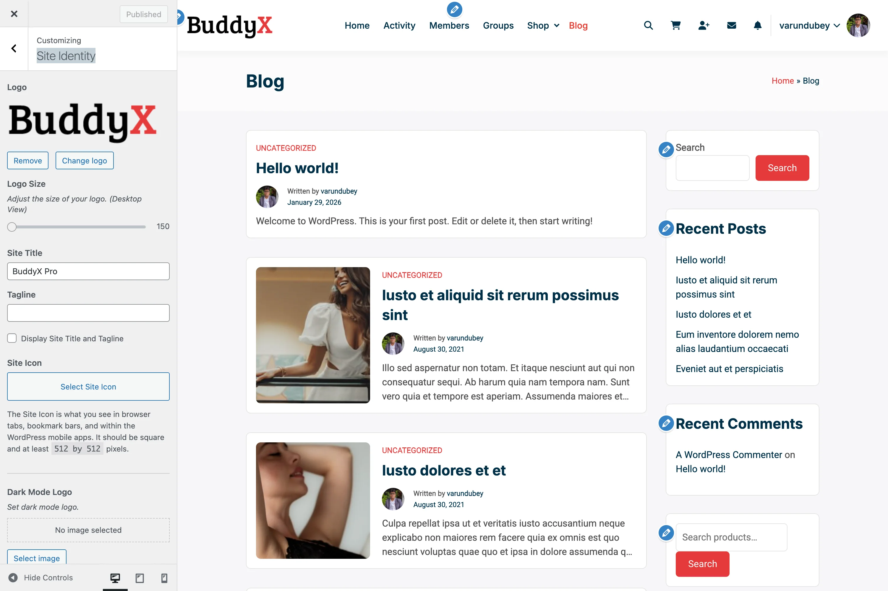
Site Identity Settings Logo and favicon configuration in Site Identity
Accessing Logo Settings

  1. Go to Appearance > Customize in your WordPress admin
  2. Click on Site Identity in the customizer panel
  3. Logo options appear after the site title and tagline settings

What You Can Do

BuddyX Pro's logo system gives you complete control over your branding:

  • Upload and configure your primary logo
  • Adjust logo size for optimal display (150-300px)
  • Set a separate dark mode logo that appears automatically when dark mode is active
  • Upload a mobile-specific logo for better display on small screens
  • Configure your site icon (favicon) for browser tabs and bookmarks
  • Use different logo formats (SVG, PNG, JPG) based on your needs
  • Optimize logos for retina/high-DPI displays

Primary Logo Settings

Logo Upload

Upload your main logo that appears in the header across your website.

Setting Description Default
Logo Primary logo image file None
Supported Formats PNG, SVG, JPG, WebP -
Upload Location Site Identity > Logo -

How to Upload:

  1. Click Select Logo button
  2. Choose Upload Files or select from Media Library
  3. Click Select to apply the logo
  4. Use Skip Cropping to maintain original dimensions

Logo Size Control

Adjust your logo's display width on desktop screens.

Setting Description Default
Logo Size Desktop logo width 150px
Minimum Smallest allowed width 150px
Maximum Largest allowed width 300px
Adjustment 1px increments via slider -

Sizing Best Practices:

  • Start at 150px and adjust upward for visibility
  • Consider your logo's aspect ratio when sizing
  • Test at different screen sizes to ensure clarity
  • Balance logo size with available header space
  • Larger sizes work better for text-based logos

Example Sizes by Use Case:

Logo Type Recommended Size Notes
Icon/Symbol 150-180px Simple marks need less space
Text Logo 180-220px Ensure text readability
Combination Mark 200-250px Balance icon and text
Wide Horizontal 250-300px Use max space available

Dark Mode Logo

When dark mode is enabled, BuddyX Pro automatically switches to an alternate logo optimized for dark backgrounds.

Setting Description Location
Dark Mode Logo Alternate logo for dark theme Site Identity (below primary logo)
Automatic Switching Changes based on user's color mode Automatic
Same Size Setting Uses primary Logo Size setting -

When to Use Dark Mode Logo:

  • Your primary logo has dark text that's invisible on dark backgrounds
  • Your logo uses colors that clash with dark mode color scheme
  • You want brand consistency across both light and dark themes
  • Your logo includes shadows or effects designed for light backgrounds

Design Tips for Dark Mode Logos:

  • Use light or white text instead of dark
  • Increase contrast between logo elements
  • Consider simplified versions with better visibility
  • Test against actual dark mode background colors
  • Maintain brand recognition despite color changes

Common Approaches:

  1. Inverted Colors: Swap dark text for light text
  2. Outlined Version: Use outline logo on dark backgrounds
  3. Alternative Colorway: Brand-approved dark theme colors
  4. Simplified Mark: Simpler version optimized for dark

Site Icon (Favicon)

The site icon appears in browser tabs, bookmarks, mobile home screens, and various browser interfaces.

Setting Description Requirements
Site Icon Square favicon image 512x512px minimum
Format PNG recommended Must be square
Location Site Identity > Site Icon WordPress native

Site Icon Requirements:

  • Dimensions: Exactly square (1:1 aspect ratio)
  • Minimum Size: 512 x 512 pixels
  • Recommended Format: PNG with transparency
  • Design: Simple, recognizable at small sizes
  • File Size: Under 100KB for fast loading

Where Your Site Icon Appears:

Location Size Displayed Notes
Browser Tabs 16x16 or 32x32px Tiny, needs to be simple
Bookmark Bars 16x16px Same as tabs
Mobile Home Screen 180x180px iOS web clips
Windows Taskbar 32x32px Pinned sites
Android Home 192x192px Add to home screen
RSS Feed Readers 64x64px Feed icons
Search Suggestions Varies Browser-dependent

Design Best Practices:

  1. Keep It Simple: Should work at 16x16px
  2. High Contrast: Clear against browser backgrounds
  3. Brand Recognition: Use primary brand element
  4. No Text: Text becomes illegible at small sizes
  5. Center Focus: Important elements in center
  6. Test at Scale: View at actual browser tab size

Recommended Logo Sizes by Use Case

Business Website

Primary Logo:

  • Desktop Width: 180-200px
  • Original File: 400px wide (2x for retina)
  • Format: PNG with transparency or SVG
  • Aspect Ratio: 3:1 horizontal

Dark Mode Logo:

  • Same dimensions as primary
  • Light text on transparent background

Site Icon:

  • 512x512px PNG
  • Simple icon or letter mark

Community Platform

Primary Logo:

  • Desktop Width: 200-220px
  • Original File: 500px wide
  • Format: SVG preferred (scales perfectly)
  • Aspect Ratio: 4:1 or wider

Dark Mode Logo:

  • Essential for community sites with dark mode toggle

Site Icon:

  • Community symbol or first letter
  • 512x512px with good contrast

E-Commerce Site

Primary Logo:

  • Desktop Width: 150-180px (leaves space for cart icon)
  • Original File: 400px wide
  • Format: PNG or SVG
  • Aspect Ratio: 2.5:1

Dark Mode Logo:

  • Optional, unless using dark theme

Mobile Logo:

  • Recommended: Square icon version
  • Saves mobile header space

Site Icon:

  • Store symbol or brand mark
  • High recognition factor

Portfolio/Creative Site

Primary Logo:

  • Desktop Width: 220-280px (bold presence)
  • Original File: 600px wide
  • Format: SVG for crisp display
  • Aspect Ratio: Flexible based on design

Dark Mode Logo:

  • Highly recommended for creative sites

Site Icon:

  • Creative mark or monogram
  • Reflects portfolio style

Learning/Course Platform

Primary Logo:

  • Desktop Width: 200-240px
  • Original File: 500px wide
  • Format: SVG or PNG
  • Aspect Ratio: 3:1 to 4:1

Dark Mode Logo:

  • Important for course reading modes

Site Icon:

  • Educational symbol (book, graduation cap, etc.)
  • Simple, professional design

File Format Recommendations

SVG (Scalable Vector Graphics)

Best For:

  • Text-based logos
  • Simple icon logos
  • Geometric designs
  • Logos needing perfect scaling

Advantages:

  • Infinite scaling without quality loss
  • Small file size
  • Crisp on all displays
  • No retina version needed

Considerations:

  • Not suitable for photographic logos
  • Complex SVGs can impact performance
  • Ensure browser compatibility

PNG (Portable Network Graphics)

Best For:

  • Logos with transparency
  • Complex designs with gradients
  • Photographic elements
  • Retina display optimization

Advantages:

  • Lossless compression
  • Transparency support
  • Wide browser support
  • Predictable rendering

Considerations:

  • Larger file size than SVG
  • Requires 2x version for retina
  • Can appear blurry if scaled up

Optimization Tips:

  • Export at 2x size (e.g., 400px for 200px display)
  • Use PNG-8 for simple logos (smaller file)
  • Use PNG-24 for complex logos
  • Optimize with tools like TinyPNG

JPG (JPEG)

Best For:

  • Photographic logos
  • Complex color gradients
  • Backgrounds within logos

Advantages:

  • Small file sizes
  • Good for photographs
  • Universal support

Considerations:

  • No transparency support
  • Lossy compression
  • Not ideal for text or sharp edges

When to Use:

  • Logo includes photograph
  • White or solid background is acceptable
  • File size is critical concern

WebP

Best For:

  • Modern websites prioritizing performance
  • Logos with transparency
  • High-quality with small file size

Advantages:

  • Superior compression
  • Supports transparency
  • Better quality-to-size ratio

Considerations:

  • Newer format, not universally supported
  • Provide PNG fallback
  • Check theme support

Logo Optimization Tips

File Size Optimization

Keep logo files under these sizes for optimal performance:

Format Target Size Maximum Size
SVG Under 10KB 50KB
PNG Under 50KB 150KB
JPG Under 30KB 100KB
WebP Under 30KB 80KB

Tools for Optimization:

  • TinyPNG/TinyJPG: Compress PNG and JPG files
  • SVGOMG: Optimize SVG files
  • Squoosh: Google's image compression tool
  • ImageOptim: Mac application for all formats
  • ShortPixel: WordPress plugin for automatic optimization

Retina/High-DPI Displays

Modern devices have high-resolution displays requiring sharper images.

Approach 1: 2x Image Export

  1. Design logo at actual display size (e.g., 200px)
  2. Export at 2x size (400px)
  3. Upload the 400px version
  4. WordPress/theme scales it down to 200px
  5. Result: Crisp on retina displays

Approach 2: SVG Format

  1. Use SVG for vector logos
  2. Automatically crisp at any size
  3. No need for multiple versions
  4. Best for text and geometric logos

Testing Retina Quality:

  • View on actual retina device (MacBook, iPhone, etc.)
  • Zoom browser to 200% on desktop
  • Check for pixelation or blur
  • Compare against vector version

Transparent Backgrounds

When to Use Transparency:

  • Logo needs to work on any background color
  • Header has image or gradient background
  • Logo overlays header image
  • Supporting dark mode with one logo file

Formats Supporting Transparency:

  • PNG (most common)
  • SVG (vector transparency)
  • WebP (modern option)

Exporting with Transparency:

  1. Remove background layer in design software
  2. Export as PNG-24 or SVG
  3. Verify transparency in image viewer
  4. Test against different background colors

Common Transparency Issues:

  • White "halo" around edges (export at higher resolution)
  • Semi-transparent elements appearing different (check alpha channels)
  • Background showing through thin strokes (increase stroke weight)

Logo Positioning & Spacing

While logo upload happens in Site Identity, logo positioning is controlled by Header Layout settings.

Header Layout Impact on Logo

Header Layout Logo Position Best Logo Type
Layout 1 Left aligned Horizontal logos
Layout 2 Centered Balanced logos
Layout 3 Left (above menu) Horizontal or tall
Layout 4 Centered (above menu) Any aspect ratio

Related Setting: Appearance > Customize > Header > Header Layout

Visual Spacing Considerations

Although padding/margins aren't directly configurable in the customizer, logo spacing is built into each layout:

Automatic Spacing:

  • Logo has built-in padding from header edges
  • Spacing adjusts based on logo size setting
  • Mobile breakpoints automatically adjust spacing
  • Sticky header may reduce spacing when scrolling

Custom Spacing (Advanced):

If you need custom logo spacing, use Additional CSS:

/* Adjust logo top/bottom spacing */
.site-branding .custom-logo-link {
    padding: 20px 0;
}

/* Adjust logo left spacing */
.site-branding {
    padding-left: 30px;
}

/* Mobile logo spacing */
@media (max-width: 768px) {
    .site-branding .custom-logo-link {
        padding: 10px 0;
    }
}

Text Logo Fallback

If no logo image is uploaded, BuddyX Pro displays your site title as a text logo.

Text Logo Display

Condition Display
No logo uploaded Site Title as text
Logo uploaded Logo image
Logo + "Display Site Title" ON Both show

Text Logo Styling:

Controlled by Typography settings:

  • Font family: Customizer > Typography > Site Title
  • Font size: Automatic based on theme
  • Font color: Customizer > Colors
  • Font weight: Typography settings

When Text Logo Works Well:

  • Clean, modern designs
  • Typography-focused branding
  • Startup/bootstrap phase before logo design
  • Minimalist aesthetic

Common Questions

Q: What's the best logo format?

A: SVG for vector logos (text, geometric), PNG for complex logos with transparency. SVG scales perfectly and loads fast. PNG works everywhere and supports detailed designs.

Q: Why does my logo look blurry?

A: You're likely uploading a file that's too small for the display size. Upload at 2x the desired display width (e.g., 400px file for 200px display), or use SVG format.

Q: How do I add a mobile-specific logo?

A: BuddyX Pro currently uses the same logo on mobile but scales it appropriately. For a custom mobile logo, you would need custom code or a child theme. The logo automatically responds to mobile screen sizes.

Q: Can I have different logos for different pages?

A: The customizer sets a site-wide logo. For page-specific logos, you'd need custom code using conditional logic in a child theme's header.php.

Q: Does the logo link to the homepage?

A: Yes, clicking the logo always returns users to your site's homepage. This is standard web convention and improves navigation.

Q: How large should my original logo file be?

A: For PNG: 2x your desired display size (e.g., 400-600px wide). For SVG: design at actual size, it scales automatically. For retina displays, always export at 2x.

Q: Will a large logo file slow down my site?

A: Yes, if not optimized. Keep logos under 100KB. Use compression tools like TinyPNG. Consider SVG for smallest file sizes. Optimize all images before uploading.

Q: How do I create a dark mode logo?

A: Design the same logo with inverted colors (light on transparent). If your primary logo has black text, make the dark mode version with white text. Upload both in Site Identity.

Q: Why isn't my dark mode logo showing?

A: Check three things: 1) Dark mode is enabled in Customizer > Skin Settings, 2) Dark mode logo is actually uploaded, 3) Clear browser and plugin caches.

Q: What's the difference between logo and site icon?

A: Logo appears in your header and is typically horizontal/rectangular. Site icon (favicon) is the tiny square icon in browser tabs, must be 512x512px, and appears in bookmarks.

Q: Can I use a full-width logo?

A: Logo width is controlled by the Logo Size slider (150-300px maximum). For full-width branding, consider using the Sub-Header or a custom header image instead.

Q: How do I center my logo?

A: Logo position is determined by Header Layout. Choose Layout 2 or Layout 4 in Customizer > Header > Header Layout for centered logo display.

Q: Does the logo automatically resize on mobile?

A: Yes, logos automatically scale down on mobile devices to fit smaller screens while maintaining aspect ratio. The theme handles responsive sizing.

Q: Why does my logo have a white box around it?

A: Your logo file has a white background instead of transparency. Re-export your logo as PNG-24 with a transparent background, or use SVG format.

Q: Can I use animated logos?

A: Animated GIFs work as logos, but they can't be resized well and increase page load time. SVG animations are possible but require custom code. Static logos are recommended for performance.

Recommended Logo Dimensions by Aspect Ratio

Square Logos (1:1)

Display Size: 150-180px Upload Size: 360px x 360px (2x) Best For: Icon-based brands, app-style logos

Horizontal Logos (3:1)

Display Size: 240px wide x 80px tall Upload Size: 480px x 160px (2x) Best For: Text-heavy logos, wide wordmarks

Balanced Logos (2:1)

Display Size: 200px wide x 100px tall Upload Size: 400px x 200px (2x) Best For: Combination marks, balanced text and icon

Wide Logos (4:1 or wider)

Display Size: 300px wide x 75px tall (maximum width) Upload Size: 600px x 150px (2x) Best For: Long company names, tagline inclusion

Tall Logos (1:2)

Display Size: 150px wide x 300px tall Upload Size: 300px x 600px (2x) Best For: Stacked text, vertical marks Note: Works best with Layout 3 or 4

Troubleshooting

Logo Not Appearing After Upload

Problem: Logo doesn't display after uploading and selecting.

Solutions:

  1. Clear browser cache (Ctrl+F5 or Cmd+Shift+R)
  2. Click Publish in customizer to save changes
  3. Check file format is supported (PNG, SVG, JPG, WebP)
  4. Verify file uploaded successfully to Media Library
  5. Disable caching plugins temporarily
  6. Try uploading a different logo file to isolate issue
  7. Check browser console for JavaScript errors
  8. Verify file permissions on wp-content/uploads folder

Logo Appears Stretched or Distorted

Problem: Logo doesn't maintain correct proportions.

Solutions:

  1. Re-upload with correct aspect ratio from design software
  2. Don't use WordPress crop tool - skip cropping
  3. Check original file isn't already distorted
  4. Verify Logo Size setting isn't forcing unusual dimensions
  5. Try SVG format which preserves aspect ratio
  6. Clear browser cache after re-uploading
  7. Inspect with browser dev tools for conflicting CSS

Logo Too Large on Mobile

Problem: Logo takes up too much space on mobile screens.

Solutions:

  1. Theme automatically scales logos on mobile
  2. Reduce desktop Logo Size setting (affects mobile too)
  3. Clear mobile browser cache to see changes
  4. Check for custom CSS forcing desktop sizes on mobile
  5. Consider adding mobile-specific logo via child theme
  6. Test on actual device, not just browser resize

Dark Mode Logo Not Switching

Problem: Same logo appears in both light and dark modes.

Solutions:

  1. Verify dark mode is enabled: Customizer > Skin Settings
  2. Check Dark Mode Logo is actually uploaded and published
  3. Clear all caches (browser, WordPress, plugin caches)
  4. Test in incognito/private browsing window
  5. Verify you're actually in dark mode (check color scheme)
  6. Check for JavaScript errors preventing mode switch
  7. Disable theme-related plugins to test for conflicts

Logo Quality Poor on Retina Displays

Problem: Logo looks pixelated on high-resolution screens.

Solutions:

  1. Upload logo at 2x the display size (e.g., 400px for 200px display)
  2. Use SVG format for infinite scaling
  3. Export PNG at higher resolution with quality set to maximum
  4. Don't scale up a small logo - create larger source file
  5. Test on actual retina device (MacBook, iPhone, iPad)
  6. Check Logo Size setting isn't enlarging a small file
  7. Use PNG-24 instead of PNG-8 for better quality

Site Icon Not Showing in Browser Tab

Problem: Favicon doesn't appear after uploading.

Solutions:

  1. Ensure image is exactly square (512x512px minimum)
  2. Use PNG format, not JPG
  3. Clear browser cache (may take several refreshes)
  4. Close and reopen browser completely
  5. Wait up to 24 hours for browser to fetch new favicon
  6. Force refresh: Ctrl+F5 (Windows) or Cmd+Shift+R (Mac)
  7. Check browser bookmark bar - may update there first
  8. Test in different browser to rule out caching
  9. Verify file uploaded to Site Icon, not Logo field

Logo Overlapping Header Elements

Problem: Logo covers menu items or icons.

Solutions:

  1. Reduce Logo Size setting
  2. Change Header Layout to one with more space
  3. Reduce number of menu items in primary navigation
  4. Hide some header icons if not essential
  5. Consider Header Layout 3 or 4 (logo above menu)
  6. Check for custom CSS forcing logo width
  7. Test at different screen sizes to find breakpoint

White Background Behind Transparent Logo

Problem: Logo shows white box despite transparent PNG.

Solutions:

  1. Re-export logo with transparency enabled
  2. Save as PNG-24, not PNG-8 or JPG
  3. Remove white background layer in design software
  4. Check for CSS adding background-color to logo
  5. Verify transparency in image viewer before uploading
  6. Try SVG format which better preserves transparency
  7. Check "Additional CSS" for conflicting styles

Integration with Other Settings

Logo settings work with several other theme features:

Header Options

  • Header Layout: Controls logo position (left, center, above menu)
  • Sticky Header: Logo appears in fixed header when scrolling
  • Header Background: Logo must contrast with background color/image

Location: Customizer > Header

Skin & Color Settings

  • Dark Mode: Triggers automatic switch to dark mode logo
  • Color Scheme: Logo should work with selected color palette
  • Accent Colors: Consider logo colors when choosing accents

Location: Customizer > Skin Settings

Typography

  • Site Title Font: Used for text logo fallback
  • Heading Fonts: Should complement logo typography
  • Font Pairing: Logo font should work with site fonts

Location: Customizer > Typography

Mobile Header

  • Mobile Breakpoints: Logo automatically scales at mobile sizes
  • Mobile Menu: Logo appears with hamburger menu icon
  • Touch Targets: Logo link sized for touch interaction

Location: Automatic responsive behavior

Related Documentation


Need Help?

Site Identity Settings

The Site Identity panel in the WordPress Customizer allows you to configure your website's core branding elements including the site title, tagline, logo, and site icon (favicon).

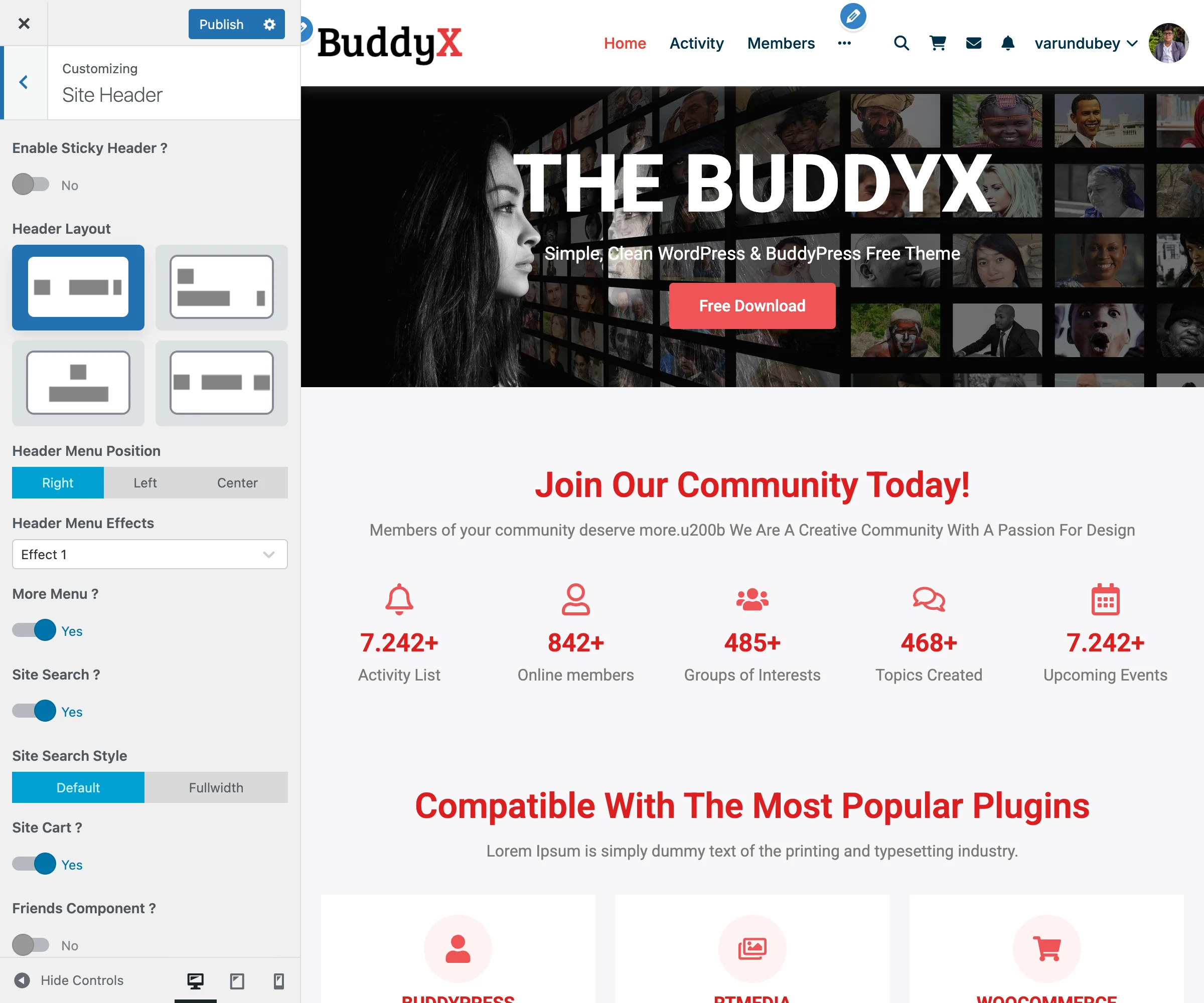
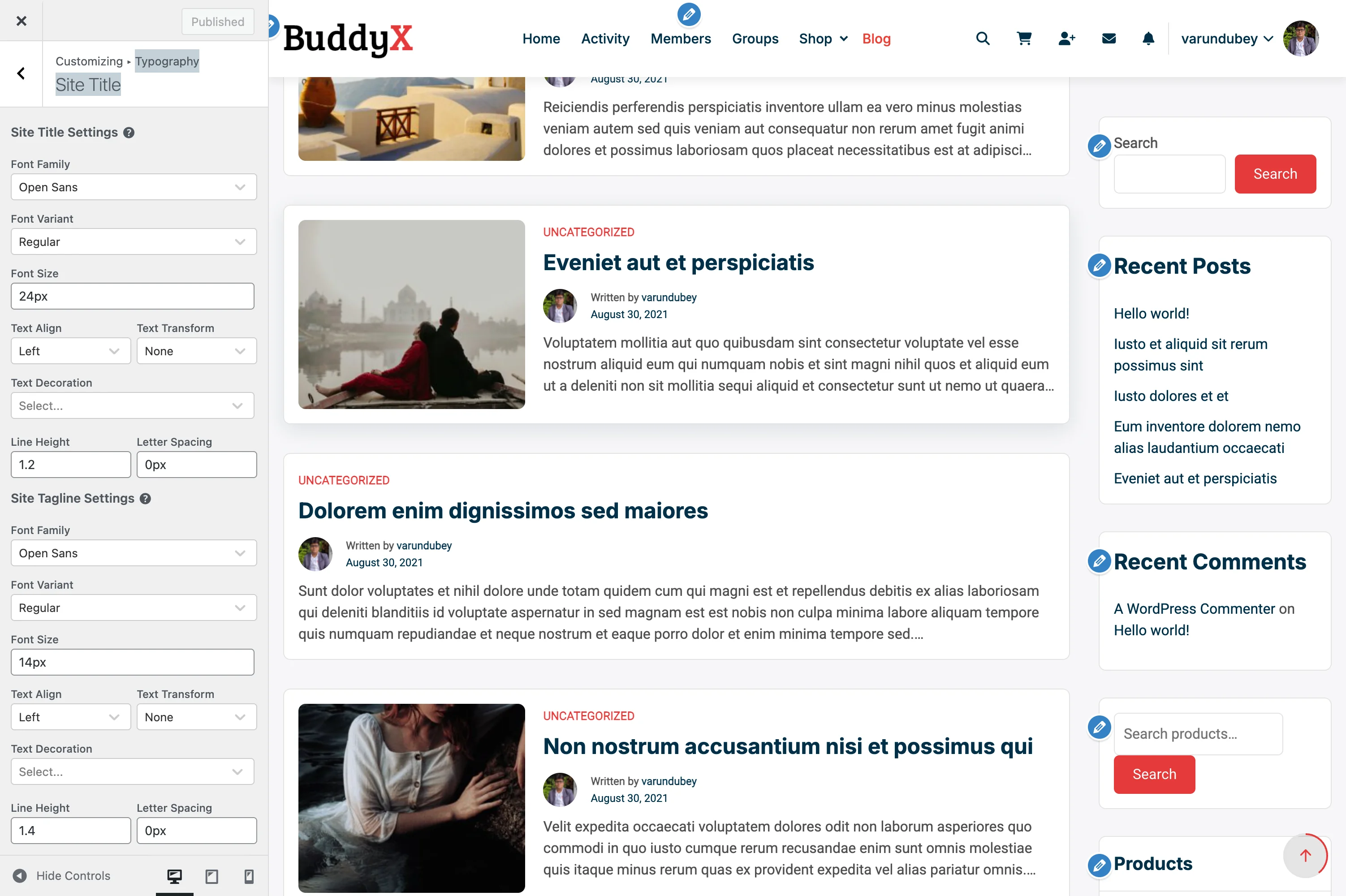
Site Identity Typography Site title typography settings in the Customizer
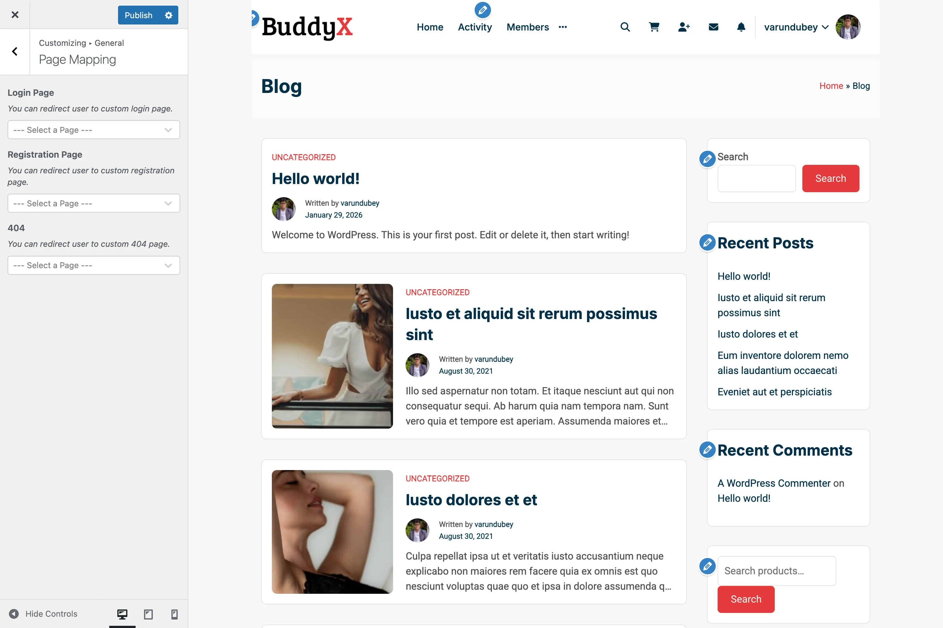
Accessing Site Identity Settings

  1. Go to Appearance > Customize in your WordPress admin
  2. Click on Site Identity in the customizer panel

Available Settings

Site Title

The site title appears in browser tabs, search results, and can be displayed in your header.

Setting Description
Site Title Your website's name (e.g., "My Community Site")
Display Site Title Toggle whether to show the title in the header

Best Practices:

  • Keep your site title concise (under 60 characters)
  • Use your brand name or a descriptive title
  • Consider SEO implications for search visibility

Tagline

The tagline is a short description of your website's purpose.

Setting Description
Tagline A brief description of your site
Display Tagline Toggle visibility in the header

Best Practices:

  • Keep taglines under 120 characters
  • Describe what makes your site unique
  • Include relevant keywords naturally

Logo

BuddyX Pro provides extensive logo customization options.

Setting Description Default
Logo Upload your primary logo image None
Logo Size Adjust logo width (150-300px) 150px
Logo Retina Upload @2x logo for high-DPI displays None

Logo Size Adjustment:

The Logo Size slider allows you to control the desktop display width:

  • Minimum: 150px
  • Maximum: 300px
  • Step: 1px increments

Supported Formats:

  • PNG (recommended for logos with transparency)
  • SVG (vector format, scales without quality loss)
  • JPG (for photographic logos)
  • WebP (modern format with good compression)

Recommended Dimensions:

  • Standard logo: 300px x 100px (max)
  • Retina logo: 600px x 200px (@2x)
  • File size: Under 100KB for optimal loading

Dark Mode Logo

When dark mode is enabled, BuddyX Pro can display an alternate logo optimized for dark backgrounds.

Setting Description
Dark Mode Logo Alternate logo for dark color scheme
Dark Mode Retina Logo @2x version for high-DPI displays

When to Use:

  • Your primary logo has dark text that's invisible on dark backgrounds
  • You want brand consistency across color schemes
  • Your logo uses colors that clash with dark mode

Mobile Logo

Optimize your header for mobile devices with a separate mobile logo.

Setting Description
Mobile Logo Smaller logo for mobile devices
Mobile Logo Size Width adjustment for mobile

Best Practices:

  • Use a simplified version of your logo
  • Consider a square icon or abbreviated version
  • Test on actual mobile devices

Site Icon (Favicon)

The site icon appears in browser tabs, bookmarks, and mobile home screens.

Setting Description
Site Icon Square image for browser tabs
Recommended Size 512 x 512 pixels

Requirements:

  • Must be square (1:1 aspect ratio)
  • Minimum 512 x 512 pixels
  • PNG format recommended
  • Simple, recognizable design

Where It Appears:

  • Browser tabs
  • Bookmark bars
  • Mobile home screen (when saved)
  • Windows taskbar pins
  • RSS feed readers

Configuration Examples

Example 1: Standard Business Site

Site Title: "Acme Community"
Tagline: "Connect, Learn, and Grow Together"
Logo: acme-logo.webp (280px wide)
Site Icon: acme-icon.webp (512x512)

Example 2: Community Platform

Site Title: "Developer Network"
Tagline: "Where developers connect and collaborate"
Logo: devnet-logo.svg
Dark Mode Logo: devnet-logo-light.svg
Mobile Logo: devnet-icon.webp

Example 3: Learning Platform

Site Title: "LearnHub Academy"
Tagline: "Online courses for professionals"
Logo: learnhub-logo.webp
Logo Size: 200px
Site Icon: learnhub-favicon.webp

Troubleshooting

Logo Not Displaying

Problem: Logo doesn't appear after upload.

Solutions:

  1. Clear browser cache and refresh
  2. Check file permissions on uploads folder
  3. Verify image format is supported
  4. Check for CSS conflicts with caching plugins

Logo Appears Blurry

Problem: Logo looks pixelated on high-resolution displays.

Solutions:

  1. Upload a larger source image (at least 2x desired display size)
  2. Use SVG format for vector logos
  3. Enable and upload a retina version
  4. Check the Logo Size setting isn't scaling up a small image

Dark Mode Logo Not Switching

Problem: Same logo shows in both light and dark mode.

Solutions:

  1. Verify Dark Mode Logo is uploaded
  2. Check dark mode is enabled in Skin settings
  3. Clear any caching plugins
  4. Test in incognito/private browser window

Site Icon Not Showing

Problem: Favicon doesn't appear in browser tabs.

Solutions:

  1. Ensure image is exactly square
  2. Upload at least 512x512 pixels
  3. Use PNG format
  4. Clear browser cache (Ctrl+F5 / Cmd+Shift+R)
  5. Wait for browser to fetch new favicon

Integration with Other Settings

Site Identity settings work in conjunction with:

  • Header Options - Logo placement and alignment
  • Skin Settings - Dark mode logo switching
  • Mobile Header - Mobile logo display
  • Typography - Site title font styling

Related Documentation


Need Help?

General Settings

Site layout, loader, page mapping, scroll-to-top, and other global controls.

Page Mapping

Page Mapping lets you redirect users to custom pages for important site functions like login, registration, and 404 errors. Instead of WordPress defaults, you can create branded, customized pages for these experiences.

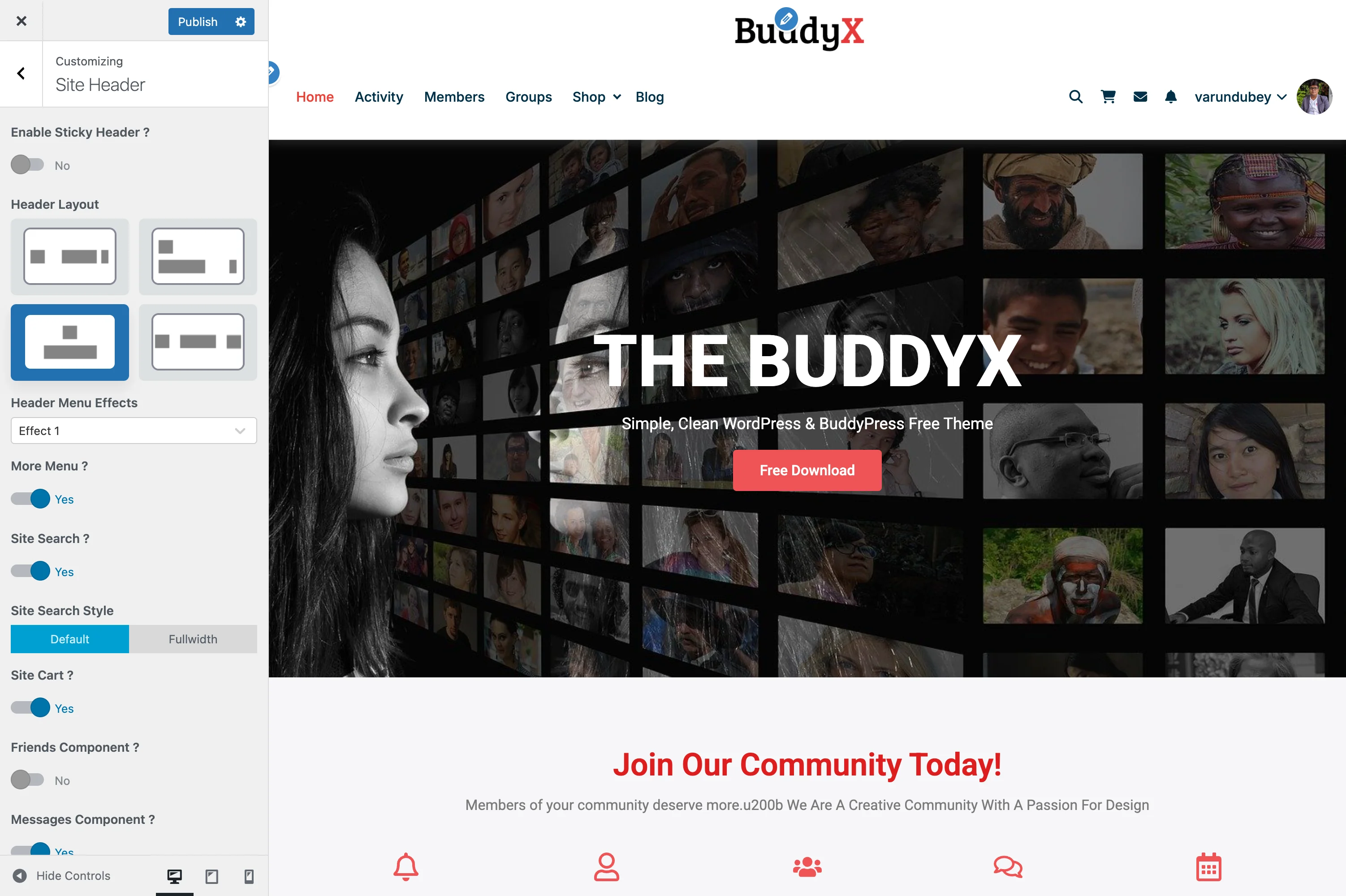
Page Mapping Settings Page mapping configuration for login, registration, and 404 pages
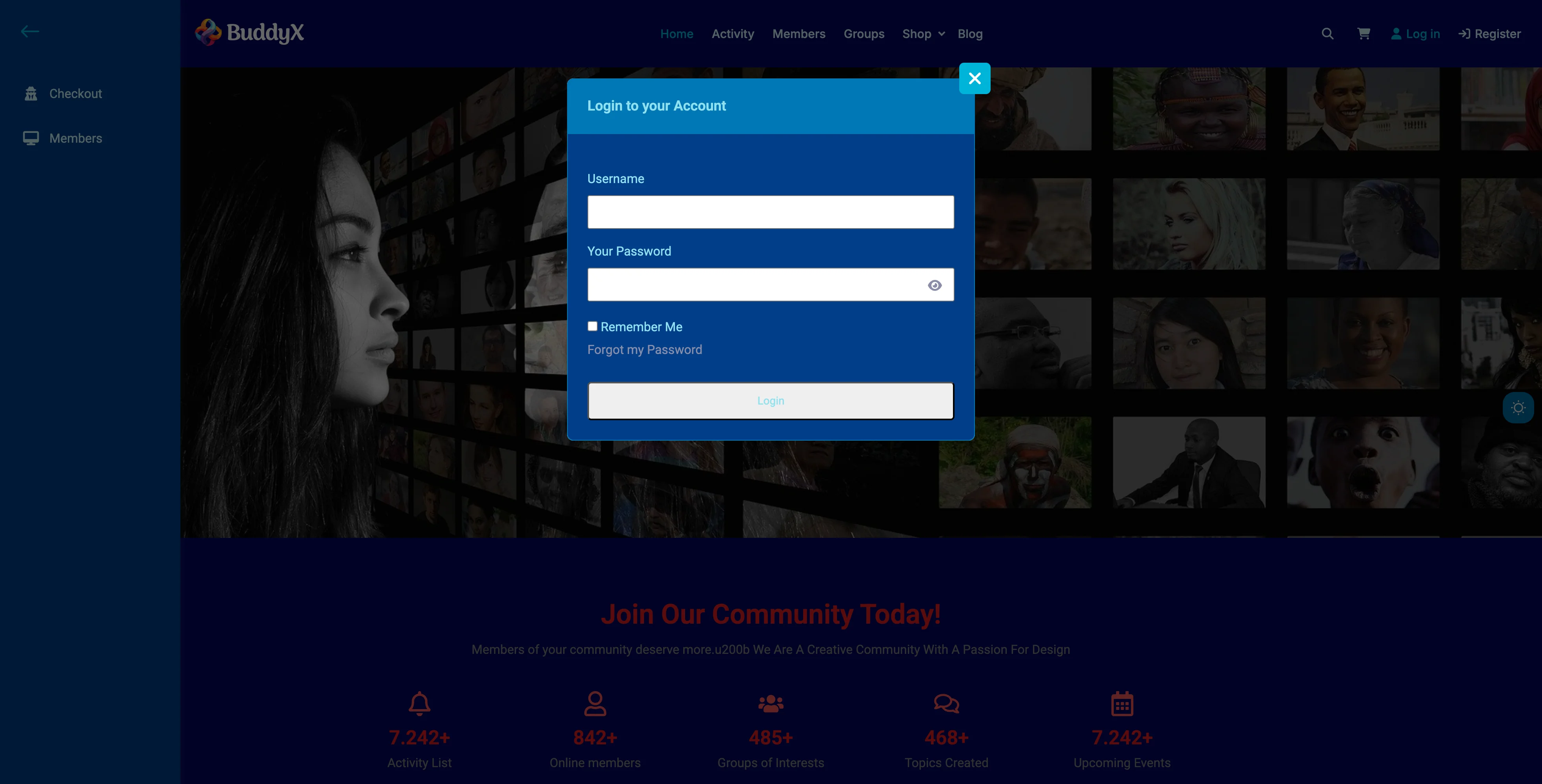
What You Can Do

With BuddyX Pro's page mapping feature, you can:

  • Redirect login to a custom page with your branding
  • Send new users to a custom registration page
  • Create a helpful 404 error page with navigation
  • Use page builders (Elementor, etc.) for these pages
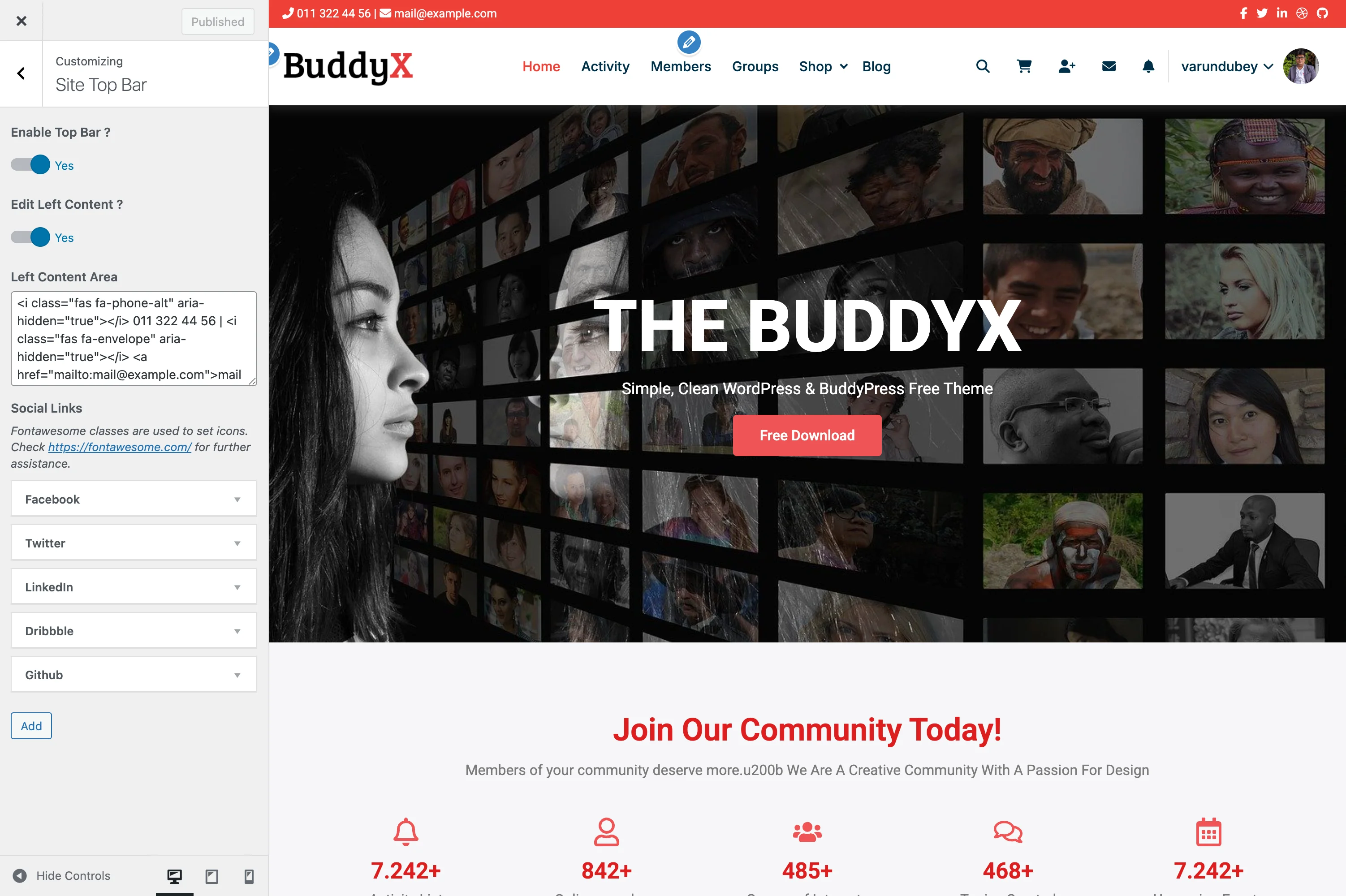
  • Control the exact user experience for these key moments
  • Integrate forms from plugins (WPForms, Contact Form 7, etc.)

Why Use Page Mapping?

Default WordPress Pages:

  • Basic, unstyled forms
  • Limited customization options
  • No branding or design control
  • Generic error messages

Custom Mapped Pages:

  • Full design freedom
  • Match your brand identity
  • Add helpful content and CTAs
  • Use page builders
  • Include videos, images, testimonials
  • Track conversions with analytics

Available Page Mappings

Login Page

Redirect users to a custom login page instead of the default wp-login.php.

Location: Appearance > Customize > General > Page Mapping

Steps:

  1. First, create your custom login page:

    • Go to Pages > Add New
    • Title it "Login" or "Sign In"
    • Add a login form using:
      • BuddyPress login widget
      • WPForms user login form
      • Ultimate Member shortcode
      • Custom login shortcode
    • Design the page to match your brand
    • Publish the page
  2. Then map the page:

    • Go to Appearance > Customize
    • Click General > Page Mapping
    • Find Login Page dropdown
    • Select your custom login page
    • Click Publish

Now when users try to access wp-login.php or click login links, they'll be redirected to your custom page.

Common Login Forms:

Plugin/Feature Shortcode
BuddyPress Use Login widget or [bp-login]
WPForms [wpforms id="123"] (User Login form)
Ultimate Member [ultimatemember form_id="123"]
Custom HTML Build your own form with styling

Registration Page

Redirect new users to a custom registration page instead of default WordPress registration.

Steps:

  1. Create your registration page:

    • Go to Pages > Add New
    • Title it "Register" or "Sign Up"
    • Add registration form using:
      • BuddyPress registration (if enabled)
      • WPForms user registration form
      • Ultimate Member registration
      • Custom registration form
    • Add welcome message, benefits, testimonials
    • Publish the page
  2. Map the registration page:

    • Go to Appearance > Customize
    • Click General > Page Mapping
    • Find Registration Page dropdown
    • Select your custom registration page
    • Click Publish

Registration Form Options:

Feature How to Add
BuddyPress Enable registration in Settings > BuddyPress > Settings
WPForms Create User Registration form with email confirmation
Ultimate Member Use UM registration form
Gravity Forms User Registration add-on

404 Error Page

Create a helpful 404 page instead of the default "Page Not Found" message.

Steps:

  1. Create your 404 page:

    • Go to Pages > Add New
    • Title it "404 - Page Not Found" (or similar)
    • Add helpful content:
      • Friendly error message
      • Search bar
      • Popular pages links
      • Categories/tags navigation
      • Contact information
      • "Back to Home" button
    • Publish the page
  2. Map the 404 page:

    • Go to Appearance > Customize
    • Click General > Page Mapping
    • Find 404 dropdown
    • Select your custom 404 page
    • Click Publish

Helpful 404 Page Elements:

┌──────────────────────────────────────┐
│  [Logo]                              │
│                                      │
│       Oops! Page Not Found           │
│                                      │
│  The page you're looking for         │
│  doesn't exist or has been moved.    │
│                                      │
│  [Search Box]                        │
│                                      │
│  Popular Pages:                      │
│  • Home                              │
│  • Shop                              │
│  • Blog                              │
│  • Contact                           │
│                                      │
│  [Back to Home Button]               │
└──────────────────────────────────────┘

Custom Page Setup Examples

Login Page with Page Builder

Using Elementor:

  1. Create new page: "Login"
  2. Edit with Elementor
  3. Add sections:
    • Hero section with welcome message
    • Login form widget (BuddyPress/WPForms)
    • Benefits section
    • Footer with "Need an account?" link
  4. Style to match brand colors
  5. Publish and map in Customizer

Layout:

┌─────────────────────────────────────┐
│       Welcome Back!                 │
│   Sign in to your account           │
│                                     │
│  [Email field]                      │
│  [Password field]                   │
│  ☑ Remember me    Forgot password? │
│                                     │
│  [Sign In Button]                   │
│                                     │
│  Don't have an account? Register    │
└─────────────────────────────────────┘

Registration Page with Social Proof

Content Structure:

  1. Hero Section

    • "Join Our Community"
    • Brief value proposition
  2. Registration Form

    • Email, username, password fields
    • Profile photo upload (BuddyPress)
    • Terms acceptance checkbox
  3. Benefits Section

    • Member testimonials
    • Feature highlights
    • Trust badges
  4. FAQ Section

    • "Is registration free?" → Yes!
    • "How long does it take?" → Under 2 minutes
    • "What happens next?" → Welcome email + tour

404 Page with Personality

Content Ideas:

┌─────────────────────────────────────┐
│         🔍                          │
│                                     │
│    404 - Lost in Cyberspace?        │
│                                     │
│  This page went on vacation without │
│  telling us. Try these instead:     │
│                                     │
│  📌 Search our site:                │
│  [Search Box]                       │
│                                     │
│  🏠 Go to Homepage                  │
│  🛒 Browse Shop                     │
│  📰 Read Blog                       │
│  📧 Contact Us                      │
│                                     │
│  Need help? Live chat is available! │
└─────────────────────────────────────┘

Working with BuddyPress

If you have BuddyPress active, consider these approaches:

BuddyPress Has Built-In Pages

BuddyPress automatically creates:

  • Member registration page
  • Activation page
  • Profile pages
  • Activity page

When to Use Page Mapping with BuddyPress:

Scenario Recommendation
Custom login form Map login to custom page with BuddyPress login widget
Enhanced registration Keep BP registration, style with customizer
Custom 404 Always beneficial to map custom 404
Landing page style Map registration to full landing page

BuddyPress Login Popup

BuddyX Pro has a Sign-in Popup feature separate from page mapping:

Sign-in Popup Settings Sign-in popup customizer settings for modal login/registration experience
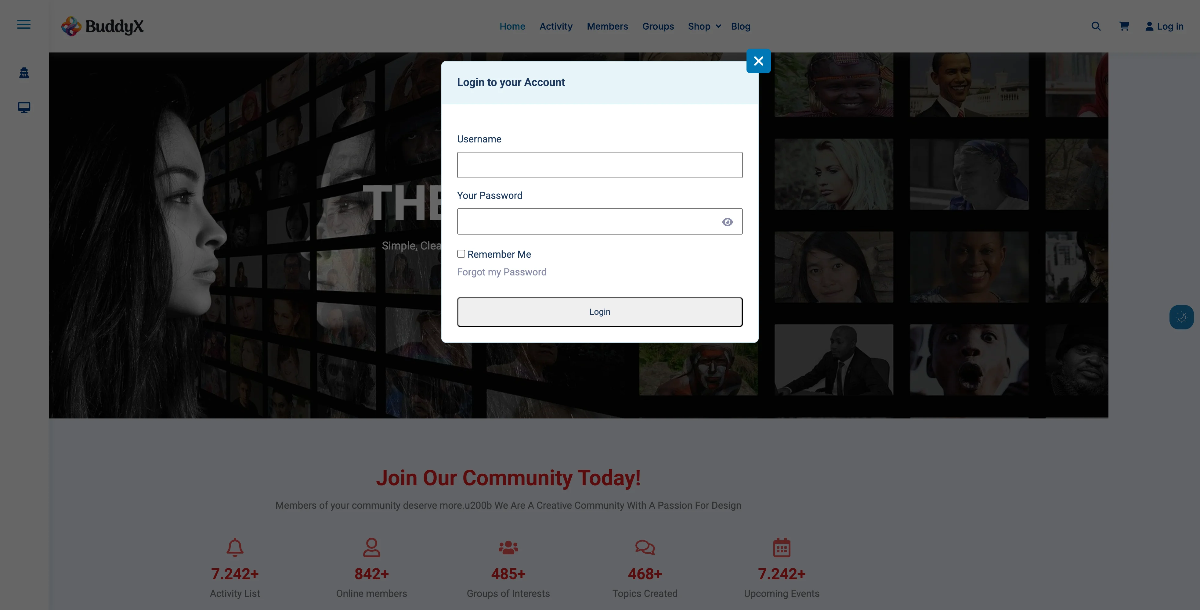
Sign-in Popup Login Result Sign-in popup modal appearance on frontend
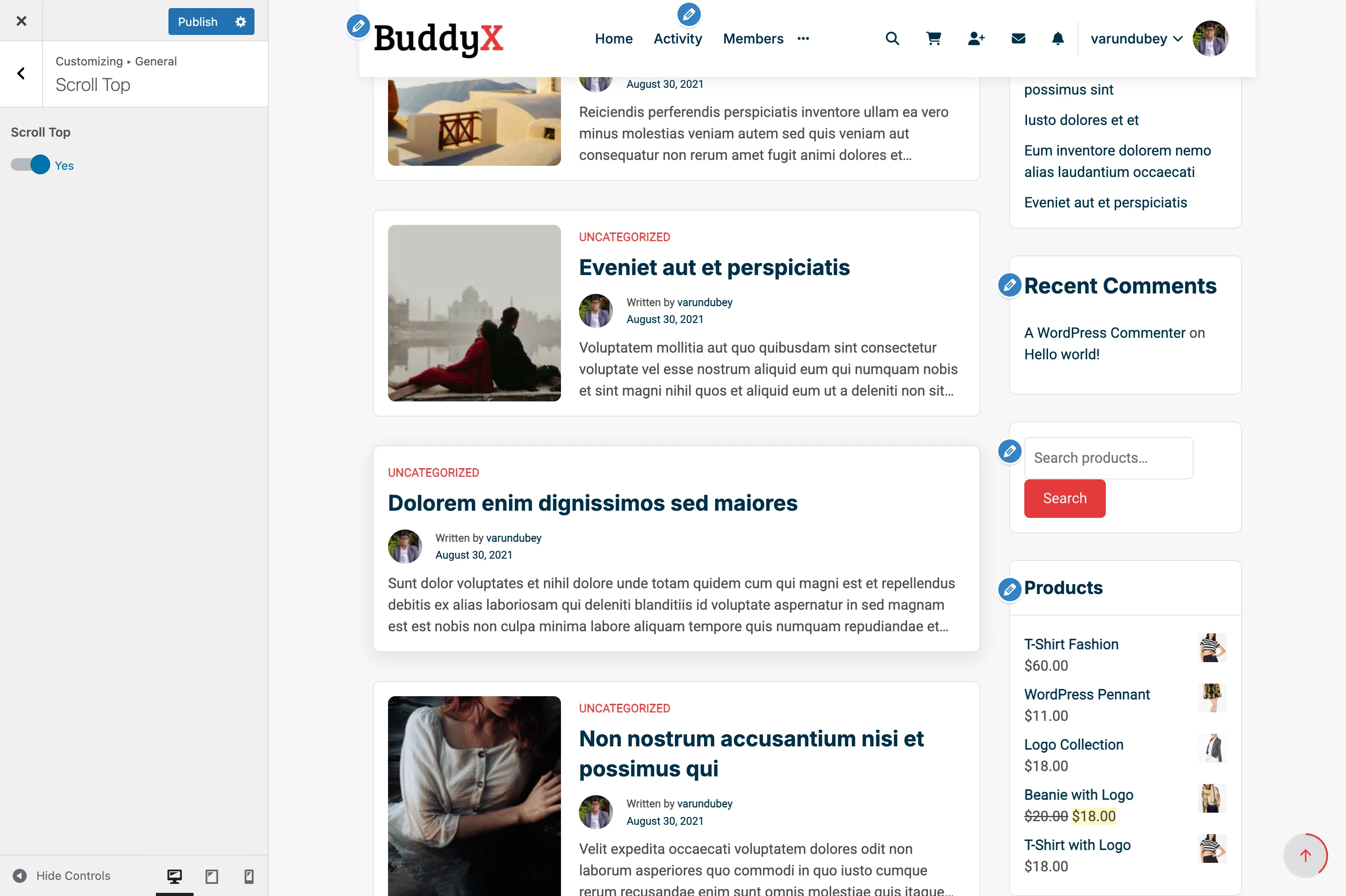
Location: Appearance > Customize > General > Sign-in Popup

This creates a modal popup for login/registration rather than redirecting to a page. Use either:

  • Sign-in Popup for modal experience
  • Page Mapping for full-page experience

Don't use both for the same purpose.

Recommended Setups by Site Type

E-Commerce Store

Login Page: Yes (custom with WooCommerce account benefits)
Registration Page: Yes (landing page style with discounts offer)
404 Page: Yes (with product search and popular categories)

Why: Capture leads during registration; help lost shoppers find products on 404.

Community Platform

Login Page: Optional (use BuddyPress popup instead)
Registration Page: Yes (showcase community benefits)
404 Page: Yes (suggest popular groups and activity)

Why: Registration needs strong value prop; 404 can reconnect users to community.

Blog / Magazine

Login Page: Optional (only if you have subscriber accounts)
Registration Page: Optional (for newsletter signup)
404 Page: Yes (search + popular posts)

Why: Blogs don't always need custom login; great 404 improves navigation.

Corporate Website

Login Page: Yes (professional branded page for employee/client login)
Registration Page: Yes (if offering client portal)
404 Page: Yes (professional with contact options)

Why: Maintain brand consistency; help visitors find information even on errors.

Membership Site

Login Page: Yes (upsell features and benefits)
Registration Page: Yes (landing page with pricing tiers)
404 Page: Yes (guide to member resources)

Why: Every touchpoint is a conversion opportunity; help members navigate.

Educational Platform

Login Page: Yes (student login with course previews)
Registration Page: Yes (showcase courses and instructors)
404 Page: Yes (course search and support links)

Why: Encourage enrollment; help students find courses on 404.

Testing Your Mapped Pages

After mapping pages, test thoroughly:

Test How to Check
Login redirect Visit yoursite.com/wp-login.php
Logout redirect Log out and see where you land
Registration works Try registering a test account
404 displays Visit yoursite.com/fake-page-xyz
Forms function Submit all forms to verify they work
Mobile responsive Test on phone and tablet

Troubleshooting

Redirect Loop on Login

Cause: Login page requires login to view.

Solution: Make sure your custom login page is set to Public and doesn't require authentication.

Registration Form Not Submitting

Cause: Form plugin conflict or missing shortcode.

Solution:

  1. Verify form shortcode is correct
  2. Check form plugin is active
  3. Test form on a regular page first
  4. Check browser console for JavaScript errors

404 Page Shows Default Template

Cause: Mapping not saved or cache issue.

Solution:

  1. Re-save Customizer settings
  2. Clear all caches (plugin, browser, CDN)
  3. Check if page is published (not draft)

Page Mapping Dropdown Is Empty

Cause: No published pages available.

Solution: Create and publish at least one page before trying to map it.

Security Considerations

Best Practice Why
Use CAPTCHA Prevent spam registrations
Enable SSL (HTTPS) Protect login credentials
Strong password requirements Improve account security
Email verification Confirm real email addresses
Rate limiting Prevent brute force attacks

Recommended Security Plugins:

  • Wordfence
  • iThemes Security
  • All In One WP Security

Advanced Customization

Redirect After Login

Control where users go after successful login:

Location: Appearance > Customize > General > Sign-in Popup

Options:

  • Current page
  • Profile page
  • Activity page
  • Custom URL

Custom Login URL Slug

Change wp-login.php to a custom URL for security:

Use a plugin like:

  • WPS Hide Login
  • Perfmatters
  • iThemes Security

Then map your custom slug to your custom page.

Common Questions

Can I use the same page for login and registration? Yes! Many forms support both in one page. WPForms and Ultimate Member have combined login/register forms.

What happens if I delete a mapped page? WordPress will revert to default behavior (standard wp-login.php or 404 template).

Can I have different login pages for different user roles? This requires custom code or specialized plugins. Default page mapping applies to all users.

Do I need to map all three pages? No. Map only the pages you want to customize. Others will use defaults.

Can I track conversions on my custom registration page? Yes! Add Google Analytics or Facebook Pixel to track registration completions.

Will page builders work on mapped pages? Yes! Elementor, Beaver Builder, and other page builders work perfectly for custom login/404 pages.

Can I use membership plugin pages? Yes. If you use Ultimate Member, MemberPress, or similar, you can map to their pages.

Related Settings


Need Help?

Scroll to Top Button

The Scroll to Top button helps visitors quickly return to the top of your page without manually scrolling. It appears as they scroll down and smoothly animates back to the top when clicked.

Scroll to Top Settings Scroll to top button configuration in the Customizer
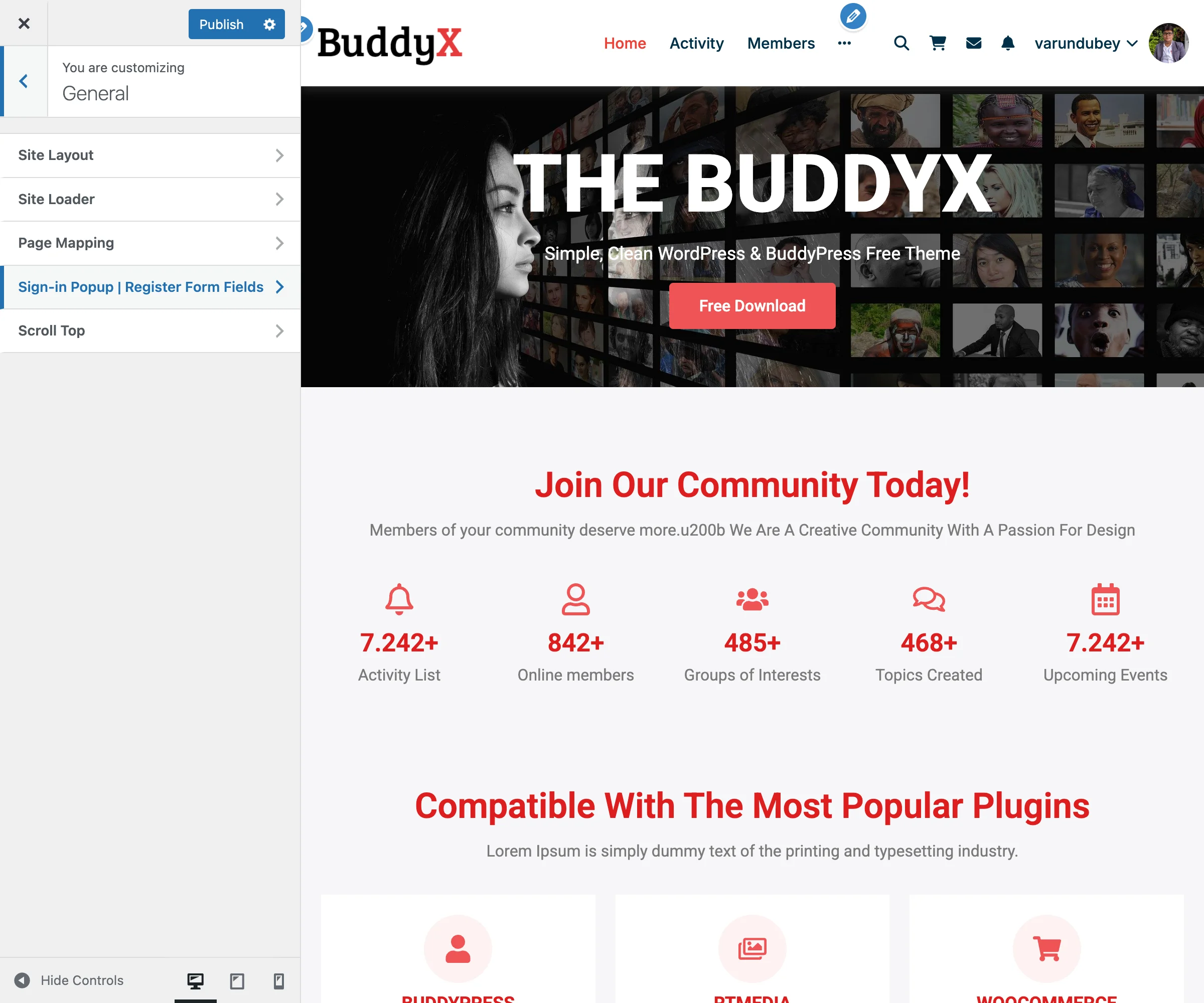
What You Can Do

With BuddyX Pro's scroll to top feature, you can:

  • Add a floating button for easy navigation
  • Help visitors return to the header menu
  • Improve user experience on long pages
  • Enable or disable the button site-wide
  • Automatic appearance based on scroll position
  • Smooth animated scrolling effect

What Is a Scroll to Top Button?

When visitors scroll down long pages (blog posts, product listings, member directories), they may want to quickly return to the top to access navigation or header elements. The Scroll to Top button provides a one-click shortcut.

How It Works:

Page Top
┌────────────────────────────┐
│  [Header/Menu]             │
├────────────────────────────┤
│                            │
│  Content                   │
│                            │  User scrolls down ↓
│                            │
│  More content...           │
│                            │
│  Even more...              │
│                            │
│  [↑] ← Button appears      │
└────────────────────────────┘

Click button → Smooth scroll back to top

Enabling Scroll to Top Button

  1. Go to Appearance > Customize
  2. Click on General > Scroll Top
  3. Switch Scroll Top to Yes
  4. Click Publish

Now scroll down any page and watch for the button to appear.

Button Behavior

When It Appears

Scroll Distance Button State
0 - 300px Hidden (not needed yet)
300px+ Fades in smoothly

The button only shows after you've scrolled 300 pixels down the page. This prevents it from cluttering the view when you're still near the top.

Visual States

Hidden (at top of page):

┌────────────────────────┐
│  [Header]              │
│                        │
│  Content starts here   │
│                        │  (No button visible)
│                        │
└────────────────────────┘

Visible (after scrolling):

┌────────────────────────┐
│                        │
│  Content (scrolled)    │
│                        │
│  More content...       │
│                   [↑]  │ ← Button appears
└────────────────────────┘

Click Behavior

When clicked, the button:

  1. Smoothly animates scroll back to top (300ms duration)
  2. Uses easing for natural feel (not instant jump)
  3. Remains visible during scroll
  4. Fades out once at the top

Animation:

User at bottom → Click [↑] → Smooth scroll animation → Arrive at top
     ↓                ↓                    ↓                ↓
  Visible         Scrolling            Scrolling         Hidden

Button Design

Default Appearance

The BuddyX Pro scroll to top button has a clean, modern design:

Property Style
Shape Circular
Icon Up arrow (↑)
Size 40px × 40px
Color Theme primary color
Background Solid with subtle shadow
Position Bottom-right corner
Distance from edge 20px from bottom, 20px from right

Visual:

                Screen Edge
                    ↓
        ┌───────────────────┐
        │                   │
        │   Your Content    │
        │                   │
        │                   │
        │              [↑]  │ ← 20px from right
        └───────────────────┘
                         ↑
                    20px from bottom

Mobile Appearance

On mobile devices, the button automatically adjusts:

Device Adjustments
Phone Slightly smaller (35px), positioned to avoid thumb zone
Tablet Standard size maintained
Landscape Positioned to avoid keyboard area

When to Use Scroll to Top

Highly Recommended For:

Page Type Why
Blog posts Long articles need easy navigation back to menu
Product archives Shoppers browsing many products
Member directories Long lists of community members
Activity feeds Social feeds with infinite scroll
Course listings Educational sites with many courses
Forum topics Long discussion threads

Less Critical For:

Page Type Why
Homepage Often short, above-the-fold focused
Contact page Usually single-screen
Login/Register Short forms, no scrolling
Landing pages Designed to scroll through linearly
Single-product pages Return to top less needed

Customization Options

While BuddyX Pro includes a styled button by default, you can customize it with CSS.

Change Button Color

Add to Appearance > Customize > Additional CSS:

/* Custom button background */
.scrollup {
    background-color: #007bff !important; /* Blue */
}

/* Hover effect */
.scrollup:hover {
    background-color: #0056b3 !important; /* Darker blue */
}

Change Button Size

/* Larger button */
.scrollup {
    width: 50px !important;
    height: 50px !important;
    font-size: 20px !important;
}

Change Button Position

/* Move to left side */
.scrollup {
    right: auto !important;
    left: 20px !important;
}

/* Move higher from bottom */
.scrollup {
    bottom: 40px !important;
}

Change Button Shape

/* Square button */
.scrollup {
    border-radius: 4px !important; /* Less rounded */
}

/* Pill shape */
.scrollup {
    border-radius: 25px !important;
    width: 50px !important;
    height: 50px !important;
}

Custom Icon

/* Use different arrow style */
.scrollup::before {
    content: "⬆" !important; /* Different arrow */
    font-size: 24px;
}

Recommended Setups by Site Type

Blog / Magazine

Scroll Top: Yes
Trigger Distance: 300px (default)
Position: Bottom-right

Why: Long articles benefit greatly from quick return to navigation.

E-Commerce Store

Scroll Top: Yes
Trigger Distance: 300px
Position: Bottom-right (avoid cart button)

Why: Shoppers browse many products and need easy access to header cart/menu.

Community Platform

Scroll Top: Yes
Trigger Distance: 200px (earlier)
Position: Bottom-right

Why: Activity feeds are infinitely scrolling; members need quick navigation.

Corporate Website

Scroll Top: Yes
Trigger Distance: 400px (later)
Position: Bottom-right

Why: Professional sites with longer content pages benefit from the feature.

Landing Page

Scroll Top: No
Trigger Distance: N/A

Why: Landing pages are designed for linear, downward scrolling to CTA.

Portfolio Site

Scroll Top: Optional
Trigger Distance: 500px
Position: Bottom-left (avoid contact button)

Why: Gallery-style portfolios may not need it; depends on layout.

Educational Platform

Scroll Top: Yes
Trigger Distance: 300px
Position: Bottom-right

Why: Course listings and lesson content often require scrolling.

User Experience Best Practices

Practice Why
Don't show immediately Appearing too early feels intrusive
Smooth animation Instant jumps are jarring
Visible but subtle Should help, not distract
Consistent position Users learn where to look
Responsive size Work on all devices

Accessibility Features

BuddyX Pro's scroll to top button includes accessibility considerations:

Feature Benefit
Keyboard accessible Can be triggered with Enter/Space
ARIA label Screen readers announce "Scroll to top"
Focus indicator Visible outline when focused
Touch-friendly Large enough for finger taps
High contrast Visible to users with vision impairments

For Users with Motion Sensitivity:

The smooth scroll respects the prefers-reduced-motion CSS media query. Users who've set this preference get instant scroll (no animation).

Performance Considerations

Aspect Impact
File size ~2KB JavaScript (minimal)
Scroll performance Uses optimized scroll detection
Animation CSS-based (hardware accelerated)
Load time No impact on page load speed

Best Practices:

  • Button loads asynchronously
  • Scroll detection is throttled
  • No impact on Core Web Vitals
  • Works with lazy loading plugins

Common Questions

Can I disable scroll to top on specific pages? Yes, with custom code or page meta boxes. By default, it applies site-wide when enabled.

Does the button work on mobile? Yes! The button is fully responsive and touch-friendly on all mobile devices.

Why doesn't the button appear immediately? It only shows after scrolling 300px to avoid cluttering the view when you're near the top.

Can I change the button icon? Yes, with custom CSS. You can use different arrows, text, or custom icons.

Does it work with infinite scroll? Yes! The button works perfectly with infinite scroll features on activity feeds and archives.

Will it slow down my site? No. The scroll to top button is extremely lightweight and has no measurable performance impact.

Can I have multiple scroll buttons? Not recommended. One scroll to top button is standard practice and avoids confusion.

Does it work with sticky headers? Yes! The button scrolls to the absolute top, which includes sticky headers.

Why would I disable this feature? Some minimalist designs or short-page sites don't need it. Landing pages often disable it to encourage downward scrolling.

Troubleshooting

Button Not Appearing

Solutions:

  1. Verify setting is enabled in Customizer > General > Scroll Top
  2. Scroll down at least 300px on the page
  3. Clear browser cache and theme caches
  4. Check browser console for JavaScript errors
  5. Disable other plugins temporarily to check for conflicts

Button Not Scrolling

Solutions:

  1. Check for JavaScript errors in browser console
  2. Verify jQuery is loading properly
  3. Test in a different browser
  4. Disable conflicting smooth scroll plugins

Button Appears in Wrong Position

Solutions:

  1. Check for conflicting CSS from other plugins
  2. Inspect element to see what's overriding position
  3. Add !important to your custom CSS positioning
  4. Check for fixed/sticky elements blocking the button

Button Looks Different Than Expected

Solutions:

  1. Clear all caches (browser, plugin, CDN)
  2. Check if custom CSS is being applied
  3. Inspect element to see inherited styles
  4. Verify theme is updated to latest version

Alternative Solutions

If you need more control over scroll behavior:

Plugin Features
WPFront Scroll Top Multiple icon options, custom images
Scroll to Top Extensive position and style controls
Dynamic Scroll to Top Progress indicator, custom triggers

Note: BuddyX Pro's built-in button is optimized and sufficient for most sites.

Related Settings


Need Help?

Site Layout Options

The site layout controls how your website content is displayed across the screen. BuddyX Pro offers flexible layout options to match your design preferences and content strategy.

General Panel The General panel in the WordPress Customizer showing site layout and container width options
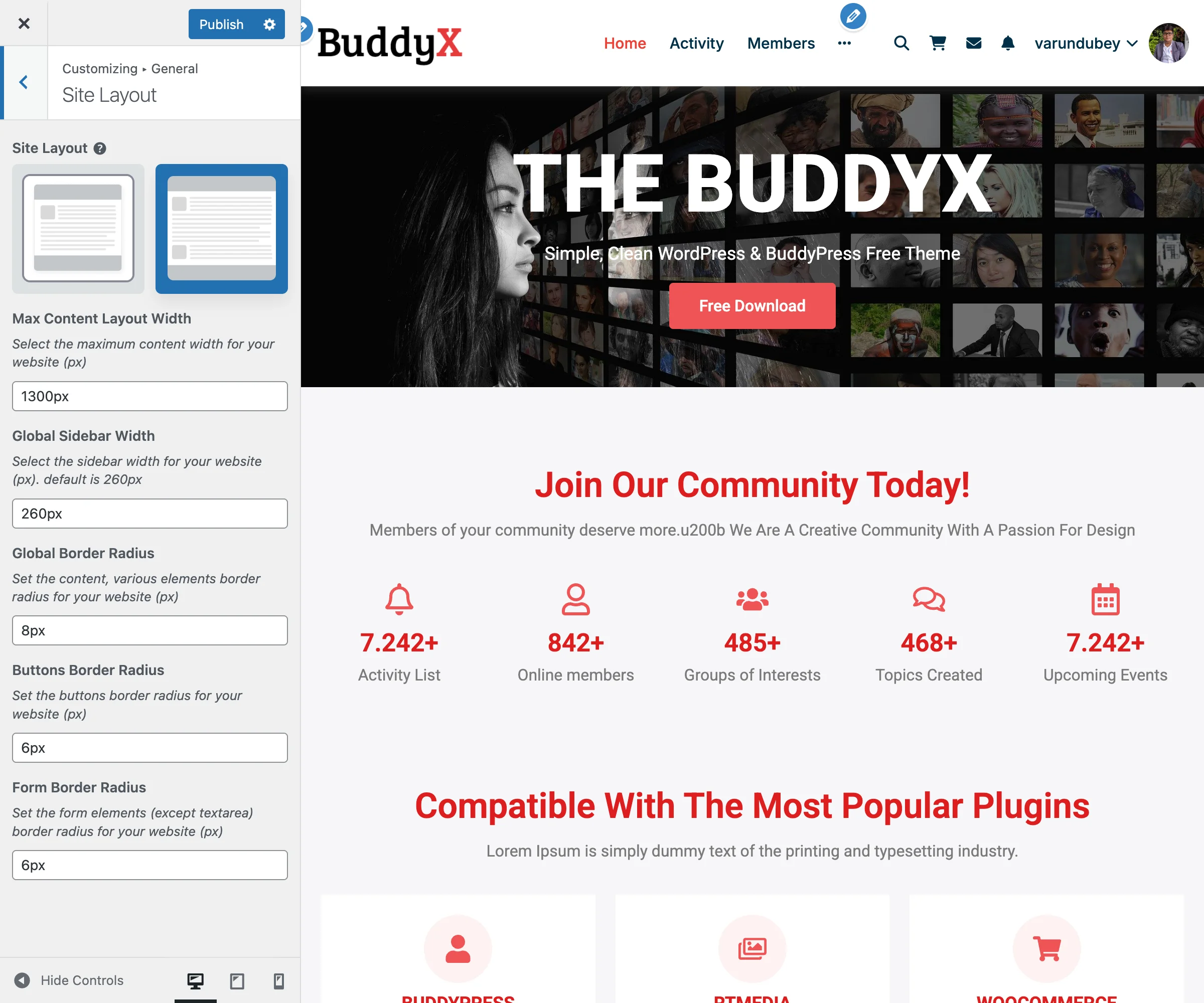
General Site Layout Settings Detailed site layout customization options including container width and spacing
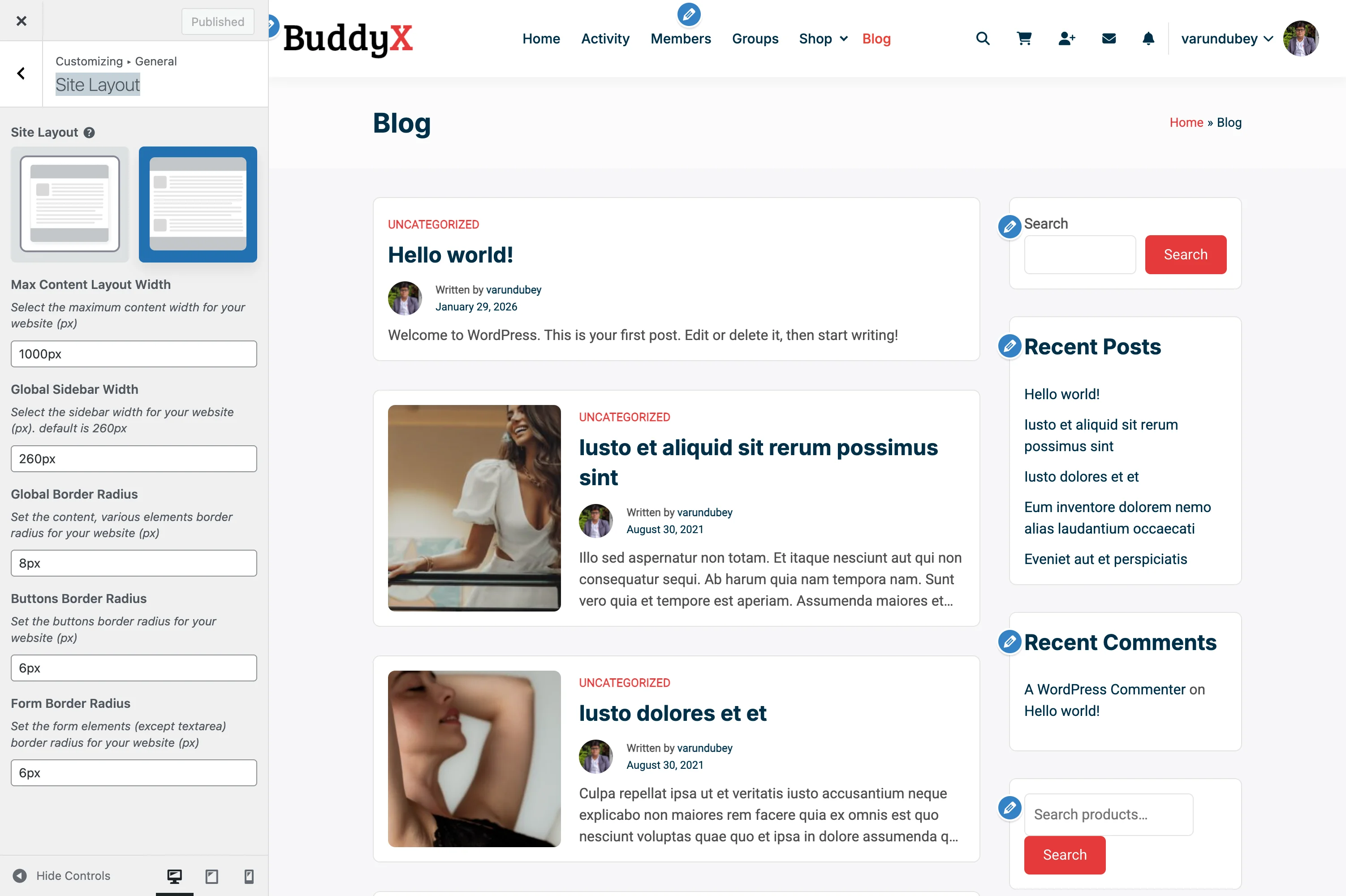
What You Can Do

With BuddyX Pro's layout settings, you can:

  • Choose between full-width or boxed layouts
  • Set custom container widths for your content
  • Control sidebar dimensions
  • Adjust border radius for design consistency
  • Optimize layouts for different screen sizes
  • Create unique layouts for blogs, shops, and community pages

Site Layout Types

Site Layout Options Site layout settings showing wide and boxed layout options
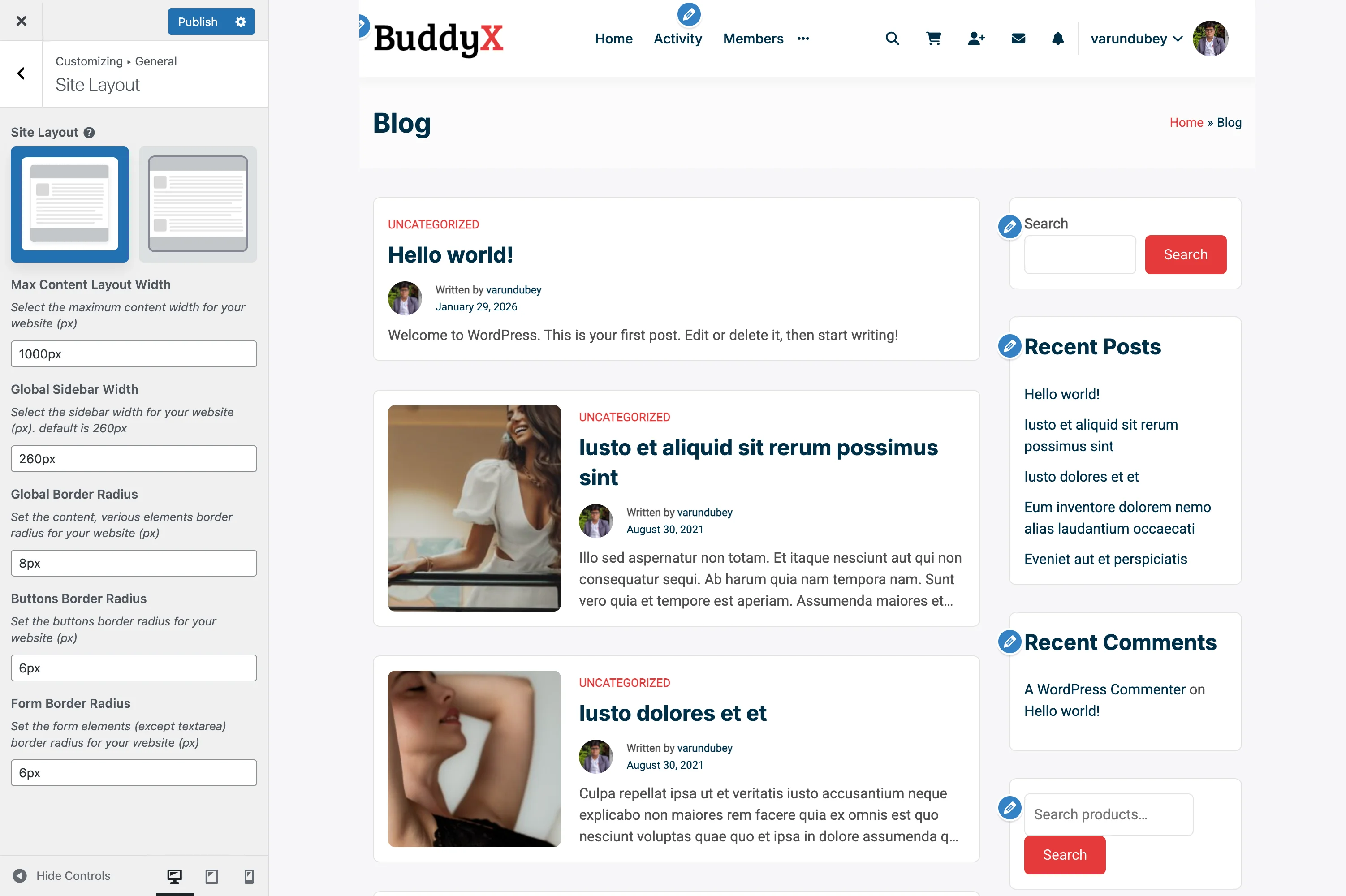
Wide Layout (Default)

Content stretches to fill the browser window width:

┌───────────────────────────────────────────────────┐
│                  Header (full width)              │
├───────────────────────────────────────────────────┤
│                                                   │
│       Content stretches to window edges          │
│                                                   │
└───────────────────────────────────────────────────┘

Best for:

  • Modern, spacious designs
  • Image-heavy websites
  • Community platforms with activity feeds
  • E-commerce stores with product galleries

Boxed Layout

Container Layout Boxed/container layout with content centered in a fixed-width box
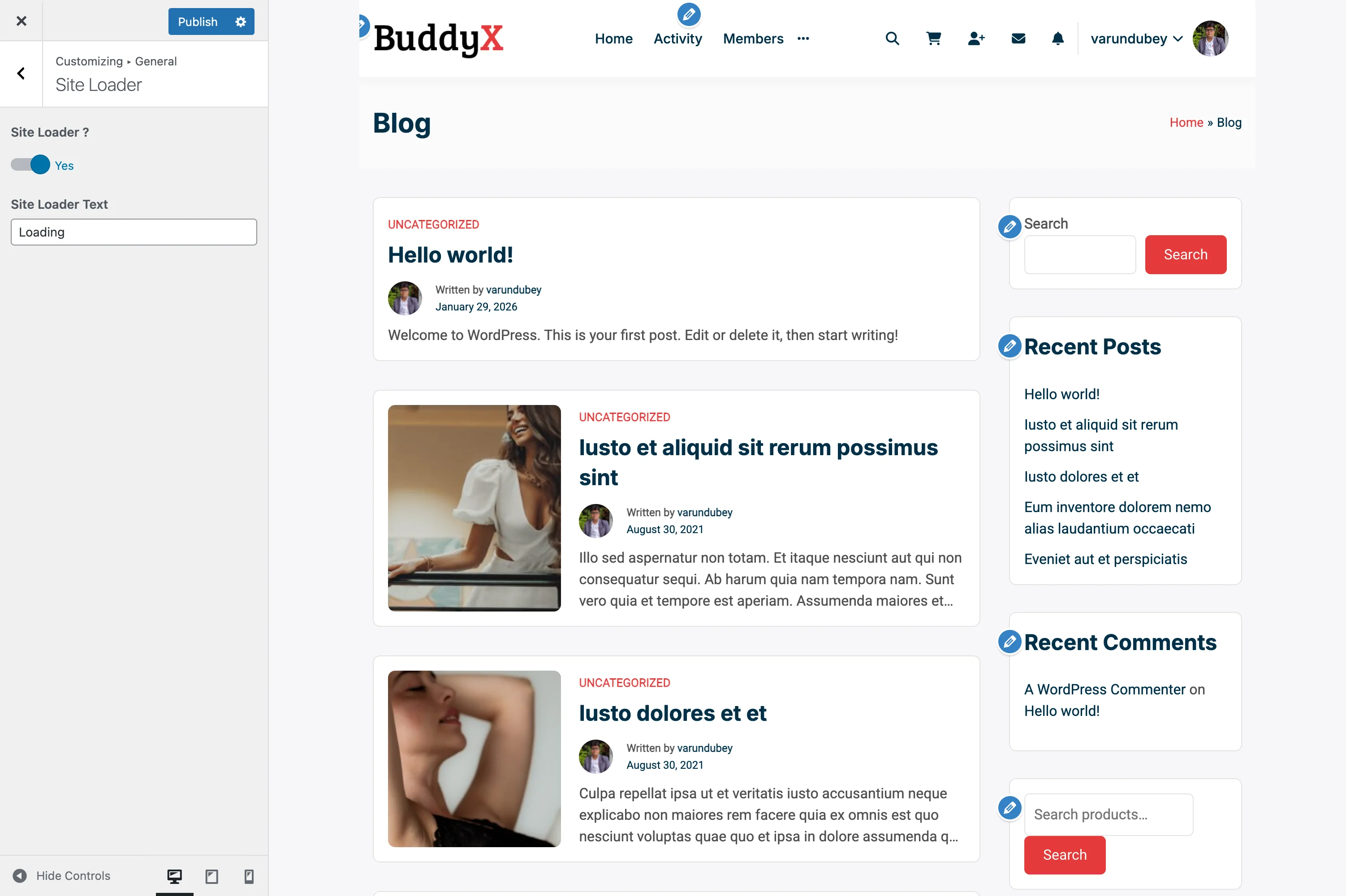
Content is contained within a fixed-width box with visible margins:

┌─────────────────────────────────────────────────┐
│                                                 │
│  ┌─────────────────────────────────────────┐   │
│  │          Header (boxed)                 │   │
│  ├─────────────────────────────────────────┤   │
│  │                                         │   │
│  │     Content within fixed container      │   │
│  │                                         │   │
│  └─────────────────────────────────────────┘   │
│                                                 │
└─────────────────────────────────────────────────┘

Best for:

  • Traditional, focused designs
  • Text-heavy blogs
  • Corporate websites
  • Portfolio sites

Choosing Your Layout

  1. Go to Appearance > Customize
  2. Click on General > Site Layout
  3. Select your preferred layout:
    • Click Wide for full-width layout
    • Click Boxed for contained layout
  4. Click Publish

Container Width Settings

Max Content Layout Width

This controls the maximum width of your content area.

Location: Appearance > Customize > General > Site Layout

Setting Default Typical Range
Max Width 1300px 1140px - 1920px

How to Set:

  1. Find Max Content Layout Width
  2. Enter your desired width (in pixels)
  3. Preview changes in real-time
  4. Click Publish

Common Width Values:

Width Use Case
1140px Traditional blogs, narrow content focus
1200px Balanced for most websites
1300px BuddyX Pro default, great for communities
1400px Wide layouts for e-commerce
1600px+ Portfolio sites, image galleries

Visual Comparison

1140px (Narrow):

┌─────────────────────────────────────────────┐
│    ┌───────────────────────────────┐       │
│    │      Content Area             │       │
│    │      (comfortable reading)    │       │
│    └───────────────────────────────┘       │
└─────────────────────────────────────────────┘

1300px (Default):

┌─────────────────────────────────────────────┐
│  ┌─────────────────────────────────────┐   │
│  │        Content Area                 │   │
│  │        (balanced layout)            │   │
│  └─────────────────────────────────────┘   │
└─────────────────────────────────────────────┘

1600px (Wide):

┌─────────────────────────────────────────────┐
│┌───────────────────────────────────────────┐│
││          Content Area                     ││
││          (spacious, modern)               ││
│└───────────────────────────────────────────┘│
└─────────────────────────────────────────────┘

Sidebar Width

Control the width of your sidebar areas.

Location: Appearance > Customize > General > Site Layout

Setting Default Range
Global Sidebar Width 260px 200px - 400px

Popular Configurations:

Width Layout Effect
220px Compact sidebar, more content space
260px Balanced sidebar (default)
300px Wide sidebar, featured widgets
350px Very prominent sidebar

Example with Sidebar:

┌──────────────────────────────────────────┐
│  Main Content        │    Sidebar        │
│  (wider area)        │    (260px)        │
│                      │                   │
│  Blog posts,         │  - Widget 1       │
│  product listings,   │  - Widget 2       │
│  or page content     │  - Widget 3       │
└──────────────────────────────────────────┘

Border Radius Settings

Create consistent rounded corners throughout your site.

Location: Appearance > Customize > General > Site Layout

Global Border Radius

Controls roundness of content boxes, cards, and containers.

Setting Default Effect
Global Border Radius 8px Subtle rounded corners

Visual Guide:

Value Appearance Best For
0px Sharp corners Modern, geometric designs
4px Slightly rounded Minimalist, clean look
8px Noticeable rounds (default) Friendly, approachable
12px Very rounded Playful, modern designs
20px+ Heavily rounded Bold, distinctive style

Button Border Radius

Separate control for all button styles.

Setting Default
Buttons Border Radius 6px

Examples:

0px:  [  Click Me  ]  ← Sharp edges
6px:  (  Click Me  )  ← Default, balanced
12px: (   Click Me   ) ← Very rounded
30px: (    Click Me    ) ← Pill-shaped

Form Border Radius

Controls input fields, dropdowns, and textboxes.

Setting Default
Form Border Radius 6px

Note: Textareas are excluded to maintain distinction between single-line and multi-line inputs.

Recommended Setups by Site Type

Blog / Magazine

Layout: Wide
Container Width: 1200px
Sidebar Width: 280px
Global Border Radius: 8px
Buttons Border Radius: 6px
Form Border Radius: 6px

Why: Comfortable reading width with prominent sidebar for featured content and ads.

E-Commerce Store

Layout: Wide
Container Width: 1400px
Sidebar Width: 260px
Global Border Radius: 8px
Buttons Border Radius: 4px
Form Border Radius: 4px

Why: Wider layout showcases more products; subtle borders keep focus on products.

Community Platform

Layout: Wide
Container Width: 1300px
Sidebar Width: 240px
Global Border Radius: 10px
Buttons Border Radius: 6px
Form Border Radius: 6px

Why: Default BuddyX Pro setup optimized for social interaction and activity feeds.

Corporate Website

Layout: Boxed
Container Width: 1140px
Sidebar Width: 300px
Global Border Radius: 4px
Buttons Border Radius: 3px
Form Border Radius: 3px

Why: Traditional, professional appearance with strong content focus.

Portfolio / Creative

Layout: Wide
Container Width: 1600px
Sidebar Width: 220px (minimal)
Global Border Radius: 12px
Buttons Border Radius: 20px
Form Border Radius: 8px

Why: Maximum space for showcasing creative work; bold, modern styling.

Educational / LMS

Layout: Wide
Container Width: 1300px
Sidebar Width: 280px
Global Border Radius: 8px
Buttons Border Radius: 6px
Form Border Radius: 6px

Why: Balanced layout for course listings and lesson content with sidebar for progress tracking.

Responsive Behavior

Your layout automatically adapts to different screen sizes:

Screen Size Behavior
Desktop (1200px+) Full settings applied
Tablet (768px - 1199px) Content width adjusts proportionally
Mobile (< 768px) Single column, no sidebar

Mobile Layout:

┌─────────────────┐
│     Header      │
├─────────────────┤
│                 │
│  Main Content   │
│  (full width)   │
│                 │
├─────────────────┤
│                 │
│  Sidebar Below  │
│                 │
└─────────────────┘

Advanced Customization

Custom Width for Specific Pages

You can override the global width for individual pages using WordPress page settings or custom CSS.

Using Custom CSS:

/* Make specific page wider */
.page-id-123 .container {
    max-width: 1600px;
}

/* Make blog archive narrower */
.blog .container {
    max-width: 1000px;
}

Different Widths by Plugin

Some plugins automatically adjust container width:

Plugin Behavior
WooCommerce Shop pages follow WooCommerce settings
LearnDash Course pages can have custom widths
BuddyPress Profile pages use optimized widths

Performance Tips

Tip Benefit
Use standard widths Easier for browsers to render consistently
Avoid extreme values Very wide layouts (2000px+) can look broken on some screens
Test on real devices Check layout on actual phones and tablets
Consider reading comfort Text lines shouldn't exceed 80-90 characters for readability

Common Questions

What's the difference between Wide and Boxed layouts? Wide layouts stretch content edge-to-edge within the container width. Boxed layouts add visible spacing around the entire site, creating a "card" effect.

Can I use different layouts on different pages? Yes! You can set individual page layouts through page meta boxes or use child theme code to customize specific pages.

Does container width affect mobile view? On mobile devices, content automatically adjusts to fit the screen width regardless of your desktop container setting.

What if my content looks too narrow or too wide? Adjust the Max Content Layout Width. Most sites work well between 1200px - 1400px. Test with your actual content.

Can I have a wide header but boxed content? Yes! The header can span full-width while content remains boxed. This is controlled in Header settings.

Why do my images look smaller after changing width? Images display relative to container width. You may need to regenerate thumbnails or adjust image sizes after major width changes.

Should I match border radius everywhere? Not necessarily! Using 8px for content boxes, 6px for buttons, and 6px for forms creates subtle visual hierarchy while maintaining consistency.

Related Settings


Need Help?

Site Loader

A site loader (also called preloader) displays an animation while your website loads. It provides visual feedback to visitors, showing that your site is loading rather than broken or frozen.

Site Loader Settings Site loader configuration options in the Customizer
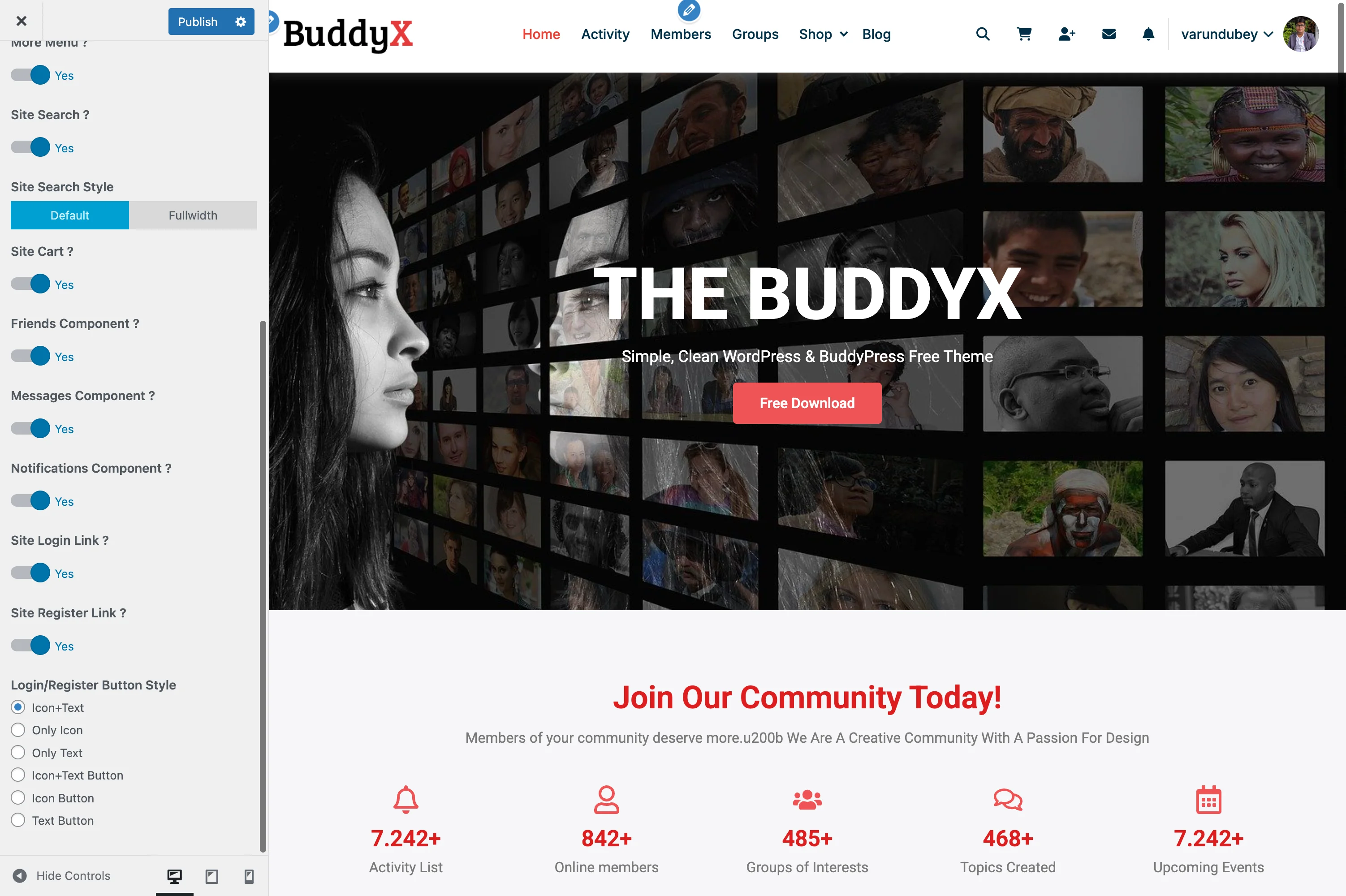
What You Can Do

With BuddyX Pro's site loader feature, you can:

  • Show an animated loading screen while your site loads
  • Add custom loading text
  • Improve perceived load times
  • Create a professional first impression
  • Maintain brand consistency during page loads

What Is a Site Loader?

When visitors first arrive at your site, the browser downloads HTML, CSS, JavaScript, images, and other assets. A site loader:

  1. Appears immediately while content loads
  2. Shows an animation to indicate progress
  3. Disappears automatically when the page is ready
  4. Prevents visitors from seeing a partially-loaded page

Visual Flow:

Visitor clicks link
      ↓
┌──────────────────┐
│                  │
│    [Loading]     │  ← Loader appears instantly
│     • • • •      │
│                  │
└──────────────────┘
      ↓
Page fully loads
      ↓
┌──────────────────┐
│                  │
│   Your Website   │  ← Content revealed
│   (fully loaded) │
│                  │
└──────────────────┘

Enabling Site Loader

  1. Go to Appearance > Customize
  2. Click on General > Site Loader
  3. Switch Site Loader to Yes
  4. Click Publish

Now refresh your site to see the loader in action.

Customizing Loader Text

Add a custom message that appears with your loading animation.

Steps:

  1. In General > Site Loader settings
  2. Find Site Loader Text
  3. Enter your custom text (default: "Loading")
  4. Click Publish

Text Ideas by Site Type

Site Type Suggested Text
E-Commerce "Loading Shop...", "Preparing Products..."
Community "Loading Community...", "Getting Ready..."
Blog "Loading Stories...", "Preparing Content..."
Corporate "Loading...", "Please Wait..."
Education "Loading Courses...", "Preparing Lessons..."
Portfolio "Loading Portfolio...", "Preparing Gallery..."

Tips:

  • Keep it short (1-3 words)
  • Use action words ("Loading", "Preparing", "Getting")
  • Match your brand voice (casual vs. professional)
  • Avoid unnecessary punctuation

Loader Animation

BuddyX Pro uses an elegant animated dot pattern:

   Loading
    • • • •

The dots pulse and animate in sequence:
• • • •  →  • • • •  →  • • • •  →  • • • •
↑           ↑           ↑           ↑

Animation Features:

  • Smooth dot pulsing effect
  • Sequential animation pattern
  • Synchronized with loading text
  • Lightweight CSS animation (no impact on load time)

Visual Appearance

Default Loader

┌─────────────────────────────────────┐
│                                     │
│                                     │
│              Loading                │
│             • • • •                 │
│        (animated dots)              │
│                                     │
│                                     │
└─────────────────────────────────────┘

Styling:

  • Center-aligned on screen
  • White/light background overlay
  • Smooth fade-in/fade-out transitions
  • Responsive (works on all screen sizes)

When to Use Site Loader

Recommended For:

Scenario Reason
Heavy imagery sites Prevents flash of unstyled content
E-commerce stores Ensures product images load properly
Community platforms Smooth transition to activity feeds
Custom fonts/icons Prevents font loading flash
Complex layouts Better than seeing layout shifts

Consider Disabling For:

Scenario Reason
Fast-loading blogs Adds unnecessary delay to quick pages
Minimal sites Simple pages don't need a loader
SEO landing pages Faster initial content display preferred
Already optimized sites May feel redundant

Performance Considerations

Load Time Impact

Aspect Impact
Added File Size Minimal (~2KB CSS)
JavaScript Overhead Negligible
Perceived Speed Actually improves (hides loading jerks)
Actual Speed No negative impact

Best Practices

Do:

  • Optimize images and assets (loader can't fix slow content)
  • Use caching plugins
  • Enable lazy loading for images
  • Minimize CSS/JS files
  • Use a CDN for static assets

Don't:

  • Rely on loader to mask slow servers
  • Add custom loader images that take time to load
  • Keep loader visible longer than necessary
  • Use heavy animations or GIFs

Customization Ideas

While BuddyX Pro includes a built-in loader, you can customize it further with CSS or child themes.

Change Loader Colors

Add this to Appearance > Customize > Additional CSS:

/* Change background color */
.site-loader {
    background-color: #f5f5f5; /* Light gray */
}

/* Change text color */
.site-loader .loader-text {
    color: #333; /* Dark gray text */
}

/* Change dot colors */
.site-loader .dot {
    background-color: #007bff; /* Blue dots */
}

Match Your Brand Colors

/* Use brand primary color */
.site-loader .dot {
    background-color: var(--color-theme-primary);
}

.site-loader .loader-text {
    color: var(--color-theme-primary);
}

Recommended Setups by Site Type

E-Commerce Store

Site Loader: Yes
Loader Text: "Loading Shop..."

Why: Customers expect smooth transitions. Loader prevents seeing partial product grids or unloaded images.

Community Platform

Site Loader: Yes
Loader Text: "Loading Community..."

Why: Activity feeds and member grids benefit from unified loading experience.

Blog / Magazine

Site Loader: Optional
Loader Text: "Loading Stories..."

Why: Text-heavy blogs load quickly and may not need a loader, but it adds polish.

Corporate Website

Site Loader: Yes
Loader Text: "Loading..."

Why: Professional appearance; hides any layout shifts or font loading.

Landing Page

Site Loader: No
Loader Text: N/A

Why: Landing pages prioritize instant content visibility for conversions.

Portfolio Site

Site Loader: Yes
Loader Text: "Preparing Gallery..."

Why: Image-heavy portfolios benefit from unified reveal of all images.

Troubleshooting

Loader Stays Visible Too Long

Cause: JavaScript not firing page ready event.

Solutions:

  1. Check browser console for JavaScript errors
  2. Disable conflicting plugins temporarily
  3. Clear all caches (browser, plugin, CDN)
  4. Check if jQuery is loading properly

Loader Doesn't Appear

Cause: Caching plugin serving cached page without loader.

Solutions:

  1. Clear all caches
  2. Check if setting is enabled in Customizer
  3. Refresh page while Customizer is open
  4. Test in incognito/private browsing

Loader Blocks Content

Cause: JavaScript error preventing loader from hiding.

Solutions:

  1. Check browser console for errors
  2. Disable other plugins to identify conflicts
  3. Update theme to latest version
  4. Contact support with error details

Loader Looks Different on Mobile

Expected Behavior: Loader is responsive and adapts to screen size. Text and dots scale appropriately.

Accessibility Considerations

The BuddyX Pro loader is built with accessibility in mind:

Feature Benefit
ARIA attributes Screen readers understand loading state
Reduced motion support Respects user's motion preferences
Semantic markup Proper HTML structure
Keyboard accessible Doesn't block keyboard navigation

For Users with Motion Sensitivity:

The loader respects the prefers-reduced-motion CSS media query. Users who've set this preference see a simplified, static loader.

Common Questions

Does a site loader slow down my website? No. The loader itself is lightweight. It only displays while your page loads normally in the background. It improves perceived performance by providing visual feedback.

Can I use my own loader animation? The built-in loader is optimized for performance. Custom loaders require child theme development or custom CSS.

Should I always use a site loader? Not necessarily. Fast-loading, text-based sites may not benefit. Test with and without to see what works for your audience.

Does the loader affect SEO? No. Search engines don't see the loader. It's only visible to human visitors and doesn't affect crawling or indexing.

Can I show the loader only on specific pages? With custom code, yes. The default setting applies site-wide for consistency.

Why does my loader text not change? Make sure to click Publish in the Customizer after entering new text. Clear caches if changes don't appear.

Is the loader mobile-friendly? Yes! The loader is fully responsive and works on all devices and screen sizes.

Related Settings


Need Help?

Header Settings

Topbar, header layouts, sticky header, sub-header, breadcrumbs, mobile header.

Header Elements & Icons

Add functional icons and elements to your header to improve navigation and user experience. These small additions help visitors quickly access key features like search, cart, and account settings.

Header Icons Settings Header icons configuration showing search, cart, notifications, and user elements

What You Can Add

BuddyX Pro lets you add these elements to your header:

  • Search icon for site-wide search
  • Shopping cart icon with item count
  • User account/profile icon
  • Notifications bell (for logged-in members)
  • Messages icon (for community sites)
  • Dark mode toggle switch

Enabling Header Elements

  1. Go to Appearance > Customize
  2. Click on Header > Header Elements
  3. Toggle on the elements you want
  4. Click Publish

Available Header Icons

Search Icon

Shows a magnifying glass icon that opens a search box when clicked.

Setting Options
Enable Search Yes / No
Search Style Dropdown, Full-screen overlay, Slide-in

Best Uses:

  • Content-heavy sites with many posts
  • E-commerce stores
  • Knowledge bases or documentation sites

Cart Icon (E-Commerce)

Displays a shopping cart icon with the number of items. Requires WooCommerce or FluentCart.

Setting Options
Enable Cart Icon Yes / No
Show Item Count Badge with number
Cart Drawer Open drawer vs. go to cart page

Best Uses:

  • Online stores
  • Course platforms with cart functionality
  • Any site selling products or services

User Account Icon

Shows a profile icon for login/account access.

Setting Options
Enable User Icon Yes / No
Show Avatar Display user's profile picture
Dropdown Menu Profile links when clicked

What Visitors See:

  • Logged Out: Login/Register links
  • Logged In: Profile, Account Settings, Logout

Notifications Bell

Displays a bell icon showing unread notifications count. Works with BuddyPress or BuddyBoss.

Setting Options
Enable Notifications Yes / No
Show Unread Count Badge with number
Dropdown Panel Recent notifications list

Best Uses:

  • Community sites
  • Social networking platforms
  • Any site with member activity

Messages Icon

Shows an envelope icon for private messages. Requires BuddyPress or BuddyBoss messaging.

Setting Options
Enable Messages Yes / No
Show Unread Count Badge with number

Dark Mode Toggle

Adds a sun/moon icon to switch between light and dark modes.

Setting Options
Enable Dark Mode Toggle Yes / No
Default Mode Light, Dark, or System

Icon Arrangement

Order & Position

You can arrange icons in any order:

Position Best For
Far Right Primary action (Search, Cart)
Near Logo Account, Profile
Grouped Related icons together

Icon Spacing

Setting Description
Icon Size Small, Medium, Large
Icon Spacing Gap between icons
Icon Color Match your header colors

Recommended Setups by Site Type

Online Store

Icons: Search + Cart + User Account
Order: Search, Cart (with count badge), User
Style: Medium icons, dropdown cart preview

Why this works: Customers can search products, see cart contents, and manage their account without leaving the page.

Community Platform

Icons: Search + Notifications + Messages + User
Order: Search, Notifications, Messages, User (with avatar)
Style: Show badges for unread items

Why this works: Members stay informed about activity and can quickly respond to messages.

Blog/Magazine

Icons: Search + Dark Mode Toggle
Order: Search on left, Dark Mode on right
Style: Large icons for easy access

Why this works: Readers can find content easily and choose their preferred viewing mode.

Online Course Platform

Icons: Search + Notifications + Cart + User
Order: Search, Notifications, Cart, User
Style: Show dropdown panels

Why this works: Students can search courses, track progress notifications, purchase new courses, and access their dashboard.

Corporate Website

Icons: Search only (optional)
Order: Far right of menu
Style: Minimal, icon only on hover

Why this works: Professional look without clutter; contact forms handle most interactions.

Membership Site

Icons: Notifications + Messages + User (with avatar)
Order: Notifications, Messages, User
Style: Show unread counts, avatar dropdown

Why this works: Members feel connected and can engage with the community easily.

Mobile Display

On mobile devices, header icons are handled differently:

Behavior Description
Icon Bar Shows in condensed row
In Menu Moved inside mobile menu
Priority Icons Only essential icons shown

Recommendation: Show only 2-3 icons on mobile to save space. Cart and user icons are usually most important.

What It Looks Like

Header with Icons:

[Logo]     Home  About  Services  Blog     [Search] [Cart 3] [Avatar]

On Hover/Click:

[Logo]     Home  About  Services  Blog     [Search box opens...]
                                           [Cart shows items...]
                                           [User dropdown shows...]

Styling Your Icons

Icon Colors

Light Header Dark Header
Dark icons (#333) Light icons (#fff)
Match menu text Match menu text
Accent on hover Accent on hover

Badge Styling

The notification/cart badges can be customized:

Setting Recommendation
Badge Color Your primary brand color
Badge Size Small (not distracting)
Badge Position Top-right of icon

Common Questions

Which icons should I enable? Only enable icons your visitors will actually use. A store needs cart; a blog might not.

Can I change the icon designs? Icons use a consistent style for visual harmony. Colors can be customized.

Will icons slow down my site? No, icons are lightweight SVGs with minimal impact on performance.

How do I hide icons for certain user roles? Some icons automatically show/hide based on login status. For advanced control, custom code may be needed.

Can I add custom icons? The built-in icons cover common needs. Custom icons require theme customization via child theme.

Related Settings


Need Help?

Header Layout Styles

BuddyX Pro offers four distinct header layout styles to match your website's design requirements. Each layout provides a different arrangement of logo, navigation, and header elements.

Site Header Panel The Site Header panel in the WordPress Customizer showing layout options

Accessing Header Settings

  1. Go to Appearance > Customize
  2. Navigate to Header > Header Layout

Available Header Layouts

Layout 1: Logo Left, Menu Right

The classic header layout with logo on the left and navigation aligned to the right.

Structure:

[Logo] .......................... [Primary Menu] [Icons]

Best For:

  • Traditional business websites
  • Corporate sites
  • Most common layout expectation
  • Sites with extensive navigation menus

Features:

  • Logo positioned at far left
  • Primary navigation aligned right
  • Header icons (search, cart, notifications) after menu
  • Clean, professional appearance

Layout 2: Logo Left, Menu Below

A two-row header with the logo on top left and navigation row below it.

Structure:

[Logo] ...................... [Header Icons/Search]
---------------------------------------------------
[Primary Menu - Full Width]

Best For:

  • Large navigation menus (10+ items)
  • Sites with prominent search functionality
  • E-commerce sites with cart prominence
  • Community sites with many navigation options

Features:

  • Larger logo display area
  • Full-width navigation bar below logo
  • More space for header elements
  • Clear visual hierarchy

Layout 3: Logo Center, Menu Below

A stacked layout with centered logo above centered navigation.

Header Layout 3 - Centered Logo Layout 3 with centered logo and navigation menu below
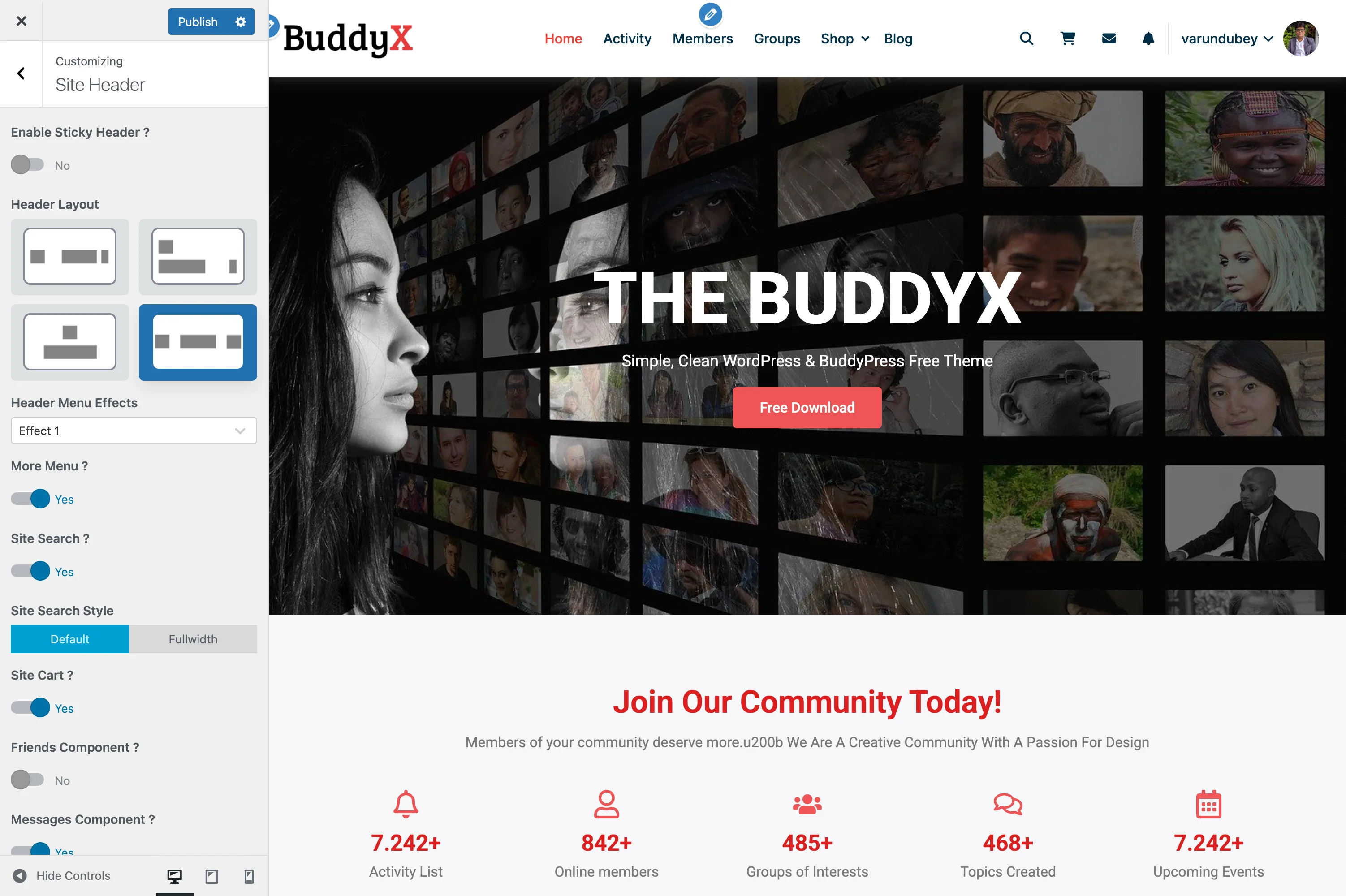
Structure:

              [Logo]
---------------------------------------------------
         [Primary Menu - Centered]

Best For:

  • Magazine-style sites
  • Portfolio websites
  • Blogs with strong branding
  • Sites wanting maximum logo visibility

Features:

  • Maximum logo prominence
  • Centered visual balance
  • Elegant, editorial feel
  • Works well with horizontal logos

Layout 4: Logo Left, Menu Centered

A single-row layout with logo on the left and navigation menu centered in the header.

Header Layout 4 - Centered Menu Layout 4 with logo on left and centered navigation menu
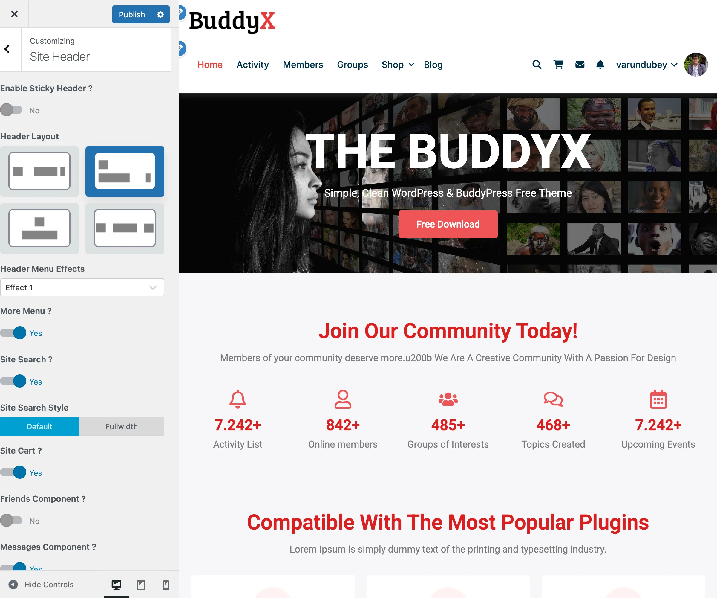
Header Menu Centered Detail Close-up showing the centered menu alignment with logo and icons
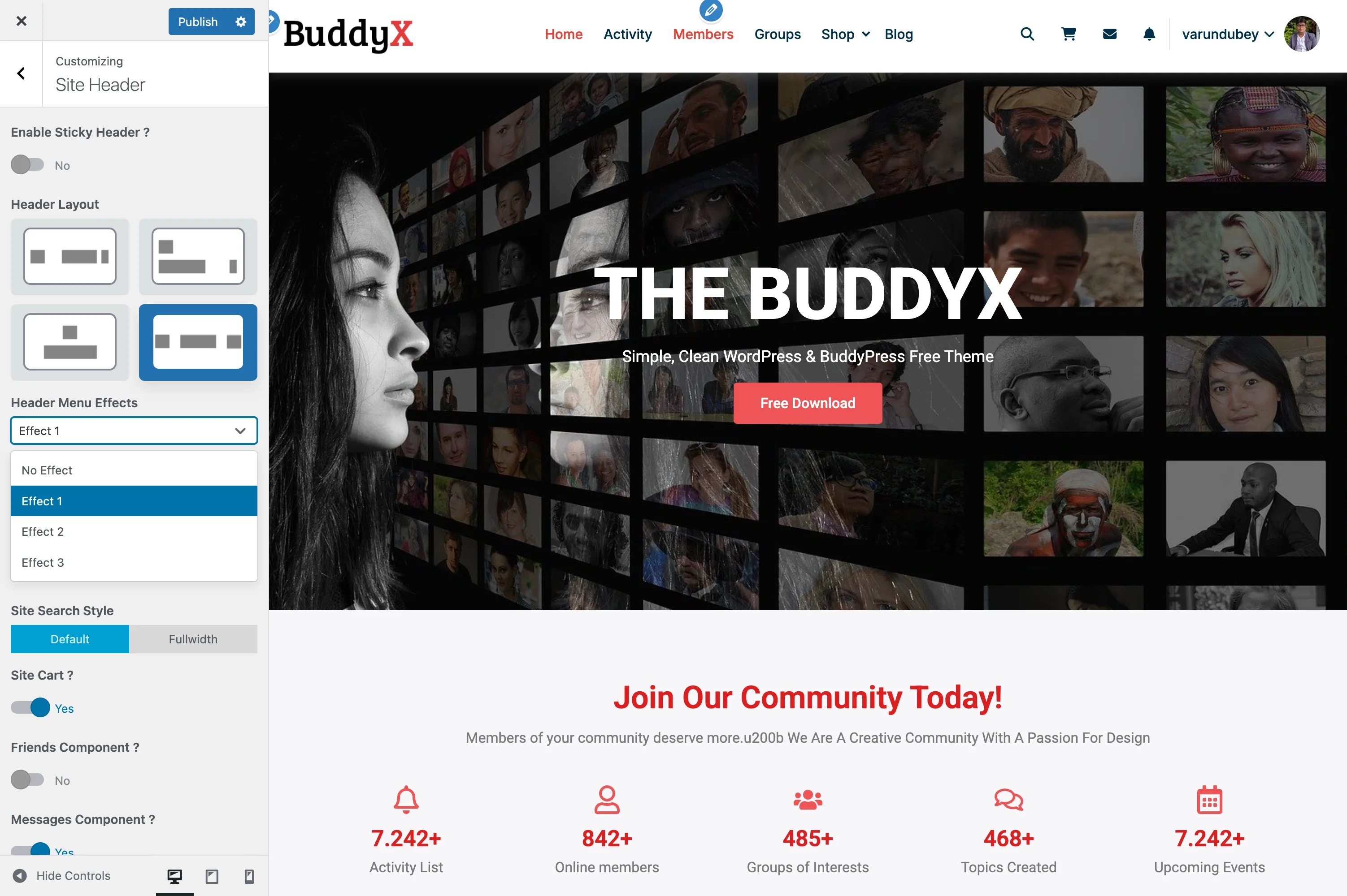
Structure:

[Logo] ....... [Primary Menu - Centered] ....... [Icons]

Best For:

  • Brand-focused websites
  • Creative portfolios
  • Sites wanting balanced visual appearance
  • Modern, clean designs

Features:

  • Logo positioned at left
  • Menu items centered in available space
  • Header icons on right
  • Balanced, symmetrical look

Header Elements Configuration

Each layout supports configurable header elements:

Logo Settings

Setting Description Location
Logo Image Primary logo upload Site Identity
Logo Size Width in pixels (150-300px) Site Identity
Dark Mode Logo Alternate logo for dark theme Site Identity
Mobile Logo Smaller logo for mobile Site Identity

Navigation Settings

Setting Description Default
Primary Menu Main navigation menu Assigned in Menus
Menu Effect Hover animation style None
Dropdown Animation Submenu reveal effect Fade

Header Menu Effects

Add visual hover effects to your navigation menu items. Choose from four styles:

Header Menu Effect 1 Effect 1: Dot indicator appears above the hovered menu item
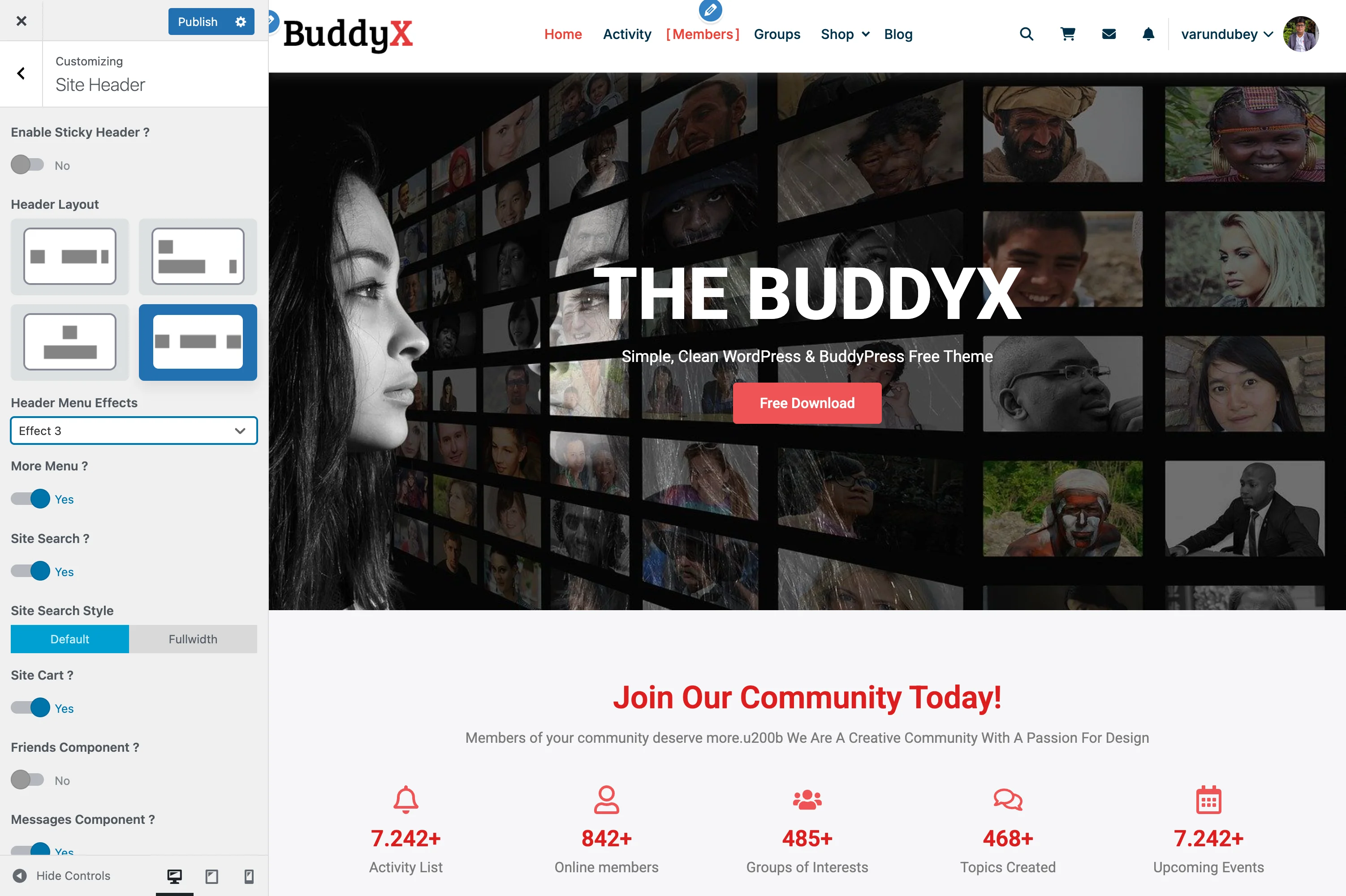
Effect Description Best For
No Effect Standard hover (color change only) Minimal, clean designs
Effect 1 Dot indicator above menu item Modern, subtle indication
Effect 2 Underline animation Professional, corporate sites
Effect 3 Brackets around menu item Creative, unique styling

Header Menu Effect 3 Effect 3: Brackets appear around the hovered menu item [Members]
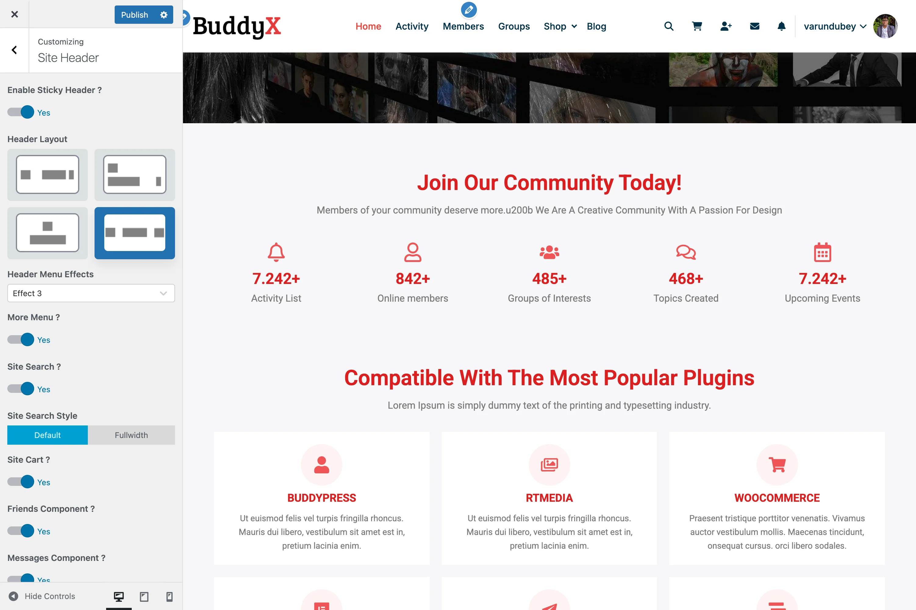
How to Change:

  1. Go to Customizer > Header > Site Header
  2. Find Header Menu Effects dropdown
  3. Select your preferred effect
  4. Preview by hovering over menu items
  5. Click Publish

Header Icons

Configure which icons and elements appear in the header area.

Header Icons Settings Header icon toggles with all icons enabled showing in the header preview

Setting Description Default
More Menu Collapse extra menu items into dropdown Yes
Site Search Show search icon in header Yes
Site Search Style Default or Fullwidth search bar Default
Site Cart Shopping cart icon (requires WooCommerce/FluentCart) Yes
Friends Component Friend requests icon (requires BuddyPress) Yes
Messages Component Private messages icon (requires BuddyPress) Yes
Notifications Component Bell notification icon (requires BuddyPress) Yes
Site Login Link Show login link for logged-out users Yes
Site Register Link Show register link for logged-out users Yes
Login/Register Button Style Icon+Text, Only Icon, Only Text, Icon Button, Text Button Icon+Text

Sticky Header

Enable a fixed header that stays visible while scrolling.

Sticky Header Sticky header enabled - header remains fixed at top while page content scrolls
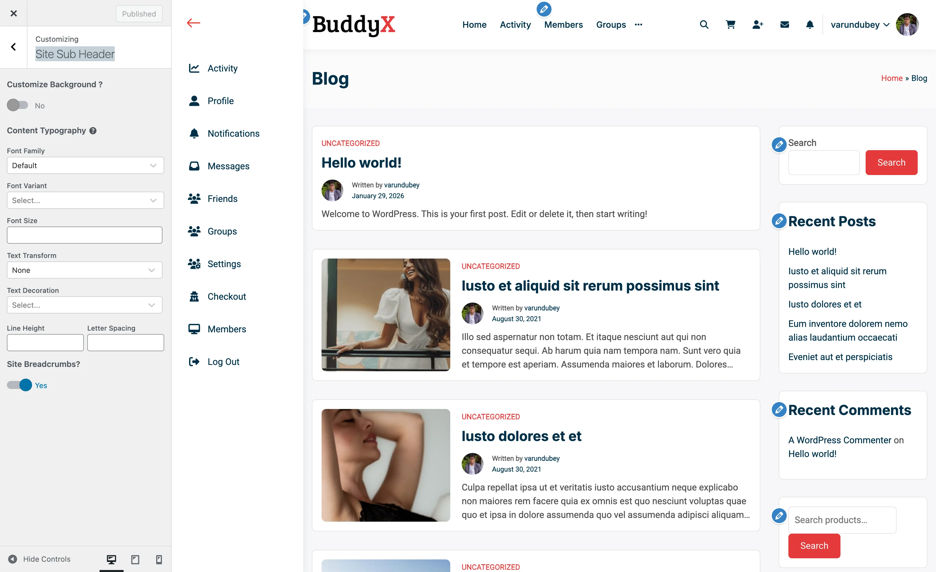
Setting Description Default
Enable Sticky Header Fix header to top on scroll Off
Sticky on Mobile Also sticky on mobile devices Off
Shrink on Scroll Reduce header size when sticky Off

Sticky Header Behavior:

  1. User loads page - header displays normally
  2. User scrolls down - header stays fixed at top
  3. Content scrolls beneath the header
  4. Optional: Header shrinks for more content space

Mobile Header

Header behavior automatically adapts on mobile devices:

Breakpoint Behavior
Desktop (>1024px) Full header layout
Tablet (768-1024px) Simplified layout
Mobile (<768px) Hamburger menu

Mobile Features:

  • Hamburger menu toggle
  • Collapsible navigation drawer
  • Touch-optimized icons
  • Mobile-specific logo option

Layout Comparison

Feature Layout 1 Layout 2 Layout 3 Layout 4
Logo Position Left Left Center Left
Menu Position Right Below Below Center Centered
Rows 1 2 2 1
Logo Prominence Medium Medium High Medium
Menu Capacity Medium High Medium Medium
Best For Business Large Menus Editorial Modern/Balanced

Configuration Examples

Example 1: Corporate Website

Layout: Layout 1 (Logo Left, Menu Right)
Sticky Header: Enabled
Header Icons: Search only
Mobile: Hamburger menu

Example 2: Community Platform

Layout: Layout 2 (Logo Left, Menu Below)
Sticky Header: Enabled
Header Icons: Search, Notifications, Messages, Cart
User Menu: Enabled with avatar
Mobile: Side panel navigation

Example 3: Portfolio Site

Layout: Layout 3 (Logo Center, Menu Below)
Sticky Header: Disabled
Header Icons: None
Menu Items: Work, About, Contact
Mobile: Minimal hamburger

Troubleshooting

Menu Items Not Aligning Correctly

Problem: Navigation doesn't align as expected in chosen layout.

Solutions:

  1. Check menu is assigned to Primary Menu location
  2. Verify no CSS conflicts from plugins
  3. Clear caching plugins
  4. Try a different layout temporarily to compare

Sticky Header Jumping

Problem: Content jumps when sticky header activates.

Solutions:

  1. This is normal - space is reserved for the header
  2. Enable "Shrink on Scroll" for smoother transition
  3. Check for conflicting sticky plugins
  4. Adjust body padding in custom CSS if needed

Header Elements Overlapping

Problem: Icons or menu items overlap on certain screen sizes.

Solutions:

  1. Reduce number of visible header icons
  2. Shorten menu item text
  3. Use mobile breakpoints appropriately
  4. Consider Layout 3 for more horizontal space

Related Documentation


Need Help?

Mobile Header

Your mobile header is what visitors see on smartphones and tablets. A well-designed mobile header makes navigation easy with limited screen space, ensuring a great experience for the majority of your visitors.

Header Settings Header configuration options in the Customizer

Why Mobile Header Matters

  • Over 60% of web traffic comes from mobile devices
  • First impression on mobile affects engagement
  • Easy navigation reduces bounce rates
  • Mobile-friendly design impacts SEO rankings

What You Can Customize

With BuddyX Pro's mobile header settings, you can:

  • Choose mobile-specific header layouts
  • Configure the hamburger menu style
  • Control which elements appear
  • Set mobile logo and sizing
  • Customize the mobile menu panel

Accessing Mobile Header Settings

  1. Go to Appearance > Customize
  2. Click on Header > Mobile Header
  3. Configure your settings
  4. Preview using the mobile/tablet icons at the bottom
  5. Click Publish

Mobile Header Layout

Layout Options

Layout Description
Logo Left, Menu Right Logo on left, hamburger icon on right
Logo Center, Menu Left Centered logo, hamburger on left
Logo Center, Split Logo centered, icons on both sides

Most Popular: Logo Left, Menu Right - familiar pattern users expect.

Mobile Header Height

Setting Recommended
Header Height 60-70px
Logo Area Proportional to height
Touch Targets At least 44px for icons

Mobile Logo

Using a Different Logo

Upload a mobile-specific logo that works better on small screens:

  1. Go to Site Identity
  2. Find Mobile Logo
  3. Upload your mobile-optimized logo
  4. Click Publish

Tips for Mobile Logos:

  • Use simpler version (icon or abbreviated)
  • Horizontal logos work well
  • Ensure readability at small sizes
  • Consider logo mark only (without text)

Logo Sizing

Setting Description
Max Width Limit logo width (e.g., 120px)
Height Usually auto based on width
Padding Space around logo

Hamburger Menu Icon

The "hamburger" menu (three horizontal lines) opens your navigation:

Icon Styles

Style Description
Classic Lines Three horizontal lines
Animated Transforms to X when open
Dots Three dots (vertical or horizontal)
Custom Use your own icon

Icon Placement

Position Best For
Right Side Most common, right-handed users
Left Side Alternative, near logo

Icon Appearance

Setting Options
Icon Color Match header text color
Icon Size 20-30px typical
Background None, circle, square
Border Optional outline

Mobile Menu Panel

When visitors tap the hamburger icon, a menu panel opens:

Panel Styles

Style Description
Slide from Right Panel slides in from right edge
Slide from Left Panel slides in from left edge
Full Screen Overlay Menu covers entire screen
Dropdown Menu drops down below header

Panel Contents

Element Options
Logo Show/hide at top of panel
Search Bar Include search field
Main Menu Primary navigation links
Social Icons Links to social profiles
Close Button X icon to close panel

Menu Behavior

Setting Options
Submenu Toggle Tap to expand submenus
Animation Slide, fade, accordion
Background Solid color, blurred backdrop
Overlay Dim page content when open

Mobile Header Elements

Which Icons to Show

Space is limited on mobile. Prioritize essential icons:

Priority Elements
High Menu toggle, Cart (for stores)
Medium Search, User/Profile
Low Notifications, Dark mode

Icon Bar Layout

[Logo]                    [Search] [Cart] [Menu]

Or:

[Menu]          [Logo]              [Cart]

Recommended Setups by Site Type

E-Commerce Store

Layout: Logo Left, Menu Right
Icons: Cart (with count) + Menu
Menu Style: Slide from Right
Panel Contents: Search + Categories + Menu + Account
Logo: Icon version or abbreviated

Why: Cart access is critical; search in menu panel helps find products.

Community Platform

Layout: Logo Center, Split
Icons: Menu (left), Notifications + Messages (right)
Menu Style: Full Screen Overlay
Panel Contents: Logo + Search + Navigation + Profile Link
Logo: Icon only

Why: Quick access to notifications; full-screen menu for extensive navigation.

Blog/Magazine

Layout: Logo Left, Menu Right
Icons: Search + Menu
Menu Style: Slide from Left
Panel Contents: Search (prominent) + Categories + Recent Posts
Logo: Text logo or icon

Why: Search prominence helps readers find content; categories in menu for browsing.

Corporate Website

Layout: Logo Left, Menu Right
Icons: Menu only
Menu Style: Full Screen Overlay
Panel Contents: Logo + Main Menu + Contact Button
Logo: Standard logo (scaled)

Why: Clean, professional appearance; prominent contact CTA in menu.

Online Course Platform

Layout: Logo Left, Menu Right
Icons: User Avatar + Menu
Menu Style: Slide from Right
Panel Contents: Search + Courses + My Dashboard + Progress
Logo: Icon version

Why: Quick dashboard access; course search for students.

Portfolio Site

Layout: Logo Center, Split
Icons: Menu (left), Social icons (right)
Menu Style: Full Screen Overlay (animated)
Panel Contents: Large menu text + Social links
Logo: Name/signature style

Why: Creative, unique presentation; social links for connecting with artist.

Mobile Menu Animation

Opening Animation

Animation Effect
Slide Panel slides into view
Push Page content pushes aside
Fade Gradual appearance
Scale Grows from icon

Closing Animation

Method User Action
X Button Tap close icon
Tap Outside Tap the dimmed area
Swipe Swipe panel away
Menu Icon Tap hamburger again

What It Looks Like

Mobile Header:

┌─────────────────────┐
│ [Logo]         [≡]  │  ← Header with hamburger
├─────────────────────┤
│                     │
│    Page Content     │
│                     │

Mobile Menu Open (Slide from Right):

┌─────────────────────┐
│ [Logo]      │ [X]   │
│  (dimmed)   │ Home  │
│             │ About │
│             │ Serv  │
│             │ Blog  │
│             │ Conta │
│             │       │
│             │ [Sear │
└─────────────────────┘

Mobile Menu Open (Full Screen):

┌─────────────────────┐
│        [X]          │
│                     │
│        Home         │
│        About        │
│        Services     │
│        Blog         │
│        Contact      │
│                     │
│   [Search Bar]      │
│   [Social Icons]    │
└─────────────────────┘

Testing Your Mobile Header

Preview Methods

  1. Customizer Preview: Use responsive icons at bottom
  2. Browser DevTools: Press F12, toggle device mode
  3. Real Devices: Test on actual phones/tablets

What to Check

Check Why It Matters
Logo visibility Can users identify your brand?
Touch targets Are icons easy to tap?
Menu navigation Can users find all pages?
Submenu access Do dropdowns work on touch?
Load speed Does header appear quickly?

Common Questions

Should my mobile logo be different? Often yes - simplified versions work better on small screens. But keep brand recognition.

Why isn't my menu closing when I tap outside? Check "Close on Outside Click" setting in menu panel options.

Can I show different menu items on mobile? Create a separate menu for mobile in Appearance > Menus, assign to Mobile Menu location.

How do I test on different devices? Use browser developer tools (F12) or actual devices. Also try services like BrowserStack.

My hamburger icon is hard to see. How do I fix it? Increase icon size, add a background circle, or change icon color for better contrast.

Related Settings


Need Help?

Sticky Header

A sticky header stays visible at the top of the screen as visitors scroll down your page. This keeps your navigation accessible at all times, making it easier for people to explore your site.

Sticky Header Settings Sticky header configuration options in the Customizer

What You Can Do

With BuddyX Pro's sticky header feature, you can:

  • Keep your menu visible while scrolling
  • Choose when the header becomes sticky
  • Use a different (smaller) logo for the sticky version
  • Customize sticky header colors
  • Enable smooth scroll-triggered animations

Enabling Sticky Header

  1. Go to Appearance > Customize
  2. Click on Header > Sticky Header
  3. Switch Enable Sticky Header to Yes
  4. Click Publish

Now scroll down any page to see your header stick to the top.

Sticky Header Behavior

When It Activates

Option What Happens
On Scroll Down Header sticks after scrolling past a certain point
On Scroll Up Header appears when scrolling back up (smart sticky)
Always Header stays fixed from the start

Recommendation: "On Scroll Up" is popular because it gives readers more screen space while scrolling down, but shows the menu when they need it.

Scroll Threshold

Set how far visitors must scroll before the sticky header activates:

Setting Typical Value
Scroll Distance 100-200 pixels
Trigger Point When original header scrolls out of view

Sticky Header Appearance

Size Changes

Your sticky header can be more compact than the original:

Element Original Sticky
Header Height 100px 70px
Logo Size Full size Smaller version
Padding Normal Reduced

This gives visitors more content viewing area while still providing navigation access.

Sticky Logo

Upload a separate logo optimized for the sticky header:

  1. Go to Site Identity
  2. Find Sticky Header Logo
  3. Upload a smaller or simpler version of your logo
  4. Click Publish

Tips:

  • Use a more compact version of your logo
  • Horizontal logos work well in sticky headers
  • Consider icon-only versions for very compact sticky headers

Background & Colors

Setting Options
Background Color Solid color, transparent, blur effect
Background Opacity 0% (transparent) to 100% (solid)
Text/Link Colors Can differ from original header
Shadow Add subtle drop shadow for depth

Animation Effects

Entry Animation

How the sticky header appears:

Animation Description
Slide Down Drops in from top
Fade In Gradually appears
None Instant appearance

Recommendation: Slide Down feels natural and draws attention to the sticky header without being distracting.

Transition Speed

Speed Feel
Fast (0.2s) Snappy, responsive
Medium (0.3s) Smooth, balanced
Slow (0.5s) Elegant, deliberate

Recommended Setups by Site Type

E-Commerce Store

Type: On Scroll Up (Smart Sticky)
Height: Compact (60-70px)
Background: Solid white with subtle shadow
Elements: Logo (compact) + Main Menu + Cart Icon

Why: Maximizes product viewing space; menu appears when customers scroll up to navigate or check cart.

Blog/Magazine

Type: On Scroll Up
Height: Minimal (50-60px)
Background: Semi-transparent with blur
Elements: Logo (icon) + Main Menu + Search

Why: Readers can focus on content; navigation available when needed without blocking reading experience.

Corporate Website

Type: On Scroll Down (Always after threshold)
Height: Standard (70-80px)
Background: Same as main header
Elements: Full menu mirroring original header

Why: Professional consistency; visitors always see company branding and can navigate easily.

Community Platform

Type: On Scroll Up
Height: Compact (60-70px)
Background: Solid with slight transparency
Elements: Logo + Main Menu + Notifications + User Avatar

Why: Members can quickly check notifications and access their profile while browsing activity feeds.

Landing Page

Type: Disabled or On Scroll Down
Height: Very compact (50px)
Background: Transparent until sticky, then solid
Elements: Logo + CTA Button only

Why: Keeps focus on content; sticky header reinforces primary call-to-action.

Portfolio Site

Type: On Scroll Up
Height: Minimal (50px)
Background: Transparent with blur effect
Elements: Logo (small) + Menu (icon/hamburger)

Why: Maximizes visual impact of portfolio pieces; clean, minimal header doesn't compete with creative work.

Mobile Sticky Header

The sticky header works on mobile too:

Setting Options
Enable on Mobile Yes / No
Mobile Height Usually more compact
Mobile Elements Menu toggle + essential icons

Recommendation: Enable sticky header on mobile, but keep it very compact (50-60px) since screen space is limited.

What It Looks Like

Before Scrolling:

┌─────────────────────────────────────────────────┐
│ [LARGE LOGO]    Home  About  Services  Contact  │  ← Full Header
├─────────────────────────────────────────────────┤
│                                                 │
│                  Page Content                   │
│                                                 │

After Scrolling (Sticky Active):

┌─────────────────────────────────────────────────┐
│ [small logo]  Home  About  Services  Contact    │  ← Sticky Header
├─────────────────────────────────────────────────┤
│                                                 │
│                  Page Content                   │
│         (user is viewing this area)             │

Performance Considerations

Sticky headers are lightweight, but here are tips for best performance:

Tip Benefit
Use CSS transitions Smoother than JavaScript animations
Keep sticky header simple Fewer elements = faster rendering
Avoid heavy images SVG logos are best
Test on mobile Ensure smooth scrolling on all devices

Common Questions

Will sticky header affect my SEO? No, sticky headers don't impact search engine rankings. They improve user experience, which can indirectly help SEO.

Can I disable sticky header on certain pages? Yes, individual pages can have sticky header disabled through page settings or custom code.

Does sticky header work with transparent headers? Yes! You can have a transparent header that becomes solid when sticky. Great for hero images.

Why does my sticky header look different on mobile? Mobile sticky headers are often more compact by design to save screen space.

Can the sticky header have a different menu? By default, it shows the same menu. Showing different items requires custom development.

Related Settings


Need Help?

Sub-Header & Breadcrumbs

The sub-header area appears below your main header and typically displays the page title and breadcrumb navigation. This helps visitors understand where they are on your site and how to navigate back.

Sub-Header Settings Sub-header and breadcrumb configuration in the Customizer

What You Can Do

With BuddyX Pro's sub-header settings, you can:

  • Display page titles in a dedicated area
  • Show breadcrumb trails for navigation
  • Add background images or colors
  • Customize typography and alignment
  • Control visibility on different page types

Understanding the Sub-Header

The sub-header is the horizontal bar between your main navigation and your page content:

┌─────────────────────────────────────────────────┐
│ [Logo]          Main Navigation Menu            │  ← Header
├─────────────────────────────────────────────────┤
│        Home > About Us > Our Team               │  ← Breadcrumbs
│              Our Team                           │  ← Page Title
│    (optional background image or color)         │
├─────────────────────────────────────────────────┤
│                  Page Content                   │

Enabling the Sub-Header

  1. Go to Appearance > Customize
  2. Click on Header > Sub-Header / Breadcrumbs
  3. Switch Enable Sub-Header to Yes
  4. Configure your settings
  5. Click Publish

Page Title Settings

Display Options

Setting Options
Show Page Title Yes / No
Title Position Left, Center, Right
Title Size Small, Medium, Large, Extra Large

Title Typography

Setting Description
Font Family Match site fonts or choose different
Font Weight Light, Normal, Bold
Font Color Match your design
Text Transform Normal, Uppercase, Capitalize

Breadcrumb Navigation

Breadcrumbs show the path from homepage to current page:

Example: Home > Products > Electronics > Smartphones

Breadcrumb Settings

Setting Options
Show Breadcrumbs Yes / No
Breadcrumb Position Above title, Below title, Left of title
Separator Style Arrow (>), Slash (/), Dot (.), Custom
Home Icon Show home icon instead of "Home" text

What Breadcrumbs Show

Page Type Breadcrumb Example
Blog Post Home > Blog > Category > Post Title
Product Page Home > Shop > Category > Product Name
Archive Page Home > Category Name
Custom Page Home > Parent Page > Current Page

Background Options

Background Style

Option Description
Solid Color Single color background
Gradient Two-color gradient
Image Photo or pattern background
Transparent No background (content starts immediately)

Background Image Settings

Setting Description
Image Upload your background image
Position Center, Top, Bottom
Size Cover, Contain, Auto
Repeat No repeat, Repeat, Tile
Overlay Color overlay for readability
Overlay Opacity How strong the overlay appears

Tip: Always use an overlay when placing text over images to ensure readability.

Per-Page Background

You can set different backgrounds for individual pages:

  1. Edit the page in WordPress
  2. Look for Sub-Header Settings in the page options
  3. Upload a unique background image
  4. The page will use this image instead of the global setting

Height & Spacing

Setting Description Typical Values
Sub-Header Height Overall height 150-300px
Padding Top Space above content 30-60px
Padding Bottom Space below content 30-60px
Breadcrumb Margin Gap between breadcrumbs and title 10-20px

Recommended Setups by Site Type

Corporate Website

Page Title: Center aligned, Large
Breadcrumbs: Below title, Arrow separator
Background: Solid brand color (dark)
Text Color: White
Height: 200px

Why: Professional appearance with clear navigation. Consistent branding across all pages.

E-Commerce Store

Page Title: Left aligned, Medium
Breadcrumbs: Above title, small text
Background: Light gray (#f5f5f5)
Text Color: Dark gray (#333)
Height: 120px

Why: Compact design saves space for products. Breadcrumbs help shoppers navigate categories.

Blog/Magazine

Page Title: Center aligned, Extra Large
Breadcrumbs: Hidden (or subtle below title)
Background: Featured image with overlay
Text Color: White
Height: 250-350px

Why: Creates visual impact for each post. Title becomes a hero element.

Community Platform

Page Title: Left aligned, Medium
Breadcrumbs: Show with home icon
Background: Subtle gradient or solid color
Text Color: Match theme
Height: 150px

Why: Quick orientation for members navigating between profiles, groups, and activity.

Portfolio Site

Page Title: Center aligned, Large, Uppercase
Breadcrumbs: Hidden
Background: Transparent or minimal
Text Color: Dark gray
Height: 100px (minimal)

Why: Clean, minimal design lets portfolio work shine. Title is informational only.

Documentation Site

Page Title: Left aligned, Large
Breadcrumbs: Always visible, above title
Background: White or very light gray
Text Color: Dark
Height: 130px

Why: Breadcrumbs are essential for navigating documentation hierarchy. Clean, functional design.

Visibility Controls

Show/Hide by Page Type

Page Type Common Setting
Homepage Usually hidden
Blog Posts Show (with post title)
Pages Show
Shop/Products Show (compact)
Archives Show (with category title)
Search Results Show (with search term)

Hide Sub-Header on Specific Pages

  1. Edit the page
  2. Find Page Layout Settings
  3. Toggle Hide Sub-Header to Yes
  4. Update the page

This is useful for landing pages where you want content to start immediately.

What It Looks Like

Standard Sub-Header:

┌─────────────────────────────────────────────────┐
│ [Light gray background]                         │
│        Home > Services > Web Design             │
│              Web Design Services                │
│                                                 │
└─────────────────────────────────────────────────┘

Hero-Style Sub-Header:

┌─────────────────────────────────────────────────┐
│ [Background image with dark overlay]            │
│                                                 │
│            ABOUT OUR COMPANY                    │
│        Home > About Us                          │
│                                                 │
└─────────────────────────────────────────────────┘

Minimal Sub-Header:

┌─────────────────────────────────────────────────┐
│ Home > Products > Category        Product Name  │
└─────────────────────────────────────────────────┘

Mobile Display

On mobile devices:

Element Mobile Behavior
Page Title Smaller font size, may wrap
Breadcrumbs Truncated if too long
Height Reduced for screen space
Background Image Repositioned for mobile

Tip: Keep page titles concise for better mobile display.

Common Questions

Should I show breadcrumbs? Yes, if your site has multiple levels of navigation. They help visitors and improve SEO.

Can I hide the sub-header on the homepage? Yes, this is common practice. Configure in customizer or use page-specific settings.

How do I change the breadcrumb separator? Look for "Separator Style" in breadcrumb settings. Common options include >, /, and custom text.

Will long titles break the layout? Very long titles will wrap to multiple lines. Consider using shorter titles or reducing font size.

Can I use different backgrounds for different pages? Yes, use the page editor to set custom backgrounds for individual pages.

Related Settings


Need Help?

Topbar Configuration

The topbar is an optional horizontal bar that appears above your main header. It's perfect for displaying contact information, social links, announcements, or secondary navigation.

Site Top Bar Settings Topbar settings showing contact information on the left and social media icons on the right
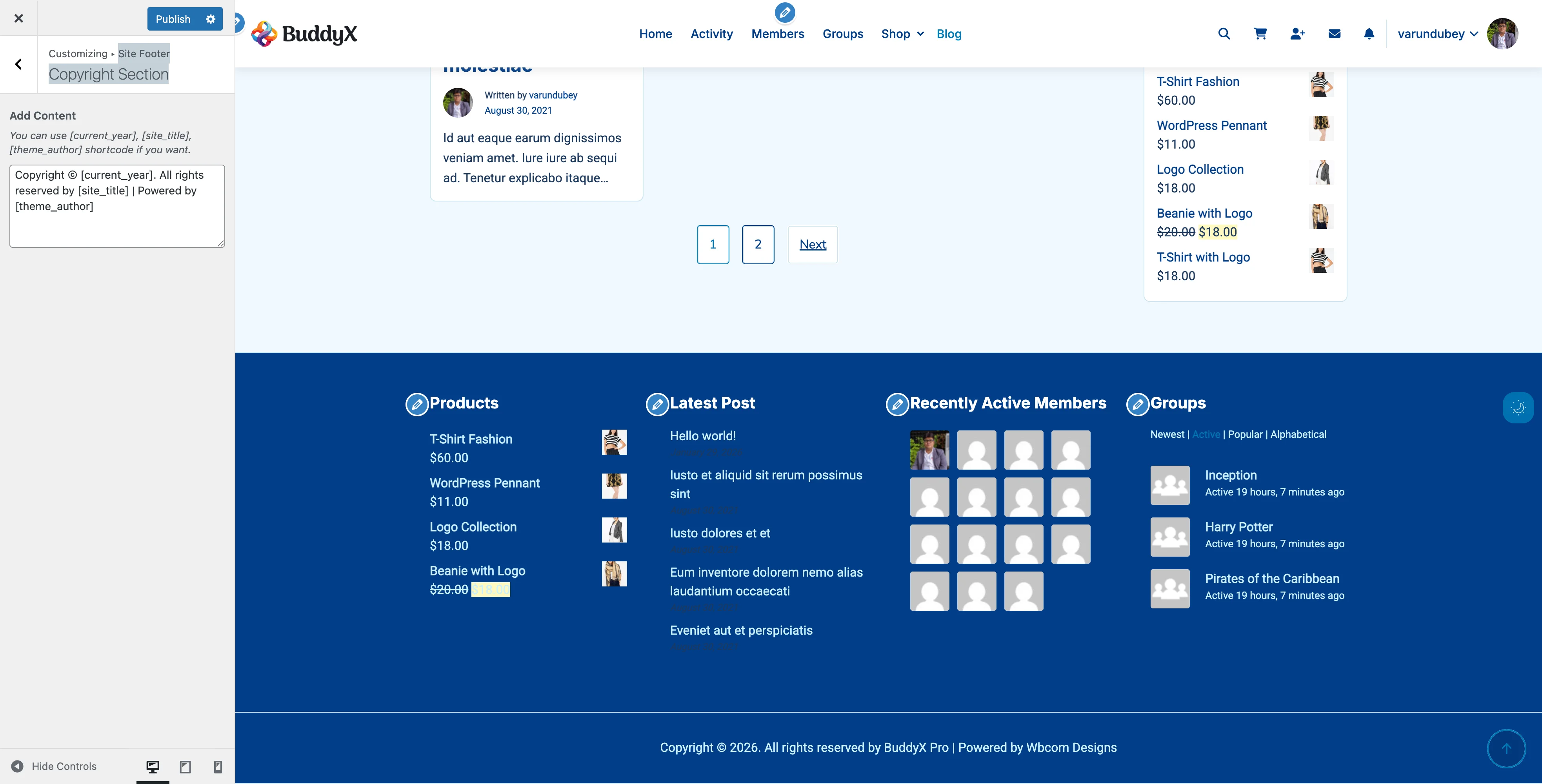
What You Can Do

With BuddyX Pro's topbar, you can:

  • Display important contact details (phone, email)
  • Show social media icons
  • Add a secondary navigation menu
  • Display announcements or promotional text
  • Customize colors to match your brand

Enabling the Topbar

  1. Go to Appearance > Customize
  2. Click on Header > Topbar
  3. Switch Enable Topbar to Yes
  4. Click Publish

You'll see a new bar appear above your main header.

Topbar Content Options

Left Side Content

Choose what appears on the left side of the topbar:

Option What It Shows
Text/HTML Custom text like phone number or address
Menu A secondary navigation menu
Social Icons Your social media links
None Leave this side empty

Right Side Content

Choose what appears on the right side:

Option What It Shows
Text/HTML Custom message or contact info
Menu Secondary navigation links
Social Icons Social media icon links
None Leave this side empty

Adding Contact Information

To display your phone number or email:

  1. Set left or right content to Text/HTML
  2. Enter your information in the text field:
    📞 (555) 123-4567  |  ✉️ hello@yoursite.com
    
  3. Click Publish

Tips:

  • Keep it short - topbar space is limited
  • Include only essential contact methods
  • Use separators (|) between items

Adding Social Icons

To display social media links:

  1. Set left or right content to Social Icons
  2. Go to Topbar > Social Links
  3. Add your profile URLs:
    • Facebook URL
    • Twitter/X URL
    • Instagram URL
    • LinkedIn URL
    • YouTube URL
  4. Click Publish

Only icons for URLs you provide will appear.

Creating a Topbar Menu

For secondary navigation links:

  1. Go to Appearance > Menus
  2. Create a new menu called "Topbar Menu"
  3. Add simple links (Login, Register, Help, Contact)
  4. Set the menu location to Topbar Menu
  5. Save

Then in customizer, set topbar content to Menu.

Topbar Colors

Color Scheme Options

Setting What It Controls
Background Color The topbar background
Text Color Regular text and icons
Link Color Clickable links
Link Hover Color Links when mouse hovers

Recommended Color Combinations

Professional/Corporate:

  • Background: Dark gray (#333333)
  • Text: White (#ffffff)
  • Creates a strong contrast with a light header below

Friendly/Approachable:

  • Background: Your primary brand color
  • Text: White (#ffffff)
  • Adds a pop of color to the top

Subtle/Minimal:

  • Background: Light gray (#f5f5f5)
  • Text: Dark gray (#666666)
  • Blends gently with the page

Announcement/Sale:

  • Background: Bright color (red, orange)
  • Text: White
  • Draws attention to promotions

Recommended Setups by Site Type

Business/Corporate Site

Left: Text - "📞 (555) 123-4567 | Mon-Fri 9am-5pm"
Right: Social Icons (LinkedIn, Twitter)
Background: #2c3e50 (dark blue)
Text: #ffffff (white)

Community Platform

Left: Menu - Help, Guidelines, FAQ
Right: Social Icons (all platforms)
Background: Primary brand color
Text: #ffffff (white)

E-Commerce Store

Left: Text - "Free shipping on orders over $50!"
Right: Text - "📞 Customer Service: (555) 123-4567"
Background: #e74c3c (attention red) or brand color
Text: #ffffff (white)

Blog/Magazine

Left: Social Icons
Right: Text - "Subscribe to our newsletter"
Background: #f8f9fa (light gray)
Text: #333333 (dark gray)

Online Course Platform

Left: Menu - Courses, Pricing, Support
Right: Text - "🎓 10,000+ students enrolled"
Background: #27ae60 (green)
Text: #ffffff (white)

Mobile Display

On mobile devices, the topbar can be:

Option Behavior
Show Topbar visible on mobile (takes screen space)
Hide Topbar hidden on mobile (saves space)

Recommendation: Hide on mobile unless the information is critical. Mobile screens have limited space.

What It Looks Like

With Topbar Enabled:

┌─────────────────────────────────────────────────┐
│ 📞 (555) 123-4567     [Facebook] [Twitter] [IG] │  ← Topbar
├─────────────────────────────────────────────────┤
│ [Logo]              Home  About  Services  Blog │  ← Main Header
├─────────────────────────────────────────────────┤
│                                                 │
│                  Page Content                   │

Without Topbar:

┌─────────────────────────────────────────────────┐
│ [Logo]              Home  About  Services  Blog │  ← Main Header
├─────────────────────────────────────────────────┤
│                                                 │
│                  Page Content                   │

Common Questions

Should I use a topbar? Use it if you have important secondary information. Skip it for cleaner, minimal designs.

Can I show different content on mobile? The topbar shows the same content, but you can hide it entirely on mobile.

Can I add HTML to the text fields? Yes, you can add links and basic HTML formatting.

Will the topbar affect my sticky header? The sticky header scrolls independently; the topbar stays at the top or scrolls away.

Related Settings


Need Help?

Footer Settings

Footer widgets, copyright, credits, and footer layout.

Sidebar Settings

Sidebar layouts, areas, and the side panel.

Side Panel Settings Guide

Configure the slide-out navigation panel that appears on the left side of your site. The Side Panel provides quick access to navigation menus and is perfect for mobile users and sites with extensive navigation.

Side Panel Settings Side panel configuration in the Customizer

What Is the Side Panel?

The Side Panel is a slide-out menu that appears from the left side of your screen. Think of it as a navigation drawer similar to mobile apps. It can contain custom menus, widgets, or any navigation items you want quick access to.

What You Can Do

  • Show or hide the side panel
  • Set it to open or closed by default
  • Display different menus for logged-in and logged-out users
  • Enable or disable on mobile devices
  • Add custom navigation with icons
  • Control visibility on specific pages
  • Toggle the panel with a button click

Visual Overview

CLOSED STATE:                     OPEN STATE:

┌──┐                             ┌──────────┬──────────┐
│  │                             │          │          │
│ ☰│  Header                     │  Menu    │  Header  │
│  │                             │  Item 1  │          │
├──┤                             │  Item 2  │──────────┤
│  │                             │  Item 3  │          │
│  │  Main Content               │  Item 4  │  Main    │
│  │                             │  Item 5  │  Content │
│  │                             │          │          │
│  │                             │          │          │
└──┘                             └──────────┴──────────┘
 ↑                                    ↑
Toggle button                    Panel slides in from left
(3 horizontal lines)             Click outside to close

Side Panel Settings

Access these settings in Appearance → Customize → Site Side Panel.

Available Options

Setting Default Description
Default State Closed Panel starts open or closed on page load
Toggle Button Enabled Show/hide the button that opens the panel
Logout Mode Enabled Show panel to logged-out users
Mobile View Enabled Show panel on mobile devices

Setting Details

Default State

Controls how the panel appears when a page loads.

Options:

  • Closed (recommended) - Panel hidden, users click to open
  • Open - Panel visible immediately

When to use "Open":

  • Sites with primary navigation in panel
  • Dashboard-style layouts
  • Wide screens where panel doesn't cover content

When to use "Closed":

  • Content-focused sites
  • Mobile-responsive layouts
  • Sites where content is primary

Toggle Button

The button that opens and closes the panel.

Enabled:

  • Three-line "hamburger" icon appears
  • Usually in header area
  • Click to open/close panel

Disabled:

  • No toggle button shown
  • Users can't open panel
  • Useful if you have custom triggers

Logout Mode

Controls panel visibility for logged-out users.

Enabled (default):

  • Logged-out users see the panel
  • Displays "Logged-Out Menu" if set
  • Falls back to main menu

Disabled:

  • Panel hidden for logged-out users
  • Only logged-in users see it
  • Good for member-only navigation

Mobile View

Controls panel on small screens (under 768px).

Enabled (default):

  • Panel works on mobile devices
  • Great for mobile navigation
  • Touch-friendly interface

Disabled:

  • Panel hidden on mobile
  • Mobile users see standard menu
  • Use if you have separate mobile menu

How to Configure Side Panel

Step 1: Enable the Side Panel

  1. Log in to WordPress dashboard
  2. Go to Appearance → Customize
  3. Navigate to Site Side Panel
  4. Ensure Toggle Button is enabled
  5. Click Publish

Step 2: Set Default State

Choose how the panel appears on load:

  1. In Site Side Panel settings
  2. Find Default State option
  3. Select Open or Closed
  4. Click Publish

Most sites work best with "Closed" as default.

Step 3: Configure User Visibility

Control who sees the panel:

For all users (default):

  • Keep Logout Mode enabled
  • Panel shows to everyone

For logged-in users only:

  • Disable Logout Mode
  • Panel hidden for guests

Step 4: Set Mobile Behavior

Choose mobile visibility:

Mobile-friendly (recommended):

  • Keep Mobile View enabled
  • Panel works on phones/tablets

Desktop-only:

  • Disable Mobile View
  • Mobile users see different menu

Side Panel Menus

The Side Panel displays custom navigation menus. You can set different menus for logged-in and logged-out users.

Menu Locations

BuddyX Pro provides dedicated menu locations:

Menu Location Who Sees It Best For
BuddyX Panel - Logged in users Logged-in members Dashboard, profile, settings
BuddyX Panel - Logged out users Guests/visitors Login, register, about

Create a Side Panel Menu

Step 1: Create the Menu

  1. Go to Appearance → Menus
  2. Click Create a new menu
  3. Name it (e.g., "Side Panel Menu")
  4. Click Create Menu

Step 2: Add Menu Items

Add pages, posts, or custom links:

  1. Select items from left column
  2. Click Add to Menu
  3. Drag to reorder items
  4. Create submenus by dragging items right

Step 3: Assign to Location

  1. Check BuddyX Panel - Logged in users box
  2. Or check BuddyX Panel - Logged out users
  3. Click Save Menu

Menu with Icons

Add icons to side panel menu items for better visual navigation:

Using Menu Icons Plugin

  1. Install "Menu Icons" plugin
  2. Go to Appearance → Menus
  3. Open your side panel menu
  4. Click triangle to expand menu item
  5. Choose icon from icon picker
  6. Save menu

Icon Libraries Supported

  • Font Awesome
  • Dashicons
  • Genericons
  • Custom SVG icons

Customize Panel Content

Default Content

By default, the panel shows:

  • Navigation menu items
  • Submenu items (expandable)
  • Icon + text labels

Custom Content with Hooks

Developers can add custom content:

// Add content before menu
add_action( 'buddyx_before_inner_panel', 'custom_panel_content' );

// Add content after menu
add_action( 'buddyx_after_inner_panel', 'custom_panel_footer' );

Per-Page Panel Control

Hide the panel on specific pages:

  1. Edit the page in WordPress
  2. Scroll to Side Panel Settings meta box
  3. Check Hide Side Panel
  4. Update the page

This is useful for:

  • Landing pages
  • Checkout pages
  • Full-screen presentations
  • Login/registration pages

Recommended Menu Configurations by Site Type

Community Site (BuddyPress)

Logged-in Menu:

  • Dashboard
  • My Profile
  • Messages
  • Notifications
  • Friends
  • Groups
  • Activity
  • Members
  • Settings

Logged-out Menu:

  • Home
  • About
  • Login
  • Register
  • Features
  • Contact

E-Commerce Site (WooCommerce)

Logged-in Menu:

  • Shop
  • My Account
  • Orders
  • Wishlist
  • Cart
  • Checkout

Logged-out Menu:

  • Shop
  • Categories
  • Sale
  • New Arrivals
  • Login/Register
  • About

Learning Site (LearnDash/LearnPress)

Logged-in Menu:

  • My Courses
  • All Courses
  • My Progress
  • Certificates
  • Assignments
  • Profile
  • Support

Logged-out Menu:

  • Browse Courses
  • Course Categories
  • Instructors
  • Pricing
  • Login
  • Enroll Now

Membership Site

Logged-in Menu:

  • Dashboard
  • My Account
  • Members Area
  • Downloads
  • Support
  • Community
  • Settings
  • Logout

Logged-out Menu:

  • Home
  • Membership Levels
  • Benefits
  • Testimonials
  • FAQ
  • Login
  • Join Now

Corporate/Business Site

Main Menu:

  • Home
  • About Us
  • Services
  • Products
  • Resources
  • Blog
  • Careers
  • Contact

User Experience Best Practices

Do's

  • Keep menu items concise
  • Use clear, descriptive labels
  • Organize items logically
  • Add icons for visual clarity
  • Limit to 8-10 main items
  • Use submenus for organization
  • Test on mobile devices

Don'ts

  • Don't overcrowd with items
  • Don't use long menu labels
  • Don't nest menus too deeply (max 2 levels)
  • Don't forget mobile testing
  • Don't hide critical navigation
  • Don't use unclear terminology

Mobile Optimization

Mobile Behavior

On mobile devices (when enabled):

  1. Touch-Friendly:

    • Large touch targets
    • Easy-to-tap menu items
    • Swipe to close
  2. Full-Screen:

    • Panel covers full height
    • Overlay dims background
    • Tap outside to close
  3. Scrollable:

    • Long menus scroll independently
    • Maintains position when reopened
    • Smooth scrolling animation

Mobile Best Practices

For mobile panels:

  • Use shorter menu labels
  • Add recognizable icons
  • Limit menu depth (1-2 levels)
  • Place important items at top
  • Test on actual devices
  • Consider thumb reach

Desktop vs. Mobile

Feature Desktop Mobile
Width 280-320px 80-90% screen width
Overlay Semi-transparent Darker overlay
Close Method Click outside or button Swipe or tap outside
Scrolling Independent scroll Independent scroll
Animation Slide in/out Slide in/out

Styling and Appearance

Panel Styling

The side panel inherits your theme colors:

  • Background: Site background color
  • Text: Site text color
  • Links: Theme link color
  • Hover: Theme hover color

Custom Styling

To customize appearance with CSS:

  1. Create a child theme
  2. Add custom CSS to child theme stylesheet
  3. Target .buddyx-menu-panel class

Example CSS:

/* Change panel background */
.buddyx-menu-panel {
    background-color: #f5f5f5;
}

/* Style menu items */
.buddyx-menu-panel .menu-item a {
    padding: 15px 20px;
    border-bottom: 1px solid #ddd;
}

/* Icon styling */
.buddyx-menu-panel .menu-item-icon {
    margin-right: 10px;
}

Width Adjustment

Default panel width is 320px on desktop. To change:

.buddyx-menu-panel {
    width: 400px;
}

Troubleshooting

Panel Doesn't Open

Check these items:

  1. Toggle enabled

    • Go to Customize → Site Side Panel
    • Verify Toggle Button is enabled
  2. Menu assigned

    • Go to Appearance → Menus
    • Check menu is assigned to panel location
  3. JavaScript errors

    • Open browser console (F12)
    • Look for JavaScript errors
    • Disable plugins to find conflicts
  4. Logout mode

    • If logged out, check Logout Mode is enabled
    • Or log in to test

Toggle Button Not Visible

Possible causes:

  1. Toggle disabled - Enable in customizer
  2. CSS conflict - Another plugin may hide it
  3. Custom header - May override button placement
  4. Cache issue - Clear all caches

Solutions:

  • Check customizer settings
  • Disable conflicting plugins
  • Clear cache
  • Update theme

Panel Appears Behind Content

This indicates a CSS z-index conflict:

  1. Open browser developer tools (F12)
  2. Inspect the panel element
  3. Note the z-index value
  4. Add custom CSS to increase it

Example fix:

.buddyx-menu-panel {
    z-index: 9999 !important;
}

Menu Items Not Showing

Verify:

  1. Menu created - Menu exists in Appearance → Menus
  2. Location set - Menu assigned to panel location
  3. Items added - Menu has items
  4. Not hidden - Menu visibility settings
  5. Cache cleared - Clear all caches

Panel Won't Close

Possible causes:

  1. JavaScript error
  2. Theme conflict
  3. Plugin conflict
  4. Browser issue

Try:

  • Check browser console for errors
  • Disable plugins one-by-one
  • Test in different browser
  • Update theme and plugins

Different Menu Shows in Panel

The panel shows different menus based on:

  1. Login state - Logged in vs. logged out
  2. Menu location - Check menu assignments
  3. Fallback - Primary menu shows if panel menu not set

Solution:

  • Verify correct menu is assigned
  • Check for both logged-in and logged-out locations
  • Assign menus to specific locations

Advanced Configuration

Hide Panel on Specific Pages

Use the per-page setting:

  1. Edit page in WordPress
  2. Find Side Panel Settings meta box
  3. Check Hide Side Panel
  4. Update page

Or use custom CSS with page IDs:

/* Hide on specific page */
.page-id-123 .buddyx-menu-panel {
    display: none !important;
}

/* Hide toggle on specific page */
.page-id-123 .buddyx-panel-toggle {
    display: none !important;
}

Change Panel Position

By default, panel slides in from left. To change to right:

This requires custom CSS and JavaScript. Consider using a child theme or consulting a developer.

Add Custom Widgets to Panel

While the panel is primarily for menus, developers can add widgets:

// Register widget area for panel
register_sidebar( array(
    'name'          => 'Side Panel Widgets',
    'id'            => 'buddyx-panel-widgets',
    'before_widget' => '<div class="panel-widget">',
    'after_widget'  => '</div>',
) );

// Display in panel
add_action( 'buddyx_after_inner_panel', function() {
    dynamic_sidebar( 'buddyx-panel-widgets' );
} );

Common Questions

What's the difference between Side Panel and mobile menu?

Side Panel:

  • Slides in from left
  • Can show on desktop and mobile
  • Custom menu location
  • Always accessible

Mobile Menu:

  • Appears in header on mobile
  • Different menu location
  • Only on small screens
  • Collapses on desktop

You can use both simultaneously.

Can I have different panels for different user roles?

Not by default, but you can:

  1. Use a plugin like "Nav Menu Roles"
  2. Show/hide menu items by role
  3. Create role-specific menus

Does the panel work with page builders?

Yes! The panel is independent of page content. It works with:

  • WordPress Block Editor
  • Elementor
  • Beaver Builder
  • Divi Builder
  • Other page builders

Can I disable the panel completely?

Yes, three ways:

  1. Disable toggle - In customizer, turn off Toggle Button
  2. Don't assign menu - Leave menu locations empty
  3. Use CSS - Hide with display: none

How many menu items can I add?

There's no hard limit, but best practices:

Recommended:

  • 8-10 main items
  • 1-2 submenu levels
  • Total items: 15-20

Not recommended:

  • 20+ main items
  • 3+ submenu levels
  • Very long labels

Will the panel slow down my site?

No, the side panel is lightweight and optimized:

  • Minimal CSS/JavaScript
  • Only loads when enabled
  • No external dependencies
  • No impact on page speed scores

Can visitors see the panel?

Yes, if Logout Mode is enabled. This lets you show navigation to non-logged-in visitors. You can:

  • Show same menu to everyone
  • Show different menu to logged-out users
  • Hide panel from logged-out users completely

Related Settings

Need Help?

If you need assistance with the side panel:

Documentation:

  • BuddyX Pro theme documentation
  • WordPress menu guide
  • Navigation best practices

Support:

Useful Plugins:

  • Menu Icons - Add icons to menus
  • Nav Menu Roles - Control menu by user role
  • Max Mega Menu - Advanced menu features

Typography

Body, heading, caption typography and Google Fonts integration.

Body Typography

Configure the typography settings for body text throughout your BuddyX Pro website. These settings control the primary reading experience for your visitors.

Body Typography Settings Body typography configuration in the WordPress Customizer
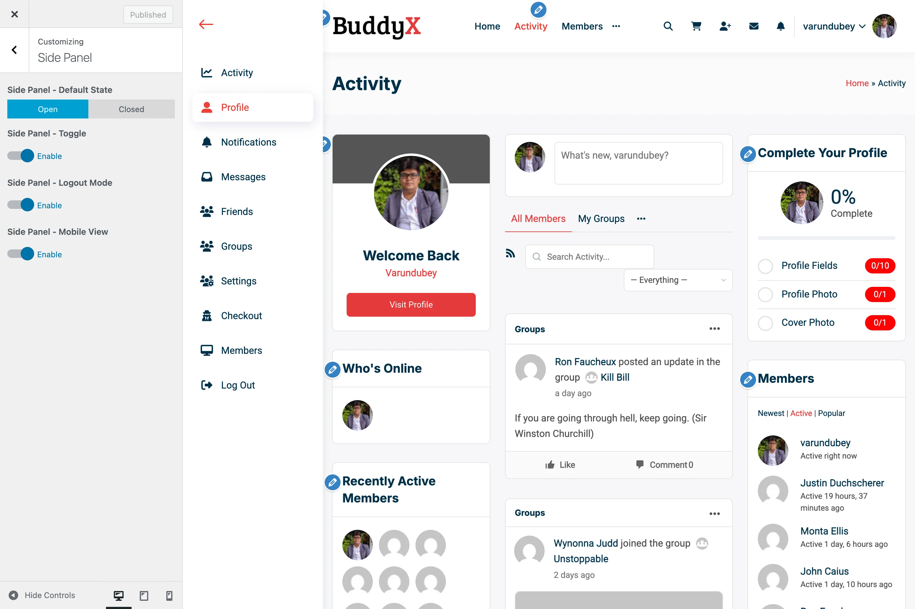
Accessing Typography Settings

  1. Go to Appearance > Customize
  2. Navigate to Typography > Body Typography

Body Font Settings

Font Family

Setting Description Default
Font Family Primary body font System Default
Font Source Google Fonts or System Fonts Google Fonts

Available Font Sources:

  • Google Fonts - 1000+ web fonts with automatic loading
  • System Fonts - Native fonts (faster loading, no external requests)

Popular Body Font Choices:

  • Open Sans - Clean and highly readable
  • Roboto - Modern and versatile
  • Lato - Friendly and professional
  • Source Sans Pro - Adobe's open-source option
  • Nunito - Rounded, friendly appearance

Font Size

Setting Description Default
Base Font Size Root font size 16px
Mobile Font Size Size on mobile devices 15px
Tablet Font Size Size on tablet devices 15px

Responsive Typography: BuddyX Pro automatically adjusts font sizes across breakpoints:

  • Desktop (>1024px): Base font size
  • Tablet (768-1024px): Tablet font size
  • Mobile (<768px): Mobile font size

Font Weight

Setting Options Default
Font Weight 100-900, Normal, Bold 400 (Normal)

Weight Scale:

  • 100 - Thin
  • 200 - Extra Light
  • 300 - Light
  • 400 - Normal/Regular
  • 500 - Medium
  • 600 - Semi Bold
  • 700 - Bold
  • 800 - Extra Bold
  • 900 - Black

Line Height

Setting Description Default
Line Height Space between lines 1.7

Recommendations:

  • Body text: 1.5 - 1.8
  • Dense content: 1.4 - 1.5
  • Spacious layout: 1.8 - 2.0

Letter Spacing

Setting Description Default
Letter Spacing Space between characters 0px

Usage:

  • Normal text: 0 to 0.5px
  • Uppercase text: 1-2px improves readability
  • Negative values: Tighten text for headings

Text Colors

Body Text Color

Setting Description Default
Text Color Primary body text color #333333
Link Color Hyperlink text color Primary Color
Link Hover Link hover state Primary Hover

See Color Scheme Settings for complete color configuration.

Font Loading Optimization

BuddyX Pro optimizes Google Fonts loading for performance:

Preconnect

Automatically adds DNS preconnect for faster font loading:

<link rel="preconnect" href="https://fonts.googleapis.com">
<link rel="preconnect" href="https://fonts.gstatic.com" crossorigin>

Font Display

Option Behavior
Swap Show fallback font, swap when loaded (default)
Block Hide text until font loads
Fallback Brief block, then fallback if slow
Optional Use if cached, otherwise fallback

Recommendation: Use swap for best user experience and Core Web Vitals.

Subsetting

BuddyX Pro requests only necessary character subsets:

  • Latin (default)
  • Latin Extended (European languages)
  • Cyrillic (Russian, etc.)
  • Greek
  • Vietnamese

System Font Stack

When using system fonts, BuddyX Pro uses this optimized stack:

font-family: -apple-system, BlinkMacSystemFont, "Segoe UI", Roboto,
             Oxygen-Sans, Ubuntu, Cantarell, "Helvetica Neue", sans-serif;

Benefits:

  • Zero external requests
  • Fastest possible loading
  • Native look and feel per OS
  • Excellent readability

Configuration Examples

Example 1: Modern Blog

Font Family: Inter
Font Size: 17px
Font Weight: 400
Line Height: 1.75
Letter Spacing: 0

Example 2: Corporate Site

Font Family: Source Sans Pro
Font Size: 16px
Font Weight: 400
Line Height: 1.6
Letter Spacing: 0.2px

Example 3: Community Platform

Font Family: Nunito
Font Size: 15px
Font Weight: 400
Line Height: 1.7
Letter Spacing: 0

Accessibility Considerations

Minimum Font Size

  • Body text: Minimum 16px recommended
  • Never below 14px for readability
  • Consider users with visual impairments

Contrast Ratio

Ensure text meets WCAG 2.1 requirements:

  • Normal text: 4.5:1 minimum contrast
  • Large text (18px+): 3:1 minimum contrast

Line Length

Optimal reading experience:

  • 45-75 characters per line
  • Controlled by container width, not font settings

Troubleshooting

Font Not Loading

Problem: Selected Google Font doesn't appear.

Solutions:

  1. Check internet connectivity
  2. Verify font name is spelled correctly
  3. Clear browser cache
  4. Check for ad blockers blocking Google Fonts
  5. Try a different font to test

Font Appears Different Than Preview

Problem: Font looks different on live site.

Solutions:

  1. Different operating systems render fonts differently
  2. Check font weight is available for chosen font
  3. Verify font-smoothing CSS isn't conflicting
  4. Some fonts have limited weight options

Performance Impact

Problem: Fonts slowing down page load.

Solutions:

  1. Limit to 2-3 font families maximum
  2. Use font-display: swap
  3. Consider system fonts for body text
  4. Preload critical fonts
  5. Use variable fonts when available

Font Not Matching Design

Problem: Font looks too light or heavy.

Solutions:

  1. Adjust font weight setting
  2. Some fonts have different weight distributions
  3. Check if font supports the weight you need
  4. Consider a different font with better weight options

Related Documentation


Need Help?

Google Fonts Integration

BuddyX Pro seamlessly integrates with Google Fonts, giving you access to over 1,000 professional web fonts. This guide explains how fonts are loaded, optimized, and customized for your website.

Typography Settings Google Fonts selection in typography settings

What Are Google Fonts?

Google Fonts is a free library of open-source fonts optimized for the web. BuddyX Pro automatically handles:

  • Font file downloading and serving
  • Browser compatibility
  • Performance optimization
  • Automatic fallback fonts
  • Character subset selection

You simply choose fonts in the Customizer - the theme handles the technical details.

Accessing Google Fonts

Google Fonts are available in any typography setting:

  1. Go to Appearance > Customize
  2. Navigate to Typography section
  3. Open any typography panel (Body, Headings, Menu, etc.)
  4. Click the Font Family dropdown
  5. Search or browse hundreds of Google Fonts

The font picker shows:

  • Font name
  • Real-time preview
  • Available font weights
  • Search functionality

How BuddyX Pro Loads Fonts

Automatic Loading System

When you select a Google Font, BuddyX Pro automatically:

  1. Detects fonts used - Scans all typography settings
  2. Builds font URL - Creates optimized Google Fonts API request
  3. Adds preconnect hints - Speeds up DNS resolution
  4. Loads font CSS - Includes only needed character sets
  5. Applies fonts - Uses CSS to apply to correct elements

All of this happens automatically - you don't write any code.

Font Loading in Action

When you choose "Roboto" for body text:

Theme detects: Roboto font is selected
Generates URL: https://fonts.googleapis.com/css?family=Roboto:400,700&display=swap
Adds to page: <link rel="stylesheet" href="[Google Fonts URL]">
Browser loads: Font files from Google's CDN
Text renders: Using Roboto instead of fallback font

Performance Optimization

BuddyX Pro includes several automatic optimizations for fast font loading:

1. Preconnect Resource Hints

The theme adds DNS preconnect headers:

<link rel="preconnect" href="https://fonts.googleapis.com">
<link rel="preconnect" href="https://fonts.gstatic.com" crossorigin>

Benefit: Reduces font loading time by 100-300ms by establishing connections before fonts are needed.

2. Font Display Swap

All Google Fonts use font-display: swap strategy:

font-display: swap;

What it does:

  • Shows fallback font immediately (prevents invisible text)
  • Swaps to Google Font when loaded
  • Prevents FOIT (Flash of Invisible Text)
  • Improves Core Web Vitals scores

User experience: Text appears instantly, then upgrades to your chosen font seamlessly.

3. Subset Optimization

BuddyX Pro requests only Latin character subsets by default:

family=Roboto:400,700&subset=latin

Why: A full font includes thousands of characters. Most English sites only need 256 Latin characters. This reduces file size by 50-80%.

Available subsets:

  • latin - English, basic European (default)
  • latin-ext - Extended European characters (ā, ē, ī, etc.)
  • cyrillic - Russian, Ukrainian, Bulgarian
  • greek - Greek alphabet
  • vietnamese - Vietnamese characters

If your site uses multiple languages, you may need additional subsets (requires custom code).

4. Font Weight Limiting

Only selected font weights are loaded:

Regular (400) body text + Bold (700) headings = 2 font files

vs.

Loading all weights (100, 200, 300, 400, 500, 600, 700, 800, 900) = 9 font files

Recommendation: Choose 2-3 weights maximum per font family for optimal performance.

5. CSS Preloading

BuddyX Pro preloads the Google Fonts CSS file:

<link rel="preload" as="style" href="[Google Fonts URL]" />

Benefit: Prioritizes font loading, improving Largest Contentful Paint (LCP) metric.

Font Performance Impact

Understanding the performance cost of web fonts:

Loading Times

Setup File Size Load Time* Recommendation
System fonts only 0 KB 0ms Fastest possible
1 Google Font, 2 weights ~40-60 KB 100-200ms Excellent
2 Google Fonts, 4 weights total ~100-150 KB 200-400ms Good
3+ fonts, 6+ weights ~200-300 KB 400-600ms+ Avoid

*Approximate on 3G connection

Core Web Vitals Impact

Google's page speed metrics affected by fonts:

  • Largest Contentful Paint (LCP) - Text using web fonts may delay this metric
  • Cumulative Layout Shift (CLS) - Font swapping can cause layout shifts
  • First Contentful Paint (FCP) - Delayed by font downloads

BuddyX Pro's optimizations minimize these impacts, but fewer fonts = better scores.

Font Selection Best Practices

Choose Wisely

  • One font family - Fastest and most cohesive
  • Two font families - Good balance (headings + body)
  • Three+ families - Usually unnecessary, impacts performance

Weight Management

Select only the weights you'll actually use:

Good setup:

Body: Roboto - Regular (400), Bold (700)
Headings: Roboto - Semi Bold (600), Bold (700)
Total: 3 weights (shared font family)

Excessive setup:

Body: Open Sans - Light (300), Regular (400), Medium (500), Bold (700)
Headings: Montserrat - Regular (400), Semi Bold (600), Bold (700), Extra Bold (800)
Menu: Lato - Medium (500), Bold (700)
Total: 9 weights across 3 families

Fallback Font Considerations

Every Google Font includes fallback fonts in case the primary font doesn't load:

font-family: 'Roboto', -apple-system, BlinkMacSystemFont, sans-serif;

Fallback stack:

  1. Roboto - Your chosen Google Font
  2. -apple-system - macOS/iOS system font
  3. BlinkMacSystemFont - Chrome on macOS
  4. sans-serif - Generic sans-serif font

The fallback font displays first, then swaps to Google Font. Choose Google Fonts that match common fallback fonts to minimize layout shift.

Popular Google Fonts by Category

Sans-Serif Fonts (Modern, Clean)

Font Name Character Best For
Roboto Neutral, friendly Corporate sites, apps
Open Sans Readable, versatile Blogs, general sites
Lato Warm, professional Business, services
Montserrat Geometric, bold Headlines, modern sites
Nunito Sans Rounded, approachable Communities, social sites
Inter Technical, precise SaaS, tech platforms
Poppins Geometric, contemporary Creative, marketing
Source Sans Pro Readable, neutral Documentation, content

Serif Fonts (Traditional, Elegant)

Font Name Character Best For
Merriweather Readable, traditional Blogs, editorial
Playfair Display Elegant, high-contrast Luxury, fashion
Lora Balanced, calligraphic Long-form content
PT Serif Traditional, neutral Professional content
Crimson Text Book-like, classic Literature, reading

Display Fonts (Decorative, Impact)

Font Name Character Best For
Bebas Neue Tall, condensed Headers only
Righteous Bold, retro Creative projects
Archivo Black Heavy, impactful Marketing, landing pages

Warning: Display fonts should only be used for large headings, never body text. They're designed for impact, not extended reading.

Font Pairing Strategies

Combine fonts effectively for professional results:

Strategy 1: Same Family (Safest)

Use one font for everything:

All text: Nunito Sans (varying weights)
- Body: Regular (400)
- Subheadings: Medium (500)
- Headings: Semi Bold (600)
- Strong headings: Bold (700)

Pros: Fastest loading, most cohesive, easiest to manage Cons: Less visual variety

Strategy 2: Serif + Sans-Serif (Classic)

Pair a serif with a sans-serif:

Option A: Serif headings, sans-serif body

Headings: Merriweather (serif)
Body: Open Sans (sans-serif)

Effect: Traditional, authoritative, editorial

Option B: Sans-serif headings, serif body

Headings: Montserrat (sans-serif)
Body: Lora (serif)

Effect: Modern headings, comfortable reading

Strategy 3: Geometric + Humanist

Combine structured and organic sans-serifs:

Headings: Montserrat (geometric, structured)
Body: Open Sans (humanist, friendly)

Effect: Modern but approachable

Strategy 4: Display + Neutral

Bold headings with safe body text:

H1-H2: Bebas Neue (display font)
H3-H6 & Body: Roboto (neutral sans-serif)

Effect: Attention-grabbing titles, readable content

Pairing Guidelines

When combining two fonts:

Do:

  • Choose fonts with similar proportions (x-height)
  • Pair fonts from different classifications (serif + sans-serif)
  • Use one font for 80% of text, accent font for 20%
  • Test readability at actual site sizes
  • Consider historical period (don't mix Renaissance serif with Futuristic sans)

Don't:

  • Pair two decorative/display fonts
  • Use fonts that are too similar (creates confusion, not contrast)
  • Mix more than 2-3 font families site-wide
  • Pair fonts from same classification unless intentional

Advanced Font Techniques

Using Variable Fonts

Some Google Fonts support variable font technology:

Benefits:

  • One file contains all weights
  • Smoother weight transitions
  • Better performance than loading multiple weight files

Supported variable fonts:

  • Inter
  • Roboto Flex
  • Crimson Pro
  • Recursive

BuddyX Pro will automatically use variable font versions when available.

Font Subset Customization

To load additional character subsets (advanced users):

// Add to child theme functions.php
add_filter( 'buddyxpro_google_fonts', function( $fonts ) {
    // Add subset parameter to font array
    return $fonts;
});

Contact support for implementation help.

Local Font Hosting

For maximum control and privacy compliance (GDPR):

BuddyX Pro includes functionality to download and self-host Google Fonts. This:

  • Eliminates external requests (privacy-friendly)
  • Slightly faster in some regions
  • Works offline/behind firewalls
  • Requires technical implementation

Contact support for local font hosting setup.

System Fonts Alternative

For the absolute fastest loading, use system fonts instead of Google Fonts:

What Are System Fonts?

Fonts already installed on users' devices:

  • macOS/iOS: San Francisco
  • Windows: Segoe UI
  • Android: Roboto
  • Linux: Ubuntu, Oxygen, Cantarell

System Font Stack

BuddyX Pro uses this optimized stack when you select system fonts:

font-family: -apple-system, BlinkMacSystemFont, "Segoe UI", Roboto,
             "Helvetica Neue", Arial, sans-serif;

Benefits of System Fonts

  • Zero network requests - Instantly available
  • Native look - Matches user's OS
  • Perfect rendering - Optimized by OS makers
  • Privacy-friendly - No external connections
  • Best Core Web Vitals - No font loading delays

When to Use System Fonts

Choose system fonts when:

  • Performance is critical priority
  • Building a web app or dashboard (native feel)
  • GDPR privacy is a concern (no Google requests)
  • Your brand doesn't require specific typography

Choose Google Fonts when:

  • Brand identity requires specific typeface
  • Design needs more personality
  • Willing to accept small performance cost for visual impact

Font Loading Strategies Compared

BuddyX Pro uses the swap strategy by default. Understanding all options:

Strategy Behavior User Experience Use Case
swap Show fallback immediately, swap when loaded Brief style change when font loads Best for most sites (default)
block Hide text up to 3 seconds until font loads Invisible text briefly Avoid (poor UX)
fallback Brief block (100ms), then fallback if slow Compromise Slow networks
optional Use font if cached, otherwise fallback Consistent render, font may not load Extreme performance priority

BuddyX Pro recommendation: Stick with swap (the default). It provides the best balance of brand consistency and user experience.

Measuring Font Performance

Test Your Font Loading

Use these tools to measure impact:

  1. Google PageSpeed Insights - pagespeed.web.dev

    • Check LCP score
    • Review font loading recommendations
    • Test mobile and desktop
  2. WebPageTest - webpagetest.org

    • Detailed font loading waterfall
    • Shows preconnect effectiveness
    • Tests from multiple locations
  3. Chrome DevTools

    • Open DevTools (F12)
    • Network tab > Filter: Font
    • See when fonts load
    • Check file sizes

Target Metrics

Aim for these benchmarks:

  • Font file total: Under 100 KB
  • Number of font requests: 1-3 requests
  • Font load time: Under 500ms on 3G
  • LCP impact: Fonts loaded before LCP element

Troubleshooting Font Issues

Issue: Fonts not loading at all

Symptoms: Text shows in fallback font only

Causes:

  • Browser ad blocker blocking Google Fonts
  • Corporate firewall blocking Google domains
  • Privacy extensions (Privacy Badger, etc.)
  • DNS issues

Solutions:

  1. Test in incognito mode without extensions
  2. Check browser console for errors (F12)
  3. Whitelist fonts.googleapis.com and fonts.gstatic.com
  4. Try a different network
  5. Consider local font hosting

Issue: Fonts load slowly

Symptoms: Long delay before custom font appears

Causes:

  • Too many font weights loaded
  • Multiple font families
  • Slow internet connection
  • No preconnect optimization

Solutions:

  1. Reduce to 2-3 font weights maximum
  2. Use only 1-2 font families
  3. Verify preconnect hints are present (view page source)
  4. Consider system fonts for body text
  5. Test on real devices, not just desktop

Issue: Flash of unstyled text (FOUT)

Symptoms: Brief moment of fallback font before Google Font appears

Explanation: This is intentional behavior with font-display: swap. Text appears immediately (good for users), then upgrades to custom font.

Solutions if problematic:

  1. Choose Google Fonts similar to fallback fonts (reduces visual shift)
  2. Accept it - better than invisible text
  3. Use system fonts if consistency critical

Not a bug - it's a performance feature protecting user experience.

Issue: Font looks different than Google Fonts preview

Causes:

  • Font rendering varies by OS and browser
  • Antialiasing differences
  • Screen resolution affects appearance
  • Color and background affect perception

Solutions:

  1. Test on target audience's primary devices
  2. Adjust font weight if too light/heavy
  3. Check contrast against background color
  4. Some fonts look better on certain OS (Mac vs. Windows)

Issue: Some font weights don't work

Cause: Not all Google Fonts include all weights (100-900).

Check available weights:

  1. Visit fonts.google.com
  2. Search for your font
  3. Check "Styles" tab for available weights

Solution: Only select weights that font actually supports, or choose a different font with needed weights.

Issue: Fonts making site slow

Symptoms: Poor PageSpeed scores, high LCP time

Solutions:

  1. Audit font usage: How many families? How many weights?
  2. Reduce fonts: Aim for 1 family with 2-3 weights
  3. Critical fonts only: Use system fonts for less important text
  4. Preload critical fonts: Add preload link for above-fold fonts
  5. Measure impact: Use PageSpeed Insights before and after changes

Font Loading Performance Checklist

Use this checklist to optimize font performance:

  • Using 2 or fewer Google Font families
  • Loading 3 or fewer font weights total
  • Preconnect hints present in page source
  • font-display: swap active (BuddyX Pro default)
  • Latin subset only (unless multilingual site)
  • PageSpeed Insights LCP under 2.5 seconds
  • No console errors related to fonts
  • Fonts load within 500ms on 3G throttling
  • CLS (layout shift) score under 0.1
  • Tested on target audience devices

Common Questions

Q: Are Google Fonts really free?

A: Yes, completely free for personal and commercial use. Google Fonts are open-source and licensed freely. No attribution required, no usage limits.

Q: Do Google Fonts work offline?

A: Once loaded and cached, yes. The browser caches font files, so repeat visits load fonts instantly from cache. But initial load requires internet connection. For true offline support, you'd need local font hosting.

Q: Can I use premium fonts with BuddyX Pro?

A: Yes, but requires custom implementation:

  1. Upload font files to theme
  2. Add @font-face CSS declarations
  3. Reference custom fonts in Additional CSS

This is an advanced technique. Contact support for guidance.

Q: Will fonts slow down my site?

A: Potentially, but BuddyX Pro's optimizations minimize impact:

  • 1 font family, 2 weights: Minimal impact (~40KB, 100-200ms)
  • 2 families, 4 weights: Moderate impact (~100KB, 200-400ms)
  • 3+ families, 6+ weights: Significant impact (>200KB, 400ms+)

The key is moderation. System fonts are faster, but Google Fonts' branding value often justifies the small cost.

Q: Are Google Fonts GDPR compliant?

A: Contested. Some EU courts ruled that loading fonts from Google servers can violate GDPR by sharing user IP addresses without consent. Solutions:

  1. Self-host fonts (local hosting) - Fully compliant
  2. Cookie consent - Show fonts only after user consent
  3. Legal assessment - Consult your legal advisor

BuddyX Pro supports local font hosting. Contact support for setup.

Q: Why does my font look bold/light on Windows vs. Mac?

A: Operating systems render fonts differently:

  • Mac/iOS: Slightly heavier rendering, more antialiasing
  • Windows: Lighter rendering, less smoothing (ClearType)
  • Linux: Varies by distribution

Choose a middle-ground weight (500-600 for headings, 400 for body) that works across systems. Test on target platforms.

Q: Can I use custom fonts from other sources (Adobe Fonts, Font Squirrel)?

A: Yes, with custom setup:

Adobe Fonts (Typekit):

  1. Get embed code from Adobe
  2. Add to theme header
  3. Reference fonts in Additional CSS

Self-hosted fonts:

  1. Upload .woff2 files to theme
  2. Define fonts with @font-face in Additional CSS
  3. Use font family names in Customizer

Contact support for implementation assistance.

Q: How often does BuddyX Pro update its Google Fonts list?

A: Google Fonts integration is dynamic - you have access to all fonts Google provides through their API. As Google adds new fonts, they become automatically available in BuddyX Pro's font picker. No theme update required.

Q: Do font settings apply to WordPress block editor?

A: Yes, BuddyX Pro synchronizes font settings with the block editor so what you see while editing matches the live site. Some editor features (font size picker) may show additional options beyond theme defaults.

Related Documentation

Additional Resources


Need Help?

Heading Typography

Control the appearance of all headings (H1-H6) on your BuddyX Pro website. These settings help you create a consistent visual hierarchy that guides your visitors through your content.

Heading Typography Settings Heading typography configuration in the WordPress Customizer
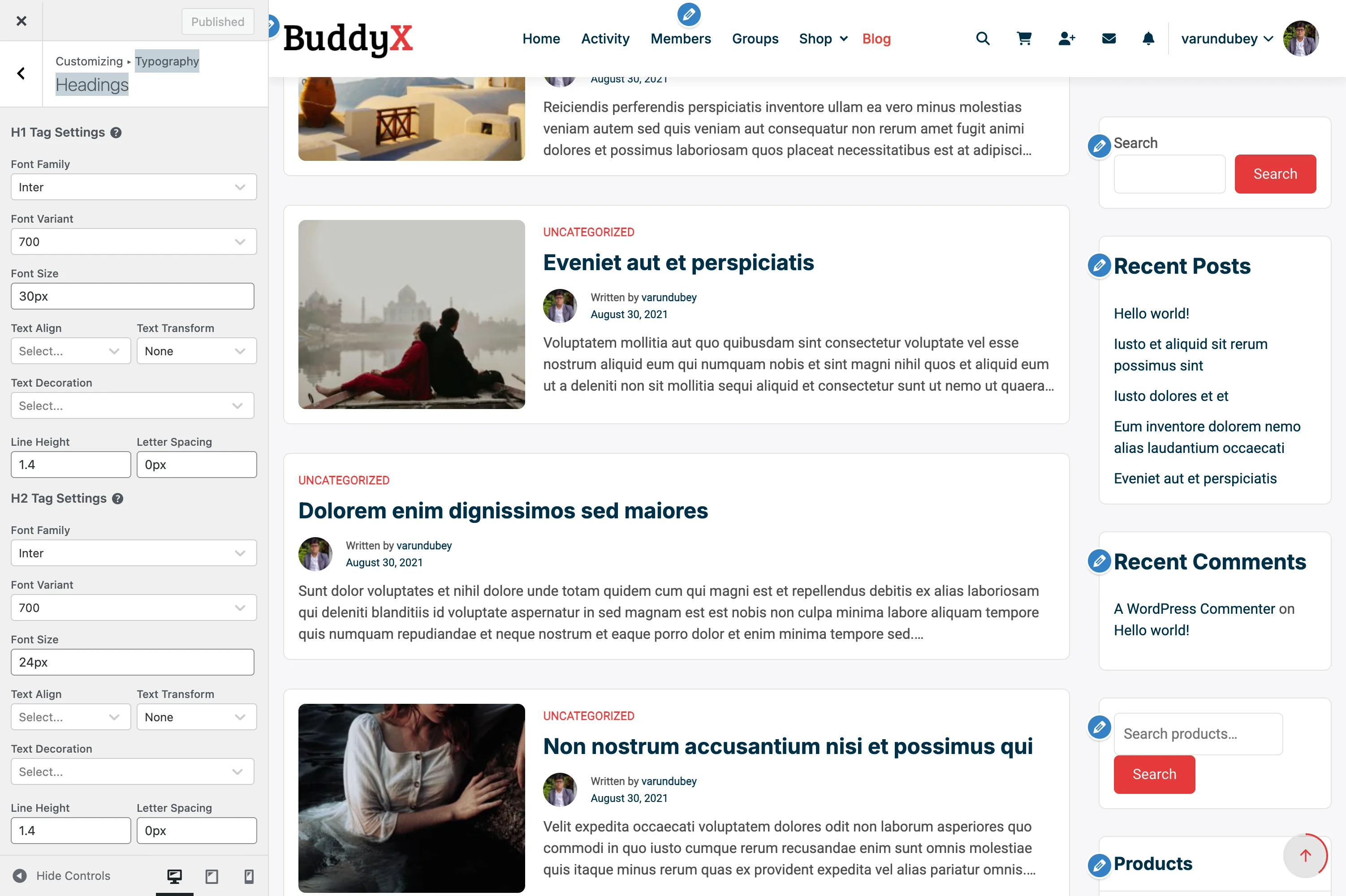
Accessing Heading Settings

  1. Go to Appearance > Customize
  2. Click on Typography
  3. Select Headings Typography

You'll see individual controls for each heading level from H1 (largest) down to H6 (smallest).

What You Can Do

With heading typography settings, you can:

  • Choose unique fonts for each heading level or use one consistent font family
  • Set appropriate sizes to create clear visual hierarchy
  • Adjust font weights (light, regular, bold, etc.)
  • Control spacing between letters and lines
  • Transform text (uppercase, lowercase, capitalize)
  • Align headings (left, center, right)
  • Create distinct looks for different site sections

Heading Levels Explained

H1 - Main Page Title

Default Settings:

  • Font Family: Nunito Sans
  • Font Size: 30px
  • Line Height: 1.4
  • Letter Spacing: 0

Where It Appears:

  • Page titles at the top of content
  • Blog post titles
  • BuddyPress profile headers
  • Main entry titles

Best Practices:

  • Largest heading on any page
  • Only one H1 per page (WordPress handles this automatically)
  • Should be immediately attention-grabbing
  • Recommended size: 28px - 48px

H2 - Section Headings

Default Settings:

  • Font Family: Nunito Sans
  • Font Size: 24px
  • Line Height: 1.4
  • Letter Spacing: 0

Where It Appears:

  • Widget titles
  • Major section dividers
  • Subheadings under main content
  • Product category titles (FluentCart)

Best Practices:

  • Second most prominent heading
  • Use for major content sections
  • Recommended size: 22px - 36px
  • Consider slightly heavier weight than H1

H3 - Subsection Headings

Default Settings:

  • Font Family: Nunito Sans
  • Font Size: 22px
  • Line Height: 1.4
  • Letter Spacing: 0

Where It Appears:

  • BuddyPress group separators
  • Blog post subheadings
  • Card titles
  • Nested content sections

Best Practices:

  • Third level in hierarchy
  • Recommended size: 20px - 28px
  • Should be noticeably smaller than H2

H4 - Smaller Subheadings

Default Settings:

  • Font Family: Nunito Sans
  • Font Size: 20px
  • Line Height: 1.4
  • Letter Spacing: 0

Where It Appears:

  • Form section labels
  • Sidebar widget subheadings
  • Tab titles
  • Comment section headers

Best Practices:

  • Recommended size: 18px - 24px
  • Can use slightly lighter weight
  • Good for breaking up dense content

H5 - Minor Headings

Default Settings:

  • Font Family: Nunito Sans
  • Font Size: 18px
  • Line Height: 1.4
  • Letter Spacing: 0

Best Practices:

  • Recommended size: 16px - 20px
  • Often same size as body text but bold
  • Use sparingly for deep content structure

H6 - Smallest Heading

Default Settings:

  • Font Family: Nunito Sans
  • Font Size: 16px
  • Line Height: 1.4
  • Letter Spacing: 0

Best Practices:

  • Recommended size: 14px - 18px
  • Rarely used in most sites
  • Can match body text size with different weight

Heading Typography Options

Each heading level has the same customization options:

Option Description Examples
Font Family Choose from Google Fonts or system fonts Nunito Sans, Roboto, Montserrat
Font Weight Thickness of the font 300 (Light), 400 (Regular), 600 (Semi Bold), 700 (Bold)
Font Style Normal or italic Regular, Italic
Font Size Height of the text 16px, 24px, 2rem
Line Height Space between lines 1.2 (tight), 1.4 (normal), 1.6 (relaxed)
Letter Spacing Space between characters 0 (default), 0.05em (loose), -0.02em (tight)
Text Transform Case style none, uppercase, lowercase, capitalize
Text Align Horizontal alignment left, center, right
Text Decoration Additional styling none, underline

Recommended Font Combinations by Site Type

Corporate Site

Goal: Professional, trustworthy, clean

H1-H3: Montserrat (Bold, 600-700 weight)
H4-H6: Montserrat (Semi Bold, 500-600 weight)
Body: Roboto (Regular, 400 weight)

Visual Effect: Modern corporate feel with excellent readability

Settings:

  • H1: 38px, Line Height 1.2, Letter Spacing -0.01em
  • H2: 30px, Line Height 1.3, Letter Spacing -0.01em
  • H3: 24px, Line Height 1.4
  • H4-H6: Decrease by 2px each

Creative Agency

Goal: Bold, unique, attention-grabbing

Headings: Poppins (Bold, 700 weight)
Body: Inter (Regular, 400 weight)

Visual Effect: Strong personality with geometric precision

Settings:

  • H1: 42px, Line Height 1.1, Letter Spacing -0.02em, Transform: uppercase
  • H2: 32px, Line Height 1.2, Letter Spacing 0.01em
  • H3: 26px, Line Height 1.3
  • Tight line height creates impact
  • Generous letter spacing for uppercase text

Blog or Magazine

Goal: Readable, comfortable, editorial

Headings: Playfair Display or Merriweather (Regular, 400 weight)
Body: Lora or Georgia (Regular, 400 weight)

Visual Effect: Classic editorial look, easy on the eyes for long reading

Settings:

  • H1: 36px, Line Height 1.3, Weight: 700
  • H2: 28px, Line Height 1.4, Weight: 600
  • H3: 24px, Line Height 1.5
  • Relaxed line heights for comfort
  • Serif fonts add elegance

E-commerce Store

Goal: Clear, modern, conversion-focused

Headings: Source Sans Pro (Semi Bold, 600 weight)
Body: Source Sans Pro (Regular, 400 weight)

Visual Effect: Unified, professional, optimized for scanning

Settings:

  • H1: 32px, Line Height 1.3 (product titles need to work in grids)
  • H2: 26px, Line Height 1.4 (category headers)
  • H3: 22px, Line Height 1.4 (product details)
  • Same font family for cohesion
  • Moderate sizes for dense product info

Community Platform

Goal: Friendly, welcoming, social

Headings: Nunito Sans (Semi Bold, 600 weight)
Body: Nunito Sans (Regular, 400 weight)

Visual Effect: Rounded, approachable, perfect for social interactions

Settings:

  • H1: 30px, Line Height 1.4
  • H2: 24px, Line Height 1.4
  • H3: 22px, Line Height 1.4
  • Consistent line heights create rhythm
  • Rounded fonts feel friendlier
  • Moderate sizes work well with avatars and user content

Creating Visual Hierarchy

The Size Ratio Method

A proven approach is to use consistent ratios between heading sizes:

Classic Scale (1.25 ratio):

  • H1: 30px
  • H2: 24px (30 ÷ 1.25)
  • H3: 19.2px (round to 20px)
  • H4: 16px
  • H5: 13px
  • H6: 10px

Modern Scale (1.33 ratio - "Perfect Fourth"):

  • H1: 38px
  • H2: 28px
  • H3: 21px
  • H4: 16px
  • H5: 12px
  • H6: 9px

Bold Scale (1.5 ratio):

  • H1: 48px
  • H2: 32px
  • H3: 21px
  • H4: 14px

Use the ratio that matches your site's personality: classic for traditional sites, modern for most current websites, bold for creative or marketing sites.

The Weight Contrast Method

Instead of large size differences, use weight variations:

All Headings: 18px - 24px range

  • H1: 24px, Weight 800
  • H2: 22px, Weight 700
  • H3: 20px, Weight 600
  • H4: 18px, Weight 500
  • H5: 18px, Weight 400
  • H6: 18px, Weight 300

This creates subtle hierarchy perfect for minimalist designs or dense informational content.

Font Weight Guidelines

Understanding font weights helps you make better choices:

Weight Number When to Use
Thin 100 Rarely used, decorative only
Extra Light 200 Hero text on light backgrounds
Light 300 Large headings, elegant feel
Regular 400 Body text standard
Medium 500 Subtle emphasis, H5-H6
Semi Bold 600 Most headings, H2-H4
Bold 700 Strong headings, H1-H2
Extra Bold 800 Impact headings, marketing
Black 900 Maximum impact, use sparingly

Important: Not all fonts support all weights. Google Fonts shows available weights in the Customizer font picker.

Line Height Best Practices

Line height affects readability and visual rhythm:

Line Height Best For Example Use
1.0 - 1.2 Large display headings Hero H1, landing page titles
1.2 - 1.4 Standard headings H1-H3, most heading use
1.4 - 1.6 Small headings H4-H6, matches body text
1.6 - 1.8 Body text Paragraph content

Rule of Thumb: Larger text = tighter line height. As font size increases, line height can decrease.

Letter Spacing Guidelines

Letter spacing (tracking) fine-tunes readability:

Spacing Effect When to Use
-0.02em to -0.01em Tighter Large headings, saves space
0 Default Most general use
0.01em to 0.05em Looser Uppercase text, improves legibility
0.1em+ Very loose All-caps subheadings, design effect

Golden Rule: When using uppercase text, always add positive letter spacing (0.05em minimum).

Responsive Considerations

Heading sizes that work on desktop may be too large on mobile. Consider:

Mobile-Friendly Sizes

  • H1: Max 30px on mobile (even if 48px on desktop)
  • H2: Max 24px on mobile
  • Reduce desktop sizes by 20-30% for mobile
  • Use CSS media queries or WordPress block editor responsive settings

Responsive Strategies

  1. Proportional Scaling: Reduce all headings by same percentage on mobile
  2. Flattened Hierarchy: Make H1-H3 closer in size on small screens
  3. Viewport Units: Use vw units for headings that scale with screen width

BuddyX Pro automatically handles some responsive adjustments, but you can fine-tune via Additional CSS if needed.

Accessibility Guidelines

Make your headings accessible to all users:

Contrast Requirements

  • Regular text: 4.5:1 minimum contrast ratio
  • Large text (18px+): 3:1 minimum contrast ratio
  • Most headings qualify as "large text"
  • Test contrast at WebAIM Contrast Checker

Structure Requirements

  • Use heading levels in order (H1 → H2 → H3, never skip levels)
  • Don't choose heading levels based on size alone
  • Use semantic HTML structure (WordPress handles this)
  • Screen readers navigate by heading hierarchy

Font Choice for Accessibility

  • Avoid decorative fonts for long headings
  • Ensure adequate spacing (don't compress too tightly)
  • Test with larger browser text sizes (125%, 150%)
  • Sans-serif fonts generally more accessible than serif

Configuration Examples

Example 1: Modern SaaS Website

H1: Poppins, 42px, Weight 700, Line Height 1.2, Letter Spacing -0.01em
H2: Poppins, 32px, Weight 600, Line Height 1.3, Letter Spacing 0
H3: Poppins, 24px, Weight 600, Line Height 1.4, Letter Spacing 0
H4: Poppins, 20px, Weight 500, Line Height 1.4, Letter Spacing 0
Body: Inter, 16px, Weight 400, Line Height 1.6

Effect: Bold, contemporary, tech-focused

Example 2: Elegant Portfolio

H1: Playfair Display, 48px, Weight 400, Line Height 1.3, Letter Spacing 0
H2: Playfair Display, 36px, Weight 400, Line Height 1.4, Letter Spacing 0
H3: Lato, 22px, Weight 600, Line Height 1.4, Letter Spacing 0.02em, Transform: uppercase
H4: Lato, 18px, Weight 400, Line Height 1.5, Letter Spacing 0
Body: Lato, 17px, Weight 400, Line Height 1.7

Effect: Sophisticated serif headings with clean sans-serif subheadings

Example 3: Friendly Community

H1: Nunito Sans, 32px, Weight 700, Line Height 1.3, Letter Spacing 0
H2: Nunito Sans, 26px, Weight 600, Line Height 1.4, Letter Spacing 0
H3: Nunito Sans, 22px, Weight 600, Line Height 1.4, Letter Spacing 0
H4: Nunito Sans, 18px, Weight 500, Line Height 1.5, Letter Spacing 0
Body: Nunito Sans, 16px, Weight 400, Line Height 1.6

Effect: Unified, rounded, approachable (BuddyX Pro default)

Example 4: Editorial Blog

H1: Merriweather, 36px, Weight 700, Line Height 1.3, Letter Spacing 0
H2: Merriweather, 28px, Weight 700, Line Height 1.4, Letter Spacing 0
H3: Open Sans, 20px, Weight 600, Line Height 1.5, Letter Spacing 0.01em
H4: Open Sans, 18px, Weight 600, Line Height 1.5, Letter Spacing 0
Body: Georgia, 18px, Weight 400, Line Height 1.7

Effect: Classic newspaper style optimized for reading

Common Questions

Q: Should all my headings use the same font?

A: Not necessarily. Many sites use:

  • One font for everything - Most unified, easiest to manage
  • Display font for H1-H2, body font for H3-H6 - Popular middle ground
  • Serif for headings, sans-serif for body (or vice versa) - Classic pairing

Start with one font family. Only add a second if you have a specific design reason.

Q: Why do my headings look different than in the Customizer preview?

A: Several possible reasons:

  1. Other plugins might be adding conflicting CSS
  2. Your content editor (Gutenberg) may override heading styles
  3. Browser caching - hard refresh (Ctrl+F5 or Cmd+Shift+R)
  4. Some fonts render differently across operating systems

Check "Additional CSS" for conflicting rules, and clear your cache.

Q: How do I make different heading sizes for mobile and desktop?

A: BuddyX Pro provides basic responsive handling. For advanced control, add custom CSS:

/* Desktop */
@media (min-width: 1024px) {
  h1 { font-size: 48px; }
}

/* Tablet */
@media (min-width: 768px) and (max-width: 1023px) {
  h1 { font-size: 36px; }
}

/* Mobile */
@media (max-width: 767px) {
  h1 { font-size: 28px; }
}

Add this in Appearance > Customize > Additional CSS.

Q: Some Google Fonts don't have all weights - what should I do?

A: Each font family supports different weights:

  • Roboto - All weights 100-900
  • Playfair Display - Limited to 400, 500, 600, 700, 800, 900
  • Pacifico - Only 400

Check the font's Google Fonts page. If your chosen weight isn't available, the browser will approximate it (not ideal). Choose a font with the weights you need, or adjust your design to use available weights.

Q: What's the difference between letter spacing and word spacing?

A:

  • Letter spacing (tracking) - Space between individual characters. Use this for headings.
  • Word spacing - Space between whole words. Rarely adjusted in web design.

BuddyX Pro typography settings control letter spacing, which is what you'll adjust most often.

Q: My headings look too bold or too light - how do I fix this?

A: Font rendering varies across systems:

  • Mac/iOS - Tends to render fonts slightly heavier
  • Windows - Often renders fonts lighter
  • Linux - Varies by distribution

Choose a weight that looks good on your primary audience's platform. If unsure, weight 600 is usually safe across all systems for headings.

Q: Can I use different fonts for BuddyPress vs. regular pages?

A: Yes, but requires custom CSS:

/* Regular page headings */
.page h1 { font-family: 'Montserrat', sans-serif; }

/* BuddyPress headings */
.buddypress h1 { font-family: 'Nunito Sans', sans-serif; }

However, using consistent typography site-wide creates better user experience.

Q: How many heading levels should I actually use?

A: Most content needs only H1-H3:

  • Simple pages - H1 (title) + H2 (sections)
  • Blog posts - H1 (title) + H2 (major sections) + H3 (subsections)
  • Documentation - H1-H4 for deep content structure
  • Landing pages - Often just H1-H2

Don't force deeper hierarchy just because you have H4-H6 available. If you need more than four levels, consider reorganizing your content structure.

Troubleshooting

Issue: Headings don't match body font settings

Cause: Headings and body have separate typography controls.

Solution:

  1. Check Typography > Headings Typography for heading settings
  2. Check Typography > Body Typography for body text settings
  3. If you want consistent fonts, set the same family in both places

Issue: Customizer shows changes but live site doesn't

Cause: Caching plugin or browser cache.

Solution:

  1. Click "Publish" in Customizer (don't just preview)
  2. Clear your caching plugin cache
  3. Hard refresh browser (Ctrl+F5 or Cmd+Shift+R)
  4. Check in incognito/private browsing mode
  5. If using Cloudflare or CDN, purge cache there too

Issue: Heading hierarchy looks wrong in editor vs. frontend

Cause: Block editor uses different styles than theme.

Solution: BuddyX Pro synchronizes editor styles with theme styles. If they still differ:

  1. Check if another plugin adds editor styles
  2. Go to Gutenberg > Preferences > Appearance and enable "Show preview"
  3. Update theme to latest version

Issue: Google Font loads slowly

Cause: External font files take time to download.

Solution:

  1. Reduce number of font weights loaded (use 2-3 weights max)
  2. Use font-display: swap (BuddyX Pro does this automatically)
  3. Consider system fonts for fastest loading
  4. Combine with Google Fonts optimization

Issue: Headings look squished or overlapping

Cause: Line height too tight.

Solution:

  1. Increase line height to minimum 1.2 for large headings
  2. Add bottom margin if headings touch following content
  3. Check for negative letter spacing that's too aggressive

Issue: Uppercase headings hard to read

Cause: Insufficient letter spacing.

Solution:

  1. Add 0.05em to 0.1em letter spacing for uppercase text
  2. Consider using sentence case instead
  3. Reduce font weight slightly (uppercase looks heavier)

Related Settings

Performance Tips

  • Limit font families - Use 1-2 families maximum (one for headings, one for body)
  • Limit font weights - Each weight adds ~20-50KB to page load
  • Use system fonts for speed - Zero network requests for fastest possible loading
  • Combine with font optimization - See Google Fonts guide for advanced techniques

Need Help?

Skin & Colors

6 color scheme presets, dark mode, border radius, and live customizer preview.

Border Radius & Styling

Control how rounded or sharp the corners of buttons, cards, images, and containers appear on your site. Border radius settings help you create either a modern, soft look or a clean, sharp aesthetic that matches your brand identity.

Skin Settings Border radius and styling options in Skin Settings

What You Can Do

With border radius settings, you can:

  • Choose between rounded, semi-rounded, or sharp corners site-wide
  • Create a consistent visual style across all elements
  • Match your site's look to your brand guidelines
  • Control styling for buttons, cards, forms, and images
  • Switch between modern (rounded) and traditional (sharp) designs instantly

What is Border Radius?

Border radius determines how rounded the corners of elements appear:

Style Radius Visual Effect
Sharp (0px) No rounding Square corners, traditional look
Subtle (3-5px) Slight rounding Softened edges, professional
Moderate (8-12px) Noticeable rounding Modern, friendly appearance
Rounded (15-25px) Heavy rounding Soft, contemporary design
Pill (50px+) Fully rounded Capsule-shaped buttons and badges

Accessing Border Radius Settings

Step 1: Open the Customizer

  1. Go to Appearance > Customize
  2. Click on Skin
  3. Select Border Radius & Styling

Step 2: Choose Your Style

You'll see sliders for different element types:

  • Buttons
  • Input fields
  • Cards and containers
  • Images
  • Badges and tags

Adjust each slider to set the radius in pixels (px).

Elements Affected by Border Radius

Buttons

What it controls: All buttons across your site

Setting Appearance Best For
0px Square, traditional Corporate, formal sites
3-5px Slightly softened Professional businesses
8-12px Modern, approachable Most websites
20-30px Pill-shaped Creative, friendly brands

Examples:

  • Login/Register buttons
  • Submit buttons on forms
  • Call-to-action buttons
  • BuddyPress action buttons (Follow, Join Group)
  • WooCommerce Add to Cart buttons

Input Fields & Forms

What it controls: Text inputs, textareas, select boxes, search fields

Setting Appearance Best For
0px Clean, sharp Minimal designs
3-4px Subtle rounding Professional forms
6-8px Friendly, modern Most websites
10-15px Soft, welcoming Creative sites

Examples:

  • Contact forms
  • Search boxes
  • Login fields
  • Comment boxes
  • BuddyPress activity post box
  • WooCommerce checkout fields

Cards & Containers

What it controls: Content boxes, widget areas, post cards

Setting Appearance Best For
0px Structured, grid-like Minimal, editorial sites
5-8px Polished, professional Business sites
10-15px Modern, clean Contemporary designs
20-25px Soft, friendly Creative, casual sites

Examples:

  • Blog post cards
  • Widget containers
  • BuddyPress activity items
  • Member/group cards
  • Course cards (LearnDash)
  • Product cards (WooCommerce)

Images

What it controls: Featured images, avatars, thumbnails

Setting Appearance Best For
0px Traditional News sites, portfolios
3-5px Slight softening Professional blogs
8-12px Modern look Social platforms
50% (circle) Fully rounded Avatars, profile images

Examples:

  • Featured images in blog posts
  • Profile avatars
  • Group avatars
  • Product images
  • Gallery thumbnails

Badges & Tags

What it controls: Category badges, labels, notification counts

Setting Appearance Best For
0px Label-like Clean, minimal
3-5px Polished Professional sites
12-20px Pill-shaped Modern designs

Examples:

  • Post categories
  • User role badges
  • Notification counts
  • Product tags
  • Course labels

Design Styles by Industry

Corporate & Professional (Sharp to Subtle)

Recommended settings:

Buttons: 3-5px
Forms: 3-4px
Cards: 5-8px
Images: 0-3px
Badges: 3-5px

Effect: Professional, structured, trustworthy. Works well for finance, legal, consulting, B2B sites.

Modern & Tech (Moderate Rounding)

Recommended settings:

Buttons: 8-12px
Forms: 6-8px
Cards: 10-15px
Images: 8-12px
Badges: 15-20px

Effect: Contemporary, clean, approachable. Perfect for tech companies, SaaS platforms, startups.

Creative & Friendly (Heavy Rounding)

Recommended settings:

Buttons: 20-30px (pill-shaped)
Forms: 10-15px
Cards: 20-25px
Images: 12-15px
Badges: 20-25px (pill-shaped)

Effect: Soft, welcoming, creative. Ideal for creative agencies, social platforms, lifestyle brands.

Minimal & Editorial (Sharp Edges)

Recommended settings:

Buttons: 0px
Forms: 0px
Cards: 0px
Images: 0px
Badges: 0px

Effect: Clean, structured, traditional. Great for news sites, magazines, portfolios, editorial content.

Social & Community (Balanced Rounding)

Recommended settings:

Buttons: 8-12px
Forms: 6-8px
Cards: 12-15px
Images: 50% (avatars), 8px (content)
Badges: 15-20px

Effect: Friendly, modern, engaging. Perfect for BuddyPress communities, forums, social networks.

Quick Style Presets

Preset 1: Sharp & Professional

All elements set to 0px for a traditional, structured look.

Use when: You want a serious, corporate, or editorial aesthetic.

Pairs well with:

  • Default Blue color preset
  • Light Minimal color preset
  • Classic fonts (serif or traditional sans-serif)

Preset 2: Modern Standard

Balanced rounding across all elements:

  • Buttons: 8px
  • Forms: 6px
  • Cards: 10px
  • Images: 8px

Use when: You want a contemporary, professional look that's still approachable.

Pairs well with:

  • Modern Teal color preset
  • Default Blue preset
  • Sans-serif fonts

Preset 3: Soft & Friendly

Generous rounding for a welcoming feel:

  • Buttons: 25px (pill)
  • Forms: 12px
  • Cards: 20px
  • Images: 15px

Use when: You want a creative, friendly, or casual community vibe.

Pairs well with:

  • Warm Orange preset
  • Fresh Green preset
  • Rounded, friendly fonts

Consistency Tips

Match Your Brand Guidelines

If your logo or brand materials use:

  • Sharp corners → Use 0-5px radius site-wide
  • Rounded corners → Use 8-15px radius
  • Very rounded → Use 15-30px radius

Keep It Consistent

Do:

  • Use similar values across related elements
  • Keep buttons and forms within 2-4px of each other
  • Match card radius to your overall style

Avoid:

  • Mixing sharp (0px) buttons with heavily rounded (20px) cards
  • Using drastically different values across the site
  • Changing radius randomly between sections

Test Across Your Site

After setting border radius, check:

  • Homepage layout
  • Blog post pages
  • Form pages (contact, checkout)
  • BuddyPress profiles and activity
  • Shop pages (if using WooCommerce)

Make sure the rounding feels consistent everywhere.

Impact on User Experience

Rounded Corners (8px+)

Benefits:

  • Appears more modern and approachable
  • Guides the eye naturally around elements
  • Creates a friendlier, less formal impression
  • Signals interactivity (especially for buttons)

Best for: Social platforms, creative sites, modern businesses, casual communities

Sharp Corners (0-3px)

Benefits:

  • Maximizes content space
  • Creates a structured, organized feel
  • Appears more traditional and serious
  • Works well for grid-based layouts

Best for: News sites, corporate platforms, editorial content, formal businesses

Combining Border Radius with Other Settings

With Color Schemes

Rounded + Bright Colors = Friendly, energetic

Border Radius: 15-25px
Color Preset: Warm Orange or Fresh Green
Effect: Welcoming, casual community

Sharp + Professional Colors = Corporate, trustworthy

Border Radius: 0-3px
Color Preset: Default Blue or Light Minimal
Effect: Professional business platform

Moderate + Modern Colors = Contemporary, balanced

Border Radius: 8-12px
Color Preset: Modern Teal or Royal Purple
Effect: Modern, stylish website

With Typography

Rounded + Rounded Fonts = Very friendly

  • Use rounded border radius (15px+)
  • Choose rounded fonts (e.g., Nunito, Quicksand)
  • Creates playful, approachable feel

Sharp + Geometric Fonts = Very structured

  • Use minimal border radius (0-3px)
  • Choose geometric fonts (e.g., Montserrat, Roboto)
  • Creates clean, modern feel

Mixed (Recommended) = Balanced

  • Moderate border radius (8-12px)
  • Traditional sans-serif fonts
  • Professional yet approachable

Advanced Customization

Different Radius for Different Elements

You don't have to use the same radius everywhere:

Example 1: Emphasis on buttons

Buttons: 25px (very rounded, eye-catching)
Forms: 8px (moderately rounded)
Cards: 10px (moderately rounded)
Effect: Buttons stand out as primary calls-to-action

Example 2: Soft containers, sharp buttons

Buttons: 3px (subtle rounding)
Forms: 3px (subtle rounding)
Cards: 20px (very rounded)
Effect: Content feels soft, actions feel precise

Avatar-Specific Styling

Profile images often use different rounding:

Style Radius Use Case
Circle 50% Social platforms, profiles
Rounded square 8-15px Professional networks
Sharp square 0px Formal directories

BuddyX Pro typically uses circular avatars (50%) for social features.

Mobile Considerations

Border radius can appear different on mobile devices:

Best practices:

  • Avoid very large radius values (30px+) on small screens
  • Test buttons with rounded corners on touchscreens
  • Ensure tappable areas are clear
  • Consider slightly reducing radius on mobile if needed

Recommended mobile radius:

  • Buttons: 8-12px (not full pills)
  • Forms: 6-8px
  • Cards: 8-12px

Common Questions

Can I set different border radius for different buttons?

The global setting applies to all buttons. For specific buttons, you'll need custom CSS or a child theme.

Will changing border radius affect my site's speed?

No, border radius is a lightweight CSS property with no performance impact.

What's the most popular border radius setting?

Most modern websites use 8-12px for a balanced, contemporary look.

Can I use different radius for light and dark mode?

No, border radius settings apply to both modes. The radius stays consistent.

Does border radius affect accessibility?

No, but rounded corners can make interactive elements (buttons) easier to identify visually.

What if I don't see changes after adjusting?

Clear your browser cache (Ctrl+F5 or Cmd+Shift+R) and ensure you clicked "Publish" in the Customizer.

Troubleshooting

Changes Not Appearing

Problem: Adjusted border radius but elements look the same.

Solutions:

  1. Click Publish in the Customizer
  2. Clear browser cache (hard refresh)
  3. Check if custom CSS is overriding theme styles
  4. Disable caching plugins temporarily

Inconsistent Rounding

Problem: Some elements are rounded, others aren't.

Possible causes:

  1. Plugin styles overriding theme styles
  2. Custom CSS with higher specificity
  3. Element type not controlled by this setting

Solution: Use browser inspect tool to check which styles are applied.

Radius Too Extreme

Problem: Elements look distorted or odd.

Solution: Very high radius values (40px+) can look strange on small elements. Keep values proportional to element size.

Related Settings


Need Help?

Color Presets

Transform your site's appearance instantly with pre-designed color schemes. BuddyX Pro includes professional color combinations that you can apply with a single click, then customize to match your exact brand.

Ocean Blue Preset Applied The Ocean Blue preset applies blue accent colors throughout the site header, buttons, and links

What You Can Do

With color presets, you can:

  • Apply professionally designed color schemes instantly
  • Switch between different site moods (professional, creative, energetic)
  • Find the perfect starting point for your brand
  • Preview colors before applying them
  • Fine-tune preset colors to match your exact brand guidelines

Accessing Color Presets

Step 1: Open the Customizer

  1. Go to Appearance > Customize
  2. Click on Skin
  3. Select Color Presets

You'll see thumbnail previews of all available color schemes.

Step 2: Apply a Preset

  1. Click on any preset thumbnail to preview it
  2. Your site updates instantly in the preview
  3. Try different presets to find the right fit
  4. Click Publish when you find one you like

That's it! Your entire site now uses the new color scheme.

Available Color Presets

Default Blue - Professional & Trustworthy

Best for corporate sites, business platforms, and professional communities.

Color Hex Code Usage
Primary #4267B2 Buttons, links, accents
Secondary #03A9F4 Secondary buttons, badges
Background #f5f5f5 Page background
Content #ffffff Post/card backgrounds

Where this works well: Business websites, corporate blogs, professional networks, finance sites

Fresh Green - Natural & Growth-Oriented

Fresh Green Preset Fresh Green preset with natural color palette

Perfect for wellness, environmental, education, and community sites.

Color Hex Code Usage
Primary #28a745 Buttons, links, accents
Secondary #20c997 Secondary buttons, badges
Background #f8f9fa Page background
Content #ffffff Post/card backgrounds

Where this works well: Health/wellness sites, environmental organizations, eco-friendly brands, learning platforms

Warm Orange - Energetic & Engaging

Great for creative communities, social platforms, and event sites.

Color Hex Code Usage
Primary #fd7e14 Buttons, links, accents
Secondary #ffc107 Secondary buttons, badges
Background #fefefe Page background
Content #ffffff Post/card backgrounds

Where this works well: Creative agencies, social networks, event platforms, food/lifestyle blogs

Royal Purple - Creative & Sophisticated

Ideal for creative industries, design agencies, and artistic communities.

Color Hex Code Usage
Primary #6f42c1 Buttons, links, accents
Secondary #e83e8c Secondary buttons, badges
Background #f8f7fb Page background
Content #ffffff Post/card backgrounds

Where this works well: Design studios, creative portfolios, artistic communities, beauty/fashion sites

Modern Teal - Contemporary & Fresh

Teal Coral Preset Teal and Coral color combination for a contemporary look

Perfect for tech companies, startups, and modern digital platforms.

Color Hex Code Usage
Primary #20c997 Buttons, links, accents
Secondary #17a2b8 Secondary buttons, badges
Background #f0f8ff Page background
Content #ffffff Post/card backgrounds

Where this works well: Tech startups, SaaS platforms, digital agencies, modern businesses

Classic Red - Bold & Attention-Grabbing

Great for media sites, news platforms, and action-oriented communities.

Color Hex Code Usage
Primary #dc3545 Buttons, links, accents
Secondary #fd7e14 Secondary buttons, badges
Background #f8f9fa Page background
Content #ffffff Post/card backgrounds

Where this works well: News sites, media platforms, sports communities, urgent/action sites

Dark Theme - Professional & Modern

Dark Theme Preset Dark theme with professional dark color palette

Excellent for tech communities, gaming platforms, and modern businesses.

Color Hex Code Usage
Primary #2c3e50 Buttons, links, accents
Secondary #3498db Secondary buttons, badges
Background #1a1a2e Page background
Content #16213e Post/card backgrounds

Where this works well: Tech forums, gaming communities, developer platforms, modern businesses

Electric - Bold & Energetic

Electric Preset Electric preset with vibrant, high-energy color palette

Perfect for creative agencies, startups, and sites wanting bold visual impact.

Where this works well: Creative agencies, tech startups, entertainment sites, youth-focused brands

Mocha - Warm & Inviting

Mocha Preset Mocha preset with warm earth tones for a cozy feel

Ideal for lifestyle, food, hospitality, and comfort-focused brands.

Where this works well: Cafes, restaurants, lifestyle blogs, hospitality sites, wellness brands

Light Minimal - Clean & Simple

Perfect for minimalist brands, portfolios, and content-focused sites.

Color Hex Code Usage
Primary #333333 Buttons, links, accents
Secondary #666666 Secondary buttons, badges
Background #ffffff Page background
Content #fafafa Post/card backgrounds

Where this works well: Minimalist blogs, portfolios, photography sites, content publishers

Recommended Color Schemes by Site Type

Corporate & Business Sites

Best presets:

  1. Default Blue - Traditional and trustworthy
  2. Dark Theme - Modern professional look
  3. Light Minimal - Clean corporate style

Why: These colors convey professionalism, stability, and trust. Blue is universally associated with reliability and business.

Creative & Design Agencies

Best presets:

  1. Royal Purple - Artistic and unique
  2. Warm Orange - Energetic and creative
  3. Modern Teal - Contemporary design

Why: These colors stand out and express creativity while remaining sophisticated.

Wellness & Health Communities

Best presets:

  1. Fresh Green - Associated with health and growth
  2. Modern Teal - Calm and peaceful
  3. Light Minimal - Clean and pure

Why: Green represents health, nature, and wellness. Teal is calming and trustworthy for healthcare.

Tech & Startup Platforms

Best presets:

  1. Modern Teal - Tech-forward and fresh
  2. Dark Theme - Developer-friendly
  3. Default Blue - Professional tech

Why: Teal and blue are popular in tech industries, while dark themes appeal to developers.

Community & Social Networks

Best presets:

  1. Warm Orange - Engaging and social
  2. Royal Purple - Unique and memorable
  3. Fresh Green - Friendly and welcoming

Why: Warm colors encourage interaction and create a friendly, inviting atmosphere.

Customizing After Applying a Preset

Presets are starting points. You can customize any color after applying:

Step 1: Apply Your Base Preset

Choose the preset closest to your vision.

Step 2: Fine-Tune Individual Colors

  1. Go to Skin > Color Scheme
  2. Adjust any color to match your exact brand
  3. Change primary color to your brand color
  4. Adjust secondary color to complement
  5. Modify background colors if needed

Step 3: Test Across Your Site

Check how colors look on:

  • Homepage
  • Blog posts
  • BuddyPress profiles and activity
  • Shop pages (if using WooCommerce)
  • Forms and buttons

Step 4: Save Your Changes

Click Publish to make your customized color scheme live.

Color Combinations That Work

High-Energy Combinations

Primary: #ff6b6b (Coral Red)
Secondary: #ffd93d (Golden Yellow)
Effect: Energetic, playful, attention-grabbing

Professional Combinations

Primary: #2c3e50 (Dark Blue-Gray)
Secondary: #3498db (Light Blue)
Effect: Professional, trustworthy, corporate

Natural Combinations

Primary: #27ae60 (Forest Green)
Secondary: #f39c12 (Warm Orange)
Effect: Organic, earthy, balanced

Creative Combinations

Primary: #9b59b6 (Purple)
Secondary: #e74c3c (Red)
Effect: Bold, creative, memorable

Accessibility Considerations

When choosing or customizing color presets, ensure good contrast:

Text Readability

For normal text (16px and smaller):

  • Need 4.5:1 contrast ratio minimum
  • 7:1 for optimal readability

For large text (18px+ or bold 14px+):

  • Need 3:1 contrast ratio minimum
  • 4.5:1 for optimal readability

Testing Contrast

All BuddyX Pro presets meet WCAG 2.1 AA standards, but if you customize:

  1. Use WebAIM Contrast Checker
  2. Enter your text color and background color
  3. Verify the ratio meets minimum standards
  4. Adjust if needed for better accessibility

Color Blindness Considerations

  • Don't rely only on color to convey information
  • Use icons alongside colored buttons
  • Ensure sufficient contrast for all users
  • Test with color blindness simulators

Common Questions

Can I save my own custom preset?

Currently, you can customize colors but not save them as a named preset. Write down your hex codes to reuse them later.

Will changing presets affect my dark mode colors?

No, dark mode has separate color settings. Apply your preset, then customize dark mode colors separately if needed.

What happens to my old colors when I apply a preset?

They're replaced with the preset colors. If you want to go back, write down your current colors before applying a new preset.

Can I apply a preset to only part of my site?

No, presets apply site-wide. For section-specific colors, you'll need custom CSS or a child theme.

Do presets work with all WordPress plugins?

BuddyX Pro presets style the theme and compatible plugins (BuddyPress, WooCommerce, LearnDash). Some third-party plugins may need additional customization.

How do I know which preset matches my brand?

Look at your logo and existing branding materials. Choose the preset with primary colors closest to your brand colors, then fine-tune.

Tips for Choosing Colors

Match Your Industry

Different industries have color expectations:

  • Finance/Legal: Blues, grays (trust, stability)
  • Health/Wellness: Greens, teals (nature, calm)
  • Food/Hospitality: Reds, oranges (appetite, energy)
  • Tech/Innovation: Blues, purples (innovation, intelligence)
  • Creative/Arts: Purples, oranges (creativity, expression)

Consider Your Audience

  • Young audiences: Bright, bold colors
  • Professional audiences: Muted, sophisticated colors
  • Global audiences: Consider cultural color meanings
  • Accessibility needs: High contrast, clear combinations

Think About Emotion

Colors evoke feelings:

  • Blue: Trust, calm, professional
  • Green: Growth, health, natural
  • Red: Energy, urgency, excitement
  • Orange: Friendly, creative, fun
  • Purple: Luxury, creative, unique
  • Yellow: Optimistic, cheerful, warm
  • Gray: Neutral, professional, modern

Related Settings


Need Help?

Color Scheme Settings

BuddyX Pro provides comprehensive color customization options to match your brand identity. Configure primary colors, secondary colors, backgrounds, and component-specific colors through the Skin panel in the Customizer.

Site Skin Panel - Light Mode The Site Skin panel in the WordPress Customizer showing color scheme options
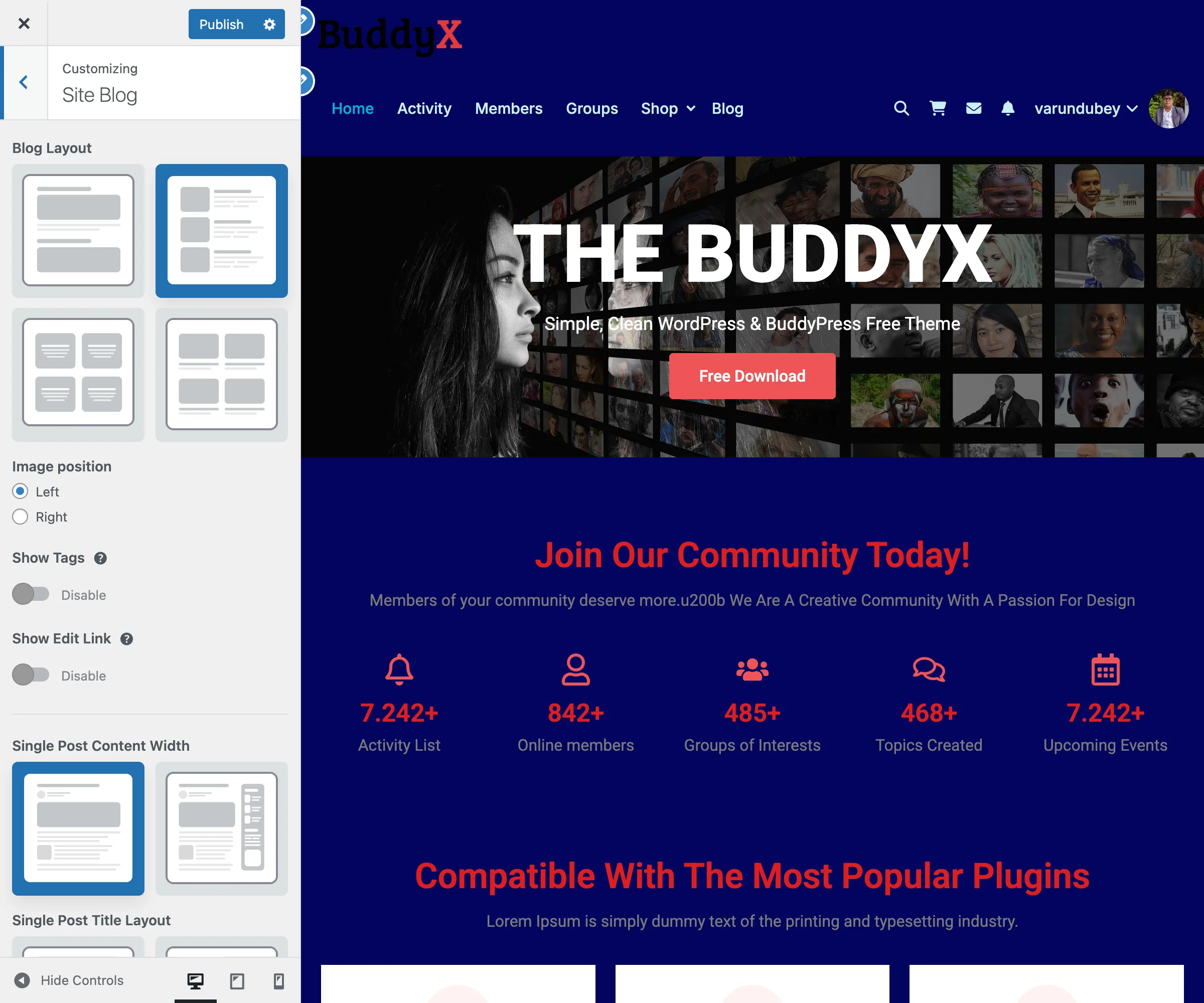
Accessing Color Settings

  1. Go to Appearance > Customize
  2. Navigate to Skin > Color Scheme

Primary Color Settings

The primary color is used throughout your site for buttons, links, accents, and interactive elements.

Primary Color

Setting Description Default
Primary Color Main brand color #4267B2
Primary Hover Color Hover state for primary elements Darkened primary

Where Primary Color Appears:

  • Buttons and call-to-action elements
  • Links (text and menu items)
  • Active/selected states
  • Progress bars and indicators
  • Form focus states
  • Navigation underlines
  • BuddyPress accent elements

Secondary Color

Setting Description Default
Secondary Color Supporting brand color #03A9F4
Secondary Hover Color Hover state for secondary elements Darkened secondary

Where Secondary Color Appears:

  • Secondary buttons
  • Alternative link colors
  • Accent elements
  • Badges and tags
  • Alternate hover states

Background Colors

Site Background

Setting Description Default
Site Background Color Main body background #f5f5f5
Site Background Image Optional background image None
Background Repeat Image repeat behavior No Repeat
Background Position Image positioning Center Center
Background Size Image sizing (Cover, Contain, Auto) Cover
Background Attachment Fixed or scroll with page Scroll

Content Background

Setting Description Default
Content Background Post/page content area #ffffff
Content Border Border around content areas Transparent

Header Background

Setting Description Default
Header Background Header area color #ffffff
Header Text Color Text/icon color in header #333333
Header Link Color Navigation link color #333333
Header Link Hover Navigation hover color Primary color

Footer Background

Setting Description Default
Footer Background Footer area color #222222
Footer Text Color Footer text color #aaaaaa
Footer Link Color Footer link color #ffffff
Footer Link Hover Footer link hover Primary color

Text Colors

Body Text

Setting Description Default
Body Text Color Paragraph and general text #333333
Heading Color H1-H6 headings #222222
Link Color Text links Primary color
Link Hover Color Link hover state Primary hover

Meta Text

Setting Description Default
Meta Text Color Post meta, dates, etc. #666666
Muted Text Color Secondary/helper text #999999

Component Colors

Buttons

Setting Description Default
Button Background Default button background Primary color
Button Text Button text color #ffffff
Button Hover Background Hover state background Primary hover
Button Hover Text Hover state text #ffffff

Forms

Setting Description Default
Input Background Form field background #ffffff
Input Border Form field border #dddddd
Input Text Form field text #333333
Input Focus Border Focus state border Primary color

Sidebar/Widgets

Setting Description Default
Widget Background Widget container background #ffffff
Widget Title Color Widget heading color Heading color
Widget Text Color Widget content text Body text

Color Presets

BuddyX Pro includes several pre-designed color schemes for quick setup. Here's what different presets look like when applied:

Dark Mode Preset

Site Skin - Dark Mode Applied The Legacy Dark preset creates a dark header and inverted color palette

Ocean Blue Preset

Site Skin - Ocean Blue Applied The Ocean Blue preset applies blue accent colors throughout the site

Available Presets

Preset Primary Secondary Style
Default Blue #4267B2 #03A9F4 Professional
Fresh Green #28a745 #20c997 Natural
Warm Orange #fd7e14 #ffc107 Energetic
Royal Purple #6f42c1 #e83e8c Creative
Modern Teal #20c997 #17a2b8 Contemporary
Classic Red #dc3545 #fd7e14 Bold
Dark Theme #2c3e50 #3498db Professional
Light Minimal #333333 #666666 Clean

Applying a Preset:

  1. Open Skin > Color Presets in Customizer
  2. Click on desired preset thumbnail
  3. Colors update automatically
  4. Customize individual colors as needed
  5. Publish changes

Color Application Examples

Example 1: Corporate Brand

Primary Color: #003366 (Navy Blue)
Secondary Color: #CC9900 (Gold)
Site Background: #F8F9FA
Content Background: #FFFFFF
Text Color: #333333

Example 2: Community Platform

Primary Color: #5C6BC0 (Indigo)
Secondary Color: #26A69A (Teal)
Site Background: #ECEFF1
Header Background: #FFFFFF
Footer Background: #37474F

Example 3: E-Learning Site

Primary Color: #43A047 (Green)
Secondary Color: #FB8C00 (Orange)
Site Background: #FAFAFA
Content Background: #FFFFFF
Link Color: #1B5E20

Color Accessibility

Ensure your color choices meet accessibility standards:

Contrast Ratios (WCAG 2.1)

Text Type Minimum Ratio Recommended
Normal Text 4.5:1 7:1
Large Text (18px+) 3:1 4.5:1
UI Components 3:1 4.5:1

Tools for Checking Contrast:

Color Blindness Considerations

  • Don't rely solely on color to convey information
  • Use icons or text alongside color indicators
  • Test with color blindness simulation tools
  • Ensure sufficient contrast for all users

Dynamic CSS Generation

BuddyX Pro generates optimized CSS based on your color settings:

Performance Features:

  • CSS is generated only when colors change
  • Cached in WordPress transients
  • Minified for production
  • Only includes rules for active features

Cache Clearing: After changing colors, the theme automatically:

  1. Generates new dynamic CSS
  2. Clears transient cache
  3. Applies new styles site-wide

If colors don't update immediately:

  1. Clear browser cache
  2. Clear any caching plugin
  3. Purge CDN cache if applicable

Troubleshooting

Colors Not Applying

Problem: Changed colors don't appear on frontend.

Solutions:

  1. Click "Publish" in Customizer (changes aren't saved until published)
  2. Clear browser cache (Ctrl+F5 / Cmd+Shift+R)
  3. Disable caching plugins temporarily
  4. Check for custom CSS overriding theme styles

Colors Look Different Than Picker

Problem: Selected color looks different on the site.

Solutions:

  1. Monitor color calibration may differ
  2. Check if transparency/opacity is applied
  3. Verify no color filters in browser extensions
  4. Compare in multiple browsers

Preset Doesn't Apply Completely

Problem: Color preset doesn't change all elements.

Solutions:

  1. Some elements may have custom overrides
  2. Check plugin-specific color settings
  3. Clear all caches after applying preset
  4. Some colors may need manual adjustment

Dark Mode Colors Conflicting

Problem: Colors look wrong when dark mode is active.

Solutions:

  1. Configure dark mode specific colors
  2. Check Dark Mode Settings
  3. Some colors auto-invert, others need manual setting
  4. Test both light and dark modes after changes

Related Documentation


Need Help?

Dark Mode

Let visitors switch between light and dark color schemes.


Enable Dark Mode

Dark Mode Settings

  1. Appearance > Customize > Skin
  2. Toggle Enable Dark Mode to Yes
  3. Click Publish

A sun/moon toggle icon appears in your header.


Set Default Mode

Choose how your site loads for first-time visitors:

Option Behavior
Light Site loads with light colors (most common)
Dark Site loads in dark mode
Match System Follows visitor's device preference

Customize Dark Mode Colors

Background Colors

Customize > Site Skin > Dark Mode Colors

Setting Recommendation
Site Background Deep navy (#1a1a2e)
Content Areas Dark blue-gray (#16213e)

Avoid: Pure black (#000000) - too harsh

Text Colors

Setting Recommendation
Body Text Light gray (#e0e0e0)
Headings White or off-white

Avoid: Pure white (#ffffff) for body text - causes eye strain


Dark Mode Logo

If your logo has dark colors that won't show on dark backgrounds:

  1. Appearance > Customize > Site Identity
  2. Upload Dark Mode Logo
  3. Use light-colored version of your logo
  4. Keep same dimensions as regular logo

How It Works

For Visitors

  • Toggle icon in header (sun = dark mode on, moon = light mode on)
  • Click to switch
  • Preference saved in browser
  • Returns to their choice on next visit

What Changes

Element Light Mode Dark Mode
Background Light/white Dark navy/gray
Text Dark gray Light gray
Cards White Dark gray
Buttons Primary color Adjusted for dark
Logo Regular logo Dark mode logo

Preview

Light Mode:

Light Mode

Dark Mode:

Dark Mode Applied


Plugin Compatibility

Dark mode automatically applies to:

  • BuddyPress/BuddyBoss (activity, profiles, groups)
  • WooCommerce (shop, cart, checkout)
  • LearnDash (courses, lessons)
  • bbPress (forums)

Common Questions

Can I hide the toggle? No built-in option, but you can use CSS:

.dark-mode-toggle { display: none; }

Does it slow down my site? No, color switching is instant with no performance impact.

Do I need a dark logo? Only if your regular logo is dark-colored.


Related


Need Help? support@wbcomdesigns.com

Blog Settings

Blog archive, single post, and post element controls.

Blog Archive Layout

Control how your blog posts appear on your main blog page, category pages, and archive pages. Choose from four different layouts and customize how posts are displayed.

Site Blog Panel The Site Blog panel in the WordPress Customizer showing layout options, image position, and post element controls

What You Can Do

With BuddyX Pro's blog archive settings, you can:

  • Choose from 4 different blog layouts (Default, List, Grid, Masonry)
  • Control how many posts appear per page
  • Show excerpt or full content on archive pages
  • Configure featured image sizes and positions
  • Display post metadata (date, author, categories)
  • Add tag badges to posts
  • Show or hide specific post elements

Choosing Your Blog Layout

Step 1: Access Blog Settings

  1. Go to Appearance > Customize
  2. Click on Blog
  3. Find the Blog Archive Layout section

Step 2: Select a Layout

BuddyX Pro offers four distinct blog layouts:

Layout Best For Description
Default Traditional blogs Classic single-column layout with featured images
List News/magazine sites Horizontal layout with thumbnail on left or right
Grid Portfolio/visual blogs Card-based grid with 1 or 2 columns
Masonry Image-heavy blogs Pinterest-style staggered grid

Layout Previews

Default Layout:

Default Blog Layout Default blog layout - classic single-column with featured images above titles
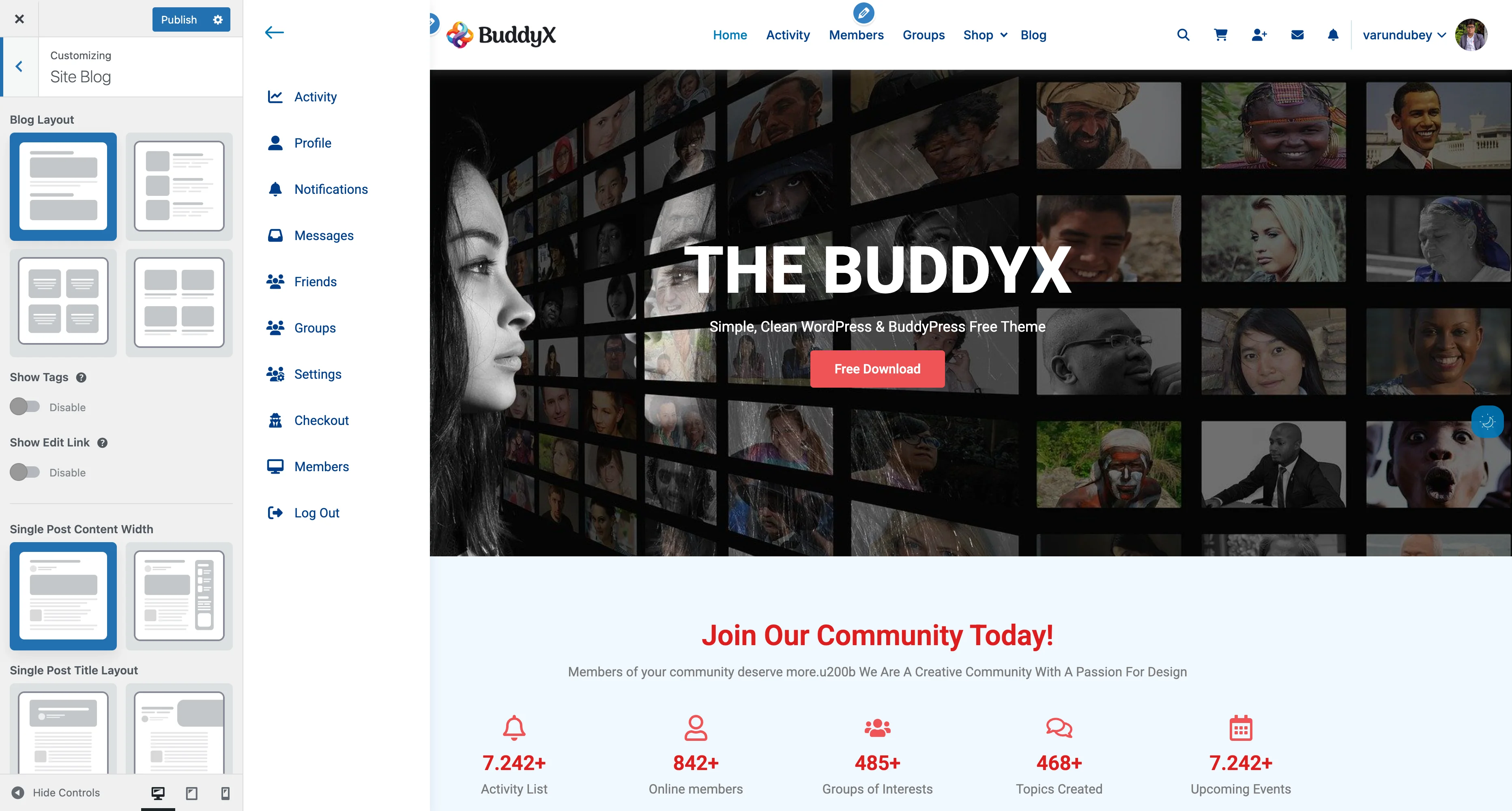
┌────────────────────────────────────┐
│  ┌────────────────────────────┐   │
│  │    Featured Image          │   │
│  └────────────────────────────┘   │
│  Blog Post Title                   │
│  Meta: Date | Author | Categories  │
│  Post excerpt text here...         │
│  [Read More]                       │
├────────────────────────────────────┤
│  ┌────────────────────────────┐   │
│  │    Featured Image          │   │
│  └────────────────────────────┘   │
│  Blog Post Title                   │
│  Meta: Date | Author | Categories  │
│  Post excerpt text here...         │
│  [Read More]                       │
└────────────────────────────────────┘

List Layout:

┌────────────────────────────────────┐
│  ┌──────┐                          │
│  │Image │  Blog Post Title         │
│  │      │  Date | Author           │
│  └──────┘  Excerpt text...         │
│            [Read More]             │
├────────────────────────────────────┤
│  ┌──────┐                          │
│  │Image │  Blog Post Title         │
│  │      │  Date | Author           │
│  └──────┘  Excerpt text...         │
│            [Read More]             │
└────────────────────────────────────┘

Grid Layout (2 Columns):

Grid Blog Layout Grid layout - card-based 2-column design with consistent heights
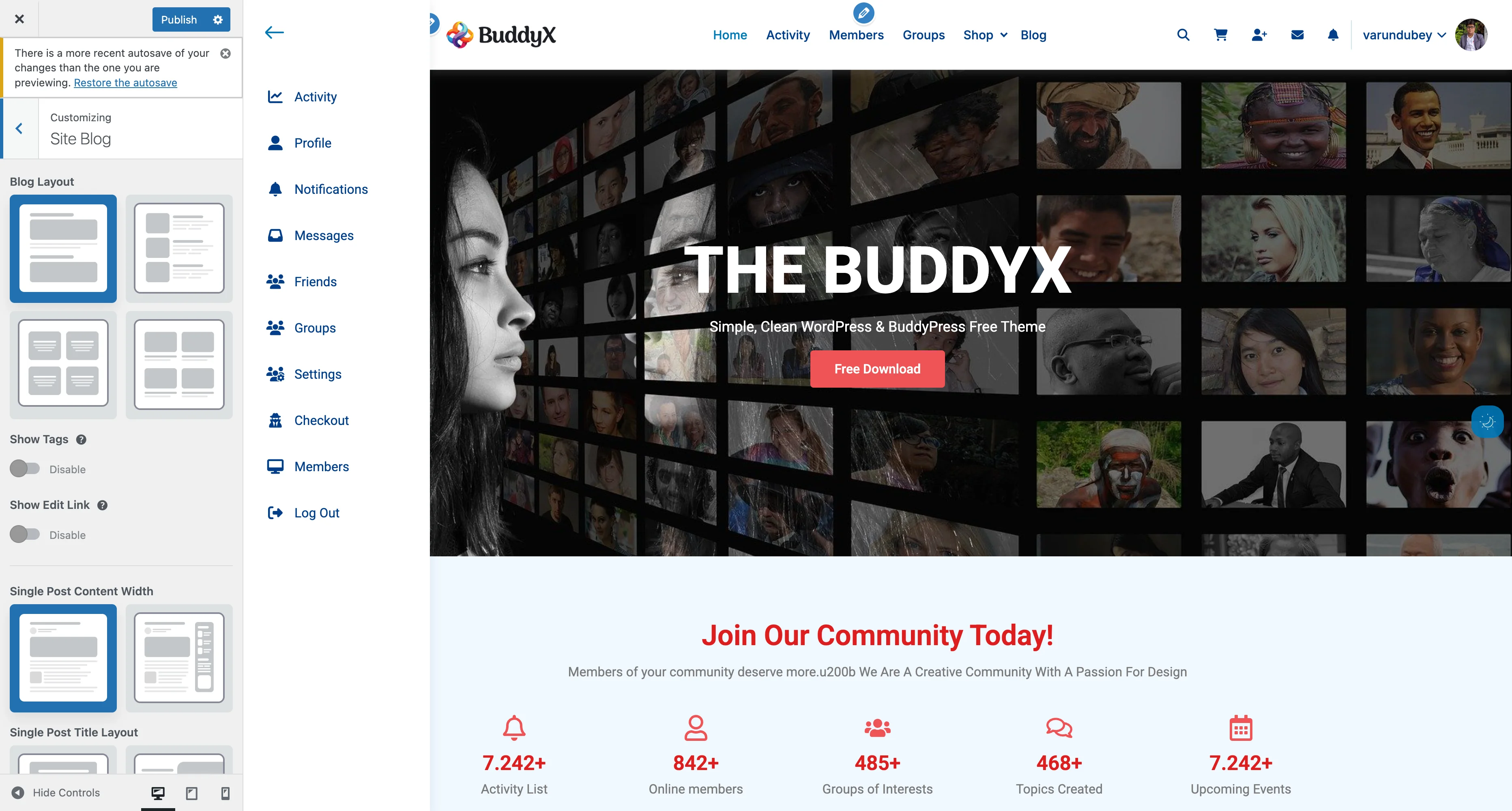
┌──────────────────┬──────────────────┐
│ ┌──────────────┐ │ ┌──────────────┐ │
│ │Featured Image│ │ │Featured Image│ │
│ └──────────────┘ │ └──────────────┘ │
│ Post Title       │ │ Post Title       │
│ Date | Author    │ │ Date | Author    │
│ Excerpt...       │ │ Excerpt...       │
│ [Read More]      │ │ [Read More]      │
├──────────────────┼──────────────────┤
│ ┌──────────────┐ │ ┌──────────────┐ │
│ │Featured Image│ │ │Featured Image│ │
│ └──────────────┘ │ └──────────────┘ │
│ Post Title       │ │ Post Title       │
│ Date | Author    │ │ Date | Author    │
│ Excerpt...       │ │ Excerpt...       │
│ [Read More]      │ │ [Read More]      │
└──────────────────┴──────────────────┘

Masonry Layout:

Masonry Blog Layout Masonry layout - Pinterest-style staggered grid with variable heights
┌──────────────┬──────────────┬──────────────┐
│ ┌──────────┐ │ ┌──────────┐ │ ┌──────────┐ │
│ │  Image   │ │ │  Image   │ │ │  Image   │ │
│ │          │ │ │  (tall)  │ │ │          │ │
│ └──────────┘ │ │          │ │ └──────────┘ │
│ Title        │ │          │ │ Title        │
│ Excerpt...   │ │          │ │ Excerpt...   │
│              │ │          │ │              │
├──────────────┤ └──────────┘ ├──────────────┤
│ ┌──────────┐ │ Title        │ ┌──────────┐ │
│ │  Image   │ │ Excerpt...   │ │  Image   │ │
│ │  (tall)  │ │              │ │          │ │
│ │          │ ├──────────────┤ └──────────┘ │
│ │          │ │ ┌──────────┐ │ Title        │
│ │          │ │ │  Image   │ │ Excerpt...   │
│ └──────────┘ │ │          │ │              │
│ Title        │ │ └──────────┘│              │
└──────────────┴──────────────┴──────────────┘

Layout-Specific Options

List Layout Settings

When you select List Layout, additional options appear:

Image Position:

Option Description Best For
Left Thumbnail on left, content on right Most common reading pattern
Right Thumbnail on right, content on left Alternative visual style

Grid Layout Settings

When you select Grid Layout, additional options appear:

Grid Columns:

Option Description Best For
One Column Single-column grid Mobile-first design, simple blogs
Two Columns Two-column grid Maximum visual impact, galleries

Masonry Layout Settings

When you select Masonry Layout, additional options appear:

Masonry View:

Option Description
Without Masonry Regular grid without staggered heights
With Masonry True Pinterest-style with staggered heights

Posts Per Row:

Option Description Best For
Two 2 posts per row Larger images, more focus per post
Three 3 posts per row More posts visible, magazine style

Posts Per Page

Control how many blog posts appear before pagination:

  1. Go to Settings > Reading
  2. Find Blog pages show at most
  3. Enter number of posts (default: 10)
  4. Click Save Changes

Recommendations by Layout:

Layout Recommended Count Why
Default 8-10 posts Good scroll depth without overwhelming
List 10-15 posts Compact format allows more posts
Grid (2 col) 6, 8, 10 posts Even numbers look best
Masonry 9, 12, 15 posts Multiples of 3 create balanced grids

Content Display Options

Excerpt vs Full Content

Choose what content visitors see on archive pages:

  1. Go to Appearance > Customize
  2. Navigate to Blog > Archive Settings
  3. Find Post Content setting
Option What It Shows Best For
Excerpt Short summary (usually first 55 words) Faster page loads, cleaner layout
Full Content Complete post text Long-form sites, single-topic posts

Excerpt Length

If using excerpts, customize the length:

Setting: Excerpt Length Default: 55 words Range: 10-100 words

Guidelines:

  • Short (10-30 words): Visual-heavy blogs, card layouts
  • Medium (40-60 words): Balanced approach, most blogs
  • Long (70-100 words): Content-rich sites, news portals

Featured Images

Control how featured images appear on archive pages:

Image Display

Setting Options Description
Show Featured Images Yes / No Display featured images on blog archives
Image Size Thumbnail, Medium, Large, Full Image dimensions
Image Position Above Title, Below Title Where image appears

Image Settings by Layout

Default Layout:

  • Recommended size: Large (1024px width)
  • Aspect ratio: 16:9 or 3:2
  • Position: Above title

List Layout:

  • Recommended size: Medium (300px width)
  • Aspect ratio: Square (1:1) or 4:3
  • Position: Side of content

Grid/Masonry Layout:

  • Recommended size: Medium-Large (600px width)
  • Aspect ratio: Flexible (masonry) or consistent (grid)
  • Position: Above title

Post Elements

Control what information appears on each post:

Post Meta Display

Show or hide these elements:

Element Setting Name Default Description
Post Date Show Post Date On When post was published
Author Name Show Author On Post author with avatar
Categories Show Categories On Post categories
Tags Show Tags Off Post tags
Comment Count Show Comment Count On Number of comments
Reading Time Show Reading Time Off Estimated read time

Tags Display Options

When Show Tags is enabled:

Tag Style:

Style Appearance Best For
Default Plain text links Minimal, clean design
Badge Tags with colored background Visual emphasis, modern look
Underline Tags with bottom border Subtle highlighting

Additional Archive Options

Show Edit Link

Setting: Show Edit Link Default: Off Who sees it: Logged-in users with edit permissions

Shows an "Edit" link on posts for administrators and editors. Useful for managing content directly from the frontend.

Read More Button

Customize the "Read More" button:

Setting Options Default
Show Read More Yes / No Yes
Button Text Custom text "Read More"
Button Style Text link, Button, Arrow Button

Recommended Blog Layouts by Site Type

Magazine / News Site

Layout: Grid (2 columns) or Masonry (3 per row) Posts per page: 9-12 Content: Excerpt (30-40 words) Featured images: Medium-Large, consistent aspect ratio Meta display: Date, Categories, Tags (Badge style) Best for: High volume content, visual storytelling

Personal Blog

Layout: Default Posts per page: 5-8 Content: Excerpt (50-60 words) Featured images: Large, above title Meta display: Date, Author, Comment count Best for: Long-form writing, personal stories

Corporate / Business Blog

Layout: List (Image on left) Posts per page: 8-10 Content: Excerpt (40-50 words) Featured images: Medium, square format Meta display: Date, Author, Categories Best for: Professional content, thought leadership

Portfolio / Photography

Layout: Masonry (2 per row, with masonry) Posts per page: 6-9 Content: Excerpt (20-30 words) Featured images: Large, variable aspect ratios Meta display: Minimal (Date only) Best for: Visual showcase, image galleries

E-Learning / Tutorial Site

Layout: Grid (2 columns) Posts per page: 6-8 Content: Excerpt (50-60 words) Featured images: Medium-Large, 16:9 ratio Meta display: Date, Author, Reading time, Categories Best for: Educational content, course previews

Common Questions

Why aren't my layout changes showing?

Check these:

  1. Click Publish in the customizer
  2. Clear your browser cache (Ctrl+F5 or Cmd+Shift+R)
  3. Clear any caching plugins (WP Super Cache, W3 Total Cache)
  4. Check if a child theme is overriding templates

Can I use different layouts for different categories?

Not directly through the customizer, but you can:

  1. Use category-specific templates in a child theme
  2. Add custom CSS to target specific category pages
  3. Use a page builder plugin for custom category archives

My masonry layout isn't working properly.

Common fixes:

  1. Ensure JavaScript is enabled
  2. Check for JavaScript console errors
  3. Verify all images have proper dimensions
  4. Clear cache and reload the page
  5. Try "Without Masonry" option first, then enable

How do I change the number of posts per page?

Go to Settings > Reading (not in the Customizer). This is a WordPress core setting that affects all archive pages.

Featured images are different sizes in masonry layout - is this normal?

Yes! Masonry layout is designed to accommodate varying image heights. If you want uniform heights, use Grid layout instead or select "Without Masonry" option.

Can I show full posts on the homepage but excerpts on category pages?

This requires custom coding. By default, WordPress uses the same setting for all archives. Consider:

  1. Using a child theme with custom templates
  2. Installing a plugin like "Display Posts" for custom loops
  3. Hiring a developer for custom functionality

The excerpt is cutting off mid-sentence.

This is normal WordPress behavior. To fix:

  1. Manually add excerpt in post editor (WordPress will use that instead)
  2. Increase excerpt length in customizer
  3. Use a plugin like "Advanced Excerpt" for smarter cutting

How do I remove the "Read More" button completely?

  1. Go to Appearance > Customize > Blog
  2. Find Show Read More Button
  3. Set to No
  4. Click Publish

Performance Tips

Optimizing Blog Archives

For Faster Loading:

  • Use excerpts instead of full content
  • Set posts per page to 6-10 (not 20+)
  • Optimize featured images (compress before upload)
  • Use lazy loading for images
  • Enable caching plugins

For Better User Experience:

  • Keep excerpt length 40-60 words
  • Always include featured images
  • Show relevant meta (date, author, categories)
  • Use clear "Read More" calls to action
  • Test on mobile devices

Image Optimization by Layout

Layout Recommended Image Size File Size Target
Default 1200×675px Under 150KB
List 400×400px Under 50KB
Grid 800×600px Under 100KB
Masonry 800×variable Under 120KB

Related Settings


Need Help?

Post Elements & Meta

Control what information appears on your blog posts, including date, author, categories, tags, reading time, and more. Customize how these elements look and where they appear.

Blog Post Settings Post meta and element configuration in the Customizer

What You Can Do

With BuddyX Pro's post element settings, you can:

  • Show or hide post metadata (date, author, categories, tags)
  • Add reading time estimates
  • Display comment counts
  • Configure edit links for administrators
  • Customize tag display styles
  • Choose which elements appear on archives vs single posts
  • Control element positioning and styling

Accessing Post Element Settings

  1. Go to Appearance > Customize
  2. Click on Blog
  3. Settings are split between:
    • Blog Archive section (for blog listings)
    • Single Post section (for individual posts)
    • Post Meta section (element-specific controls)

Post Meta Elements

Post Date

Setting: Show Post Date Default: On Locations: Blog archives, single posts

Shows when the post was published.

Display Formats:

Format Example Code
Default January 29, 2026 F j, Y
Short Jan 29, 2026 M j, Y
Numeric 01/29/2026 m/d/Y
Relative 3 days ago Custom
Time ago 2 hours ago Custom

Changing Date Format:

  1. Go to Settings > General
  2. Find Date Format
  3. Select format or enter custom
  4. Save changes

Custom Format Examples:

  • F j, Y → January 29, 2026
  • M d, Y → Jan 29, 2026
  • Y-m-d → 2026-01-29
  • d/m/Y → 29/01/2026

Author Information

Setting: Show Author Default: On Locations: Blog archives, single posts

Displays the post author's name and optionally their avatar.

What's Shown:

  • Author display name
  • Author avatar (if enabled)
  • Link to author archive page

Author Display Options:

Option Description Shows
Name Only Text link "By Sarah Johnson"
Avatar + Name Image + text [Avatar] Sarah Johnson
Avatar Only Just the image [Avatar]

Configuring Author Info:

  1. Go to Users > Your Profile
  2. Set Display name publicly as
  3. Update Biographical Info (for author box)
  4. Upload Profile Picture via Gravatar
  5. Save changes

Avatar Sizes:

  • Archive pages: 32×32px (small)
  • Single posts: 64×64px (medium)
  • Author bio box: 120×120px (large)

Categories

Setting: Show Categories Default: On Locations: Blog archives, single posts

Displays post categories as clickable links.

Display Styles:

Style Appearance Best For
Default Plain text links Clean, minimal design
Badge Colored background boxes Modern, visual emphasis
Pills Rounded background boxes Friendly, approachable
Underline Text with bottom border Subtle, professional

Category Prefix:

  • Can show "in" before categories ("in Technology, News")
  • Or show icon (folder icon or similar)
  • Or no prefix (just the category names)

Tags

Setting: Show Tags Default: Off (on archives), On (on single posts) Locations: Blog archives, single posts

Displays post tags as clickable links.

Tag Display Styles:

Style Appearance Example
Default Plain text links wordpress, tutorial, beginner
Badge Colored backgrounds [wordpress] [tutorial] [beginner]
Underline Underlined links wordpress, tutorial, beginner
Hash With # prefix #wordpress #tutorial #beginner

When to Show Tags:

On Archives:

  • Show if: Visual/magazine sites, topic discovery important
  • Hide if: Cluttered design, too many tags per post

On Single Posts:

  • Show: Almost always (helps with related content, SEO)
  • Position: Bottom of post content (standard)

Comment Count

Setting: Show Comment Count Default: On Locations: Blog archives, single posts

Displays number of comments on the post.

Display Formats:

Format Zero Comments One Comment Multiple
Default 0 Comments 1 Comment 12 Comments
Short 0 1 12
Icon 💬 0 💬 1 💬 12
Hidden if zero (nothing) 1 Comment 12 Comments

Why Show Comment Counts:

  • Indicates popular content
  • Encourages engagement
  • Social proof
  • Community activity signal

Consider Hiding If:

  • Comments are disabled
  • Very few comments (looks inactive)
  • Minimalist design preference

Reading Time

Setting: Show Reading Time Default: Off Locations: Blog archives, single posts

Displays estimated time to read the post.

How It's Calculated:

  • Average reading speed: 200-250 words per minute
  • Counts all text in post content
  • Rounds to nearest minute

Display Examples:

  • "5 min read"
  • "12 minute read"
  • "Quick read (2 min)"
  • "☕ 8 min"

Benefits:

  • Helps readers plan their time
  • Increases engagement (commitment)
  • Professional appearance
  • Good for long-form content

Best For:

  • Tutorial sites
  • Educational blogs
  • Long-form journalism
  • Professional blogs

Skip For:

  • Very short posts (< 3 min)
  • Image-heavy posts
  • Video content posts

Edit Link

Setting: Show Edit Link Default: Off Locations: Blog archives, single posts

Shows "Edit" link for users with editing permissions.

Who Sees It:

  • Administrators (can edit all posts)
  • Editors (can edit all posts)
  • Authors (can edit own posts)
  • Contributors (can edit own unpublished posts)

When to Enable:

  • Multi-author blogs
  • Client sites (easy access)
  • Content teams
  • Quick frontend editing needed

When to Disable:

  • Single-author blogs
  • Clean public appearance
  • Edit only from admin dashboard

Meta Element Positioning

Control where post meta appears:

Archive Pages

Above Title:

┌─────────────────────────────────────┐
│  Category Badge | 5 min read         │
│  ----------------------------------- │
│  Post Title Here                     │
│  By Author | Jan 29, 2026 | 12 Comments
│                                      │
│  [Featured Image]                    │
│  Post excerpt text...                │
└─────────────────────────────────────┘

Below Title:

┌─────────────────────────────────────┐
│  Post Title Here                     │
│  By Author | Jan 29, 2026 | 12 Comments
│  Category Badge | 5 min read         │
│  ----------------------------------- │
│  [Featured Image]                    │
│  Post excerpt text...                │
└─────────────────────────────────────┘

Below Excerpt:

┌─────────────────────────────────────┐
│  Post Title Here                     │
│  [Featured Image]                    │
│  Post excerpt text...                │
│  ----------------------------------- │
│  By Author | Jan 29, 2026           │
│  Category Badge | 5 min read | 12 Comments
└─────────────────────────────────────┘

Single Post Pages

Above Content:

┌─────────────────────────────────────┐
│        Post Title Here               │
│  By Author | Jan 29, 2026           │
│  Category Badge | 8 min read | 23 Comments
│  ----------------------------------- │
│  [Featured Image]                    │
│                                      │
│  Post content starts here...         │
└─────────────────────────────────────┘

After Featured Image:

┌─────────────────────────────────────┐
│        Post Title Here               │
│  [Featured Image]                    │
│  ----------------------------------- │
│  By Author | Jan 29, 2026           │
│  Category Badge | 8 min read | 23 Comments
│                                      │
│  Post content starts here...         │
└─────────────────────────────────────┘

Separator Styles

Control how meta elements are separated:

Style Example Best For
**Pipe ( )** Author | Date | Comments
Dot (•) Author • Date • Comments Modern, subtle
Slash (/) Author / Date / Comments Casual, friendly
Comma (,) Author, Date, Comments Compact, simple
None Author Date Comments Minimal, spacious

Icon Options

Add icons to meta elements:

Element Icon Options Example
Date Calendar, Clock, None 📅 Jan 29, 2026
Author User icon, Avatar, None 👤 Sarah Johnson
Categories Folder, Tag, None 📁 Technology
Tags Tag, Hash, None 🏷️ wordpress
Comments Speech bubble, Number, None 💬 12 Comments
Reading Time Clock, Book, Coffee, None ☕ 5 min read

Icon Styles:

  • Icon Font (Font Awesome, Dashicons)
  • SVG (scalable, crisp)
  • Emoji (universal, fun)
  • Image (custom, branded)

Meta Element Recommendations by Site Type

Magazine / News Site

Show:

  • ✅ Post Date (prominent)
  • ✅ Author (with avatar)
  • ✅ Categories (badge style)
  • ✅ Comment Count
  • ✅ Reading Time
  • ❌ Tags (too cluttered on archives)

Position: Above title or below title Separator: Dot (•) Icons: Yes, subtle

Personal Blog

Show:

  • ✅ Post Date
  • ✅ Author (your name)
  • ✅ Categories (text links)
  • ✅ Tags (on single posts)
  • ✅ Comment Count
  • ❌ Reading Time (unless long-form)

Position: Below title Separator: Pipe (|) Icons: Optional

Corporate / Business Blog

Show:

  • ✅ Post Date
  • ✅ Author (builds authority)
  • ✅ Categories (professional style)
  • ✅ Reading Time (respects user time)
  • ⚠️ Comment Count (if active)
  • ❌ Tags (usually not needed)

Position: Below title Separator: Pipe (|) Icons: Minimal or none

Portfolio / Photography

Show:

  • ✅ Post Date (small, subtle)
  • ⚠️ Author (only if multiple)
  • ❌ Categories (minimal design)
  • ❌ Comment Count (distraction)
  • ❌ Reading Time (visual focus)
  • ❌ Tags (cluttered)

Position: Bottom of post Separator: None Icons: None

Tutorial / Educational Site

Show:

  • ✅ Post Date (content freshness)
  • ✅ Author (instructor credentials)
  • ✅ Categories (topic organization)
  • ✅ Tags (on single posts)
  • ✅ Reading Time (learning commitment)
  • ✅ Comment Count (student questions)

Position: Above content Separator: Pipe (|) Icons: Yes, helpful

Customizing Meta Display with CSS

Hide Specific Elements

/* Hide date on mobile */
@media (max-width: 767px) {
    .entry-meta .posted-on {
        display: none;
    }
}

/* Hide comment count on archives */
.blog .entry-meta .comments-link {
    display: none;
}

/* Hide author on single posts */
.single-post .entry-meta .author {
    display: none;
}

Style Meta Elements

/* Make date bold */
.entry-meta .posted-on {
    font-weight: 700;
}

/* Add background to author */
.entry-meta .author {
    background: #f5f5f5;
    padding: 4px 10px;
    border-radius: 4px;
}

/* Change separator color */
.entry-meta .sep {
    color: #ccc;
}

/* Uppercase categories */
.entry-meta .category-links a {
    text-transform: uppercase;
    font-size: 0.85em;
    letter-spacing: 0.05em;
}

Responsive Adjustments

/* Stack meta on mobile */
@media (max-width: 767px) {
    .entry-meta {
        display: flex;
        flex-direction: column;
        gap: 8px;
    }

    .entry-meta .sep {
        display: none;
    }
}

Common Questions

Why isn't my reading time showing?

Check these:

  1. Setting enabled: Customizer > Blog > Show Reading Time = Yes
  2. Sufficient content: Post must have 100+ words
  3. Cache cleared: Clear site and browser cache
  4. Theme support: Verify theme includes this feature
  5. Plugin conflicts: Disable reading time plugins

Can I show different meta on archives vs single posts?

Yes! Settings are usually separated:

  • Blog Archive Settings → controls meta on blog listings
  • Single Post Settings → controls meta on individual posts

You can enable categories on archives but hide them on single posts, or vice versa.

How do I change the date format?

  1. Go to Settings > General
  2. Find Date Format section
  3. Choose preset or enter custom format
  4. Click Save Changes

This is a WordPress core setting affecting all dates site-wide.

My categories show numbers in parentheses (5). How do I remove them?

Those are post counts. To remove:

  1. Check theme settings for "Show Category Count"
  2. Or add CSS: .cat-links .count { display: none; }
  3. Or use a child theme to modify the template

Can I add custom meta (like "Updated Date")?

Yes, but requires custom code:

  1. Add custom field to posts
  2. Use child theme to display in template
  3. Or use a plugin like "Advanced Custom Fields"
  4. Or hire a developer for custom functionality

Tags are showing but I want to hide them on mobile.

Add this CSS in Customizer > Additional CSS:

@media (max-width: 767px) {
    .entry-meta .tags-links {
        display: none;
    }
}

How do I reorder the meta elements?

This requires template editing:

  1. Create a child theme
  2. Copy the post template file
  3. Reorder the meta output functions
  4. Or use a plugin like "Post Meta Data Manager"

The author link goes to a 404 page.

This happens when the author has no published posts. To fix:

  1. Ensure author has at least one published post
  2. Check permalink settings (Settings > Permalinks, click Save)
  3. Consider removing link: CSS .author a { pointer-events: none; }

Can I show post views instead of comments?

Not built into WordPress core. You'll need:

  1. Post views tracking plugin (e.g., "Post Views Counter")
  2. Custom code to display view count in meta
  3. Or all-in-one plugin like "WP-PostViews"

Accessibility Considerations

Screen Reader Friendly

Ensure meta is accessible:

Do:

  • Use semantic HTML (<time> for dates, <address> for authors)
  • Add descriptive labels ("Published on", "Written by")
  • Ensure sufficient color contrast
  • Make links keyboard accessible

Avoid:

  • Icon-only meta (no text)
  • Decorative separators that are read aloud
  • Extremely small font sizes
  • Relying only on color to convey meaning

ARIA Labels

<!-- Good example -->
<time datetime="2026-01-29" aria-label="Published January 29, 2026">
    Jan 29, 2026
</time>

<span class="author" aria-label="Written by">
    By <a href="/author/sarah">Sarah Johnson</a>
</span>

Performance Tips

Optimizing Meta Display

For Speed:

  • Minimize database queries (cache author data)
  • Use CSS sprites for icons
  • Lazy load author avatars
  • Cache category/tag lists
  • Avoid external icon fonts (use SVG or system fonts)

For Better UX:

  • Keep meta concise (5-6 elements max)
  • Use clear labels
  • Ensure mobile readability
  • Make all links tappable (44×44px minimum)
  • Test with real content (long author names, many categories)

Related Settings


Need Help?

Single Post Layout

Customize how individual blog posts appear when visitors click to read them. Control the header design, featured image placement, author information, and related content.

Site Blog Panel The Site Blog panel in the WordPress Customizer showing single post layout options and reading progress bar settings

What You Can Do

With BuddyX Pro's single post settings, you can:

  • Choose from 4 different title and image layouts
  • Set content width for optimal reading
  • Add a reading progress bar
  • Display author bio at the end of posts
  • Show related posts to keep visitors engaged
  • Configure post navigation (previous/next links)
  • Add social sharing buttons
  • Customize post meta display

Accessing Single Post Settings

  1. Go to Appearance > Customize
  2. Click on Blog
  3. Find the Single Post Settings section

Post Title Layouts

Choose how the post title and featured image appear at the top of your posts:

Single Post Title Layout 1 Title Over Image layout - title overlaid on featured image with dark overlay
Single Post Title Layout 2 Title Above Image layout - traditional style with title, then featured image below
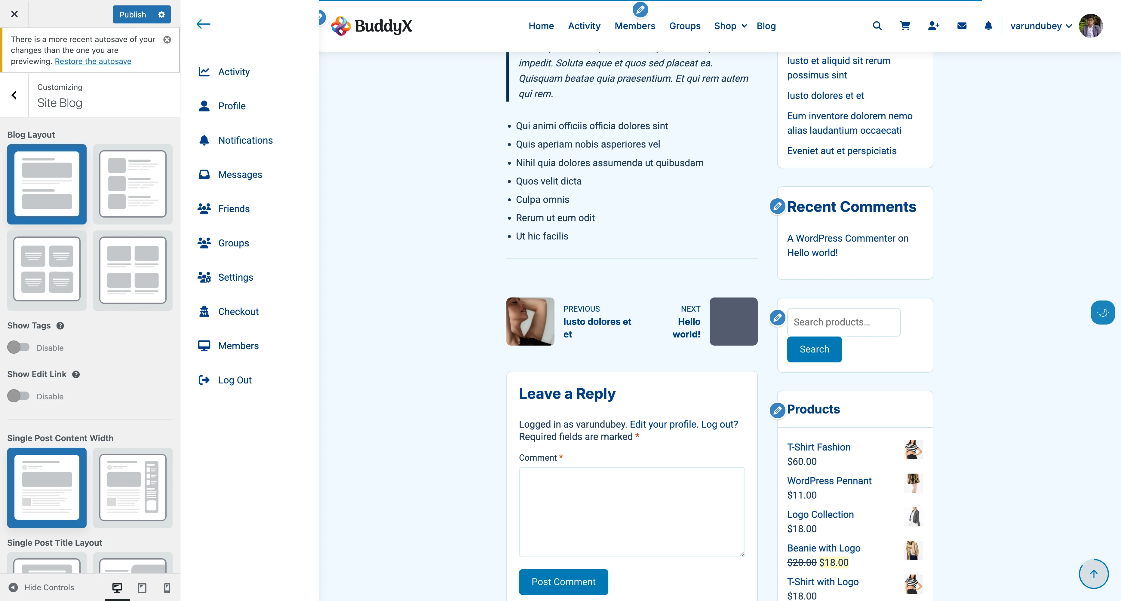
Available Layouts

Layout Description Best For
Title Over Image Title overlaid on featured image Hero-style posts, dramatic effect
Half & Half Split screen: image on one side, title on other Modern design, visual impact
Title Above Image Traditional: title, then featured image below Classic blogs, clean reading
Title Below Image Featured image first, title underneath Image-focused content, portfolios

Layout Previews

Title Over Image:

┌─────────────────────────────────────┐
│    ┌───────────────────────────┐   │
│    │                           │   │
│    │   [Featured Image with    │   │
│    │    dark overlay]          │   │
│    │                           │   │
│    │   Post Title in White     │   │
│    │   Date | Author | Category│   │
│    │                           │   │
│    └───────────────────────────┘   │
│                                     │
│  Post content starts here...        │
└─────────────────────────────────────┘

Half & Half:

┌─────────────────────────────────────┐
│  ┌────────────┐  ┌───────────────┐ │
│  │            │  │               │ │
│  │  Featured  │  │  Post Title   │ │
│  │   Image    │  │               │ │
│  │            │  │  Date | Author│ │
│  │            │  │               │ │
│  │            │  │  Post excerpt │ │
│  └────────────┘  └───────────────┘ │
│                                     │
│  Post content starts here...        │
└─────────────────────────────────────┘

Title Above Image:

┌─────────────────────────────────────┐
│                                     │
│        Post Title in Large Text     │
│        Date | Author | Categories   │
│                                     │
│    ┌───────────────────────────┐   │
│    │                           │   │
│    │    Featured Image         │   │
│    │                           │   │
│    └───────────────────────────┘   │
│                                     │
│  Post content starts here...        │
└─────────────────────────────────────┘

Title Below Image:

┌─────────────────────────────────────┐
│    ┌───────────────────────────┐   │
│    │                           │   │
│    │    Featured Image         │   │
│    │                           │   │
│    └───────────────────────────┘   │
│                                     │
│        Post Title in Large Text     │
│        Date | Author | Categories   │
│                                     │
│  Post content starts here...        │
└─────────────────────────────────────┘

Single Blog Layout Settings Single post layout customizer settings showing width, spacing, and element options
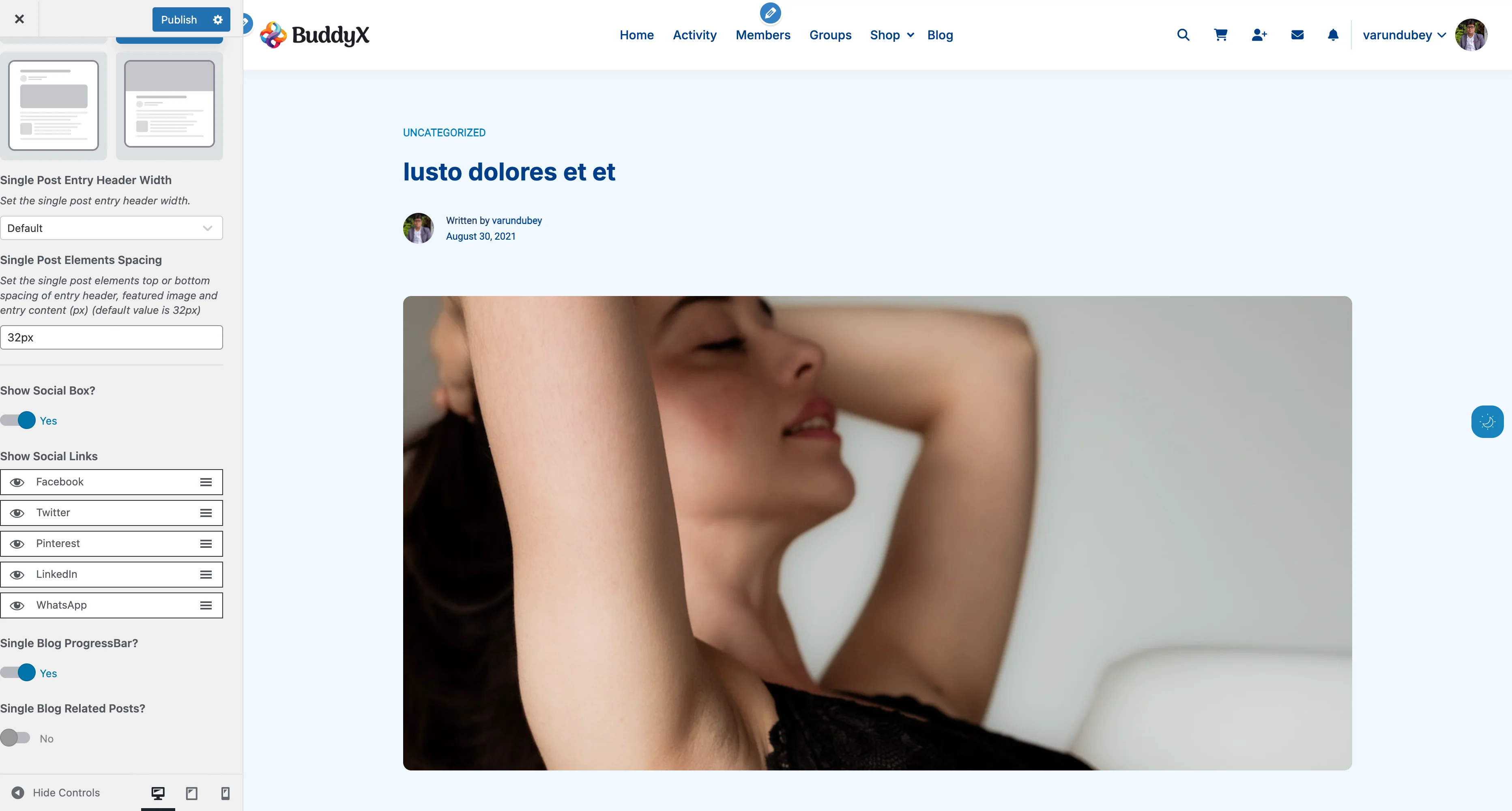
Content Width Settings

Control how wide the post content appears:

Setting Width Description Best For
Small ~700px Narrower content area Long-form reading, text-heavy posts
Large ~1200px Wider content area Visual content, galleries, wide images

Reading Tip: Small width provides optimal line length (50-75 characters per line) for comfortable reading. This is recommended for most text-based blogs.

When to Use Each Width

Use Small Width For:

  • Text-focused articles
  • Long-form storytelling
  • Professional blogs
  • News articles
  • Tutorial content

Use Large Width For:

  • Image galleries
  • Portfolio posts
  • Video-heavy content
  • Wide charts/diagrams
  • E-commerce product showcases

Title Over Image Options

When you select Title Over Image layout, additional settings appear:

Image Overlay Color

Setting: Image Overlay Color Default: Black with 10% opacity Purpose: Makes white text readable over photos

Recommendations:

Overlay Color Best For Example
Dark gray/black Light-colored images rgba(0, 0, 0, 0.4)
Navy blue Warm-toned images rgba(20, 30, 60, 0.5)
Dark purple Vibrant images rgba(50, 20, 70, 0.4)
Gradient All images Custom CSS required

Opacity Guide:

  • 10-20%: Subtle tint, image clearly visible
  • 30-50%: Balanced, good text contrast
  • 60-80%: Heavy overlay, focus on text
  • 90-100%: Almost solid color

Entry Header Settings

Header Width

Setting: Single Post Entry Header Width Default: Default (follows content width) Options:

Option Description Best For
Default Header matches content width Consistent, clean design
Full Width Header spans entire container Dramatic, hero-style headers

Featured Image Height (Full Width Only)

When using Full Width header, you can set the featured image height:

Setting: Single Post Featured Image Height Default: 500px Range: 300px - 800px Applies to: Desktop screens (768px+)

Height Recommendations:

Content Type Recommended Height Why
Standard blog posts 400-500px Balanced, not overwhelming
Portfolio/visual 600-700px Showcases imagery
News articles 350-450px Quick to scroll past
Landing page style 700-800px Maximum impact

Element Spacing

Setting: Single Post Elements Spacing Default: 32px Range: 16px - 80px

Controls vertical space between:

  • Entry header (title/meta)
  • Featured image
  • Post content

Spacing Guide:

Space Effect Best For
16-24px Tight, compact Mobile-first, news sites
28-40px Comfortable, standard Most blogs, balanced design
48-80px Spacious, airy Luxury, minimalist, portfolio

Reading Progress Bar

Add a visual indicator showing how much of the post has been read:

Setting: Single Blog ProgressBar Default: On Options: Yes / No

How It Works

  1. Thin bar appears at top of screen
  2. Fills from left to right as visitor scrolls
  3. Reaches 100% at end of post content
  4. Encourages completion

Benefits:

  • Shows reading progress visually
  • Increases engagement
  • Encourages visitors to finish reading
  • Modern UX feature
  • Minimal performance impact

Best For:

  • Long-form content (1000+ words)
  • Tutorial and guide posts
  • Story-driven content
  • Educational articles

Consider Disabling For:

  • Very short posts (under 500 words)
  • Minimal, distraction-free design
  • Sites where it conflicts with header design

Author Bio Section

Display author information at the end of each post:

Setting: Show Author Bio Default: On (recommended) Options: Yes / No

What's Included

When enabled, displays:

  • Author avatar
  • Author name (linked to archive)
  • Author biographical info (from user profile)
  • Author social links (if configured)
  • Link to view all author posts

Configuring Author Info

  1. Go to Users > Your Profile
  2. Fill out Biographical Info
  3. Add social profile URLs
  4. Upload profile picture
  5. Click Update Profile

Bio Writing Tips:

  • Keep it 2-3 sentences
  • Mention expertise/credentials
  • Include a call-to-action
  • Update regularly

Example: "Sarah Johnson is a WordPress developer with 10 years of experience. She specializes in building community-driven websites and shares tips weekly on this blog."

Related Posts

Keep visitors engaged by showing similar content:

Social Sharing and Related Posts Social sharing buttons and related posts section at the bottom of single posts
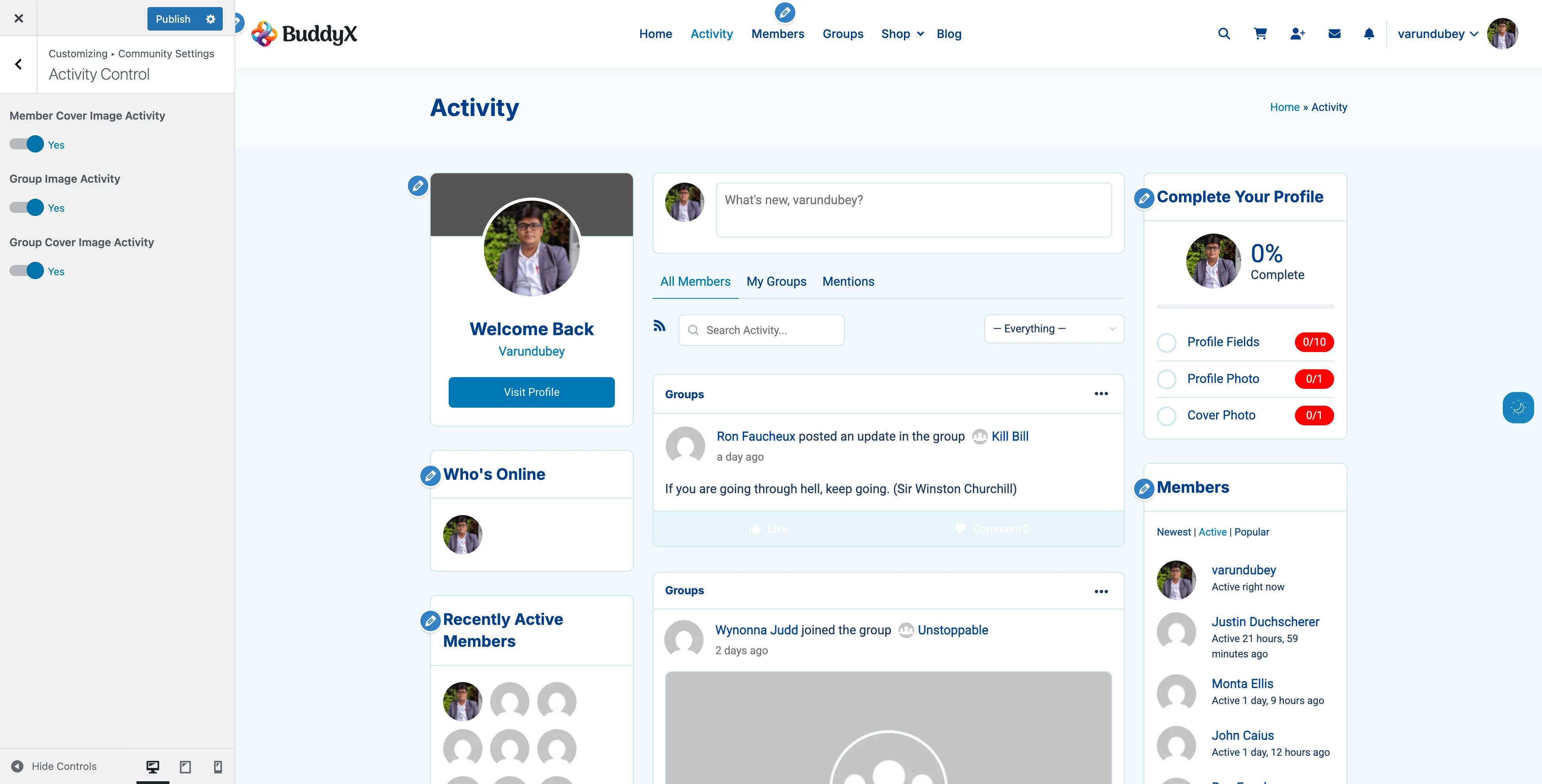
Setting: Single Blog Related Posts Default: Off Options: Yes / No

Related Posts Title

Setting: Related Posts Title Default: "You may also like" Visible when: Related Posts is enabled

Alternative Titles:

  • "Related Articles"
  • "Continue Reading"
  • "More from this Category"
  • "What to Read Next"
  • "Similar Posts"
  • "Keep Exploring"

How Related Posts Are Selected

WordPress shows related posts based on:

  1. Same categories (highest priority)
  2. Same tags
  3. Recent posts (if no matches)

Display Format

Related posts typically show:

  • Thumbnail image
  • Post title
  • Post date
  • Brief excerpt (optional)

Number of Posts Shown: 3 (standard)

Post Navigation

Help visitors discover more content with previous/next links:

Setting: Show Post Navigation Default: On Options: Yes / No

Navigation Styles

Previous Post ← | → Next Post

  • Simple text links
  • Appears at bottom of post
  • Shows adjacent posts by date

Advanced Navigation (if enabled in theme):

  • Post thumbnails
  • Post titles
  • Category/tag based navigation

Social Sharing Buttons

Let visitors share your posts on social media:

Setting: Show Social Box Default: On Options: Yes / No

Available Platforms

Setting: Show Social Links (sortable list) Default Enabled: Facebook, Twitter, Pinterest, LinkedIn, WhatsApp

Customization:

  • Drag to reorder platforms
  • Uncheck to hide specific platforms
  • Checked items appear in your order

Platform Descriptions

Platform Best For Share Format
Facebook General content Link with image/title
Twitter News, quotes Text + link (280 chars)
Pinterest Visual content Image + description
LinkedIn Professional content Article preview
WhatsApp Mobile sharing Direct message with link

Share Button Placement

Position: Below post content, above comments Style: Icon buttons or text links (theme dependent) Mobile: Often combined into single "Share" button

Comments Section

Comments appear after post content (WordPress core feature):

Comment Display Settings

Access via Settings > Discussion:

Setting Description Recommended
Allow comments Enable/disable comments On
Require name/email Mandatory fields On
Comment moderation Manual approval On for new sites
Comment registration Must be logged in Off (reduces engagement)

Comment Pagination

For posts with many comments:

  • Break comments into pages: Yes
  • Comments per page: 50
  • Show newer/older: Newer first

Recommended Single Post Layouts by Site Type

Magazine / News Site

Title Layout: Title Above Image (traditional) Content Width: Small (readability focus) Progress Bar: Yes Author Bio: Yes Related Posts: Yes (high engagement) Social Sharing: All platforms Best for: High-volume news, current events

Personal Blog

Title Layout: Title Over Image (visual impact) Content Width: Small (comfortable reading) Progress Bar: Yes Author Bio: Yes (personal connection) Related Posts: Yes (extend visit time) Social Sharing: Facebook, Twitter, Pinterest Best for: Lifestyle, travel, personal stories

Corporate Blog

Title Layout: Title Above Image (professional) Content Width: Small (focused reading) Progress Bar: Optional Author Bio: Yes (establish authority) Related Posts: Yes (thought leadership) Social Sharing: LinkedIn, Twitter, Facebook Best for: Business insights, industry news

Portfolio / Photography

Title Layout: Title Below Image (image-first) Content Width: Large (showcase visuals) Progress Bar: No (minimal distraction) Author Bio: Optional Related Posts: Yes (portfolio browsing) Social Sharing: Pinterest, Instagram (if available) Best for: Visual showcases, project case studies

Tutorial / Educational Site

Title Layout: Title Above Image (clear structure) Content Width: Large (code blocks, screenshots) Progress Bar: Yes (encourages completion) Author Bio: Yes (instructor credentials) Related Posts: Yes (lesson series) Social Sharing: Twitter, LinkedIn, Pinterest Best for: How-to guides, courses, documentation

Common Questions

Can I use different layouts for different posts?

Not directly through customizer (applies to all posts), but you can:

  1. Use a page builder plugin for specific posts
  2. Add custom CSS targeting specific post IDs
  3. Create custom post templates in a child theme
  4. Use categories with category-specific templates

The title is hard to read over my featured image.

For Title Over Image layout:

  1. Increase overlay opacity (try 0.5 or higher)
  2. Use darker overlay color
  3. Choose darker featured images
  4. Switch to Title Above Image layout

How do I disable the featured image on single posts?

  1. Option 1: Don't set a featured image on that post
  2. Option 2: Use custom CSS: .single-post .entry-header img { display: none; }
  3. Option 3: Use a plugin like "Hide Featured Image"

My related posts aren't showing.

Check these:

  1. Setting is enabled: Customizer > Blog > Related Posts = Yes
  2. Posts have categories/tags: Related posts need common taxonomy
  3. Enough published posts: Need at least 4-5 posts total
  4. Cache cleared: Clear site cache and refresh

Can I show author bio only on certain posts?

Requires custom code. Options:

  1. Use a plugin like "Author Bio Box"
  2. Add conditional logic in child theme
  3. Use post meta boxes to control per-post

Social sharing buttons aren't appearing.

Check:

  1. Setting enabled: Customizer > Blog > Show Social Box = Yes
  2. At least one platform selected: Check the platforms list
  3. JavaScript enabled: Social features require JS
  4. No conflicts: Disable other social sharing plugins
  5. Cache cleared: Clear cache and test

How do I change the social sharing button design?

Styling is theme-controlled. To customize:

  1. Add custom CSS in Customizer > Additional CSS
  2. Use a child theme to override styles
  3. Install a dedicated social sharing plugin for more options

The reading progress bar disappears on mobile.

This may be intentional design. To force it on mobile:

  1. Check customizer for mobile-specific settings
  2. Add custom CSS for mobile displays
  3. Contact support if it should appear but doesn't

Can I add more social platforms?

Default platforms are built into the theme. To add more:

  1. Use a plugin like "Social Warfare" or "AddToAny"
  2. Hire a developer to extend the theme
  3. Use a child theme to add custom share buttons

Performance Tips

Optimizing Single Posts

For Speed:

  • Compress featured images before upload
  • Use appropriate content width (less HTML/CSS rendering)
  • Limit related posts to 3-4
  • Lazy load images in post content
  • Minimize social sharing platforms to essentials

For Engagement:

  • Always include featured image
  • Enable progress bar for long posts
  • Show author bio (builds trust)
  • Enable related posts
  • Keep post navigation enabled

Image Recommendations

Element Size Format Max File Size
Featured image (default width) 1200×675px JPG 150KB
Featured image (full width) 1920×800px JPG 200KB
In-content images 800-1200px wide JPG/PNG 100-150KB
Author avatar 150×150px JPG/PNG 20KB

Related Settings


Need Help?

BuddyPress

Activity stream, member profiles, groups, and BuddyPress settings.

Activity Stream

The activity stream is the heartbeat of your BuddyPress community. BuddyX Pro transforms the standard activity feed into an engaging, modern experience with card layouts, activity types, and social interactions.

What You Can Do

BuddyX Pro enhances the BuddyPress activity stream with:

  • Modern Card Layout - Instagram/Facebook-style activity cards
  • Activity Type Badges - Visual indicators for different activities
  • Action Buttons - Like, comment, share, delete
  • Component Filtering - Filter by profile, groups, forums, etc.
  • Activity Type Control - Show/hide cover image updates
  • Media Display - Optimized photo and video rendering
  • Comment Threading - Nested comment conversations
  • Real-time Updates - AJAX-powered live updates
  • Post Form - Share updates from any page

Activity Stream Features

Activity Card Design

BuddyX Pro uses a modern card-based layout for all activity items.

What Each Card Shows:

1. Activity Type Badge

  • Colored label at top
  • Shows activity category
  • Examples: "Profile", "Activity", "Groups", "Forums"

2. Member Avatar

  • Profile picture
  • Links to member profile
  • Shows online status (if enabled)

3. Activity Header

  • Member name and action
  • "John posted an update"
  • "Jane joined the group Marketing Team"
  • Timestamp

4. Activity Content

  • Post text
  • Embedded media
  • Shared links
  • Attachments

5. Activity Actions

  • Like/Favorite button
  • Comment button
  • Share button (if enabled)
  • Delete (for own activity)

6. Comment Section

  • Existing comments
  • Comment form
  • Nested replies

Activity Types and Badges

BuddyX Pro adds visual badges to help members quickly identify activity types.

Activity Type Badge Label What It Represents
Profile "Profile" Profile updates, avatar changes
Activity "Activity" Status updates, posts
Groups "Groups" Group joins, posts, updates
Forums "Forums" Forum posts (bbPress)
Friends "Friends" New friendships
Members "Members" New member registrations
Blogs "Blogs" Blog posts (multisite)
Business "Business" Custom business activities

Why This Matters: Members can quickly scan their feed and identify the types of content they're interested in.

Activity Stream Locations

The activity stream appears in multiple places throughout your site.

Sitewide Activity

Location: Main activity page (usually /activity/)

What It Shows:

  • All public activity across the site
  • Member posts
  • Group updates
  • New friendships
  • Profile changes

Who Sees It:

  • All visitors (public activity only)
  • Logged-in members see more

Member Profile Activity

Location: Individual member profiles, Activity tab

What It Shows:

  • That member's personal activity
  • Posts they've made
  • Comments they've left
  • Activity mentions

Who Sees It:

  • Depends on privacy settings
  • Usually public

Group Activity

Location: Individual group pages, Activity tab

What It Shows:

  • Activity within that group
  • Member posts to group
  • Group announcements
  • Member joins

Who Sees It:

  • Group members only (private groups)
  • Everyone (public groups)

Activity Widgets

Location: Sidebars and widget areas

What Shows:

  • Recent activity
  • Filtered activity streams
  • Specific components

Activity Type Settings

Control what types of activity appear in feeds.

Activity Control Settings Activity control settings to show or hide specific activity types in the feed
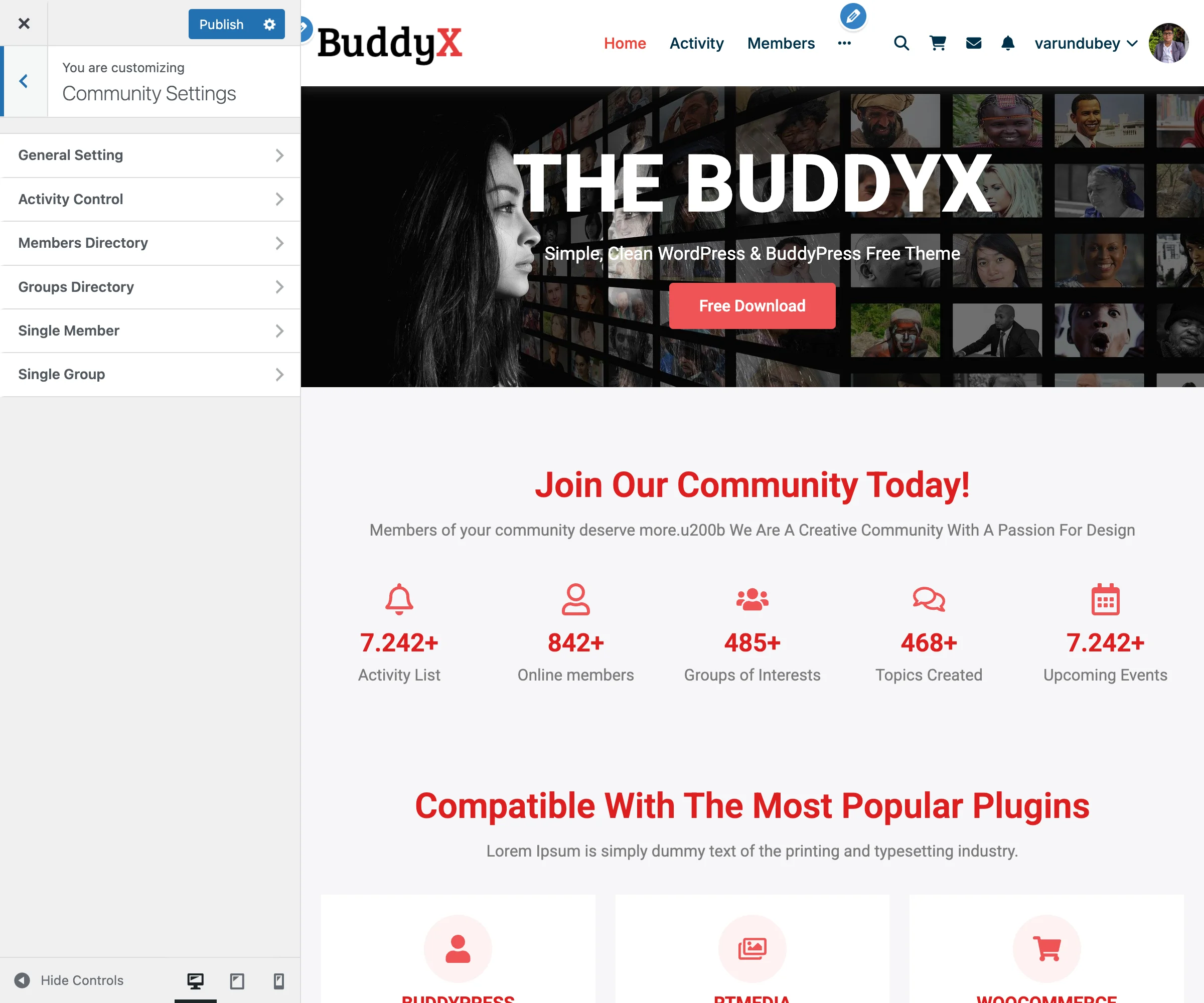
Cover Image Activity Settings

BuddyX Pro lets you hide profile update clutter.

Available Settings:

Setting What It Controls Default
Member Cover Image Activity Shows when member updates cover On
Group Image Activity Shows when group avatar changes On
Group Cover Image Activity Shows when group cover updates On

Why You'd Disable These:

Reasons to Hide:

  • Reduces activity stream noise
  • Focuses on user-generated content
  • Members update covers frequently
  • Professional communities prefer substance over style changes

Reasons to Show:

  • Encourages profile customization
  • Celebrates member engagement
  • Visual community culture
  • Shows active participation

How to Configure:

  1. Appearance > Customize
  2. BuddyPress > Activity
  3. Check/uncheck desired activity types
  4. Click Publish

Activity Posting

Let members share updates from anywhere on your site.

The Activity Post Form

What It Includes:

  • "What's new?" text area
  • Media upload button (with plugins)
  • Privacy selector (with plugins)
  • Post button

Where It Appears:

  • Top of activity stream page
  • Member profile pages
  • Group pages (post to group)

Who Can Post:

  • Logged-in members only
  • Must have posting permissions

Posting to Groups

Members can post specifically to groups:

  1. Visit group page
  2. Use post form at top
  3. Write message
  4. Click Post
  5. Appears in group activity only

Privacy:

  • Public groups: Activity visible to all
  • Private groups: Members only
  • Hidden groups: Members only

@Mentions

Tag other members in posts and comments.

How to Mention:

  1. Type @ symbol
  2. Start typing member name
  3. Select from autocomplete
  4. Member gets notification

Example: @JohnDoe check out this cool feature!

What Happens:

  • Tagged member gets notification
  • Activity appears in their Mentions stream
  • Creates engagement opportunity

Activity Filtering

Help members find relevant content.

Filter Options

Members can filter activity by:

By Component:

  • Everything (default)
  • Updates & Replies
  • Profile Updates
  • Friendships
  • New Groups
  • Group Updates
  • Forum Topics (bbPress)

By Scope:

  • Everything
  • My Activity
  • My Favorites
  • My Friends (if friends enabled)
  • My Groups
  • Mentions (@mentions)

How to Use Filters:

  1. Visit activity stream
  2. Click filter dropdown
  3. Select desired filter
  4. Stream updates instantly (AJAX)

Custom Activity Streams

Create focused activity streams with widgets:

Widget Examples:

  • Recent activity from specific group
  • Activity from members in same city
  • Forum activity only
  • Friend activity only

Setup:

  1. Appearance > Widgets
  2. Add BP Activity Widget
  3. Configure filters
  4. Place in sidebar

Activity Actions

What members can do with activity items.

Like/Favorite

What It Does:

  • Marks activity as favorite
  • Shows appreciation
  • Saves for later

How It Works:

  1. Click heart/star icon
  2. Activity saved to "My Favorites"
  3. Counter increments
  4. Original poster sees engagement

Who Can See:

  • Favorite count is public
  • Individual favorites are private

Comment

What It Does:

  • Add comment to activity
  • Start conversations
  • Nested replies supported

How to Comment:

  1. Click Comment button
  2. Type comment
  3. Click Post
  4. Appears below activity

Comment Features:

  • @mention support
  • Threaded replies
  • Delete own comments
  • Like comments (with plugins)

Share (If Plugin Enabled)

What It Does:

  • Reshare activity to your stream
  • Credit original poster
  • Amplify content

Requires: Activity sharing plugin

Delete

Who Can Delete:

  • Original poster (own activity)
  • Site administrators
  • Group moderators (group activity)

How to Delete:

  1. Click Delete or trash icon
  2. Confirm deletion
  3. Activity removed permanently

Note: Deleting activity also deletes all comments on it.

Activity Privacy

Control who sees activity content.

Default Privacy Levels

Public Activity:

  • Status updates
  • Profile changes
  • New friendships
  • Group joins (public groups)

Private Activity:

  • Private group posts
  • Hidden group activity
  • Direct mentions (sometimes)

Privacy by Component

Friends Component:

  • New friendships are public
  • Friend activity filter is personal

Groups Component:

  • Public groups: Activity is public
  • Private groups: Members only
  • Hidden groups: Members only

Private Messages:

  • Never appear in activity stream
  • Completely private

Media in Activity

Enhance posts with photos, videos, and links.

Photo Uploads

Requires: Media plugin (MediaPress, BuddyPress Media, etc.)

What Members Can Do:

  • Upload photos to posts
  • Create photo albums
  • Tag photos
  • Like and comment on media

Display in Activity:

  • Inline photo display
  • Lightbox viewing
  • Gallery layouts

Video Uploads

Requires: Media plugin

Supported:

  • Uploaded videos
  • YouTube embeds
  • Vimeo embeds

Display:

  • Inline video players
  • Thumbnail previews
  • Responsive sizing

Link Previews

What Happens:

  1. Member pastes URL in post
  2. System fetches link preview
  3. Shows thumbnail, title, description
  4. Rich preview in activity stream

Supported Platforms:

  • YouTube
  • Vimeo
  • Most websites with OpenGraph tags

MediaPress Integration

If MediaPress Plugin Installed:

BuddyX Pro provides enhanced media list views.

Enhanced Features:

  • Better media grid layouts
  • Improved activity media display
  • Optimized lightbox viewing

Control Setting:

  1. Customizer > BuddyPress > General
  2. Override Activity Media List View: Enable/Disable
  3. Publish

Note: When enabled, MediaPress backend settings for media size may not function as expected.

Activity Notifications

How members stay updated on activity.

Notification Triggers

Members get notified for:

  • @mentions in activity
  • Replies to their activity
  • Comments on their posts
  • Likes on their activity (with plugins)
  • New group activity (if enabled)

Notification Display

Header Notification Icon:

  • Bell icon in site header
  • Badge shows unread count
  • Dropdown shows recent notifications

Email Notifications:

  • Configurable in member settings
  • Instant, daily digest, or never
  • Per-notification-type controls

Performance Optimization

Keep your activity stream fast.

For Large Communities

Best Practices:

  1. Enable object caching (Redis/Memcached)
  2. Limit activity per page (10-15 items)
  3. Disable unnecessary activity types
  4. Use lazy loading for media
  5. Implement infinite scroll carefully

Caching Considerations

Don't Cache:

  • Activity stream pages (dynamic content)
  • Post forms (nonce issues)
  • Comment forms

Do Cache:

  • Media files
  • Avatars
  • Static elements

How to Exclude from Cache: Add activity pages to cache plugin exclusions.

Common Questions

Q: Can I delete old activity automatically? A: Not built-in. Requires plugin like "BP Activity Cleaner" or custom cron job.

Q: Why don't I see all activity types? A: Only active BuddyPress components generate activity. Enable components in Settings > BuddyPress.

Q: Can members hide their activity from others? A: Not by default. BuddyPress activity is generally public. Requires custom development.

Q: How do I disable activity stream entirely? A: Deactivate the Activity component in Settings > BuddyPress > Components.

Q: Why do cover image updates clutter my feed? A: Disable them in Customizer > BuddyPress > Activity > Uncheck cover image options.

Q: Can I limit who can post activity? A: You can disable posting for specific user roles with custom code or plugins.

Q: How do I moderate inappropriate activity? A: Site admins can delete any activity. Consider moderation plugins for better tools.

Q: Does activity have a character limit? A: No character limit by default. Can be added with custom code.

Q: Can I schedule activity posts? A: Not natively. Requires third-party scheduling plugins.

Q: Why don't @mentions work? A: Ensure notifications component is active and member name is spelled correctly.

Activity Stream Best Practices

Encourage Engagement

Do:

  • Post regularly as admin
  • Respond to member activity
  • Create discussion prompts
  • Feature member content
  • Use @mentions actively

Don't:

  • Over-moderate (stifles conversation)
  • Let spam accumulate
  • Ignore member questions
  • Post only announcements

Content Moderation

Set Clear Guidelines:

  • Post community rules
  • Link to guidelines in post form
  • Moderate consistently
  • Explain removals

Use Tools:

  • Moderation plugins
  • Report buttons
  • Admin controls
  • Spam filters

Drive Activity

Strategies:

  • Weekly discussion topics
  • Member spotlights
  • Questions of the day
  • Challenges and contests
  • Group activity prompts

Recommended Configurations by Community Type

Professional Network

  • Disable: Cover image activity, group image activity
  • Enable: @mentions, comments
  • Focus: Professional updates, industry discussions
  • Moderation: Higher standard, clear guidelines

Casual Social Community

  • Enable: All activity types, media sharing
  • Encourage: Photos, videos, personal updates
  • Features: Likes, favorites, sharing
  • Moderation: Lighter touch, community-driven

Learning Community

  • Disable: Cover image updates
  • Enable: Group activity, forum activity
  • Focus: Educational content, course discussions
  • Features: Document sharing, Q&A

Support Community

  • Disable: Friendship updates, cover images
  • Enable: Group activity, @mentions
  • Privacy: Consider more private groups
  • Moderation: High sensitivity, quick response

Hobby/Interest Community

  • Enable: All activity, media sharing
  • Encourage: Project photos, achievements
  • Features: Rich media, photo albums
  • Moderation: Community guidelines, self-policing

Related Settings


Need Help?

BuddyPress Integration

BuddyX Pro automatically styles all BuddyPress pages with custom templates and Customizer options.


Quick Setup

1. Install BuddyPress

  1. Plugins > Add New
  2. Search "BuddyPress"
  3. Click Install Now then Activate

2. Set Template Pack

Required: BP Nouveau (BP Legacy not supported)

  1. Settings > BuddyPress > Options
  2. Select BP Nouveau
  3. Save

3. Enable Components

Settings > BuddyPress > Components

Enable what you need:

  • Extended Profiles
  • Activity Streams
  • Friend Connections
  • Private Messaging
  • User Groups
  • Notifications

4. Configure BuddyX Settings

Appearance > Customize > BuddyPress

That's it - BuddyX Pro handles the styling automatically.


What BuddyX Pro Adds

Activity Stream

  • Clean card layout
  • Styled action buttons (like, comment, share)
  • Optimized media display
  • AJAX load more
  • Filter dropdowns

Member Directory

  • Grid and list views
  • Member cards with avatar, name, meta
  • Online status indicators
  • Search and filters
  • Pagination

Member Profiles

  • 6 header layout styles
  • Cover image with drag-drop upload
  • Navigation tabs
  • Profile fields display
  • Action buttons (Add Friend, Message)

Groups

  • Grid and list directory views
  • Group cards with avatar and meta
  • 6 single group header styles
  • Group navigation
  • Join/Leave buttons

Private Messaging

  • Conversation threads
  • Message composition
  • Star important messages
  • Search messages

Customizer Settings

Member Directory

Customize > BuddyPress > Members Directory

Setting Options
Directory Layout Grid, List
Members Per Page Number
Show Online Status Yes/No
Avatar Style Circle, Square

Member Profiles

Customize > BuddyPress > Member Header

Setting Options
Header Style 6 layout options
Show Cover Image Yes/No
Cover Height Pixels

Groups

Customize > BuddyPress > Groups

Setting Options
Directory Layout Grid, List
Groups Per Page Number
Header Style 6 layout options

Header Icons

BuddyX Pro adds these to your site header:

  • Notification Bell - Unread count badge, dropdown list
  • Messages Icon - Unread count, quick access
  • User Menu - Avatar dropdown with profile links

Enable/disable at: Customize > Site Header > Header Elements


Sidebar Widget Areas

BuddyX Pro creates dedicated sidebars:

Widget Area Use For
BuddyPress Left/Right Sidebar BP pages
Members Directory Sidebar Member listing
Groups Directory Sidebar Groups listing
Activity Sidebar Activity stream

Add widgets at: Appearance > Widgets


Common Issues

Members page 404

  1. Settings > Permalinks
  2. Click Save Changes

"Requires BP Nouveau" error

  1. Settings > BuddyPress > Options
  2. Select BP Nouveau under Template Pack
  3. Save

Activity not loading

  1. Enable Activity at Settings > BuddyPress > Components
  2. Create test content
  3. Clear cache

Avatars not showing

  1. Check folder permissions: chmod 755 wp-content/uploads
  2. Verify uploads enabled in BuddyPress settings

Profile pages broken

  1. Verify using BP Nouveau template pack
  2. Clear all caches
  3. Deactivate plugins to find conflict

Related Docs


Need Help? support@wbcomdesigns.com

BuddyPress Customizer Settings

Customize every aspect of your BuddyPress community through the WordPress Customizer. BuddyX Pro provides extensive settings to match your community's brand and style.

What You Can Configure

BuddyX Pro organizes BuddyPress settings into five main sections:

  • General Settings - Avatar styles and global options
  • Activity Settings - Activity stream display options
  • Members Settings - Member directory and card layouts
  • Groups Settings - Group directory and card layouts
  • Single Member/Group Settings - Individual profile page layouts

Accessing BuddyPress Settings

  1. Log in to your WordPress admin dashboard
  2. Go to Appearance > Customize
  3. Click on BuddyPress panel
  4. Select the section you want to configure

General Settings

Configure global BuddyPress appearance options.

BuddyPress General Settings BuddyPress general settings for avatar style and activity media options
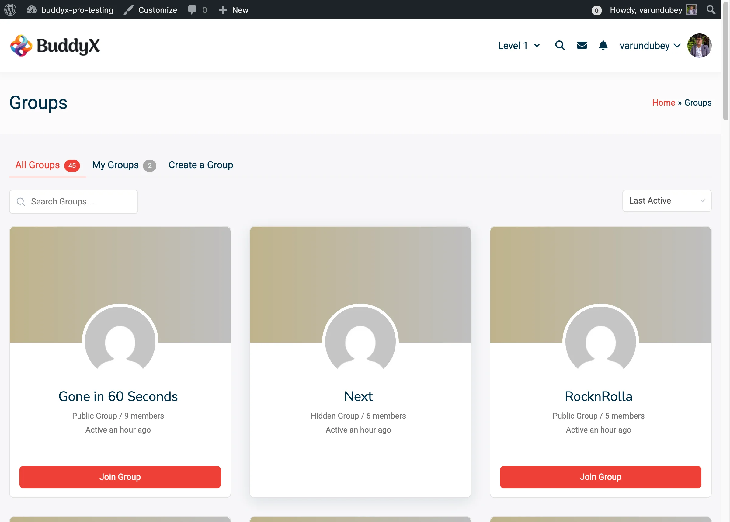
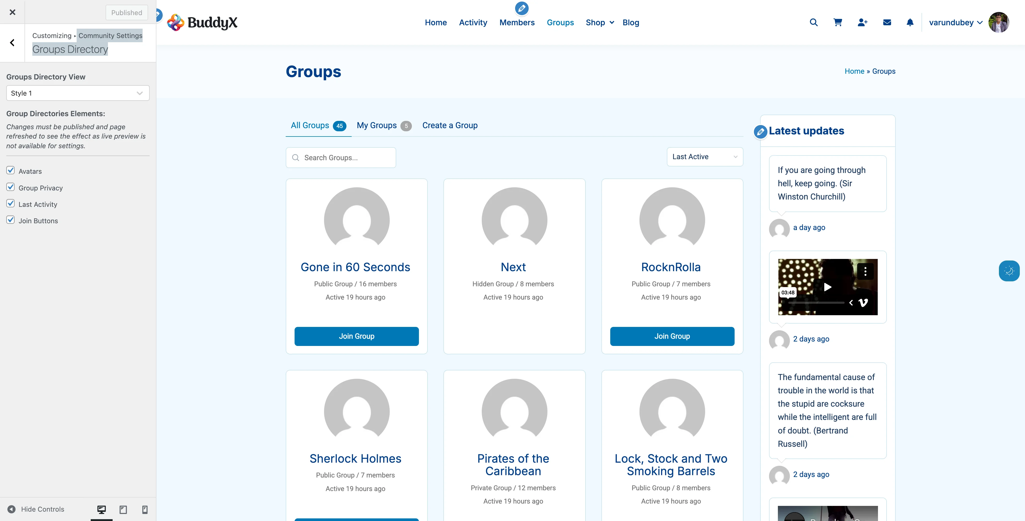
Available Settings

Setting Options Default What It Does
Avatar Style Yes/No Yes Makes avatars circular. Turn off for square avatars.
Override Activity Media List View Enable/Disable Enable Enhances MediaPress media display (if installed).

Location: Customizer > BuddyPress > General

Activity Settings

Control what appears in activity streams across your community.

Available Settings

Setting Options Default What It Does
Member Cover Image Activity Yes/No Yes Shows activity when member updates cover photo.
Group Image Activity Yes/No Yes Shows activity when group avatar changes.
Group Cover Image Activity Yes/No Yes Shows activity when group cover photo updates.

Why This Matters: Disabling these options reduces activity stream clutter if your community prefers to focus on user-generated content rather than profile updates.

Location: Customizer > BuddyPress > Activity

Members Directory Settings

Customize how members appear in your directory and what information displays.

Directory Layout Options

Layout Description Best For
Style 1 (Default) Classic list view with avatars on left Traditional social networks
Style 2 (Card) Card layout with cover images Visual, portfolio-based communities
Style 3 (Card1) Compact card with action buttons Professional networks, business directories

How to Change:

  1. Customizer > BuddyPress > Members
  2. Find Members Directory View
  3. Select your preferred style
  4. Click Publish

Cover Image Customization

Available for: Style 2 and Style 3 layouts

Setting What It Does
Customize Members Cover Background Enables custom default cover images
Set Default Cover Image Upload image shown when member has no cover

Recommended Cover Dimensions: 1300px x 225px

Member Directory Elements

Control which information appears on member cards:

Element Default What It Shows
Online Status On Green dot for online, gray for offline
Profile Type Off Member type badge (if using member types)
Followers Off Follower count (requires BP Follow or BuddyBoss)
Last Active On "Active 2 hours ago" timestamp
Joined Date On "Joined Jan 2024" registration date

Performance Tip: The Online Status indicator updates every 5 minutes. Disable it on high-traffic sites to reduce database queries.

Location: Customizer > BuddyPress > Members > Member Directories Elements

Groups Directory Settings

Configure how groups display in your directory.

Directory Layout Options

Layout Description Best For
Style 1 (Default) List view with group info Simple communities with few groups
Style 2 (Card) Card layout with cover images Communities with many active groups

Cover Image Customization

Available for: Style 2 (Card) layout

Setting What It Does
Customize Groups Cover Background Enables custom default cover images
Set Default Cover Image Upload image shown when group has no cover

Recommended Cover Dimensions: 1300px x 225px

Group Directory Elements

Control which information appears on group cards:

Element Default What It Shows Available In
Cover Images On Group cover photo Style 2 only
Avatars On Group profile picture All styles
Group Privacy On Public/Private/Hidden badge All styles
Last Activity On Most recent activity timestamp All styles
Members On Member count BuddyBoss only
Group Descriptions On Brief description text BuddyBoss only
Join Buttons On Join/Request to Join button All styles

Location: Customizer > BuddyPress > Groups > Group Directories Elements

Single Member Profile Settings

Customize individual member profile pages with multiple header layouts and navigation styles.

Header Layout Options

Layout Description Best For
Left View Avatar on left, info on right, full width Classic profiles
Centered View Avatar centered, info below Modern, minimal designs
Container Left View Left layout within container Boxed site layouts
Container Centered View Centered layout within container Professional networks
Stretch Left View Left layout, full browser width Magazine-style sites
Stretch Centered View Centered layout, full browser width Portfolio communities

Navigation Options

Navigation View:

  • More - Dropdown for extra tabs
  • Swipe - Horizontal scroll navigation

Navigation Style:

  • Default - Text labels only
  • Icon + Label - Icons with text
  • Icon + Label (Swipe 1) - Compact icons for swipe
  • Icon + Label (Swipe 2) - Larger icons for swipe

Display Name Format

Available for: BuddyPress (not BuddyBoss)

Format Shows Example
Username WordPress username @johndoe
Display Name User's display name John Doe

Profile Header Elements

Control what information appears in member headers:

Element Default What It Shows
Online Status On Online/offline indicator
Profile Type On Member type badge
Member Handle On @username display
Joined Date On Registration date
Last Active On Last activity timestamp
Followers On Follower count (requires BP Follow)
Following On Following count (requires BP Follow)

User Social Links

Enable members to add social media profiles to their BuddyPress profiles.

How to Enable:

  1. Customizer > BuddyPress > Single Member
  2. Enable Show User Social Links
  3. Configure social networks in User Social Links section

Default Networks:

  • Facebook
  • Twitter
  • LinkedIn
  • Instagram

Add Custom Networks:

  1. Click Add button
  2. Enter network name
  3. Add FontAwesome icon code (e.g., <i class="fa-brands fa-tiktok"></i>)
  4. Choose icon color
  5. Save

Members can then add their profile URLs in their BuddyPress profile edit page.

Location: Customizer > BuddyPress > Single Member

Single Group Settings

Configure individual group pages with header and navigation options.

Header Layout Options

Same layouts as Single Member profiles:

  • Left View
  • Container View
  • Container Left View
  • Container Centered View
  • Stretch Left View
  • Stretch Centered View

Navigation Options

Navigation View:

  • More (dropdown)
  • Swipe (horizontal scroll)

Navigation Style:

  • Default
  • Icon + Label
  • Icon + Label (Swipe 1)
  • Icon + Label (Swipe 2)

Group Header Elements

Control what information appears in group headers:

Element Default What It Shows
Group Type On Group type badge
Last Activity On Most recent activity
Group Description On Group description text
Group Organizers On Group admin/moderator info
Group Privacy On Public/Private/Hidden status

Location: Customizer > BuddyPress > Single Group

Recommended Configurations by Community Type

Professional Network

Members Directory:

  • Layout: Style 3 (Card1)
  • Show: Profile Type, Followers, Joined Date
  • Hide: Last Active, Online Status

Single Member:

  • Header: Container Centered View
  • Navigation: Icon + Label
  • Show: Profile Type, Member Handle, Followers
  • Enable: User Social Links

Casual Social Community

Members Directory:

  • Layout: Style 2 (Card)
  • Show: Online Status, Last Active, Joined Date
  • Custom: Add fun cover images

Single Member:

  • Header: Left View
  • Navigation: Swipe with Icon + Label
  • Show: Online Status, Last Active, Followers

Learning Community

Members Directory:

  • Layout: Style 1 (Default)
  • Show: Profile Type, Joined Date, Last Active

Groups:

  • Layout: Style 2 (Card)
  • Show: Cover Images, Descriptions, Member Count

Single Member:

  • Header: Container Left View
  • Navigation: More (dropdown)

Private Membership Site

Members Directory:

  • Layout: Style 3 (Card1)
  • Show: Profile Type, Joined Date
  • Hide: Online Status (privacy)

Single Member:

  • Header: Container Centered View
  • Hide: Last Active (privacy)
  • Show: Profile Type, Member Handle

Common Questions

Q: Do I need to refresh the page to see changes? A: Yes. Most BuddyPress settings require publishing and refreshing the page as live preview is not available.

Q: Can I use different layouts for different member types? A: No. The layout applies to all members. You can use custom CSS to style specific member types differently.

Q: Will changing layouts break my site? A: No. You can safely test different layouts. If you don't like a change, simply switch back.

Q: Do cover images slow down my site? A: Cover images add visual appeal but do increase page weight. Use optimized images (WebP format, under 200KB) for best performance.

Q: What if I don't see the BuddyPress panel in Customizer? A: Ensure BuddyPress or BuddyBoss Platform is installed and activated. The panel only appears when one of these plugins is active.

Q: Can members choose their own layout? A: No. Layout settings are site-wide and controlled by administrators only.

Q: How do I know which layout looks best? A: Test each layout with real member data. Ask a few community members for feedback before finalizing.

Q: Will these settings work with BuddyBoss Platform? A: Yes. BuddyX Pro is fully compatible with both BuddyPress and BuddyBoss Platform.

Related Settings


Need Help?

Groups

BuddyPress Groups let members create communities within your community. BuddyX Pro enhances groups with beautiful layouts, custom cover images, and extensive customization options.

Groups Directory Frontend

What You Can Do with Groups

BuddyX Pro provides powerful group features:

  • 2 Directory Layout Styles - List or card views
  • 6 Header Layout Options - For single group pages
  • Custom Cover Images - Visual group identity
  • Group Type Badges - Categorize groups visually
  • Privacy Indicators - Public/Private/Hidden badges
  • Activity Integration - Group-specific activity streams
  • Member Lists - Showcase group members
  • Organizer Display - Highlight group admins
  • Join/Leave Buttons - Easy membership management

Groups Directory Layouts

Choose how groups appear in your directory.

Style 1: Default (List View)

Groups Directory Style 1 Style 1 - Classic list view with groups displayed in horizontal rows
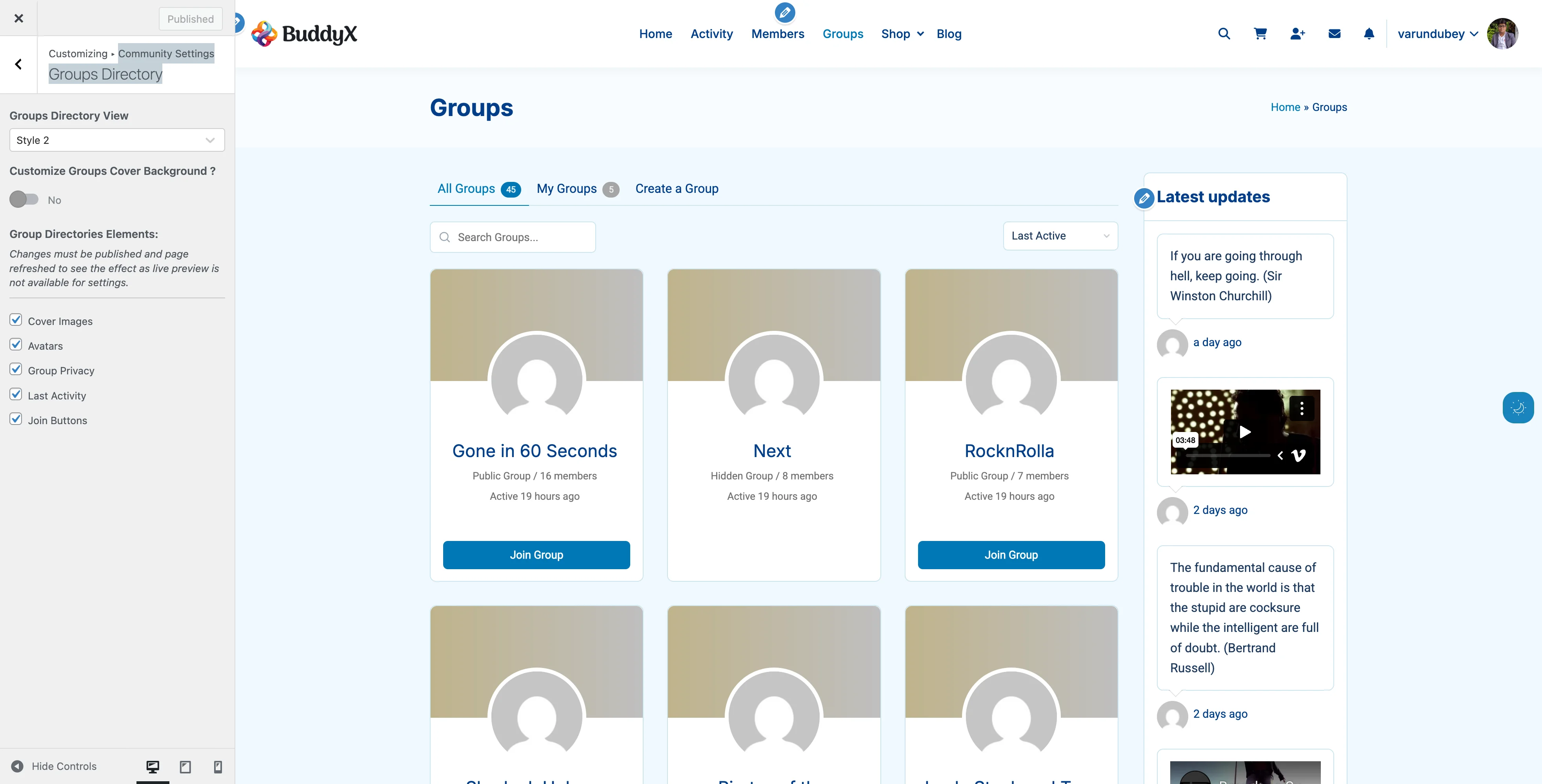
Best For: Simple communities, few groups

Features:

  • Horizontal list layout
  • Group avatar on left
  • Info on right
  • Classic forum style
  • Maximum information density

What Displays:

  • Group avatar (square or circular)
  • Group name and description
  • Last activity timestamp
  • Member count
  • Privacy status (Public/Private/Hidden)
  • Join/Leave button

When to Use:

  • Communities with <20 groups
  • Forum-style sites
  • Information-focused layouts
  • Desktop-primary audiences

Style 2: Card with Cover Images

Groups Directory Style 2 Style 2 - Card view with cover images and overlapping group avatars
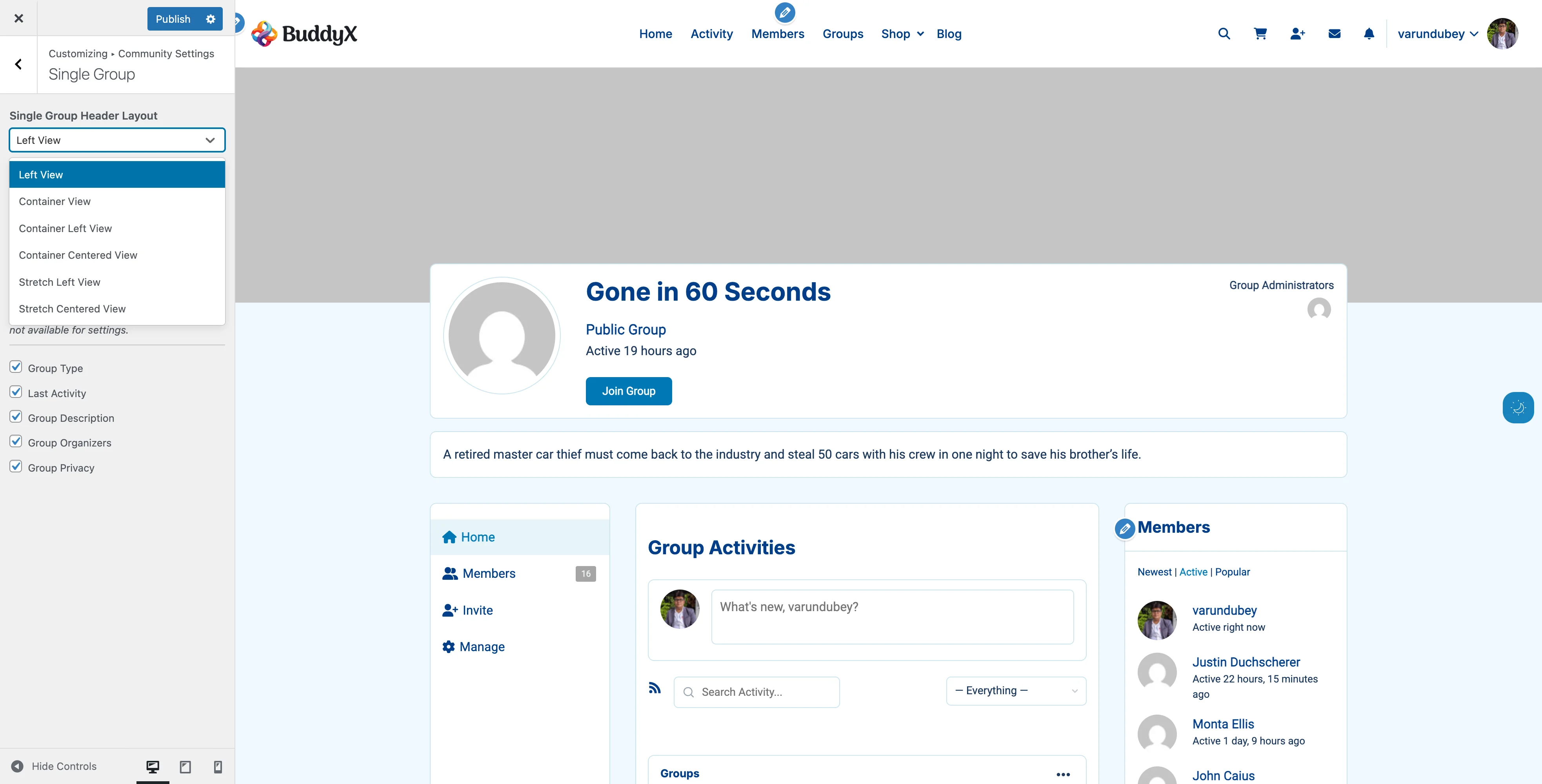
Best For: Visual communities, active groups

Features:

  • Card-based grid layout
  • Cover images at top
  • Avatar overlays cover
  • Modern, visual design
  • Instagram-like cards

What Displays:

  • Cover image background
  • Group avatar (overlapping cover)
  • Group name
  • Privacy badge
  • Member count
  • Last activity
  • Join button

When to Use:

  • Communities with many active groups
  • Visual, modern brands
  • Groups with cover images
  • Communities encouraging group creation

Requirements:

  • Looks best when groups have cover images
  • Custom default cover recommended

How to Change Layout

  1. Go to Appearance > Customize
  2. Navigate to BuddyPress > Groups
  3. Find Groups Directory View
  4. Select: Style 1 (Default) or Style 2 (Card)
  5. Click Publish
  6. Visit groups directory to see changes

Note: Publish and refresh page to see changes. Live preview not available.

Group Directory Elements

Control what information appears on group cards.

Available Elements

Element What It Shows Default Available In
Cover Images Group cover photo On Style 2 only
Avatars Group profile picture On All styles
Group Privacy Public/Private/Hidden On All styles
Last Activity Recent activity time On All styles
Members Member count On BuddyBoss only
Group Descriptions Brief description On BuddyBoss only
Join Buttons Join/Leave actions On All styles

How to Configure Elements

  1. Customizer > BuddyPress > Groups
  2. Scroll to Group Directories Elements
  3. Check/uncheck desired elements
  4. Click Publish
  5. Refresh groups page

Important: Changes require publishing and page refresh.

Element Details

Cover Images

Available: Style 2 (Card) only

What It Is:

  • Banner image at top of card
  • Visible in directory
  • Uploaded by group admins

Why Show:

  • Visual group identity
  • Attractive directory
  • Encourages group branding

Why Hide:

  • Cleaner, simpler layout
  • Faster loading
  • Few groups have covers

Performance: Disable if page load is slow with many groups.

Avatars

What It Is:

  • Group profile picture
  • Appears on all layouts

Why Show:

  • Visual group recognition
  • Professional appearance
  • Standard expectation

Why Hide:

  • Text-only preference (rare)
  • Extreme minimalism

Recommendation: Keep enabled. Avatars are core to group identity.

Group Privacy

What It Shows:

  • Public - Anyone can see and join
  • Private - Visible, join requires approval
  • Hidden - Invitation-only, not visible in directory

Why Show:

  • Transparency
  • Helps members understand access
  • Reduces confusion

Why Hide:

  • All groups same privacy level
  • Minimalist design

Recommendation: Keep enabled for clarity.

Last Activity

What It Shows:

  • "Active 2 hours ago"
  • "Active this week"
  • Relative timestamps

Why Show:

  • Shows active vs inactive groups
  • Helps members find engagement
  • Encourages participation

Why Hide:

  • Don't want to highlight inactive groups
  • All groups consistently active

Members Count (BuddyBoss Only)

What It Shows:

  • Total member count
  • "24 members" text

Why Show:

  • Popular group indicator
  • Helps members find active groups
  • Social proof

Why Hide:

  • Don't want to highlight small groups
  • Equal emphasis on all groups

Group Descriptions (BuddyBoss Only)

What It Shows:

  • Brief group description text
  • Excerpt from full description

Why Show:

  • Helps members understand group purpose
  • Better browsing experience
  • More context

Why Hide:

  • Cleaner, simpler cards
  • Group names self-explanatory

Join Buttons

What It Shows:

  • Join Group - For public groups
  • Request Membership - For private groups
  • Leave Group - If already member
  • No button for hidden groups

Why Show:

  • Quick group joining
  • Better user experience
  • Standard functionality

Why Hide:

  • Force visits to group page first
  • Reduce accidental joins (rare)

Recommendation: Keep enabled for best user experience.

Cover Image Customization

Available for: Style 2 (Card) layout

Add visual appeal with group cover images.

Setting Default Cover Images

Provide fallback cover when groups don't upload their own:

  1. Customizer > BuddyPress > Groups
  2. Enable Customize Groups Cover Background
  3. Click Set Default Cover Image
  4. Upload your image
  5. Click Publish

Cover Image Best Practices

Recommended Dimensions: 1300px x 225px

Design Tips:

  • Use community-themed images
  • Subtle patterns work best
  • Avoid text (accessibility)
  • Keep file size under 200KB
  • Test with avatar overlay
  • Consider group avatar position

Good Default Ideas:

  • Branded gradient
  • Community logo watermark
  • Abstract patterns
  • Thematic backgrounds
  • Solid colors with texture

What to Avoid:

  • Busy photos
  • Dark colors (poor avatar contrast)
  • Text or detailed logos
  • Stock photos of people

Group Admin Upload Process

Group admins can upload custom covers:

  1. Visit group page
  2. Click Change Cover Image (on cover area)
  3. Drag and drop or browse
  4. Crop if needed
  5. Click Upload

Requirements:

  • Must be group admin or moderator
  • BuddyPress cover images enabled
  • Logged in

Single Group Layouts

Customize individual group pages.

Header Layout Options

Choose from 6 layouts (same as member profiles):

Group Header Left View Left View - Classic layout with avatar left, info right
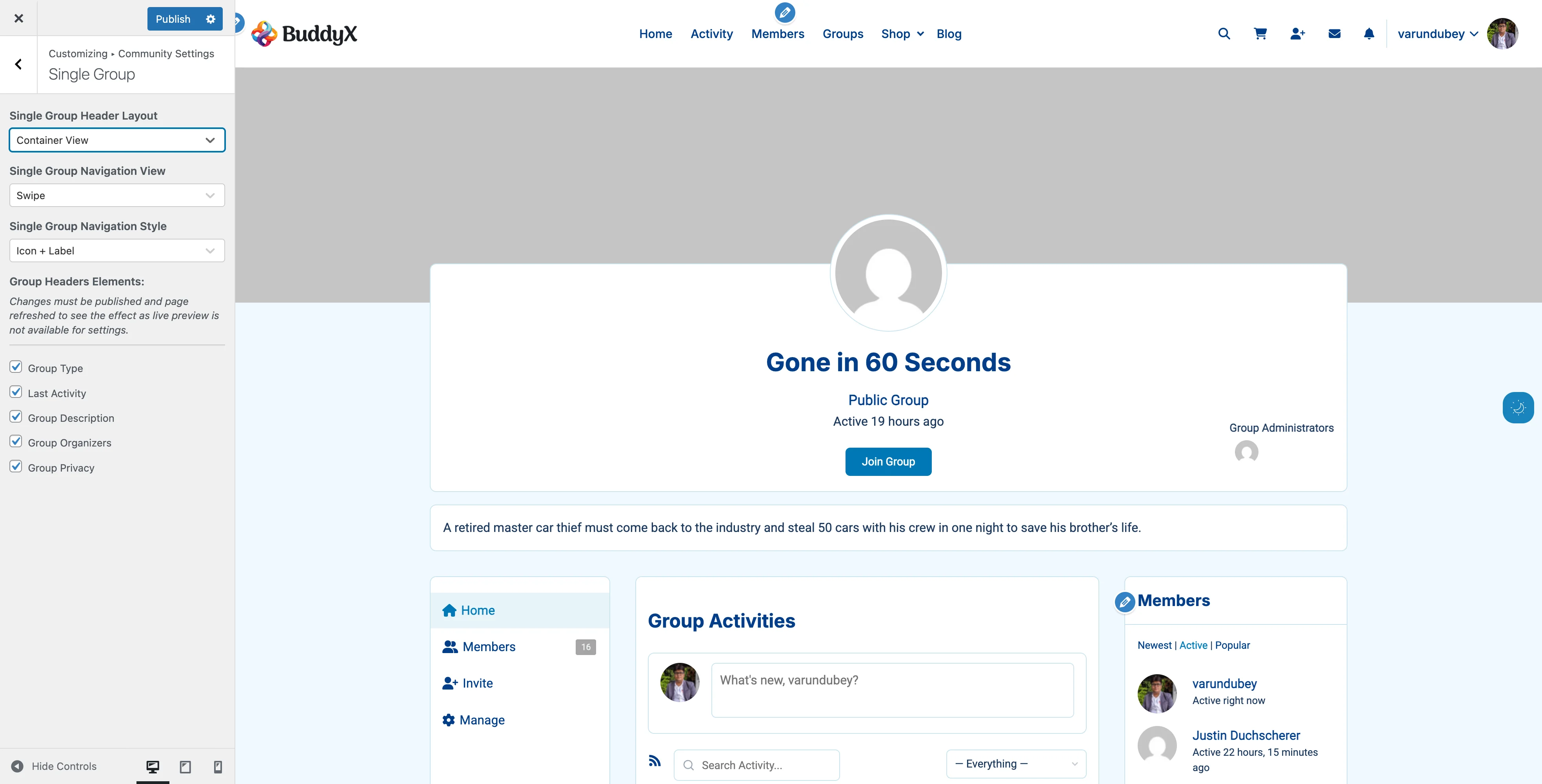
Group Header Container Container View - Contained width layout
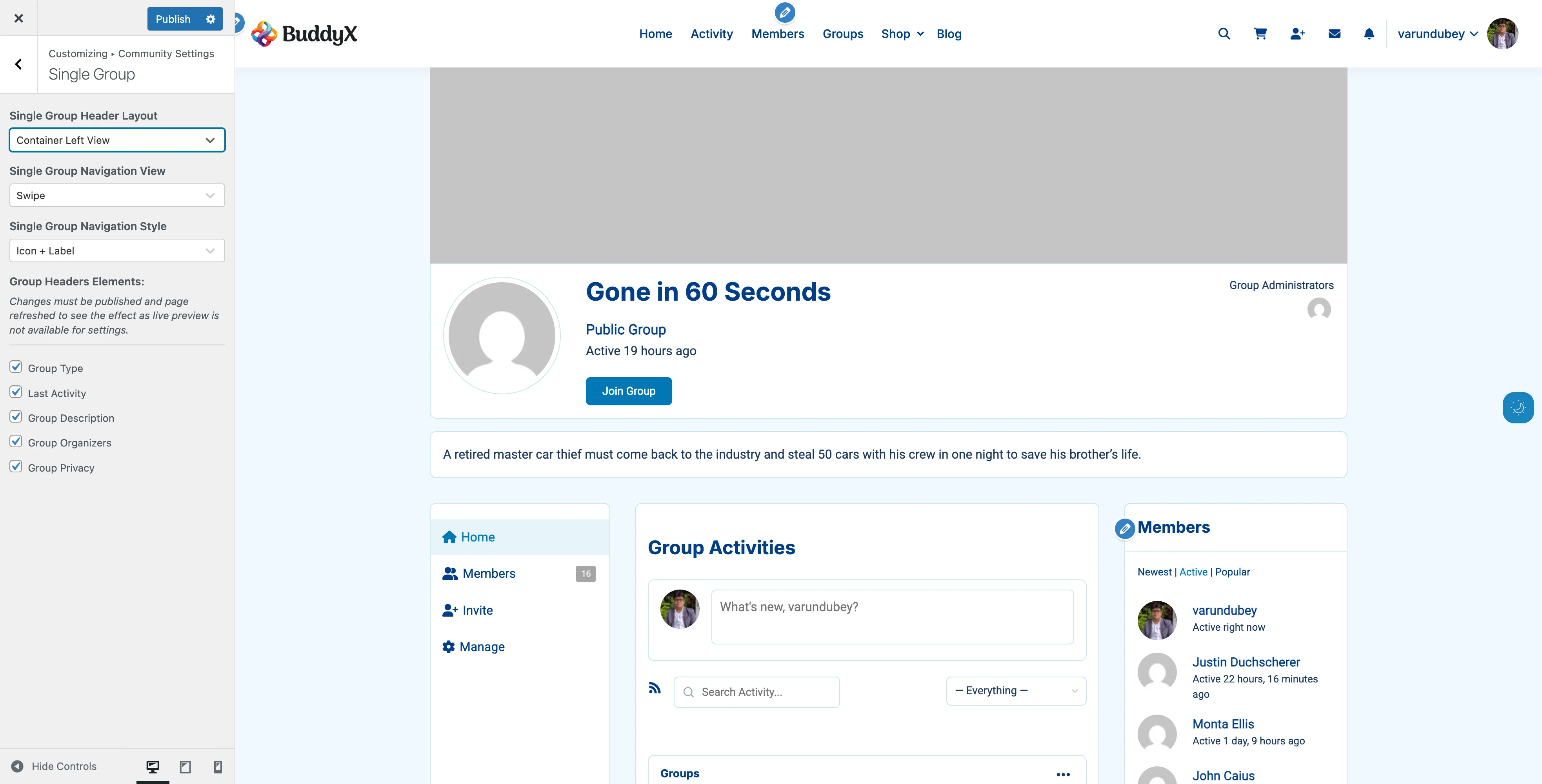
Group Header Container Left Container Left View - Left-aligned in contained width
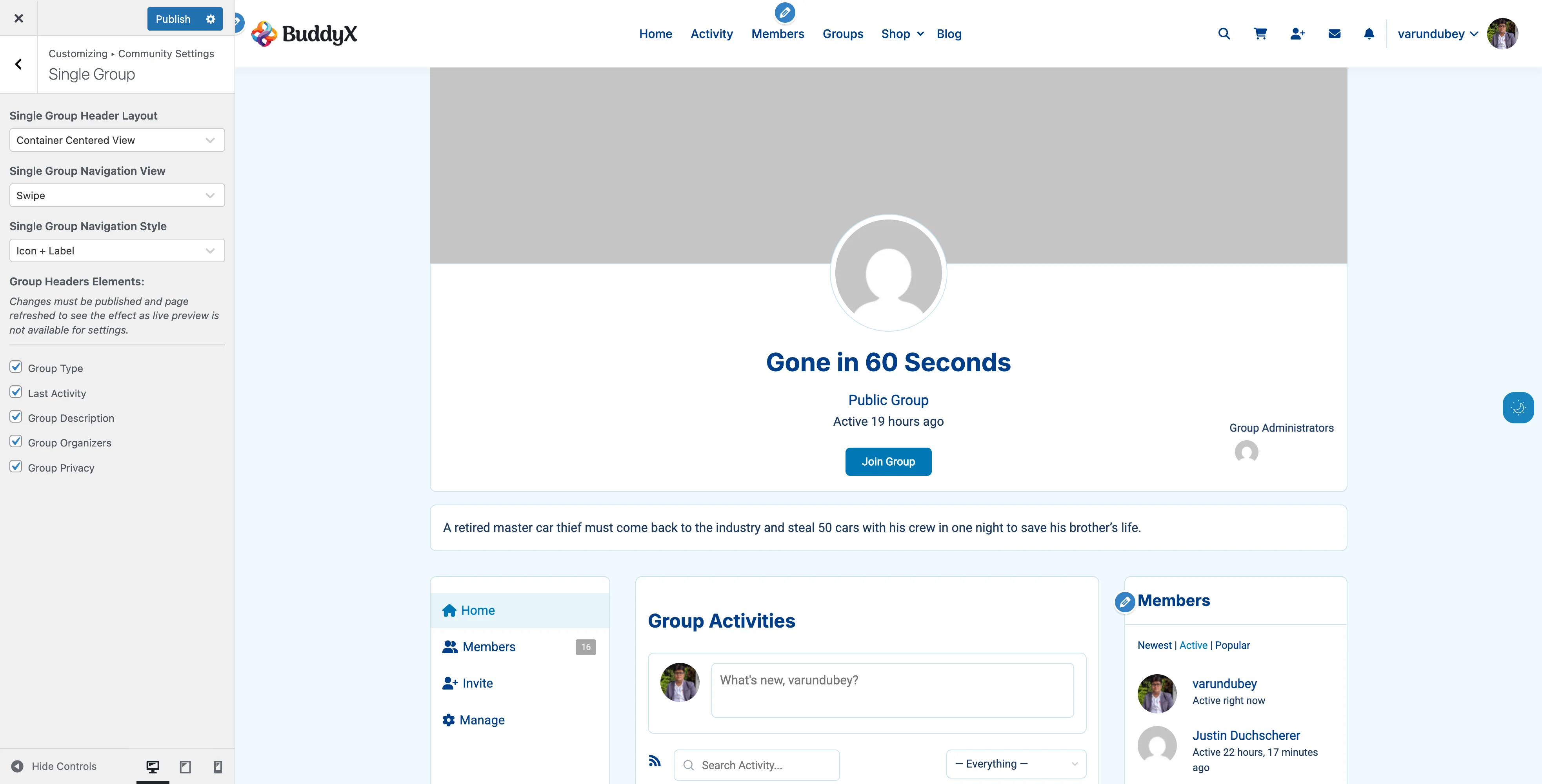
Group Header Container Center Container Centered View - Centered in contained width
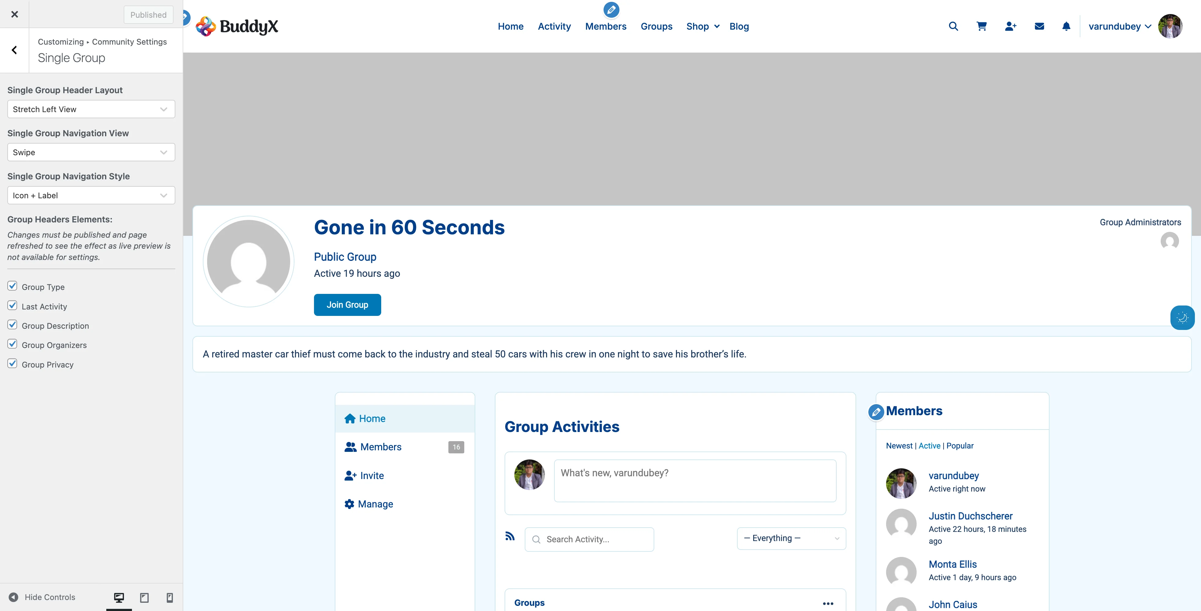
Group Header Stretch Left Stretch Left View - Full width with left alignment
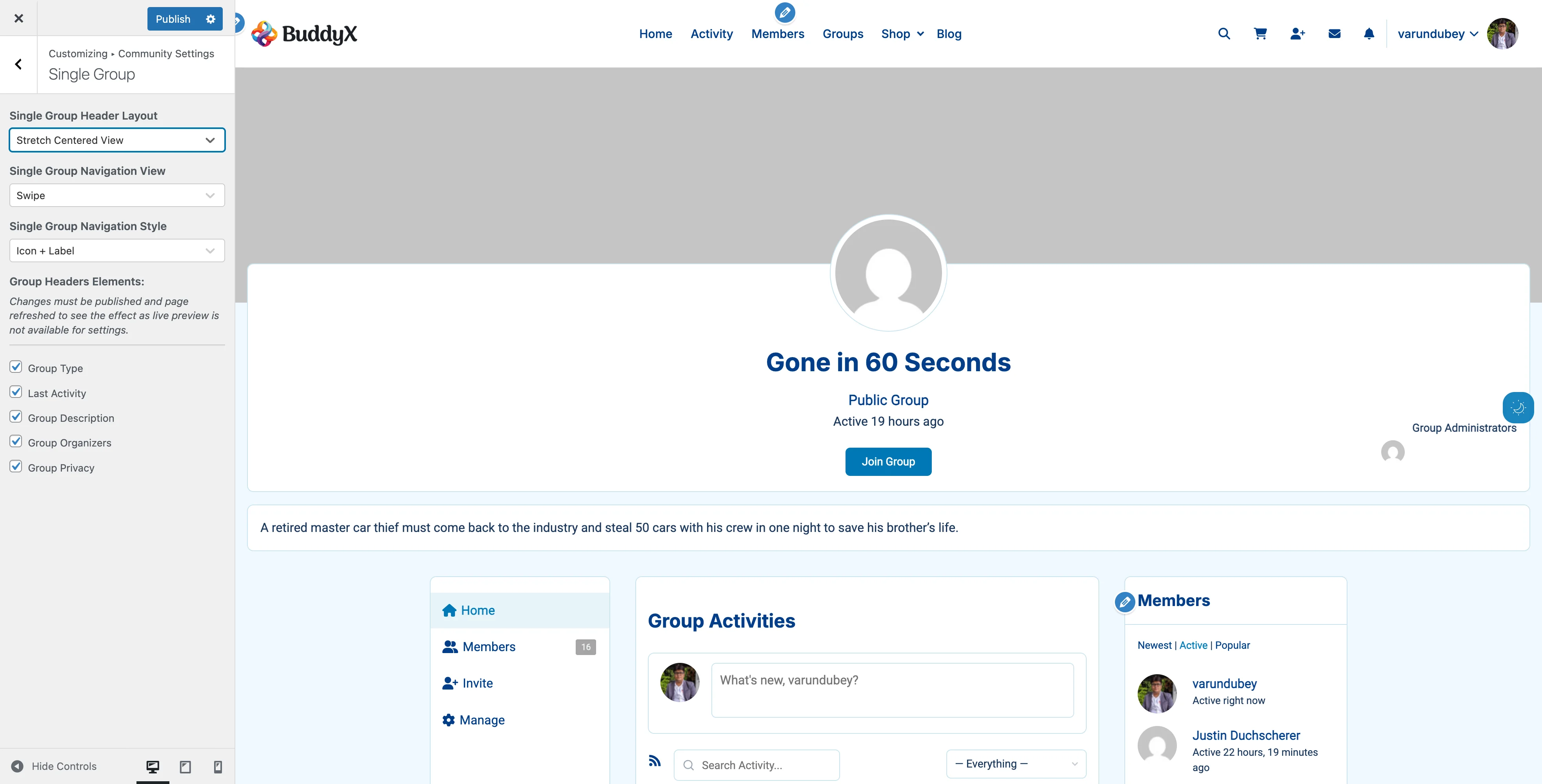
Group Header Stretch Center Stretch Centered View - Full width with centered alignment
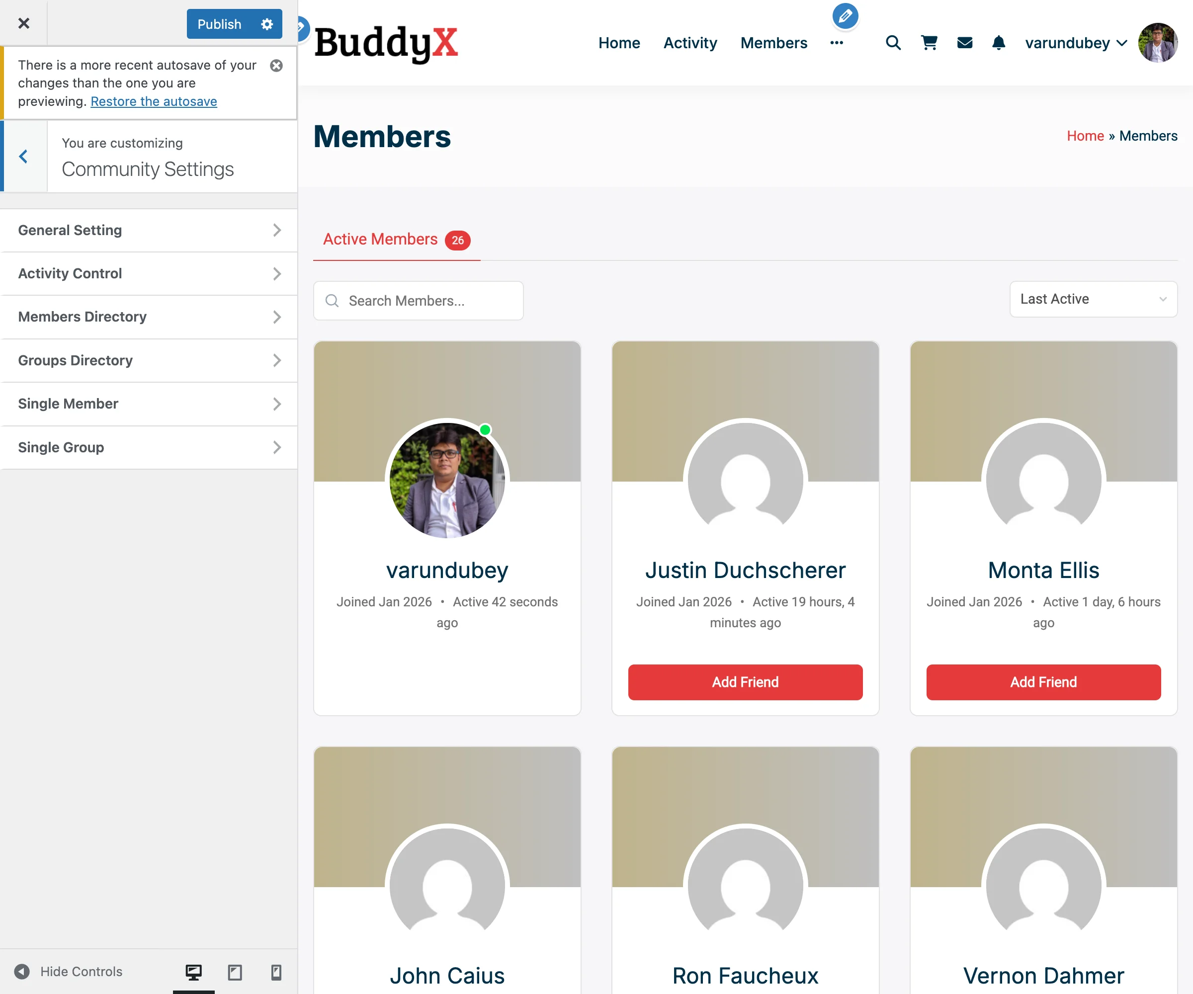
Layout Description Best For
Left View Avatar left, info right, full width Classic group pages
Container View Centered, contained width Boxed layouts
Container Left View Left layout, contained Professional communities
Container Centered View Centered, contained Formal organizations
Stretch Left View Left layout, full browser width Visual impact
Stretch Centered View Centered, full browser width Maximum impact

How to Change:

  1. Customizer > BuddyPress > Single Group
  2. Single Group Header Layout: Choose layout
  3. Publish

Recommended Layout

Left View is recommended for most communities because:

  • Familiar layout - Users expect avatar on left, info on right (like Facebook groups, LinkedIn)
  • Easy scanning - Eye naturally flows left to right
  • Action buttons accessible - Prominent placement for Join Group, Send Message
  • Works at all screen sizes - Responsive without awkward reflows
  • Professional appearance - Clean, traditional social network feel

Use centered or stretch layouts only if your design specifically calls for it (portfolios, creative communities, magazine-style sites).

Navigation Options

Navigation View:

  • More - Extra tabs in dropdown
  • Swipe - Horizontal scrolling tabs

Navigation Style:

  • Default - Text only
  • Icon + Label - Icons with text
  • Icon + Label (Swipe 1) - Compact for swipe
  • Icon + Label (Swipe 2) - Larger for swipe

Configuration:

  1. Customizer > BuddyPress > Single Group
  2. Single Group Navigation View: Choose More or Swipe
  3. Single Group Navigation Style: Choose style
  4. Publish

Group Header Elements

Control information displayed in group headers.

Available Elements

Element What It Shows Default
Group Type Type badge On
Last Activity Recent activity On
Group Description Full description On
Group Organizers Admin/mod list On
Group Privacy Privacy status On

How to Configure

  1. Customizer > BuddyPress > Single Group
  2. Scroll to Group Headers Elements
  3. Check/uncheck elements
  4. Publish and refresh

Element Details

Group Type

What It Is:

  • Visual badge showing group category
  • Examples: "School", "Project", "Social"

Why Show:

  • Multiple group categories
  • Help members understand purpose
  • Visual organization

Why Hide:

  • All groups same type
  • Simpler design

Requirements: Group Types must be set up in BuddyPress.

Last Activity

Shows: Most recent group activity timestamp

Why Show: Indicates active vs dormant groups

Why Hide: Privacy or all groups equally active

Group Description

Shows: Full group description text

Why Show: Clear group purpose and rules

Why Hide: Minimal design, description obvious from name

Group Organizers

Shows:

  • Group creator
  • Administrators
  • Moderators
  • Avatar and name

Why Show:

  • Contact information
  • Accountability
  • Community transparency

Why Hide:

  • Anonymous group structure
  • Minimal information preference

Group Privacy

Shows: Public/Private/Hidden status with icon

Why Show: Clear access expectations

Why Hide: All groups same privacy level

Group Types

Categorize groups for better organization.

What Are Group Types?

Group types let you categorize groups:

  • Study Groups vs Social Groups
  • Regional Chapters
  • Project Teams vs Discussion Groups
  • Free vs Premium Groups

Setting Up Group Types

  1. Install group types plugin or use custom code
  2. Define group type taxonomy
  3. Assign types when creating groups
  4. BuddyX Pro displays type badges automatically

Where Types Appear

  • Group directory cards
  • Single group header
  • Group search filters

To Hide Type Badges:

  1. Customizer > BuddyPress > Single Group
  2. Uncheck Group Type
  3. Publish

Group Privacy Levels

Understand BuddyPress group privacy options.

Public Groups

Visibility: Listed in directory, visible to all

Who Can Join: Anyone

Content Visibility: Public activity

Best For:

  • Open communities
  • Public discussions
  • Marketing/brand groups
  • Community announcements

Private Groups

Visibility: Listed in directory

Who Can Join: Requires approval

Content Visibility: Members only

Best For:

  • Semi-private discussions
  • Teams requiring approval
  • Alumni groups
  • Professional groups

Hidden Groups

Visibility: Not in directory (invitation only)

Who Can Join: Invitation required

Content Visibility: Members only

Best For:

  • Secret projects
  • Executive teams
  • Support groups
  • VIP access

Note: BuddyX Pro displays privacy badges to help members understand access levels.

Group Activity Feeds

Every group has its own activity stream.

What Appears in Group Activity

  • Member posts to group
  • Group announcements
  • New member joins
  • Group updates
  • Uploaded media (with plugins)

Activity Features

For Members:

  • Post directly to group
  • Comment on group activity
  • Like/react to posts
  • Share activity

For Admins:

  • Pin important posts
  • Delete inappropriate content
  • Moderate discussions

Location: Single group page, Activity tab

Group Member Lists

Show who's in each group.

What's Displayed

  • All group members
  • Admins and moderators highlighted
  • Member avatars
  • Join dates
  • Member roles

Admin Actions

Group admins can:

  • Promote to admin/moderator
  • Remove members
  • Ban members
  • Send group messages

Location: Single group page, Members tab

Creating Groups

How members create new groups.

Group Creation Process

  1. Click Create a Group button
  2. Details: Name, description, privacy
  3. Settings: Enable features
  4. Cover/Avatar: Upload images
  5. Invite: (optional) Invite members
  6. Click Finish

Admin Settings for Group Creation

Who Can Create Groups:

Set in Settings > BuddyPress > Settings > Group Creation

Options:

  • All members
  • Administrators only
  • Specific user roles (with plugins)

Recommendation: Start restricted, open up as community matures.

Common Questions

Q: Can I limit how many groups a member can create? A: Not in BuddyPress by default. Requires custom plugin.

Q: How do I delete a group? A: Group admins can delete from group settings, or WordPress admins from admin dashboard.

Q: Can groups have subgroups? A: Not natively. Requires hierarchical groups plugin.

Q: What's the difference between admin and moderator? A: Admins have full control. Moderators can moderate content but not delete group.

Q: Can I disable group creation entirely? A: Yes. Settings > BuddyPress > Settings > Restrict group creation to admins.

Q: How do I make all new groups require approval? A: Requires custom code or plugin. Not a default BuddyPress option.

Q: Why don't my cover images appear in directory? A: Cover images only show in Style 2 (Card) layout. Switch from Style 1.

Q: Can I change the default group privacy? A: Not through theme settings. Requires custom code modification.

Q: How do I feature/pin certain groups at top? A: Requires custom code or groups featured plugin.

Q: Can members join multiple groups? A: Yes, unlimited by default.

Recommended Configurations by Community Type

Educational Institution

  • Layout: Style 1 (Default)
  • Show: Group Type, Descriptions, Organizers, Members
  • Group Types: Classes, Clubs, Departments
  • Why: Information-focused, clear organization

Professional Network

  • Layout: Style 2 (Card)
  • Show: Group Type, Privacy, Members, Join Buttons
  • Hide: Last Activity, Descriptions
  • Why: Visual, professional appearance

Hobby/Interest Community

  • Layout: Style 2 (Card)
  • Show: Cover Images, Last Activity, Members, Descriptions
  • Custom Covers: Themed backgrounds
  • Why: Engaging, visual, activity-focused

Corporate/Internal

  • Layout: Style 1 (Default)
  • Show: Group Type, Organizers, Privacy, Descriptions
  • Hide: Join Buttons (controlled access)
  • Why: Professional, controlled, informative

Gaming Community

  • Layout: Style 2 (Card)
  • Show: Cover Images, Last Activity, Members
  • Hide: Descriptions (prefer short names)
  • Why: Visual, competitive, activity-driven

Related Settings


Need Help?

Member Directory

The member directory is where visitors discover and connect with your community members. BuddyX Pro provides three distinct layout styles and extensive customization options to showcase your members beautifully.

Members Directory Card View The Members Directory with Style 2 (Card with Cover Images) layout showing member cards with avatars, cover images, names, join dates, last active times, and Add Friend buttons
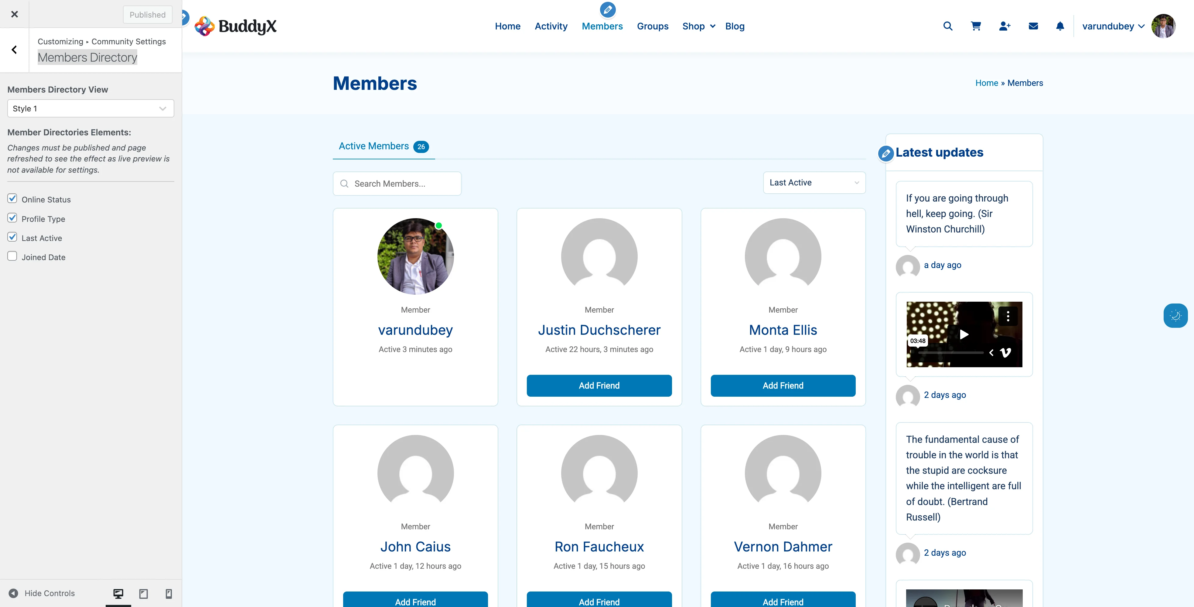
What You Can Do

With BuddyX Pro's member directory features, you can:

  • Choose from 3 card layout styles
  • Show/hide member information elements
  • Display online status indicators
  • Show follower and following counts
  • Add custom default cover images
  • Display member type badges
  • Control information density
  • Optimize for mobile and desktop

Directory Layout Styles

BuddyX Pro offers three distinct member directory layouts.

Style 1: Default (Classic List)

Members Directory Style 1 Style 1 - Classic horizontal list layout with avatars on left and member info on right
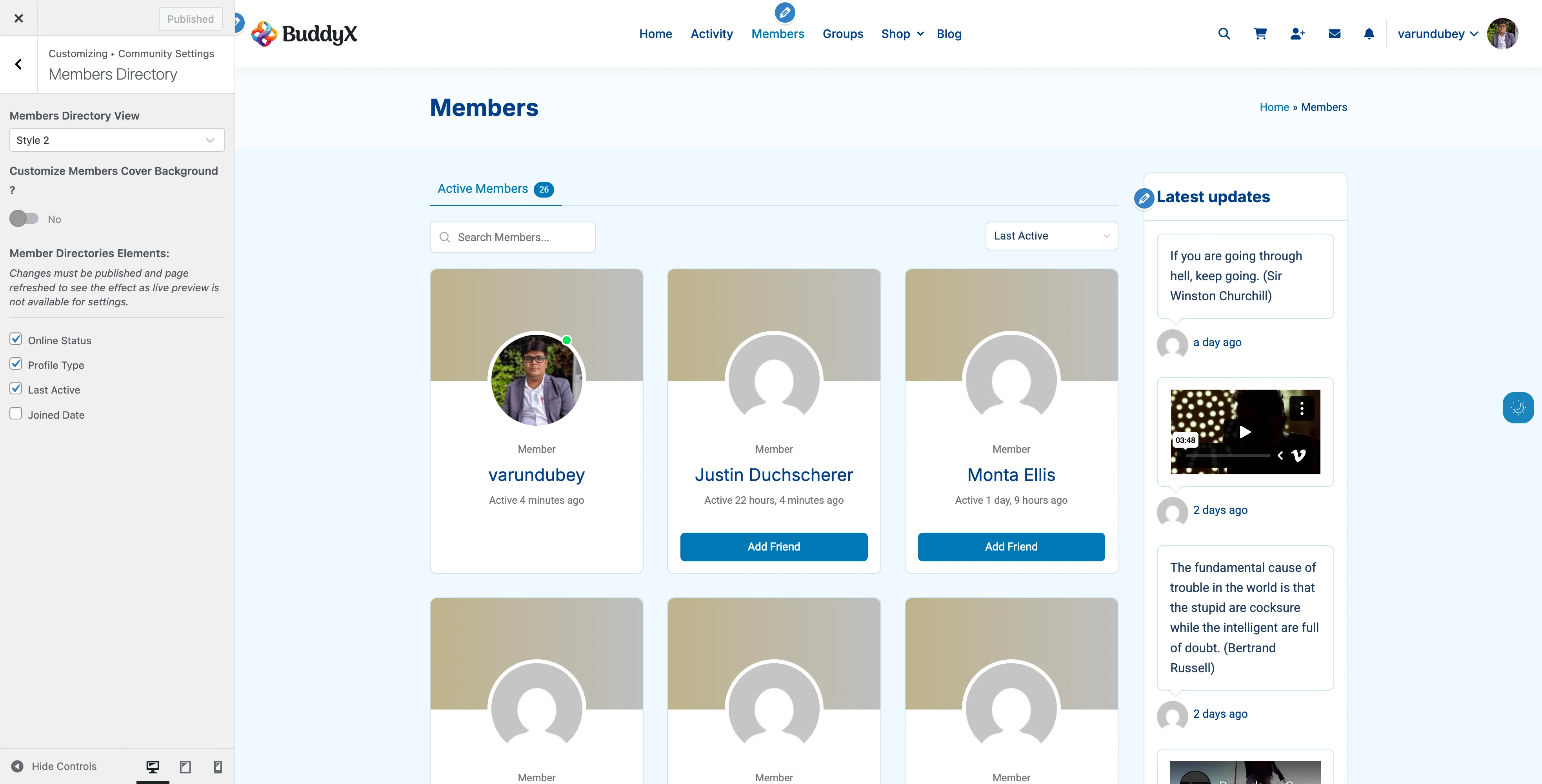
Best For: Traditional social networks, forums

Features:

  • Horizontal list layout
  • Avatar on left
  • Member info on right
  • Clean, scannable design
  • Maximum information density

What Members See:

  • Large avatar (circular or square)
  • Member name as clickable link
  • Joined date
  • Last active timestamp
  • Action buttons (Add Friend, Send Message)

When to Use:

  • Communities with 100+ members
  • Forums and discussion sites
  • Information-heavy communities
  • Desktop-focused audiences

Style 2: Card with Cover Images

Members Directory Style 2 Style 2 - Card layout with cover images and overlapping avatars
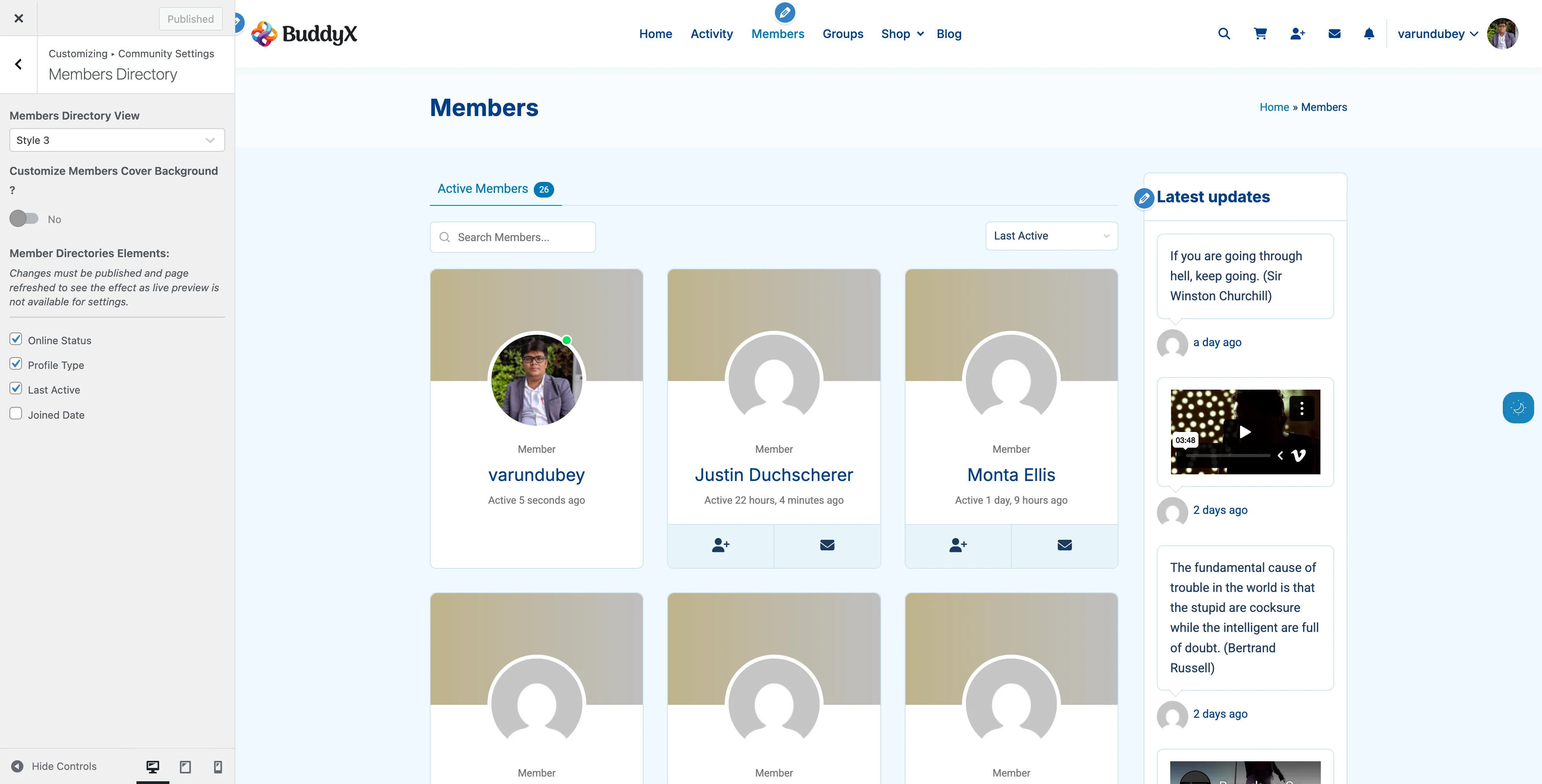
Best For: Visual communities, portfolios

Features:

  • Card-based grid layout
  • Cover images at top
  • Avatar overlays cover
  • Modern, visual design
  • Instagram-like appearance

What Members See:

  • Cover image background
  • Profile avatar (overlapping cover)
  • Member name
  • Meta information
  • Online status indicator

When to Use:

  • Creative communities
  • Photo-focused networks
  • Portfolio sites
  • Communities with <200 members
  • Visual, modern brands

Requirements:

  • Cover images look best when most members have them
  • Custom default cover recommended

Style 3: Card with Action Buttons

Members Directory Style 3 Style 3 - Card layout with prominent action buttons for quick interactions
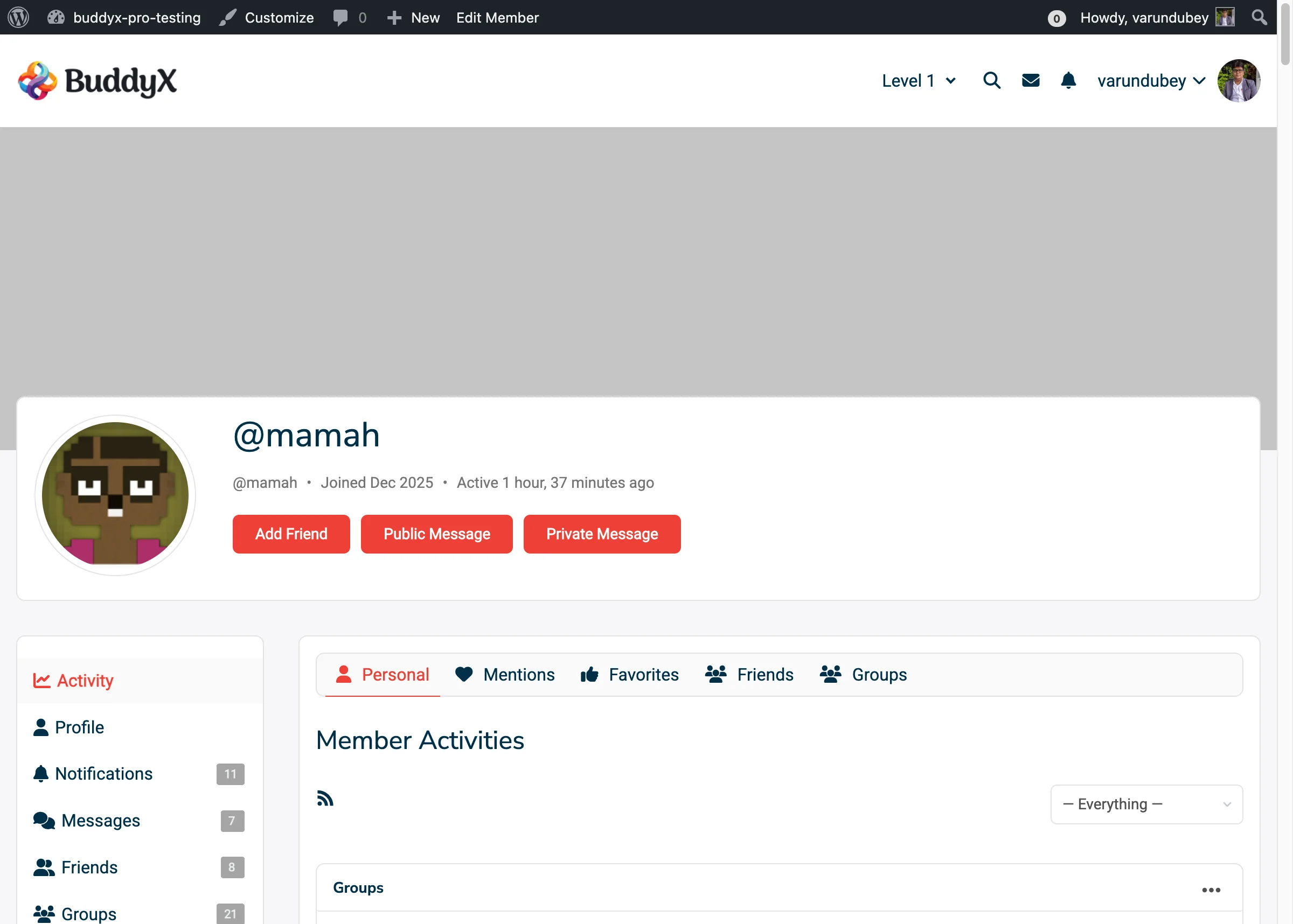
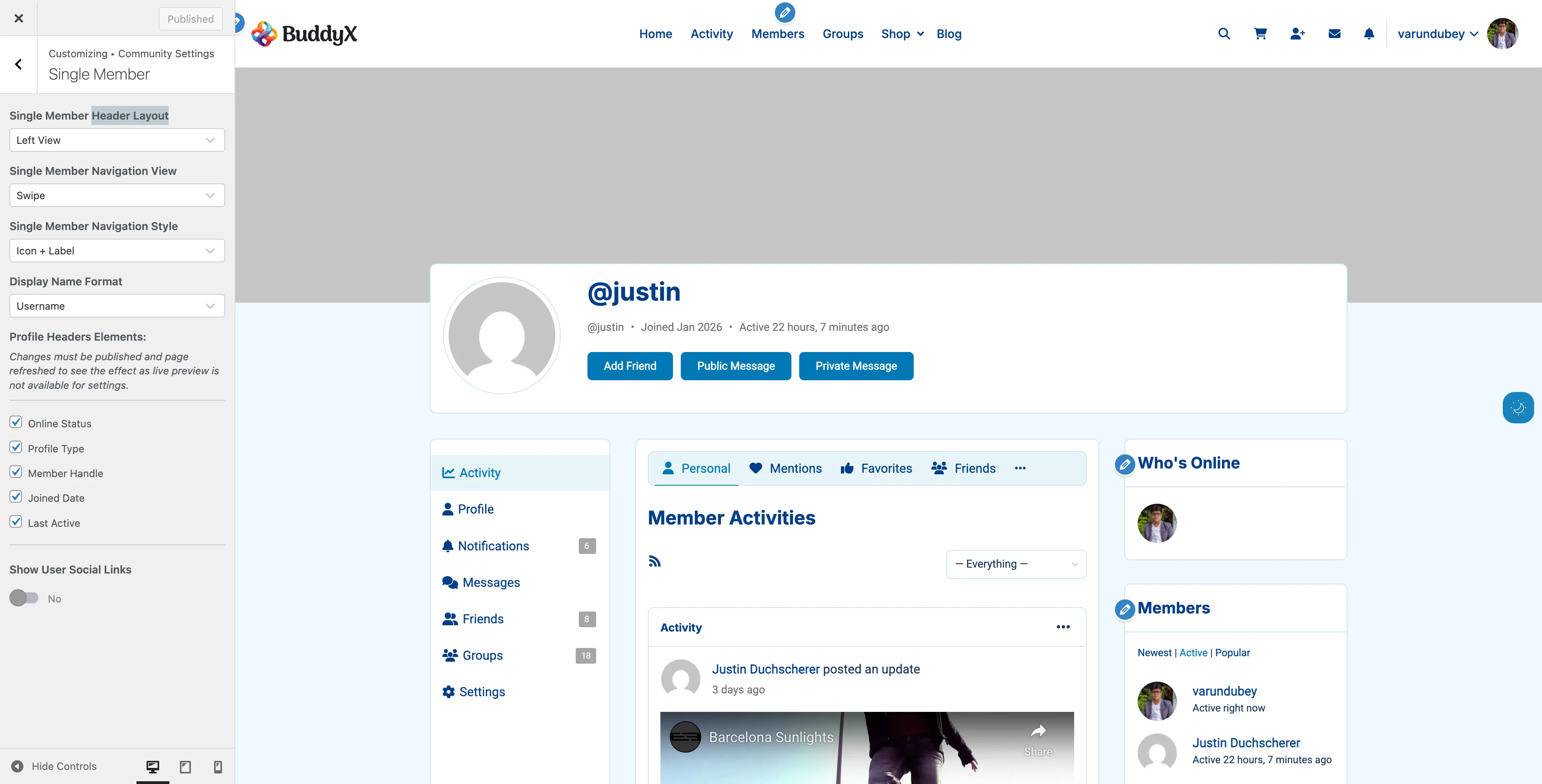
Best For: Professional networks, directories

Features:

  • Compact card layout
  • No cover images
  • Quick action buttons
  • Private message button
  • Clean, professional look

What Members See:

  • Profile avatar
  • Member name and info
  • "Private Message" button (if logged in)
  • Meta information
  • Profile type badge (optional)

When to Use:

  • Professional networking sites
  • Business directories
  • Dating/matchmaking communities
  • Action-oriented communities

Unique Features:

  • Prominent messaging button
  • Space-efficient cards
  • No cover image clutter

How to Change Layout Style

  1. Go to Appearance > Customize
  2. Navigate to BuddyPress > Members
  3. Find Members Directory View
  4. Select: Style 1, Style 2, or Style 3
  5. Click Publish
  6. Visit your members page to see the change

Page Refresh Required: Live preview is not available. Publish and refresh to see changes.

Cover Image Customization

Available for: Style 2 and Style 3 layouts

Add visual appeal with custom cover images.

Setting Default Cover Images

When members don't upload their own cover, show your custom default:

  1. Customizer > BuddyPress > Members
  2. Enable Customize Members Cover Background
  3. Click Set Default Cover Image
  4. Upload your image
  5. Click Publish

Cover Image Best Practices

Recommended Dimensions: 1300px x 225px

Design Tips:

  • Use subtle gradients or patterns
  • Avoid bright colors that clash with avatars
  • Don't include text (accessibility)
  • Keep file size under 200KB
  • Test with various avatar positions
  • Use WebP format for best performance

Good Default Cover Ideas:

  • Branded gradient
  • Subtle geometric pattern
  • Community logo watermark
  • Themed background (tech, nature, abstract)
  • Solid color with texture overlay

What to Avoid:

  • Photos with faces (confusing)
  • Busy patterns (distracting)
  • Dark images (poor contrast)
  • Text or logos (accessibility issues)

Member Information Elements

Control exactly what information displays on member cards.

Available Elements

Element What It Shows Default Performance Impact
Online Status Green/gray dot indicator On Medium (cached)
Profile Type Member type badge Off Low
Followers Follower count Off Low
Last Active "Active 2 hours ago" On Low (cached)
Joined Date "Joined Jan 2024" On None

How to Configure Elements

  1. Customizer > BuddyPress > Members
  2. Scroll to Member Directories Elements
  3. Check/uncheck desired elements
  4. Click Publish
  5. Refresh directory page

Note: Changes won't show in Customizer preview. Publish and refresh to see results.

Element Details

Online Status

What It Is:

  • Real-time activity indicator
  • Green dot = active in last 5 minutes
  • Gray dot = offline

Why Show It:

  • Encourages real-time connections
  • Shows community activity level
  • Helps members find active users

Why Hide It:

  • Privacy concerns
  • Reduces database queries on large sites
  • Professional communities prefer no tracking

Performance Note: Cached for 5 minutes per user to reduce database load.

Profile Type

What It Is:

  • Visual badge showing member category
  • Examples: "Teacher", "Premium Member", "Admin"

Why Show It:

  • Multi-tiered communities
  • Different member roles
  • Paid vs free members

Why Hide It:

  • All members same type
  • Minimalist design preference
  • Reduces visual clutter

Requirements: You must set up BuddyPress Member Types first.

Followers Count

Requirements: BP Follow plugin or BuddyBoss Platform

What It Shows:

  • "25 Followers" text
  • Not clickable in directory

Why Show It:

  • Social networking communities
  • Gamification
  • Showcase popular members

Why Hide It:

  • Not using follow feature
  • Reduces "popularity contest" feeling
  • Simpler, cleaner design

Last Active

What It Shows:

  • "Active 3 hours ago"
  • "Active this week"
  • Relative timestamps

Why Show It:

  • Shows community engagement
  • Helps find active members
  • Encourages participation

Why Hide It:

  • Privacy-focused communities
  • Pressure on inactive members
  • Professional networks

Joined Date

What It Shows:

  • "Joined Jan 2024"
  • Month and year only

Why Show It:

  • Celebrates long-time members
  • Shows community growth
  • "Veteran" vs "new" member distinction

Why Hide It:

  • All members joined recently
  • Avoid highlighting age differences
  • Minimalist design

Online Status Indicators

Help members see who's currently active.

How It Works

Technology:

  • Checks last activity timestamp
  • Active = activity in last 5 minutes
  • Updates every 5 minutes
  • Results cached for performance

Visual Display:

  • Green dot - Online now
  • Gray dot - Offline
  • Appears next to avatar

Where It Appears

When enabled, online status shows in:

  • Member directory cards
  • Single member profiles
  • Activity stream
  • Group member lists

Privacy Considerations

Show Online Status When:

  • You have a real-time community
  • Members expect social networking features
  • You want to encourage live conversations
  • Gaming or chat-based community

Hide Online Status When:

  • Privacy is important
  • Mental health or support groups
  • Members need anonymity
  • Professional formal environments

How to Disable:

  1. Customizer > BuddyPress > Members
  2. Uncheck Online Status
  3. Customizer > BuddyPress > Single Member
  4. Uncheck Online Status there too
  5. Publish

Search and Filter Features

BuddyPress provides built-in member search and filtering.

Available Filters

Members can filter directory by:

  • Newest Members - Recently registered
  • Active Members - Recently active
  • Popular Members - Most connections
  • Alphabetical - A-Z by name

Search:

  • Search by name
  • Search by username
  • Real-time filtering

How Members Use Filters

  1. Visit members directory
  2. Click filter dropdown
  3. Select filter option
  4. Results update automatically

No Configuration Needed: Filters work automatically with all layout styles.

Pagination and Performance

Default Settings

  • 24 members per page (BuddyPress default)
  • AJAX pagination (no page reload)
  • Infinite scroll option (with plugins)

Performance Tips

For Large Communities (1000+ members):

  • Keep online status enabled (it's cached)
  • Disable unnecessary elements
  • Use Style 1 (Default) layout
  • Consider reducing members per page
  • Use caching plugin

For Small Communities (<200 members):

  • Style 2 (Card) looks great
  • Show all elements
  • Encourage cover image uploads

For Medium Communities (200-1000 members):

  • Style 3 (Card1) good balance
  • Selective element display
  • Monitor page load times

Optimizing Cover Images

If using Style 2:

  1. Encourage members to upload covers
  2. Use image optimization plugin
  3. Serve images via CDN
  4. Use WebP format
  5. Lazy load images (with plugin)

Action Buttons

What members can do from the directory.

Style 1 and Style 2 Buttons

Add Friend (if friend component active)

  • Adds connection request
  • Changes to "Pending" or "Accept"

Send Message (if messages active)

  • Opens private message composer
  • Requires login

Style 3 Unique Button

Private Message

  • Prominent button on each card
  • Direct message access
  • Visible only when logged in
  • Hidden on own card

Requirements

For Add Friend:

  • BuddyPress Friend Connections component active

For Send Message:

  • BuddyPress Private Messaging component active
  • User must be logged in

Disabling Buttons: Deactivate components in Settings > BuddyPress > Components

Mobile Responsiveness

All layouts are fully responsive.

Style 1 (Default)

  • Stacks to single column
  • Avatar size adjusts
  • Maintains information hierarchy

Style 2 (Card)

  • 3 columns → 2 columns → 1 column
  • Cover images scale proportionally
  • Touch-friendly cards

Style 3 (Card1)

  • 3 columns → 2 columns → 1 column
  • Buttons remain accessible
  • Compact, thumb-friendly

No Configuration Needed: Responsive behavior is automatic.

Common Questions

Q: Can I have different layouts for different member types? A: No. The layout style applies to all members in the directory. Use custom CSS if you need type-specific styling.

Q: How do I increase members shown per page? A: This is controlled by BuddyPress settings, not the theme. Requires custom code or plugin.

Q: Why don't cover images appear in Style 1? A: Style 1 (Default) doesn't support cover images. Use Style 2 (Card) or Style 3 (Card1) for covers.

Q: Can members choose to hide their last active time? A: Not by default. BuddyPress shows this for all members. Custom development required for individual privacy.

Q: Will disabling elements improve performance? A: Marginally. Online status has the most impact. Other elements have minimal performance cost.

Q: How do I remove the member directory entirely? A: You would need to disable the Members component in BuddyPress settings (not recommended).

Q: Can I show member fields (like "Location") in directory? A: Not through theme settings. Requires custom template editing or plugin.

Q: Why do some members have green dots and others gray? A: Green = online (active in last 5 minutes), Gray = offline or not active recently.

Q: Can I change the 5-minute online threshold? A: Yes, but requires custom code modification in the theme's functions file.

Q: Do cover images slow down the page? A: They add page weight. Use optimized images (WebP, under 200KB) and caching for best performance.

Recommended Configurations by Community Type

Professional Network

  • Layout: Style 3 (Card1)
  • Show: Profile Type, Followers, Joined Date
  • Hide: Online Status, Last Active
  • Why: Professional, action-oriented, privacy-respecting

Casual Social Community

  • Layout: Style 2 (Card)
  • Show: Online Status, Last Active, Joined Date
  • Custom Cover: Branded gradient
  • Why: Visual, engaging, social

Forum Community

  • Layout: Style 1 (Default)
  • Show: Last Active, Joined Date, Online Status
  • Hide: Profile Type, Followers
  • Why: Information-dense, traditional

Creative Portfolio Network

  • Layout: Style 2 (Card)
  • Show: Profile Type, Joined Date
  • Hide: Online Status, Last Active
  • Custom Cover: Artistic pattern
  • Why: Visual showcase, less tracking

Learning Community

  • Layout: Style 1 (Default)
  • Show: Profile Type, Joined Date
  • Hide: Followers, Online Status
  • Why: Focus on learning, not social gaming

Dating/Matchmaking

  • Layout: Style 3 (Card1)
  • Show: Online Status, Last Active
  • Hide: Joined Date, Followers
  • Why: Quick messaging, see who's available now

Related Settings


Need Help?

Member Profiles

Member profiles are the heart of your BuddyPress community. BuddyX Pro transforms standard BuddyPress profiles into beautiful, feature-rich pages that showcase your members' information, activity, and achievements.

Member Profile Frontend

What Makes BuddyX Pro Profiles Special

BuddyX Pro enhances BuddyPress member profiles with:

  • 6 Header Layout Styles - From classic to modern designs
  • 3 Navigation Styles - Optimized for desktop and mobile
  • Cover Images - Visual profile headers with drag-drop upload
  • Online Status Indicators - Real-time online/offline display
  • Social Links Integration - Connect member social media profiles
  • Follower Counts - Display followers and following (with BP Follow)
  • Member Type Badges - Visual indicators for member roles
  • Achievement Badges - BadgeOS integration support
  • Profile Visitor Counter - Track profile views (with plugin)

Profile Header Layouts

Choose the layout that matches your community's style.

Member Profile Header Default Member profile header with avatar, cover image, member info, and action buttons
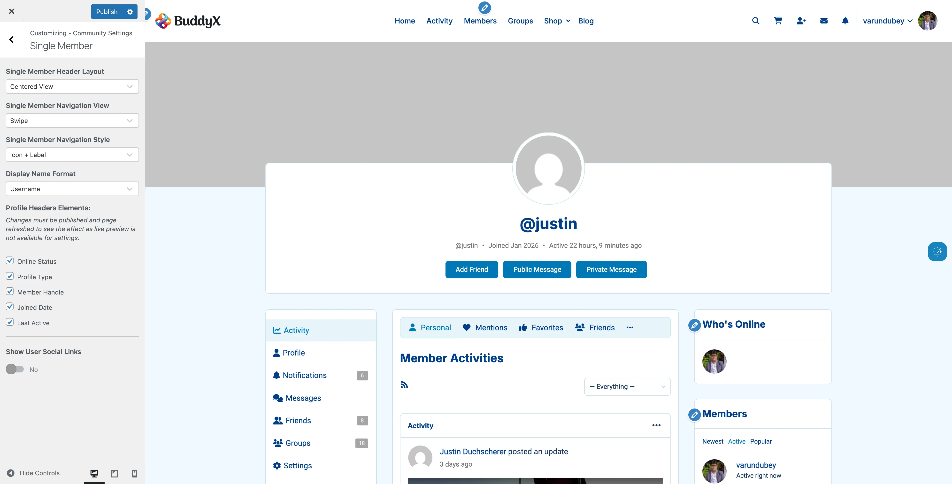
Layout 1: Left View (Default)

Best For: Traditional social networks, general communities

Layout:

  • Avatar positioned on the left
  • Member info and stats on the right
  • Full-width background
  • Horizontal navigation below header

When to Use:

  • Facebook-style communities
  • General purpose social networks
  • Communities prioritizing information density

Layout 2: Centered View

Member Header Centered Centered layout with avatar and info aligned in the center
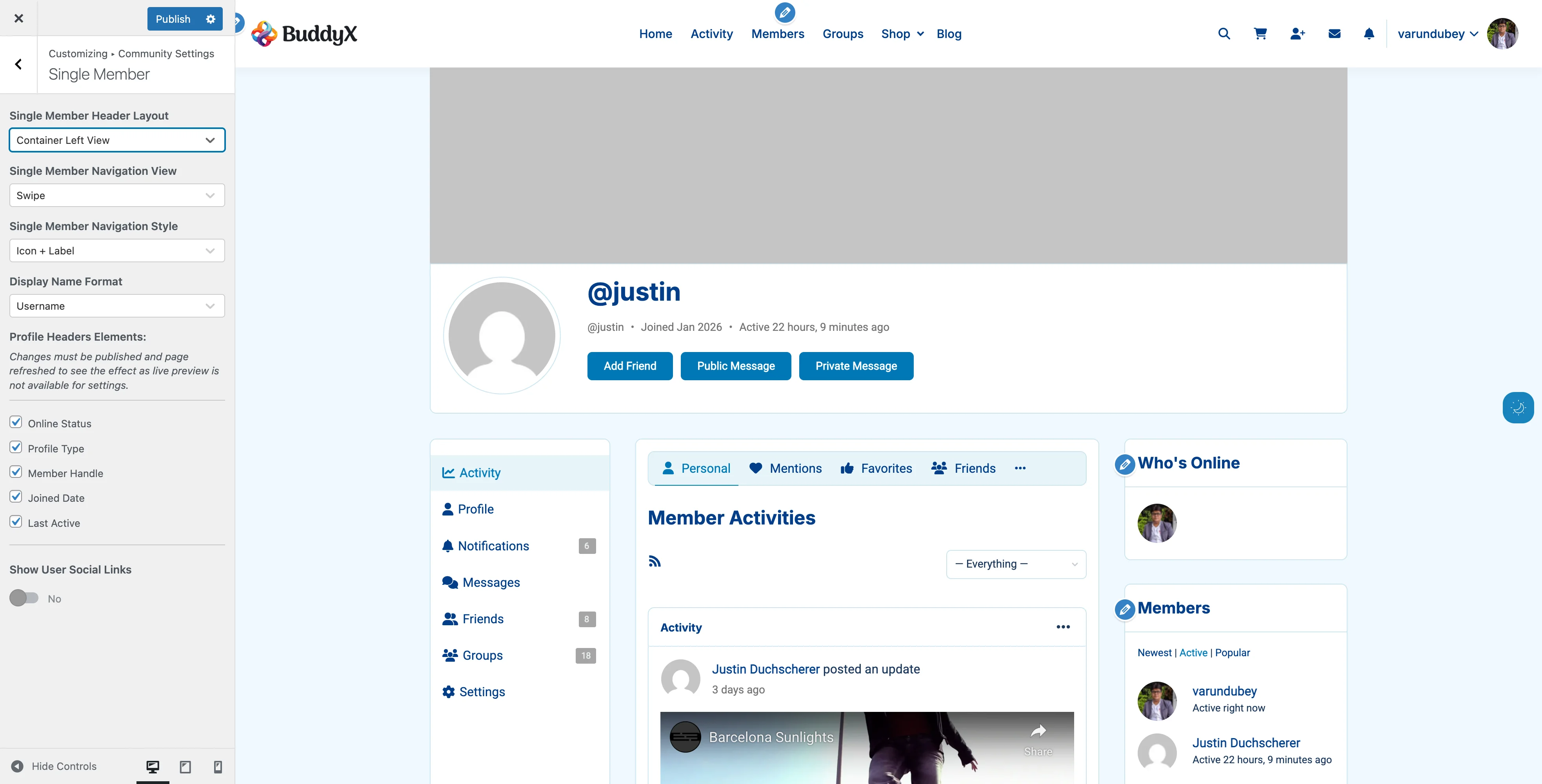
Best For: Modern, visual communities

Layout:

  • Avatar centered at top
  • Member info centered below avatar
  • Symmetrical design
  • Navigation tabs centered

When to Use:

  • Portfolio communities
  • Creative professional networks
  • Image-focused communities

Layout 3: Container Left View

Member Header Container Left Container left layout - contained within site width with left alignment
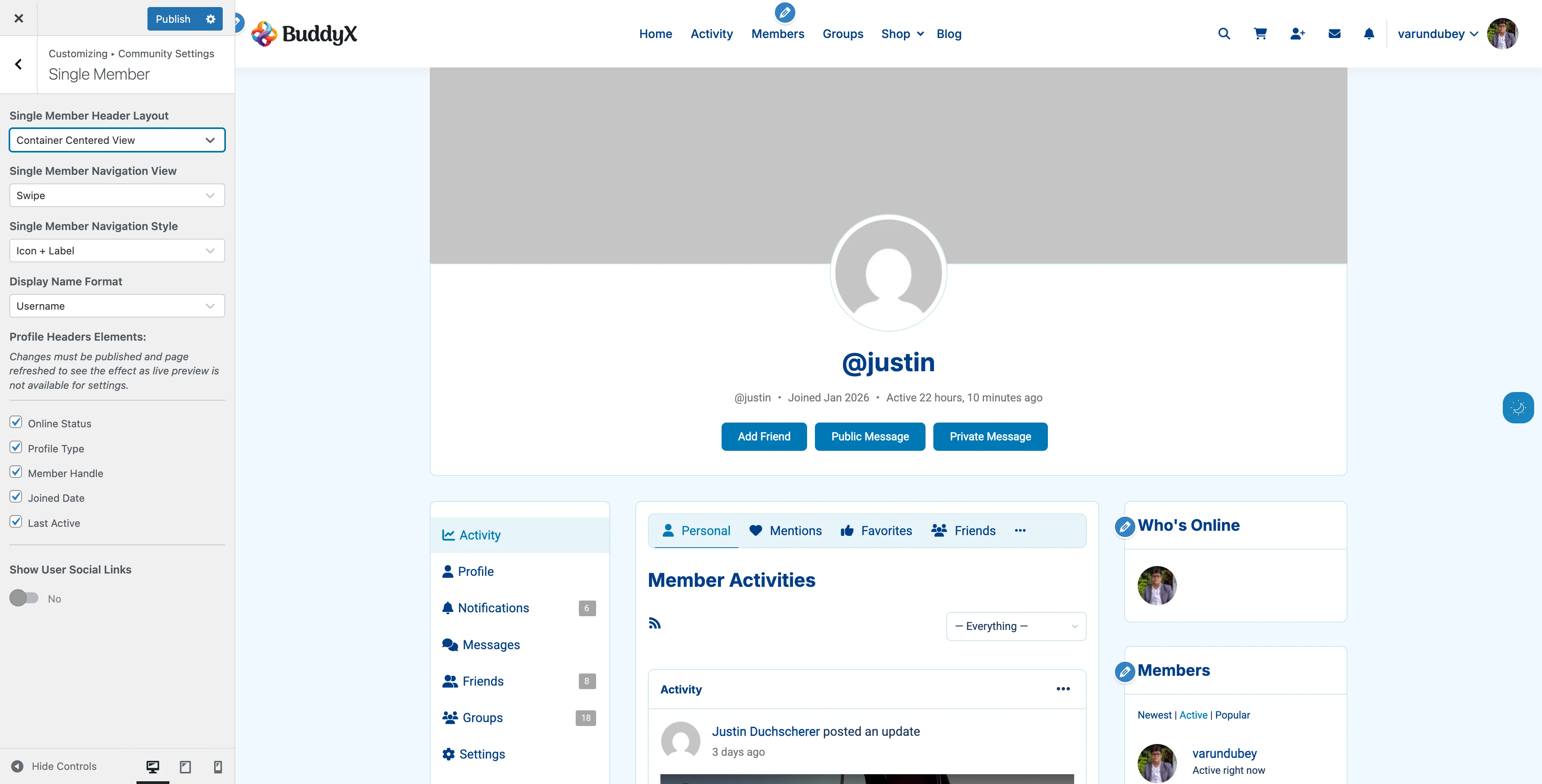
Best For: Boxed website layouts

Layout:

  • Left-aligned like Layout 1
  • Contained within site's content width
  • Better integration with boxed themes

When to Use:

  • Sites with boxed/contained layouts
  • Corporate community sites
  • Learning management communities

Layout 4: Container Centered View

Member Header Container Centered Container centered layout - contained width with centered alignment
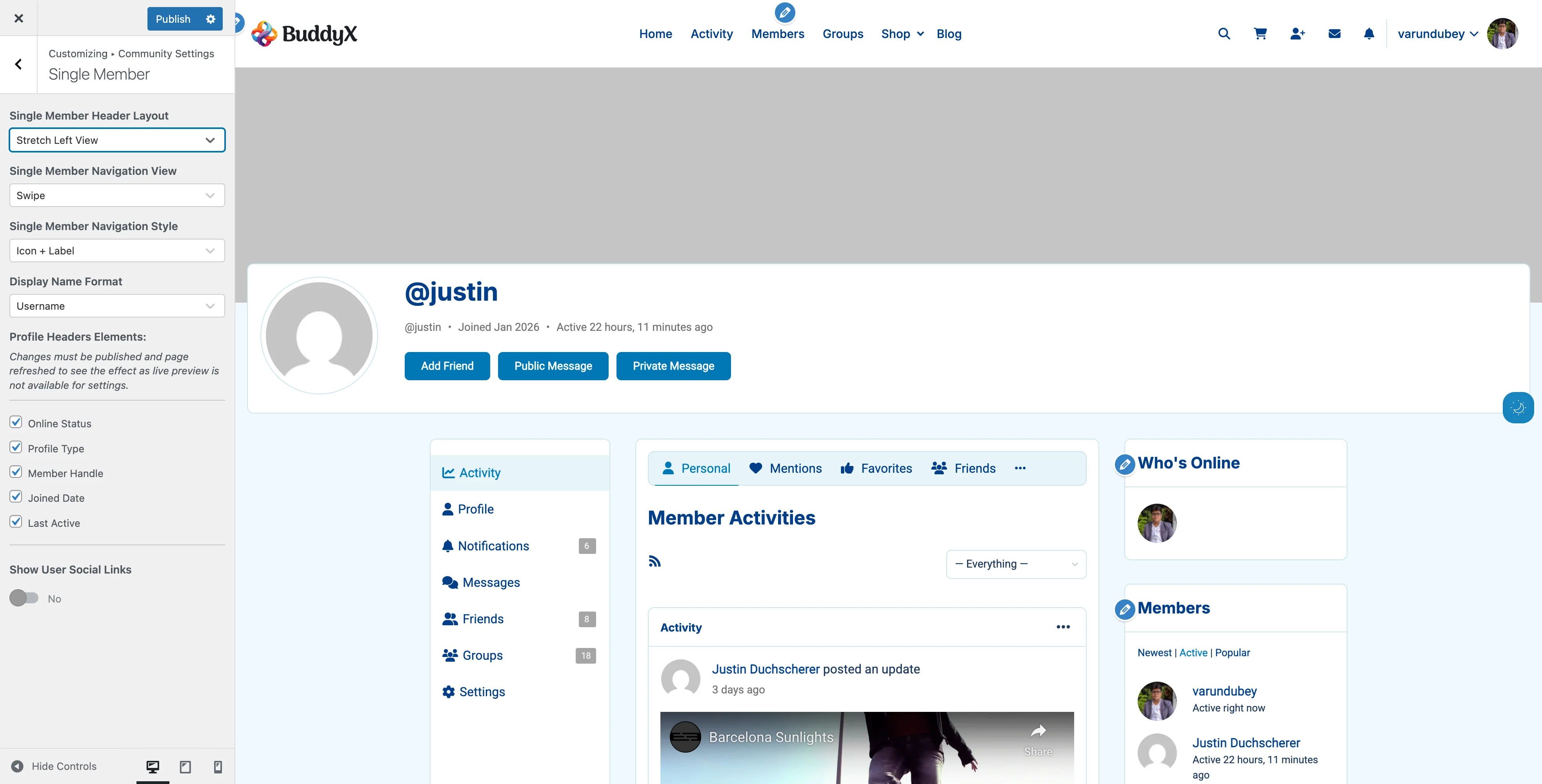
Best For: Professional networks with contained layouts

Layout:

  • Centered like Layout 2
  • Contained within content width
  • Professional, organized appearance

When to Use:

  • Business directories
  • Professional associations
  • B2B communities

Layout 5: Stretch Left View

Member Header Stretch Left Stretch left layout - full browser width with left alignment
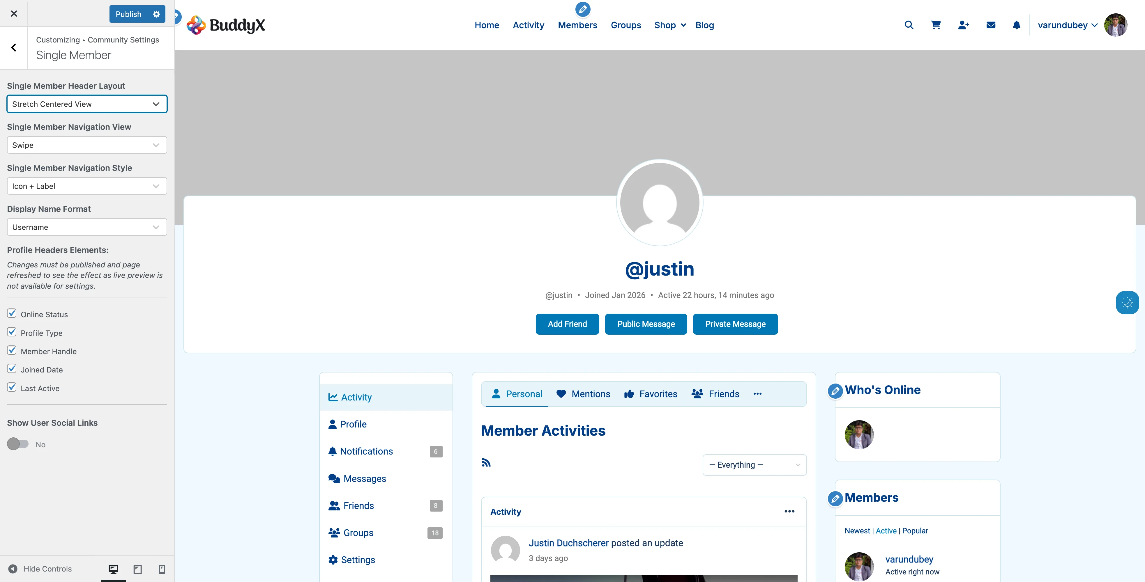
Best For: Magazine-style sites

Layout:

  • Left-aligned layout
  • Extends full browser width
  • Maximum visual impact

When to Use:

  • Media-rich communities
  • Magazine-style sites
  • Communities with large cover images

Layout 6: Stretch Centered View

Member Header Stretch Centered Stretch centered layout - full browser width with centered alignment
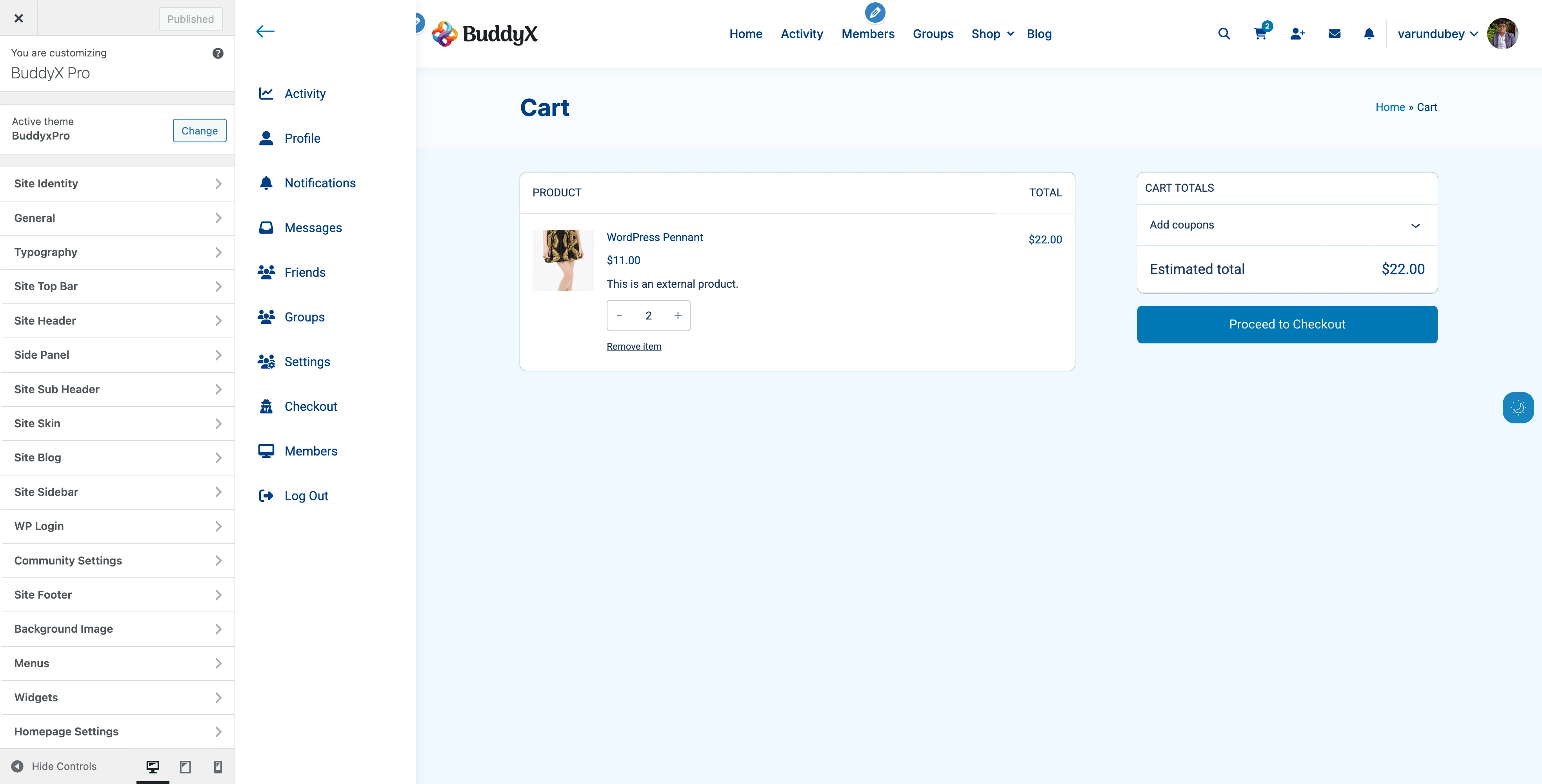
Best For: Portfolio and creative communities

Layout:

  • Centered layout
  • Full browser width
  • Maximum impact for cover images

When to Use:

  • Artist communities
  • Photography networks
  • Design portfolios

How to Change Header Layout

  1. Go to Appearance > Customize
  2. Navigate to BuddyPress > Single Member
  3. Find Single Member Header Layout
  4. Select your preferred layout
  5. Click Publish
  6. Visit a member profile to see the change

Recommended Layout

Left View is recommended for most communities because:

  • Familiar layout - Users expect avatar on left, info on right (like Facebook, LinkedIn)
  • Easy scanning - Eye naturally flows left to right
  • Action buttons accessible - Prominent placement for Add Friend, Send Message
  • Works at all screen sizes - Responsive without awkward reflows
  • Professional appearance - Clean, traditional social network feel

Use centered or stretch layouts only if your design specifically calls for it (portfolios, creative communities, magazine-style sites).

Profile Navigation

Control how navigation tabs appear on member profiles.

Navigation View Options

More (Dropdown)

How It Works:

  • Primary tabs visible
  • Extra tabs in "More" dropdown
  • Saves vertical space

Best For:

  • Desktop-focused communities
  • Sites with many profile sections
  • Traditional forum-style layouts

Swipe (Horizontal Scroll)

How It Works:

  • All tabs in horizontal row
  • Swipe/scroll to see more tabs
  • Touch-friendly

Best For:

  • Mobile-first communities
  • Modern, app-like experiences
  • Communities with 4-8 profile sections

Navigation Style Options

Default (Text Only)

  • Tab labels without icons
  • Clean, minimal look
  • Fastest loading

Icon + Label

  • Icons with text labels
  • Easy visual recognition
  • Modern appearance

Icon + Label (Swipe 1)

  • Compact icons for swipe navigation
  • Optimized for horizontal scrolling
  • Space-efficient

Icon + Label (Swipe 2)

  • Larger icons for swipe navigation
  • Better visibility on mobile
  • Touch-friendly targets

How to Change Navigation

  1. Customizer > BuddyPress > Single Member
  2. Single Member Navigation View: Choose More or Swipe
  3. Single Member Navigation Style: Choose icon style
  4. Click Publish

Cover Images

Cover images add visual appeal to member profiles.

Cover Image Features

  • Drag-and-drop upload - Easy image updates
  • Default images - Set fallback for members without covers
  • Responsive design - Looks great on all devices
  • Activity feed updates - Shows when cover changes (optional)

Setting Up Default Cover Images

  1. Customizer > BuddyPress > Members
  2. Enable Customize Members Cover Background
  3. Click Set Default Cover Image
  4. Upload your image
  5. Click Publish

Recommended Dimensions: 1300px x 225px

Image Tips:

  • Use WebP format for smaller file size
  • Keep file size under 200KB
  • Use subtle patterns or gradients
  • Avoid text in images (accessibility)
  • Test on mobile devices

Member Upload Process

Members can upload their own cover images:

  1. Visit own profile
  2. Click Change Cover Image button (on cover area)
  3. Drag and drop image or click to browse
  4. Crop if needed
  5. Click Upload

Member Upload Requirements:

  • BuddyPress must allow cover image uploads
  • Member must be logged in
  • Viewing own profile

Profile Information Display

Control what information appears in profile headers.

Available Elements

Element What It Shows When to Show When to Hide
Online Status Green/gray indicator Real-time communities Privacy-focused sites
Profile Type Member type badge Multiple member types Single member type
Member Handle @username Twitter-like communities Formal professional networks
Joined Date Registration date Growth-focused communities Privacy-focused sites
Last Active Recent activity timestamp Active engagement sites Privacy concerns
Followers Follower count Social networks Private communities
Following Following count Social networks Simple communities

How to Configure Elements

  1. Customizer > BuddyPress > Single Member
  2. Scroll to Profile Headers Elements
  3. Check/uncheck desired elements
  4. Click Publish
  5. Refresh a profile page to see changes

Note: Changes require page refresh; live preview is not available.

Online Status Indicators

Show members who's currently active in your community.

How It Works

  • Green dot - Member active in last 5 minutes
  • Gray dot - Member offline or inactive
  • Updates automatically - Checks every 5 minutes
  • Cached for performance - Reduces database load

Where It Appears

  • Profile header
  • Member directory cards
  • Activity stream avatars
  • Group member lists

Privacy Considerations

Some communities prefer to hide online status:

Hide For:

  • Mental health communities
  • Private support groups
  • Professional networks where privacy matters
  • High-profile member communities

Show For:

  • Social networks
  • Gaming communities
  • Real-time collaboration sites
  • Dating/matchmaking communities

How to Disable:

  1. Customizer > BuddyPress > Single Member
  2. Uncheck Online Status
  3. Customizer > BuddyPress > Members
  4. Uncheck Online Status in directory settings
  5. Publish

Social Links Integration

Let members showcase their social media profiles.

How to Enable

  1. Customizer > BuddyPress > Single Member
  2. Enable Show User Social Links
  3. Configure User Social Links section
  4. Add desired social networks
  5. Publish

Default Social Networks

  • Facebook
  • Twitter
  • LinkedIn
  • Instagram

Adding Custom Social Networks

  1. Click Add button in User Social Links
  2. Title: Network name (e.g., "TikTok")
  3. Icon: FontAwesome code: <i class="fa-brands fa-tiktok"></i>
  4. Icon Color: Choose brand color
  5. Click Publish

Finding FontAwesome Icons:

  1. Visit fontawesome.com/search
  2. Search for social network
  3. Click icon
  4. Copy HTML code
  5. Paste into Icon field

Member Setup Process

Once enabled, members add links in their profile:

  1. Go to profile Edit page
  2. Scroll to Social Links section
  3. Enter social media URLs
  4. Click Save Changes

Links appear:

  • In profile header
  • As clickable icons
  • With hover tooltips
  • In customizable colors

Display Name Format

BuddyPress Only (not BuddyBoss)

Choose how member names appear throughout the site.

Username Format

Shows: WordPress username (e.g., johndoe123)

Best For:

  • Twitter-like communities
  • Gaming communities
  • Anonymous communities

Display Name Format

Shows: User's display name (e.g., John Doe)

Best For:

  • Professional networks
  • Real-name communities
  • Formal organizations

How to Change:

  1. Customizer > BuddyPress > Single Member
  2. Display Name Format: Choose Username or Display Name
  3. Publish

Follower and Following Counts

Requires: BP Follow plugin or BuddyBoss Platform

Display social connections on member profiles.

What's Included

  • Follower count - Number following this member
  • Following count - Number this member follows
  • Clickable links - View full follower/following lists
  • Directory display - Optional in member cards

Where It Appears

  • Profile header meta section
  • Member directory cards (optional)
  • Activity stream

How to Enable

Already enabled by default if you have:

  • BP Follow plugin installed, OR
  • BuddyBoss Platform active

To hide from directory:

  1. Customizer > BuddyPress > Members
  2. Uncheck Followers in Member Directories Elements
  3. Publish

Member Type Badges

Display visual badges for different member types.

What Are Member Types?

Member types let you categorize members:

  • Students vs Teachers
  • Free vs Premium members
  • Customers vs Staff
  • Regular vs VIP members

Setting Up Member Types

Requires: BuddyPress Member Types feature or custom code

  1. Define member types in BuddyPress
  2. Assign types to members
  3. BuddyX Pro displays type badges automatically

Badge Display Options

Show in:

  • Profile header
  • Member directory cards
  • Activity stream

To hide:

  1. Customizer > BuddyPress > Single Member
  2. Uncheck Profile Type
  3. Publish

Visitor Counter

Requires: "Who Viewed My Profile" plugin

Track and display profile view counts.

What It Shows

  • Total unique visitors
  • "Visitor" or "Visitors" label
  • Appears below profile header

How to Enable

  1. Install "Who Viewed My Profile" plugin
  2. Activate plugin
  3. Counter appears automatically on profiles
  4. Members see who viewed their profile

Location: Displays in profile meta section, below member information.

Profile Achievements (BadgeOS)

Requires: BadgeOS plugin

Showcase member achievements and badges.

What's Displayed

  • Recently earned badges
  • Badge images
  • Up to 10 badges
  • Links to individual badge pages

How It Works

  1. Install and configure BadgeOS
  2. Create achievement types and badges
  3. Members earn badges through activity
  4. Badges automatically display on profiles

Location: Appears in dedicated section on profile page.

Common Questions

Q: Can members choose their own profile layout? A: No. Profile layouts are set site-wide by administrators. All members have the same layout.

Q: How do I disable cover images completely? A: Go to BuddyPress > Settings > Cover Images and disable cover image uploads.

Q: Will social links work if member leaves field empty? A: Yes. Only filled social links display. Empty fields are hidden automatically.

Q: Can I add more than 4 social networks? A: Yes. Click "Add" as many times as needed. There's no limit.

Q: Do profile visitors see my online status? A: Yes, if online status is enabled. It updates every 5 minutes.

Q: How accurate is the online status indicator? A: Very accurate. It shows members active in the last 5 minutes. Cached for performance.

Q: Can I use different header layouts for different member types? A: Not through Customizer settings. You would need custom CSS or theme customization.

Q: What if a member doesn't upload a cover image? A: They see the default cover image you set in Customizer, or BuddyPress default if none set.

Q: How do I remove the @username handle from profiles? A: Customizer > BuddyPress > Single Member > Uncheck "Member Handle" > Publish.

Q: Can visitors see follower counts? A: Yes. Follower/following counts are public information visible to all visitors.

Recommended Configurations by Community Type

Professional Network

  • Layout: Container Centered View
  • Navigation: More (dropdown), Icon + Label
  • Show: Profile Type, Member Handle, Followers, Following
  • Hide: Last Active, Online Status (privacy)
  • Social Links: Enabled with LinkedIn, Twitter

Casual Social Community

  • Layout: Left View
  • Navigation: Swipe, Icon + Label
  • Show: Online Status, Last Active, Followers
  • Social Links: Enabled with Facebook, Instagram, Twitter

Learning Community

  • Layout: Container Left View
  • Navigation: More (dropdown), Default style
  • Show: Profile Type, Joined Date, Last Active
  • Hide: Online Status
  • Social Links: Optional

Private Support Group

  • Layout: Centered View
  • Navigation: Swipe, Default style
  • Show: Profile Type, Joined Date
  • Hide: Online Status, Last Active, Follower counts
  • Social Links: Disabled

Related Settings


Need Help?

BuddyBoss Platform

BuddyBoss Platform integration and exclusive features.

BuddyBoss-Specific Features

This guide covers the unique features available when using BuddyX Pro with BuddyBoss Platform, including detailed configuration instructions and best practices for each feature.

Media Galleries

BuddyBoss Platform provides built-in photo and video gallery features for members and groups.

Photo Albums

Create and organize photo collections:

Where Photos Appear:

  • Member profiles (personal photos)
  • Group pages (group photos)
  • Activity stream (shared photos)
  • Media directory page

Upload Photos:

  1. Go to your profile or group
  2. Click Media tab
  3. Click Upload Photos
  4. Select one or multiple images
  5. Add captions (optional)
  6. Choose album (or create new)
  7. Click Save

Photo Settings:

Setting Location Options
Who Can Upload BuddyBoss > Settings > Media All Members, Registered Only
Max File Size BuddyBoss > Settings > Media Up to PHP limit
Photo Privacy Per upload Public, Friends, Only Me
Activity Post Per upload Create activity or not

Video Support

Share video content directly:

Supported Formats:

  • MP4 (recommended)
  • MOV
  • AVI
  • WMV

Video Uploads:

  1. Navigate to profile or group
  2. Go to Media tab
  3. Click Upload Videos
  4. Select video file(s)
  5. Wait for upload to complete
  6. Add title and description
  7. Set privacy and album

Video Optimization Tips:

  • Keep videos under 50MB for faster uploads
  • Use MP4 format for best compatibility
  • Compress videos before uploading
  • Consider video length (under 5 minutes recommended)

Media Privacy Controls

Control who sees your media:

Privacy Level Who Can View
Public Everyone, including visitors
My Connections Friends/followers only
Only Me Only you (private)
Group Members Group members (for group media)

Set Privacy:

  1. Click the media item
  2. Click Edit
  3. Select Privacy dropdown
  4. Choose privacy level
  5. Click Save Changes

Media in Activity Stream

Photos and videos automatically appear in activity:

Activity Post Options:

  • Automatic post on upload (can be disabled)
  • Manual photo/video posts from activity composer
  • Comment with media attachments
  • Share existing media to activity

Disable Auto-Activity:

  1. Upload photo/video
  2. Uncheck "Post to activity feed"
  3. Media saves without activity post

Activity Reactions

Members can react to posts with emoji reactions beyond simple likes.

Available Reactions

Reaction Icon When to Use
Like 👍 General approval or agreement
Love ❤️ Strong positive emotion
Haha 😂 Funny or amusing content
Wow 😮 Surprising or impressive
Sad 😢 Sympathetic or disappointing
Angry 😠 Disagreement (if enabled)

Using Reactions

React to Activity:

  1. Hover over activity post
  2. Click reaction icon (heart, laugh, etc.)
  3. Your reaction appears immediately
  4. Click again to remove reaction

View Who Reacted:

  1. Click reaction count below post
  2. See list of members who reacted
  3. Filter by reaction type
  4. Click member to view profile

Configuring Reactions

Enable/Disable Reactions:

  1. Go to BuddyBoss > Settings > Activity
  2. Scroll to Reactions section
  3. Toggle Enable Activity Reactions
  4. Choose which reactions to enable
  5. Click Save Settings

Reaction Options:

Setting Options Recommendation
Enable Reactions On/Off On for engagement
Show Reaction Count Yes/No Yes for transparency
Allow Multiple Reactions Yes/No No (one per person)
Negative Reactions Include/Exclude Exclude for positivity

Profile Types

Categorize members into different types with unique features and fields.

What Are Profile Types?

Profile types let you:

  • Organize members into categories
  • Display different registration forms
  • Show different profile fields per type
  • Control content access by type
  • Add visual badges to profiles

Example Uses:

  • Student, Teacher, Administrator (school)
  • Buyer, Seller, Agent (marketplace)
  • Free, Premium, VIP (membership)
  • Patient, Doctor, Staff (healthcare)

Creating Profile Types

Add New Profile Type:

  1. Go to BuddyBoss > Profile Types
  2. Click Add New
  3. Enter type name (e.g., "Premium Member")
  4. Add description
  5. Choose label color for badge
  6. Set display settings:
    • Show on registration
    • Show in member directory
    • Enable type filter
  7. Click Save

Profile Type Settings:

Setting Description Example
Type Name Display name "Gold Member"
Slug URL-friendly "gold-member"
Label Color Badge color #FFD700 (gold)
Registration Show on signup form Yes
Directory Filter Filter members by type Yes
Custom Fields Type-specific fields Phone number required

Assigning Profile Types

Assign to Existing Users:

  1. Go to Users in admin
  2. Click user's name
  3. Scroll to Profile Type section
  4. Select type from dropdown
  5. Click Update User

Auto-Assignment on Registration:

  1. Go to BuddyBoss > Settings > Profiles
  2. Set Default Profile Type for new members
  3. Or create type-specific registration pages
  4. New users get type automatically

Let Users Choose:

  1. Enable profile type on registration form
  2. Users select type when signing up
  3. Dropdown appears on registration page
  4. Admin can change later if needed

Profile Type Badges

Visual indicators appear on member profiles:

Badge Display Locations:

  • Member directory cards
  • Profile header
  • Activity stream author info
  • Group member lists
  • Search results

Customize Badge Appearance:

/* Add to Customizer > Additional CSS */

/* Style premium member badge */
.bp-member-type-badge.premium-member {
    background-color: #FFD700;
    color: #000;
    border-radius: 20px;
    padding: 4px 12px;
    font-weight: bold;
}

/* Style teacher badge */
.bp-member-type-badge.teacher {
    background-color: #007bff;
    color: white;
}

Type-Specific Profile Fields

Show different fields based on profile type:

Set Field Visibility:

  1. Go to Users > Profile Fields
  2. Edit a field
  3. Scroll to Profile Type Visibility
  4. Check which types see this field
  5. Save changes

Example Field Configurations:

Field Student Type Teacher Type Admin Type
Grade Level
Subject Taught
Department
Bio

Private Messaging Enhancements

BuddyBoss Platform extends private messaging with advanced features.

Message Threads

Group conversations with multiple participants:

Start Group Message:

  1. Go to Messages > Compose
  2. Type first recipient name
  3. Click + Add to add more recipients
  4. Write message
  5. Click Send
  6. All recipients can reply to thread

Thread Features:

  • Up to 100 participants
  • All participants see all replies
  • Anyone can add new participants
  • Thread owner can remove participants
  • Conversation history preserved

File Attachments

Send files in messages:

Attach Files:

  1. Compose or reply to message
  2. Click Attach File icon
  3. Select file from computer
  4. Supported types:
    • Documents (PDF, DOC, TXT)
    • Images (JPG, PNG, GIF)
    • Videos (MP4, MOV)
    • Archives (ZIP)
  5. Wait for upload
  6. Click Send

Attachment Settings:

Setting Location Default
Max File Size BuddyBoss > Settings > Messages 10MB
Allowed Types BuddyBoss > Settings > Messages All safe types
Multiple Files Per message Up to 5 files

Message Notifications

Enhanced notification options:

Email Notifications:

  1. Go to Settings > Email Preferences
  2. Configure message notifications:
    • Instant email (immediate)
    • Daily digest (once per day)
    • Weekly digest (once per week)
    • Off (no emails)
  3. Save preferences

Push Notifications:

  1. Install BuddyBoss App
  2. Enable push notifications
  3. Receive instant alerts:
    • New message received
    • New message in thread
    • Message read receipt
  4. Tap to open message

Message Management

Organize your messages:

Star Important Messages:

  • Click star icon on message
  • Starred messages appear in Starred folder
  • Quick access to important conversations
  • Unstar to remove from folder

Search Messages:

  1. Go to Messages page
  2. Use search box at top
  3. Search by:
    • Sender name
    • Message content
    • Subject line
  4. Results filter in real-time

Message Actions:

Action How to Do It
Delete Message Click trash icon
Leave Thread Click "Leave Conversation"
Mute Thread Click bell icon
Block Sender User Settings > Blocked Members

Forums Integration

BuddyBoss Platform includes built-in forums (replaces bbPress).

Forum Features

What's Included:

  • Discussion forums
  • Topic subscriptions
  • Forum replies
  • Topic tags
  • Forum search
  • Moderation tools

Forum vs. bbPress:

  • Native integration (no separate plugin)
  • Better mobile experience
  • Activity stream integration
  • Modern UI matching theme
  • Enhanced moderation

Setting Up Forums

Enable Forums:

  1. Go to BuddyBoss > Components
  2. Enable Forum Discussions
  3. Click Save Settings

Create Forum Structure:

  1. Go to BuddyBoss > Forums
  2. Click New Forum
  3. Enter forum details:
    • Forum name
    • Description
    • Visibility (public/private)
    • Order position
  4. Click Publish

Group Forums

Each group can have its own forum:

Enable Group Forums:

  1. Go to BuddyBoss > Settings > Groups
  2. Check Enable group forums
  3. Save settings

Create Group Forum:

  1. Edit or create a group
  2. Go to Settings tab
  3. Check Enable discussion forum
  4. Save group settings
  5. Forum appears in group navigation

Group Forum Benefits:

  • Automatic membership (group members only)
  • Integrated with group activity
  • Private discussions per group
  • Group admin moderation
  • Topic notifications to members

Forum Moderation

Tools for managing discussions:

Moderator Capabilities:

  • Edit any topic or reply
  • Delete spam content
  • Close/open topics
  • Stick topics to top
  • Move topics between forums
  • Mark topics as resolved

Assign Moderators:

  1. Go to forum settings
  2. Add moderator usernames
  3. Save changes
  4. Moderators can manage that forum

Push Notifications

Send real-time notifications to mobile apps.

Notification Types

Configure what triggers notifications:

Trigger Example
New Messages "Sarah sent you a message"
Friend Requests "John wants to be friends"
Activity Mentions "Mike mentioned you in a post"
Group Invites "You're invited to Marketing Team"
New Posts in Group "New post in Your Book Club"
Comment Replies "Lisa replied to your comment"

Setting Up Notifications

Configure Notification Service:

  1. Go to BuddyBoss > Integrations
  2. Click Push Notifications
  3. Enable service
  4. Connect your app credentials
  5. Test notifications

User Notification Settings:

  1. Users go to Settings > Notifications
  2. Toggle notification types on/off
  3. Choose for each category:
    • Push notification
    • Email notification
    • Both
    • Neither
  4. Save preferences

Mobile App Connection

Connect your community to mobile apps:

Using BuddyBoss App:

  1. Purchase BuddyBoss App license
  2. Configure app in BuddyBoss platform
  3. Submit apps to stores (iOS/Android)
  4. Users download from App Store/Play Store
  5. Push notifications work automatically

App Features:

  • Native mobile experience
  • Offline content caching
  • Push notifications
  • Camera integration for photos
  • Mobile-optimized layouts
  • Deep linking to content

Document Uploads

Share files and documents in groups and profiles.

Document Sharing

Upload Documents:

  1. Go to profile or group
  2. Click Documents tab
  3. Click Upload Document
  4. Select file(s):
    • PDF files
    • Word documents
    • Spreadsheets
    • Presentations
    • Text files
  5. Add title
  6. Click Upload

Document Organization:

  • Create folders
  • Move documents between folders
  • Tag documents
  • Set privacy per document
  • Activity posts on upload

Document Settings

Setting Location Options
Enable Documents BuddyBoss > Settings On/Off
Who Can Upload BuddyBoss > Settings > Documents All Members, Groups Only
Max File Size BuddyBoss > Settings > Documents Up to 50MB
Allowed Types BuddyBoss > Settings > Documents Select file types

Video Conferencing

Host live video meetings (requires BuddyBoss Pro).

Zoom Integration

Connect Zoom:

  1. Go to BuddyBoss > Integrations > Zoom
  2. Enter Zoom API credentials
  3. Enable for groups
  4. Save settings

Host Meeting:

  1. Go to group page
  2. Click Meetings tab
  3. Click Create Meeting
  4. Set date, time, duration
  5. Click Schedule
  6. Members join from group page

Meeting Features:

  • One-click join from group
  • Recording capabilities
  • Waiting rooms
  • Meeting passwords
  • Host controls

Member Subscriptions

Follow members and get updates.

Following System

Follow a Member:

  1. Visit member's profile
  2. Click Follow button
  3. See their public activity in your feed
  4. No approval needed (unlike friends)

Follower Benefits:

  • See followed members' public activity
  • Filter activity by followed members
  • Notification on new posts (optional)
  • Following count on profile

Following vs. Friends:

Feature Friends Following
Approval Required Yes No
Two-Way Connection Yes No
See Private Activity Yes Only public
Send Private Message Yes Yes

Activity Feed Filtering

Filter by Followed Members:

  1. Go to Activity page
  2. Click filter dropdown
  3. Select "People I Follow"
  4. See only followed members' activity

Connection Settings

Control who can connect with members.

Connection Types

Friend Connections:

  • Require acceptance
  • Two-way relationship
  • See friends-only content
  • Mutual connection badge

Following Connections:

  • No approval needed
  • One-way relationship
  • See public content only
  • Follower/following counts

Privacy Controls

Connection Settings:

  1. Go to Settings > Privacy
  2. Configure:
    • Who can send friend requests
    • Who can follow you
    • Show connection lists
  3. Save settings

Options:

Setting Choices
Friend Requests Everyone, No One
Following Everyone, No One, Friends
Show Friends List Public, Friends, Only Me
Show Followers Public, Only Me

Common Questions

Can I disable media uploads?

Yes:

  1. Go to BuddyBoss > Settings > Media
  2. Uncheck Enable Media Upload
  3. Save settings
  4. Media tab disappears from profiles

How do I limit file upload sizes?

Check three places:

  1. BuddyBoss Settings - Set maximum per file type
  2. PHP settings - upload_max_filesize in php.ini
  3. Web server - Nginx/Apache upload limits

The lowest limit applies.

Can profile types be changed later?

Yes:

  • Admins can change any user's type
  • Users can change their own type (if enabled)
  • Enable in BuddyBoss > Settings > Profiles
  • Past activity remains unchanged

Do reactions replace likes?

Reactions replace the simple "like" button with multiple reaction options. If you enable reactions, the like button becomes a reaction picker.

Can I use custom forum URLs?

Yes:

  1. Go to Settings > Permalinks
  2. Scroll to Forum Settings
  3. Customize forum slug
  4. Save changes
  5. Old URLs redirect automatically

How many members can follow each other?

No built-in limit. However:

  • Following thousands may slow profile loading
  • Consider reasonable limits for UX
  • Monitor database performance
  • Use caching for large communities

Best Practices

Media Management

Optimize Performance:

  • Set reasonable file size limits
  • Compress images before upload
  • Use CDN for media delivery
  • Archive old unused media
  • Monitor storage usage monthly

Community Guidelines:

  • Post community media rules
  • Moderate inappropriate content
  • Set clear copyright policies
  • Encourage high-quality uploads
  • Feature great media on homepage

Profile Type Strategy

Planning Types:

  • Limit to 3-5 types maximum
  • Choose clear, distinct names
  • Plan field requirements early
  • Consider access control needs
  • Test registration process

Managing Types:

  • Review type usage quarterly
  • Merge underused types
  • Update field requirements
  • Communicate type changes
  • Maintain type documentation

Forum Moderation

Keep Discussions Healthy:

  • Set clear forum rules
  • Appoint active moderators
  • Respond to reports quickly
  • Archive old inactive topics
  • Feature quality discussions

Moderation Tools:

  • Use topic tags for organization
  • Close resolved topics
  • Merge duplicate discussions
  • Move off-topic posts
  • Ban repeat offenders

Related Settings


Need Help?

BuddyBoss Platform Integration

BuddyX Pro offers seamless integration with BuddyBoss Platform, providing enhanced social networking features beyond standard BuddyPress. This guide explains how BuddyBoss Platform works with the theme and the unique features it brings to your community site.

What is BuddyBoss Platform?

BuddyBoss Platform is a premium evolution of BuddyPress that adds enterprise-level features for building modern online communities, membership sites, and social learning platforms.

Key Differences: BuddyPress vs BuddyBoss Platform

Feature BuddyPress BuddyBoss Platform
Core Features Basic social networking Enhanced social + enterprise features
Media Support Limited Full photo/video galleries
Profile Types Basic member types Advanced profile types with visibility
Push Notifications No Yes (with BuddyBoss App)
Private Messaging Basic Enhanced with threads and attachments
Activity Reactions No Yes (like, love, laugh, etc.)
Forums bbPress integration Built-in forums
Mobile App No iOS and Android apps available
Premium Support Community only Direct priority support

Requirements

Requirement Minimum Recommended
BuddyBoss Platform 1.0.0 Latest
PHP 8.0 8.2+
WordPress 6.0 Latest
Memory Limit 256M 512M+

Note: BuddyBoss Platform replaces BuddyPress. You cannot use both plugins at the same time.

Installation & Setup

Step 1: Install BuddyBoss Platform

  1. Purchase BuddyBoss Platform from BuddyBoss.com
  2. Download the plugin ZIP file
  3. Go to Plugins > Add New > Upload Plugin
  4. Upload the ZIP file and click Install Now
  5. Click Activate after installation

Step 2: Initial Configuration

  1. Navigate to BuddyBoss > Components

  2. Enable desired components:

    • Member Profiles - User profiles with custom fields
    • Account Settings - Member account management
    • Friend Connections - Member friendships
    • Private Messages - Direct messaging
    • Activity Feeds - Social activity stream
    • Notifications - Member notifications
    • Social Groups - Community groups
    • Forums - Discussion forums
    • Media - Photo and video uploads
    • Document Uploads - File sharing
    • Profile Types - Member categorization
  3. Click Save Settings

Step 3: Configure BuddyX Pro Settings

  1. Go to Appearance > Customize
  2. Navigate to BuddyPress panel (works for BuddyBoss too)
  3. Configure display settings:
    • Member directory layout
    • Profile header style
    • Activity stream appearance
    • Groups directory view

Theme Compatibility

Automatic Detection

BuddyX Pro automatically detects BuddyBoss Platform and:

  • Loads BuddyBoss-specific templates from bb-buddypress/ folder
  • Applies BuddyBoss-compatible styling
  • Adjusts layouts for BuddyBoss features
  • Enables BuddyBoss-specific functionality

Template Structure

themes/buddyx-pro/
├── buddypress/           # Standard BuddyPress templates
└── bb-buddypress/        # BuddyBoss Platform templates
    ├── activity/
    │   ├── entry.php
    │   └── single/
    ├── members/
    │   ├── members-loop.php
    │   └── single/
    ├── groups/
    │   ├── groups-loop.php
    │   └── single/
    └── messages/

How Template Detection Works

The theme checks for BuddyBoss Platform using this logic:

if ( function_exists( 'buddypress' ) && isset( buddypress()->buddyboss ) ) {
    // Load BuddyBoss templates from bb-buddypress/
} else {
    // Load standard BuddyPress templates from buddypress/
}

What You Can Do With BuddyBoss Platform

Build Different Community Types

Learning Community

  • Create courses and lesson groups
  • Set up discussion forums per course
  • Use profile types for students, instructors
  • Enable document uploads for course materials
  • Track member progress with achievements

Professional Network

  • Create industry-specific profile types
  • Enable company/organization groups
  • Use private messaging for networking
  • Set up job board with groups
  • Share professional documents

Membership Site

  • Create tiered profile types (Free, Pro, Premium)
  • Restrict content by profile type
  • Enable subscription groups
  • Use private forums for members
  • Offer exclusive media galleries

Alumni Network

  • Create graduation year profile types
  • Set up class reunion groups
  • Enable photo galleries for events
  • Use private messaging for connections
  • Share news via activity feed

Support Community

  • Create customer profile types
  • Set up product-specific groups
  • Enable help forum discussions
  • Share documentation files
  • Track support tickets via activity

Enhanced Features for Communities

Media Galleries

Upload and organize photos and videos:

Feature Description
Photo Albums Create organized photo collections
Video Uploads Share video content directly
Media Comments Comment on photos and videos
Media Privacy Control who sees your media
Media Activity Automatic activity posts for uploads

Advanced Private Messaging

Enhanced messaging beyond basic BuddyPress:

Feature Description
Message Threads Group conversations with multiple people
File Attachments Send documents, images, videos
Message Search Find messages by keyword
Message Types Notices, important flags
Read Receipts See when messages are read

Activity Reactions

Members can react to activity posts:

Reaction When to Use
Like General approval
Love Strong positive emotion
Laugh Funny content
Surprised Unexpected news
Sad Sympathetic response
Angry Disagreement (optional)

Profile Types

Categorize members with different types:

Example Profile Types:

  • Students, Teachers, Administrators (Learning)
  • Founders, Investors, Developers (Startup)
  • Buyers, Sellers, Agents (Real Estate)
  • Patients, Doctors, Nurses (Healthcare)
  • Members, Moderators, Admins (General)

Profile Type Benefits:

  • Different registration forms per type
  • Custom profile fields per type
  • Content access control by type
  • Activity filtering by type
  • Visual badges in member lists

Social Groups

Enhanced groups beyond BuddyPress:

Feature Description
Group Types Categorize groups (Study, Work, Social)
Group Media Shared photo/video galleries
Group Documents File sharing within groups
Sub-Groups Create nested group hierarchies
Group Forums Integrated discussion boards
Group Messages Send messages to all members

BuddyBoss App Integration

Mobile App Features

BuddyBoss Platform connects to native iOS and Android apps:

Feature Description
Push Notifications Real-time alerts on mobile
Offline Access Cache content for offline viewing
Native Experience Feels like a native app
App Store Publishing Your own branded apps
Deep Linking Link directly to content

Setting Up Push Notifications

  1. Go to BuddyBoss > Integrations > Push Notifications

  2. Enable push notification service

  3. Configure notification types:

    • New messages
    • Friend requests
    • Group invitations
    • Activity mentions
    • New posts in followed content
  4. Test notifications with BuddyBoss Preview app

Recommended Configurations by Community Type

Educational Platform

Enable These Components:

  • Member Profiles (Student/Teacher types)
  • Social Groups (Course groups)
  • Forums (Q&A discussions)
  • Media (Lesson videos)
  • Document Uploads (Course materials)

Recommended Settings:

  • Profile Type: Student, Instructor, Admin
  • Default Activity: Members + Groups
  • Media Upload: Members and Groups
  • Forums: Per-group forums enabled

Business Network

Enable These Components:

  • Member Profiles (Professional types)
  • Friend Connections
  • Private Messages (with threads)
  • Social Groups (Industry/Company)
  • Document Uploads

Recommended Settings:

  • Profile Type: Freelancer, Agency, Client
  • Registration: Email verification required
  • Privacy: Members-only content
  • Groups: Public and private options

Membership Community

Enable These Components:

  • Member Profiles (Tier-based types)
  • Private Messages
  • Social Groups (Premium content)
  • Media Galleries
  • Forums

Recommended Settings:

  • Profile Type: Free, Premium, VIP
  • Content Restriction: By profile type
  • Activity Privacy: Members only
  • Group Creation: Restricted by type

Support Community

Enable These Components:

  • Member Profiles (Customer types)
  • Social Groups (Product groups)
  • Forums (Support categories)
  • Document Uploads
  • Activity Feeds

Recommended Settings:

  • Profile Type: Free User, Pro User, Enterprise
  • Forums: Priority support sections
  • Activity: Public for announcements
  • Groups: Product-specific groups

Performance Considerations

Server Requirements

BuddyBoss Platform requires more resources than BuddyPress:

Resource Minimum Recommended
RAM 2GB 4GB+
CPU 2 cores 4+ cores
PHP Memory 256M 512M
Upload Size 64M 128M+

Optimization Tips

  1. Use Object Caching

    • Install Redis or Memcached
    • Configure persistent object cache
    • Reduces database queries significantly
  2. Enable Page Caching

    • Cache non-member pages only
    • Exclude activity feeds from cache
    • Use WP Rocket or similar plugin
  3. Optimize Media Uploads

    • Set maximum upload file size
    • Enable image compression
    • Use CDN for media files
    • Consider offsite storage (S3)
  4. Database Maintenance

    • Run regular cleanups
    • Archive old activity
    • Optimize tables monthly
    • Monitor database size

Common Questions

Can I switch from BuddyPress to BuddyBoss?

Yes, but carefully:

  1. Backup your entire site first
  2. Deactivate BuddyPress
  3. Install and activate BuddyBoss Platform
  4. Check all pages and features
  5. Test member profiles and groups
  6. Verify no data loss occurred

Note: All BuddyPress data transfers automatically.

Does BuddyX Pro work without BuddyBoss theme?

Yes! BuddyX Pro is a standalone theme. You do not need the BuddyBoss theme. BuddyX Pro provides all the design and layout features while BuddyBoss Platform provides the functionality.

Can I use BuddyBoss Platform free features?

BuddyBoss Platform is a premium plugin requiring a license. However, the core social networking features are included in the base license. Advanced features like mobile apps require higher-tier licenses.

Will my customizations work with BuddyBoss?

Template customizations may need adjustment:

  • Copy templates to bb-buddypress/ instead of buddypress/
  • Test all custom CSS for compatibility
  • Check custom JavaScript for BuddyBoss-specific elements
  • Review plugin integrations

How do I get BuddyBoss support?

  • BuddyBoss Platform: Contact BuddyBoss support
  • Theme compatibility: Contact Wbcom Designs support
  • Template issues: Check which templates are loading
  • General WordPress: WordPress.org forums

Can I use BuddyPress plugins with BuddyBoss?

Most BuddyPress plugins work with BuddyBoss Platform because it maintains BuddyPress compatibility. However:

  • Test plugins in staging first
  • Some UI plugins may conflict
  • Check plugin documentation for BuddyBoss support
  • Report compatibility issues to plugin authors

Troubleshooting

Templates Not Loading Correctly

Problem: Pages look broken or unstyled.

Solutions:

  1. Verify BuddyBoss Platform is active
  2. Check theme version (4.5.0+ required)
  3. Clear all caching (plugin + browser)
  4. Re-save permalinks
  5. Disable conflicting plugins

Media Uploads Failing

Problem: Cannot upload photos or videos.

Solutions:

  1. Check PHP upload_max_filesize setting
  2. Verify folder permissions (wp-content/uploads)
  3. Check Media component is enabled
  4. Test with smaller file size
  5. Review server error logs

Profile Types Not Showing

Problem: Profile type badges not visible.

Solutions:

  1. Enable Profile Types component
  2. Create at least one profile type
  3. Assign users to profile types
  4. Check visibility settings
  5. Clear theme cache

Activity Reactions Not Working

Problem: Cannot react to posts.

Solutions:

  1. Verify Activity component is enabled
  2. Check Reactions settings in BuddyBoss
  3. Clear JavaScript cache
  4. Test in different browser
  5. Check for JavaScript errors in console

Related Settings


Need Help?

bbPress

Forum setup, topic views, and bbPress styling.

bbPress Forums Setup

BuddyX Pro provides seamless bbPress integration, transforming your WordPress site into a discussion forum platform with styled forum layouts, user roles, and community engagement features.

What is bbPress?

bbPress is a lightweight forum plugin for WordPress. Combined with BuddyX Pro, you get:

  • Discussion forums organized by topics
  • Forum categories and hierarchies
  • User roles (Moderator, Participant, etc.)
  • Topic subscriptions and favorites
  • Reply threading
  • Forum search
  • SEO-friendly URLs
  • BuddyPress integration (when available)

Requirements

Requirement Minimum Recommended
bbPress 2.6 Latest
PHP 8.0 8.2+
WordPress 6.0 Latest

Installation & Setup

Step 1: Install bbPress

  1. Go to Plugins > Add New
  2. Search for "bbPress"
  3. Click Install Now then Activate

Step 2: Create Your First Forum

  1. Navigate to Forums > New Forum
  2. Enter forum title (e.g., "General Discussion")
  3. Add forum description
  4. Set forum type:
    • Category - Parent container for forums
    • Forum - Standard discussion board
  5. Click Publish

Step 3: Create Forum Structure

Example Forum Hierarchy:

Community Forums (Category)
├── General Discussion (Forum)
├── Support & Help (Forum)
└── Feedback (Forum)

Product Forums (Category)
├── Feature Requests (Forum)
├── Bug Reports (Forum)
└── Showcase (Forum)

Step 4: Configure bbPress Settings

  1. Go to Settings > Forums
  2. Configure main settings
  3. Save changes

What You Can Do

Forums & Topics

Feature Description
Create Forums Organize discussions by topic or category
Nest Forums Create parent/child forum relationships
Forum Icons Add featured images to forum listings
Forum Descriptions Display helpful info about each forum
Forum Order Drag to reorder forums

User Engagement

Feature Description
Reply to Topics Participate in discussions
Subscribe Get email notifications for topic updates
Favorites Bookmark topics for quick access
User Profiles View member forum activity
Search Forums Find topics and replies

Moderation

Feature Description
User Roles Assign Keymaster, Moderator, Participant roles
Edit/Delete Moderate topics and replies
Spam Protection Mark content as spam
Close Topics Lock topics from new replies
Stick Topics Pin important topics to top
Merge Topics Combine duplicate discussions

BuddyX Pro Theme Features

Forum Layouts

BuddyX Pro styles bbPress with modern, responsive layouts:

Layout Element Description
Forum Directory Clean listing of all forums
Topic Lists Grid or list view of topics
Reply Threading Visual indication of reply depth
User Avatars Member avatars in forum posts
Last Activity Show recent activity timestamps
Forum Meta Topic/reply counts, freshness

Styled Components

Component BuddyX Pro Enhancement
Forum Cards Modern card-style forum display
Topic Rows Alternating row colors, hover effects
Reply Forms Styled rich text editor
Search Bar Custom search interface
Breadcrumbs Forum navigation path
User Badges Role indicators (Moderator, Admin)

BuddyPress Integration

When both BuddyPress and bbPress are active:

Feature Description
Unified Profiles Forum activity appears in member profiles
Activity Stream New topics appear in site activity
User Groups Link forums to BuddyPress groups
Group Forums Each group can have its own forum
Notifications Mentions and replies trigger BP notifications

Customizer Settings

Navigate to Appearance > Customize > Sidebar to configure forum layouts.

Forum Sidebar Settings

Setting Options Default
Forum Archive Sidebar Right, Left, Both, None Right
Single Topic Sidebar Right, Left, Both, None Right

Location: Customize > Sidebar > Sidebar Layout

Note: "Default" option inherits from Global Sidebar Setting.

Available Widget Areas

Widget Area Description
bbPress Left Sidebar Appears on forum pages with left sidebar layout
bbPress Right Sidebar Appears on forum pages with right sidebar layout

Recommended Sidebar Widgets

Forum Sidebar:

  • Forum Search Widget
  • Recent Forum Topics
  • Popular Topics
  • Active Users
  • Topic Tags

bbPress Settings

Configure bbPress at Settings > Forums.

Main Settings

Setting Description Default
Forum Prefix URL slug for forums forums
Topic Prefix URL slug for topics topic
Topic Tags Enable topic tagging Yes
Favorites Enable favorite topics Yes
Subscriptions Enable email subscriptions Yes

Per-Page Settings

Setting Description Default
Topics Per Page How many topics to show 15
Replies Per Page How many replies to show 15

Reply Threading

Setting Options Default
Enable Threading Yes/No Yes
Thread Depth Maximum nesting level 5
Replies Per Page Page split for long topics 15

Slugs & Permalinks

Setting Description Default
Archive Slug Main forums URL forums
Forum Slug Single forum URL forum
Topic Slug Single topic URL topic
Topic Tag Slug Tag archive URL topic-tag

After changing slugs: Go to Settings > Permalinks and click Save to flush rewrite rules.

Recommended Configurations by Use Case

Community Discussion Site

Best For: General community, Q&A, user engagement

Settings:

  • Sidebar: Right sidebar on all pages
  • Topics per page: 20
  • Reply threading: Enabled (depth: 3)
  • Enable subscriptions: Yes
  • Enable favorites: Yes
  • Topic tags: Yes

Forum Structure:

General (Category)
├── Introductions
├── General Discussion
└── Off-Topic

Support (Category)
├── How-To Questions
└── Troubleshooting

Product Support Forum

Best For: SaaS, software, product support

Settings:

  • Sidebar: Right sidebar with search + docs
  • Topics per page: 25
  • Reply threading: Enabled (depth: 2)
  • Enable subscriptions: Yes
  • Topic tags: Yes (for feature tracking)

Forum Structure:

Product Help (Category)
├── Getting Started
├── Technical Support
└── Feature Requests

Documentation (Category)
├── Guides & Tutorials
└── FAQ

Learning Community

Best For: Courses, education, student discussions

Settings:

  • Sidebar: Right sidebar with course navigation
  • Topics per page: 15
  • Reply threading: Enabled (depth: 4)
  • Enable group forums: Yes (with BuddyPress)

Forum Structure:

Courses (Category)
├── Course 1 Forum
├── Course 2 Forum
└── General Student Lounge

Resources (Category)
├── Study Groups
└── Q&A

Knowledge Base / FAQ Forum

Best For: Documentation, self-service support

Settings:

  • Sidebar: No sidebar (full width)
  • Topics per page: 30
  • Reply threading: Disabled or shallow (depth: 1)
  • Enable search: Yes (prominent position)
  • Topic tags: Yes (for categorization)

Forum Structure:

Getting Started (Category)
├── Installation
├── Configuration
└── First Steps

Advanced Topics (Category)
├── Customization
└── Troubleshooting

Common Questions

Can I add images to forum posts?

Yes. BuddyX Pro supports:

  • Gravatars for user avatars (automatic)
  • Featured images on forums (set when creating/editing forum)
  • Media uploads in replies (requires bbPress Media plugin or similar)

How do I make a forum private?

  1. Edit the forum
  2. Find Forum Visibility setting
  3. Select:
    • Public - Everyone can view
    • Private - Only members can view
    • Hidden - Only keymasters/moderators can view
  4. Update forum

Can forums integrate with BuddyPress groups?

Yes! When both plugins are active:

  1. Go to Settings > Forums
  2. Enable Group Forums option
  3. Each BuddyPress group can have its own forum
  4. Forum activity appears in group activity stream

How do I change user roles?

  1. Go to Users in WordPress admin
  2. Find the user
  3. Hover and click Edit
  4. Find Forum Role dropdown
  5. Select role:
    • Keymaster - Full admin (super moderator)
    • Moderator - Can moderate all forums
    • Participant - Can post topics and replies
    • Spectator - Can only read
    • Blocked - Cannot access forums
  6. Click Update User

Why aren't topics showing in BuddyPress activity?

Requirements:

  1. Both bbPress and BuddyPress must be active
  2. Activity component must be enabled in BuddyPress
  3. Forum must be public (not private/hidden)
  4. User must have permission to view the forum

To verify:

  • Go to Settings > BuddyPress > Components
  • Ensure Activity Streams is checked
  • Save settings

How do I add forum icons/images?

  1. Edit the forum
  2. Find Featured Image metabox (right sidebar)
  3. Click Set featured image
  4. Upload or select image
  5. Update forum

BuddyX Pro automatically displays forum images in forum listings.

Can I customize the reply editor?

Yes! bbPress uses WordPress's built-in editor. You can:

Option 1: Use a plugin

  • Install bbPress Fancy Editor or similar
  • Adds formatting toolbar to reply form

Option 2: Enable visual editor

  1. Install bbPress Visual Editor plugin
  2. Activate plugin
  3. Reply forms get full WordPress editor

How do I reorganize forum order?

  1. Go to Forums in admin
  2. Use the drag handle (≡) to reorder forums
  3. Drag forums up or down
  4. Changes save automatically

Alternative:

  • Edit the forum
  • Change Menu Order number (lower = higher position)
  • Update forum

Why are forum URLs showing 404 errors?

Solution: Flush permalinks

  1. Go to Settings > Permalinks
  2. Click Save Changes (don't change anything)
  3. WordPress regenerates rewrite rules
  4. Try accessing forum again

How do I style forum elements?

Add custom CSS at Appearance > Customize > Additional CSS.

Examples:

/* Style forum title */
.bbp-forum-title {
    font-size: 24px;
    color: #333;
}

/* Change reply background */
.bbp-reply-content {
    background: #f9f9f9;
    padding: 20px;
}

/* Highlight moderator posts */
.bbp-author-role-moderator .bbp-reply-content {
    border-left: 4px solid #28a745;
}

Troubleshooting

Forums Not Displaying Properly

Problem: Forum layouts broken or unstyled.

Solutions:

  1. Verify bbPress is activated
  2. Clear theme cache
  3. Check for theme conflicts (switch to default theme temporarily)
  4. Re-save permalinks

Cannot Create Topics

Problem: Users can't create new topics.

Solutions:

  1. Check user has "Participant" role or higher
  2. Verify forum isn't set to "Closed" status
  3. Check user hasn't been blocked
  4. Review forum permissions

Breadcrumbs Not Showing

Problem: Forum navigation breadcrumbs missing.

Solutions:

  1. Go to Appearance > Customize > Header > Sub Header
  2. Ensure breadcrumbs are enabled
  3. Check that sub-header is enabled
  4. Clear caching

Sidebar Not Appearing on Forums

Problem: Sidebar missing from forum pages.

Solutions:

  1. Add widgets to bbPress sidebar widget areas
  2. Check Customize > Sidebar forum settings
  3. Verify sidebar isn't set to "None"
  4. Check that widgets are in correct widget area

Search Not Finding Topics

Problem: Forum search returns no results.

Solutions:

  1. Verify topics are published (not drafts)
  2. Check search permissions
  3. Rebuild search index (if using search plugin)
  4. Try default WordPress search

Performance Optimization

Caching

  • Use object caching (Redis/Memcached)
  • Configure page caching to exclude forum pages
  • Enable browser caching for static assets

Database

  • Regularly optimize bbPress database tables
  • Clean spam topics/replies
  • Archive old, inactive topics if needed

Best Practices

  • Limit topics per page to 20-30 for performance
  • Disable deep threading (max 3-4 levels) for large forums
  • Use pagination instead of "load more"
  • Enable WordPress object caching

Related Settings


Need Help?

LearnDash

Course layouts, instructor dashboard, hooks reference.

Course Layouts

BuddyX Pro transforms LearnDash courses with modern, customizable layouts. Create stunning course pages with cover images, custom features, instructor profiles, and flexible content areas.

What You Can Do

Customize every aspect of your course appearance:

  • Add Cover Images - Beautiful header backgrounds for courses and groups
  • Highlight Features - Icon-based feature lists with custom text
  • Showcase Instructors - Multiple instructor profiles with avatars
  • Display Progress - Show enrollment counts and completion status
  • Customize Cards - Control course card appearance in grids
  • Style Headers - Rich course headers with breadcrumbs
  • Control Layouts - Grid, list, or custom column layouts
  • Show Participants - Display enrolled students with avatars

Single Course Page Layout

BuddyX Pro completely redesigns the single course page for better visual appeal and information hierarchy.

Course Header Components

The enhanced course header includes:

Element Description Customizable
Cover Image Full-width background image Yes - per course
Breadcrumbs Navigation path to course Yes - global toggle
Course Title Large, prominent heading Automatic
Short Description Brief course overview Yes - per course
Enrollment Count Number of enrolled students Automatic
Instructor Profiles Avatars and names with links Automatic
Last Updated Date Most recent modification Automatic

Header Layout Structure

┌─────────────────────────────────────────────┐
│                                             │
│            [Cover Image Background]          │
│                                             │
│  Breadcrumbs > Courses > Web Development    │
│                                             │
│  Web Development Fundamentals               │ ← Title
│                                             │
│  Learn HTML, CSS, and JavaScript from       │ ← Short Description
│  scratch to build modern websites           │
│                                             │
│  👥 247 students                            │ ← Enrollment
│                                             │
│  [Avatar] [Avatar] John Doe, Jane Smith     │ ← Instructors
│                                             │
│  🏆 Last updated January 25, 2026           │ ← Updated Date
│                                             │
└─────────────────────────────────────────────┘

Adding Cover Images

Cover images create visual impact and help students identify courses.

For Courses

  1. Edit Your Course

    • Go to LearnDash LMS → Courses
    • Click on course to edit
  2. Find Cover Image Meta Box

    • Look in the right sidebar
    • Find Course Cover Image box
  3. Upload Image

    • Click Set cover image button
    • Choose from Media Library or upload new
    • Click Set cover image again to confirm
  4. Save Course

    • Click Update button
    • View course page to see cover

For LearnDash Groups

  1. Edit Your Group

    • Go to LearnDash LMS → Groups
    • Click on group to edit
  2. Find Cover Image Meta Box

    • Right sidebar
    • Find Group Cover Image box
  3. Upload Image

    • Click Set cover image button
    • Select or upload image
    • Confirm selection
  4. Save Group

    • Click Update button

Cover Image Specifications

Property Recommendation Notes
Dimensions 1920×600px Minimum width 1200px
Aspect Ratio 3.2:1 Wider than standard hero
File Format JPG for photos, PNG for graphics WebP for best performance
File Size Under 200KB Compress before upload
Safe Area Center 60% Sides may crop on mobile

Image Tips:

  • Use high-quality, relevant images
  • Avoid text in images (use overlays instead)
  • Ensure good contrast with white text
  • Test on mobile devices
  • Consider dark overlay for readability

Removing Cover Images

  1. Edit the course/group
  2. In the cover image meta box
  3. Click Remove listing image
  4. Update course/group

Effect:

  • Header still displays but with solid color background
  • All other header elements remain

Custom Course Features

Highlight what students receive or learn with icon-based feature lists.

Enabling Custom Features

  1. Edit Course

    • Go to LearnDash LMS → Courses
    • Edit your course
  2. Find Custom Course Features Meta Box

    • Usually in the main content area
    • Under Course Settings tab
  3. Enable Features

    • Check Enable checkbox
    • Features section expands

Adding Features

  1. Select Icon

    • Click icon dropdown
    • Choose from 500+ Font Awesome icons
    • Icons are categorized and searchable
  2. Enter Feature Text

    • Type feature description
    • Keep it short (5-10 words)
    • Be specific and benefit-focused
  3. Add More Features

    • Click Add Feature button
    • Repeat for each feature
    • Supports unlimited features
  4. Reorder Features

    • Drag and drop rows
    • Most important features first
  5. Delete Features

    • Click × button on row
    • Feature removed immediately
  6. Save Course

    • Click Update button

Feature Display Location

Custom features appear on single course page:

  • Below course content
  • Above lesson list
  • In a styled grid layout
  • Icons on the left, text on right

Layout Example:

What You'll Learn
┌──────────────────────────────────┐
│ 📹 12 hours of video content     │
│ 📄 15 downloadable resources     │
│ 🏆 Certificate of completion     │
│ ♾️  Lifetime access              │
│ 📱 Access on mobile and desktop  │
└──────────────────────────────────┘

Feature Ideas by Course Type

Programming Courses:

  • 💻 50+ coding exercises
  • 🎓 Build 5 real-world projects
  • 📚 Downloadable code snippets
  • ⏰ 20 hours of content
  • 🏆 Certificate upon completion

Business Courses:

  • 📊 15 business templates
  • 💼 Case studies from Fortune 500
  • 🎯 Actionable frameworks
  • 👥 Lifetime community access
  • 📈 Results-focused training

Creative Courses:

  • 🎨 Project-based learning
  • 📷 20+ design templates
  • 🖼️ Portfolio examples included
  • 🎬 Step-by-step video tutorials
  • 💾 Software setup guides

Language Courses:

  • 🗣️ Conversational practice
  • 📖 Grammar cheat sheets
  • 🎧 Audio lessons
  • 📝 Quizzes and exercises
  • 🌍 Cultural context lessons

Instructor Profiles

BuddyX Pro automatically displays instructor information on course pages.

How Instructors Are Detected

The theme pulls instructors from three sources:

  1. Course Author (WordPress user who created course)
  2. LearnDash Instructor IDs (course meta: _ld_instructor_ids)
  3. Instructor Role Plugin (if using Instructor Role for LearnDash)

All three are combined and de-duplicated automatically.

Instructor Display

In Course Header:

  • Up to 3 instructor avatars (40×40px)
  • All instructor names as clickable links
  • Links go to instructor archive page

Instructor Archive Page: Shows when clicking instructor name:

  • URL: yoursite.com/author/username/?post_type=sfwd-courses
  • Instructor bio and avatar
  • List of their courses
  • Social links (if configured)

Setting Up Instructor Profiles

  1. Edit User Profile

    • Go to Users → All Users
    • Click on instructor's name
  2. Complete Profile Information

    • Display Name: How name appears
    • Biographical Info: Instructor bio
    • Profile Picture: Upload via Gravatar or BuddyPress
    • Email: Contact email
    • Website: Personal/company URL
  3. Add Social Links (Optional)

    • Install Yoast SEO plugin
    • In user profile, find Social Profiles
    • Add Twitter, Facebook, LinkedIn, etc.
  4. Assign to Courses

    • Make user the course author, OR
    • Use LearnDash instructor meta box, OR
    • Install Instructor Role for LearnDash plugin

Multiple Instructors

To Add Multiple Instructors:

Method 1: LearnDash Meta Box

  1. Edit course
  2. Find LearnDash Instructor IDs meta box
  3. Enter user IDs separated by commas
  4. Update course

Method 2: Instructor Role Plugin

  1. Install Instructor Role for LearnDash
  2. Create instructor users
  3. Assign instructors to courses in plugin settings

Display:

  • All instructor avatars appear (up to 3 shown)
  • All names listed with commas
  • Example: "John Doe, Jane Smith, Bob Johnson"

Course Archive Layouts

Control how courses appear on your course listing page.

Grid Layout Options

Configure in Appearance → Customize → LearnDash → Course Columns

List View (1 Column)

Best For:

  • Courses with long descriptions
  • Detailed course information
  • Professional/corporate training
  • When you have fewer courses (under 12)

What Shows:

  • Large course thumbnail (left)
  • Full course title
  • Complete short description
  • Instructor info
  • Price/enrollment button
  • Categories and tags

Use Case: Corporate training portal with detailed course requirements.

Two Columns

Best For:

  • Balanced layout
  • Medium-sized course catalogs (12-30 courses)
  • Academic institutions
  • Professional certifications

What Shows:

  • Medium course thumbnail
  • Course title
  • Truncated description (2-3 lines)
  • Instructor name
  • Price/button

Use Case: University department offering 20 courses across semesters.

Three Columns

Best For:

  • Compact display
  • Larger course catalogs (30-60 courses)
  • Category-based browsing
  • Visual learners

What Shows:

  • Smaller thumbnail
  • Course title
  • Brief description (1-2 lines)
  • Price/button
  • Minimal instructor info

Use Case: Online learning marketplace with varied course topics.

Four Columns (Default)

Best For:

  • Maximum courses visible
  • Very large catalogs (60+ courses)
  • Image-focused browsing
  • Modern, Pinterest-style layout

What Shows:

  • Small thumbnail
  • Course title only
  • Price badge
  • Hover for more info

Use Case: Massive open online course (MOOC) platform with hundreds of courses.

Responsive Grid Behavior

BuddyX Pro automatically adjusts columns based on device:

Screen Size 4 Column 3 Column 2 Column 1 Column
Desktop (>1200px) 4 cols 3 cols 2 cols 1 col
Laptop (992-1200px) 3 cols 3 cols 2 cols 1 col
Tablet (768-992px) 2 cols 2 cols 2 cols 1 col
Mobile (<768px) 1 col 1 col 1 col 1 col

Result: Your courses always look great regardless of device.

Course Card Styling

Each course card in the grid includes standardized elements.

Standard Card Elements

┌──────────────────────────┐
│                          │
│   [Course Thumbnail]     │
│                          │
├──────────────────────────┤
│ Web Development          │ ← Title
│                          │
│ Learn HTML, CSS, and...  │ ← Description
│                          │
│ 👤 John Doe              │ ← Instructor
│                          │
│ 👥 247 Students          │ ← Enrollment
│                          │
│ [Enroll Now - $49]       │ ← Price/Button
└──────────────────────────┘

Customizing Card Content

Via LearnDash Course Grid Plugin:

  1. Install LearnDash Course Grid (free on WordPress.org)
  2. Go to LearnDash → Course Grid
  3. Configure card elements:
    • Show/hide short description
    • Show/hide instructor
    • Show/hide enrollment count
    • Show/hide course progress
    • Button text customization

Via LearnDash Settings:

  1. Go to LearnDash LMS → Settings → General
  2. Find Price Type Display
  3. Choose: Free, Closed, Open, Buy Now
  4. This affects price badges on cards

Course Thumbnail Images

Setting Featured Images:

  1. Edit course
  2. Find Featured Image in right sidebar
  3. Click Set featured image
  4. Select or upload image
  5. Update course

Recommended Specifications:

  • Dimensions: 800×600px (4:3 ratio)
  • File size: Under 100KB
  • Format: JPG or WebP
  • Consistent style across all courses

Lesson and Topic Layouts

Control the appearance of lessons and topics within courses.

Lesson Sidebar

Default: Inherits from global sidebar setting

Override Per Lesson: Lessons typically use LearnDash's built-in layout, but you can:

  1. Use Focus Mode (recommended)

    • No sidebars, distraction-free
    • Controlled by LearnDash settings
  2. Use Standard Mode with sidebar

    • Go to Customizer → Sidebar → Lesson Sidebar
    • Choose layout
    • Sidebar shows LearnDash Course Sidebar widgets

Lesson Progress Display

Location: Top of lesson content

Shows:

  • Lesson number in course
  • Percentage complete
  • Previous/Next lesson buttons
  • Mark complete button

Styling: BuddyX Pro applies consistent progress bar styling matching theme colors.

Topic Display

Topics are sub-lessons within a lesson.

Default Display:

  • Nested under parent lesson
  • Indented in course content list
  • Same layout options as lessons
  • Numbered sequentially

Best Practice: Keep topics focused on single concepts for better learning flow.

LearnDash Groups Layout

Groups bundle multiple courses together (like "bundles" or "memberships").

Group Page Components

Similar to course pages with:

  • Group cover image
  • Group title and description
  • Group leaders (instructors)
  • Member count
  • List of included courses
  • Enrollment button

Group vs Course Differences

Element Courses Groups
Cover Meta _course_image_id _group_image_id
Instructors Multiple sources Group leaders
Enrollment Students Users/Members
Content Lessons/topics Courses
Progress Lesson completion Course completion

Progress Tracking Display

BuddyX Pro enhances how progress is displayed throughout the learning experience.

Course Progress Bar

Location: Student dashboard, course cards

Shows:

  • Percentage complete (0-100%)
  • Colored progress bar
  • "Not Started," "In Progress," or "Completed" badge

Styling:

  • Theme primary color for progress
  • Secondary color for incomplete
  • Success green for completed

Lesson Completion

Location: Within course content

Shows:

  • Checkmarks for completed lessons
  • Play icons for in-progress
  • Lock icons for unavailable
  • Estimated time per lesson

Quiz Results

Location: After quiz completion

Shows:

  • Score percentage
  • Pass/fail status
  • Correct/incorrect answers (if enabled)
  • Certificate link (if passed and certificates enabled)

Certificate Integration

Display certificates for completed courses.

Enabling Certificates

  1. Create Certificate Template

    • Go to LearnDash → Certificates
    • Click Add New
    • Design certificate with shortcodes
    • Publish certificate
  2. Assign to Course

    • Edit course
    • Find Course Settings → Associated Certificate
    • Select your certificate template
    • Update course
  3. Set Criteria

    • In course settings
    • Enable Certificate Threshold
    • Set minimum quiz score (optional)
    • All lessons must be complete

Certificate Display

Where Certificates Appear:

  • Student dashboard (after course completion)
  • Course page (if completed)
  • User profile (via shortcode)

BuddyX Pro Enhancements:

  • Download button with PDF icon
  • Print button
  • Share certificate option (if using sharing plugin)

Quiz Styling

BuddyX Pro applies modern styling to LearnDash quizzes.

Quiz Elements Styled

  • Question Cards: Clean, card-based design
  • Answer Choices: Clear radio/checkbox buttons
  • Submit Button: Theme-styled primary button
  • Results Screen: Formatted score display
  • Timer: Prominent countdown (if enabled)
  • Progress: Question X of Y indicator

Quiz Types Supported

All LearnDash quiz types are styled:

  • Single choice
  • Multiple choice
  • Free text
  • Fill in the blank
  • Essay
  • Sorting choice
  • Matrix sorting

Focus Mode Compatibility

BuddyX Pro fully supports and enhances LearnDash Focus Mode.

Focus Mode Features

What BuddyX Pro Adds:

  1. Dark Mode Toggle

    • Sun/moon icon in header
    • Toggles dark theme
    • Saved per user
  2. Improved Sidebar

    • Better course navigation
    • Mobile-friendly toggle
    • Progress indicators
  3. Video Player Integration

    • Full-width video display
    • Better controls visibility
    • Responsive sizing
  4. Reading Optimization

    • Improved typography
    • Better line spacing
    • Optimal content width

Enabling Focus Mode

Globally:

  1. Go to LearnDash LMS → Settings → Courses
  2. Find Course Navigation
  3. Select Focus Mode
  4. Save settings

Per Course:

  1. Edit course
  2. Course Settings meta box
  3. Course Navigation → Focus Mode
  4. Update course

Dark Mode in Focus Mode

How It Works:

  1. Student enters Focus Mode
  2. Clicks moon icon (top right)
  3. Dark theme activates
  4. Preference saved in browser cookie
  5. Persists across lessons

Customizing Dark Mode: Dark mode colors inherit from Customizer → Skin → Dark Mode settings.

Common Questions

How do I change course card hover effects?

BuddyX Pro applies hover effects automatically:

  • Slight scale increase
  • Shadow enhancement
  • Smooth transition

To customize, use CSS in child theme:

.ld_course_grid .thumbnail:hover {
    transform: scale(1.05);
    box-shadow: 0 10px 20px rgba(0,0,0,0.1);
}

Can I hide the enrollment count?

Yes, via LearnDash Course Grid plugin:

  1. Install plugin
  2. Go to LearnDash → Course Grid
  3. Uncheck Show Enrolled Count
  4. Save settings

How do I add course prerequisites to the layout?

Prerequisites are shown automatically if configured:

  1. Edit course
  2. Course Settings → Prerequisites
  3. Select required courses
  4. Prerequisites display on course page

Can I customize the "Enroll" button text?

Yes:

  1. Go to LearnDash LMS → Settings → General
  2. Find Custom Button Labels
  3. Change "Take This Course" text
  4. Save settings

How do I show course duration?

Install LearnDash Course Grid plugin:

  1. Enables duration field in course settings
  2. Enter duration (e.g., "8 weeks")
  3. Duration displays on course cards

Recommended Configurations by Course Type

Video-Heavy Courses

Layout Settings:

  • Course Columns: 3-4 columns
  • Single Course: No sidebar
  • Lessons: Focus Mode enabled
  • Progress: Visible on all pages

Why: Maximizes video player space, minimal distractions.

Text-Based Courses

Layout Settings:

  • Course Columns: 2 columns
  • Single Course: Right sidebar
  • Lessons: Standard mode with sidebar
  • Custom Features: Emphasize reading materials

Why: Sidebars provide navigation, two-column provides readable line length.

Quiz-Focused Certification

Layout Settings:

  • Course Columns: List view
  • Single Course: Both sidebars
  • Lessons: No sidebar
  • Certificate: Prominently displayed

Why: Detailed course info, quizzes need focus, certificates are the goal.

Community Learning

Layout Settings:

  • Course Columns: 3 columns
  • Single Course: Right sidebar (BuddyPress widgets)
  • Lessons: Focus Mode
  • Enable: Course participants display

Why: Community engagement via sidebars, focused learning in lessons.

Related Settings


Need Help?

LearnDash Hooks Reference

Developer documentation for customizing BuddyX Pro's LearnDash integration.


Filter Hooks

buddyx_ld_filter_course_author_url

Modify the instructor profile URL on course pages.

add_filter( 'buddyx_ld_filter_course_author_url', 'my_instructor_url', 10, 2 );

function my_instructor_url( $author_url, $instructor_id ) {
    // Link to BuddyPress profile instead
    if ( function_exists( 'bp_core_get_user_domain' ) ) {
        return bp_core_get_user_domain( $instructor_id );
    }
    return $author_url;
}

Parameters:

  • $author_url (string) - Default author posts URL with ?post_type=sfwd-courses
  • $instructor_id (int) - User ID of the instructor

Return: String - Modified URL


buddyx_ld_course_search_form_format

Control the search form HTML format.

add_filter( 'buddyx_ld_course_search_form_format', 'my_search_format' );

function my_search_format( $format ) {
    // Force XHTML format
    return 'xhtml';
}

Parameters:

  • $format (string) - 'html5' or 'xhtml'

Return: String - Format type


get_buddyx_ld_course_search_form

Customize the complete course search form output.

add_filter( 'get_buddyx_ld_course_search_form', 'my_search_form' );

function my_search_form( $form ) {
    // Add custom class to form
    $form = str_replace( 'class="buddyx_ld_course_search-form',
                         'class="my-custom-class buddyx_ld_course_search-form',
                         $form );
    return $form;
}

Parameters:

  • $form (string) - Complete search form HTML

Return: String - Modified form HTML


buddyx_learndash_lms_get_course_participants_per_page

Control how many participants show per AJAX load.

add_filter( 'buddyx_learndash_lms_get_course_participants_per_page', 'my_participants_count' );

function my_participants_count( $per_page ) {
    // Show 10 participants per page
    return 10;
}

Parameters:

  • $per_page (int) - Default is 5

Return: Integer - Number of participants per page


learndash_header_tab_menu

BuddyX Pro uses this LearnDash filter to add custom meta boxes.

add_filter( 'learndash_header_tab_menu', 'my_metaboxes', 15, 4 );

function my_metaboxes( $header_data_tabs, $menu_tab_key, $screen_post_type ) {
    // Add custom metabox to Settings tab
    foreach ( $header_data_tabs as $key => $data_tabs ) {
        if ( 'sfwd-courses-settings' === $data_tabs['id'] ) {
            $header_data_tabs[ $key ]['metaboxes'][] = 'my_custom_metabox';
        }
    }
    return $header_data_tabs;
}

Theme-registered metaboxes:

  • learndash_course_custom_features - Custom features panel

single_template

BuddyX Pro filters single templates for LearnDash groups.

add_filter( 'single_template', 'my_group_template', 15 );

function my_group_template( $template ) {
    if ( get_post_type() === 'groups' ) {
        // Use custom template
        $my_template = get_stylesheet_directory() . '/my-group-template.php';
        if ( file_exists( $my_template ) ) {
            return $my_template;
        }
    }
    return $template;
}

Action Hooks

buddyx_sub_header

BuddyX Pro replaces the sub header on LearnDash pages.

// Add content before the LearnDash course header
add_action( 'buddyx_sub_header', 'my_before_course_header', 5 );

function my_before_course_header() {
    if ( is_singular( 'sfwd-courses' ) ) {
        echo '<div class="course-announcement">Enrollment open!</div>';
    }
}

Theme modifications:

  • Removes default buddyx_sub_header on single courses/groups
  • Adds buddyx_learndash_single_course_header for courses
  • Adds buddyx_learndash_single_group_header for groups
  • Adds buddyx_learndash_instructor_header for instructor pages

learndash-focus-header-nav-after

BuddyX Pro adds elements after the Focus Mode header navigation.

add_action( 'learndash-focus-header-nav-after', 'my_focus_button', 15, 2 );

function my_focus_button( $course_id, $user_id ) {
    ?>
    <button class="my-focus-action">Custom Action</button>
    <?php
}

Theme additions at this hook:

  • Dark/Light mode toggle (priority 10)
  • Sidebar trigger button (priority 10)

pre_get_buddyx_ld_course_search_form

Fires before the course search form is generated.

add_action( 'pre_get_buddyx_ld_course_search_form', 'my_search_setup' );

function my_search_setup() {
    // Custom setup before search form renders
}

save_post

BuddyX Pro saves custom course meta on post save.

add_action( 'save_post', 'my_course_save', 15 );

function my_course_save( $post_id ) {
    if ( get_post_type( $post_id ) !== 'sfwd-courses' ) {
        return;
    }

    // Your custom save logic
}

Theme-saved meta:

  • buddyx_ld_ccf_enable - Custom features enabled
  • buddyx_ld_features - Array of feature icons/text
  • _course_image_id - Cover image attachment ID
  • _group_image_id - Group cover image attachment ID

Theme Functions

buddyx_learndash_single_course_header()

Renders the Udemy-style single course header.

// Replace with custom header
remove_action( 'buddyx_sub_header', 'buddyx_learndash_single_course_header' );
add_action( 'buddyx_sub_header', 'my_course_header' );

function my_course_header() {
    // Custom course header implementation
}

Output includes:

  • Breadcrumbs (if enabled)
  • Course title
  • Short description
  • Enrollment count
  • Instructor avatars/names
  • Last updated date

buddyx_learndash_single_group_header()

Renders the single group header.

// Customize group header
remove_action( 'buddyx_sub_header', 'buddyx_learndash_single_group_header' );
add_action( 'buddyx_sub_header', 'my_group_header' );

buddyx_learndash_instructor_header()

Renders the instructor profile header.

// Customize instructor header
remove_action( 'buddyx_sub_header', 'buddyx_learndash_instructor_header' );
add_action( 'buddyx_sub_header', 'my_instructor_header' );

get_buddyx_ld_course_search_form()

Generates the course search form with filters.

// Display in template
if ( function_exists( 'get_buddyx_ld_course_search_form' ) ) {
    get_buddyx_ld_course_search_form();
}

// Get form as string
$form = get_buddyx_ld_course_search_form( false );

Parameters:

  • $echo (bool) - Whether to echo or return (default: true)

Return: String|void - Form HTML when $echo is false


buddyx_learndash_ld_course_enrolled_users_list()

Get cached count of enrolled users.

$count = buddyx_learndash_ld_course_enrolled_users_list( $course_id );
echo $count . ' students enrolled';

// Force refresh cache
$count = buddyx_learndash_ld_course_enrolled_users_list( $course_id, true );

Parameters:

  • $course_id (int) - Course ID
  • $force_refresh (bool) - Bypass transient cache (default: false)

Return: Integer - Number of enrolled users


buddyx_learndash_fontawesome_icons()

Get array of available FontAwesome icons for course features.

$icons = buddyx_learndash_fontawesome_icons();
// Returns array of icon class names like 'fas fa-book', 'fab fa-youtube', etc.

Return: Array - List of FontAwesome icon class names


AJAX Endpoints

buddyx_learndash_lms_get_course_participants

AJAX handler for loading more course participants.

Request Parameters:

  • course (int) - Course ID
  • total (int) - Total number of users
  • page (int) - Current page number
  • nonce (string) - Security nonce

Response:

{
    "success": true,
    "data": {
        "html": "<li>...</li>",
        "show_more": "true",
        "page": 2
    }
}

Customizer Settings

Getting Customizer Values

// Category filter enabled
$cat_filter = get_theme_mod( 'ld_category_filter', buddyx_defaults( 'ld-category-filter' ) );

// Instructor filter enabled
$inst_filter = get_theme_mod( 'ld_instructors_filter', buddyx_defaults( 'ld-instructors-filter' ) );

// Course columns
$columns = get_theme_mod( 'ld_cousse_columns', 'default' );
// Values: 'ld_column_1', 'ld_column_2', 'ld_column_3', 'default' (4 columns)

// LearnDash sidebar layout
$sidebar = get_theme_mod( 'ld_sidebar_option', buddyx_defaults( 'ld-sidebar-option' ) );

Post Meta Reference

Course Meta

Meta Key Type Description
buddyx_ld_ccf_enable string 'yes' or empty
buddyx_ld_features array Icon/text pairs
_course_image_id int Cover image ID

Group Meta

Meta Key Type Description
_group_image_id int Cover image ID

CSS Classes

Course Header Classes

Class Element
.learndash-single-course-header Main header container
.course-cover-image When cover image is set
.learndash-single-course-header-inner-wrap Content wrapper
.course-header-short-description Description text
.learndash-course-info Enrollment info
.learndash-course-instructor Instructor section
.instructor-avatar Avatar container
.instructor-name Name links
.last-update-date Update date

Instructor Header Classes

Class Element
.buddyx-learndash-author-info Main container
.lm-course-author-info-tab Content wrapper
.lm-course-author-avatar Avatar container
.lm-author-bio Bio section
.lm-author-title Name heading
.lm-author-social Social links list
.lm-author-description Bio text

Focus Mode Classes

Class Element
.learndash-dark-mode Dark mode icon
.learndash-light-mode Light mode icon
.ld-focus-sidebar-trigger Sidebar toggle button

Template Overrides

Custom Search Form Template

Create buddyx_ld_course_searchform.php in your child theme to override the search form.

// child-theme/buddyx_ld_course_searchform.php
<form role="search" method="get" class="my-search-form" action="<?php echo esc_url( get_post_type_archive_link( 'sfwd-courses' ) ); ?>">
    <!-- Your custom form HTML -->
</form>

Custom Group Template

Create single-sfwd-groups.php in your child theme for custom group single template.


Related Documentation

LearnDash Dashboard

The LearnDash student dashboard is the central hub where learners track their progress, access courses, view certificates, and manage their learning journey. BuddyX Pro enhances this dashboard with modern styling and seamless BuddyPress integration.

What You Can Do

Transform the student learning experience with:

  • Track Course Progress - Visual progress bars and completion status
  • View Enrolled Courses - Quick access to active and completed courses
  • Download Certificates - Easy access to earned certificates
  • See Quiz Results - Detailed quiz scores and history
  • Access Course Materials - Direct links to lessons and topics
  • Manage Profile - Update profile and preferences (with BuddyPress)
  • View Achievements - Badges, points, and gamification (with GamiPress)
  • Connect with Peers - See course participants and interact

Dashboard Overview

The LearnDash user dashboard displays when students visit their profile or dedicated dashboard page.

Dashboard Components

Section Description Customizable
Enrolled Courses Active courses with progress Layout only
Completed Courses Finished courses with completion date Layout only
Course Progress Visual progress indicators Colors via theme
Certificates Downloadable completion certificates Template design
Quiz Results Scores and quiz history Via LearnDash
Points & Achievements Gamification elements Via GamiPress

Dashboard Access Points

Students can access their dashboard via:

  1. User Profile Link

    • URL: yoursite.com/profile/username/courses/
    • With BuddyPress: Integrated tab
  2. Dashboard Shortcode

    • [ld_profile] - Shows current user's dashboard
    • [ld_course_list] - Shows enrolled courses only
  3. Menu Link

    • Add to navigation menu
    • Links to profile/dashboard page

Setting Up the Dashboard

Creating a Dashboard Page

Method 1: Using Shortcode

  1. Create New Page

    • Go to Pages → Add New
    • Title: "My Courses" or "Learning Dashboard"
  2. Add Shortcode

    • In content editor, add:
    [ld_profile]
    
  3. Configure Page

    • Template: Default or Full Width
    • Sidebar: Recommended - No Sidebar
    • Publish page
  4. Add to Menu

    • Go to Appearance → Menus
    • Add page to navigation
    • Save menu

Method 2: Using LearnDash Settings

  1. Configure Registration URLs

    • Go to LearnDash LMS → Settings → Registration & Profile
    • Set Profile URL to your dashboard page
    • Save settings
  2. LearnDash Links

    • LearnDash automatically links to this page
    • "My Courses" buttons go here
    • User profile links point here

BuddyPress Integration

If using BuddyPress, the dashboard integrates automatically:

What Happens:

  • Courses Tab added to member profiles
  • Shows enrolled courses
  • Displays course progress
  • Visible to profile owner only (by default)

Accessing via BuddyPress:

  1. User logs in
  2. Clicks their avatar/name
  3. Views profile
  4. Clicks Courses tab

Making Courses Tab Public: Use a plugin like BuddyPress Profile Tabs Visibility to control tab privacy.

Dashboard Layout Options

BuddyX Pro provides several layout options for the dashboard.

Sidebar Configuration

Recommended: No Sidebar

Why:

  • Dashboard is full-width for better course card display
  • More courses visible at once
  • Cleaner, app-like interface

To Change:

  1. Go to Appearance → Customize → Sidebar
  2. Find Page Sidebar setting
  3. Select sidebar layout
  4. Publish

Alternative: Use right sidebar with:

  • Course search widget
  • Course categories widget
  • Recent courses widget

Grid Layout

Enrolled courses display in a grid similar to course archive.

Default Layout:

  • 3-4 columns on desktop
  • 2 columns on tablet
  • 1 column on mobile
  • Progress bars on each card
  • "Continue" or "Start" buttons

Customizing Grid: Controlled by LearnDash Course Grid plugin settings:

  1. Install LearnDash Course Grid
  2. Go to LearnDash → Course Grid
  3. Configure:
    • Columns per row
    • Show/hide progress
    • Button text
    • Card elements

Course Progress Tracking

BuddyX Pro enhances how progress is displayed in the dashboard.

Progress Bar Styling

Visual Elements:

Web Development Fundamentals
━━━━━━━━━━━━━━━━━━━━━━━━━━━━━
████████████░░░░░░░░░░░░░ 45%

12 of 24 lessons completed

Color Coding:

  • In Progress: Theme primary color
  • Not Started: Light gray
  • Completed: Success green
  • Failed/Locked: Warning red

Progress Calculation

LearnDash calculates progress based on:

Method Calculation Use Case
Lesson-Based Completed lessons ÷ total lessons Standard courses
Quiz-Based Passed quizzes ÷ total quizzes Test-focused courses
Assignment-Based Approved assignments ÷ total Project courses
Mixed Average of all methods Comprehensive courses

Set in Course Settings:

  1. Edit course
  2. Course Settings meta box
  3. Find Course Progression
  4. Choose calculation method
  5. Update course

Completion Status Badges

Each course card shows status:

Badge Meaning Color
Not Started 0% complete Gray
In Progress 1-99% complete Blue/Primary
Completed 100% complete Green
Expired Access period ended Red

Certificate Display

Certificates appear in the dashboard after course completion.

Certificate Section

Location: Below completed courses

What Shows:

  • Certificate thumbnail/icon
  • Course name
  • Completion date
  • Download PDF button
  • Print button

Layout Example:

Certificates
┌──────────────────────────────────────┐
│ 📜 Web Development Fundamentals      │
│    Completed: January 25, 2026       │
│    [Download PDF] [Print]            │
├──────────────────────────────────────┤
│ 📜 Advanced JavaScript               │
│    Completed: January 20, 2026       │
│    [Download PDF] [Print]            │
└──────────────────────────────────────┘

Creating Certificate Templates

  1. Add New Certificate

    • Go to LearnDash → Certificates
    • Click Add New
  2. Design Certificate

    • Use visual editor
    • Add shortcodes for dynamic content:
      • {user_name} - Student name
      • {course_title} - Course name
      • {completion_date} - Date completed
      • {course_points} - Points earned
  3. Style Certificate

    • Background image
    • Fonts and colors
    • Logo and signature
    • Border and decorations
  4. Assign to Course

    • Edit course
    • Course Settings → Associated Certificate
    • Select certificate template
    • Update course

Certificate Verification

Making Certificates Verifiable:

  1. Install LearnDash Certificate Verification plugin
  2. Generates unique certificate IDs
  3. Public verification page
  4. Prevents fraud

Verification Process:

  1. Student shares certificate PDF
  2. Employer/school visits verification page
  3. Enters certificate ID
  4. System confirms authenticity

Quiz Results & History

The dashboard provides detailed quiz performance tracking.

Quiz History Display

Location: Dashboard quiz results section

What Shows:

  • Quiz name
  • Course association
  • Score percentage
  • Pass/fail status
  • Date taken
  • Number of attempts
  • Time spent

Layout Example:

Quiz Results
┌───────────────────────────────────────────┐
│ JavaScript Basics Quiz                    │
│ Course: Web Development Fundamentals      │
│ Score: 85% (17/20 correct) ✓ PASSED      │
│ Date: January 24, 2026                    │
│ Time: 15 minutes                          │
│ [View Answers] [Retake]                   │
└───────────────────────────────────────────┘

Quiz Statistics

If using LearnDash Course Grid or LearnDash ProPanel:

Available Stats:

  • Average quiz score across all courses
  • Total quizzes taken
  • Total quizzes passed
  • Success rate percentage
  • Best and worst performing quizzes

Viewing Quiz Answers

If Enabled in Quiz Settings:

  1. Student clicks View Answers button
  2. See all questions
  3. View correct/incorrect answers
  4. See explanations (if provided)
  5. Review missed questions

Enabling Answer Review:

  1. Edit quiz
  2. Quiz Settings → Quiz Results Display
  3. Enable View Quiz Questions
  4. Update quiz

Course Participants Display

See other students enrolled in your courses.

Participant Section

Location: Single course page (when enrolled)

What Shows:

  • Student avatars (40×40px)
  • Display names
  • Profile links (if BuddyPress active)
  • Load more button (if >5 participants)

Privacy: Participants are only visible to enrolled students, not public visitors.

Customizing Participant Display

Number of Participants Per Page:

Default: 5 participants

To Change (requires code): Add to child theme functions.php:

add_filter( 'buddyx_learndash_lms_get_course_participants_per_page', function( $per_page ) {
    return 10; // Show 10 participants
});

Hiding Participants: Use CSS in child theme:

.learndash-course-participants {
    display: none;
}

Gamification Integration

Enhance the dashboard with badges, points, and achievements using GamiPress.

What GamiPress Adds

Dashboard Elements:

  • Points balance
  • Earned badges
  • Achievement progress
  • Leaderboards
  • Ranks

Setting Up GamiPress with LearnDash

  1. Install GamiPress

    • Install base GamiPress plugin
    • Install GamiPress - LearnDash integration
    • Activate both plugins
  2. Create Achievement Types

    • Go to GamiPress → Achievement Types
    • Add types like "Course Completion Badges"
    • Configure display settings
  3. Set Up Awards

    • Create achievements
    • Set triggers:
      • Complete a course
      • Pass a quiz with X%
      • Complete X lessons
      • Earn X points
  4. Add to Dashboard

    • Use shortcodes:
    [gamipress_achievements]
    [gamipress_points type="points"]
    [gamipress_ranks]
    

GamiPress Dashboard Layout

Example Integration:

My Learning Dashboard

┌─────────────────────────────┐
│ 🏆 Points: 1,250            │
│ 🎖️  Badges: 12 earned       │
│ 📊 Rank: Gold Learner       │
└─────────────────────────────┘

My Courses
┌──────────┬──────────┬──────────┐
│ Course 1 │ Course 2 │ Course 3 │
│ 45% ████ │ 80% ████ │ 100% ✓   │
└──────────┴──────────┴──────────┘

Recent Achievements
┌────────────────────────────┐
│ 🎓 First Course Complete   │
│ 📚 5 Lessons in One Day    │
│ 💯 Quiz Master (100%)      │
└────────────────────────────┘

BuddyPress Profile Integration

When BuddyPress is active, the learning dashboard integrates with social profiles.

Profile Tabs

Courses Tab:

  • Shows enrolled courses
  • Displays progress
  • Public or private (configurable)

Activity Tab:

  • Course enrollments posted
  • Quiz completions shared
  • Achievements displayed
  • Certificate announcements

Badges Tab (with GamiPress):

  • All earned badges
  • Badge progress
  • Badge showcases

Profile Widgets

Add to BuddyPress profile sidebars:

Widget Shows Source
Course Progress Current course status LearnDash
Recent Certificates Latest completions LearnDash
Achievements Badges and points GamiPress
Learning Streak Consecutive days Custom plugin

Activity Stream Integration

Automatic Activity Posts:

  • Course enrollments
  • Course completions
  • Quiz passes
  • Certificate earnings
  • Achievements unlocked

Customizing Activity:

  1. Go to Settings → BuddyPress → Activity
  2. Find LearnDash activity types
  3. Enable/disable types
  4. Save settings

Dashboard Shortcodes

Use these shortcodes to build custom dashboard pages.

LearnDash Shortcodes

Shortcode Description Attributes
[ld_profile] Full user profile dashboard user_id, per_page
[ld_course_list] Enrolled courses only user_id, course_id
[ld_course_resume] Resume last lesson button user_id, course_id
[learndash_user_status] Course progress status user_id, course_id
[ld_certificate] Certificate download link user_id, course_id

GamiPress Shortcodes

Shortcode Description Attributes
[gamipress_achievement] Single achievement id, user_id
[gamipress_achievements] Achievement list type, columns
[gamipress_points] Points balance type, user_id
[gamipress_leaderboard] Top users type, limit

Example Custom Dashboard

Create a page with:

<h2>My Learning Progress</h2>
[ld_profile]

<h2>My Achievements</h2>
[gamipress_achievements type="course-badges" columns="3"]

<h2>My Points</h2>
[gamipress_points]

<h2>Leaderboard</h2>
[gamipress_leaderboard limit="10"]

Mobile Dashboard Experience

BuddyX Pro ensures the dashboard works beautifully on all devices.

Mobile Optimizations

Responsive Grid:

  • Desktop: 3-4 columns
  • Tablet: 2 columns
  • Mobile: 1 column stacked

Touch-Friendly:

  • Large buttons (44px minimum)
  • Adequate spacing
  • Swipeable course cards (if using carousel)

Mobile Navigation:

  • Sticky dashboard menu
  • Tab-based sections
  • Collapsible course lists

Mobile-Specific Features

Progressive Web App (PWA): Install a plugin like Super Progressive Web Apps to:

  • Add to home screen
  • Offline course access
  • Push notifications
  • App-like experience

Customizing Dashboard Appearance

Using the Customizer

Available Settings:

  1. Colors

    • Go to Customizer → Skin
    • Primary color affects progress bars
    • Success color affects completion badges
  2. Typography

    • Go to Customizer → Typography
    • Heading fonts affect course titles
    • Body font affects descriptions
  3. Sidebar

    • Go to Customizer → Sidebar
    • Control dashboard sidebar
    • Widget areas

Custom CSS

Add to Customizer → Additional CSS or child theme:

Change Progress Bar Colors:

.ld-progress-bar .ld-progress-bar-percentage {
    background-color: #your-color;
}

Adjust Card Spacing:

.ld_course_grid {
    gap: 30px; /* Increase spacing */
}

Customize Button Styles:

.ld-course-list-items .ld-status-action a {
    background: #your-color;
    border-radius: 5px;
    padding: 12px 24px;
}

Dashboard Widgets

Add functionality to dashboard sidebars.

Recommended Widgets

For Student Dashboard:

  1. Course Search

    • Allows quick course lookup
    • Filters by title, instructor, category
  2. Course Categories

    • Browse courses by topic
    • Shows course counts
  3. Recent Courses

    • Displays newly added courses
    • Encourages exploration
  4. Course Progress Summary

    • Overall completion percentage
    • Total lessons completed
    • Total courses enrolled
  5. Upcoming Lessons (requires plugin)

    • Next scheduled lessons
    • Due dates for assignments

Creating Custom Dashboard Widgets

Using WordPress Widget API:

class My_Dashboard_Widget extends WP_Widget {
    public function __construct() {
        parent::__construct(
            'my_dashboard_widget',
            'My Dashboard Widget',
            array( 'description' => 'Custom dashboard info' )
        );
    }

    public function widget( $args, $instance ) {
        // Widget output
        echo $args['before_widget'];
        echo '<h3>My Progress</h3>';
        // Custom progress display
        echo $args['after_widget'];
    }
}

add_action( 'widgets_init', function() {
    register_widget( 'My_Dashboard_Widget' );
});

Common Questions

How do I change the dashboard page URL?

Method 1: Change Page Slug

  1. Edit dashboard page
  2. Click Edit next to permalink
  3. Change slug (e.g., "my-learning")
  4. Update page

Method 2: Set in LearnDash

  1. Go to LearnDash → Settings → Registration & Profile
  2. Set Profile URL to new page
  3. Save settings

Can students see other students' dashboards?

Default: No, only their own

To Allow:

  1. Install BP Profile Visibility plugin
  2. Allow "Courses" tab to be public
  3. Students can view each other's enrolled courses

Privacy Note: Quiz scores and detailed progress remain private unless specifically shared.

How do I hide completed courses?

Using Shortcode Attribute:

[ld_course_list show="enrolled"]

Using LearnDash Settings:

  1. Go to LearnDash → Course Grid
  2. Find Completed Courses option
  3. Set to "Hide"
  4. Save settings

Can I export dashboard data?

Yes, using plugins:

  1. LearnDash Reports

    • Built into LearnDash Pro
    • Export user progress
    • CSV format
  2. Uncanny Toolkit

    • Advanced reporting
    • PDF exports
    • Custom reports
  3. WP All Export

    • Export all LearnDash data
    • Scheduled exports
    • Multiple formats

How do I add a course search to the dashboard?

Method 1: Widget

  1. Go to Appearance → Widgets
  2. Find dashboard widget area
  3. Add Search widget
  4. Configure to search courses only

Method 2: Shortcode Add to dashboard page:

[learndash_course_search]

(Requires LearnDash Course Grid plugin)

Can I customize the certificate download button?

Yes, with CSS:

.ld-certificate-link a {
    background: #your-color;
    color: white;
    padding: 10px 20px;
    border-radius: 5px;
    text-decoration: none;
}
.ld-certificate-link a:hover {
    background: #darker-color;
}

Recommended Configurations by User Type

K-12 Students

Dashboard Features:

  • Simplified layout (1-2 columns)
  • Large, colorful buttons
  • Heavy gamification (badges, points)
  • Parent access/reports
  • Reduced text, more visuals

Adult Learners

Dashboard Features:

  • Professional design
  • Detailed progress metrics
  • Certificate prominence
  • LinkedIn integration
  • Career-focused layout

Corporate Training

Dashboard Features:

  • Manager oversight
  • Compliance tracking
  • Deadline indicators
  • Completion reports
  • Team leaderboards

Hobby/Interest Learners

Dashboard Features:

  • Visual, Pinterest-style
  • Social features
  • Community integration
  • Flexible pacing
  • Achievement showcases

Related Settings


Need Help?

LearnDash Setup

BuddyX Pro provides custom styling and Customizer options for LearnDash.


Quick Setup

1. Install LearnDash

  1. Purchase from learndash.com
  2. Plugins > Add New > Upload Plugin
  3. Upload ZIP and activate
  4. Enter license key when prompted

2. Set Template

Required: LearnDash 3.0 (LD30) template

  1. LearnDash LMS > Settings > General
  2. Set Active Template to LearnDash 3.0
  3. Save

3. Configure BuddyX Settings

Appearance > Customize > LearnDash

That's it - BuddyX Pro handles course styling automatically.


BuddyX Pro Settings

Course Archive

Customize > LearnDash

Setting Options Default
Course Columns 1, 2, 3, 4 4
Categories Filter Yes/No Yes
Instructors Filter Yes/No Yes

Course Sidebar

Customize > Sidebar

Page Type Setting
Course Archive Default, Left, Right, None
Single Course Default, Left, Right, None
Lessons Default, Left, Right, None

Tip: Use "None" for lessons to maximize content area.


What BuddyX Pro Adds

Course Archive

  • Grid layout with configurable columns
  • Category and instructor filters
  • Responsive design (stacks on mobile)

Single Course

  • Styled course content
  • Progress tracking display
  • Enrollment buttons

Focus Mode

BuddyX Pro enhances LearnDash Focus Mode with:

  • Dark mode toggle in header
  • Improved mobile sidebar
  • Theme color integration

Focus Mode Setup

Enable Focus Mode

LearnDash LMS > Settings > Courses

  1. Set Course Navigation to Focus Mode
  2. Save

Or enable per-course in course settings.

When to Use

Good for: Video courses, long content, certification programs

Skip for: Short courses, heavy community integration


Common Issues

Course pages look wrong

  1. Verify using LearnDash 3.0 template
  2. LearnDash LMS > Settings > General > Active Template
  3. Clear cache

Category filter not showing

  1. Customize > LearnDash > Categories Filter - Enable
  2. Create course categories at LearnDash > Courses > Course Categories
  3. Assign categories to courses

Course sidebar not showing

  1. Customize > Sidebar > Single Course Sidebar
  2. Select Left or Right
  3. Add widgets at Appearance > Widgets > LearnDash Course Sidebar

Related Docs


Need Help? support@wbcomdesigns.com

Other LMS Plugins

LifterLMS, TutorLMS, LearnPress, Sensei LMS integrations.

LearnPress LMS Integration

Create engaging online courses with LearnPress and BuddyX Pro. This free, lightweight LMS plugin integrates seamlessly with BuddyX Pro to deliver professional course experiences with community features.

What You Can Do

With BuddyX Pro's LearnPress integration, you can:

  • Beautiful Course Archives - Display courses in customizable grid layouts
  • Enhanced Course Pages - Show course features, lectures, quizzes, and student counts
  • Progress Tracking - Visual progress bars and completion status
  • Quiz Management - Styled quiz interfaces with results display
  • Student Dashboards - Clean profile pages with course progress
  • Instructor Profiles - Showcase course creators and their offerings
  • BuddyPress Integration - Connect students through community features
  • Certificate Display - Award and display course completion certificates

Prerequisites

Before setting up LearnPress, ensure you have:

Requirement Version Notes
WordPress 6.0+ Latest stable version recommended
BuddyX Pro Theme Active Must be activated
LearnPress 4.0+ Free from wordpress.org
PHP 7.4+ Required by LearnPress

Optional But Recommended:

  • LearnPress Collections - Course bundles and packages
  • LearnPress Certificates - Award completion certificates
  • LearnPress Prerequisites - Set course dependencies
  • BuddyPress - Community features and student profiles

Initial Setup

Step 1: Install LearnPress

  1. Go to Plugins → Add New
  2. Search for "LearnPress"
  3. Click Install Now next to LearnPress by ThimPress
  4. Click Activate

Step 2: Complete LearnPress Setup Wizard

After activation, LearnPress launches a setup wizard:

  1. Sample Course

    • Choose Yes to create sample course
    • Helps you understand course structure
    • Can delete later
  2. Pages Setup

    • LearnPress creates required pages:
      • Courses (course archive)
      • Profile (student dashboard)
      • Checkout (course purchase)
      • Become a Teacher (instructor registration)
    • Click Continue
  3. Currency Settings

    • Set your currency (USD, EUR, etc.)
    • Choose currency position
    • Set decimal separator
    • Click Continue
  4. Payment Methods

    • Enable PayPal or Stripe (if selling courses)
    • Configure for free courses later
    • Click Continue
  5. Ready

    • Click Create Your First Course or
    • Click Return to Dashboard

Step 3: Verify BuddyX Pro Integration

After installing LearnPress, verify the integration:

  1. Go to Appearance → Customize
  2. Check for BuddyX Pro styling on LearnPress pages
  3. Visit your Courses page to see theme styling

If styling looks off:

  • Clear any caching plugins
  • Check that LearnPress is active
  • Verify BuddyX Pro theme is active

LearnPress Settings Overview

Configure core LearnPress settings before creating courses.

General Settings

Go to LearnPress → Settings → General

Setting Recommendation Why
Course Slug courses (default) Clean URLs for courses
Lesson Slug lessons Clean lesson URLs
Quiz Slug quizzes Clean quiz URLs
Profile Slug profile Student dashboard URL

Courses Settings

Go to LearnPress → Settings → Courses

Setting Recommendation
Archive Page Limit 12 courses
Enable Review Yes
Review Guests No (require login)
Enable Course Duration Yes

Profile Settings

Go to LearnPress → Settings → Profile

Setting Recommendation
Enable Public Profile Yes
Enable Login Form Yes
Enable Register Form Yes
Profile Avatar WordPress or BuddyPress

Payment Settings

Go to LearnPress → Settings → Payments

Only configure if selling courses:

Setting Description
Currency Your currency (USD, EUR, etc.)
PayPal Enable and add PayPal email
Stripe Add API keys
Offline Payment Manual payment processing

Course Display Settings

Control how courses display on your site.

Course Archive Layout

Default Display:

  • Responsive grid layout
  • Course thumbnail
  • Title and excerpt
  • Price badge
  • Instructor info
  • Student count and lesson count

Course Information Displayed: The theme automatically shows:

  • Number of lectures
  • Number of quizzes
  • Number of enrolled students
  • Assessment type (Self or Instructor)

Course Sidebar Options

Control sidebar layouts for LearnPress pages.

Go to Appearance → Customize → Sidebar

Page Type Setting Available Recommended
Course Archive Global sidebar Right sidebar
Single Course Global sidebar Right sidebar
Lesson Pages Global sidebar No sidebar

Course Features Widget

BuddyX Pro displays a "Course Features" widget on single course pages:

Features Shown:

  • Lectures count
  • Quizzes count
  • Students enrolled
  • Assessment type

This appears automatically in the course sidebar (if enabled).

Single Course Page

Course Header

The course header displays:

  • Course title
  • Course category
  • Instructor name with avatar
  • Course rating (if reviews enabled)
  • Price or "Free" badge

Course Curriculum

Layout:

  • Sections/chapters with expand/collapse
  • Lessons listed under each section
  • Quiz indicators
  • Lock icons for locked content
  • Progress indicators

Course Sidebar

Default Elements:

  • Course Features box
  • Price and enrollment button
  • Course Meta:
    • Duration
    • Skill level
    • Language
    • Students enrolled
    • Last updated

Lesson Pages

Lesson Layout

Components:

  • Lesson title
  • Lesson content area
  • Previous/Next navigation
  • Lesson completion button
  • Course curriculum sidebar (collapsible)

Sidebar Navigation:

  • Full course curriculum
  • Current lesson highlighted
  • Progress percentage
  • Quick jump to any lesson

Lesson Completion

Students complete lessons by:

  1. Reading/viewing lesson content
  2. Clicking "Complete Lesson" button
  3. Progress updates automatically
  4. Next lesson unlocks (if sequential)

Quiz Interface

Quiz Display

BuddyX Pro styles LearnPress quizzes with:

Quiz Header:

  • Quiz title
  • Time limit (if set)
  • Number of questions
  • Passing grade
  • Attempts remaining

Question Types Supported:

  • True/False
  • Single choice
  • Multiple choice
  • Fill in the blanks
  • Essay (manual grading)

Quiz Results

After submission, students see:

  • Score achieved
  • Passing status
  • Correct/incorrect answers
  • Question review
  • Option to retake (if allowed)

Student Dashboard

Profile Page

Students access their dashboard at /profile/ (or your custom slug).

Dashboard Sections:

  1. Courses

    • In progress courses
    • Completed courses
    • Course progress bars
    • Continue learning buttons
  2. Quizzes

    • Quiz results
    • Grades achieved
    • Review quiz attempts
  3. Orders (if selling courses)

    • Purchase history
    • Order details
    • Download receipts
  4. Settings

    • Profile information
    • Avatar upload
    • Password change

Progress Tracking

Visual Indicators:

  • Course progress percentage
  • Lesson completion checkmarks
  • Quiz scores
  • Overall completion status

Certificate Display

With LearnPress Certificates add-on:

Enabling Certificates

  1. Install LearnPress Certificates add-on
  2. Go to LearnPress → Certificates
  3. Click Add New
  4. Design certificate template
  5. Assign to courses

Certificate Settings

Setting Description
Template Certificate design
Orientation Portrait or Landscape
Paper Size A4, Letter, etc.
Completion Required 100% or custom

Student Certificate View

Students can:

  • View certificates in dashboard
  • Download as PDF
  • Share certificate link
  • Print certificates

Instructor Features

Instructor Profile

With LearnPress Instructor add-on:

Profile Displays:

  • Instructor bio
  • Instructor courses
  • Rating and reviews
  • Contact information
  • Social links

Instructor Dashboard

Instructors can:

  • Create and manage courses
  • View student enrollment
  • Grade essay questions
  • Download student reports
  • Reply to course questions

BuddyPress Integration

Connecting Students

When BuddyPress is active:

Features:

  • Student profiles link to BuddyPress profiles
  • Activity stream shows course progress
  • Private messaging between students
  • Course discussion groups
  • Student directory filtering

Course Groups

Create BuddyPress groups for courses:

  1. Create group in BuddyPress → Groups
  2. Name after course
  3. Set as private or public
  4. Link in course description

Group Activities:

  • Course discussions
  • Study groups
  • Peer support
  • File sharing

Customization Options

Theme Customizer

Go to Appearance → Customize

Available Settings:

  • Sidebar layouts
  • Color scheme (applies to LearnPress)
  • Typography (applies to course content)
  • Dark mode toggle

Custom CSS

Add custom styling:

  1. Go to Appearance → Customize → Additional CSS
  2. Add LearnPress-specific styles
  3. Target class .learnpress

Example CSS:

/* Change course grid spacing */
.course-summary-content {
    padding: 20px;
}

/* Customize course button */
.course-readmore a {
    background: #2563eb;
    color: white;
}

Common Questions

How do I change the Courses page URL?

  1. Go to LearnPress → Settings → General
  2. Find Course Slug
  3. Change "courses" to your preferred slug
  4. Click Save Changes
  5. Go to Settings → Permalinks
  6. Click Save Changes to refresh permalinks

Can I sell course bundles?

Yes, install LearnPress Collections add-on:

  1. Install LearnPress Collections
  2. Go to LearnPress → Collections
  3. Create collection
  4. Add multiple courses
  5. Set collection price

How do I create drip content?

Install LearnPress Prerequisites add-on:

  1. Install Prerequisites add-on
  2. Edit a course
  3. Set lesson unlock schedule
  4. Lessons release on schedule
  5. Students see countdown timer

Can students download course materials?

Yes, several options:

Method 1: Add Download Links

  • Add download links in lesson content
  • Use WordPress Media Library
  • Or link to external files

Method 2: Install Materials Add-on

  • Install LearnPress Course Materials
  • Add materials in course settings
  • Students download from sidebar

How do I enable course reviews?

  1. Go to LearnPress → Settings → Courses
  2. Enable Enable Review option
  3. Choose Review Guests setting
  4. Click Save Changes
  5. Reviews appear on course pages

Why can't students see quiz results?

Common causes:

  1. Review not enabled:

    • Edit quiz
    • Enable Review option
    • Save quiz
  2. Manual grading required:

    • Quiz contains essay questions
    • Instructor must grade manually
    • Results show after grading
  3. Attempts remaining:

    • Student may need to complete all attempts
    • Check quiz settings

How do I add instructors to courses?

Method 1: Change Author

  1. Edit course
  2. Change Author in sidebar
  3. Update course

Method 2: Install Co-Instructors Add-on

  1. Install LearnPress Co-Instructors
  2. Edit course
  3. Add multiple instructors
  4. All appear on course page

Can I create course categories?

Yes, built-in support:

  1. Go to LearnPress → Course Categories
  2. Click Add New Category
  3. Enter category name
  4. Add description
  5. Click Add New Course Category
  6. Assign when editing courses

Best LMS Choice by Use Case

LearnPress vs Other LMS Platforms

Use Case Best Choice Why
Free/Budget Projects LearnPress 100% free, no upsells
Simple Courses LearnPress or Sensei Easy setup, minimal features
Professional Training LearnDash or LifterLMS Advanced features, better support
School/University LearnDash Group management, prerequisites
Membership Courses LifterLMS Built-in memberships
Marketplaces Tutor LMS Multi-instructor features

LearnPress Strengths

Best For:

  • Budget-conscious projects
  • Simple course structures
  • Beginners to LMS
  • Sites with basic needs
  • Free course delivery

Limitations:

  • Fewer add-ons than competitors
  • Basic reporting
  • Limited automation
  • Smaller community

Recommended Configurations by Course Type

Educational Institution

Best Settings:

  • Enable Reviews: Yes
  • Course Slug: classes
  • Profile Public: Yes
  • BuddyPress: Active
  • Certificates: Enabled

Why: Schools need student interaction, reviews, and certificates for accreditation.

Professional Training

Best Settings:

  • Enable Reviews: Yes
  • Course Duration: Yes
  • Prerequisites: Enabled
  • Certificates: Enabled
  • Collections: For bundles

Why: Professional learners need structured paths and recognized certificates.

Hobby/Personal Development

Best Settings:

  • Enable Reviews: Yes
  • Profile Public: Optional
  • Course Duration: Yes
  • Simple structure

Why: Hobbyists prefer easy-to-follow courses without complex features.

Corporate Training

Best Settings:

  • Review Guests: No
  • Profile Public: No
  • Prerequisites: Enabled
  • Collections: For training paths

Why: Corporate training requires privacy and structured learning paths.

Related Settings


Need Help?

LifterLMS Integration

Create powerful membership sites and online courses with LifterLMS and BuddyX Pro. Build engaging learning experiences with built-in memberships, advanced quizzing, and comprehensive student management.

What You Can Do

With BuddyX Pro's LifterLMS integration, you can:

  • Membership Management - Built-in membership system without extra plugins
  • Course Bundles - Group courses into memberships and packages
  • Advanced Quizzes - Multiple question types with conditional logic
  • Gamification - Achievements, badges, and certificates
  • Drip Content - Schedule lesson releases automatically
  • Student Analytics - Detailed progress tracking and reporting
  • Email Automation - Triggered emails for engagement
  • BuddyPress Integration - Connect learners through community features

Prerequisites

Before setting up LifterLMS, ensure you have:

Requirement Version Notes
WordPress 6.0+ Latest stable version recommended
BuddyX Pro Theme Active Must be activated
LifterLMS 7.0+ Free from wordpress.org
PHP 7.4+ Required by LifterLMS

Optional But Recommended:

  • LifterLMS Advanced Quizzes - Enhanced quiz features
  • LifterLMS Assignments - Student submissions
  • LifterLMS Social Learning - Community features
  • BuddyPress - Social networking and profiles
  • WooCommerce - Additional payment options

Initial Setup

Step 1: Install LifterLMS

  1. Go to Plugins → Add New
  2. Search for "LifterLMS"
  3. Click Install Now next to LifterLMS by LifterLMS
  4. Click Activate

Step 2: Complete Setup Wizard

After activation, LifterLMS launches a setup wizard:

  1. Welcome Screen

    • Click Get Started to begin
    • Or skip to dashboard
  2. Pages Setup

    • LifterLMS creates required pages:
      • Courses (archive)
      • Memberships (archive)
      • Student Dashboard
      • Checkout
    • Click Continue
  3. Currency Settings

    • Select currency (USD, EUR, etc.)
    • Set currency position
    • Set thousands/decimal separator
    • Click Continue
  4. Payment Gateways

    • Enable Manual Payment (test orders)
    • Configure PayPal (if selling)
    • Stripe requires add-on
    • Click Continue
  5. Starter Courses

    • Choose Import Sample Course (recommended)
    • Or Start Fresh
    • Click Continue
  6. Add-ons

    • Review available add-ons
    • Install if desired
    • Click Finish

Step 3: Verify Integration

After installing LifterLMS, verify theme integration:

  1. Visit your Courses page
  2. Check BuddyX Pro styling is applied
  3. Go to Appearance → Customize
  4. Verify sidebar settings work

If styling looks incorrect:

  • Clear cache plugins
  • Deactivate/reactivate theme
  • Check LifterLMS is active

LifterLMS Settings Overview

Configure core settings before creating courses.

General Settings

Go to LifterLMS → Settings → General

Setting Recommendation Why
Course Catalog Enable Shows all courses
Membership Catalog Enable Shows memberships
Lesson Comments Optional Student discussions
Shop Pages Set permalinks Clean URLs

Accounts Settings

Go to LifterLMS → Settings → Accounts

Setting Recommendation
Open Registration Yes (for public sites)
Required Fields Email, Name, Password
Account Erasure Yes (GDPR compliance)
User Login Email or Username

Checkout Settings

Go to LifterLMS → Settings → Checkout

Setting Recommendation
Confirm Payment Yes
Free Enrollment Automatic
Checkout Fields Customize as needed
Terms and Conditions Add page link

Membership Settings

Go to LifterLMS → Settings → Memberships

Setting Recommendation
Auto-enroll Configure per membership
Restriction Behavior Custom message
Sitewide Membership Optional

Email Settings

Go to LifterLMS → Settings → Emails

Configure automated emails:

  • Purchase receipts
  • Enrollment confirmations
  • Achievement earned
  • Quiz passed/failed
  • Lesson complete

Course Archive Display

Control how courses appear on your course catalog page.

Archive Layout

Default Display:

  • Grid layout (3 columns on desktop)
  • Course featured image
  • Course title and excerpt
  • Instructor name
  • Course progress (if enrolled)
  • Price or membership badge
  • Enrollment button

Course Meta Displayed:

  • Course difficulty level
  • Lesson count
  • Total course length
  • Student count (if enabled)
  • Average rating

Course Catalog Filters

LifterLMS provides filtering options:

Filter By:

  • Course category
  • Course tag
  • Difficulty level
  • Instructors

Sort Options:

  • Date (newest/oldest)
  • Title (A-Z)
  • Popularity
  • Price (low to high)

Course Categories & Tags

Organize courses effectively:

Categories:

  1. Go to Courses → Course Categories
  2. Add categories (e.g., Business, Design, Technology)
  3. Assign when editing courses

Tags:

  1. Go to Courses → Course Tags
  2. Add tags (e.g., beginner, advanced, video-based)
  3. Assign multiple tags per course

Single Course Page

Course Header

The course page displays:

Title Section:

  • Course title
  • Course tagline/subtitle
  • Course category breadcrumb
  • Difficulty level badge

Course Image:

  • Featured image or video
  • Full-width or contained

Sidebar (Right):

  • Price or "Free" badge
  • Enrollment/purchase button
  • Course includes:
    • Lessons count
    • Quizzes count
    • Course length
    • Difficulty level
    • Certificate availability
    • Membership requirement

Course Content Sections

Syllabus:

  • Sections and lessons
  • Lesson titles
  • Lesson previews (if enabled)
  • Quiz indicators
  • Free preview badges
  • Lock icons for restricted content

About:

  • Course description
  • What you'll learn
  • Course requirements
  • Target audience

Instructor:

  • Instructor bio
  • Profile photo
  • Courses taught
  • Student count
  • Contact/social links

Reviews:

  • Overall rating
  • Star breakdown
  • Student reviews
  • Review submission form

FAQs (if configured):

  • Common questions
  • Expandable answers

Membership Integration

Creating Memberships

LifterLMS includes built-in memberships:

  1. Go to LifterLMS → Memberships
  2. Click Add New
  3. Set membership name
  4. Configure access:
    • Auto-enroll courses
    • Restrict pages/posts
    • Bundle multiple courses
  5. Set pricing:
    • One-time
    • Recurring (monthly/yearly)
    • Free
  6. Publish membership

Membership Features

Access Control:

  • Grant access to specific courses
  • Restrict content site-wide
  • Custom restriction messages
  • Drip content scheduling

Pricing Plans:

  • Single payment
  • Recurring subscriptions
  • Payment plans (installments)
  • Free trial periods

Member Dashboard:

  • Enrolled courses
  • Membership status
  • Renewal dates
  • Upgrade options

Lesson Interface

Lesson Layout

Components:

  • Lesson title
  • Lesson content area
  • Video player (if video lesson)
  • Text/mixed content
  • Navigation sidebar (right)
  • Previous/Next buttons
  • Mark Complete button

Lesson Sidebar

Navigation Elements:

  • Course outline/syllabus
  • Current lesson highlighted
  • Overall progress bar
  • Section titles
  • Expandable lesson lists
  • Quiz indicators
  • Lock icons

Lesson Types

Content Formats:

  • Video lessons (embedded)
  • Text lessons
  • Audio lessons
  • Downloadable materials
  • External resources
  • Presentations

Lesson Progression

Controls:

  • Drip content (time-based release)
  • Prerequisites (complete before next)
  • Quiz requirements
  • Manual advancement
  • Automatic completion

Quiz System

Quiz Creation

Create powerful quizzes:

  1. Add quiz to course
  2. Configure quiz settings
  3. Add questions
  4. Set grading options

Question Types

Standard Types:

  • True/False
  • Multiple Choice (single)
  • Multiple Choice (multiple)
  • Fill in the Blank
  • Scale (1-5 rating)
  • Free Response/Essay

Advanced Types (with add-on):

  • Image Choice
  • Matching
  • Ordering
  • Code snippets
  • Math equations

Quiz Settings

Setting Options
Attempts Unlimited or limited
Passing Grade Set percentage
Time Limit Optional countdown
Question Randomization Shuffle questions
Show Correct Answers After attempt or never
Question Bank Random from pool

Quiz Results

Student View:

  • Score achieved
  • Percentage
  • Pass/Fail status
  • Correct answers (if enabled)
  • Instructor feedback
  • Certificate earned (if passed)
  • Retake button

Instructor View:

  • All attempts
  • Grade essay questions
  • Provide feedback
  • Manual grading

Assignments

With LifterLMS Assignments add-on:

Student Submissions

Students can:

  1. Read assignment instructions
  2. Upload files (PDFs, docs, images)
  3. Add text response
  4. Submit for grading
  5. View instructor feedback

Instructor Grading

Instructors can:

  1. View all submissions
  2. Download submitted files
  3. Add comments
  4. Assign grade
  5. Mark complete/incomplete

Grading Options:

  • Points/percentage
  • Pass/Fail
  • Custom rubric
  • Written feedback

Achievements & Certificates

Achievements System

Create Achievements:

  1. Go to LifterLMS → Achievements
  2. Click Add New
  3. Design achievement badge
  4. Set earning criteria
  5. Configure notification email

Achievement Triggers:

  • Complete course
  • Pass quiz
  • Complete section
  • Earn points
  • Custom actions

Certificate System

Create Certificates:

  1. Go to LifterLMS → Certificates
  2. Click Add New
  3. Design certificate template:
    • Add merge codes (student name, date, course)
    • Upload background image
    • Set fonts and styling
  4. Assign to courses

Certificate Features:

  • Personalized for each student
  • Downloadable PDF
  • Unique verification URL
  • Award date tracking
  • Sequential numbering

Student Dashboard

Students access dashboard at /dashboard/ (or custom slug).

Dashboard Sections

My Courses:

  • Enrolled courses
  • Course progress bars
  • Continue learning buttons
  • Completion percentage
  • Course certificates

My Achievements:

  • Earned achievements
  • Achievement gallery
  • Share on social media

My Certificates:

  • Earned certificates
  • Download as PDF
  • View and share

My Memberships:

  • Active memberships
  • Renewal dates
  • Upgrade options
  • Payment history

Edit Account:

  • Profile information
  • Email preferences
  • Password change
  • Delete account

Orders:

  • Purchase history
  • Order details
  • Receipts
  • Refund requests

Notifications:

  • System notifications
  • Course updates
  • Achievement alerts

Reporting & Analytics

Student Reports

View individual student data:

  1. Go to LifterLMS → Reporting → Students
  2. Select student
  3. View:
    • Enrolled courses
    • Course progress
    • Quiz attempts
    • Certificates earned
    • Time spent learning

Course Reports

Track course performance:

  1. Go to LifterLMS → Reporting → Courses
  2. Select course
  3. View:
    • Enrollment numbers
    • Completion rates
    • Average quiz scores
    • Student engagement
    • Revenue generated

Quiz Reports

Analyze quiz performance:

  • Average scores
  • Pass/fail rates
  • Question difficulty
  • Time to complete
  • Most missed questions

Sales Reports

Track revenue (if selling courses):

  • Total sales
  • Revenue by course
  • Revenue by membership
  • Payment gateway breakdown
  • Refund tracking

Engagement Tools

Email Notifications

Automated emails for:

  • Course enrollment
  • Lesson completion
  • Quiz results
  • Achievement earned
  • Certificate earned
  • Membership expiring
  • Payment received

Customize Emails:

  1. Go to LifterLMS → Settings → Emails
  2. Select email type
  3. Edit subject and content
  4. Use merge codes for personalization
  5. Save changes

Engagement Triggers

Set up automatic actions:

  • Award achievement on quiz pass
  • Send email after lesson complete
  • Grant certificate on course finish
  • Enroll in next course automatically

BuddyPress Integration

Social Learning Features

When BuddyPress is active:

Profile Integration:

  • Course progress on profiles
  • Achievements display
  • Certificates showcase
  • Instructor badges

Activity Stream:

  • "Jane enrolled in Course X"
  • "John earned Achievement Y"
  • "Sarah completed Course Z"
  • Course discussions

Groups Integration:

  • Create course groups
  • Group enrollments
  • Private group courses
  • Study groups

Setting Up Course Groups

  1. Install BuddyPress
  2. Create group for each course
  3. Auto-add enrolled students (with Social Learning add-on)
  4. Enable group discussions
  5. Share course materials

Monetization Options

Built-in Payment Processing

Manual Payment:

  • Invoice-based
  • Admin approval required
  • Good for corporate training

PayPal Standard:

  • One-time payments
  • Subscriptions
  • Free with LifterLMS

Add-on Payment Gateways

Stripe:

  • Credit card processing
  • Subscription support
  • SCA compliance

Authorize.net:

  • Credit card processing
  • Recurring billing

WooCommerce Integration:

  • Use WooCommerce for payments
  • Advanced payment options
  • Existing WooCommerce setup

Pricing Options

Course Pricing:

  • Free
  • One-time payment
  • Recurring subscription
  • Payment plan (installments)
  • Members-only (via membership)

Membership Pricing:

  • Free membership
  • Monthly subscription
  • Yearly subscription
  • Lifetime access
  • Free trial period

Advanced Features

Drip Content

Schedule content release:

Options:

  • Specific date
  • Days after enrollment
  • Days after prerequisite
  • Immediately

Per Lesson:

  1. Edit lesson
  2. Set Drip Method
  3. Configure timing
  4. Save lesson

Prerequisites

Control lesson access:

  1. Edit lesson
  2. Set Prerequisite Lesson
  3. Student must complete prerequisite first
  4. Save lesson

Also Works For:

  • Quiz prerequisites
  • Course prerequisites (via membership)
  • Section prerequisites

Groups & Team Access

With Groups add-on:

Features:

  • Bulk enrollments
  • Team licenses
  • Corporate training
  • Progress tracking per group
  • Group administrators

Customization Options

Sidebar Layouts

Control sidebars via Customizer:

  1. Go to Appearance → Customize → Sidebar
  2. Configure for LifterLMS pages:
    • Course Archive
    • Single Course
    • Lessons
    • Memberships

Custom Colors

BuddyX Pro theme colors apply to LifterLMS:

  • Primary color for buttons
  • Link colors
  • Progress bars
  • Badges

Custom CSS

Add custom styling:

/* Customize course card */
.llms-course-list .llms-loop-item {
    border-radius: 12px;
    box-shadow: 0 2px 8px rgba(0,0,0,0.1);
}

/* Change enroll button */
.llms-button-primary {
    background: #2563eb;
    border-radius: 8px;
}

/* Style progress bars */
.llms-progress {
    background: #2563eb;
}

Common Questions

How do I change the course URL?

  1. Go to LifterLMS → Settings → General
  2. Click Catalog & Shop
  3. Find Course Permalink Base
  4. Change slug
  5. Save changes
  6. Go to Settings → Permalinks and save

Can I create course bundles?

Yes, two methods:

Method 1: Memberships

  • Create membership
  • Auto-enroll multiple courses
  • Sell membership access

Method 2: Access Plans

  • Add multiple courses to membership
  • Single purchase price

How do I enable course previews?

  1. Edit course
  2. Go to Syllabus tab
  3. Edit a lesson
  4. Enable Free Lesson
  5. Save lesson
  6. Lesson viewable before enrollment

Can students download certificates?

Yes, students can:

  1. Go to Dashboard → My Certificates
  2. View certificate
  3. Click Download or Print
  4. Certificate saves as PDF

How do I create recurring subscriptions?

  1. Edit course or membership
  2. Go to Access Plans
  3. Click Add Access Plan
  4. Set Billing Frequency:
    • Monthly
    • Yearly
    • Custom interval
  5. Set subscription price
  6. Save plan

Why aren't quiz results showing?

Common causes:

  1. Quiz not completed:

    • Student must submit quiz
    • All questions must be answered
  2. Manual grading required:

    • Essay questions need grading
    • Instructor must review
  3. Quiz settings:

    • Check "Show correct answers" setting
    • May be disabled by instructor

How do I add instructors to courses?

  1. Edit course
  2. Find Author dropdown in sidebar
  3. Select instructor (must be WordPress user)
  4. Update course

For multiple instructors:

  • Use third-party plugin
  • Or list in course description

Can I import courses from other LMS?

Not directly, but:

  • Manually recreate course structure
  • Copy/paste content
  • Use third-party migration services
  • Hire developer for bulk import

Best LMS Choice by Use Case

LifterLMS vs Other Platforms

Use Case Best Choice Why
Membership Sites LifterLMS Built-in memberships
Course Bundles LifterLMS Native bundling
Gamification LifterLMS Achievements system
Course Marketplace Tutor LMS Multi-instructor features
Budget Projects LearnPress Free, lightweight
Advanced Quizzing LearnDash or LifterLMS Both excellent

LifterLMS Strengths

Best For:

  • Membership-based learning
  • Course subscriptions
  • Gamified learning
  • Corporate training
  • Email automation
  • Detailed analytics

Limitations:

  • Expensive add-ons
  • No multi-instructor (marketplace)
  • Steeper learning curve
  • Resource intensive

Recommended Configurations by Use Case

Membership Learning Platform

Best Settings:

  • Create memberships (not individual courses)
  • Recurring subscriptions
  • Drip content enabled
  • Multiple access tiers
  • Achievements for engagement

Why: Memberships provide recurring revenue and encourage long-term engagement.

Corporate Training

Best Settings:

  • Groups add-on
  • Manual payment processing
  • Assignments enabled
  • Detailed reporting
  • Certificates required

Why: Corporate needs bulk enrollments, tracking, and completion certificates.

Online School/University

Best Settings:

  • Prerequisites enabled
  • Advanced quizzes
  • Assignments enabled
  • Certificates
  • BuddyPress for community

Why: Academic settings need structured progression and student interaction.

Professional Certification

Best Settings:

  • Single course access
  • High passing grade (80%+)
  • Certificates with verification
  • Time-limited quizzes
  • Prerequisites

Why: Certification requires rigor and verified completion.

Related Settings


Need Help?

Sensei LMS Integration

Build simple, effective online courses with Sensei LMS and BuddyX Pro. Created by Automattic (makers of WordPress.com), Sensei offers a straightforward approach to e-learning without overwhelming features.

What You Can Do

With BuddyX Pro's Sensei LMS integration, you can:

  • Simple Course Creation - No-fuss course building with intuitive interface
  • WooCommerce Integration - Native integration for selling courses
  • Clean Course Layouts - Minimalist, distraction-free learning
  • Student Progress Tracking - Visual progress bars and completion status
  • Quiz Management - Essential quiz types without complexity
  • Student Profiles - Track enrolled courses and achievements
  • Mobile Responsive - Optimized for learning on any device
  • BuddyPress Compatible - Add community features to learning

Prerequisites

Before setting up Sensei LMS, ensure you have:

Requirement Version Notes
WordPress 6.0+ Latest stable version recommended
BuddyX Pro Theme Active Must be activated
Sensei LMS 4.0+ Free from wordpress.org
PHP 7.4+ Required by Sensei

Optional But Recommended:

  • WooCommerce - Required for selling courses
  • Sensei Pro - Advanced features and support
  • BuddyPress - Community features and student networking
  • Sensei Content Drip - Schedule lesson releases

Initial Setup

Step 1: Install Sensei LMS

  1. Go to Plugins → Add New
  2. Search for "Sensei LMS"
  3. Click Install Now next to Sensei LMS by Automattic
  4. Click Activate

Step 2: Complete Setup Wizard

After activation, Sensei launches a setup wizard:

  1. Welcome Screen

    • Click Let's Go to start
    • Or skip wizard
  2. Purpose Selection

    • Choose your use case:
      • Share knowledge
      • Generate income
      • Educate students
      • Train employees
    • Click Continue
  3. Features Setup

    • Select features to enable:
      • Course themes
      • Learning mode
      • Course progress
    • Click Continue
  4. Pages Setup

    • Sensei creates required pages:
      • Courses (archive)
      • My Courses (student dashboard)
    • Click Continue
  5. WooCommerce

    • Install WooCommerce (if selling courses)
    • Skip if offering free courses
    • Click Continue
  6. Sample Content

    • Import sample course (recommended)
    • Skip if starting fresh
    • Click Continue
  7. Newsletter

    • Subscribe to Sensei newsletter (optional)
    • Click Finish Setup

Step 3: Verify Integration

After installing Sensei, verify theme integration:

  1. Visit your Courses page
  2. Check BuddyX Pro styling is applied
  3. Navigate to a course
  4. Verify sidebar and layout settings work

If styling looks incorrect:

  • Clear caching plugins
  • Refresh permalinks: Settings → Permalinks → Save
  • Verify both Sensei and BuddyX Pro are active

Sensei Settings Overview

Configure core Sensei settings before creating courses.

General Settings

Go to Sensei LMS → Settings → General

Setting Recommendation Why
Course Page Auto-created page Central course listing
My Courses Page Auto-created page Student dashboard
Course Completion Manual Student control
Lesson Comments Enable Student engagement

Course Settings

Go to Sensei LMS → Settings → Courses

Setting Recommendation
Course Author Display
Course Prerequisite Enable
Featured Courses Enable
Course Archive Grid layout

Lesson Settings

Go to Sensei LMS → Settings → Lessons

Setting Recommendation
Auto-complete Lessons No
Lesson Prerequisites Enable
Video Embeds YouTube, Vimeo

Learner Settings

Go to Sensei LMS → Settings → Learners

Setting Recommendation
Public Profiles Yes
Learner Dashboard My Courses page

WooCommerce Settings

Go to Sensei LMS → Settings → WooCommerce

Only configure if selling courses:

Setting Description
Enable WooCommerce Turn on integration
Course Products Auto-create products
Add to Cart Button Show on courses

Course Archive Display

Control how courses appear on your course catalog page.

Archive Layout Options

Default Display:

  • Grid layout (3 columns desktop, 2 tablet, 1 mobile)
  • Course featured image
  • Course title
  • Short description
  • Instructor/author
  • Lesson count
  • Category
  • Price or "Free" badge

Course Meta Shown:

  • Number of lessons
  • Course category
  • Course difficulty (if set)
  • Student count (optional)

Course Filtering

Filter Options:

  • All courses
  • Active courses (student enrolled)
  • Completed courses
  • Featured courses

Search Functionality:

  • Search by course title
  • Search by instructor
  • Filter by category

Course Categories

Organize courses with categories:

  1. Go to Sensei LMS → Course Categories
  2. Click Add New Category
  3. Enter category name
  4. Add description (appears on category archive)
  5. Click Add New Course Category
  6. Assign categories when editing courses

Category Display:

  • Category archive pages
  • Filter dropdown on course archive
  • Breadcrumb navigation

Single Course Page

Course Header

The course page header displays:

Title Section:

  • Course title
  • Course category
  • Breadcrumb navigation
  • Featured image/video

Course Meta:

  • Instructor name and avatar
  • Number of lessons
  • Course length/duration
  • Difficulty level
  • Prerequisite courses (if any)

Enrollment Section:

  • Price or "Free"
  • "Start Course" or "Add to Cart" button
  • Already enrolled status
  • Completion percentage (if enrolled)

Course Lessons List

Lessons Display:

  • Lesson titles
  • Lesson numbers
  • Preview badges (if enabled)
  • Completion checkmarks (if enrolled)
  • Lock icons (if prerequisite not met)

Lesson Organization:

  • Listed in order
  • Expandable modules (with Sensei Pro)
  • Clear progression path

Course Description

Sections:

  • About this course
  • What you'll learn
  • Course requirements
  • Target audience
  • Instructor bio

Learning Mode

Sensei's distraction-free learning interface.

Enabling Learning Mode

  1. Go to Sensei LMS → Settings → General
  2. Enable Learning Mode
  3. Save changes
  4. Students see full-screen learning interface

Learning Mode Features

Interface:

  • Full-screen lesson content
  • Minimal distractions
  • Progress sidebar
  • Previous/Next navigation
  • Exit to course button

Progress Sidebar:

  • Course outline
  • Current lesson highlighted
  • Overall progress percentage
  • Quick lesson navigation
  • Completion checkmarks

Lesson Layout (Learning Mode)

Components:

  • Lesson title
  • Lesson content
  • Video player (if video lesson)
  • Text content
  • Downloadable files
  • Complete lesson button
  • Lesson navigation

Quiz System

Creating Quizzes

Sensei includes essential quiz functionality:

  1. Add quiz to lesson
  2. Configure quiz settings
  3. Add questions
  4. Set passing grade
  5. Publish quiz

Question Types

Available Types:

  • Multiple Choice (single answer)
  • Multiple Choice (multiple answers)
  • True/False
  • Gap Fill (fill in the blank)
  • Single Line (short answer)
  • Multi Line (essay)
  • File Upload

Quiz Settings

Setting Options
Passing Grade Set percentage (default: 100%)
Enable Quiz Reset Allow retakes
Randomize Questions Shuffle order
Show Answers After completion
Auto-grade Except essays

Quiz Results

Student View:

  • Score achieved
  • Pass/fail status
  • Correct answers (if enabled)
  • Explanation for answers
  • Retake button (if enabled)
  • Next lesson button (if passed)

Teacher View:

  • All student attempts
  • Grade essays manually
  • View submission details
  • Reset student quiz

Student Dashboard

Students access their dashboard at /my-courses/ (or custom page).

Dashboard Sections

Active Courses:

  • Currently enrolled courses
  • Progress percentage per course
  • Continue learning button
  • Course thumbnails
  • Last accessed date

Completed Courses:

  • Finished courses
  • Completion date
  • Final grade/score
  • Certificate (if available)
  • Review course option

Course Progress:

  • Visual progress bars
  • Lessons completed / Total lessons
  • Quizzes passed
  • Overall percentage

Course Progression

Lesson Completion

Completion Methods:

  1. Student reads/watches lesson
  2. Clicks "Complete Lesson" button
  3. System marks as complete
  4. Next lesson unlocks (if sequential)

Auto-completion:

  • Optional setting
  • Completes when student leaves page
  • Not recommended for most courses

Prerequisites

Course Prerequisites:

  1. Edit course
  2. Set Prerequisite Course
  3. Students must complete prerequisite first
  4. Prerequisite shows on course page

Lesson Prerequisites:

  1. Edit lesson
  2. Set Prerequisite Lesson
  3. Lesson locked until prerequisite complete
  4. Lock icon shows in course outline

WooCommerce Integration

Selling Courses

Sensei integrates natively with WooCommerce:

Setup:

  1. Install WooCommerce
  2. Enable in Sensei → Settings → WooCommerce
  3. Sensei creates products automatically

How It Works:

  • Each course becomes a WooCommerce product
  • Students add to cart
  • Complete checkout
  • Auto-enrolled after purchase

Course Pricing

Setting Price:

  1. Edit course
  2. Find WooCommerce Product section
  3. Set price
  4. Choose Simple or Variable product
  5. Configure WooCommerce options
  6. Update course

Pricing Options:

  • Free courses (no product)
  • One-time payment
  • Subscription (with WooCommerce Subscriptions)
  • Course bundles (WooCommerce Grouped Products)

Payment Gateways

Use WooCommerce payment gateways:

  • Stripe
  • PayPal
  • Square
  • Other WooCommerce gateways

Grading & Certificates

Manual Grading

For essay questions and file uploads:

  1. Go to Sensei LMS → Grading
  2. View student submissions
  3. Click Grade
  4. Review submission
  5. Add grade and feedback
  6. Save grading

Grading Interface:

  • View submitted answers
  • Add points/percentage
  • Provide written feedback
  • Mark as graded

Certificates (Sensei Pro)

With Sensei Pro:

Create Certificates:

  1. Go to Sensei LMS → Certificates
  2. Design certificate template
  3. Add merge codes (name, date, course)
  4. Assign to courses

Certificate Awards:

  • Automatic on course completion
  • Based on passing grade
  • Downloadable PDF
  • Student dashboard display

Reporting & Analytics

Student Reports

View individual learner progress:

  1. Go to Sensei LMS → Learners
  2. Select student
  3. View:
    • Enrolled courses
    • Course progress
    • Quiz results
    • Completion dates

Course Reports

Track course performance:

  1. Go to Sensei LMS → Courses
  2. Select course
  3. Click Learners tab
  4. View:
    • Total enrollments
    • Active learners
    • Completed students
    • Average grade

Lesson Analytics

View lesson data:

  • Lessons completed
  • Average time spent
  • Completion rate
  • Drop-off points

Quiz Analytics

Track quiz performance:

  • Average score
  • Pass/fail rate
  • Question difficulty
  • Most missed questions

BuddyPress Integration

Social Learning Features

When BuddyPress is active:

Profile Integration:

  • Courses on member profiles
  • Display enrolled courses
  • Show course progress
  • Achievement badges

Activity Stream:

  • "John enrolled in Course X"
  • "Sarah completed Course Y"
  • "Mike passed Quiz Z"
  • Course updates

Private Messaging:

  • Message instructors
  • Student-to-student messaging
  • Group messaging

Course Groups

Create BuddyPress groups for courses:

  1. Install BuddyPress
  2. Create group per course
  3. Add enrolled students
  4. Enable discussions
  5. Share course materials

Group Features:

  • Course discussions
  • Study groups
  • Peer support
  • Additional resources

Sensei Pro Features

Content Drip

Schedule lesson releases:

Drip Options:

  • Specific date
  • Days after enrollment
  • Days after previous lesson
  • Immediately

Benefits:

  • Paced learning
  • Reduces overwhelm
  • Increases engagement
  • Better completion rates

Interactive Blocks

Enhanced Gutenberg blocks:

Blocks Available:

  • Flashcards
  • Hotspots
  • Interactive video
  • Tasklist
  • Question blocks

Priority Support

Sensei Pro Benefits:

  • Priority email support
  • Live chat support
  • Documentation access
  • Feature requests

Advanced Features

Pro Add-ons:

  • Certificates
  • Content drip
  • Interactive blocks
  • WooCommerce Subscriptions integration
  • Groups (cohort learning)

Customization Options

Sidebar Layouts

Control sidebars via Customizer:

  1. Go to Appearance → Customize → Sidebar
  2. Configure for Sensei pages:
    • Course Archive
    • Single Course
    • Lessons
    • Student Dashboard

Recommended:

  • Course Archive: Right sidebar or No sidebar
  • Single Course: Right sidebar
  • Lessons: No sidebar (Learning Mode)

Theme Colors

BuddyX Pro theme colors apply to Sensei:

  • Button colors
  • Link colors
  • Progress bars
  • Badges

Customize via Appearance → Customize → Colors

Custom CSS

Add custom styling:

/* Customize course card */
.sensei-course-card {
    border-radius: 12px;
    box-shadow: 0 2px 8px rgba(0,0,0,0.1);
}

/* Style start course button */
.sensei-course-enroll {
    background: #2563eb;
    border-radius: 8px;
}

/* Progress bar color */
.sensei-progress-bar {
    background: #10b981;
}

Common Questions

How do I change the Courses page URL?

  1. Go to Sensei LMS → Settings → General
  2. Create new page with preferred slug
  3. Set as Course Page
  4. Save settings
  5. Go to Settings → Permalinks and save

Can I create course bundles?

Yes, using WooCommerce:

Method 1: Grouped Products

  1. Create grouped product in WooCommerce
  2. Add course products to group
  3. Set bundle price
  4. Students get all courses

Method 2: Subscriptions

  1. Install WooCommerce Subscriptions
  2. Create subscription product
  3. Grant access to multiple courses
  4. Recurring billing

How do I enable course previews?

  1. Edit course
  2. Edit a lesson
  3. Find Lesson Preview option
  4. Enable preview
  5. Save lesson
  6. Lesson viewable before enrollment

Can students download lessons?

Not built-in, but you can:

Method 1: Add Download Links

  • Add links in lesson content
  • Link to PDF, docs, files
  • Use WordPress Media Library

Method 2: Use Plugin

  • Install download manager plugin
  • Embed downloads in lessons
  • Restrict to enrolled students

How do I add multiple instructors?

Sensei shows course author as instructor:

Change Instructor:

  1. Edit course
  2. Change Author in sidebar
  3. New author becomes instructor

For Multiple Instructors:

  • Not supported natively
  • List additional instructors in course description
  • Or use third-party plugin

Why can't students access lessons?

Common causes:

  1. Not enrolled:

    • Student must enroll or purchase
    • Check enrollment status
  2. Prerequisite not met:

    • Check prerequisite course
    • Verify prerequisite lesson completion
  3. Course not published:

    • Course must be published
    • Check course status
  4. Payment not complete:

    • Verify WooCommerce order status
    • Check payment received

How do I reset student progress?

  1. Go to Sensei LMS → Learners
  2. Find student
  3. Click student name
  4. Find course
  5. Click Reset Progress
  6. Confirm reset

This removes:

  • All lesson completion
  • Quiz attempts
  • Course progress

Can I import courses from other LMS?

Not directly supported:

Options:

  • Manually recreate courses
  • Copy/paste content
  • Hire developer for migration
  • Use third-party migration service

Best LMS Choice by Use Case

Sensei vs Other Platforms

Use Case Best Choice Why
Simple Courses Sensei Easy, no bloat
WooCommerce Sites Sensei Native integration
Budget Projects LearnPress or Sensei Both free, simple
Advanced Features LearnDash or LifterLMS More functionality
Course Marketplace Tutor LMS Multi-instructor
Memberships LifterLMS Built-in memberships

Sensei Strengths

Best For:

  • WordPress beginners
  • Simple course structures
  • WooCommerce integration
  • Minimalist approach
  • Automattic ecosystem users
  • Clean, modern UI

Limitations:

  • Fewer features than competitors
  • Limited customization
  • No built-in memberships
  • Basic reporting
  • Requires Pro for advanced features

Recommended Configurations by Use Case

Educational Institution

Best Settings:

  • Learning Mode: Enabled
  • Prerequisites: Enabled
  • Lesson Comments: Yes
  • Public Profiles: Yes
  • BuddyPress: Active

Why: Schools need structured learning paths and student interaction.

Professional Training

Best Settings:

  • Learning Mode: Yes
  • Prerequisites: Yes
  • Passing Grade: 80%+
  • Quiz Reset: Limited attempts
  • Certificates: Yes (Pro)

Why: Professional courses need rigor and verified completion.

Hobby/Personal Development

Best Settings:

  • Learning Mode: Optional
  • Prerequisites: Optional
  • Lesson Comments: Yes
  • Free courses
  • Simple structure

Why: Hobbyists prefer easy, flexible learning without pressure.

Corporate Training

Best Settings:

  • Learning Mode: Yes
  • Prerequisites: Yes
  • Private courses
  • Manual enrollment
  • Detailed reporting

Why: Corporate needs controlled access and compliance tracking.

Related Settings


Need Help?

Tutor LMS Integration

Build a comprehensive online learning platform with Tutor LMS and BuddyX Pro. Create courses, manage students, and monetize your knowledge with this feature-rich, modern LMS solution.

What You Can Do

With BuddyX Pro's Tutor LMS integration, you can:

  • Multi-Instructor Platform - Allow multiple teachers to create and sell courses
  • Beautiful Course Layouts - Modern, card-based course displays
  • Interactive Learning - Video lessons, quizzes, assignments, and live classes
  • Advanced Analytics - Track student progress and course performance
  • Course Marketplace - Create Udemy-style course marketplaces
  • Certification System - Award verified certificates on completion
  • Monetization Options - Sell courses with WooCommerce or Easy Digital Downloads
  • BuddyPress Integration - Build learning communities with social features

Prerequisites

Before setting up Tutor LMS, ensure you have:

Requirement Version Notes
WordPress 6.0+ Latest stable version recommended
BuddyX Pro Theme Active Must be activated
Tutor LMS 2.0+ Free from wordpress.org
PHP 7.4+ Required by Tutor LMS

Optional But Recommended:

  • Tutor LMS Pro - Advanced features and add-ons
  • WooCommerce - For selling courses
  • BuddyPress - Community features and student networking
  • Elementor - Visual course page building (Pro feature)

Initial Setup

Step 1: Install Tutor LMS

  1. Go to Plugins → Add New
  2. Search for "Tutor LMS"
  3. Click Install Now next to Tutor LMS by Themeum
  4. Click Activate

Step 2: Complete Setup Wizard

After activation, Tutor LMS launches a setup wizard:

  1. Welcome Screen

    • Click Let's Start to begin
    • Or skip to dashboard
  2. Basic Configuration

    • Set course permalink base (default: courses)
    • Set lesson permalink base (default: lessons)
    • Click Continue
  3. Instructor Setup

    • Enable Public Course (anyone can create)
    • Or Instructor Only (admin approval required)
    • Click Continue
  4. Monetization

    • Choose Free Courses or
    • Select WooCommerce or Easy Digital Downloads
    • Install if not present
    • Click Continue
  5. Email Notifications

    • Configure instructor notifications
    • Set student notifications
    • Click Continue
  6. Finish

    • Click Go to Dashboard
    • Or Create First Course

Step 3: Verify BuddyX Pro Integration

After installing Tutor LMS, verify the integration:

  1. Go to your site's course page
  2. Verify BuddyX Pro styling is applied
  3. Check that custom colors work properly

Note: BuddyX Pro automatically detects Tutor LMS color settings. If you use Tutor's default color preset, the theme applies custom styling for better consistency.

Tutor LMS Settings Overview

Configure core Tutor LMS settings before creating courses.

General Settings

Go to Tutor LMS → Settings → General

Setting Recommendation Why
Students per page 20 Balanced for performance
Enable Public Course Your choice Open or instructor-only
Hide Course Price No Show pricing clearly
Course Archive Filter Yes Helps students find courses

Course Settings

Go to Tutor LMS → Settings → Course

Setting Recommendation
Display Course Instructors Yes
Course Enrollment Limit Optional
Enable Course Duration Yes
Enable Course Level Yes
Enable Course Benefits Yes
Enable Course Requirements Yes

Lesson Settings

Go to Tutor LMS → Settings → Lesson

Setting Recommendation
Video Source YouTube, Vimeo, HTML5
Autoplay No (user preference)
Auto-complete Video Yes
Hide Lesson Duration No

Quiz Settings

Go to Tutor LMS → Settings → Quiz

Setting Recommendation
Quiz Per Page 10 questions
Hide Quiz Time No
Quiz Attempts Unlimited
Passing Grade 80%

Instructor Settings

Go to Tutor LMS → Settings → Instructor

Setting Recommendation
Instructor Registration Yes (for marketplaces)
Instructor Approval Manual (quality control)
Public Profile Yes
Instructor Commission Set % for marketplace

Course Archive Display

Control how courses display on your course listing page.

Archive Layout Options

Default Display:

  • Responsive grid layout (3 columns on desktop)
  • Course thumbnail/featured image
  • Course title and excerpt
  • Instructor info with avatar
  • Rating and review count
  • Price or "Free" badge
  • Student enrollment count
  • Lesson count

Archive Filters

Tutor LMS provides built-in filtering:

Filter Options:

  • Search by keyword
  • Filter by category
  • Filter by difficulty level
  • Filter by price (Free/Paid)
  • Sort by (Popular, Newest, Price)

Enabling Filters:

  1. Go to Tutor LMS → Settings → General
  2. Enable Course Archive Filter
  3. Save changes
  4. Filters appear above course grid

Course Categories

Organize courses with categories:

  1. Go to Tutor LMS → Course Categories
  2. Click Add New Category
  3. Enter category name and slug
  4. Add description (optional)
  5. Upload category image (optional)
  6. Click Add New Course Category

Category Display:

  • Category archive pages
  • Filter dropdown on course archive
  • Course single page breadcrumb

Single Course Page

Course Header Section

The course page header displays:

Left Side:

  • Course title
  • Short description/tagline
  • Rating and review count
  • Student enrollment count
  • Last updated date
  • Course category

Right Side (Sidebar):

  • Course preview video/image
  • Price or "Free" badge
  • Add to Cart / Enroll button
  • Course includes:
    • Duration
    • Lessons count
    • Quizzes count
    • Skill level
    • Language
    • Certificate availability

Course Content Tabs

Overview Tab:

  • Full course description
  • What you'll learn (benefits)
  • Course requirements
  • Target audience

Curriculum Tab:

  • Sections and lessons
  • Lesson duration
  • Lesson previews (if enabled)
  • Quiz indicators
  • Assignment markers

Instructor Tab:

  • Instructor bio
  • Instructor rating
  • Total students taught
  • Total courses
  • Other courses by instructor

Reviews Tab:

  • Course rating breakdown
  • Student reviews
  • Review submission form

Q&A Tab:

  • Student questions
  • Instructor answers
  • Community discussions

Lesson Interface

Lesson Player

Components:

  • Video player (top)
  • Lesson content below video
  • Lesson navigation sidebar (right)
  • Previous/Next buttons
  • Mark complete button

Video Features:

  • Autoplay option
  • Playback speed control
  • Quality selection
  • Fullscreen mode
  • Auto-complete on video end

Lesson Sidebar

Navigation Elements:

  • Full course curriculum
  • Current lesson highlighted
  • Progress percentage
  • Section expand/collapse
  • Quick jump to any lesson
  • Lock icons for locked content

Lesson Types

Supported Formats:

  • Video lessons (YouTube, Vimeo, HTML5)
  • Text lessons
  • Mixed content (video + text)
  • Downloadable materials
  • External resources

Quiz System

Quiz Interface

Quiz Header:

  • Quiz title and description
  • Time limit display
  • Total questions
  • Total marks
  • Passing grade
  • Attempts remaining

Question Types:

  • True/False
  • Multiple Choice (single answer)
  • Multiple Choice (multiple answers)
  • Fill in the Blanks
  • Short Answer
  • Essay/Open Ended
  • Matching
  • Image Matching
  • Image Answering
  • Ordering

Quiz Taking Experience

Features:

  • Question navigation
  • Mark for review
  • Time remaining countdown
  • Auto-submit on time end
  • Save progress
  • Review before submit

Quiz Results

Results Display:

  • Score achieved
  • Percentage
  • Pass/Fail status
  • Correct answers (if enabled)
  • Question review
  • Instructor feedback
  • Retake option

Assignment System

Assignment Submission

Students can:

  1. View assignment instructions
  2. Upload files (PDF, DOC, images)
  3. Add text submission
  4. Submit for review
  5. Track submission status

Assignment Grading

Instructors can:

  1. View submissions
  2. Download files
  3. Add comments
  4. Assign grade/marks
  5. Approve or reject

Grading Options:

  • Pass/Fail
  • Points/Marks
  • Percentage
  • Letter grade

Student Dashboard

Dashboard Sections

Students access dashboard at /my-dashboard/ (or custom slug).

1. My Profile

  • Profile photo
  • Bio and description
  • Social links
  • Edit profile button

2. Enrolled Courses

  • Active courses
  • Course progress bars
  • Continue learning buttons
  • Completion percentage
  • Course thumbnails

3. Active Courses

  • Currently learning
  • Recent activity
  • Next lessons

4. Completed Courses

  • Finished courses
  • Completion date
  • Certificate download

5. My Quiz Attempts

  • Quiz history
  • Scores achieved
  • Review attempts
  • Retake quizzes

6. My Assignments

  • Submitted assignments
  • Grading status
  • Instructor feedback
  • Pending submissions

7. Purchase History (if selling)

  • Order history
  • Course purchases
  • Download invoices

8. Settings

  • Profile settings
  • Password change
  • Notification preferences
  • Social profiles

Instructor Dashboard

Instructor Features

Instructors access features at /instructor-dashboard/.

Dashboard Overview:

  • Total courses
  • Total students
  • Total earnings (if selling)
  • Ratings overview

Create Course:

  • Course builder
  • Drag-and-drop curriculum
  • Add lessons, quizzes, assignments
  • Course settings
  • Publish or draft

My Courses:

  • View all courses
  • Edit courses
  • Course analytics
  • Student enrollment

Earnings (Pro):

  • Revenue reports
  • Payout history
  • Commission tracking
  • Withdrawal requests

Students:

  • Enrolled students list
  • Student progress
  • Course-wise students
  • Export student data

Reviews:

  • Course reviews
  • Reply to reviews
  • Rating analytics

Quiz Attempts:

  • View attempts
  • Grade essay questions
  • Send feedback

Assignments:

  • View submissions
  • Grade assignments
  • Provide feedback
  • Download submissions

Withdrawals (Pro):

  • Request payouts
  • View payout history
  • Set payment method

Settings:

  • Profile settings
  • Social links
  • Payment info
  • Notification preferences

Certificate System

Enabling Certificates

  1. Go to Tutor LMS → Settings → Course
  2. Enable Certificate System
  3. Save changes

Creating Certificates

  1. Go to Tutor LMS → Certificates
  2. Click Add New
  3. Design certificate:
    • Add course title
    • Add student name
    • Add completion date
    • Add instructor signature
    • Customize styling
  4. Publish template

Assigning Certificates

Per Course:

  1. Edit course
  2. Go to Course Settings
  3. Select certificate template
  4. Save course

Requirements:

  • Student completes 100% of course
  • Passes all required quizzes
  • Submits all assignments

Student Certificate Access

Students can:

  • View in dashboard
  • Download as PDF
  • Share certificate URL
  • Print certificate

BuddyPress Integration

Social Learning Features

When BuddyPress is active:

Student Connections:

  • View classmate profiles
  • Send friend requests
  • Private messaging
  • Activity streams

Course Activities:

  • "John enrolled in Course X"
  • "Jane completed Course Y"
  • "Mike achieved 95% in Quiz Z"

Study Groups:

  • Create course groups
  • Group discussions
  • Peer support
  • File sharing

Setting Up Course Groups

  1. Install and activate BuddyPress
  2. Create group: BuddyPress → Groups → Add New
  3. Name group after course
  4. Set as Public/Private/Hidden
  5. Link in course description
  6. Invite enrolled students

Monetization Options

WooCommerce Integration

Setup:

  1. Install WooCommerce
  2. Go to Tutor LMS → Settings → Monetization
  3. Select WooCommerce
  4. Save changes

Features:

  • Course products in WooCommerce
  • Cart and checkout
  • Payment gateways
  • Order management
  • Tax support
  • Coupons and discounts

Easy Digital Downloads

Setup:

  1. Install Easy Digital Downloads
  2. Select EDD in monetization settings
  3. Configure payment gateways

Subscription Courses (Pro)

With Tutor LMS Pro:

  • Monthly/yearly subscriptions
  • Recurring revenue
  • Membership integration
  • Drip content

Marketplace Features

Multi-Instructor Platform

Enable Marketplace:

  1. Go to Tutor LMS → Settings → Instructor
  2. Enable Instructor Registration
  3. Set Commission Rate (e.g., 80% to instructor)
  4. Enable Withdrawal Method

Instructor Commissions:

  • Set global commission rate
  • Or per-instructor rates (Pro)
  • Automated payout calculations
  • Withdrawal requests

Withdrawal Methods:

  • PayPal
  • Bank transfer
  • Stripe Connect (Pro)
  • Custom methods

Advanced Features (Pro)

Course Bundles

Group courses into bundles:

  • Create bundle products
  • Discounted pricing
  • Sell multiple courses together

Prerequisites

Set course dependencies:

  1. Edit course
  2. Go to Course Settings
  3. Add prerequisite courses
  4. Students must complete prerequisites first

Drip Content

Schedule content release:

  • Unlock lessons on schedule
  • Days after enrollment
  • Specific dates
  • Sequential unlocking

Live Classes (Pro)

Integrate with Zoom:

  • Schedule live sessions
  • Automatic Zoom links
  • Recording access
  • Attendance tracking

Gradebook (Pro)

Track student performance:

  • Overall grades
  • Course-wise grades
  • Export reports
  • Grade analytics

Customization Options

Color Customization

BuddyX Pro integrates with Tutor's color settings:

  1. Go to Tutor LMS → Settings → Design
  2. Choose Color Preset Type:
    • Tutor Default - Uses Tutor colors
    • BuddyX Custom - Uses theme colors

If using Tutor Default:

  • Set primary color
  • Set secondary color
  • Customize button colors
  • Set hover states

Typography Settings

Go to Appearance → Customize → Typography

Theme typography applies to:

  • Course titles
  • Lesson content
  • Quiz questions
  • Dashboard elements

Custom CSS

Add custom styling:

  1. Go to Appearance → Customize → Additional CSS
  2. Add Tutor-specific styles

Example CSS:

/* Customize course card */
.tutor-course-card {
    border-radius: 15px;
    box-shadow: 0 4px 6px rgba(0,0,0,0.1);
}

/* Change enroll button */
.tutor-btn-primary {
    background: #2563eb;
    border-radius: 8px;
}

Common Questions

How do I change the course page URL?

  1. Go to Tutor LMS → Settings → General
  2. Find Course Permalink Base
  3. Change to your preferred slug
  4. Save changes
  5. Go to Settings → Permalinks
  6. Click Save Changes

Can I import courses from other LMS?

Yes, with Tutor LMS Pro:

  1. Go to Tutor LMS → Tools
  2. Select Import
  3. Choose source (LearnPress, LearnDash, LifterLMS)
  4. Map fields
  5. Import courses

How do I enable instructor payouts?

  1. Go to Tutor LMS → Settings → Instructor
  2. Enable Withdrawal
  3. Set minimum withdrawal amount
  4. Configure payout methods (PayPal, Stripe)
  5. Save settings

Instructors request payouts from their dashboard.

Can students ask questions on lessons?

Yes, built-in Q&A system:

  1. Students click Q&A tab on course page
  2. Submit question
  3. Instructors receive notification
  4. Instructor answers
  5. Other students see Q&A

How do I create a course preview?

  1. Edit course
  2. Edit a lesson
  3. Enable Preview This Lesson
  4. Save lesson
  5. Lesson is viewable before enrollment

Why aren't certificates generating?

Common causes:

  1. Certificates not enabled:

    • Go to Settings → Course
    • Enable Certificate System
  2. No certificate assigned:

    • Edit course
    • Assign certificate template
    • Save course
  3. Course not 100% complete:

    • Student must complete all content
    • Check completion requirements
  4. Quiz not passed:

    • Student must pass required quizzes
    • Check quiz passing grades

How do I allow guest reviews?

By default, only enrolled students can review:

  • This prevents spam
  • Ensures authentic reviews
  • Cannot be changed (Tutor design choice)

Can I sell courses without plugins?

No, Tutor requires WooCommerce or EDD:

  • Free Tutor = Free courses only
  • Paid courses require e-commerce plugin
  • WooCommerce recommended
  • Or use Tutor LMS Pro subscriptions

Best LMS Choice by Use Case

Tutor LMS vs Other Platforms

Use Case Best Choice Why
Course Marketplace Tutor LMS Multi-instructor, commissions
Single Instructor LearnDash or LearnPress Simpler, fewer features
Budget Projects LearnPress 100% free
Advanced Features Tutor LMS Pro or LearnDash Most features
Live Classes Tutor LMS Pro Zoom integration
Membership Sites LifterLMS Built-in memberships

Tutor LMS Strengths

Best For:

  • Multi-instructor platforms
  • Course marketplaces
  • Modern UI/UX requirements
  • Video-based courses
  • Community learning
  • Instructor payouts

Limitations:

  • Requires Pro for advanced features
  • Resource intensive
  • Complex for simple needs

Recommended Configurations by Platform Type

Course Marketplace (Udemy-style)

Best Settings:

  • Instructor Registration: Yes
  • Instructor Approval: Manual
  • Commission: 70-80% to instructor
  • Public Profiles: Yes
  • Reviews: Enabled
  • Q&A: Enabled
  • Certificates: Yes

Why: Marketplaces need instructor management, revenue sharing, and trust features.

School/Educational Institution

Best Settings:

  • Public Course: No
  • Instructor Only: Yes
  • Free Courses: Yes
  • BuddyPress: Active
  • Assignments: Enabled
  • Gradebook: Yes (Pro)

Why: Schools need controlled access, free content, and student tracking.

Professional Training

Best Settings:

  • Course Duration: Yes
  • Prerequisites: Yes
  • Certificates: Yes
  • Live Classes: Yes (Pro)
  • Assignments: Yes

Why: Professional training requires structured paths and verified completion.

Membership Learning Platform

Best Settings:

  • WooCommerce Subscriptions
  • Drip Content: Yes
  • Course Bundles: Yes
  • Prerequisites: Yes

Why: Memberships need recurring revenue and content scheduling.

Related Settings


Need Help?

WooCommerce

Shop layouts, cart, checkout, and WooCommerce hooks.

Cart & Checkout

Complete guide to customizing your shopping cart and checkout experience in BuddyX Pro.


Overview

BuddyX Pro enhances the WooCommerce cart and checkout experience with a modern cart icon, optional mini cart sidebar, and optimized checkout layouts. This guide covers all cart and checkout customization options.

What You Can Do

With BuddyX Pro's cart and checkout features, you can:

  • Add Cart Icon to Header - Live-updating cart counter in navigation
  • Enable Mini Cart Sidebar - Slide-out cart preview without leaving the page
  • Customize Checkout Layout - Optimize the checkout flow
  • Configure Cross-Sells - Display related products in cart
  • Style Payment Gateways - Professional payment method display
  • Optimize for Conversion - Reduce cart abandonment

Header Cart Icon

The header cart icon shows customers their cart status at a glance.

What It Shows

Default State (Empty Cart):

  • Shopping cart icon
  • No badge counter

Active State (Items in Cart):

  • Shopping cart icon
  • Badge with item count (e.g., "3")
  • Changes color to indicate active cart

On Click:

  • Links to cart page
  • Or opens mini cart sidebar (if enabled)

How It Works

Real-Time Updates:

  • Counter updates when items added
  • Updates via AJAX (no page reload)
  • Changes reflect immediately
  • Works with WooCommerce AJAX add to cart

Visual Feedback:

  • Badge appears with first item
  • Number increases with each item
  • Icon remains visible in header
  • Mobile-friendly responsive design

Setting Up Header Cart

Step 1: Enable Cart Icon

  1. Go to Appearance → Customize
  2. Navigate to Site Header → Header Cart
  3. Enable "Show Cart Icon in Header"
  4. Click Publish

Step 2: Choose Cart Behavior

  • Cart Page: Icon links to full cart page
  • Mini Cart: Icon opens slide-out cart (if enabled)

Customization Options:

Setting Location What It Does
Cart Icon Color Colors section Changes icon color
Badge Color Colors section Changes counter badge color
Icon Position Header layout Left, center, or right header

Mini Cart Sidebar

The mini cart sidebar provides a quick cart preview without leaving the current page.

Mini Cart Side Panel The mini cart sidebar slides in from the right showing cart contents, subtotal, and checkout options
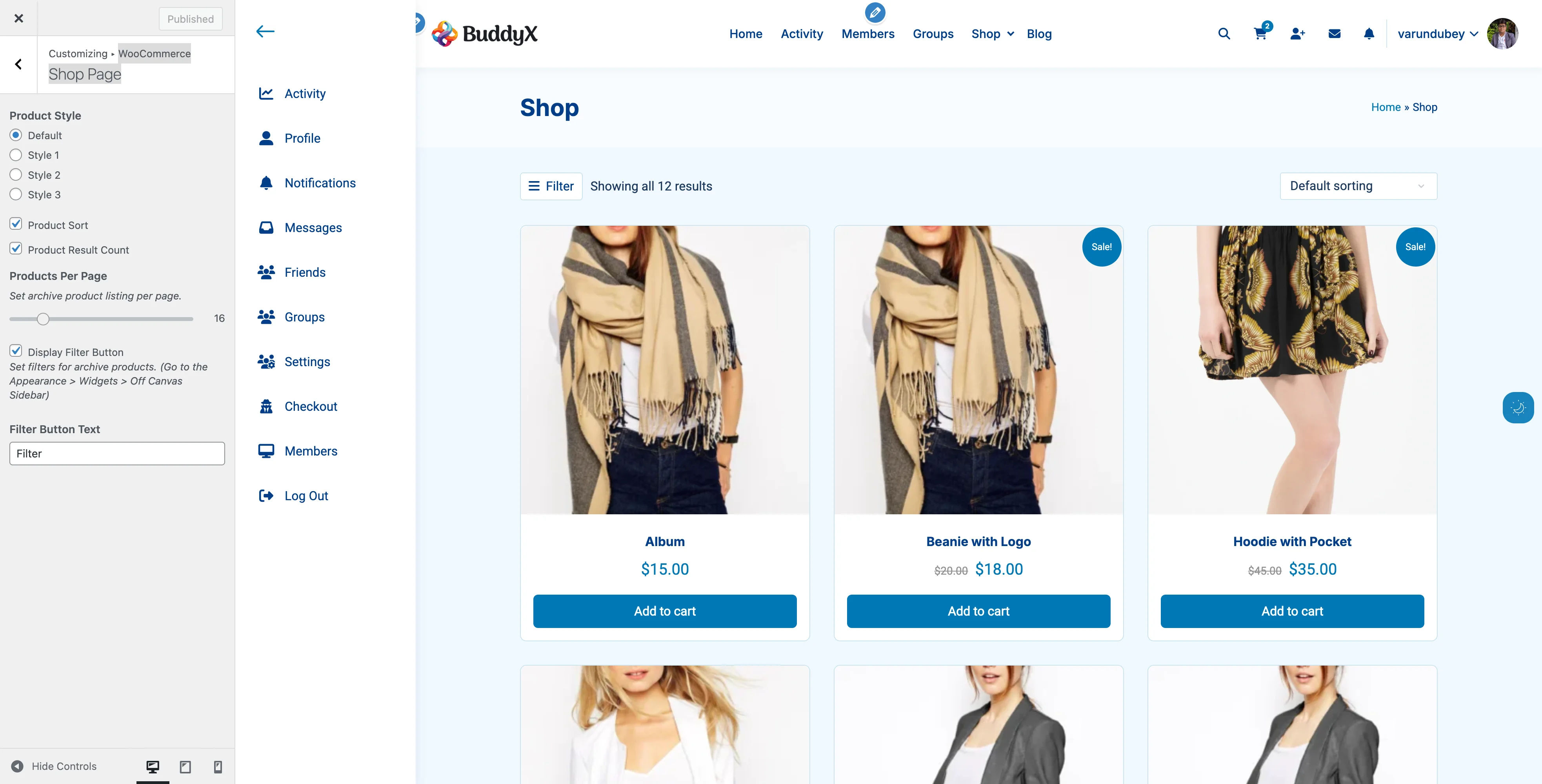
What It Includes

Cart Preview:

  • Product thumbnails
  • Product names and quantities
  • Individual prices
  • Subtotal
  • Remove item buttons
  • View Cart button
  • Checkout button

Interactive Features:

  • Quantity adjustment (with some plugins)
  • Remove items directly
  • Coupon code entry (with extensions)
  • Free shipping progress bar (with extensions)

User Experience

Opening the Cart:

  1. Customer adds product to cart
  2. Mini cart automatically slides in from right
  3. Shows added product with confirmation
  4. Customer can continue shopping or checkout

Closing the Cart:

  • Click "Close" button
  • Click outside cart area
  • Press Escape key
  • Automatically closes after action

Setting Up Mini Cart

Step 1: Enable Feature

The mini cart is automatically available with BuddyX Pro when WooCommerce is active. No setup required!

Step 2: Customize Appearance

Add to child theme style.css:

/* Mini cart width */
.buddyx-cart-widget-side {
    width: 400px;
}

/* Background color */
.buddyx-cart-widget-side {
    background-color: #ffffff;
}

/* Heading style */
.buddyx-cart-widget-side .widget-title {
    font-size: 18px;
    color: #333;
}

Step 3: Test Functionality

  1. Add product to cart
  2. Click cart icon in header
  3. Verify sidebar opens
  4. Test remove item
  5. Test checkout button

Cart Page Features

The main cart page displays full cart details and allows quantity updates.

Standard Features

Product Display:

  • Product thumbnail images
  • Product names (linked)
  • Individual prices
  • Quantity selectors with +/- buttons
  • Line totals
  • Remove item buttons

Cart Totals:

  • Subtotal
  • Shipping options and costs
  • Tax calculations
  • Coupon discount display
  • Total amount

Actions:

  • Update cart button
  • Continue shopping link
  • Proceed to checkout button
  • Apply coupon field

BuddyX Pro Enhancements

Quantity Buttons:

  • Plus (+) and minus (-) buttons
  • Replaces default input field
  • Easier for customers to adjust quantities
  • Mobile-friendly
  • Automatic cart update

Cross-Sells Relocated:

  • Moved after cart form (from sidebar)
  • Better visibility
  • More prominent display
  • Increased cross-sell effectiveness

Responsive Layout:

  • Table layout on desktop
  • Card layout on mobile
  • Touch-friendly buttons
  • Optimized spacing

Customizing Cart Page

Enable/Disable Coupon Field:

  1. Go to WooCommerce → Settings → General
  2. Check/uncheck "Enable coupons"
  3. Save changes

Customize Cross-Sells:

  1. Edit product
  2. Scroll to "Linked Products"
  3. Add cross-sell products
  4. Save product

Change Quantity Button Style:

Add to child theme style.css:

/* Larger quantity buttons */
.quantity .plus,
.quantity .minus {
    width: 35px;
    height: 35px;
    font-size: 18px;
}

Checkout Page Optimization

The checkout page is critical for conversions. BuddyX Pro optimizes layout and user experience.

Default Checkout Layout

Two-Column Layout:

Left Column (Billing & Shipping):

  • Billing details form
  • Shipping address (if different)
  • Order notes field

Right Column (Order Review):

  • Product list with thumbnails
  • Prices and quantities
  • Shipping method selection
  • Payment method options
  • Order total
  • Place Order button

BuddyX Pro Checkout Features

Clean Form Design:

  • Clearly labeled fields
  • Logical field ordering
  • Helpful placeholder text
  • Required field indicators
  • Validation messages

Mobile-Optimized:

  • Single column on mobile
  • Large touch-friendly buttons
  • Simplified form layout
  • Progress indicators
  • Easy payment selection

Security Indicators:

  • SSL badge (if SSL active)
  • Secure checkout messaging
  • Privacy policy link
  • Terms and conditions

Checkout Customization

Simplify Checkout Fields:

Add to child theme functions.php:

// Remove phone field
add_filter('woocommerce_billing_fields', function($fields) {
    unset($fields['billing_phone']);
    return $fields;
});

// Make company field optional
add_filter('woocommerce_billing_fields', function($fields) {
    $fields['billing_company']['required'] = false;
    return $fields;
});

Customize Button Text:

  1. Install "WooCommerce Customizer" plugin
  2. Go to Customizer → WooCommerce → Checkout
  3. Change "Place Order" button text
  4. Customize other checkout text

Add Trust Badges:

Add after checkout form using hook:

add_action('woocommerce_review_order_before_submit', function() {
    echo '<div class="trust-badges">';
    echo '<img src="/path/to/ssl-badge.webp" alt="Secure Checkout">';
    echo '<img src="/path/to/money-back.webp" alt="Money Back Guarantee">';
    echo '</div>';
});

Payment Gateway Display

How payment methods appear on checkout page.

Standard Payment Display

Default WooCommerce:

  • Radio buttons for each gateway
  • Gateway logos (if provided)
  • Description text below each option
  • Payment form appears below selection

BuddyX Pro Enhancements:

  • Styled radio buttons
  • Prominent gateway logos
  • Clear payment descriptions
  • Smooth transitions when switching
  • Mobile-optimized layout

Popular Payment Gateways

Stripe:

  • Credit card fields
  • Apple Pay / Google Pay buttons
  • 3D Secure support
  • Inline validation

PayPal:

  • PayPal button
  • Credit card option
  • Express checkout
  • Pay Later messaging

Cash on Delivery:

  • Simple selection
  • Custom instructions
  • Confirmation message

Customizing Payment Display

Reorder Payment Methods:

Add to child theme functions.php:

add_filter('woocommerce_available_payment_gateways', function($gateways) {
    // Move PayPal to top
    if(isset($gateways['paypal'])) {
        $paypal = $gateways['paypal'];
        unset($gateways['paypal']);
        $gateways = array('paypal' => $paypal) + $gateways;
    }
    return $gateways;
});

Style Gateway Buttons:

Add to child theme style.css:

/* Stripe payment button */
.wc-stripe-elements-field {
    padding: 15px;
    border: 2px solid #635bff;
    border-radius: 5px;
}

/* PayPal button */
.payment_method_paypal img {
    max-width: 100px;
}

Reducing Cart Abandonment

Strategies to improve checkout completion rates.

Enable Guest Checkout

Why: Requiring account creation increases abandonment

How to Enable:

  1. Go to WooCommerce → Settings → Accounts & Privacy
  2. Check "Allow customers to place orders without an account"
  3. Save changes

Impact: Can reduce abandonment by 20-30%

Display Shipping Costs Early

Why: Surprise shipping costs cause abandonment

Solutions:

  • Show shipping calculator on product pages
  • Display estimated shipping in cart
  • Offer free shipping threshold
  • Show all costs before checkout

Implementation:

// Add shipping calculator to cart
add_action('woocommerce_before_cart_table', 'woocommerce_shipping_calculator');

Simplify Form Fields

Why: Long forms discourage completion

What to Remove:

  • Company name (unless B2B)
  • Secondary address line
  • Phone number (if not essential)
  • Unnecessary custom fields

What to Keep:

  • Name and email
  • Primary address
  • Payment information
  • Required legal fields

Add Progress Indicators

Why: Shows customers how far along they are

Implementation Options:

  • Checkout steps plugin
  • Custom progress bar
  • Step numbers
  • Breadcrumb navigation

Offer Multiple Payment Options

Why: Customers have preferred payment methods

Recommended Methods:

  • Credit/debit cards (Stripe)
  • PayPal
  • Apple Pay / Google Pay
  • Buy Now, Pay Later (Afterpay, Klarna)
  • Bank transfer for large orders

Show Security Badges

Why: Builds trust during payment

What to Display:

  • SSL certificate badge
  • Payment gateway logos
  • Money-back guarantee
  • Privacy policy link
  • Secure checkout message

Recommended Cart Configurations by Store Type

Fashion & Lifestyle Store

Cart Features:

Header Cart: Enabled
Mini Cart: Enabled
Cross-Sells: Related accessories
Quantity Buttons: Enabled
Guest Checkout: Enabled
Shipping Calculator: On cart page

Checkout Features:
- Simplified form (remove company field)
- Multiple payment options
- Size guide link
- Return policy link

Why: Fashion customers browse multiple items, need quick cart access and reassurance.


Digital Products Store

Cart Features:

Header Cart: Enabled
Mini Cart: Enabled
Cross-Sells: Complementary downloads
Quantity Buttons: Hidden (single qty)
Guest Checkout: Enabled
Shipping: Disabled

Checkout Features:
- Minimal form fields
- Instant payment options
- Downloadable after payment notice
- License terms link

Why: Digital sales should be fast and frictionless with instant access.


High-Ticket Items (Furniture, Electronics)

Cart Features:

Header Cart: Enabled
Mini Cart: Optional
Cross-Sells: Warranties, accessories
Quantity Buttons: Enabled
Guest Checkout: Optional
Shipping Calculator: Prominent

Checkout Features:
- Detailed shipping options
- White glove delivery option
- Phone support number
- Installation service upsell

Why: High-value purchases need more information and support options.


Subscription Products

Cart Features:

Header Cart: Enabled
Mini Cart: Enabled
Cross-Sells: Higher tier plans
Quantity Buttons: Disabled
Guest Checkout: Disabled (account required)
Shipping: Based on subscription

Checkout Features:
- Subscription summary
- Billing schedule clear
- Easy upgrade options
- Cancel policy visible

Why: Subscriptions need clear recurring billing information and account management.


B2B/Wholesale Store

Cart Features:

Header Cart: Enabled
Mini Cart: Optional
Cross-Sells: Bulk discounts
Quantity Buttons: Large increments
Guest Checkout: Disabled
Shipping Calculator: Detailed

Checkout Features:
- Company field required
- Purchase order number
- Tax ID field
- Invoice option
- Net payment terms

Why: B2B needs company information and purchasing workflow.


Advanced Features

Cart Notices and Messages

Add Custom Cart Notices:

// Free shipping progress
add_action('woocommerce_before_cart', function() {
    $threshold = 50; // $50 for free shipping
    $current = WC()->cart->get_cart_contents_total();

    if($current < $threshold) {
        $remaining = $threshold - $current;
        wc_print_notice(
            sprintf('Add %s more to get free shipping!',
            wc_price($remaining)),
            'notice'
        );
    } else {
        wc_print_notice('You have free shipping!', 'success');
    }
});

Cart Expiration

Set Cart Expiration Time:

// Expire cart after 24 hours
add_filter('wc_session_expiring', function() {
    return 60 * 60 * 24; // 24 hours in seconds
});

Sticky Checkout Button

Keep Checkout Button Visible:

Add to child theme style.css:

/* Sticky cart totals on checkout */
@media (min-width: 768px) {
    .woocommerce-checkout .order-review {
        position: sticky;
        top: 20px;
    }
}

One-Click Checkout

Enable with Plugin:

  • WooCommerce Amazon Pay (Amazon Pay button)
  • WooCommerce Stripe (Apple Pay / Google Pay)
  • PayPal for WooCommerce (PayPal Express)

Troubleshooting

Cart icon not updating

Symptoms:

  • Counter doesn't change when items added
  • Number stays at 0 or old count

Solutions:

  1. Clear browser cache
  2. Clear WordPress cache
  3. Check JavaScript console for errors
  4. Disable conflicting plugins
  5. Test with default theme
  6. Regenerate cart fragments

Code Fix:

// Force cart refresh
add_filter('woocommerce_add_to_cart_fragments', function($fragments) {
    ob_start();
    woocommerce_mini_cart();
    $fragments['.widget_shopping_cart_content'] = ob_get_clean();
    return $fragments;
});

Mini cart not opening

Symptoms:

  • Click cart icon, nothing happens
  • Sidebar doesn't slide in

Solutions:

  1. Check browser console for JavaScript errors
  2. Ensure jQuery is loading
  3. Clear JavaScript cache
  4. Test without other plugins
  5. Check z-index conflicts

CSS Fix:

/* Ensure mini cart is on top */
.buddyx-cart-widget-side {
    z-index: 9999;
}

Checkout page layout broken

Symptoms:

  • Fields overlap
  • Columns stack incorrectly
  • Buttons misaligned

Solutions:

  1. Check page template (should be default)
  2. Verify checkout shortcode exists
  3. Clear all caches
  4. Disable page builder plugins
  5. Test with default theme

Fix Checkout Template:

  1. Go to Pages → Checkout
  2. Ensure content is: [woocommerce_checkout]
  3. Template should be "Default Template"
  4. No other page builder elements

Payment gateway not showing

Symptoms:

  • Expected gateway missing
  • Only some gateways visible

Solutions:

  1. Verify gateway is enabled: WooCommerce → Settings → Payments
  2. Check gateway requirements (SSL, currency, country)
  3. Review gateway account status
  4. Check for PHP errors
  5. Test with sandbox mode

Cross-sells not displaying

Symptoms:

  • No related products in cart
  • Cross-sells section empty

Solutions:

  1. Verify products have cross-sells assigned
  2. Check theme removes/adds cross-sell action
  3. Ensure products are in stock
  4. Verify products are published
  5. Clear transient cache

Performance Optimization

Optimize Cart AJAX

Enable AJAX Cart Updates: Most modern themes include this, but ensure:

// Support AJAX add to cart
add_theme_support('wc-product-gallery-zoom');
add_theme_support('wc-product-gallery-lightbox');
add_theme_support('wc-product-gallery-slider');

Cache Exclusions

Don't Cache These Pages:

  • Cart page (/cart/)
  • Checkout page (/checkout/)
  • My Account page (/my-account/)

WP Rocket Example:

  1. Go to Settings → WP Rocket → Advanced Rules
  2. Add to "Never cache" URLs:
/cart/(.*)
/checkout/(.*)
/my-account/(.*)

Minimize Checkout Scripts

Defer Non-Essential Scripts:

add_filter('script_loader_tag', function($tag, $handle) {
    if(is_checkout() && !in_array($handle, ['jquery', 'woocommerce'])) {
        return str_replace(' src', ' defer src', $tag);
    }
    return $tag;
}, 10, 2);

Accessibility Best Practices

Keyboard Navigation

Ensure accessible:

  • Tab through cart items
  • Enter to update quantities
  • Space to select payment methods
  • Tab to Place Order button

Screen Reader Support

Label Elements Properly:

<button aria-label="Remove item from cart">×</button>
<input aria-label="Quantity" type="number">
<label for="payment_method_stripe">Credit Card</label>

Color Contrast

Check these elements:

  • Button text on button background
  • Error messages visibility
  • Required field indicators
  • Price text readability

Focus Indicators

/* Visible focus styles */
.woocommerce input:focus,
.woocommerce select:focus,
.woocommerce button:focus {
    outline: 2px solid #007cba;
    outline-offset: 2px;
}

Common Questions

Can I customize the cart icon?

Yes! Use custom CSS to change the icon or upload your own via child theme. The icon uses Font Awesome by default.

How do I add estimated delivery dates?

Use a plugin like "Order Delivery Date" or "WooCommerce Estimated Delivery Date" to add delivery estimates.

Can I have a sticky cart button?

Yes, use CSS to make the checkout button sticky (see "Sticky Checkout Button" above).

How do I remove the Continue Shopping button?

Add to child theme functions.php:

remove_action('woocommerce_cart_actions', 'woocommerce_button_proceed_to_checkout');

Can I set a minimum order amount?

Yes, go to WooCommerce → Settings → Advanced and set minimum order amount.

How do I enable cart expiration?

See "Cart Expiration" in Advanced Features section above.


Related Settings


Need Help?

Documentation: docs.wbcomdesigns.com Support Forum: wbcomdesigns.com/support Cart Optimization Services: wbcomdesigns.com/hire

Email Support: support@wbcomdesigns.com

WooCommerce Hooks Reference

Developer documentation for customizing BuddyX Pro's WooCommerce integration.


Filter Hooks

buddyx_off_canvas_filter_button_output

Customize the off-canvas filter button HTML output.

add_filter( 'buddyx_off_canvas_filter_button_output', 'my_custom_filter_button' );

function my_custom_filter_button( $output ) {
    return '<button class="my-custom-filter-btn">
        <i class="fas fa-filter"></i> Filter Products
    </button>';
}

Parameters:

  • $output (string) - Default button HTML

Return: String - Modified button HTML


woocommerce_add_to_cart_fragments

BuddyX Pro uses this WooCommerce filter to update cart elements via AJAX.

add_filter( 'woocommerce_add_to_cart_fragments', 'my_custom_fragments' );

function my_custom_fragments( $fragments ) {
    // Add custom fragment
    $fragments['.my-custom-cart-element'] = '<div class="my-custom-cart-element">' .
        WC()->cart->get_cart_contents_count() . ' items</div>';

    return $fragments;
}

Theme-registered fragments:

  • .menu-icons-wrapper .cart a - Header cart icon with count
  • .buddyx-mini-cart - Mini cart contents
  • .buddyx-cart-count - Cart item count
  • .buddyx-cart-contents - Cart summary text

woocommerce_sale_flash

Customize the sale badge output when percentage display is enabled.

add_filter( 'woocommerce_sale_flash', 'my_sale_badge', 10, 3 );

function my_sale_badge( $badge, $post, $product ) {
    // Custom sale badge with different styling
    return '<span class="my-sale-badge">SALE!</span>';
}

Note: Theme only modifies this when buddyx_woo_sale_badge_content is set to 'percent'.


post_class

BuddyX Pro adds WooCommerce-specific classes to products.

add_filter( 'post_class', 'my_product_classes', 50, 3 );

function my_product_classes( $classes, $class, $post_id ) {
    if ( ! function_exists( 'wc_get_product' ) ) {
        return $classes;
    }

    $product = wc_get_product( $post_id );
    if ( ! $product ) {
        return $classes;
    }

    // Add custom class for products on sale
    if ( $product->is_on_sale() ) {
        $classes[] = 'my-custom-sale-class';
    }

    return $classes;
}

Theme-added classes:

  • square-sale - When sale badge style is square
  • circle-sale - When sale badge style is circle
  • left-position - When sale badge position is left

loop_shop_per_page

Control products displayed per page.

add_filter( 'loop_shop_per_page', 'my_products_per_page', 30 );

function my_products_per_page( $count ) {
    // Show 24 products per page
    return 24;
}

Note: Theme sets this based on buddyx_woo_product_per_page customizer setting.


Action Hooks

woocommerce_before_shop_loop

BuddyX Pro adds the filter button here (priority 10).

// Add custom element before shop loop
add_action( 'woocommerce_before_shop_loop', 'my_shop_intro', 5 );

function my_shop_intro() {
    if ( is_shop() ) {
        echo '<div class="shop-intro">Welcome to our shop!</div>';
    }
}

woocommerce_after_cart_form

Cross-sell products are moved here from their default location.

// Add custom content after cart
add_action( 'woocommerce_after_cart_form', 'my_cart_message', 5 );

function my_cart_message() {
    echo '<div class="cart-message">Free shipping on orders over $50!</div>';
}

wp_footer

Theme adds quantity button scripts here.

// Add custom WooCommerce scripts
add_action( 'wp_footer', 'my_woo_scripts', 20 );

function my_woo_scripts() {
    if ( ! is_woocommerce() && ! is_cart() ) {
        return;
    }
    ?>
    <script>
    // Custom WooCommerce JavaScript
    jQuery(document).ready(function($) {
        // Your code here
    });
    </script>
    <?php
}

Theme Functions

buddyx_render_cart_icon()

Renders the shopping cart icon with item count.

// Use in custom template
if ( function_exists( 'buddyx_render_cart_icon' ) ) {
    buddyx_render_cart_icon();
}

Output:

<div class="cart cart-widget-opener">
    <a href="[cart_url]" title="View Shopping Cart">
        <span class="fas fa-shopping-cart"></span>
        <sup>3</sup>
    </a>
</div>

buddyx_cart_widget_side()

Outputs the mini cart sidebar widget.

// Use in custom template
if ( function_exists( 'buddyx_cart_widget_side' ) ) {
    buddyx_cart_widget_side();
}

buddyx_filters_widget_side()

Outputs the off-canvas filter sidebar.

// Use in custom template
if ( function_exists( 'buddyx_filters_widget_side' ) ) {
    buddyx_filters_widget_side();
}

buddyx_is_woo_shop()

Check if current page is the WooCommerce shop page.

if ( buddyx_is_woo_shop() ) {
    // We're on the shop page
}

Returns: Boolean


buddyx_is_woo_tax()

Check if current page is a WooCommerce taxonomy archive.

if ( buddyx_is_woo_tax() ) {
    // We're on a product category/tag page
}

Returns: Boolean


Customizer Settings

Getting Customizer Values

// Sale badge style
$sale_style = get_theme_mod( 'buddyx_woo_sale_badge_style', 'default' );

// Sale badge position
$sale_position = get_theme_mod( 'buddyx_woo_sale_badge_position', 'right' );

// Sale badge content type
$sale_content = get_theme_mod( 'buddyx_woo_sale_badge_content', 'text' );

// Product style
$product_style = get_theme_mod( 'woocommerce_product_style', 'default' );

// Show sorting dropdown
$show_sort = get_theme_mod( 'buddyx_woo_shop_sort', true );

// Show result count
$show_count = get_theme_mod( 'buddyx_woo_shop_result_count', true );

// Products per page
$per_page = get_theme_mod( 'buddyx_woo_product_per_page', 16 );

// Off canvas filter enabled
$filter_enabled = get_theme_mod( 'buddyx_woo_off_canvas_filter', false );

// Filter button text
$filter_text = get_theme_mod( 'buddyx_woo_off_canvas_filter_text', 'Filter' );

Removing Theme Modifications

Restore WooCommerce Breadcrumbs

add_action( 'init', function() {
    add_action( 'woocommerce_before_main_content', 'woocommerce_breadcrumb', 20 );
}, 15 );

Restore Default Sidebar

add_action( 'init', function() {
    add_action( 'woocommerce_sidebar', 'woocommerce_get_sidebar', 10 );
}, 15 );

Restore Cross-Sells Location

add_action( 'init', function() {
    remove_action( 'woocommerce_after_cart_form', 'woocommerce_cross_sell_display', 10 );
    add_action( 'woocommerce_cart_collaterals', 'woocommerce_cross_sell_display' );
}, 15 );

Restore Default Sort/Count

add_action( 'init', function() {
    add_action( 'woocommerce_before_shop_loop', 'woocommerce_catalog_ordering', 30 );
    add_action( 'woocommerce_before_shop_loop', 'woocommerce_result_count', 20 );
}, 15 );

CSS Classes

Sale Badge Classes

Class Applied When
.onsale Default WooCommerce sale badge
.square-sale Sale badge style is "Square"
.circle-sale Sale badge style is "Circle"
.left-position Sale badge position is "Left"

Cart Classes

Class Element
.cart-widget-opener Cart icon container
.buddyx-cart-widget-side Mini cart sidebar
.buddyx-mini-cart Mini cart contents
.buddyx-cart-count Cart count badge
.buddyx-cart-contents Cart summary

Filter Classes

Class Element
.buddyx-woo-canvas-filter Filter button
.buddyx-filter-widget-side Filter sidebar
.woo-off-canvas-sidebar Filter sidebar content

Shop Classes

Class Applied When
.infinite-loader-active Infinite Loader plugin is active

JavaScript Events

Mini Cart Open/Close

jQuery(document).ready(function($) {
    // Cart widget opened
    $(document).on('click', '.cart-widget-opener', function(e) {
        console.log('Mini cart opened');
    });

    // Cart widget closed
    $(document).on('click', '.widget-close', function(e) {
        console.log('Mini cart closed');
    });
});

Quantity Button Events

jQuery(document).ready(function($) {
    // Quantity changed via +/- buttons
    $(document.body).on('click', '.plus, .minus', function() {
        console.log('Quantity changed');
    });
});

Related Documentation

Shop Page Layouts

Complete guide to customizing your shop page display, product grids, and catalog layouts in BuddyX Pro.


Overview

BuddyX Pro gives you complete control over how products display on your shop page, category archives, and search results. Choose from multiple layout options, adjust grid spacing, and optimize for different product types.

What You Can Do

With BuddyX Pro's shop layout options, you can:

  • Choose Product Card Styles - Select from 4 pre-designed product layouts
  • Control Grid Layout - Adjust products per row and spacing
  • Manage Sidebars - Show filters on left, right, both sides, or hide them
  • Set Products Per Page - Control pagination and scroll length
  • Enable Mobile Filters - Add off-canvas filter sidebar for mobile users
  • Customize Product Info - Show/hide ratings, prices, descriptions

Product Card Styles

BuddyX Pro includes four distinct product card designs. Each style is optimized for different store types.

WooCommerce Shop Page Settings Shop Page settings in the Customizer showing Product Style options, Products Per Page, and Filter Button settings
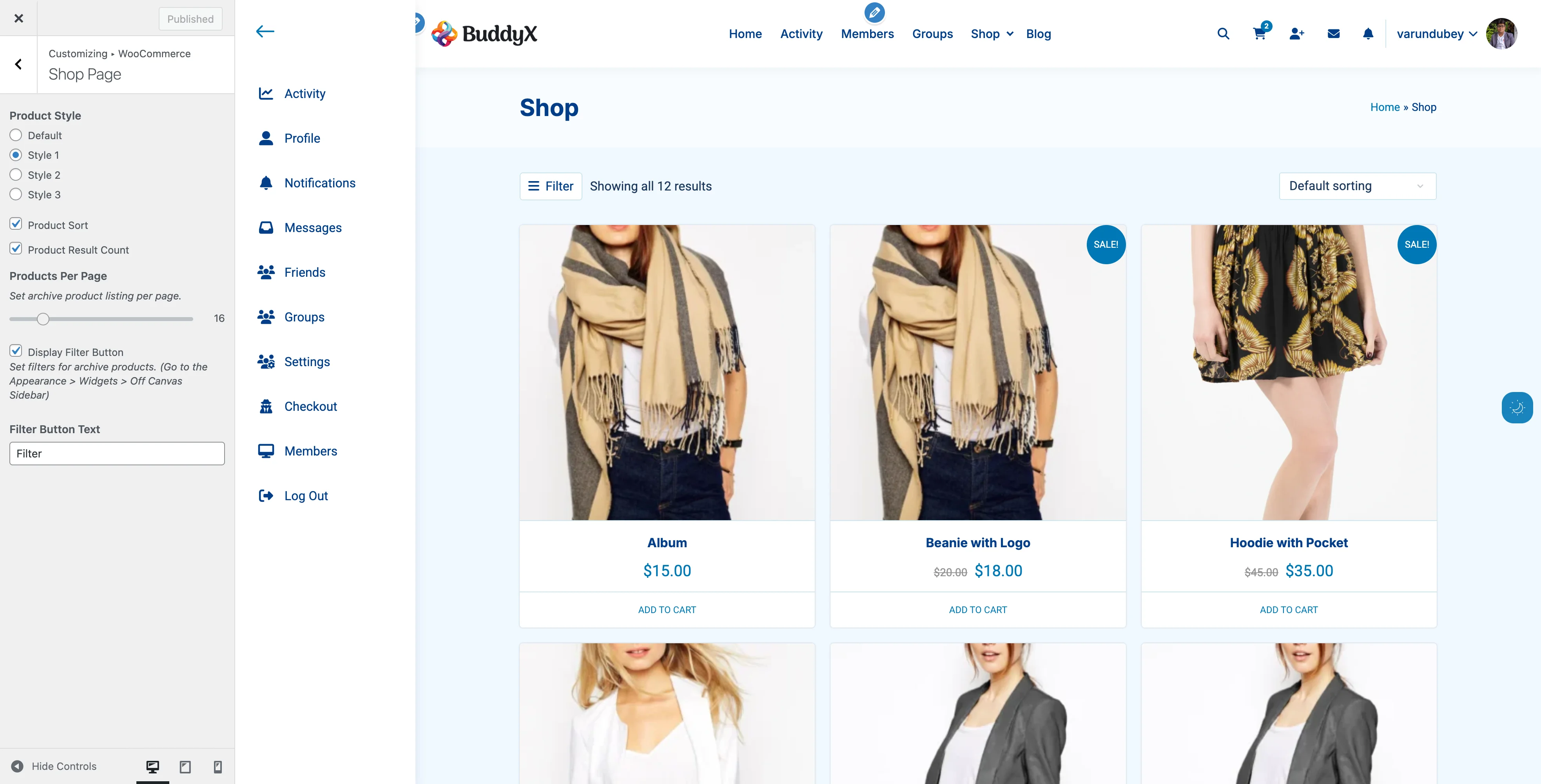
Default Style

Appearance:

  • Standard WooCommerce layout
  • Product image with hover zoom
  • Title and price clearly visible
  • Add to Cart button always shown
  • Star ratings (if enabled)

Best For:

  • General merchandise stores
  • First-time WooCommerce users
  • Traditional e-commerce look
  • Stores with diverse product types

Features:

  • Maximum compatibility with plugins
  • Clean, familiar design
  • Fast loading
  • Mobile-optimized

How to Enable:

  1. Go to Appearance → Customize
  2. Navigate to WooCommerce → Shop
  3. Find "Product Style"
  4. Select "Default"
  5. Click Publish

Style 1: Modern with Hover Effects

WooCommerce Shop Style 1 Style 1 with "ADD TO CART" text links and clean product presentation
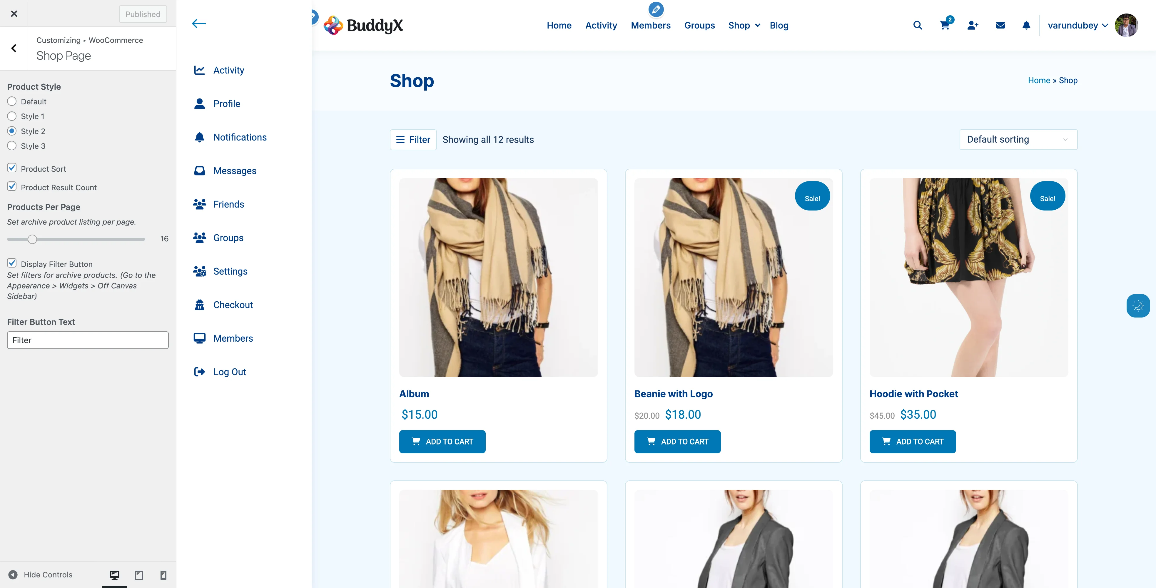
Appearance:

  • Elegant product cards
  • Image hover effects with smooth transitions
  • Quick action buttons appear on hover
  • Subtle shadows and animations
  • Modern spacing and typography

Best For:

  • Fashion and apparel stores
  • Beauty and cosmetics
  • Home décor
  • Lifestyle products
  • Brands with strong visual identity

Features:

  • Eye-catching hover animations
  • Modern card design with shadows
  • Quick view button integration (with plugin)
  • Add to wishlist support (with plugin)
  • Social sharing icons (with plugin)

Hover Actions: When customers hover over products:

  • Add to Cart button animates in
  • Quick view icon appears
  • Wishlist icon shows (if plugin active)
  • Image slightly zooms

How to Enable:

  1. Go to Appearance → Customize → WooCommerce → Shop
  2. Select "Style 1" for Product Style
  3. Click Publish

Pro Tip: Combine with Circle sale badges for maximum visual impact.


Style 2: Minimal & Clean

WooCommerce Shop Style 2 Style 2 with cart icon buttons and product info outside cards
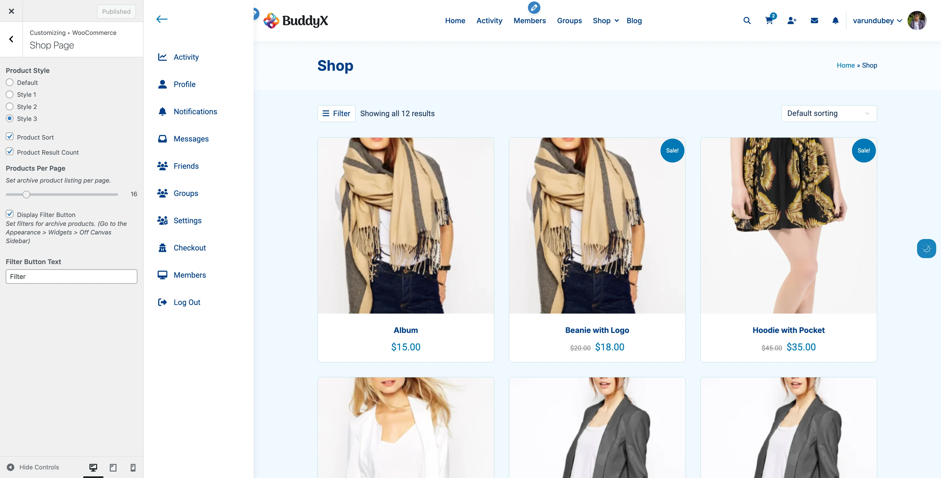
Appearance:

  • Minimal design with focus on images
  • Reduced visual clutter
  • Compact spacing
  • Clean typography
  • Large product images

Best For:

  • Photography stores
  • Art galleries
  • Digital products
  • Portfolio-style shops
  • Premium brands
  • Minimalist aesthetics

Features:

  • Maximum image prominence
  • Reduced border and shadow usage
  • Clean, uncluttered layout
  • Fast rendering
  • Perfect for high-quality photos

Design Philosophy:

  • "Less is more" approach
  • Product images tell the story
  • Minimal text overlay
  • Plenty of white space

How to Enable:

  1. Go to Appearance → Customize → WooCommerce → Shop
  2. Select "Style 2" for Product Style
  3. Click Publish

Recommendation: Combine with full-width layout (no sidebar) for maximum impact.


Style 3: Information-Dense

WooCommerce Shop Style 3 Style 3 with minimal layout showing product name and price only
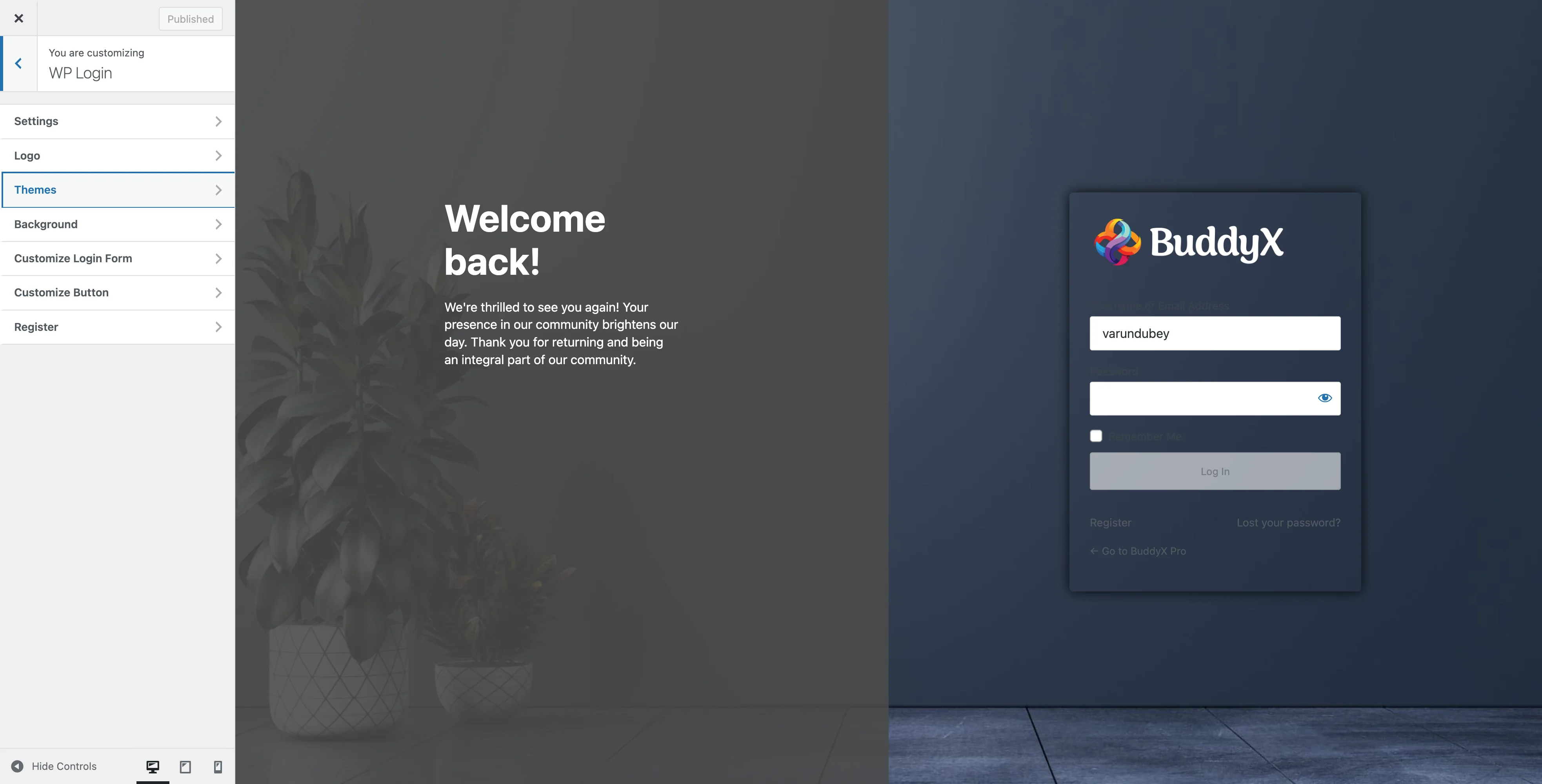
Appearance:

  • Detailed product cards
  • Specifications visible upfront
  • Category badges shown
  • More text content
  • Information hierarchy

Best For:

  • Electronics and tech products
  • Books and educational materials
  • Tools and equipment
  • B2B stores
  • Products with complex specifications

Features:

  • Short description visible
  • Category labels displayed
  • Stock status shown
  • Multiple product attributes
  • Compare-ready layout

What's Displayed:

  • Product image with zoom
  • Full product title
  • Price and sale price
  • Star ratings
  • Short description (excerpt)
  • Category badges
  • Stock status
  • Add to Cart button

How to Enable:

  1. Go to Appearance → Customize → WooCommerce → Shop
  2. Select "Style 3" for Product Style
  3. Click Publish

Pro Tip: Use left sidebar with attribute filters for best results with this style.


Grid Layout Options

Control how products arrange on your shop page.

Products Per Row

WooCommerce typically displays 4 products per row on desktop. You can customize this with code or page builders.

Standard Layouts:

Layout Products/Row Desktop Products/Row Tablet Products/Row Mobile
Default 4 2-3 1-2
Wide 5-6 3 1-2
Spacious 3 2 1

Width Calculations:

For 4-column layout:

  • Each product: ~25% width
  • With spacing: ~23% width + 2% margin

For 3-column layout:

  • Each product: ~33% width
  • With spacing: ~31% width + 2% margin

How to Change (Requires Code):

Add to child theme functions.php:

// Change to 3 columns
add_filter('loop_shop_columns', function() {
    return 3;
});

Page Builder Options:

  • Elementor: Use WooCommerce Products widget with columns setting
  • WPBakery: Use WooCommerce products element
  • Gutenberg: Use Products block with column controls

Products Per Page

Control how many products show before pagination.

Current Setting: Controlled via Customizer (#woocommerce-settings-bxpro))

Optimal Settings by Store Size:

Store Size Products Products Per Page Why
Small (1-50) All on one page 24-50 No pagination needed
Medium (50-200) Multiple pages 16-24 Balanced loading
Large (200-1000) Many pages 12-16 Performance focus
Huge (1000+) Very many pages 12 Load time critical

SEO Considerations:

  • More products per page = fewer pages for Google to crawl
  • Fewer products per page = faster loading = better ranking
  • Balance: 16-20 products per page

Sidebar Layouts

Choose where sidebars display on shop pages.

No Sidebar (Full Width)

Layout: Products span full content area

Benefits:

  • Maximum space for products
  • Modern, clean appearance
  • Focus on products, not filters
  • Mobile-friendly by default

Best For:

  • Small catalogs (under 50 products)
  • Curated collections
  • Minimal stores
  • Landing pages
  • Flash sales

How to Set Up:

  1. Go to Appearance → Customize → Sidebars
  2. Find "WooCommerce Sidebar"
  3. Select "None"
  4. Click Publish

Left Sidebar

Layout: Sidebar on left, products on right

Benefits:

  • Filters visible first (LTR languages)
  • Traditional layout
  • Category-first navigation
  • Good for desktop users

Best For:

  • Category-heavy stores
  • Electronics and tech
  • Stores with many attributes
  • B2B catalogs

How to Set Up:

  1. Go to Appearance → Customize → Sidebars
  2. Find "WooCommerce Sidebar"
  3. Select "Left"
  4. Click Publish
  5. Add widgets to WooCommerce Left Sidebar

Recommended Widgets:

  • WooCommerce Product Categories
  • WooCommerce Layered Nav (Attributes)
  • WooCommerce Price Filter

Right Sidebar

Layout: Products on left, sidebar on right

Benefits:

  • Standard e-commerce layout
  • Products visible first
  • Familiar to customers
  • Most common configuration

Best For:

  • Most store types
  • General merchandise
  • Fashion stores
  • Default recommendation

How to Set Up:

  1. Go to Appearance → Customize → Sidebars
  2. Find "WooCommerce Sidebar"
  3. Select "Right"
  4. Click Publish
  5. Add widgets to WooCommerce Right Sidebar

Recommended Widgets:

  • WooCommerce Layered Nav (Price)
  • WooCommerce Product Search
  • WooCommerce Recent Products
  • WooCommerce Top Rated Products

Both Sidebars

Layout: Sidebars on both sides, products in center

Benefits:

  • Maximum filter options
  • Advanced navigation
  • Multiple widget areas
  • Power-user focused

Best For:

  • Large catalogs (500+ products)
  • Stores with many categories
  • Advanced filtering needs
  • B2B marketplaces

How to Set Up:

  1. Go to Appearance → Customize → Sidebars
  2. Find "WooCommerce Sidebar"
  3. Select "Both"
  4. Click Publish
  5. Add widgets to both sidebar areas

Layout Strategy:

  • Left Sidebar: Categories, brands, main filters
  • Right Sidebar: Price range, ratings, recent products

Mobile Filter Sidebar

BuddyX Pro includes a special off-canvas filter sidebar for mobile devices.

What It Does

Desktop Behavior:

  • Filter button hidden on desktop
  • Regular sidebars display normally

Mobile Behavior:

  • "Filter" button appears above products
  • Clicking opens slide-in sidebar
  • Filters accessible without scrolling
  • Smooth animation
  • Close button included

Benefits:

  • Mobile-optimized filtering
  • Doesn't clutter mobile layout
  • Standard e-commerce pattern
  • Improves conversion on mobile

Setting Up Mobile Filters

Step 1: Enable Filter Button

  1. Go to Appearance → Customize
  2. Navigate to WooCommerce → Shop
  3. Enable "Display Filter Button"
  4. Customize "Filter Button Text" if desired
  5. Click Publish

Step 2: Add Filter Widgets

  1. Go to Appearance → Widgets
  2. Find Off Canvas Sidebar widget area
  3. Add these widgets:
    • WooCommerce Product Categories
    • WooCommerce Layered Nav (Color, Size, etc.)
    • WooCommerce Price Filter
    • WooCommerce Product Search

Step 3: Test on Mobile

  1. Visit shop page on mobile device
  2. Look for "Filter" button above products
  3. Tap to open filter sidebar
  4. Verify all filters work correctly

Recommended Layouts by Store Type

Fashion & Apparel Store

Layout Configuration:

Product Style: Style 1 (hover effects)
Products Per Page: 12
Sidebar: Right
Products Per Row: 4
Filter Button: Enabled

Sidebar Widgets:
- Product Categories
- Layered Nav (Size)
- Layered Nav (Color)
- Price Filter

Why This Works:

  • Visual products need modern presentation
  • Size and color are primary filters
  • 12 products balance browsing and performance
  • Right sidebar is familiar pattern

Electronics Store

Layout Configuration:

Product Style: Style 3 (info-dense)
Products Per Page: 16
Sidebar: Left
Products Per Row: 4
Filter Button: Enabled

Sidebar Widgets:
- Product Categories
- Layered Nav (Brand)
- Layered Nav (Screen Size)
- Price Filter
- Top Rated Products

Why This Works:

  • Specifications are important
  • Brand filtering is critical
  • More products per page for comparison
  • Left sidebar emphasizes categories

Digital Products Store

Layout Configuration:

Product Style: Style 2 (minimal)
Products Per Page: 24
Sidebar: None (full width)
Products Per Row: 5-6
Filter Button: Disabled

No sidebars needed

Why This Works:

  • Digital products need less visual space
  • More products visible at once
  • Minimal design for clean presentation
  • No physical attributes to filter

Furniture & Home Décor

Layout Configuration:

Product Style: Default
Products Per Page: 9
Sidebar: Right
Products Per Row: 3
Filter Button: Enabled

Sidebar Widgets:
- Product Categories
- Layered Nav (Color)
- Layered Nav (Style)
- Price Filter
- Recent Products

Why This Works:

  • Large products need space (3 columns)
  • Visual presentation is key
  • Fewer products allow larger images
  • Style and color are important filters

Books & Educational Materials

Layout Configuration:

Product Style: Style 3 (info-dense)
Products Per Page: 20
Sidebar: Left
Products Per Row: 4
Filter Button: Enabled

Sidebar Widgets:
- Product Categories
- Layered Nav (Author)
- Layered Nav (Genre)
- Price Filter
- Recent Reviews

Why This Works:

  • Details matter (descriptions visible)
  • Many products per page for browsing
  • Category navigation is primary
  • Author and genre filters essential

Customization Tips

Creating Custom Product Grids

Using CSS (Child Theme):

/* 3 columns on desktop */
@media (min-width: 768px) {
    .woocommerce ul.products li.product {
        width: 31.33%;
        margin-right: 2%;
    }
}

/* 2 columns on tablet */
@media (min-width: 481px) and (max-width: 767px) {
    .woocommerce ul.products li.product {
        width: 48%;
        margin-right: 4%;
    }
}

Adding Custom Spacing

/* More space between products */
.woocommerce ul.products li.product {
    margin-bottom: 3em;
}

/* Tighter spacing */
.woocommerce ul.products li.product {
    margin-bottom: 1em;
}

Changing Image Aspect Ratios

/* Square images (1:1) */
.woocommerce ul.products li.product a img {
    aspect-ratio: 1 / 1;
    object-fit: cover;
}

/* Portrait images (3:4) */
.woocommerce ul.products li.product a img {
    aspect-ratio: 3 / 4;
    object-fit: cover;
}

Troubleshooting Layouts

Products displaying in single column

Cause: Theme or plugin CSS conflict

Solution:

  1. Check for CSS conflicts in browser inspector
  2. Temporarily disable plugins one by one
  3. Verify WooCommerce CSS is loading
  4. Clear all caches

Sidebar not showing

Cause: No widgets added to sidebar area

Solution:

  1. Go to Appearance → Widgets
  2. Add at least one widget to the sidebar
  3. Make sure sidebar position is not "None"
  4. Check if WooCommerce pages are using correct template

Mobile layout broken

Cause: Theme not responsive or CSS conflict

Solution:

  1. Test on different mobile devices
  2. Check viewport meta tag exists
  3. Verify responsive CSS is loading
  4. Test with default WordPress theme

Products too wide/narrow

Cause: Custom CSS or theme conflict

Solution:

  1. Inspect element in browser
  2. Check for custom CSS overrides
  3. Remove conflicting CSS
  4. Adjust container width settings

Filter button not appearing

Cause: Setting not enabled or JavaScript error

Solution:

  1. Enable "Display Filter Button" in Customizer
  2. Check browser console for errors
  3. Add widgets to Off Canvas Sidebar
  4. Clear JavaScript cache

Performance Optimization

Image Loading

Recommendations:

  • Use 600×600px for product thumbnails
  • Enable lazy loading
  • Compress images before upload
  • Use WebP format when possible

Implementation:

// Add to child theme functions.php
add_filter('wp_lazy_loading_enabled', '__return_true');

Limiting Products Per Page

Impact on Performance:

Products Page Load Memory Best For
12 ~1-2s Low Small servers
16 ~1.5-2.5s Medium Balanced
24 ~2-3s High Strong servers
50+ ~3-5s Very High Avoid

Recommendation: Keep under 24 products per page for best performance.

Caching Strategies

  1. Enable Page Caching

    • Cache shop page
    • Don't cache cart/checkout
    • Use WP Rocket or W3 Total Cache
  2. Enable Object Caching

    • Reduces database queries
    • Speeds up repeated page loads
    • Use Redis or Memcached
  3. Use CDN for Images

    • Offload product images
    • Faster delivery worldwide
    • Cloudflare or StackPath

Accessibility Best Practices

Keyboard Navigation

Ensure customers can navigate with keyboard:

  • Tab through products
  • Enter to open product pages
  • Arrow keys for grid navigation (optional)

Screen Reader Support

  • Product images have descriptive alt text
  • Prices are properly labeled
  • Add to Cart buttons are clear
  • Sale badges are announced

Color Contrast

  • Ensure text meets WCAG AA standards
  • Price text clearly visible
  • Sale badges readable
  • Link colors distinguishable

Focus Indicators

/* Visible focus for keyboard users */
.woocommerce ul.products li.product a:focus {
    outline: 2px solid #007cba;
    outline-offset: 2px;
}

Common Questions

Can I show different layouts on different categories?

Not natively through Customizer. You would need custom code or a plugin like "WooCommerce Category Page Customizer".

How do I change the number of columns?

Use custom code (see "Creating Custom Product Grids" above) or a page builder widget.

Can I hide prices from non-logged-in users?

Yes, use a plugin like "WooCommerce Catalog Mode" or add custom code to your child theme.

Will changing layout affect mobile?

BuddyX Pro layouts are responsive and adjust automatically for mobile devices.

Can I mix product styles?

Not on the same page. Product style applies globally to all shop pages.

How do I add a banner above products?

Use the WooCommerce shop page hook or add content to the page itself using a page builder.


Related Settings


Need Help?

Documentation: docs.wbcomdesigns.com Support Forum: wbcomdesigns.com/support Custom Layout Services: wbcomdesigns.com/hire

Email Support: support@wbcomdesigns.com

WooCommerce Customizer Settings

Complete guide to customizing your WooCommerce store appearance using BuddyX Pro's Customizer settings.


Overview

BuddyX Pro provides extensive WooCommerce customization options through the WordPress Customizer. You can change product layouts, sale badges, filters, and more without touching any code.

Accessing WooCommerce Settings

Method 1: Through Customizer

  1. Log in to WordPress dashboard
  2. Go to Appearance → Customize
  3. Look for the WooCommerce section
  4. You'll see two sub-sections:
    • General - Sale badges and global settings
    • Shop - Product display and layout options

Method 2: Quick Access

  1. Visit your Shop page while logged in
  2. Click the Customize button in the admin bar
  3. Navigate to WooCommerce section

General Settings

Located at: Customize → WooCommerce → General

These settings affect all WooCommerce pages including product archives and single product pages.

Sale Badge Style

Control how sale badges appear on product images.

Option Appearance Best For
Default Small rectangular badge Clean, minimal stores
Square Square badge with sharp corners Modern, bold designs
Circle Circular badge Fashion, premium brands

How to Change:

  1. Go to Customize → WooCommerce → General
  2. Find "Sale Badge Style"
  3. Select your preferred style
  4. Click Publish

Visual Preview: The Customizer shows live preview on your shop page.

Sale Badge Position

Choose where sale badges appear on product images.

Position Location Best For
Right Top-right corner (default) Most stores, RTL friendly
Left Top-left corner LTR languages, unique layouts

How to Change:

  1. Go to Customize → WooCommerce → General
  2. Find "Sale Badge Position"
  3. Select Left or Right
  4. Preview changes in Customizer
  5. Click Publish

Sale Badge Content

Display either text or percentage discount on sale badges.

Content Type Display Example Best For
Sale Text Shows "Sale!" text "Sale!" Simple sales, flat discounts
Percentage Shows discount % "-25%" Competitive pricing, variable discounts

How to Change:

  1. Go to Customize → WooCommerce → General
  2. Find "Sale Badge Content"
  3. Select "Sale Text" or "Percentage"
  4. Click Publish

Note: Percentage calculation works for both simple and variable products. For variable products, it shows the maximum discount percentage.


Shop Settings

Located at: Customize → WooCommerce → Shop

These settings control your main shop page and product archive pages (categories, tags).

Product Style

Choose from four different product card designs.

Default Style

  • Clean, standard WooCommerce layout
  • Product image on top
  • Title and price below
  • Add to Cart button visible

Best for: Traditional e-commerce stores, general merchandise

Style 1

  • Hover effects on product images
  • Quick actions appear on hover
  • Smooth transitions
  • Modern card design

Best for: Fashion stores, visual products, modern brands

Style 2

  • Minimal design with emphasis on images
  • Compact information display
  • Reduced spacing
  • Quick view integration ready

Best for: Photography stores, art galleries, portfolio-style shops

Style 3

  • Detailed product information visible
  • Specifications shown upfront
  • Category labels displayed
  • Information-dense layout

Best for: Electronics, books, technical products

How to Change:

  1. Go to Customize → WooCommerce → Shop
  2. Find "Product Style"
  3. Select your preferred style
  4. Preview different options
  5. Click Publish

Product Sort

Show or hide the product sorting dropdown.

When Enabled:

  • Customers can sort by: Popularity, Average rating, Latest, Price (Low to High), Price (High to Low)
  • Dropdown appears above product grid
  • Helpful for large catalogs

When Disabled:

  • Sorting dropdown is hidden
  • Products display in default order
  • Cleaner interface for small catalogs

How to Change:

  1. Go to Customize → WooCommerce → Shop
  2. Find "Product Sort" checkbox
  3. Check to enable, uncheck to disable
  4. Click Publish

Recommendation: Enable for stores with 20+ products, disable for smaller catalogs.

Product Result Count

Show or hide the product count text (e.g., "Showing 1-12 of 50 results").

When Enabled:

  • Customers see total results
  • Pagination context is clear
  • Professional appearance

When Disabled:

  • Cleaner header area
  • More space for products
  • Simpler interface

How to Change:

  1. Go to Customize → WooCommerce → Shop
  2. Find "Product Result Count" checkbox
  3. Check to enable, uncheck to disable
  4. Click Publish

Recommendation: Enable for stores with multiple pages of products.

Products Per Page

Control how many products display on shop and archive pages.

Default: 16 products per page

Recommended Settings:

Store Type Products Per Page Reason
Fashion 12-16 Large images need space
Electronics 16-20 Smaller images, more comparisons
Digital Products 20-24 Minimal space needed
Furniture 8-12 Large products, detailed viewing
General Store 16 Balanced layout

How to Change:

  1. Go to Customize → WooCommerce → Shop
  2. Find "Products Per Page" slider
  3. Drag slider to desired number (0-100)
  4. Preview the layout
  5. Click Publish

Performance Note: More products per page = longer load times. Balance user experience with performance.

Display Filter Button

Enable a mobile-friendly off-canvas filter sidebar.

When Enabled:

  • "Filter" button appears above products
  • Clicking opens sidebar with filter widgets
  • Mobile-optimized interface
  • Smooth slide-in animation

When Disabled:

  • No filter button
  • Regular sidebar layout (if sidebar is active)
  • Traditional desktop experience

How to Change:

  1. Go to Customize → WooCommerce → Shop
  2. Find "Display Filter Button" checkbox
  3. Check to enable
  4. Click Publish
  5. Add filter widgets: Widgets → Off Canvas Sidebar

Note: When enabled, a new widget area "Off Canvas Sidebar" appears in Appearance → Widgets.

Filter Button Text

Customize the text on the filter button.

Default: "Filter"

Popular Alternatives:

  • "Filter Products"
  • "Refine Search"
  • "Shop By Category"
  • "Find Products"

How to Change:

  1. Go to Customize → WooCommerce → Shop
  2. Find "Filter Button Text"
  3. Enter your custom text
  4. Click Publish

Note: This setting only appears when "Display Filter Button" is enabled.


Sidebar Settings

Located at: Customize → Sidebars → WooCommerce Sidebar

Control sidebar position for WooCommerce pages.

Sidebar Position Options

Position Layout Best For
None Full-width, no sidebar Modern stores, focus on products
Left Sidebar on left, products on right Categories-heavy stores
Right Sidebar on right, products on left Most common layout
Both Sidebars on both sides Advanced filtering needs

How to Change:

  1. Go to Customize → Sidebars
  2. Find "WooCommerce Sidebar" option
  3. Select desired position
  4. Click Publish

Adding Sidebar Widgets

  1. Go to Appearance → Widgets
  2. Find WooCommerce Left Sidebar or WooCommerce Right Sidebar
  3. Add filter widgets:
    • WooCommerce Layered Nav - Filter by attributes
    • WooCommerce Price Filter - Filter by price range
    • WooCommerce Product Categories - Category navigation
    • WooCommerce Recent Products - Show recent items
    • WooCommerce Top Rated Products - Social proof

What You Can Do

Create Visual Hierarchy

Combine these settings for impact:

  1. Highlight Sales:

    • Badge Style: Circle
    • Badge Content: Percentage
    • Badge Position: Right
  2. Minimal Modern Look:

    • Product Style: Style 2
    • Sidebar: None
    • Sort: Disabled
    • Result Count: Disabled
  3. Information-Rich Layout:

    • Product Style: Style 3
    • Sidebar: Right
    • Sort: Enabled
    • Result Count: Enabled
    • Filter Button: Enabled

Optimize for Mobile

Mobile-Friendly Settings:

  • Enable "Display Filter Button"
  • Keep "Products Per Page" at 12-16
  • Use Simple sale badge styles
  • Consider disabling sidebars on mobile (CSS)

A/B Testing Ideas

Test these combinations to find what works best:

Test 1: Sale Badge Effectiveness

  • Version A: Text-based badges
  • Version B: Percentage badges
  • Measure: Click-through rate on sale items

Test 2: Product Density

  • Version A: 12 products per page
  • Version B: 24 products per page
  • Measure: Time on site, pages viewed

Test 3: Sorting Options

  • Version A: Sort enabled
  • Version B: Sort disabled, curated order
  • Measure: Conversion rate

Recommended Shop Configurations by Store Type

Boutique Fashion Store

General Settings:
- Sale Badge Style: Circle
- Sale Badge Position: Right
- Sale Badge Content: Percentage

Shop Settings:
- Product Style: Style 1
- Product Sort: Enabled
- Result Count: Enabled
- Products Per Page: 12
- Filter Button: Enabled
- Filter Text: "Refine"

Sidebar: Right with categories

Why: Fashion customers browse visually and appreciate elegant design.

Electronics & Tech Store

General Settings:
- Sale Badge Style: Square
- Sale Badge Position: Right
- Sale Badge Content: Percentage

Shop Settings:
- Product Style: Style 3
- Product Sort: Enabled
- Result Count: Enabled
- Products Per Page: 16
- Filter Button: Enabled
- Filter Text: "Filter"

Sidebar: Left with specifications

Why: Tech buyers compare specs and need robust filtering.

Digital Downloads Store

General Settings:
- Sale Badge Style: Default
- Sale Badge Position: Right
- Sale Badge Content: Text

Shop Settings:
- Product Style: Style 2
- Product Sort: Enabled
- Result Count: Disabled
- Products Per Page: 24
- Filter Button: Disabled

Sidebar: None

Why: Digital products need less visual space, maximize content.

Premium Jewelry Store

General Settings:
- Sale Badge Style: Circle
- Sale Badge Position: Left
- Sale Badge Content: Percentage

Shop Settings:
- Product Style: Default
- Product Sort: Disabled (curated order)
- Result Count: Disabled
- Products Per Page: 8
- Filter Button: Disabled

Sidebar: None

Why: Premium products need space to breathe, curated presentation.

Large Multi-Category Store

General Settings:
- Sale Badge Style: Square
- Sale Badge Position: Right
- Sale Badge Content: Percentage

Shop Settings:
- Product Style: Default
- Product Sort: Enabled
- Result Count: Enabled
- Products Per Page: 16
- Filter Button: Enabled
- Filter Text: "Filter Products"

Sidebar: Right with multiple filters

Why: Large catalogs need comprehensive navigation and filtering.


Advanced Customization Tips

Using Child Theme

For CSS customizations beyond Customizer options:

  1. Create child theme
  2. Add custom CSS to override product styles
  3. Keep parent theme updates safe

Example: Custom badge colors

/* In child theme style.css */
.onsale {
    background-color: #ff6b6b !important;
    color: white !important;
}

Filter Hook Customization

Developers can use theme filters for advanced changes. See WooCommerce Hooks Reference.


Troubleshooting Settings

Settings not saving

Solution:

  1. Check browser console for JavaScript errors
  2. Disable other plugins temporarily
  3. Try different browser
  4. Clear browser cache

Changes not visible on frontend

Solution:

  1. Clear WordPress cache (if using caching plugin)
  2. Clear browser cache
  3. Try incognito/private browsing
  4. Regenerate CSS: Customize → Publish

Filter button not showing

Solution:

  1. Verify "Display Filter Button" is enabled
  2. Visit shop page (not homepage)
  3. Check for JavaScript conflicts
  4. Add widgets to Off Canvas Sidebar

Sale badge showing wrong percentage

Solution:

  1. Verify product has regular price set
  2. Verify sale price is lower than regular price
  3. For variable products, check all variations
  4. Clear transients: WooCommerce → Status → Tools

Common Questions

Can I customize badge colors?

Customizer doesn't include color options for badges. Use custom CSS in child theme or Appearance → Customize → Additional CSS.

Will changing products per page affect SEO?

No, it's a display setting only. Search engines crawl all products regardless of pagination.

Can I hide prices for certain customers?

Not through Customizer. Use a plugin like "WooCommerce Catalog Mode" or custom code.

How do I change product grid columns?

WooCommerce displays 4 columns by default. Change via code in child theme functions.php or use the "Products Per Row" option in some page builders.

Can I have different settings for categories?

Not natively. All settings apply globally. Consider using category-specific sidebar widgets for customization.


Best Practices

Performance

  • Don't show too many products per page (max 24 for performance)
  • Enable caching to speed up repeated page loads
  • Optimize images before uploading
  • Use lazy loading for product images

User Experience

  • Enable sort options for catalogs with 20+ products
  • Show result counts for clarity on large catalogs
  • Use filter buttons for mobile-friendly filtering
  • Test on mobile devices before going live

Accessibility

  • Use descriptive filter button text ("Filter Products" vs. "Filter")
  • Ensure badge text has good contrast
  • Test keyboard navigation on shop pages
  • Include alt text on all product images

Design Consistency

  • Match badge style to your overall brand
  • Keep product styles consistent across all archives
  • Use sidebars consistently (don't mix left and right)
  • Maintain visual hierarchy with proper spacing

Related Settings


Need Help?

Documentation: docs.wbcomdesigns.com Support Forum: wbcomdesigns.com/support Customization Services: wbcomdesigns.com/hire

Email Support: support@wbcomdesigns.com

WooCommerce Setup

BuddyX Pro automatically styles WooCommerce when activated.


Quick Setup

1. Install WooCommerce

  1. Plugins > Add New
  2. Search "WooCommerce"
  3. Click Install Now then Activate
  4. Complete WooCommerce setup wizard

2. Verify Integration

After activating WooCommerce:

  1. Visit your Shop page (/shop/)
  2. You should see product grid with BuddyX styling
  3. Add item to cart - cart icon appears in header with count

That's it - BuddyX Pro handles the styling automatically.


BuddyX Pro Settings

All WooCommerce theme settings are in Appearance > Customize > WooCommerce.

Shop Page Settings

Setting Options Default
Products Per Page Number 12
Products Per Row 2, 3, 4 4
Product Style Style 1, 2, 3 Style 1
Show Result Count Yes/No Yes
Show Sorting Dropdown Yes/No Yes

Sale Badge

Setting Options
Badge Content Percentage, Text
Badge Style Circle, Square

Cart Icon

Enable at: Customize > Site Header > Header Elements > Site Cart

Features:

  • Live-updating item count
  • Click to open mini-cart panel
  • Links to cart and checkout

Shop Sidebar

Customize > Sidebar > Shop Sidebar

Options: Left, Right, None


Essential WooCommerce Pages

WooCommerce creates these automatically:

Page URL Purpose
Shop /shop/ Product catalog
Cart /cart/ Shopping cart
Checkout /checkout/ Payment
My Account /my-account/ Customer dashboard

Missing pages? Go to WooCommerce > Status > Tools > Create default pages


Common Issues

Shop page 404

  1. WooCommerce > Settings > Products
  2. Verify Shop Page is assigned
  3. Settings > Permalinks > Click Save

Cart icon not showing

  1. Verify WooCommerce is active
  2. Customize > Site Header > Header Elements
  3. Toggle Site Cart to On

Product images wrong size

  1. WooCommerce > Settings > Products > Display
  2. Adjust image dimensions
  3. Use Regenerate Thumbnails plugin

Mini-cart not opening

  1. Clear all caches
  2. Disable JS minification temporarily
  3. Check browser console for errors

Related Docs


Need Help? support@wbcomdesigns.com

FluentCart

FluentCart setup and theming.

FluentCart E-Commerce Setup

BuddyX Pro provides complete FluentCart integration, turning your WordPress site into a modern e-commerce platform with native theme styling, cart functionality, and seamless checkout experience.

What is FluentCart?

FluentCart is a lightweight e-commerce plugin for WordPress. Combined with BuddyX Pro, you get:

  • Product catalog with categories and brands
  • Shopping cart with real-time updates
  • Secure checkout process
  • Order management
  • Payment gateway integration
  • Digital and physical product support
  • Subscription products (with FluentCart Pro)
  • Header cart icon with live count
  • Mobile-optimized shopping experience

Requirements

Requirement Minimum Recommended
FluentCart 1.2.4 Latest
PHP 8.0 8.2+
WordPress 6.0 Latest

Optional: FluentCart Pro for subscriptions, memberships, and advanced features.

Installation & Setup

Step 1: Install FluentCart

  1. Go to Plugins > Add New
  2. Search for "FluentCart"
  3. Click Install Now then Activate

Step 2: Run Setup Wizard

  1. FluentCart setup wizard launches automatically
  2. Configure basic settings:
    • Store name and location
    • Currency settings
    • Checkout pages (auto-created)
  3. Click through wizard steps
  4. Finish setup

Step 3: Add Your First Product

  1. Navigate to FluentCart > Products
  2. Click Add New Product
  3. Enter product details:
    • Product name
    • Description
    • Price
    • Product image
    • Inventory
  4. Click Publish

Step 4: Configure Payment Gateways

  1. Go to FluentCart > Settings > Payment
  2. Enable payment methods:
    • Stripe
    • PayPal
    • Other gateways
  3. Enter API credentials
  4. Test payment processing
  5. Save settings

What You Can Do

Product Management

Feature Description
Create Products Add unlimited products with images
Product Variants Size, color, style options
Product Categories Organize by category
Product Brands Filter by brand
Digital Products Sell downloads
Physical Products Manage inventory and shipping
Pricing Options Regular, sale, subscription pricing
Product Gallery Multiple product images

Store Features

Feature Description
Shop Page Main product catalog
Category Pages Browse by category
Brand Pages Browse by brand
Product Search Find products quickly
Product Filters Filter by price, category, etc.
Cart Drawer Slide-out shopping cart
Checkout Page Secure purchase process
Order Confirmation Receipt and order details

Customer Experience

Feature Description
Guest Checkout Buy without account
User Accounts Save addresses, view orders
Order History Past purchase tracking
Cart Persistence Cart saved between visits
Real-time Cart Updates Instant cart count changes
Mobile Responsive Optimized for all devices

BuddyX Pro Theme Features

Header Cart Icon

BuddyX Pro integrates a cart icon directly into your site header:

Feature Description
Cart Icon Shopping cart icon in header menu
Live Count Badge Shows number of items in cart
Cart Drawer Toggle Click to open FluentCart drawer
Real-time Updates Badge updates when cart changes
Mobile Optimized Responsive on all screen sizes

Enable/Disable: Customize > Header > Primary Header > Enable Cart Icon

Shop Page Styling

Layout Element Description
Full Width Layout Product grid spans full width
Product Grid Responsive card-based layout
Category Filters Styled filter sidebar
Search Bar Custom search interface
Breadcrumbs Navigation path
Sort Options Price, name, date sorting

Single Product Pages

Component BuddyX Pro Enhancement
Product Gallery Responsive image gallery with zoom
Product Info Clean price, description layout
Add to Cart Button Styled call-to-action
Product Meta Category, brand, SKU display
Related Products "You May Also Like" section
Product Tabs Description, specs, reviews

Checkout Experience

Feature Description
Clean Layout Full-width checkout template
Step Indicators Visual checkout progress
Form Styling Styled checkout fields
Order Summary Cart review sidebar
Payment Options Styled payment method selection
No Distractions Header/footer simplified

Customizer Settings

Navigate to Appearance > Customize to configure FluentCart integration.

Cart Icon Setting

Location: Customize > Header > Primary Header

Setting Options Default
Enable Cart Icon Yes/No Yes

Note: Cart icon only appears when WooCommerce and SureCart are not active.

Product Sidebar Setting

Location: Customize > Sidebar > Sidebar Layout

Setting Options Default
Single Product Sidebar Right, Left, Both, None None

Layout Options:

  • None - Full-width product display (recommended)
  • Right - Product content with right sidebar
  • Left - Product content with left sidebar
  • Both - Product content with two sidebars

Available Widget Areas

Widget Area Description
FluentCart Left Sidebar Appears on product pages with left sidebar
FluentCart Right Sidebar Appears on product pages with right sidebar

Recommended Sidebar Widgets

Product Sidebar:

  • Product Search
  • Product Categories
  • Popular Products
  • Recent Products
  • Product Tags

Page Templates

BuddyX Pro automatically applies optimal templates for FluentCart pages:

Shop Pages

Page Type Template Used Layout
Main Shop archive-fluent-products.php Full width
Category Archive taxonomy-product-categories.php Full width
Brand Archive taxonomy-product-brands.php Full width
Single Product FluentCart default + theme styling Customizable sidebar

Special Pages

Page Auto-Applied Template Customizable
Checkout Full Width Yes
Cart Full Width Yes
Receipt Full Width Yes

To change page template:

  1. Edit the page
  2. Find Page Attributes box
  3. Select Template dropdown
  4. Choose desired template
  5. Update page

FluentCart Settings

Configure FluentCart at FluentCart > Settings.

General Settings

Setting Description Default
Store Name Your shop name Site title
Store Address Business location (empty)
Currency Price currency USD
Currency Position Before/after price Before

Product Settings

Setting Description Default
Products Per Page Shop page display count 12
Product Image Size Gallery dimensions 800x800
Enable Reviews Product reviews No
Stock Management Inventory tracking Yes

Checkout Settings

Setting Description Default
Guest Checkout Allow non-registered purchases Yes
Account Creation Create account during checkout Optional
Checkout Fields Required customer info Name, email, address
Terms & Conditions Require acceptance No

Cart Settings

Setting Description Default
Enable Cart Shopping cart functionality Yes
Cart Persistence Save cart between sessions Yes
Empty Cart Button Clear all items option Yes
Continue Shopping URL Return to shop link Shop page

Recommended Configurations by Use Case

Digital Products Store

Best For: Courses, ebooks, software, memberships

Settings:

  • Product sidebar: None (full width)
  • Products per page: 16
  • Guest checkout: Yes (faster conversions)
  • Inventory management: Off (digital products)
  • Cart icon: Enabled

Homepage Setup:

  1. Use page builder for hero section
  2. Add product grid shortcode
  3. Feature bestsellers
  4. Include testimonials

Physical Products Store

Best For: Retail, merchandise, handmade goods

Settings:

  • Product sidebar: Right (categories widget)
  • Products per page: 12
  • Guest checkout: Yes
  • Stock management: On
  • Shipping zones: Configured

Features to Enable:

  • Product variations (size, color)
  • Shipping calculator
  • Tax settings by region
  • Low stock notifications

Membership/Subscription Site

Best For: Recurring products, clubs, services

Requirements: FluentCart Pro required

Settings:

  • Product sidebar: None
  • Subscription products: Enabled
  • Recurring payments: Configured
  • Account creation: Required

Integration:

  • Connect with LearnDash for course access
  • Use BuddyPress for member community
  • Enable FluentCart subscription features

Hybrid Content + Commerce

Best For: Blog/magazine with shop section

Settings:

  • Product sidebar: Right (blog-style)
  • Products per page: 9
  • Cart icon: Enabled (prominent)
  • Featured products: On homepage

Setup:

  • Create shop menu item
  • Add product widget to blog sidebar
  • Feature products in blog posts
  • Use shortcodes in content

FluentCart vs WooCommerce

If you're familiar with WooCommerce, here are key differences:

Feature WooCommerce FluentCart
Plugin Size Large (many features) Lightweight, focused
Performance Can be heavy Fast, optimized
Setup Complexity More options Simpler setup
Extensions Massive ecosystem Growing marketplace
BuddyX Pro Support Full support Full support
Cart Experience Page-based Drawer-based
Admin Interface WordPress native Custom React UI

When to Use FluentCart:

  • You want lightweight, fast e-commerce
  • You're starting a new store
  • You need simple, focused features
  • You prefer modern drawer-based cart

When to Use WooCommerce:

  • You need extensive third-party plugins
  • You have complex requirements
  • You're migrating existing WooCommerce store
  • You need specific WooCommerce extensions

Common Questions

Does the cart icon work on mobile?

Yes! The cart icon is fully responsive and works on all devices. On mobile, it remains in the mobile header menu.

Can I customize product layouts?

Yes. BuddyX Pro provides:

  • Sidebar options via Customizer
  • Full-width or sidebar layouts per product
  • Custom CSS for styling
  • Child theme for template overrides

How do I change the number of products displayed?

  1. Go to FluentCart > Settings > Products
  2. Find Products Per Page setting
  3. Enter desired number (e.g., 12, 16, 20)
  4. Save settings

Can I hide the cart icon?

Yes:

  1. Go to Appearance > Customize
  2. Navigate to Header > Primary Header
  3. Find Enable Cart Icon setting
  4. Toggle to No
  5. Click Publish

Why is my checkout page full width?

BuddyX Pro automatically applies full-width template to checkout for optimal experience. This is intentional and recommended.

To change:

  1. Edit checkout page
  2. Find Page Attributes
  3. Select different template
  4. Update page (not recommended)

Can I add product reviews?

FluentCart doesn't include reviews by default. Options:

  1. Use review plugin
    • Install "FluentCart Reviews" (if available)
    • Or use generic WordPress review plugin
  2. Use comment system
    • Enable WordPress comments on products
    • Style via custom CSS
  3. Third-party integration
    • Integrate Judge.me or similar service

How do I organize products by category?

  1. Go to FluentCart > Categories
  2. Create new category (e.g., "Electronics")
  3. When creating/editing product:
    • Find Product Categories box
    • Check desired categories
  4. Save product

Category pages: Automatically created at /product-categories/category-name/

Can I integrate with BuddyPress?

Yes! FluentCart works alongside BuddyPress:

  • Members can view their order history
  • Purchase notifications appear in activity
  • Orders link to member profiles
  • Group leaders can sell to members

Why aren't related products showing?

Requirements:

  1. Products must share same category or tag
  2. Must have at least 2+ products published
  3. Related products feature must be enabled

To enable:

  1. Go to FluentCart > Settings > Products
  2. Find Related Products option
  3. Set to Enabled
  4. Configure number to display
  5. Save settings

How do I create product variations?

  1. Edit or create product
  2. Select Product Type: Variable Product
  3. Add Attributes (e.g., Size: Small, Medium, Large)
  4. Go to Variations tab
  5. Click Add Variation
  6. Set price/SKU for each variation
  7. Save product

Can I sell subscriptions?

Yes, with FluentCart Pro:

  1. Install FluentCart Pro
  2. Create new product
  3. Select Product Type: Subscription
  4. Configure billing cycle (weekly, monthly, yearly)
  5. Set subscription price
  6. Save product

Troubleshooting

Cart Icon Not Appearing

Problem: Cart icon missing from header.

Solutions:

  1. Go to Customize > Header > Primary Header
  2. Verify Enable Cart Icon is set to Yes
  3. Ensure WooCommerce/SureCart are not active (conflict)
  4. Clear browser and server cache
  5. Check that FluentCart is active

Products Not Displaying

Problem: Shop page empty or products missing.

Solutions:

  1. Verify products are published (not drafts)
  2. Check product visibility settings
  3. Flush permalinks (Settings > Permalinks > Save)
  4. Ensure shop page is configured correctly
  5. Check for theme conflicts

Checkout Page Errors

Problem: Checkout doesn't load or shows errors.

Solutions:

  1. Verify checkout page exists and has FluentCart shortcode
  2. Check that payment gateway is configured
  3. Enable WordPress debug to see error messages
  4. Test with default theme to rule out theme conflict
  5. Clear all caching

Cart Count Not Updating

Problem: Badge shows wrong number or doesn't update.

Solutions:

  1. Clear browser cache
  2. Check for JavaScript errors in console
  3. Ensure FluentCart JS is loading
  4. Disable conflicting plugins
  5. Re-save theme customizer settings

Sidebar Not Showing on Products

Problem: Product pages missing sidebar even when enabled.

Solutions:

  1. Add widgets to FluentCart sidebar widget areas
  2. Check Customize > Sidebar product setting
  3. Verify sidebar isn't set to "None"
  4. Ensure widgets are in correct widget area
  5. Clear theme cache

Payment Gateway Not Working

Problem: Cannot process payments.

Solutions:

  1. Verify gateway credentials are correct
  2. Check that gateway is enabled
  3. Test with Stripe/PayPal test mode first
  4. Review gateway documentation
  5. Check for SSL certificate (required for live payments)

Performance Optimization

Speed Recommendations

  • Use caching: Enable WordPress object cache
  • Optimize images: Compress product images
  • CDN: Use CDN for product gallery
  • Lazy loading: Enable for product images
  • Minify assets: Combine CSS/JS files

Best Practices

  • Limit products per page to 12-20
  • Use appropriately sized product images
  • Enable browser caching
  • Use lazy load for product galleries
  • Optimize database regularly

Related Settings

Additional Resources


Need Help?

Marketplace

Dokan, WC Vendors, and other multivendor integrations.

Dokan Hooks Reference

Developer documentation for customizing BuddyX Pro's Dokan integration.


Action Hooks

buddyx_store_container_open

Opens the container wrapper for store pages.

add_action( 'buddyx_store_container_open', 'my_store_container_open', 5 );

function my_store_container_open() {
    echo '<div class="my-custom-wrapper">';
}

Default behavior: Outputs <div class="container">

Priority: 10


buddyx_store_container_close

Closes the container wrapper for store pages.

add_action( 'buddyx_store_container_close', 'my_store_container_close', 15 );

function my_store_container_close() {
    echo '</div><!-- .my-custom-wrapper -->';
}

Default behavior: Outputs </div>

Priority: 10


dokan_store_profile_frame_after

Dokan action hook - BuddyX Pro templates trigger this after the store header.

add_action( 'dokan_store_profile_frame_after', 'my_after_store_header', 10, 2 );

function my_after_store_header( $store_user_data, $store_info ) {
    // Add content after store header
    echo '<div class="store-announcement">';
    echo 'Free shipping on orders over $50!';
    echo '</div>';
}

Parameters:

  • $store_user_data (object) - Vendor user data
  • $store_info (array) - Store information array

Theme Functions

buddyx_store_container_open()

Outputs the opening container div for store pages.

// Override in child theme
function buddyx_store_container_open() {
    ?>
    <div class="container wide-container">
    <?php
}

Usage: Called via action hook, typically in store templates.


buddyx_store_container_close()

Outputs the closing container div for store pages.

// Override in child theme
function buddyx_store_container_close() {
    ?>
    </div><!-- .wide-container -->
    <?php
}

render_store_header_on_top()

Renders the store header in the "top" position.

// Check header position and render
$position = get_theme_mod( 'store_header_position', 'top' );
if ( 'top' === $position ) {
    render_store_header_on_top();
}

Output:

<div class="dokan-single-store dokan-single-store-top">
    <div class="store-page-wrap" role="main">
        <!-- Store header template -->
    </div>
</div>

Customizer Settings

Getting Customizer Values

// Store header position
$position = get_theme_mod( 'store_header_position', 'top' );
// Values: 'top' or 'inner'

// Store layout (sidebar position)
$layout = get_theme_mod( 'store_layout', 'left' );
// Values: 'left' or 'right'

Template Variables

Store Page (store.php)

Variable Type Description
$store_user object Dokan vendor object
$store_info array Store information
$map_location string Store location
$layout string Sidebar layout
$position string Header position
// Example: Access store user in template
$store_user = dokan()->vendor->get( get_query_var( 'author' ) );
$store_name = $store_user->get_shop_name();
$store_url = $store_user->get_shop_url();

CSS Classes

Store Layout Classes

Class Applied When
.layout-left Left sidebar layout
.layout-right Right sidebar layout
.dokan-single-store Main store container
.dokan-single-store-top Store header at top

Container Classes

Class Element
.container Main container wrapper
.dokan-store-wrap Store content wrapper
.store-page-wrap Store page inner wrapper

Template Overrides

Available Templates

Override these templates in your child theme:

child-theme/dokan/
├── store.php              # Main store page
├── store-sidebar.php      # Store sidebar
├── store-toc.php          # Table of contents
├── store-reviews.php      # Store reviews
└── vendor-biography.php   # Vendor biography

Override Example

Child theme: dokan/store.php

<?php
/**
 * Custom store template
 */

$store_user = dokan()->vendor->get( get_query_var( 'author' ) );
$store_info = $store_user->get_shop_info();

get_header( 'shop' );

// Your custom store layout here

get_footer( 'shop' );

Removing Theme Modifications

Use Default Store Container

// Remove theme container
remove_action( 'buddyx_store_container_open', 'buddyx_store_container_open' );
remove_action( 'buddyx_store_container_close', 'buddyx_store_container_close' );

// Add your own
add_action( 'buddyx_store_container_open', function() {
    echo '<div class="my-container">';
});

add_action( 'buddyx_store_container_close', function() {
    echo '</div>';
});

Dokan API Reference

Get Vendor Object

// By author query var (on store page)
$vendor = dokan()->vendor->get( get_query_var( 'author' ) );

// By user ID
$vendor = dokan()->vendor->get( $user_id );

Vendor Methods

$vendor->get_shop_name();       // Store name
$vendor->get_shop_url();        // Store URL
$vendor->get_shop_info();       // All store info array
$vendor->get_location();        // Store location
$vendor->get_banner();          // Banner URL
$vendor->get_gravatar();        // Avatar URL
$vendor->is_featured();         // Is featured vendor
$vendor->get_rating();          // Store rating

WooCommerce Hooks Used

The store template uses these WooCommerce hooks:

// Before main content
do_action( 'woocommerce_before_main_content' );

// Product loop
woocommerce_product_loop_start();
wc_get_template_part( 'content', 'product' );
woocommerce_product_loop_end();

// After main content
do_action( 'woocommerce_after_main_content' );

Yoast SEO Integration

The store template supports Yoast breadcrumbs:

if ( function_exists( 'yoast_breadcrumb' ) ) {
    yoast_breadcrumb( '<p id="breadcrumbs">', '</p>' );
}

Related Documentation

Dokan Multi-Vendor Marketplace Setup

Learn how to create a multi-vendor marketplace with Dokan and BuddyX Pro theme where multiple sellers can manage their own stores.


Overview

BuddyX Pro provides complete integration with Dokan Multi-Vendor, transforming your WordPress site into a fully functional marketplace like Etsy or Amazon. Vendors get their own storefronts, dashboards, and product management tools while you earn commissions on every sale.

What You Can Do

With Dokan and BuddyX Pro, you can create:

  • Multi-Vendor Marketplace - Allow unlimited vendors to sell products
  • Individual Vendor Stores - Each vendor gets a custom storefront with unique URL
  • Vendor Registration - Simple signup process for new sellers
  • Vendor Dashboards - Sellers manage products, orders, and earnings independently
  • Commission System - Automatically collect commissions from vendor sales
  • Store Directories - Display all vendors in searchable, filterable lists
  • Vendor Reviews & Ratings - Customers can rate vendor performance
  • Social Integration - Connect vendor profiles with BuddyPress member pages

Installation Steps

Step 1: Install Required Plugins

You need both WooCommerce and Dokan:

  1. Go to Plugins → Add New
  2. Search for "WooCommerce" and click Install Now, then Activate
  3. Search for "Dokan Lite" and click Install Now, then Activate
  4. (Optional) Install Dokan Pro for advanced features

Step 2: Run WooCommerce Setup

  1. Complete the WooCommerce setup wizard (#woocommerce-setup-bxpro))
  2. Configure payment gateways and shipping methods
  3. These settings apply to all vendor products

Step 3: Configure Dokan Settings

Navigate to Dokan → Settings to configure your marketplace:

General Settings

Setting Recommended Value Description
Admin Commission 20% Percentage you earn from each sale
Admin Commission Type Percentage How commissions are calculated
Vendor Store URL store URL slug for vendor stores (example.com/store/vendor-name)
Selling Status Enable Allow vendors to sell products

Withdrawal Settings

Setting Recommended Value Description
Withdraw Methods PayPal, Bank Transfer How vendors receive payments
Minimum Withdraw Amount $50 Prevent small, frequent withdrawals
Withdraw Threshold 7 days Days before vendors can withdraw earnings

Vendor Registration

Setting Recommended Value Description
Enable Registration Yes Allow new vendor signups
Enable Terms & Conditions Yes Vendors must agree to your terms
Enable Vendor Verification Recommended Manually approve new vendors

Step 4: Configure BuddyX Pro Store Layouts

Navigate to Appearance → Customize → Dokan Store:

Store Layout Options

Option Choices Default Description
Store Layout Left Sidebar, Right Sidebar Left Sidebar Sidebar position on vendor stores
Store Header Position Top, Inside Content Top Where to display store banner and info
Products Per Row 2, 3, 4 3 Product grid columns on store pages

Pro Tip: Use "Top" header position for prominent vendor branding with large banner images.


Vendor Store Features

Store Header & Branding

Each vendor store includes:

  • Store Banner - Full-width header image (1920×400px recommended)
  • Store Logo - Vendor brand logo displayed prominently
  • Store Name - Customizable business name
  • Store Tagline - Brief description or slogan
  • Store Rating - Average rating based on customer reviews
  • Store Address - Physical location (if provided)
  • Social Media Links - Connect Facebook, Twitter, Instagram, etc.

Store Sidebar Information

The store sidebar automatically displays:

  • Vendor profile picture
  • Store rating and review count
  • Contact button (email/message)
  • Store address with map
  • Business hours
  • Recent products
  • Product categories

Store Layouts

BuddyX Pro provides three layout options:

1. Left Sidebar Layout

[Sidebar] [Products Grid]

Best For: Marketplaces where filtering is important (fashion, electronics)

Features:

  • Filter options easily accessible
  • Vendor info always visible
  • Good for category-heavy stores

2. Right Sidebar Layout

[Products Grid] [Sidebar]

Best For: Visual-first marketplaces (art, photography, handmade)

Features:

  • Products get primary focus
  • Clean, modern look
  • Better for mobile responsiveness

3. Full Width Layout

[Products Grid - Full Width]

Best For: Stores with fewer products or large product images

Features:

  • Maximum space for products
  • Modern, spacious design
  • Best for premium/luxury items

Vendor Registration & Onboarding

Enable Vendor Registration

  1. Go to Dokan → Settings → General
  2. Enable "Enable Vendor Registration"
  3. Choose registration page location
  4. Set Terms & Conditions page

Registration Form Fields

Default fields collected:

  • First Name & Last Name
  • Store Name (auto-generated URL slug)
  • Store URL Preview
  • Email Address
  • Phone Number (optional)
  • Terms & Conditions Agreement

Vendor Verification Options

Option 1: Automatic Approval

  • Vendors can sell immediately after registration
  • Best for: Low-risk products, trusted communities

Option 2: Manual Approval

  • Admin reviews each vendor before activation
  • Best for: High-value products, quality control needed

Set in: Dokan → Settings → General → Enable Vendor Verification


Vendor Dashboard Features

Vendors access their dashboard at: yoursite.com/dashboard/

Dashboard Sections

Section What Vendors Can Do
Dashboard View sales overview, recent orders, earnings
Products Add, edit, delete products
Orders View and manage customer orders
Earnings Track revenue and commissions
Withdraw Request payment withdrawals
Store Settings Customize store appearance, bio, social links
Reviews View and respond to customer reviews
Reports View sales analytics and statistics

BuddyPress Integration

Vendor Profile Widgets

BuddyX Pro includes a special widget to display vendor stores on BuddyPress member profiles:

  1. Go to Appearance → Widgets
  2. Find Vendor Profile Widget
  3. Add to Member Profile Sidebar widget area
  4. Configure display options:
    • Show store banner
    • Display product count
    • Show recent products
    • Show store rating

Connect Member Profiles to Stores

Vendors automatically get:

  • Link to their store on their BuddyPress profile
  • Activity feed updates for new products
  • Store badge on member directory
  • Integration with social features

Enable in: Dokan → Settings → BuddyPress Integration


Store Directory & Listings

Enable Store List Page

Create a page to display all vendors:

  1. Go to Pages → Add New
  2. Name it "Vendors" or "Stores"
  3. Add the shortcode: [dokan-stores]
  4. Publish the page

Store List Customization

Configure how stores appear in listings:

Shortcode Options:

[dokan-stores per_page="12" search="yes" per_row="3"]
Parameter Values Description
per_page Number (12, 24, 36) Stores displayed per page
search yes/no Show search box
per_row 2, 3, 4 Stores per row in grid

Store Card Information

Each store card displays:

  • Store logo/avatar
  • Store name and rating
  • Number of products
  • Store location
  • "Visit Store" button
  • Featured products preview

Commission Settings

Global Commission

Set default commission for all vendors:

  1. Go to Dokan → Settings → General
  2. Set Admin Commission percentage
  3. Choose Commission Type:
    • Percentage - Fixed percentage of sale price (e.g., 20%)
    • Flat - Fixed amount per sale (e.g., $5)
    • Combine - Both percentage + flat fee

Per-Vendor Commission (Dokan Pro)

Override global settings for specific vendors:

  1. Go to Dokan → Vendors
  2. Edit vendor profile
  3. Set custom commission rate
  4. Save changes

Example Use Cases:

  • Premium vendors: Lower commission (15%)
  • New vendors: Higher commission during trial (30%)
  • High-volume vendors: Reduced rate (10%)

Vendor Verification & Trust

Verification Badge

Enable verified vendor badges:

  1. Go to Dokan → Settings → Selling Options
  2. Enable "Show Verified Badge"
  3. Manually verify vendors in Dokan → Vendors

Trust Elements

BuddyX Pro displays these trust signals:

  • ⭐ Store Rating (1-5 stars)
  • ✓ Verified Vendor Badge
  • 📊 Total Sales Count
  • 💬 Review Count
  • 📅 Member Since Date
  • 🏆 Featured Vendor Badge (Pro)

Store Reviews & Ratings

Customers can rate vendors based on:

  1. Product Quality - How good are the products?
  2. Customer Service - How responsive is the vendor?
  3. Shipping Speed - How fast do orders arrive?
  4. Communication - How well does vendor communicate?

Enable in: Dokan → Settings → General → Enable Vendor Rating


Recommended Configurations by Marketplace Type

Fashion & Apparel Marketplace

Settings:

  • Store Layout: Left Sidebar (filters important)
  • Products Per Row: 4 (more browsing options)
  • Commission: 20-25%
  • Minimum Withdraw: $100
  • Verification: Manual (quality control)

Why: Fashion requires filtering by size, color, style. Higher commission justified by competitive market.

Handmade & Crafts Marketplace (like Etsy)

Settings:

  • Store Layout: Right Sidebar (visual focus)
  • Products Per Row: 3 (showcase craftsmanship)
  • Commission: 15-20%
  • Minimum Withdraw: $50
  • Verification: Automatic with review

Why: Handmade items need visual prominence. Lower commission supports artisans. Quick onboarding encourages signups.

Digital Products Marketplace

Settings:

  • Store Layout: Full Width (no sidebar needed)
  • Products Per Row: 4 (compact display)
  • Commission: 25-35%
  • Minimum Withdraw: $25
  • Verification: Manual (prevent piracy)

Why: Digital products have no shipping costs, higher margins support higher commissions. Manual verification prevents illegal content.

Electronics & Tech Marketplace

Settings:

  • Store Layout: Left Sidebar (specs filtering)
  • Products Per Row: 3 (detailed views)
  • Commission: 10-15%
  • Minimum Withdraw: $200
  • Verification: Manual (authenticity checks)

Why: High-value items need lower commission. Strong verification prevents counterfeit products.

Food & Local Goods Marketplace

Settings:

  • Store Layout: Right Sidebar
  • Products Per Row: 3 (appetizing visuals)
  • Commission: 15-20%
  • Minimum Withdraw: $50
  • Verification: Manual (health compliance)

Why: Food safety requires verification. Moderate commission balances platform costs with vendor margins.


Advanced Features (Dokan Pro)

Product Subscription

Allow vendors to pay monthly/yearly fees:

  • Free Plan - Limited products (e.g., 5 products)
  • Basic Plan - Medium products (e.g., 50 products)
  • Premium Plan - Unlimited products + featured listing

Geolocation

Enable location-based vendor discovery:

  • Show nearby vendors to customers
  • Filter stores by distance
  • Display vendor location on map

Follow Store

Let customers follow their favorite vendors:

  • Email notifications for new products
  • Updates in customer dashboard
  • Build vendor loyalty

Store SEO

Vendors can optimize their stores:

  • Custom meta titles & descriptions
  • Social media previews
  • SEO-friendly store URLs

Vendor Analytics

Advanced reporting for vendors:

  • Sales by product
  • Revenue trends
  • Customer demographics
  • Best-selling items

Customization Options

Store Header Customization

Vendors can customize:

Banner Image:

  • Recommended size: 1920×400px
  • Formats: JPG, PNG
  • Upload in: Dashboard → Settings → Store

Store Logo:

  • Recommended size: 300×300px
  • Square format works best
  • Displays on store page and listings

Color Scheme (Pro):

  • Primary store color
  • Button colors
  • Banner overlay

Store Information

Vendors can add:

  • Store biography (about page)
  • Business hours
  • Shipping policies
  • Return policies
  • Terms of Service
  • Privacy policy
  • FAQ section

Payment & Withdrawal

Payment Flow

  1. Customer Purchases → Payment goes to admin account
  2. Commission Calculated → Your commission is deducted
  3. Vendor Earnings → Remaining amount goes to vendor balance
  4. Withdrawal Request → Vendor requests payout
  5. Admin Approval → You approve withdrawal
  6. Payment Sent → Vendor receives payment via chosen method

Withdrawal Methods

Configure available methods:

PayPal:

  • Instant transfers
  • Small fees apply
  • Requires verified PayPal account

Bank Transfer:

  • Direct deposit
  • 2-5 business days
  • Requires bank details

Custom Methods (Pro):

  • Skrill
  • Stripe Connect (automatic payouts)
  • Custom payment gateway

Withdrawal Settings

Setting Recommended Description
Min. Amount $50-$100 Prevents micro-withdrawals
Threshold Days 7-14 days Buffer for refunds
Auto Approval No Manual review recommended

Common Questions

Can vendors message customers directly?

Yes, with Dokan Pro. Vendors can communicate with customers through the built-in messaging system. Messages are tracked in the vendor dashboard.

Do vendors need their own payment gateway?

No. All payments go through your WooCommerce payment gateways. You collect the money and pay vendors based on your commission structure.

Can I set different commissions for different products?

Yes, with Dokan Pro. You can set:

  • Global commission (all vendors)
  • Per-vendor commission
  • Per-category commission
  • Per-product commission

How do refunds work in a marketplace?

When a refund is issued:

  1. Customer receives full refund
  2. Vendor's earnings are reduced
  3. Your commission is returned
  4. If vendor already withdrew, you can manually adjust balance

Can vendors offer coupons and discounts?

Yes. Vendors can create their own coupon codes from their dashboard. Coupons apply only to their products.

Is there a mobile app for vendors?

Dokan offers a separate mobile app (iOS/Android) for vendors to manage their stores on the go. Available with Dokan Pro.

Can I feature certain vendors?

Yes. Mark vendors as "Featured" in Dokan → Vendors. Featured vendors appear at the top of store listings with a special badge.

How do I prevent vendor spam or low-quality products?

Best practices:

  • Enable manual vendor verification
  • Set product approval requirements (Dokan Pro)
  • Review new vendor stores regularly
  • Create strict vendor guidelines
  • Use product quality reporting system

Can vendors see each other's earnings?

No. Vendor dashboards are completely isolated. Each vendor only sees their own data.

Does this work with WooCommerce extensions?

Most WooCommerce extensions work with Dokan. Compatible extensions include:

  • WooCommerce Subscriptions
  • WooCommerce Bookings
  • Product Add-ons
  • PDF Invoices

Troubleshooting Common Issues

Issue: Vendor store pages show 404 error

Solution:

  1. Go to Settings → Permalinks
  2. Click Save Changes (without making changes)
  3. This regenerates permalink structure
  4. Visit vendor store again

Issue: Store banner not displaying

Solution:

  1. Check vendor uploaded image to Dashboard → Settings → Store
  2. Verify image size (max 2MB recommended)
  3. Clear browser cache
  4. Check theme setting: Customize → Dokan Store → Store Header Position

Issue: Vendors can't edit products

Solution:

  1. Verify vendor is approved and active
  2. Check Dokan → Settings → General → Selling Status is enabled
  3. Review user role capabilities
  4. Check for plugin conflicts (disable other plugins temporarily)

Issue: Commission calculations incorrect

Solution:

  1. Go to Dokan → Settings → General
  2. Verify commission percentage and type
  3. Check if product has custom commission override
  4. Review WooCommerce tax settings (commissions calculated before/after tax)

Issue: Store list page not showing all vendors

Solution:

  1. Check shortcode: [dokan-stores per_page="50"]
  2. Verify vendors are "Active" status in Dokan → Vendors
  3. Check vendor published products (vendors with 0 products may be hidden)
  4. Clear page cache

Issue: Withdrawals not working

Solution:

  1. Verify withdrawal method is configured: Dokan → Settings → Withdraw
  2. Check minimum withdraw amount requirement
  3. Verify threshold days have passed
  4. Ensure vendor has sufficient balance
  5. Check withdrawal request status in Dokan → Withdraw

Security & Best Practices

Vendor Approval Workflow

  1. New Vendor Registers → Receives pending status
  2. Admin Reviews → Check store info, business legitimacy
  3. Request Documentation → Business license, tax ID if required
  4. Approve Vendor → Activate selling privileges
  5. Monitor First Month → Review initial products and customer feedback

Product Approval Process (Pro)

Enable product review before publishing:

  1. Go to Dokan → Settings → Selling Options
  2. Enable "Product Status" → "Pending Review"
  3. Review new products in Products → All Products
  4. Approve or reject with feedback

Terms & Conditions

Create clear vendor agreements covering:

  • Commission structure and payment terms
  • Product listing requirements and restrictions
  • Prohibited items and content policies
  • Intellectual property rights
  • Vendor responsibilities for customer service
  • Dispute resolution process
  • Platform liability limitations

Set in: Dokan → Settings → General → Vendor Registration → Terms & Conditions


Performance Optimization

For Marketplaces with 100+ Vendors

  1. Use Caching Plugin

    • Install WP Rocket or W3 Total Cache
    • Enable object caching (Redis/Memcached)
    • Exclude vendor dashboards from cache
  2. Optimize Database

    • Install WP-Optimize
    • Clean order data older than 2 years
    • Remove spam reviews and transients
  3. Use CDN

    • CloudFlare or similar
    • Speeds up image loading
    • Reduces server load
  4. Upgrade Hosting

    • Minimum: 4GB RAM, SSD storage
    • Recommended: VPS or dedicated server
    • Consider managed WooCommerce hosting

Image Optimization

Require vendors to use optimized images:

  1. Install image compression plugin (ShortPixel, Imagify)
  2. Set maximum upload size (1MB for products)
  3. Automatically compress uploads
  4. Generate optimized thumbnails

Next Steps

After setting up Dokan:

  1. Customize Store Pages - Configure layouts and colors
  2. Set Up Commission Structure - Define your revenue model
  3. Create Vendor Guidelines - Document policies and procedures
  4. Test Vendor Experience - Create a test vendor account
  5. Launch Marketing - Promote your marketplace to potential vendors

Related Settings


Need Help?

Dokan Documentation: wedevs.com/docs/dokan Theme Support: support@wbcomdesigns.com Community Forum: wbcomdesigns.com/support

Note: Some features require Dokan Pro. Check wedevs.com/dokan/pricing for feature comparison.

WC Vendors Marketplace Setup

Learn how to create a lightweight, performance-focused multi-vendor marketplace with WC Vendors and BuddyX Pro theme.


Overview

BuddyX Pro provides full integration with WC Vendors, the original and most streamlined marketplace solution for WordPress. WC Vendors is known for its simplicity, clean code, and excellent performance even with hundreds of vendors.

What You Can Do

With WC Vendors and BuddyX Pro, you can:

  • Lightweight Marketplace - Fast, efficient, no bloat
  • Simple Vendor Dashboards - Easy-to-use vendor interface
  • Commission Management - Flexible commission structures
  • Product Assignment - Automatic vendor-product linking
  • Custom Store URLs - Each vendor gets branded store page
  • Vendor Reviews - Built-in rating system (Pro)
  • Flexible Commission - Global, vendor, product, and category levels
  • PayPal Mass Pay - Bulk vendor payments (Pro)
  • Shipping Controls - Per-vendor shipping setup (Pro)
  • Tax Handling - Smart tax calculations
  • BuddyPress Integration - Connect stores with member profiles

Installation Steps

Step 1: Install Required Plugins

Install in this order:

  1. Go to Plugins → Add New
  2. Install and activate:
    • WooCommerce (required)
    • WC Vendors Marketplace (free version)
    • WC Vendors Pro (optional, advanced features)

Step 2: Complete WooCommerce Setup

Follow the WooCommerce Setup Guide:

  • Configure payment gateways
  • Set up shipping zones
  • Define tax rates
  • Create essential pages

Step 3: Configure WC Vendors

Navigate to WooCommerce → Settings → Vendors:

General Settings

Setting Recommended Description
Vendor Dashboard Page Select/Create Page with [wcv_dashboard] shortcode
Shop Settings Page Select/Create Page with [wcv_shop_settings] shortcode
Vendor Store URL vendor URL structure (example.com/vendor/store-name)

Commission Settings

Setting Recommended Description
Commission Type Percentage How you earn from sales
Commission Rate 20 Your percentage (enter as whole number)
Commission Fee 0 Additional fixed fee per sale
Give Tax Enabled Vendors receive tax amounts
Give Shipping Enabled Vendors receive shipping fees

Capabilities Settings

Setting Recommended Description
Submit Products Enabled Vendors can add products
Edit Published Products Enabled Vendors can update their products
View Orders Enabled Vendors see orders with their items
View Order Notes Enabled Vendors see private notes
Export CSV Enabled Vendors export order data

Step 4: Create Required Pages

WC Vendors needs these pages:

Vendor Dashboard:

  1. Create page: "Vendor Dashboard"
  2. Add shortcode: [wcv_dashboard]
  3. Set template: Full Width
  4. Publish page

Shop Settings:

  1. Create page: "Shop Settings"
  2. Add shortcode: [wcv_shop_settings]
  3. Set template: Full Width
  4. Publish page

Vendor List (Optional):

  1. Create page: "Vendors" or "Sellers"
  2. Add shortcode: [wcv_vendorslist]
  3. Publish page

Set Pages in: WooCommerce → Settings → Vendors → General


Vendor Dashboard

WC Vendors provides a clean, focused dashboard.

Dashboard Overview

The main dashboard shows:

  • Sales Overview - Total sales and commission owed
  • Recent Orders - Latest orders containing vendor products
  • Quick Stats - Products, sales, pending commission
  • Date Range Filter - View specific time periods

Product Management

Add/Edit Products:

  • Product name and description
  • Featured image and gallery
  • Regular and sale prices
  • Stock management
  • Categories and tags
  • Attributes and variations
  • Shipping settings (Pro)
  • Downloads (for digital products)

Product Approval:

  • Products go to "Pending Review" status
  • Admin approves before publishing
  • Vendor receives notification when approved

Order Management

View Orders:

  • See orders containing their products only
  • View customer details
  • See order total and their commission
  • Check shipping addresses
  • Update order status (Pro)
  • Add order notes (Pro)
  • Mark shipped (Pro)

Commission Display:

  • Shows vendor's earnings per order
  • Excludes admin commission automatically
  • Includes/excludes tax based on settings
  • Includes/excludes shipping based on settings

Shop Settings

Vendors customize their store:

Store Details:

  • Shop name (appears in store header)
  • Store description (about section)
  • Store banner image (1920×400px)
  • Store icon/logo (300×300px)

Contact Information:

  • Seller info (name, email, phone)
  • Company URL
  • Payment email (for PayPal)

Social Media:

  • Facebook page
  • Twitter username
  • Instagram handle
  • YouTube channel
  • LinkedIn profile
  • Pinterest profile
  • Snapchat username

Policies (Pro):

  • Shipping policy
  • Return policy
  • Privacy policy

BuddyX Pro Store Styling

BuddyX Pro automatically enhances WC Vendors stores.

Store Page Layout

Store Header:

  • Full-width banner image with overlay
  • Store logo/icon prominently displayed
  • Store name and rating
  • Total products count
  • Vendor description/bio
  • Social media icon links
  • Contact vendor button
  • Store location (if provided)

Product Grid:

  • Customizable columns (2, 3, or 4)
  • Product filters and sorting
  • Pagination
  • WooCommerce product loop styling

Store Sidebar (Optional):

  • Vendor information card
  • Store rating and reviews
  • Product categories
  • Recent products
  • Contact form widget

BuddyX Theme Integration

The theme includes helper functions for WC Vendors:

Banner Display:

buddyx_wc_vendors_banner_image( $vendor_id )

Displays vendor banner with fallback to default.

Store Icon:

buddyx_wc_vendors_stor_icon( $vendor_id, $width, $height )

Shows store logo or avatar.

Store Rating:

buddyx_wc_vendors_shop_rating( $vendor_id )

Displays star rating with review count.

Store Description:

buddyx_wc_vendors_shop_description( $vendor_id )

Shows truncated store description (350 characters default).

Social Media Icons:

buddyx_wc_vendors_format_store_social_icons( $vendor_id, $size, $hidden )

Renders social media links as icons.


Vendor Registration

Enable Vendor Registration

  1. Go to WooCommerce → Settings → Vendors → Capabilities
  2. Enable "Can Apply to Become a Vendor"
  3. Choose registration method

Registration Methods

Option 1: Manual Application

  • Users apply to become vendors
  • Admin reviews and approves
  • Best for curated marketplaces

Option 2: Automatic Approval

  • Users automatically become vendors
  • Immediate selling access
  • Best for open marketplaces

Set in: WooCommerce → Settings → Vendors → Capabilities → Approve Vendor Applications Manually

Application Form

Users fill out:

  • Username and email (if not logged in)
  • Shop name
  • Shop URL slug
  • Vendor description
  • Terms & conditions acceptance (if configured)

Approval Process

For Manual Approval:

  1. User submits application
  2. Admin receives email notification
  3. Review application in WooCommerce → Vendors
  4. Click "Approve" or "Deny"
  5. Vendor receives approval email
  6. Vendor can access dashboard and add products

Commission System

WC Vendors offers one of the most flexible commission systems.

Global Commission

Set default for all vendors:

  1. Go to WooCommerce → Settings → Vendors → Commission
  2. Set commission type and rate
  3. Configure what's included

Commission Types:

Type Example Calculation
Percentage 20% 20% of product price goes to you
Fixed $5 You get $5 per product sold
Percentage + Fixed 15% + $2 Combined calculation

Per-Vendor Commission (Pro)

Override global commission for specific vendors:

  1. Go to WooCommerce → Vendors
  2. Edit vendor profile
  3. Scroll to "Commission" section
  4. Set custom rate
  5. Save changes

Use Cases:

  • New vendors: Higher commission during probation
  • Top performers: Reward with lower commission
  • Bulk sellers: Volume discounts
  • Premium vendors: Negotiated rates

Per-Product Commission (Pro)

Set commission at product level:

  1. Edit any product
  2. Scroll to "WC Vendors Pro Product" metabox
  3. Set product-specific commission
  4. Overrides vendor and global settings

Example:

  • Regular products: 20% commission
  • High-margin digital products: 30% commission
  • Clearance items: 10% commission

Per-Category Commission (Pro)

Set rates by product category:

  1. Go to Products → Categories
  2. Edit category
  3. Set commission for this category
  4. Applies to all products in category

Example:

  • Electronics: 10% (lower margin)
  • Fashion: 25% (higher margin)
  • Digital: 35% (no shipping costs)

Commission Priority

When multiple commissions exist:

  1. Product (highest priority)
  2. Category
  3. Vendor
  4. Global (lowest priority, fallback)

Store Directory & Vendor List

Create Vendor Directory

Display all vendors in a searchable list:

  1. Go to Pages → Add New
  2. Title: "Vendors" or "Our Sellers"
  3. Add shortcode: [wcv_vendorslist]
  4. Publish page

Vendor List Customization (Pro)

Enhance with additional parameters:

[wcv_vendorslist show_products="yes" orderby="registered" order="ASC" vendors_per_page="12"]
Parameter Values Description
show_products yes/no Display vendor product count
orderby registered, name, rating Sort vendors by
order ASC/DESC Sort direction
vendors_per_page Number Vendors displayed per page

Vendor Card Display

Each vendor card shows:

  • Store banner image (background)
  • Store logo/avatar
  • Vendor name
  • Store rating (Pro)
  • Total products
  • "Visit Store" button
  • Sample products (if configured)

Recommended Configurations by Marketplace Type

Budget/Discount Marketplace

Settings:

  • Commission: 25-30% (high volume, low prices)
  • Product Approval: Manual (quality control)
  • Vendor Approval: Automatic
  • Min Commission: $0 (allow small sales)

Features:

  • Allow coupon creation
  • Show sale badges
  • Enable bulk pricing (Pro)
  • Quick checkout

Why: High commission justifies low prices. Volume over margin strategy.

Luxury/Premium Marketplace

Settings:

  • Commission: 10-15% (high ticket items)
  • Product Approval: Strict manual review
  • Vendor Approval: Application with verification
  • Min Commission: $50

Features:

  • Detailed product fields
  • High-resolution images required
  • Vendor verification badges
  • White-glove support

Why: High prices mean lower commission percentage still generates revenue. Quality is paramount.

Handmade/Artisan Marketplace

Settings:

  • Commission: 15-20%
  • Product Approval: Manual with feedback
  • Vendor Approval: Application review
  • Min Commission: $0

Features:

  • Vendor story sections
  • Custom product options
  • Made-to-order functionality
  • Gift services

Why: Support artisans with fair commission. Focus on unique, one-of-a-kind items.

Digital Downloads Marketplace

Settings:

  • Commission: 30-40%
  • Product Approval: Automated with manual spot checks
  • Vendor Approval: Email verification
  • Min Commission: $0

Features:

  • File version control
  • License key system
  • Update notifications
  • Preview/demo files

Why: No physical costs, higher margins support higher commission. Piracy prevention is key.

Local Services Marketplace

Settings:

  • Commission: 20-25%
  • Product Approval: Manual (verify legitimacy)
  • Vendor Approval: Business verification
  • Min Commission: $10

Features:

  • Location-based search
  • Booking system (Pro)
  • Service area mapping
  • Review system

Why: Services require verification. Geographic targeting important for local businesses.


Payment & Withdrawal

Payment Flow Overview

  1. Customer Purchase → Money goes to site owner
  2. Order Complete → Commission calculated
  3. Vendor Balance → Earnings tracked in dashboard
  4. Manual Payout → You pay vendors (free version)
  5. PayPal Mass Pay → Automated bulk payments (Pro)

PayPal Mass Pay (Pro)

Automate vendor payments:

Setup:

  1. Install WC Vendors Pro
  2. Configure PayPal API credentials
  3. Set payout schedule (weekly, monthly)
  4. Define minimum payout amount

Process:

  1. Review pending commissions
  2. Select vendors to pay
  3. Click "Mass Pay"
  4. PayPal processes all payments
  5. Vendors receive payment simultaneously

Manual Payment Process

Without PayPal Mass Pay:

  1. Go to WooCommerce → Commission
  2. Filter "Due" commissions
  3. Export vendor payment report
  4. Process payments via bank transfer, PayPal, etc.
  5. Mark commissions as "Paid"
  6. Vendors see updated balance in dashboard

Commission Settings

Configure payout rules:

Setting Recommended Description
Payment Schedule Monthly How often you pay vendors
Minimum Payout $100 Threshold before payment
Payment Method PayPal How vendors receive payment
Payment Tax Exclude Handle tax separately

Vendor Reviews & Ratings (Pro)

Enable Store Reviews

  1. Go to WooCommerce → Settings → WC Vendors Pro → Ratings
  2. Enable "Store Ratings"
  3. Configure rating options

Rating System

Customers rate vendors on multiple criteria:

Default Criteria:

  • Customer Service (1-5 stars)
  • Quality of Products (1-5 stars)
  • Delivery Speed (1-5 stars)
  • Product as Described (1-5 stars)

Overall Rating = Average of all criteria

Review Display

Ratings appear:

  • On vendor store header
  • In vendor directory listings
  • On products (vendor rating)
  • In vendor dashboard
  • In search results

Review Moderation

Options:

  • Auto-approve verified purchases
  • Require admin approval for all reviews
  • Allow vendors to respond
  • Hide low ratings until resolved (Pro)

Shipping Configuration (Pro)

Per-Vendor Shipping

Each vendor sets their own shipping:

Vendor Dashboard → Shipping:

  • Flat rate shipping
  • Free shipping threshold
  • International shipping
  • Shipping classes
  • Multiple rates per zone

Benefits:

  • Vendors control shipping costs
  • Accurate rates per product location
  • Vendor handles fulfillment
  • Customer sees combined shipping at checkout

Shipping Split Orders

When customers buy from multiple vendors:

  • Order automatically splits by vendor
  • Each vendor sees only their portion
  • Shipping calculated per vendor
  • Customer pays combined shipping
  • Each vendor fulfills independently

BuddyPress Integration

Vendor Profile Widget

BuddyX Pro includes vendor profile widget:

  1. Go to Appearance → Widgets
  2. Find Vendor Profile Widget
  3. Add to Member Profile Sidebar
  4. Configure options:
    • Show store banner
    • Display product count
    • Show store rating
    • Recent products
    • "Visit Store" button

Member-Store Connection

When BuddyPress is active:

Profile Enhancements:

  • Link to vendor store on member profile
  • Store badge on member directory
  • Vendor role indicator
  • Product count display

Activity Integration:

  • New product posts in activity stream
  • Store milestone achievements
  • Vendor badges and achievements

Private Messaging:

  • "Message Vendor" button
  • BuddyPress PM integration
  • Order-related messages

Advanced Features (WC Vendors Pro)

Frontend Dashboard

Enhanced vendor interface:

Pro Dashboard Sections:

  • Advanced reports with graphs
  • Customer management
  • Coupon creation
  • Shipping management
  • Store settings
  • Media library
  • Store SEO
  • Product import/export

Vacation Mode

Vendors can pause their stores:

  • Set vacation dates
  • Display vacation notice
  • Disable product purchases
  • Auto-reply to messages
  • Return date displayed

Store Policies

Vendors create custom policies:

Policy Types:

  • Shipping policy
  • Return & refund policy
  • Privacy policy
  • Terms of service
  • Store disclaimer

Display:

  • Tabs on store page
  • Footer of store
  • During checkout
  • In order emails

Advanced Product Options

Pro adds:

  • Product variations interface
  • Downloadable products
  • External/affiliate products
  • Grouped products
  • Product scheduling
  • Featured products
  • Product tags

Common Questions

Do vendors access WordPress admin?

In free version, vendors have limited admin access. With Pro, you can use Frontend Dashboard for zero admin access.

Can I charge vendors listing fees?

Not built-in. You'd need WooCommerce Subscriptions + WC Vendors Pro to charge vendors membership fees for store access.

How do I handle customer support?

Options:

  • Vendors handle their own support
  • Site owner provides all support
  • Hybrid: Vendors handle product questions, you handle tech issues

Configure in: WooCommerce → Settings → Vendors → Capabilities

Can vendors create discount coupons?

Yes, with WC Vendors Pro. Vendors create coupons in their dashboard that only apply to their products.

What happens with multi-vendor orders?

Orders containing products from multiple vendors are split. Each vendor sees only their portion in their dashboard.

Can I set different commission rates for different product categories?

Yes, with WC Vendors Pro. Set per-category commission rates that override global settings.

Do vendors see customer information?

Yes. Vendors see customer names, emails, and shipping addresses for orders containing their products. This is necessary for fulfillment.

Can I approve products before they go live?

Yes. Enable product approval in settings. All new products require admin approval before publishing.

How do refunds work?

When you issue a refund:

  1. Customer receives money back
  2. Vendor's commission is reversed
  3. Your commission is reversed
  4. If vendor was already paid, deduct from next payout

Troubleshooting Common Issues

Issue: Vendor dashboard shows blank page

Solution:

  1. Go to Settings → Permalinks
  2. Click Save Changes
  3. Clear browser cache
  4. Verify dashboard page has correct shortcode: [wcv_dashboard]
  5. Check for PHP errors in debug.log

Issue: Commission not calculating correctly

Solution:

  1. Go to WooCommerce → Settings → Vendors → Commission
  2. Verify commission type and rate
  3. Check "Give Tax" and "Give Shipping" settings
  4. Review vendor-specific commission overrides
  5. Test with simple product first
  6. Check for decimal vs percentage confusion (20 not 0.20)

Issue: Vendor store page not found (404)

Solution:

  1. Check WooCommerce → Settings → Vendors → General
  2. Verify "Vendor Store URL" is set
  3. Go to Settings → Permalinks and save
  4. Check vendor has published products
  5. Verify vendor account is active

Issue: Vendors can't upload product images

Solution:

  1. Check PHP upload_max_filesize (8MB minimum)
  2. Verify post_max_size is adequate
  3. Check server disk space
  4. Verify vendor has "Upload Files" capability
  5. Test with smaller image file

Issue: Store header/banner not displaying

Solution:

  1. Check vendor uploaded banner in Shop Settings
  2. Verify image dimensions (1920×400px recommended)
  3. Check theme compatibility
  4. Look for CSS conflicts
  5. Verify BuddyX helper functions are loading

Issue: Products not showing on vendor store

Solution:

  1. Verify products are "Published" (not draft/pending)
  2. Check product assigned to correct vendor
  3. Look for inventory issues (out of stock hidden?)
  4. Check catalog visibility settings
  5. Clear product query cache

Security Best Practices

Vendor Screening

Before Approving Vendors:

  1. Verify email address is valid
  2. Check for business legitimacy (Google search)
  3. Request business documentation for high-risk categories
  4. Review store information completeness
  5. Set probation period with higher commission

Product Quality Control

Mandatory Reviews:

  • Enable product approval for all vendors
  • Review first 5-10 products from new vendors
  • Create detailed product guidelines
  • Define prohibited items clearly
  • Spot-check random products monthly

Quality Standards:

  • Minimum description length
  • Required product images (at least 3)
  • Accurate categorization
  • Complete product attributes
  • Honest pricing (no deceptive tactics)

Terms & Conditions

Create vendor agreement covering:

Essential Terms:

  • Commission structure and calculation method
  • Payment schedule and minimum payout
  • Product guidelines and prohibited items
  • Intellectual property responsibilities
  • Customer service requirements
  • Refund and return policies
  • Data protection compliance
  • Account termination conditions
  • Dispute resolution process

Set Terms Page in: WooCommerce → Settings → Vendors → Capabilities → Terms and Conditions

Fraud Prevention

Red Flags:

  • Multiple accounts from same IP
  • Too-good-to-be-true pricing
  • Stolen product images
  • Copied descriptions from other sites
  • Unusual order patterns
  • Customer complaints about authenticity

Actions:

  • Enable manual product approval
  • Use image reverse search (Google Images)
  • Monitor vendor feedback closely
  • Require ID verification for high-value items
  • Implement strike system (3 strikes = ban)

Performance Optimization

For Large Marketplaces (200+ Vendors)

Server Requirements:

  • Minimum: 4GB RAM, SSD storage
  • PHP 7.4 or higher
  • MySQL 5.7+
  • OPcache enabled

Optimization Steps:

  1. Install Caching Plugin

    • WP Rocket, W3 Total Cache, or LiteSpeed
    • Enable object caching (Redis preferred)
    • Exclude vendor dashboards from cache
  2. Database Optimization

    • Index vendor_id columns
    • Clean old order data (1+ years)
    • Remove expired transients
    • Optimize tables weekly
  3. Limit Dashboard Queries

    • Show last 30 days by default
    • Paginate order lists
    • Lazy load reports
    • Cache vendor statistics
  4. CDN for Static Assets

    • Use CloudFlare or similar
    • Offload images to CDN
    • Cache CSS/JS files
    • Enable image optimization

Vendor Store Performance

Speed up vendor pages:

  1. Limit products displayed per page (24 maximum)
  2. Optimize store banner images (compress before upload)
  3. Use lazy loading for product images
  4. Cache store pages (refresh every 6 hours)
  5. Minimize custom widgets on store sidebar

Next Steps

After WC Vendors setup:

  1. Create Test Vendor - Experience vendor dashboard
  2. Test Full Purchase Flow - Order, commission, payout
  3. Configure Email Templates - Customize vendor notifications
  4. Write Vendor Guidelines - Document policies and rules
  5. Launch Vendor Recruitment - Invite initial sellers
  6. Monitor First Month - Address issues quickly

Related Settings


Need Help?

WC Vendors Documentation: docs.wcvendors.com Theme Support: support@wbcomdesigns.com WC Vendors Support: wcvendors.com/support

Note: Many advanced features require WC Vendors Pro. Compare versions at wcvendors.com/pricing.

WCFM Marketplace Setup

Learn how to create a professional multi-vendor marketplace with WCFM (WooCommerce Frontend Manager) and BuddyX Pro theme.


Overview

BuddyX Pro integrates seamlessly with WCFM Marketplace, giving you a powerful alternative to create an Amazon-style marketplace. WCFM provides an advanced frontend dashboard system where vendors manage everything without accessing WordPress admin.

What You Can Do

With WCFM Marketplace and BuddyX Pro, you can:

  • Frontend Store Management - Vendors manage stores from beautiful frontend dashboards
  • Zero Backend Access - Vendors never see WordPress admin area
  • Advanced Vendor Controls - More granular control than other marketplace solutions
  • Built-in Messaging - Vendor-customer communication system
  • Inquiry Management - Handle product questions efficiently
  • Advanced Reports - Detailed analytics and sales reports
  • Store Policies - Shipping, refund, and return policy management
  • Product Q&A - Built-in product question system
  • Vendor Coupons - Individual discount management
  • Staff Management - Vendors can add team members (Pro)

Installation Steps

Step 1: Install Required Plugins

You need three core plugins:

  1. Go to Plugins → Add New
  2. Install and activate in this order:
    • WooCommerce (required base)
    • WCFM (free version)
    • WCFM Marketplace (required for multi-vendor)

Step 2: Complete WooCommerce Setup

Follow the WooCommerce Setup Guide to configure:

  • Store details and currency
  • Payment gateways
  • Shipping zones
  • Tax settings

Step 3: Configure WCFM Marketplace

Navigate to WooCommerce → Settings → WCFM Marketplace:

Commission Settings

Setting Recommended Description
Commission Mode Percent How you earn from sales
Admin Commission 20% Your percentage of each sale
Commission Tax Include Tax Calculate commission with tax
Commission Include Shipping No Don't take commission on shipping
Commission Include Coupon Yes Calculate on discounted price

Vendor Settings

Setting Recommended Description
Store URL store Vendor store slug (example.com/store/vendor-name)
Store Approval Enabled Manually approve new vendors
Product Approval Enabled Review products before publishing
Auto Publish Product No Maintain quality control

Withdrawal Settings

Setting Recommended Description
Withdrawal Mode Threshold Based on amount, not schedule
Minimum Withdrawal $100 Prevents frequent small payouts
Withdrawal Tax Deducted Remove tax from withdrawals
Auto Approval No Manual review recommended

Step 4: Configure Store Pages

WCFM creates these pages automatically. Verify they exist:

Page Purpose Shortcode
Store Manager Vendor dashboard [wcfm_store_manager]
Stores List Directory of all vendors [wcfm_stores]
Articles Vendor blog posts [wcfm_articles]

Check: Go to Pages → All Pages and verify these pages exist.


Vendor Dashboard Features

WCFM provides the most comprehensive vendor dashboard in WordPress.

Dashboard Home

Vendors see at a glance:

  • Sales Summary - Today, this week, this month
  • Recent Orders - Latest customer purchases
  • Pending Products - Items awaiting approval
  • Low Stock Alerts - Inventory warnings
  • Recent Messages - Customer inquiries
  • Sales Chart - Visual revenue trends

Products Management

Full product control:

  • Add new products with all WooCommerce features
  • Manage simple, variable, grouped products
  • Set product attributes and variations
  • Upload product images and galleries
  • Configure inventory and SKUs
  • Set pricing and sale prices
  • Add product videos (Pro)

Orders Management

Vendors can:

  • View all orders containing their products
  • Update order status (processing, completed, etc.)
  • Print packing slips and invoices
  • Export order data to CSV
  • Filter orders by status and date
  • Add private order notes

Inquiry System

Built-in customer communication:

  • Product inquiries on product pages
  • Direct messages from customers
  • Email notifications for new messages
  • Message history and archive
  • Quick reply templates

Coupons Management

Vendors create their own discounts:

  • Percentage or fixed amount coupons
  • Minimum purchase requirements
  • Product/category restrictions
  • Usage limits per coupon
  • Expiration dates
  • Free shipping coupons

Reports & Analytics

Comprehensive sales data:

  • Sales by date range
  • Best-selling products
  • Sales by category
  • Customer analytics
  • Revenue trends
  • Product-wise sales reports

Store Customization

Store Info Settings

Vendors can configure:

Basic Details:

  • Store name and slug
  • Store description/bio
  • Store address and map
  • Business hours
  • Store logo (300×300px)
  • Store banner (1920×400px)

Contact Details:

  • Phone number
  • Email address
  • Contact form
  • Live chat widget code

Social Profiles:

  • Facebook page URL
  • Twitter handle
  • Instagram profile
  • YouTube channel
  • LinkedIn profile
  • Pinterest profile

Store Policies

Vendors must define:

Shipping Policy:

  • Shipping methods used
  • Processing time
  • Shipping carriers
  • International shipping details

Refund Policy:

  • Return window (e.g., 30 days)
  • Return conditions
  • Restocking fees
  • Refund processing time

Cancellation Policy:

  • When orders can be canceled
  • Cancellation fees
  • Refund for cancellations

BuddyX Pro Store Layouts

BuddyX Pro automatically styles WCFM stores to match your theme.

Store Page Elements

Store Header:

  • Full-width banner image with overlay
  • Store logo displayed prominently
  • Store rating and review count
  • Total products and followers
  • Follow store button
  • Social media icons
  • Store contact button

Store Content Area:

  • Product grid with customizable columns
  • Product filters (categories, price, etc.)
  • Store sidebar with vendor info
  • Store tabs (Products, About, Policies, Reviews)

Store Sidebar:

  • Vendor avatar and name
  • Store rating
  • Contact vendor button
  • Store location map
  • Business hours
  • Recent products widget
  • Product categories

Layout Options

Configure in WooCommerce → Settings → WCFM Store → Display:

Setting Options Description
Store Sidebar Left, Right, None Sidebar position
Products Per Page 12, 24, 36, 48 Products displayed
Products Per Row 2, 3, 4 Grid columns
Store Tabs Customize Choose which tabs to show

Vendor Registration

Enable Vendor Registration

  1. Go to WooCommerce → Settings → WCFM Marketplace → Vendor
  2. Enable "Vendor Registration"
  3. Select registration page (default: My Account page)
  4. Configure registration fields

Registration Form Fields

Standard fields:

  • First Name / Last Name
  • Username
  • Email Address
  • Password
  • Store Name
  • Store URL (auto-generated)
  • Vendor Type (if multi-type marketplace)

Optional fields (configure in settings):

  • Phone number
  • Store address
  • Business description
  • Terms & Conditions agreement

Vendor Approval Workflow

Automatic Approval:

Register → Email Verification → Active Vendor

Manual Approval:

Register → Pending Status → Admin Reviews → Approved/Rejected

Set in: WCFM Marketplace → Vendor Settings → Store Approval


Store Directory & Listings

Create Store List Page

The stores page displays all active vendors:

  1. Create new page or edit existing
  2. Add shortcode: [wcfm_stores]
  3. Publish the page

Advanced Store List Shortcode

Customize the directory:

[wcfm_stores per_row="3" per_page="12" has_product="yes" search="yes" category="yes" orderby="newness"]
Parameter Values Description
per_row 2, 3, 4 Stores per row
per_page Number Stores per page
has_product yes/no Only show vendors with products
search yes/no Show search box
category yes/no Show category filter
orderby newness, name, rating Sort order

Store Card Display

Each store shows:

  • Store banner image
  • Store logo/avatar
  • Store name with verified badge
  • Store rating (1-5 stars)
  • Total products count
  • Store location
  • "Visit Store" button
  • Quick preview of products

Commission System

Global Commission

Set default for all vendors:

  1. Go to WooCommerce → Settings → WCFM Marketplace → Commission
  2. Set commission type and rate
  3. Choose what's included in commission

Commission Types:

Type Example When to Use
Percent 20% Standard marketplace model
Fixed $5 per sale Low-margin products
Percent + Fixed 15% + $2 Balanced approach
Fixed + Percent $3 + 10% Cover base costs plus percentage

Category-Specific Commission (Pro)

Set different rates by product category:

  1. Go to Products → Categories
  2. Edit category
  3. Set custom commission
  4. Overrides global setting

Example:

  • Electronics: 10% (lower margin)
  • Fashion: 25% (higher margin)
  • Digital: 30% (no physical costs)

Vendor-Specific Commission (Pro)

Customize rates for individual vendors:

  1. Go to WCFM → Vendors
  2. Edit vendor profile
  3. Set custom commission
  4. Highest priority override

Use Cases:

  • New vendors: Higher rate during trial
  • Top performers: Reward with lower rate
  • Bulk sellers: Volume discounts

Recommended Configurations by Marketplace Type

Fashion & Clothing Marketplace

Settings:

  • Products Per Row: 4
  • Store Sidebar: Right
  • Commission: 20-25%
  • Product Approval: Enabled
  • Minimum Withdrawal: $100

Features to Enable:

  • Size charts
  • Color swatches
  • Product videos
  • Customer Q&A
  • Style guides

Why: Fashion needs visual browsing, strict quality control, and detailed product information.

Handmade Artisan Marketplace

Settings:

  • Products Per Row: 3
  • Store Sidebar: Right
  • Commission: 15-20%
  • Product Approval: Manual review
  • Minimum Withdrawal: $50

Features to Enable:

  • Vendor stories (about page)
  • Custom product fields
  • Made-to-order options
  • Gift wrapping
  • Seller badges

Why: Support artisans with lower fees, showcase craftsmanship, build vendor-customer connections.

Digital Products Marketplace

Settings:

  • Products Per Row: 4
  • Store Sidebar: None (full width)
  • Commission: 25-35%
  • Product Approval: Strict
  • Minimum Withdrawal: $25

Features to Enable:

  • Instant downloads
  • License key management
  • Software version control
  • File update notifications
  • Demo versions

Why: Digital products have high margins, need piracy protection, require frequent updates.

Food & Grocery Marketplace

Settings:

  • Products Per Row: 3
  • Store Sidebar: Left (for categories)
  • Commission: 15-20%
  • Product Approval: Health compliance check
  • Minimum Withdrawal: $200

Features to Enable:

  • Delivery time slots
  • Perishable item warnings
  • Nutritional information
  • Allergen notices
  • Temperature zones

Why: Food safety is critical, local delivery focus, health regulations compliance.

Electronics & Tech Marketplace

Settings:

  • Products Per Row: 3
  • Store Sidebar: Left (specifications)
  • Commission: 8-12%
  • Product Approval: Authenticity verification
  • Minimum Withdrawal: $300

Features to Enable:

  • Technical specifications
  • Warranty information
  • Product comparisons
  • Expert reviews
  • Installation guides

Why: High-value items need lower commission, authenticity verification prevents counterfeits.


Advanced Features (WCFM Pro)

Vendor Subscription Plans

Create tiered membership for vendors:

Free Plan:

  • 5 products maximum
  • Basic features only
  • Limited uploads
  • No featured products

Silver Plan ($29/month):

  • 50 products
  • Priority support
  • Product videos
  • 5 featured products

Gold Plan ($99/month):

  • Unlimited products
  • All features
  • API access
  • Unlimited featured products
  • Staff accounts

Configure in: WCFM → Subscription

Vendor Staff Management

Vendors can add team members:

  • Assign roles (manager, inventory, support)
  • Set permissions per staff member
  • Track staff activity
  • Staff login to vendor dashboard
  • Multi-user collaboration

Shipment Tracking

Advanced shipping features:

  • Tracking number system
  • Carrier integration
  • Delivery status updates
  • Customer tracking page
  • Estimated delivery dates

Store Followers

Build vendor loyalty:

  • Customers follow favorite stores
  • New product notifications
  • Exclusive follower discounts
  • Follower count displayed
  • Follow/unfollow system

Product Import/Export

Bulk operations:

  • Import products via CSV
  • Export vendor products
  • Bulk edit pricing
  • Mass update inventory
  • Clone products

Payment & Withdrawal System

Payment Flow

  1. Customer Purchase → Payment to site owner (you)
  2. Commission Calculated → Your percentage deducted
  3. Vendor Balance Updated → Remaining amount added to vendor
  4. Withdrawal Request → Vendor requests payout
  5. Admin Review → Approve or reject
  6. Payment Processed → Money sent to vendor

Withdrawal Methods

Configure available options:

PayPal:

  • Instant transfers
  • Requires vendor PayPal email
  • Small transaction fee
  • Global availability

Bank Transfer:

  • Direct deposit
  • 2-5 business days
  • Requires bank details
  • Domestic only (usually)

Stripe Connect (Pro):

  • Automatic split payments
  • Real-time transfers
  • Vendor receives payment directly
  • Reduces admin workload

Custom Payment Methods:

  • Wire transfer
  • Cryptocurrency
  • Mobile money (Africa/Asia)
  • Custom gateway integration

Withdrawal Request Process

Vendor Side:

  1. Goes to Dashboard → Withdrawal
  2. Enters withdrawal amount
  3. Selects payment method
  4. Adds payment details (if needed)
  5. Submits request

Admin Side:

  1. Review in WCFM → Withdrawal
  2. Verify amount and account
  3. Approve or reject with note
  4. Process payment manually
  5. Mark as completed

Store Reviews & Ratings

Enable Store Reviews

  1. Go to WCFM → Settings → Marketplace → Review
  2. Enable "Store Review"
  3. Configure review settings

Rating Criteria

Customers rate vendors on:

  • Product Quality (1-5 stars)
  • Shipping Speed (1-5 stars)
  • Communication (1-5 stars)
  • Customer Service (1-5 stars)

Overall Rating = Average of all criteria

Review Moderation

Options:

  • Auto-approve reviews
  • Require admin approval
  • Allow vendor responses
  • Report inappropriate reviews

Set in: WCFM Settings → Review Settings


Inquiry & Messaging System

Product Inquiries

Built-in Q&A on product pages:

Customer Side:

  • Click "Ask about this product"
  • Submit question via form
  • Receive email when answered
  • View all Q&A on product page

Vendor Side:

  • Receive notification
  • Answer from dashboard
  • Manage inquiry history
  • Set up FAQ templates

Direct Messaging

Vendor-customer communication:

Features:

  • Message inbox in dashboard
  • Email notifications
  • Message threads
  • File attachments (Pro)
  • Mark as read/unread
  • Quick reply templates

BuddyPress Integration

Vendor Member Profiles

Connect marketplace with community:

Profile Elements:

  • Store banner on member profile
  • Link to vendor store
  • Product count badge
  • Store rating display
  • Recent products widget
  • "Shop Now" button

Activity Integration

Store updates in activity feed:

  • New product announcements
  • Store milestones
  • Special promotions
  • Vendor blog posts

Enable in: WCFM Settings → BuddyPress Integration

Private Messaging

Link WCFM messaging with BuddyPress:

  • Customer can message vendor via BP
  • Messages sync between systems
  • Unified communication experience

Common Questions

Do vendors access WordPress admin?

No. WCFM provides a complete frontend dashboard. Vendors never see the WordPress backend, making it safer and simpler.

Can vendors create variations (size, color)?

Yes. WCFM fully supports WooCommerce variable products with unlimited variations, attributes, and custom options.

How do refunds work?

When you issue a refund:

  1. Customer receives money back
  2. Vendor balance is reduced by their share
  3. Your commission is returned to you
  4. If vendor withdrew already, manually adjust next payout

Can I charge vendors a membership fee?

Yes, with WCFM Pro. Create subscription plans that vendors pay monthly/yearly for store access and features.

Do vendors get their own payment gateway?

No. All payments go through your WooCommerce gateways. You hold the money and pay vendors based on commission structure.

Can customers follow their favorite stores?

Yes, with WCFM Pro. Customers can follow stores and receive notifications about new products and promotions.

Does WCFM work with WooCommerce extensions?

Yes. WCFM is built on WooCommerce and supports most extensions including:

  • Subscriptions
  • Bookings
  • Product Bundles
  • PDF Invoices
  • Points & Rewards

Can I set different commissions per product category?

Yes, with WCFM Pro. Set category-level commissions that override global settings.

How do I prevent fake or spam vendors?

Best practices:

  • Enable manual vendor approval
  • Require product approval before publishing
  • Collect business documentation
  • Set minimum store requirements
  • Monitor new vendor activity
  • Use email verification

Troubleshooting Common Issues

Issue: Vendor dashboard showing blank page

Solution:

  1. Go to Settings → Permalinks
  2. Click Save Changes (regenerates rules)
  3. Clear browser cache and cookies
  4. Check for plugin conflicts
  5. Verify WCFM page has correct shortcode

Issue: Vendors can't upload product images

Solution:

  1. Check PHP memory limit (256MB recommended)
  2. Verify upload file size limit (8MB minimum)
  3. Check server disk space
  4. Test image size (reduce if > 2MB)
  5. Verify vendor role has upload capability

Issue: Commission calculations wrong

Solution:

  1. Check WCFM → Settings → Commission
  2. Verify commission mode (percent/fixed/combined)
  3. Check if product has category-level commission
  4. Review vendor-specific commission overrides
  5. Clear WooCommerce transients

Issue: Store pages not displaying correctly

Solution:

  1. Verify BuddyX Pro theme is active
  2. Clear theme cache and browser cache
  3. Check for CSS conflicts (disable other plugins)
  4. Regenerate CSS in Appearance → Customize
  5. Contact theme support if issue persists

Issue: Withdrawal requests not working

Solution:

  1. Verify minimum withdrawal amount is met
  2. Check vendor payment details are complete
  3. Verify withdrawal method is enabled
  4. Check for pending orders (threshold not met)
  5. Review withdrawal request status

Issue: Products not appearing on vendor store

Solution:

  1. Check product status (must be "Published")
  2. Verify product is assigned to vendor
  3. Check if store has product approval enabled
  4. Look for inventory issues (out of stock hidden)
  5. Clear product visibility settings

Security Best Practices

Vendor Verification Process

  1. Email Verification - Confirm valid email
  2. Business Documentation - Request tax ID, business license
  3. Identity Verification - ID proof for high-value sellers
  4. Store Review - Check store info completeness
  5. Trial Period - Monitor first 30 days closely

Product Quality Control

Mandatory Approvals:

  • Enable product approval for new vendors
  • Review first 10 products from each vendor
  • Create product listing guidelines
  • Define prohibited items clearly
  • Regular random product checks

Quality Standards:

  • Minimum image quality requirements
  • Required product information fields
  • Description length minimums
  • Accurate categorization rules
  • Pricing reasonableness checks

Terms & Conditions

Create comprehensive vendor agreement:

Must Include:

  • Commission structure and fees
  • Payment terms and schedule
  • Product guidelines and restrictions
  • Intellectual property policies
  • Customer service responsibilities
  • Data privacy requirements
  • Termination conditions
  • Dispute resolution process

Performance Optimization

For Large Marketplaces (500+ Vendors)

Server Requirements:

  • Minimum: 8GB RAM
  • Recommended: 16GB RAM + SSD
  • PHP 7.4 or higher
  • MySQL 5.7 or higher

Caching Strategy:

  1. Install Redis or Memcached
  2. Use object caching
  3. Enable page caching (exclude dashboards)
  4. CDN for images and assets

Database Optimization:

  • Regular cleanup of old orders
  • Archive inactive vendor accounts
  • Remove transients weekly
  • Optimize database tables monthly

Dashboard Performance

Speed up vendor dashboards:

  1. Limit Dashboard Data

    • Show last 30 days by default
    • Paginate order lists (20 per page)
    • Lazy load reports
    • Cache dashboard widgets
  2. Optimize Queries

    • Index vendor_id in custom tables
    • Use query caching
    • Limit related product queries
    • Reduce real-time calculations

Next Steps

After WCFM setup:

  1. Create Test Vendor Account - Experience vendor dashboard
  2. Test Complete Workflow - Create product, make purchase, process withdrawal
  3. Configure Email Templates - Customize vendor notifications
  4. Set Up Store Policies Page - Define marketplace rules
  5. Launch Vendor Recruitment - Market to potential sellers

Related Settings


Need Help?

WCFM Documentation: docs.wclovers.com Theme Support: support@wbcomdesigns.com WCFM Support: wclovers.com/support

Note: Many advanced features require WCFM Pro. Check wclovers.com/product/wcfm-marketplace for details.

Login & Register

Custom login page designer, register, and password reset.

Login Page Branding

Customize your WordPress login page to match your brand and create a professional first impression for your users.

WP Login Page Panel

WP Login Page Result

Overview

BuddyX Pro lets you transform the standard WordPress login page with custom logos, backgrounds, colors, and layouts. You can choose from pre-designed themes or create your own split-screen design.

Getting Started

  1. Go to WordPress Admin → Appearance → Customize
  2. Navigate to Site Settings → Login Customization
  3. Enable Enable Custom Login toggle
  4. Choose your customization approach:
    • Custom Split View - Create your own design
    • Choose Theme - Select from 4 pre-designed templates

What You Can Do

Logo Customization

WP Login Logo Settings Login page logo customization options including logo upload, dimensions, and URL settings

Control how your logo appears on the login page.

Option Description Default
Disable Logo Hide the logo completely Off
Custom Logo Upload a custom logo image Site Identity logo
Logo Width Set logo width in pixels 84px
Logo Height Set logo height in pixels 84px
Logo Space Bottom Add spacing below logo 0px
Logo URL Where logo links when clicked Homepage
Logo Title Tooltip text on hover "Powered by WordPress"
Page Title Browser tab title "Log In"

Pro Tip: If you don't upload a custom login logo, BuddyX Pro automatically uses your site logo from Appearance → Customize → Site Identity.

Layout Options

Option 1: Pre-Designed Themes

WP Login Themes Pre-designed login page themes including Simple, Minimal, Creative, and Modern options

Choose from 4 professionally designed login page templates:

Simple Theme

  • Clean, centered design
  • Perfect for minimalist brands
  • Best for corporate sites

Minimal Theme

  • Ultra-clean design
  • Maximum focus on login form
  • Ideal for modern startups

Creative Theme

  • Bold, artistic layout
  • Eye-catching backgrounds
  • Great for creative agencies

Modern Theme

  • Split-screen design with content area
  • Customizable left-side content
  • Perfect for community sites

WP Login Split View Theme Modern theme with split-screen layout showing customizable left-side content area

To use themes:

  1. Enable Choose Theme toggle
  2. Select your preferred theme
  3. Customize colors and backgrounds

Option 2: Custom Split View

Create your own split-screen login page:

  1. Keep Choose Theme disabled
  2. Enable Split View toggle
  3. Configure these options:
Setting Purpose
Background Image Image for left side of screen
Heading Welcome message (e.g., "Welcome back!")
Description Additional welcome text
Overlay Opacity Darken background (0-100%)
Heading Color Text color for heading and description

Background Customization

WP Login Background Settings Background customization options including image gallery, custom upload, and color settings

Make your login page visually stunning with custom backgrounds.

For Pre-Designed Themes:

Option Description
Background Gallery Choose from 4 built-in images
Background Color Solid color background
Background Image Upload your own image
Background Video Upload video background (MP4)

Priority Order: Custom Image > Background Color > Gallery Image

Video Background Requirements:

  • Format: MP4
  • Recommended size: Under 5MB
  • Auto-plays on loop, muted
  • Only visible on Modern theme

Login Form Styling

WP Login Form Settings Login form styling options including transparency, dimensions, border radius, and shadow settings

Customize the appearance of the login form container.

Setting Description Default
Enable Form Transparency Make form background transparent Off
Background Image Image behind form fields None
Background Color Solid color for form None
Form Width Maximum width 350px
Form Minimum Height Minimum vertical space 200px
Form Radius Rounded corners 5px
Form Shadow Shadow blur size 15px
Form Shadow Opacity Shadow darkness 80%
Form Padding Internal spacing 26px

Note: Background Image and Color are disabled when Form Transparency is enabled.

Input Field Styling

Control the appearance of username and password fields.

Field Appearance:

Setting Description Default
Input Field Background Color Background color Theme default
Input Field Text Color Text color Theme default
Input Field Border Color Border color Theme default
Input Field Width Field width 100%
Input Field Border Radius Rounded corners 3px

Label Styling:

Setting Description Default
Input Field Label Color "Username" and "Password" color Theme default
Remember Me Label Color "Remember Me" checkbox label Theme default
Label Font Size Size of "Username"/"Password" 14px
Remember Me Font Size Size of "Remember Me" 14px

Link Colors:

Setting Description
Login Form Link Color Color for "Lost password?" and other links
Login Form Link Hover Color Link color on mouse hover

Submit Button Styling

WP Login Button Settings Submit button customization including colors, dimensions, padding, and hover effects

Customize the "Log In" button appearance.

Colors:

Setting Description
Button Background Color Button fill color
Button Border Color Border color
Button Background Color (Hover) Color when hovering
Button Border Color (Hover) Border color when hovering
Button Text Color Text color
Button Text Color (Hover) Text color when hovering

Dimensions:

Setting Default
Button Width 100%
Padding Top 13px
Padding Bottom 13px
Border Radius 3px
Font Size 13px

Effects:

Setting Description Default
Shadow Size Drop shadow blur 0px
Shadow Opacity Shadow darkness 80%

Password Reset Page

Customize the "Lost Password" form separately from the main login form.

Setting Description
Background Image Custom background for reset form
Background Color Solid color for reset form

Note: These settings only appear when Form Transparency is disabled.

Modern Theme Special Options

When using the Modern theme, additional left-side content options appear:

Setting Description Default
Heading Left-side headline "Welcome Back"
Description Left-side text "Sign in to continue"
Content Position Vertical positioning (5-90%) 30%
Left Side Overlay Opacity Background overlay darkness 30%
Content Color Text color White

Recommended Designs by Site Type

Community/Social Network

  • Theme: Modern
  • Split View: Enabled
  • Heading: "Welcome back to [Community Name]!"
  • Background: Group photo or community activity
  • Form: Semi-transparent with brand colors

E-Learning Platform

  • Theme: Simple
  • Background: Education-themed image
  • Button Color: Match course category colors
  • Logo: Centered, larger size (120px × 120px)

Business/Corporate

  • Theme: Minimal
  • Background Color: Brand primary color
  • Form: White, with shadow
  • Logo: Standard size, professional

Creative Agency

  • Theme: Creative
  • Background: Bold, artistic image
  • Form Transparency: Enabled
  • Button: Contrasting accent color

Membership Site

  • Theme: Modern with split view
  • Background: Member benefits imagery
  • Heading: "Members Only"
  • Description: Highlight exclusive features

Live Preview

You can preview your login page customization in real-time:

  1. In the Customizer, look for the Preview Login Page button
  2. Click it to navigate to the login page
  3. Changes update live as you adjust settings
  4. Forms are disabled in preview mode

Tip: The customizer automatically allows the login page URL for preview. You can switch between your site and login page using the preview navigation.

Common Questions

How do I change the logo on the login page?

Go to Appearance → Customize → Site Settings → Login Customization → Logo. You can either:

  • Upload a custom logo via Custom Logo field
  • Or use your site logo (set in Appearance → Customize → Site Identity)

Can I have different logos for the site header and login page?

Yes. Upload a separate image in Login Customization → Logo → Custom Logo. If this is empty, your site logo is used.

Why isn't my background image showing?

Check these settings:

  1. Ensure Enable Custom Login is ON
  2. If using themes, enable Choose Theme
  3. Check if Background Color is set (it overrides gallery images)
  4. Custom Background Image overrides both color and gallery
  5. For split view, ensure Split View toggle is enabled

How do I remove the logo completely?

Enable Disable Logo toggle in Login Customization → Logo section.

Can I use a video background?

Yes, but only with pre-designed themes:

  1. Enable Choose Theme
  2. Go to Background section
  3. Enable Background Video toggle
  4. Upload an MP4 video file

Videos auto-play on loop and are muted by default.

My changes aren't visible. What's wrong?

Common issues:

  • Enable Custom Login toggle is OFF
  • Browser cache - try hard refresh (Ctrl+Shift+R / Cmd+Shift+R)
  • Customizer preview vs actual page - click Publish to save
  • Another plugin overriding login page styles
  • Theme compatibility issue with custom login plugins

Can I customize the registration page separately?

Registration page customization is available when BuddyPress is active. See the Registration Page documentation for details.

How do I reset to WordPress defaults?

Disable the Enable Custom Login toggle. All customizations will be hidden, and WordPress default login page appears.

What image size should I use for backgrounds?

Recommended sizes:

  • Full background: 1920×1080px (Full HD)
  • Split view background: 960×1080px (half screen)
  • Logo: 200×200px maximum
  • Form background: 800×600px

Format: JPG or PNG (WebP for better performance) File size: Under 500KB for images, under 5MB for videos

Can I add custom CSS to the login page?

Yes. Use Appearance → Customize → Additional CSS. Target login page with:

body.login #login {
  /* Your custom styles */
}

Does this work on mobile devices?

Yes. All login page customizations are responsive. Split view displays as single column on mobile, and form adjusts to screen width.

Can I add social login buttons?

Social login buttons require a separate plugin. BuddyX Pro styling automatically applies to common social login plugins like:

  • Nextend Social Login
  • Super Socializer
  • WP Social Login

How do I change the "Remember Me" checkbox color?

The checkbox uses browser defaults. You can change the label color via Remember Me Label Color setting.

To style the checkbox itself, use custom CSS:

body.login #login input[type="checkbox"] {
  accent-color: #your-color;
}

Related Settings

Support

Need help with login page customization?

Before contacting support:

  1. Check browser console for JavaScript errors
  2. Disable other plugins temporarily to check for conflicts
  3. Try a different browser
  4. Take screenshots of your customizer settings

Password Reset Page

Help users quickly and securely reset their passwords with a well-designed password reset experience.

Login Form Settings Password reset form styling inherits from login customization

Overview

WordPress includes a built-in password reset system. When users forget their passwords, they request a reset link via email. BuddyX Pro lets you customize how the password reset form looks to match your login page branding.

How Password Reset Works

The User Journey

  1. User clicks "Lost your password?" on the login page
  2. Enters their username or email on the reset form
  3. Receives an email with a password reset link
  4. Clicks the link in the email
  5. Enters a new password on the reset page
  6. Logs in with the new password

What You Can Customize

BuddyX Pro provides customization options for the visual appearance of the password reset form, which inherits most styling from your login page settings.

Customization Options

Password Reset Form Styling

When you enable custom login in BuddyX Pro, the password reset page automatically uses your login page theme. You can further customize the "Lost Password" form specifically.

Location: Appearance → Customize → Site Settings → Login Customization → Forget Form

Setting Description Requirement
Background Image Custom background for reset form Form Transparency must be OFF
Background Color Solid color background Form Transparency must be OFF

Note: These settings only appear when:

  1. Enable Custom Login is turned ON
  2. Choose Theme is enabled
  3. Enable Form Transparency is turned OFF

Inherited Settings

The password reset form automatically inherits these styles from your login page:

From Login Form Settings:

  • Form width
  • Form minimum height
  • Form border radius
  • Form shadow and shadow opacity
  • Form padding
  • Input field styling (background, text, border colors)
  • Input field dimensions
  • Label colors and sizes
  • Link colors

From Button Settings:

  • Button background and border colors
  • Button hover states
  • Button text colors
  • Button dimensions and padding
  • Button border radius and shadow

From Background Settings:

  • Page background (image, color, or video)
  • Background gallery selection

This means you typically don't need to configure the password reset form separately-it automatically matches your login page design.

Configuration Examples

Example 1: Distinct Reset Form

Create a visually different password reset form to help users understand they're on a different page.

Settings:

  • Background Image: Upload a distinct image (e.g., lock icon, security theme)
  • Background Color: Leave empty or use complementary color

Use Case: When you want users to clearly know they're resetting their password, not logging in.

Example 2: Consistent Branding

Keep the reset form identical to the login form for brand consistency.

Settings:

  • Leave Background Image and Background Color empty
  • Form automatically uses login page styling

Use Case: Maintain seamless brand experience across all authentication pages.

Example 3: High Security Feel

Emphasize security on the password reset page.

Settings:

  • Background Image: Security-themed image (shield, lock, key)
  • Background Color: Darker shade of your brand color

Use Case: Financial services, healthcare, or any security-sensitive application.

Password Reset Email

While BuddyX Pro customizes the visual appearance of the reset form, WordPress handles the password reset email. You can customize these emails using plugins or code.

Default Email Content

WordPress sends a plain-text email containing:

  • Site name
  • Username
  • Password reset link (expires in 24 hours)
  • Login URL
  • Note that the email was automatically generated

Customizing Reset Emails

To customize the password reset email, you have several options:

Option 1: Email Customizer Plugins

Use plugins designed for WordPress email customization:

WP Mail SMTP

  • Customize email sender name and address
  • Add logo to emails
  • Style with HTML templates

Email Templates by Kadence WP

  • Visual email designer
  • Pre-built templates
  • Custom branding

BuddyPress (if installed)

  • Built-in email customizer
  • Navigate to Settings → BuddyPress → Emails
  • Customize all BuddyPress-related emails

Option 2: Custom Code

Add to your child theme's functions.php or a custom plugin:

/**
 * Customize password reset email subject
 */
add_filter( 'retrieve_password_title', function( $title, $user_login, $user_data ) {
  return sprintf( '[%s] Reset Your Password', get_bloginfo( 'name' ) );
}, 10, 3 );

/**
 * Customize password reset email message
 */
add_filter( 'retrieve_password_message', function( $message, $key, $user_login, $user_data ) {
  $message = sprintf( __( 'Hello %s,' ), $user_login ) . "\r\n\r\n";
  $message .= __( 'Someone requested a password reset for your account. If this was you, click the link below:' ) . "\r\n\r\n";
  $message .= network_site_url( "wp-login.php?action=rp&key=$key&login=" . rawurlencode( $user_login ), 'login' ) . "\r\n\r\n";
  $message .= __( 'If you did not request this, please ignore this email.' ) . "\r\n\r\n";
  $message .= sprintf( __( 'Thanks, %s Team' ), get_bloginfo( 'name' ) ) . "\r\n";

  return $message;
}, 10, 4 );

Option 3: HTML Email Templates

For styled HTML emails, use this code:

/**
 * Send password reset email as HTML
 */
add_filter( 'wp_mail_content_type', function( $content_type ) {
  if ( did_action( 'retrieve_password' ) ) {
    return 'text/html';
  }
  return $content_type;
} );

/**
 * Customize HTML password reset email
 */
add_filter( 'retrieve_password_message', function( $message, $key, $user_login, $user_data ) {
  $reset_url = network_site_url( "wp-login.php?action=rp&key=$key&login=" . rawurlencode( $user_login ), 'login' );

  ob_start();
  ?>
  <div style="font-family: Arial, sans-serif; max-width: 600px; margin: 0 auto;">
    <h2 style="color: #333;">Password Reset Request</h2>
    <p>Hello <?php echo esc_html( $user_login ); ?>,</p>
    <p>Someone requested a password reset for your account on <?php echo get_bloginfo( 'name' ); ?>.</p>
    <p style="text-align: center; margin: 30px 0;">
      <a href="<?php echo esc_url( $reset_url ); ?>"
         style="background-color: #0073aa; color: white; padding: 12px 24px;
                text-decoration: none; border-radius: 4px; display: inline-block;">
        Reset Password
      </a>
    </p>
    <p style="color: #666; font-size: 14px;">
      If you did not request this, please ignore this email. The link expires in 24 hours.
    </p>
    <hr style="border: 0; border-top: 1px solid #ddd; margin: 30px 0;" />
    <p style="color: #999; font-size: 12px;">
      This email was sent from <?php echo get_bloginfo( 'name' ); ?>
    </p>
  </div>
  <?php
  return ob_get_clean();
}, 10, 4 );

Email Best Practices

Subject Line:

  • Keep it clear and action-oriented
  • Include site name for recognition
  • Example: "[YourSite] Password Reset Request"

Email Body:

  • Greet user by username
  • Explain what happened (someone requested reset)
  • Provide clear call-to-action button/link
  • Mention link expiration (24 hours)
  • Add security note (ignore if not you)
  • Include site name/branding

Sender Information:

  • Use recognizable sender name (your site name)
  • Use professional email address (not wordpress@yoursite.com)
  • Configure via Settings → General or email plugin

Security Considerations

Built-in WordPress Security

WordPress password reset includes several security features:

Rate Limiting:

  • Limits password reset requests
  • Prevents spam/abuse

Time Expiration:

  • Reset links expire in 24 hours
  • Links become invalid after use

Unique Keys:

  • Each reset link is unique
  • Cannot be reused or guessed

User Verification:

  • Requires valid username or email
  • Sends link only to registered email

Additional Security

Enhance password reset security:

1. Two-Factor Authentication Use plugins like:

  • Two-Factor
  • WP 2FA
  • Google Authenticator

2. Password Strength Requirements Enforce strong passwords:

add_filter( 'password_hint', function( $hint ) {
  return 'Password must be at least 12 characters with uppercase, lowercase, numbers, and symbols.';
} );

3. Login Attempt Limiting Use plugins like:

  • Limit Login Attempts Reloaded
  • WP Cerber Security

4. reCAPTCHA Protection Add reCAPTCHA to password reset:

  • Google reCAPTCHA
  • Advanced noCaptcha & invisible Captcha

5. Security Logging Monitor password reset activity:

  • WP Activity Log
  • Simple History
  • WP Security Audit Log

Warning Signs to Monitor

Watch for these suspicious activities:

  • Multiple reset requests from same IP
  • Reset requests for admin accounts
  • Unusual time patterns (middle of night)
  • Mass reset requests across multiple accounts

Use security plugins to alert you to these patterns.

Common Questions

Why don't I see separate password reset settings?

Password reset form styling is controlled by your login page settings. Specific "Forget Form" settings only appear when:

  1. Custom login is enabled
  2. You're using a pre-designed theme (Choose Theme ON)
  3. Form transparency is disabled

Most customization happens automatically through login page inheritance.

Can I redirect users after password reset?

Yes, using custom code:

add_filter( 'login_redirect', function( $redirect_to, $requested_redirect_to, $user ) {
  // Check if this is after password reset
  if ( isset( $_GET['password'] ) && $_GET['password'] === 'changed' ) {
    return home_url( '/welcome/' );
  }
  return $redirect_to;
}, 10, 3 );

How do I change the password reset link expiration?

WordPress default is 24 hours. To modify:

add_filter( 'password_reset_expiration', function() {
  return DAY_IN_SECONDS; // 24 hours (default)
  // return HOUR_IN_SECONDS * 2; // 2 hours
  // return DAY_IN_SECONDS * 2; // 48 hours
} );

Security note: Shorter expiration is more secure.

Users aren't receiving reset emails

Common issues and solutions:

1. Email not configured properly

  • Install WP Mail SMTP plugin
  • Configure with your email provider
  • Test email sending

2. Spam folder

  • Check user's spam/junk folder
  • Configure SPF/DKIM records
  • Use authenticated email service

3. Server email blocking

  • Contact hosting provider
  • May need to use transactional email service (SendGrid, Mailgun)

4. Incorrect email address

  • Verify user's email in Users admin
  • Update if incorrect

5. Plugin conflict

  • Temporarily disable security plugins
  • Check if they're blocking password resets

Can I require additional verification?

Yes, through custom code or plugins. Example with security question:

// Add custom field to password reset form
add_action( 'lostpassword_form', function() {
  echo '<p>';
  echo '<label for="security_answer">Security Question: What is your favorite color?<br />';
  echo '<input type="text" name="security_answer" id="security_answer"
        class="input" value="" size="20" required /></label>';
  echo '</p>';
} );

// Verify security question
add_action( 'lostpassword_post', function( $errors ) {
  if ( empty( $_POST['security_answer'] ) ) {
    $errors->add( 'invalid_security', __( 'Please answer the security question.' ) );
  }

  // Add your verification logic here
  // Compare with stored answer in user meta
} );

How do I track password reset activity?

Use a security logging plugin or custom code:

add_action( 'after_password_reset', function( $user, $new_pass ) {
  // Log password reset
  error_log( sprintf(
    'Password reset for user: %s (ID: %d) at %s',
    $user->user_login,
    $user->ID,
    current_time( 'mysql' )
  ) );

  // Or save to custom table, send admin notification, etc.
}, 10, 2 );

Can I customize the "Lost your password?" link?

Yes, using CSS or hooks:

Change link text:

add_filter( 'gettext', function( $translated_text, $text, $domain ) {
  if ( $text === 'Lost your password?' ) {
    return 'Forgot password?';
  }
  return $translated_text;
}, 10, 3 );

Change link styling:

body.login #nav a {
  color: #your-color;
  font-weight: bold;
}
body.login #nav a:hover {
  color: #your-hover-color;
}

Does this work with custom user roles?

Yes. WordPress password reset works for all user roles (subscriber, contributor, author, editor, administrator). However:

  • Some security plugins may disable admin password reset
  • Custom roles need proper capabilities
  • Multi-site has additional considerations

Can I add password reset to a custom page?

Yes, using a password reset form plugin or shortcode:

Option 1: Use a Plugin

  • Theme My Login
  • WP User Frontend
  • Ultimate Member

Option 2: Custom Shortcode

add_shortcode( 'custom_password_reset', function() {
  if ( is_user_logged_in() ) {
    return '<p>You are already logged in.</p>';
  }

  ob_start();
  ?>
  <form name="lostpasswordform" method="post"
        action="<?php echo wp_lostpassword_url(); ?>">
    <p>
      <label for="user_login">Username or Email<br>
      <input type="text" name="user_login" id="user_login"
             class="input" value="" size="20" required></label>
    </p>
    <?php do_action( 'lostpassword_form' ); ?>
    <p>
      <input type="submit" name="wp-submit" id="wp-submit"
             value="Reset Password">
    </p>
  </form>
  <?php
  return ob_get_clean();
} );

Use with: [custom_password_reset]

What happens if the reset link is clicked twice?

WordPress invalidates the reset key after first use for security. If clicked again, the user sees an error message and must request a new reset link.

Advanced Customization

Custom Password Reset Page Template

Create a custom template for the password reset experience:

  1. Create page-password-reset.php in your child theme
  2. Add custom HTML and styling
  3. Use WordPress password reset functions
  4. Create a page and assign this template

Multi-Site Considerations

For WordPress Multi-Site networks:

// Customize password reset for network
add_filter( 'retrieve_password_title', function( $title, $user_login, $user_data ) {
  $site_name = get_network()->site_name;
  return sprintf( '[%s] Password Reset', $site_name );
}, 10, 3 );

// Send from network admin email
add_filter( 'wp_mail_from', function( $email ) {
  if ( did_action( 'retrieve_password' ) ) {
    return get_network_option( null, 'admin_email' );
  }
  return $email;
} );

Integration with BuddyPress

If using BuddyPress, leverage its email customizer:

  1. Go to Settings → BuddyPress → Emails
  2. Find password reset related emails
  3. Customize with visual editor
  4. Add BuddyPress tokens for personalization

Testing Your Password Reset

Before going live, thoroughly test:

Test Checklist:

  • Request password reset with valid username
  • Request password reset with valid email
  • Try invalid username/email (should show generic message)
  • Check email arrives quickly (within 1-2 minutes)
  • Verify email formatting and links work
  • Click reset link and set new password
  • Confirm old password no longer works
  • Verify new password works for login
  • Test link expiration (wait 24+ hours)
  • Test link reuse (should fail after first use)
  • Test on mobile devices
  • Check spam folder delivery

Email Testing Tools:

  • Mail Tester (mail-tester.com)
  • GlockApps
  • Email on Acid

Related Settings

Support

Need help with password reset customization?

Before contacting support:

  1. Test password reset with multiple user accounts
  2. Check email delivery logs
  3. Verify SMTP configuration
  4. Test with default theme to rule out conflicts
  5. Provide email headers if emails aren't delivering
  6. Share screenshots of any error messages

Registration Page Branding

Create an inviting registration experience that encourages new members to join your community.

Registration Page Split View Split view registration page customization
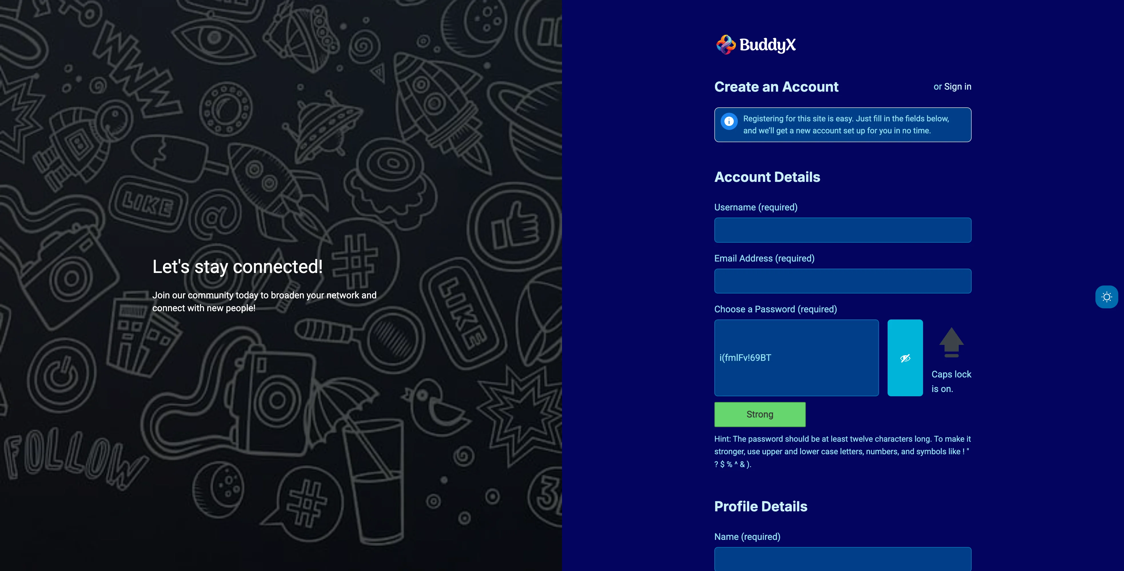
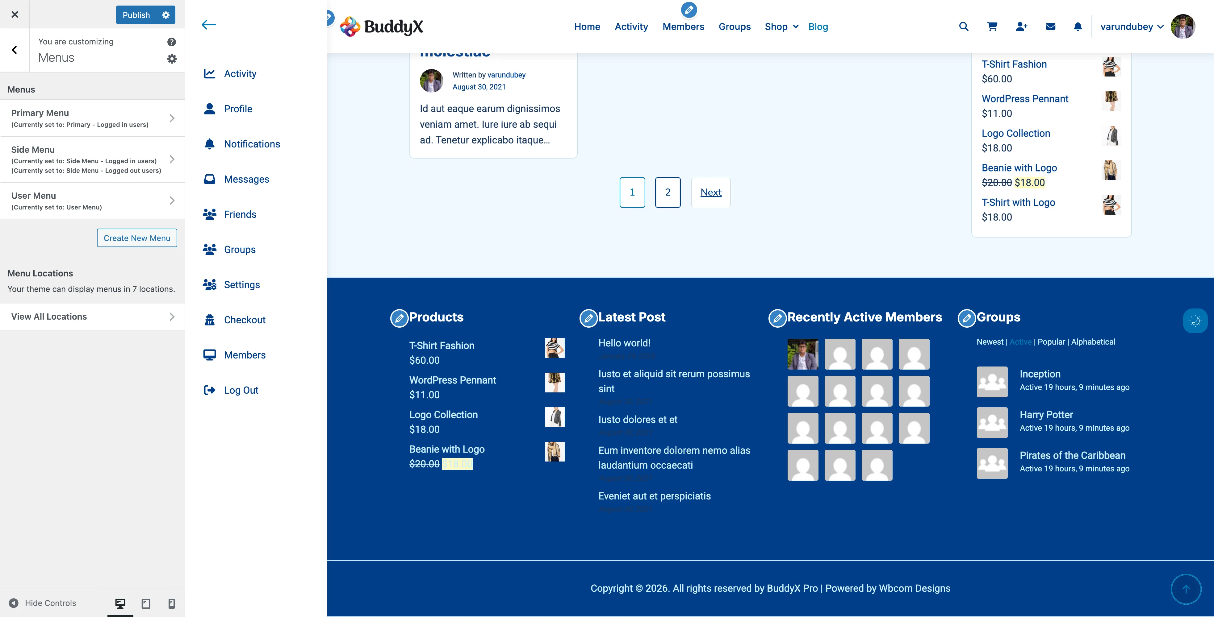
Overview

When BuddyPress is active, BuddyX Pro provides special customization options for your registration page. You can add custom backgrounds, welcome messages, and split-screen layouts to make registration more engaging.

Requirements:

  • BuddyPress plugin must be installed and activated
  • Registration must be enabled in BuddyPress settings

Getting Started

  1. Install and activate BuddyPress plugin
  2. Go to WordPress Admin → Appearance → Customize
  3. Navigate to Community → Registration Page
  4. Enable Toggle Split View to activate customization options

What You Can Do

Split View Layout

Transform your registration page with an attractive split-screen design.

How it works:

  • Left side: Custom background image with welcome message
  • Right side: Registration form
  • Mobile: Stacks vertically for perfect mobile experience

To enable:

  1. Turn ON Toggle Split View switch
  2. Additional customization options will appear

Background Image

Add a stunning background image to the left side of the registration page.

Setting Description Recommended
Background Image Upload image for left side 960×1080px

Best practices:

  • Use high-quality images showing community interaction
  • Avoid busy images that distract from the message
  • Ensure good contrast with text overlay
  • File size: Under 500KB for fast loading

Image ideas by site type:

  • Social Network: People connecting and interacting
  • Learning Platform: Students or classroom activities
  • Fitness Community: Group workout or active lifestyle
  • Business Network: Professional collaboration
  • Hobby Community: Members enjoying the activity

Welcome Content

Greet new members with personalized messaging on the left side.

Setting Description Default
Custom Heading Main headline "Let's stay connected!"
Custom Text Supporting description "Join our community today..."

Heading tips:

  • Keep it short and welcoming (3-6 words)
  • Use action words: "Join," "Welcome," "Connect"
  • Make it about THEM, not you
  • Create excitement and belonging

Good examples:

  • "Welcome to [Community Name]!"
  • "Join thousands of members"
  • "Your journey starts here"
  • "Connect with like-minded people"
  • "Become part of something great"

Description tips:

  • Explain the benefit of joining (1-2 sentences)
  • Highlight what makes your community unique
  • Keep it concise and scannable
  • Focus on value, not features

Good examples:

  • "Join our community today to broaden your network and connect with new people!"
  • "Get access to exclusive content, connect with experts, and grow your skills."
  • "Find your tribe. Share your passion. Make lasting connections."

Visual Customization

Control how your welcome content appears on the background.

Setting Description Range Default
Overlay Opacity Darken background for text readability 0-100% 70%
Custom Color Text color for heading and description Any color White (#ffffff)

Overlay Opacity:

  • 0% - No overlay, full image brightness
  • 30-50% - Light overlay, still shows image detail
  • 50-70% - Medium overlay, balanced visibility (recommended)
  • 70-90% - Dark overlay, maximum text contrast
  • 100% - Solid black, hides image completely

Choosing text color:

  • White works best for most images
  • Use dark colors only with very light backgrounds
  • Ensure WCAG AA contrast ratio (4.5:1 minimum)
  • Test on mobile devices

Page Structure

When split view is enabled, the registration page displays:

┌─────────────────────────────────────────────┐
│ Desktop Layout (Wide Screens)               │
├──────────────────┬──────────────────────────┤
│                  │                          │
│  Background      │  Registration Form       │
│  Image +         │                          │
│  Welcome         │  - Username              │
│  Message         │  - Email                 │
│                  │  - Password              │
│  (Left Side)     │  - Profile Fields        │
│                  │  - Submit Button         │
│                  │                          │
└──────────────────┴──────────────────────────┘

┌─────────────────────────────────────────────┐
│ Mobile Layout (Narrow Screens)              │
├─────────────────────────────────────────────┤
│ Background Image + Welcome Message          │
│ (Collapsed/Small Banner)                    │
├─────────────────────────────────────────────┤
│                                             │
│ Registration Form                           │
│ - Username                                  │
│ - Email                                     │
│ - Password                                  │
│ - Profile Fields                            │
│ - Submit Button                             │
│                                             │
└─────────────────────────────────────────────┘

Configuration Examples

Example 1: Professional Network

Perfect for LinkedIn-style professional communities.

Settings:

  • Background Image: Business professionals collaborating
  • Heading: "Join [Company] Network"
  • Description: "Connect with industry professionals and grow your career."
  • Overlay Opacity: 60%
  • Custom Color: White

Result: Clean, professional look that builds trust.

Example 2: Creative Community

Ideal for artists, designers, photographers.

Settings:

  • Background Image: Vibrant, artistic workspace
  • Heading: "Unleash Your Creativity"
  • Description: "Join a community of creators sharing inspiration and feedback."
  • Overlay Opacity: 50%
  • Custom Color: White or light yellow

Result: Inspiring, energetic feel that appeals to creatives.

Example 3: Fitness/Wellness

Great for gyms, yoga studios, health communities.

Settings:

  • Background Image: Group fitness class or outdoor activity
  • Heading: "Start Your Wellness Journey"
  • Description: "Join our community and achieve your fitness goals together."
  • Overlay Opacity: 65%
  • Custom Color: White

Result: Motivating, inclusive atmosphere.

Example 4: Learning Platform

Perfect for online courses, training platforms.

Settings:

  • Background Image: Students learning or studying together
  • Heading: "Begin Learning Today"
  • Description: "Access expert-led courses and connect with fellow learners."
  • Overlay Opacity: 70%
  • Custom Color: White

Result: Educational, approachable environment.

Example 5: Hobby/Interest Community

Ideal for book clubs, gaming, cooking communities.

Settings:

  • Background Image: People enjoying the hobby together
  • Heading: "Find Your Tribe"
  • Description: "Connect with people who share your passion for [hobby]."
  • Overlay Opacity: 55%
  • Custom Color: White

Result: Welcoming, friendly community feel.

Recommended Designs by Site Type

Site Type Heading Style Background Type Overlay
Professional Network Formal, benefit-focused Office/collaboration 60-70%
Social Community Friendly, inclusive Diverse people 50-60%
Learning Platform Educational, inspiring Study/learning 65-75%
Fitness/Health Motivational, action-oriented Active lifestyle 60-70%
Creative/Arts Inspirational, emotional Artistic/creative 45-55%
Gaming Community Exciting, fun Gaming scenes 55-65%
Support Group Warm, comforting Supportive imagery 60-70%
Business/Corporate Professional, trustworthy Business setting 65-75%

Integration with BuddyPress

BuddyPress Registration Page

Registration Fields

BuddyX Pro's split view works seamlessly with BuddyPress registration features:

Standard Fields:

  • Username
  • Email address
  • Password (with strength indicator)
  • Profile visibility toggle

Extended Profile Fields: All custom profile fields you create in BuddyPress → Settings → Profile Fields automatically display in the registration form.

To add custom fields:

  1. Go to BuddyPress → Settings → Profile Fields
  2. Create new fields (text, dropdown, checkboxes, etc.)
  3. Enable "Show on registration" for each field
  4. Fields appear automatically on registration page

Registration Confirmation

After registration, users see confirmation based on your BuddyPress settings:

Immediate Activation:

  • User logs in right away
  • Sees welcome message
  • Redirected to profile completion

Email Activation:

  • User receives activation email
  • Must click link to activate
  • Then logs in to complete profile

Profile Completion

BuddyX Pro enhances the post-registration experience:

  1. User activates account (if required)
  2. Logs in for first time
  3. Prompted to complete profile
  4. Guided through avatar upload
  5. Directed to community activity

Activation Page

The split view design also applies to the activation page users see after clicking the email confirmation link.

What users see:

  • Same split view layout
  • Same background and welcome message
  • Activation status message
  • Link to login page

Consistency benefit: Users have a cohesive visual experience from registration through activation.

Common Questions

Does this work without BuddyPress?

No. Registration page customization requires BuddyPress. The Community → Registration Page section only appears in the Customizer when BuddyPress is active.

For WordPress-only registration, you'll need to use a separate registration plugin or custom code.

Can I customize the form fields themselves?

Form fields are controlled by BuddyPress. You can:

  • Add custom fields via BuddyPress → Settings → Profile Fields
  • Style fields using Additional CSS in the Customizer
  • Reorder fields in BuddyPress profile field settings

The split view customization affects the page layout and welcome content, not the form fields themselves.

Why don't I see the Registration Page settings?

Check these requirements:

  1. BuddyPress plugin is installed and active
  2. Registration is enabled in Settings → BuddyPress → Settings → General
  3. You're looking in Appearance → Customize → Community → Registration Page

If BuddyPress is not active, this section won't appear.

Can I use this with WooCommerce?

Yes, but note:

  • This customizes the BuddyPress registration page
  • WooCommerce uses a different registration/checkout flow
  • For WooCommerce-specific customization, see WooCommerce settings

If you want unified registration, use a plugin that integrates BuddyPress and WooCommerce registration.

My background image is too dark/light

Adjust the Overlay Opacity slider:

  • Too dark: Decrease opacity (try 40-50%)
  • Too light (text hard to read): Increase opacity (try 70-80%)

You can also adjust the image brightness before uploading using photo editing software.

Can I have different messages for registration vs activation?

Currently, both pages share the same welcome message. To differentiate:

  1. Use generic welcoming text that works for both
  2. Or use custom CSS to hide/show different content based on page

Example CSS:

body.buddypress.register .custom-register-text {
  display: block;
}
body.buddypress.activate .custom-register-text {
  display: none;
}

How do I change the registration form colors?

BuddyX Pro inherits form styling from your global theme colors. To customize:

  1. Go to Appearance → Customize → Colors
  2. Adjust form field colors there
  3. Or use Additional CSS for registration-specific styling:
body.buddypress.register input[type="text"],
body.buddypress.register input[type="password"],
body.buddypress.register input[type="email"] {
  background-color: #your-color;
  border-color: #your-border-color;
}

Can I add terms and conditions checkbox?

BuddyPress doesn't include this by default. Options:

  1. Plugin: Use "BuddyPress Registration Options" or similar
  2. Custom Code: Add via BuddyPress signup hooks
  3. Third-party Form: Use WPForms or Gravity Forms with BuddyPress integration

Does this work with social registration?

Yes. If you use social login plugins like Nextend Social Login, the social buttons appear above or below the standard registration form, within the right-side panel.

The split view layout accommodates social registration buttons automatically.

How do I translate the welcome message?

If you're using a multilingual plugin (WPML, Polylang, etc.):

  1. Navigate to the Customizer
  2. Switch language in the customizer
  3. Enter translated text in Custom Heading and Custom Text
  4. Save settings for each language

Or use translation plugins that support theme modifications.

Can I hide the split view on mobile?

The split view automatically adapts to mobile:

  • Background becomes a small banner
  • Form takes full width
  • Maintains responsive design

To completely hide on mobile, use custom CSS:

@media (max-width: 768px) {
  body.buddypress.register .login-split {
    display: none;
  }
}

My registration page looks different from the preview

Common causes:

  1. Not published: Click Publish in the Customizer
  2. Browser cache: Clear cache and hard refresh
  3. Plugin conflict: Disable other plugins temporarily
  4. Theme update needed: Ensure BuddyX Pro is up to date

Can I add a video background?

Not directly through the settings. To add video background:

  1. Upload video to your media library
  2. Use custom CSS and JavaScript
  3. Or use a plugin like "Advanced Custom Fields" with custom templates

Video backgrounds can slow page load, so use cautiously for registration pages.

Advanced Customization

Custom CSS Examples

Add these in Appearance → Customize → Additional CSS.

Change welcome text alignment:

body.buddypress.register .login-split .split-screen-content {
  text-align: left; /* or center, right */
  padding-left: 60px;
}

Add pattern/texture to background:

body.buddypress.register .login-split {
  background-blend-mode: multiply;
  background-color: rgba(0, 0, 0, 0.3);
}

Adjust form width:

@media (min-width: 992px) {
  body.buddypress.register #buddypress {
    max-width: 450px;
  }
}

Change overlay color (not just black):

body.buddypress.register .login-split .split-overlay {
  background: linear-gradient(135deg, rgba(99, 66, 255, 0.7), rgba(66, 133, 244, 0.7));
}

Developer Hooks

For developers needing programmatic control:

// Modify registration page heading
add_filter( 'theme_mod_register_custom_heading', function( $heading ) {
  if ( is_user_logged_in() ) {
    return $heading;
  }
  return 'Custom heading for non-logged users';
} );

// Conditionally disable split view
add_filter( 'theme_mod_register_split_view', function( $enabled ) {
  // Disable on mobile
  if ( wp_is_mobile() ) {
    return false;
  }
  return $enabled;
} );

Related Settings

Support

Need help with registration page customization?

Before contacting support:

  1. Confirm BuddyPress is active and updated
  2. Check registration is enabled in BuddyPress settings
  3. Test with default WordPress theme to rule out conflicts
  4. Provide screenshots of your customizer settings
  5. Share your site URL for visual context

Theme Features

Block patterns, menus, page templates, widgets, and add-on plugins.

Bundled Addon Plugins

BuddyX Pro includes several premium addon plugins as part of your purchase. These plugins extend the functionality of your community website with reactions, social sharing, and more.

Included Plugins

BuddyPress Reactions Pro

Add emoji reactions to BuddyPress activities, comments, and posts. Members can express themselves beyond traditional likes with a variety of reaction options.

Key Features:

  • Multiple emoji reactions (like, love, haha, wow, sad, angry)
  • Works with BuddyPress activity stream
  • Works with blog post comments
  • Customizable reaction icons
  • Reaction counts and summaries
  • Who reacted popup

Documentation: Link coming soon


BuddyPress Share Pro

Enable social sharing for BuddyPress activities and WordPress posts. Members can share content to popular social networks with one click.

Key Features:

  • Share to Facebook, Twitter, LinkedIn, WhatsApp, and more
  • Share BuddyPress activities
  • Share blog posts
  • Customizable share button styles
  • Share count tracking
  • Copy link option

Documentation: Link coming soon


Installation

All bundled plugins are available in your BuddyX Pro download package or through your Wbcom Designs account.

Step 1: Download Plugins

  1. Log in to your Wbcom Designs account
  2. Go to Downloads
  3. Find BuddyX Pro and bundled plugins
  4. Download the plugin ZIP files

Step 2: Install Plugins

  1. Go to Plugins → Add New → Upload Plugin
  2. Choose the plugin ZIP file
  3. Click Install Now
  4. Click Activate

Step 3: Configure

Each plugin has its own settings page:

  • Reactions Pro: Settings → BuddyPress Reactions
  • Share Pro: Settings → BuddyPress Share

Plugin Requirements

Plugin Requires
BuddyPress Reactions Pro BuddyPress or BuddyBoss Platform
BuddyPress Share Pro BuddyPress or BuddyBoss Platform

License Activation

Bundled plugins are covered under your BuddyX Pro license. To receive updates:

  1. Go to each plugin's settings page
  2. Enter your license key (same as BuddyX Pro)
  3. Click Activate License

Support

For support with bundled addon plugins:

Related Documentation


Need Help?

Block Patterns

BuddyX Pro includes 60+ pre-designed block patterns for quickly building pages.


Overview

Block patterns are pre-built layouts that can be inserted into any page or post using the WordPress block editor. BuddyX Pro includes patterns for:

  • BuddyPress community features
  • Full page templates
  • Hero sections
  • Feature showcases
  • Testimonials
  • Call-to-action sections
  • And more

Using Block Patterns

Inserting a Pattern

  1. Open a page or post in the block editor
  2. Click the + button to add a block
  3. Select the Patterns tab
  4. Browse categories or search
  5. Click a pattern to insert it

Finding BuddyX Patterns

Look for these categories:

  • BuddyX BuddyPress - Community patterns
  • BuddyX Templates - Full page layouts
  • BuddyX Community - Social features
  • BuddyX LMS - Learning patterns
  • BuddyX WooCommerce - E-commerce patterns
  • BuddyX Dark Mode - Dark themed patterns

BuddyPress Patterns (14)

Patterns for building community pages:

Pattern Description
Active Members Grid of recently active members
Activity Feed Latest activity stream display
Community Hero Hero section for community pages
Community Sidebar Sidebar with community widgets
Community Stats Member and group statistics
Groups List Grid of available groups
Login Widget Login/register form pattern
Member Testimonials Member quotes and reviews
Members List Directory of members
Newest Groups Recently created groups
Newest Members New member showcase
Online Members Currently active users
Sitewide Notice Announcement banner
Why Join Us Community benefits section

General Patterns (25)

Versatile patterns for any page:

Hero Sections (5)

Pattern Description
Hero Centered Centered headline with CTA buttons
Hero Gradient Gradient background hero
Hero Minimal Clean, simple hero
Hero Split Image on one side, content on other
Hero Video Video background hero

Feature Sections (5)

Pattern Description
Features Alternating Left/right alternating layout
Features Cards Card-based feature display
Features Grid 3-Col Three column feature grid
Features Grid 4-Col Four column feature grid
Features Icons Icon-focused feature list

Call to Action (4)

Pattern Description
CTA Gradient Gradient background CTA
CTA Newsletter Email signup CTA
CTA Simple Clean, minimal CTA
CTA Split Two-column CTA layout

Testimonials (4)

Pattern Description
Testimonials Cards Card-based testimonials
Testimonials Grid Grid layout testimonials
Testimonials Minimal Simple quote display
Testimonials Single Featured single testimonial

Content Sections (4)

Pattern Description
Content About About section layout
Content FAQ Frequently asked questions
Content Pricing Pricing table display
Content Stats Statistics/numbers display

Headers & Footers (3)

Pattern Description
Page Header Page title with breadcrumbs
Section Header Section title with description
Footer Links Multi-column footer links
Footer Simple Minimal footer design

Template Patterns (21)

Complete page layouts ready to use:

Homepage Templates (3)

Pattern Description
Homepage Community Community-focused homepage
Homepage Courses LMS/courses homepage
Homepage Marketplace E-commerce homepage

Standard Pages (12)

Pattern Description
About Page Company/site about page
About Team Team members showcase
Blog Page Blog listing layout
Contact Page Full contact page
Contact Simple Minimal contact form
Event Page Event listings page
FAQ Page Frequently asked questions
Portfolio Page Project showcase
Pricing Page Pricing tiers display
Services Page Services showcase
Team Page Team members grid
Landing Page Marketing landing page

Utility Pages (4)

Pattern Description
404 Page Not found page
Coming Soon Pre-launch page
Maintenance Site maintenance page
Privacy Policy Privacy policy template
Terms of Service Terms & conditions

Pattern Categories Reference

Category Slug Label Description
buddyx-buddypress BuddyX BuddyPress BuddyPress patterns
buddyx-lms BuddyX LMS Learning patterns
buddyx-woocommerce BuddyX WooCommerce E-commerce patterns
buddyx-dark BuddyX Dark Mode Dark themed patterns
buddyx-templates BuddyX Templates Full page templates
buddyx-community BuddyX Community Community patterns

Customizing Patterns

After Insertion

Once inserted, patterns are regular blocks:

  • Edit any text by clicking and typing
  • Change colors in block settings
  • Swap images using the media library
  • Adjust spacing and alignment
  • Delete unwanted blocks

Creating Reusable Blocks

Save customized patterns for reuse:

  1. Select the blocks you want to save
  2. Click the three-dot menu
  3. Select Create pattern
  4. Name your pattern
  5. Choose whether to sync it

Dependencies

Some patterns require plugins:

Pattern Category Required Plugin
BuddyPress patterns BuddyPress
LMS patterns LearnDash/LearnPress
WooCommerce patterns WooCommerce

Patterns will still appear but may not function fully without dependencies.


Developer Information

Pattern File Structure

patterns/
├── buddypress/     # BuddyPress patterns
├── general/        # General use patterns
└── templates/      # Full page templates

Pattern Header Format

<?php
/**
 * Title: Pattern Name
 * Slug: buddyx-pro/pattern-slug
 * Categories: buddyx-community, featured
 * Keywords: keyword1, keyword2
 * Description: Pattern description.
 * Viewport Width: 1400
 * Inserter: true
 */
?>

Registration

Patterns are auto-registered via the Block_Patterns\Component class on init hook (priority 11).


Related Documentation

Page Templates

BuddyX Pro includes multiple page and post templates for different layouts.


Overview

Page templates control the layout structure of individual pages and posts. BuddyX Pro provides templates for:

  • Full-width layouts
  • Sidebar layouts (left, right, both)
  • Custom content widths

Page Templates

Page No Sidebar

File: page-templates/full-width-container.php Template Name: Page No Sidebar

Full-width page with content contained in the standard container width. No sidebars.

Best for:

  • Landing pages
  • Sales pages
  • Pages using block editor layouts

Page Full Screen

File: page-templates/full-width.php Template Name: Page Full Screen

True full-width page that stretches edge-to-edge. No container constraints.

Best for:

  • Visual showcases
  • Full-width block patterns
  • Custom designs

Page Left Sidebar

File: page-templates/page-left-sidebar.php Template Name: Page Left Sidebar

Page content with a sidebar on the left side.

Best for:

  • Documentation pages
  • Archive-style content
  • Pages needing navigation

Page Right Sidebar

File: page-templates/page-right-sidebar.php Template Name: Page Right Sidebar

Page content with a sidebar on the right side.

Best for:

  • Blog-style pages
  • Pages with widgets
  • Standard content layouts

Page Both Sidebar

File: page-templates/page-both-sidebar.php Template Name: Page Both Sidebar

Page content with sidebars on both left and right sides.

Best for:

  • Complex layouts
  • Multi-widget pages
  • Dashboard-style pages

Post Templates

Right Sidebar (Default)

File: post-templates/post-right-sidebar.php Template Name: Right Sidebar

Standard post layout with sidebar on the right.


Left Sidebar

File: post-templates/post-left-sidebar.php Template Name: Left Sidebar

Post layout with sidebar on the left side.


Both Sidebar

File: post-templates/post-both-sidebar.php Template Name: Both Sidebar

Post layout with sidebars on both sides.


Full Width - Small Container

File: post-templates/post-full-small.php Template Name: Full Width - Small container

Full-width post with narrow content width. Good for readability.


Full Width - Large Container

File: post-templates/post-full-large.php Template Name: Full Width - Large container

Full-width post with wide content width. Good for media-rich content.


Applying Templates

For Pages

  1. Edit your page
  2. In the right sidebar, find Page Attributes
  3. Click the Template dropdown
  4. Select your desired template
  5. Click Update

For Posts

  1. Edit your post
  2. In the right sidebar, find Post Attributes or Template
  3. Select your desired template
  4. Click Update

Default Settings

You can set default layouts in the Customizer:

Default Page Sidebar

  1. Go to Appearance → Customize → Sidebar
  2. Find Default Sidebar Layout
  3. Choose your default
  4. Click Publish

Default Post Sidebar

  1. Go to Appearance → Customize → Sidebar
  2. Find Single Post Sidebar Layout
  3. Choose your default
  4. Click Publish

Template Hierarchy

Templates are applied in this order of priority:

  1. Template assigned to specific page/post (highest)
  2. Customizer default for content type
  3. Theme default (lowest)

Sidebar Widget Areas

Different templates use different widget areas:

Template Widget Area Used
Left Sidebar Main Sidebar
Right Sidebar Main Sidebar
Both Sidebar Main Sidebar + Right Sidebar

Custom Templates

Creating Custom Templates

Create custom templates in a child theme:

Page Template:

<?php
/**
 * Template Name: My Custom Template
 */

get_header();
?>

<div class="my-custom-layout">
    <!-- Your custom layout -->
    <?php the_content(); ?>
</div>

<?php
get_footer();

Location: child-theme/page-templates/my-template.php


Integration Templates

BuddyPress Pages

BuddyPress pages have their own sidebar settings:

  • Appearance → Customize → Sidebar → BuddyPress Sidebar Layout

WooCommerce Pages

WooCommerce pages have their own sidebar settings:

  • Appearance → Customize → Sidebar → WooCommerce Sidebar Layout

LearnDash Pages

LearnDash pages have their own sidebar settings:

  • Appearance → Customize → Sidebar → LearnDash Sidebar Layout

Responsive Behavior

On mobile devices:

  • Sidebars stack below content
  • Full-width templates remain full-width
  • Container widths adjust responsively

Related Documentation

Custom Widgets

BuddyX Pro includes custom widgets for enhanced functionality.

Widgets Settings Widget areas configuration in the Customizer


Available Widgets

1. BP Profile Completion Widget

File: inc/widgets/bp-profile-completion-widget.php Requires: BuddyPress

Displays a profile completion progress bar encouraging users to complete their profile.

Features:

  • Progress percentage display
  • Visual progress bar
  • Links to incomplete sections
  • Customizable message

Settings:

  • Title
  • Completion message

Best used in:

  • BuddyPress member sidebar
  • Dashboard widgets
  • Activity stream sidebar

2. LearnDash Featured Course Widget

File: inc/widgets/ld-featured-course-widget.php Requires: LearnDash

Showcases a featured course with image, title, and enrollment button.

Features:

  • Course thumbnail
  • Course title
  • Short description
  • Enrollment/continue button
  • Price display

Settings:

  • Title
  • Course to feature
  • Display style

Best used in:

  • Homepage sidebar
  • Blog sidebar
  • Course archive sidebar

3. Login Widget

File: inc/widgets/login-widget.php

Displays a login form for logged-out users and user info for logged-in users.

Features:

  • Login form with username/password
  • Remember me checkbox
  • Register and forgot password links
  • User avatar when logged in
  • Logout link when logged in

Settings:

  • Title
  • Show/hide register link
  • Show/hide forgot password link
  • Redirect URL after login

Best used in:

  • Sidebar
  • Header widget area
  • Off-canvas sidebar

4. Vendor Profile Widget

File: inc/widgets/class-vendor-profile-widget.php Requires: Dokan or WC Vendors

Displays vendor information on store and product pages.

Features:

  • Vendor avatar
  • Store name
  • Store rating
  • Contact information
  • Store link

Settings:

  • Title
  • Display elements

Best used in:

  • Product sidebar
  • Store sidebar
  • Marketplace pages

Widget Areas

BuddyX Pro registers multiple widget areas:

Main Widget Areas

Area Description
Main Sidebar Primary sidebar for pages/posts
Right Sidebar Secondary sidebar (when using both sidebars)
Footer Widgets Footer widget area (columns configurable)

Specialty Widget Areas

Area Description Requires
BuddyPress Sidebar BuddyPress pages sidebar BuddyPress
WooCommerce Sidebar Shop/product sidebar WooCommerce
Off Canvas Sidebar Off-canvas filter area WooCommerce

Adding Widgets

Via Customizer

  1. Go to Appearance → Customize → Widgets
  2. Select a widget area
  3. Click Add a Widget
  4. Select your widget
  5. Configure settings
  6. Click Publish

Via Widgets Screen

  1. Go to Appearance → Widgets
  2. Find the widget you want
  3. Drag it to a widget area
  4. Configure settings
  5. Click Save

Widget Styling

Widgets inherit theme styling:

  • Background colors from theme settings
  • Typography from theme fonts
  • Spacing from theme design

Custom Widget CSS

Target widgets with these classes:

.widget { }                    /* All widgets */
.widget-title { }              /* Widget titles */
.widget_buddyx_login { }       /* Login widget */
.widget_bp_profile_completion { }  /* Profile completion */

Conditional Display

Many widgets show different content based on user state:

Login Widget

User State Displays
Logged Out Login form
Logged In User info + logout

Profile Completion Widget

User State Displays
Logged Out Nothing
Logged In Progress bar
100% Complete Congratulations message

Plugin Compatibility

Some widgets require specific plugins:

Widget Required Plugin
BP Profile Completion BuddyPress
LearnDash Featured Course LearnDash
Vendor Profile Dokan or WC Vendors
Login Widget None (works standalone)

Widgets that require plugins will not appear if the plugin is not active.


Best Practices

Widget Placement

  • Place login widget in easily accessible areas
  • Use profile completion in member-focused areas
  • Feature courses on high-traffic pages
  • Match widget areas to page purpose

Performance

  • Limit widgets per area (5-7 recommended)
  • Use caching for complex widgets
  • Avoid duplicate widgets

Mobile Experience

  • Test widget display on mobile
  • Consider hiding some widgets on mobile
  • Ensure touch-friendly interactions

Developer Information

Creating Custom Widgets

class My_Custom_Widget extends WP_Widget {

    public function __construct() {
        parent::__construct(
            'my_custom_widget',
            __( 'My Custom Widget', 'buddyxpro' ),
            array(
                'description' => __( 'Widget description', 'buddyxpro' ),
            )
        );
    }

    public function widget( $args, $instance ) {
        echo $args['before_widget'];
        echo $args['before_title'] . $instance['title'] . $args['after_title'];
        // Widget content here
        echo $args['after_widget'];
    }

    public function form( $instance ) {
        // Admin form fields
    }

    public function update( $new_instance, $old_instance ) {
        // Save logic
        return $new_instance;
    }
}

add_action( 'widgets_init', function() {
    register_widget( 'My_Custom_Widget' );
});

Related Documentation

Other Plugin Integrations

Elementor, GamiPress, The Events Calendar, and more.

Elementor Page Builder

Create stunning custom layouts with Elementor and BuddyX Pro. Build beautiful pages, headers, footers, and templates with drag-and-drop simplicity while maintaining full theme compatibility.


What You Can Do

With BuddyX Pro's Elementor integration, you can:

  • Build Custom Pages - Design unique layouts with Elementor's visual editor
  • Create Custom Headers - Replace theme header with Elementor templates
  • Design Custom Footers - Build custom footer layouts
  • Template Builder - Create templates for posts, archives, and more (Pro)
  • Theme Builder - Design templates for any WordPress content (Pro)
  • Widget Library - Access 40+ Elementor widgets
  • Responsive Design - Automatic mobile optimization
  • Full Theme Compatibility - BuddyX Pro styling applies to Elementor content

Prerequisites

Before using Elementor with BuddyX Pro:

Requirement Version Notes
WordPress 6.0+ Latest stable version recommended
BuddyX Pro Theme Active Must be activated
Elementor 3.0+ Free version available
PHP 7.4+ Required by Elementor

Recommended:

  • Elementor Pro - Unlock Theme Builder, popup builder, and advanced widgets
  • RAM: At least 128MB PHP memory limit
  • Max Execution Time: 300 seconds for large pages

Installation & Setup

Step 1: Install Elementor

  1. Log in to your WordPress dashboard
  2. Go to Plugins → Add New
  3. Search for "Elementor"
  4. Click Install Now next to Elementor Website Builder
  5. Click Activate after installation completes

Step 2: Configure Elementor Settings

After activation:

  1. Go to Elementor → Settings
  2. Configure recommended settings:

General Tab:

Setting Recommendation Why
Editing Handles On Easier widget selection
Enable Flexbox On Better responsive layouts
Default Generic Fonts System Match BuddyX Pro typography

Style Tab:

Setting Value
Content Width 1170px (matches BuddyX Pro)
Space Between Widgets 20px
Stretched Section Width 100%
Default Colors Use BuddyX Pro colors (set in Customizer)

Advanced Tab:

Setting Recommendation
CSS Print Method External File (better performance)
Google Fonts On (or use BuddyX Pro fonts)
Font Display Swap

Step 3: Verify BuddyX Pro Compatibility

BuddyX Pro automatically works with Elementor. To verify:

  1. Create new page: Pages → Add New
  2. Click Edit with Elementor button
  3. Page opens in Elementor editor
  4. BuddyX Pro styles apply to Elementor widgets

If Elementor button doesn't appear:

  • Go to Elementor → Settings → General
  • Check "Enable for Posts" and "Enable for Pages"
  • Save settings

BuddyX Pro Integration Features

Automatic Canvas Template Support

BuddyX Pro supports all Elementor canvas templates:

Available Templates:

Template Header Footer Sidebar Use Case
Default Theme Theme Theme Regular pages with BuddyX Pro design
Elementor Canvas None None None Blank slate, 100% custom
Elementor Full Width Theme Theme None Keep BuddyX Pro header/footer, custom content

How to Set Template:

  1. Edit page with Elementor
  2. Click gear icon (Page Settings)
  3. Find Template dropdown
  4. Choose your template
  5. Update page

Theme Colors Integration

Elementor inherits BuddyX Pro color scheme:

Automatic Color Sync:

  • Primary color → Elementor primary color
  • Secondary color → Elementor secondary color
  • Text color → Elementor text color
  • Link color → Elementor link color

To Use Theme Colors in Elementor:

  1. Select any widget
  2. Go to Style tab
  3. Click color picker
  4. Choose from Global Colors at top
  5. Colors match your theme customizer settings

Typography Integration

Elementor respects BuddyX Pro font settings:

Font Inheritance:

  • Body font applies to paragraph widgets
  • Heading font applies to heading widgets
  • Menu font applies to navigation widgets

To Match Theme Typography:

  1. Go to Elementor → Settings → Style
  2. Set Primary Font to match BuddyX Pro body font
  3. Set Secondary Font to match BuddyX Pro heading font
  4. Or leave blank to inherit theme fonts

Responsive Breakpoints

BuddyX Pro breakpoints match Elementor:

Device Breakpoint BuddyX Pro Elementor
Desktop 1025px+ Yes Yes
Tablet 768px - 1024px Yes Yes
Mobile <768px Yes Yes

Consistent Across:

  • Theme layouts
  • Elementor sections
  • Widget spacing
  • Font sizes

Building Pages with Elementor

Creating Your First Elementor Page

  1. Go to Pages → Add New
  2. Enter page title
  3. Click Edit with Elementor button
  4. Elementor editor opens

Editor Interface:

Panel Location Purpose
Left Panel Left side Widget library and settings
Canvas Center Live preview and editing
Top Bar Top Save, preview, responsive mode
Bottom Bar Bottom Navigator, history, user preferences

Page Building Workflow

Step 1: Choose Structure

  1. Click + icon in canvas
  2. Choose column structure:
    • Single column (full width)
    • Two columns (50/50)
    • Three columns (33/33/33)
    • Custom columns

Step 2: Add Widgets

  1. Search or browse widgets in left panel
  2. Drag widget to desired column
  3. Widget appears with default settings

Step 3: Customize Content

  1. Click widget to select
  2. Left panel shows Content tab
  3. Edit text, images, links, etc.

Step 4: Style Widget

  1. Click Style tab
  2. Adjust colors, spacing, typography
  3. Changes appear live in canvas

Step 5: Advanced Settings

  1. Click Advanced tab
  2. Set margins, padding, CSS classes
  3. Configure animations, backgrounds

Recommended Page Templates

Homepage Template:

  • Hero section (full width, background image)
  • Features section (3 columns with icons)
  • Statistics section (4 columns with numbers)
  • Call-to-action section (centered, full width)

About Page Template:

  • Header section (full width)
  • Team section (4 columns with photos)
  • Timeline section (2 columns)
  • Contact section (form)

Landing Page Template:

  • Hero with headline and CTA button
  • Benefits section (icon boxes)
  • Testimonials (slider)
  • Pricing table
  • FAQ accordion
  • Final CTA section

Theme Builder (Elementor Pro)

Create custom templates for WordPress content types.

Setting Up Theme Builder

Requires Elementor Pro.

  1. Go to Elementor → Theme Builder
  2. Choose template type:
    • Header
    • Footer
    • Single Post
    • Archive
    • Search Results
    • 404 Page

Creating Custom Header

Replace BuddyX Pro header with Elementor header:

  1. Go to Elementor → Theme Builder
  2. Click Add NewHeader
  3. Name your header template
  4. Click Create Template

Building the Header:

  1. Add Section
  2. Set section height to fit header (80-100px)
  3. Add columns (3 columns recommended):
    • Column 1: Logo (Site Logo widget)
    • Column 2: Menu (Nav Menu widget)
    • Column 3: Icons (Search Icon, Cart Icon widgets)

Header Widgets to Use:

Widget Purpose
Site Logo Your logo image
Site Title Site name text
Nav Menu Main navigation menu
Search Form Search bar
Social Icons Social media links

Header Settings:

  1. Click section settings (gear icon)
  2. Advanced tab → Positioning
  3. Set Width: Full Width (100%)
  4. Set Position: Fixed (for sticky header)

Display Conditions:

  1. Click Publish button
  2. Set display conditions:
    • Include: Entire Site
    • Or specific pages/sections
  3. Click Save & Close

Creating Custom Footer

Build custom footer with widgets:

  1. Go to Elementor → Theme Builder
  2. Click Add NewFooter
  3. Name your footer template
  4. Click Create Template

Footer Structure:

4-Column Footer Layout:

  • Column 1: About text and logo
  • Column 2: Quick links menu
  • Column 3: Recent posts
  • Column 4: Contact info

Footer Widgets:

Widget Use For
Text Editor About text, descriptions
Icon List Quick links
Nav Menu Footer menu
Social Icons Social media links
Heading Section titles
Divider Visual separation

Footer Bottom Bar:

Add second section below:

  • Left column: Copyright text
  • Right column: Privacy links or payment icons

Display Conditions:

Set to Entire Site or specific pages.

Creating Single Post Template

Custom design for blog posts:

  1. Elementor → Theme Builder → Add New → Single
  2. Choose Post as content type
  3. Build layout using these widgets:

Essential Post Widgets:

Widget Displays
Post Title Article title
Post Excerpt Short description
Post Content Full article content
Featured Image Main image
Post Info Author, date, categories
Author Box Author bio and avatar
Post Comments Comment section
Post Navigation Previous/next post links

Layout Recommendations:

Classic Blog Layout:

  • Full width featured image
  • Centered title and meta
  • Single column content (800px wide)
  • Author box at bottom
  • Comments section

Magazine Layout:

  • Side-by-side featured image and title
  • Two column content with sidebar
  • Related posts grid
  • Social sharing buttons

Display Conditions:

Set to All Singular → Posts.

Creating Archive Template

Design for blog archive, category, tag pages:

  1. Elementor → Theme Builder → Add New → Archive
  2. Choose Posts Archive
  3. Build with Archive widgets:

Archive-Specific Widgets:

Widget Purpose
Archive Title Category/tag name
Archive Posts Post loop/grid
Breadcrumbs Navigation path

Archive Posts Widget Settings:

Setting Options
Layout Classic, Cards, Grid
Columns 2, 3, or 4
Posts Per Page 9, 12, 15
Pagination Numbers, Prev/Next, Load More

Display Conditions:

  • All Archives
  • Or specific (Categories, Tags, Authors)

BuddyPress & Community Pages

Can I Use Elementor with BuddyPress Pages?

Partially supported:

Works Well:

  • Custom homepages with BuddyPress widgets
  • Landing pages for community
  • About/Contact pages

Not Recommended:

  • Activity page (uses BuddyPress templates)
  • Member profiles (uses BuddyPress templates)
  • Group pages (uses BuddyPress templates)

Best Practice:

Use Elementor for marketing/info pages, let BuddyX Pro handle BuddyPress pages.

Adding BuddyPress Elements

On Elementor pages, add BuddyPress content:

Using Shortcodes:

Add Shortcode widget and use these:

Shortcode Displays
[bp_activity_stream] Activity feed
[bp_member_list] Member directory
[bp_group_list] Group directory
[bp_login_form] Login form
[bp_registration_form] Registration form

Using Widgets:

Add WordPress Widget and choose BuddyPress widgets:

  • Who's Online
  • Recently Active Members
  • Members
  • Groups

WooCommerce & E-commerce (Elementor Pro)

WooCommerce Builder

Elementor Pro includes WooCommerce widgets:

Product Widgets:

Widget Purpose
Products Product grid/list
Product Categories Category grid
Product Title Single product name
Product Price Product price display
Product Add to Cart Buy button
Product Images Gallery

Building Shop Page:

  1. Elementor → Theme Builder → Add New → Archive
  2. Choose Products Archive
  3. Add Products widget
  4. Configure grid layout
  5. Set display conditions to Shop page

Building Product Page:

  1. Elementor → Theme Builder → Add New → Single
  2. Choose Product as content type
  3. Layout products widgets:
    • Product Images (left column)
    • Product Title, Price, Add to Cart (right column)
    • Product Tabs (full width below)
    • Related Products (bottom)

Cart & Checkout Pages

For cart/checkout, keep BuddyX Pro default templates:

Why:

  • WooCommerce forms require specific structure
  • BuddyX Pro optimizes these pages
  • Elementor can break checkout functionality

If You Need Customization:

  • Use WooCommerce Customizer options
  • Or add custom CSS
  • Avoid building entire cart/checkout in Elementor

LearnDash Course Pages (Elementor Pro)

Building Course Templates

Elementor Pro supports LearnDash templates:

  1. Elementor → Theme Builder → Add New → Single
  2. Choose Course (LearnDash)
  3. Use Dynamic Content widgets

LearnDash Dynamic Tags:

Tag Displays
Course Title Course name
Course Description Course overview
Course Price Enrollment price
Course Progress Progress bar
Course Curriculum Lesson list

Example Course Layout:

  • Hero section: Course title, featured image, price
  • Course info: Instructor, duration, students enrolled
  • Course content: Description and what you'll learn
  • Curriculum: Lesson/topic accordion
  • Instructor bio: Author box
  • Enrollment button: Buy/Enroll CTA

Display Conditions:

Set to All Singular → Courses.


Performance Optimization

Speed Tips for Elementor

  1. Limit Widget Count

    • Use 20-30 widgets per page maximum
    • Combine widgets when possible
    • Remove unused widgets
  2. Optimize Images

    • Compress before upload
    • Use WebP format
    • Recommended max: 1920px wide
    • Use Elementor's built-in lazy load
  3. Font Loading

    • Limit Google Fonts to 2-3 families
    • Use system fonts when possible
    • Enable font preloading
  4. CSS Optimization

    • Set CSS Print Method to External File
    • Enable "Minify CSS Files"
    • Combine CSS files when possible
  5. Reduce Animations

    • Limit entrance animations
    • Use CSS animations over JS
    • Disable animations on mobile

Caching with Elementor

Recommended caching plugins:

Plugin Compatibility Notes
WP Rocket Excellent Auto-detects Elementor
LiteSpeed Cache Excellent ESI for dynamic content
W3 Total Cache Good Configure minify settings

Cache Settings:

  • Enable page caching
  • Enable browser caching
  • Don't cache logged-in users
  • Clear cache after Elementor edits

Common Questions

Can I use Elementor and Gutenberg together?

Yes! You can:

  • Use Elementor for some pages
  • Use Gutenberg (Block Editor) for others
  • Mix content types on same site

To Switch:

  • Click "Edit with Elementor" for Elementor editor
  • Click "Edit" for Gutenberg editor

Will Elementor pages work if I deactivate the plugin?

No. Elementor content requires the plugin to display. If deactivated:

  • Pages appear blank
  • Content is saved as shortcodes
  • Reactivating restores content

Best Practice: Don't use Elementor for critical pages if you might switch themes.

How do I match Elementor colors to my theme?

Method 1: Global Colors

  1. Elementor → Settings → Style
  2. Set colors under "Global Colors"
  3. Use Customizer values:
    • Primary: BuddyX Pro primary color
    • Secondary: BuddyX Pro secondary color
    • Text: Body text color
    • Accent: Link color

Method 2: Color Picker

Use eyedropper tool to pick colors from existing theme elements.

Can I export/import Elementor designs?

Yes, with Elementor Pro:

Export Template:

  1. Elementor → Template Library
  2. Find your template
  3. Click export icon
  4. Download JSON file

Import Template:

  1. Elementor → Template Library → Import
  2. Upload JSON file
  3. Template appears in library

How do I create a sticky header in Elementor?

For Elementor Headers:

  1. Edit header template
  2. Click section settings
  3. Advanced tab → Motion Effects
  4. Enable "Sticky"
  5. Set Sticky On: Top
  6. Choose sticky behavior

For Theme Header with Elementor:

Use BuddyX Pro sticky header instead:

  • Appearance → Customize → Site Header → Sticky Header
  • Enable and configure

Why are my Elementor pages loading slowly?

Common Causes:

  1. Too Many Widgets - Reduce to 20-30 per page
  2. Large Images - Compress and resize
  3. Google Fonts - Limit to 2-3 families
  4. No Caching - Install caching plugin
  5. Cheap Hosting - Upgrade to better server

Quick Fixes:

  • Enable lazy load for images
  • Use CSS print method: External File
  • Disable unused widgets in Elementor settings
  • Optimize database

Can I use BuddyX Pro header and Elementor content?

Yes! Use Elementor Full Width template:

  1. Edit page with Elementor
  2. Page Settings → Template
  3. Choose "Elementor Full Width"
  4. BuddyX Pro header/footer remain
  5. Content area is 100% Elementor

Recommended Configurations

For Marketing Sites

Pages to Build with Elementor:

  • Homepage
  • About page
  • Services/Products page
  • Contact page
  • Landing pages

Keep Default BuddyX Pro:

  • Blog archive
  • Single posts
  • 404 page
  • Search results

For Community Sites

Use Elementor For:

  • Homepage (welcome/features)
  • About/Team page
  • Resource library
  • Documentation pages

Keep BuddyX Pro Default:

  • All BuddyPress pages
  • Member profiles
  • Activity stream
  • Groups pages
  • Forums (bbPress)

For Course Platforms

Build with Elementor Pro:

  • Course archive page
  • Single course layout
  • Instructor page template
  • Student dashboard

Keep BuddyX Pro Default:

  • Lesson pages (LearnDash Focus Mode)
  • Quiz pages
  • Assignment pages
  • Profile pages

Related Settings


Need Help?

Documentation: docs.wbcomdesigns.com Elementor Docs: elementor.com/help Video Tutorials: youtube.com/wbcomdesigns

Email Support: support@wbcomdesigns.com

Include: BuddyX Pro version, Elementor version, and link to your page for troubleshooting.

The Events Calendar

Display and manage events beautifully with The Events Calendar and BuddyX Pro. Create event listings, calendars, and single event pages with stunning layouts and seamless theme integration.


What You Can Do

With BuddyX Pro's Events Calendar integration, you can:

  • Display Events - Beautiful event listings in list, calendar, and photo views
  • Custom Event Pages - Styled single event pages with venue and organizer details
  • Calendar Views - Month, week, day, and list calendar displays
  • Venue & Organizer Pages - Dedicated pages for venues and event organizers
  • Responsive Design - Perfect display on all devices
  • BuddyPress Integration - Events in activity stream and member profiles
  • Search & Filters - Category, tag, venue, and date filtering
  • Google Maps - Location maps on event pages

Prerequisites

Before setting up The Events Calendar:

Requirement Version Notes
WordPress 6.0+ Latest stable version recommended
BuddyX Pro Theme Active Must be activated
The Events Calendar 5.0+ Free version available
PHP 7.4+ Required by the plugin

Recommended Plugins:

  • Events Calendar PRO - Recurring events, advanced views, more features
  • Community Events - Let members submit events
  • Event Tickets - Sell tickets and manage RSVPs
  • Eventbrite Tickets - Sync with Eventbrite

Installation & Setup

Step 1: Install The Events Calendar

  1. Log in to your WordPress dashboard
  2. Go to Plugins → Add New
  3. Search for "The Events Calendar"
  4. Click Install Now next to The Events Calendar by The Events Calendar
  5. Click Activate after installation completes

Step 2: Run Initial Setup

After activation, the setup assistant appears:

  1. Choose Views

    • Select default view (List, Month, Day, Photo)
    • Recommended: Month View or List View
    • Click Next
  2. Configure Timezone

    • Set your site timezone
    • Choose date/time format
    • Click Next
  3. Set Event Pages

    • Plugin creates default pages
    • Events page (main calendar)
    • Can customize slugs later
    • Click Finish

Step 3: Configure Basic Settings

Go to Events → Settings

General Tab:

Setting Recommendation Why
Number of events per page 12 Good balance for performance
Default view List View or Month View Most user-friendly
Enable live refresh Yes Updates calendar without reload
Google Maps API Key Add your key Required for maps

Display Tab:

Setting Recommendation
Events URL slug events (default)
Single event URL slug event (default)
Venue URL slug venue (default)
Organizer URL slug organizer (default)

After changing slugs:

  1. Go to Settings → Permalinks
  2. Click Save Changes (refreshes permalinks)

BuddyX Pro Integration Features

BuddyX Pro automatically detects The Events Calendar and applies custom styling.

Automatic Template Detection

BuddyX Pro includes custom templates for:

Template Location Purpose
default-template.php tribe/events/v2/ Main wrapper template
event.php tribe/events/v2/list/ Single event in list view
event.php tribe/events/v2/day/ Single event in day view
event.php tribe/events-pro/v2/photo/ Single event in photo view
single-event.php tribe-events/ Single event page

Theme Integration:

  • BuddyX Pro header and footer automatically display
  • Sub-header and breadcrumbs appear
  • Sidebar settings respected
  • Dark mode compatible

Custom Styling

BuddyX Pro includes dedicated Events Calendar stylesheet:

Location: assets/css/eventscalendar.min.css

Styled Elements:

  • Calendar month grid
  • Event list cards
  • Event details boxes
  • Venue and organizer info
  • Search and filter bars
  • Pagination
  • Tooltips and modals

Color Integration:

  • Event colors match theme primary color
  • Hover effects use secondary color
  • Typography inherits theme fonts
  • Responsive spacing

Layout Options

BuddyX Pro provides flexible layouts for events:

Available Layouts:

Layout Description Best For
Full Width No sidebar, maximum content width Calendar views, photo views
Right Sidebar Content + sidebar widgets Event lists with filters
Left Sidebar Sidebar + content Alternative list layout
Both Sidebars Sidebar + content + sidebar Advanced filtering needs

How to Set Layout:

  1. Go to Appearance → Customize → Sidebar
  2. Find Event Archive Sidebar
  3. Choose your layout
  4. For single events: Single Event Sidebar
  5. Click Publish

Creating Your First Event

Step 1: Add New Event

  1. Go to Events → Add New
  2. Enter event title (e.g., "Community Meetup")
  3. Add event description in content area

Content Tips:

  • Write engaging event description
  • Include what attendees will learn/experience
  • Add schedule/agenda if applicable
  • Include any prerequisites or requirements

Step 2: Set Event Date & Time

In Event Date Time meta box:

Field Example
Start Date June 15, 2025
Start Time 7:00 PM
End Date June 15, 2025
End Time 9:00 PM
Timezone America/Los_Angeles

Time Options:

  • Check "All Day Event" for full-day events
  • Leave end date/time blank for ongoing events
  • Set timezone for multi-timezone audiences

Step 3: Add Venue Information

In Event Venue meta box:

Create New Venue:

  1. Click "Add New Venue" link
  2. Enter venue name
  3. Add address information:
Field Example
Venue Name Community Center
Address 123 Main Street
City San Francisco
State/Province CA
Zip/Postal Code 94102
Country United States
Phone (555) 123-4567
Website https://communitycenter.com

Or Select Existing Venue:

  • Choose from dropdown
  • Previously created venues appear here

Google Maps:

  • Address automatically generates map
  • Map displays on single event page
  • Requires Google Maps API key

Step 4: Add Organizer Information

In Event Organizer meta box:

Create New Organizer:

  1. Click "Add New Organizer"
  2. Enter organizer details:
Field Example
Organizer Name Tech Community Group
Phone (555) 987-6543
Website https://techgroup.com
Email contact@techgroup.com

Multiple Organizers:

  • Can add multiple organizers per event
  • Useful for co-hosted events

Step 5: Set Featured Image

  1. Click "Set featured image" in sidebar
  2. Upload or select event image
  3. Recommended: 1200×800px (3:2 ratio)
  4. Image appears in:
    • Event list view
    • Photo view
    • Single event page header
    • Calendar tooltips (PRO)

Step 6: Add Event Details

Event Categories:

  • Create categories: Events → Event Categories
  • Examples: Conference, Meetup, Workshop, Webinar
  • Assign in "Event Category" meta box

Event Tags:

  • Add relevant tags
  • Examples: networking, tech, community, free
  • Helps with filtering and search

Cost Information:

  • Add price in "Event Cost" field
  • Enter "Free" for free events
  • Or specific amount: $25, $50, etc.
  • Displays in event listings

Step 7: Publish Event

  1. Review all information
  2. Click Publish button
  3. Event appears on events calendar
  4. View event by clicking "View Event" link

Event Calendar Views

The Events Calendar provides multiple viewing options.

Month View

Shows calendar grid with events:

Features:

  • Full month display
  • Events listed by date
  • Click date to see all events
  • Navigate months with arrows

Best For:

  • Seeing full month at glance
  • Planning around dates
  • Finding date-specific events

Customization:

  • Grid displays 4-6 weeks
  • Today highlighted
  • Past dates grayed out
  • Events show as colored dots/bars

List View

Displays events as list:

Features:

  • Chronological event list
  • Full event details visible
  • Thumbnail images
  • Next/previous navigation

Best For:

  • Detailed event browsing
  • Reading descriptions
  • Mobile viewing
  • Accessibility

Layout in BuddyX Pro:

  • Large event images
  • Clear typography
  • Prominent date/time
  • Venue and category tags

Day View

Shows single day's events:

Features:

  • All events for one day
  • Hour-by-hour layout
  • Time conflicts visible
  • Easy day navigation

Best For:

  • Conference schedules
  • Daily event listings
  • Time-based planning

Photo View (Events Calendar PRO)

Grid of event images:

Features:

  • Masonry image grid
  • Minimal text
  • Hover for details
  • Filter by category

Best For:

  • Visual browsing
  • Event galleries
  • Image-heavy events

Venue & Organizer Pages

Single Venue Pages

Each venue gets dedicated page:

URL Structure: yoursite.com/venue/community-center/

Page Displays:

  • Venue name and description
  • Full address
  • Google Map
  • Phone and website
  • All events at this venue

Customization:

  • Add venue description
  • Upload venue photo
  • Include directions/parking info

Single Organizer Pages

Each organizer gets dedicated page:

URL Structure: yoursite.com/organizer/tech-community-group/

Page Displays:

  • Organizer name and bio
  • Contact information
  • Website and social links
  • All events by this organizer

Use Cases:

  • Multiple event hosts
  • Business/organization profiles
  • Speaker/instructor pages

Managing Venues & Organizers

Edit Existing:

  1. Go to Events → Venues or Events → Organizers
  2. Find item in list
  3. Click Edit
  4. Update information
  5. Click Update

Delete:

  • Events using deleted venues/organizers show "N/A"
  • Reassign events before deleting

Search & Filtering

Event Search Bar

Built-in search on events page:

Search By:

  • Event title
  • Description content
  • Venue name
  • Organizer name

Location:

  • Appears above event listings
  • Sticky on scroll (optional)

Category Filtering

Filter events by category:

Setup:

  1. Create categories: Events → Event Categories
  2. Assign to events
  3. Filter bar appears automatically

Filter Display:

  • Dropdown menu (default)
  • Or horizontal tag list (PRO)

Date Range Filtering (PRO)

Advanced date filtering:

Options:

  • Custom date range picker
  • "This Week" shortcut
  • "This Month" shortcut
  • "Next 3 Months" shortcut

Location Filtering (PRO)

Search by location:

Options:

  • City
  • State/Province
  • Country
  • Radius search (within X miles)

Recurring Events (Events Calendar PRO)

Create repeating events with PRO version.

Creating Recurring Event

  1. Create new event
  2. Check "This is a recurring event"
  3. Choose recurrence pattern:

Recurrence Options:

Pattern Example
Daily Every day, every 2 days
Weekly Every Monday, Every Mon/Wed/Fri
Monthly First Tuesday of month, 15th of month
Yearly Same date each year

End Options:

  • Never (continues indefinitely)
  • After X occurrences
  • On specific date

Managing Recurring Events

Edit Recurring Series:

  • Changes apply to all future instances
  • Past instances unchanged

Edit Single Instance:

  • Click single event
  • Choose "Edit this occurrence"
  • Changes apply only to that date

Delete Recurring Events:

  • Delete all: Removes entire series
  • Delete single: Removes one instance

Community Events (Add-on)

Let members submit events with Community Events add-on.

Setup Community Events

  1. Install Community Events add-on (premium)
  2. Go to Events → Settings → Community
  3. Configure submission settings:

Submission Settings:

Setting Options
Allow submissions Yes
Require login Yes (recommended)
Submission page Choose page with shortcode
Moderation Approve manually or auto-publish

User Roles:

  • Set which roles can submit
  • Default: Subscribers and above

Submission Form

Create submission page:

  1. Create new page: "Submit Event"
  2. Add shortcode: [tribe_community_events]
  3. Form displays on page

Form Fields:

  • Event title
  • Description
  • Date/time
  • Venue (can create new)
  • Organizer (can create new)
  • Featured image
  • Categories

Member Experience:

  1. Member visits submission page
  2. Fills out event form
  3. Submits event
  4. Admin receives notification
  5. Admin approves or edits
  6. Event appears on calendar

Event Tickets & RSVPs

Manage attendance with Event Tickets plugin.

Free Tickets/RSVPs

Built-in RSVP system:

  1. Edit event
  2. Scroll to Tickets meta box
  3. Click Add RSVP
  4. Configure RSVP:
Setting Example
Name Free Registration
Description Secure your spot
Capacity 50
Start sale Immediately
End sale Day before event

RSVP Features:

  • Track attendees
  • Set capacity limits
  • Require login
  • Send confirmations
  • Export attendee list

Paid Tickets (Event Tickets Plus)

Sell tickets with Event Tickets Plus:

Ticket Types:

  • Regular admission
  • VIP tickets
  • Early bird pricing
  • Group discounts

Payment Options:

  • PayPal
  • Stripe
  • WooCommerce integration

Features:

  • Automated confirmations
  • QR code tickets
  • Check-in app
  • Attendee reports

BuddyPress Integration

Display events in your BuddyPress community.

Events in Activity Stream

Show event posts in activity feed:

Requires: BuddyPress and Events Calendar PRO

Setup:

  1. Create new event
  2. Check "Post event to activity stream"
  3. Event appears in activity feed
  4. Members can like/comment

Activity Content:

  • Event title and excerpt
  • Featured image thumbnail
  • Date/time
  • Link to full event

Member Event Lists

Show member's events on profile:

Display Options:

  • Events attending (RSVPs)
  • Events created (organizer)
  • Past events attended

Implementation: Add to profile page:

[tribe_events view="list" author="current"]

Shows events by profile member.

Group Events

Associate events with BuddyPress groups:

Method 1: Event Category

  • Create category per group
  • Tag events with group category
  • Display category on group page

Method 2: Custom Field

  • Add group selector field
  • Filter events by group
  • Display on group page

Customization Options

Calendar Widget

Add calendar to sidebar:

  1. Go to Appearance → Widgets
  2. Add Events Calendar widget
  3. Configure:
Setting Options
Title Upcoming Events
Number to show 5-10
Display List or Calendar

Widget Displays:

  • Upcoming events
  • Mini calendar
  • Links to event pages

Event List Widget

Show filtered event list:

Options:

  • By category
  • By venue
  • By organizer
  • Date range

Usage:

  • Homepage sidebar
  • Event category pages
  • Venue/organizer pages

Calendar Shortcodes

Display events anywhere:

Basic Calendar:

[tribe_events view="list"]

Filtered List:

[tribe_events view="list" category="meetup" posts_per_page="5"]

Month Calendar:

[tribe_events view="month"]

By Venue:

[tribe_events venue="community-center"]

Recommended Configurations

Conference Website

Best Settings:

  • View: Day View (schedule)
  • Enable recurring events (PRO)
  • Multiple tracks (categories)
  • Venue: Conference center
  • Tickets: Paid registration

Features to Enable:

  • Attendee list
  • Session filtering
  • Speaker (organizer) pages
  • Schedule export

Community Calendar

Best Settings:

  • View: Month View (overview)
  • Community Events (member submissions)
  • Multiple venues
  • Free RSVPs
  • Category filters

Features:

  • Member event submission
  • BuddyPress activity integration
  • Simple RSVP system
  • Email reminders

Venue/Location Site

Best Settings:

  • View: List View
  • Location filtering
  • Map display
  • Venue pages prominent
  • Search by location

Features:

  • Radius search
  • Multiple venues
  • Detailed venue info
  • Directions/parking

Training/Workshop Platform

Best Settings:

  • View: List View
  • Category: Workshop types
  • Recurring events
  • Capacity limits
  • Paid tickets

Features:

  • Registration management
  • Attendee export
  • Email confirmations
  • Certificate delivery

Common Questions

How do I change the events page URL?

  1. Go to Events → Settings → Display
  2. Change "Events URL slug" (default: events)
  3. Click Save Settings
  4. Go to Settings → Permalinks
  5. Click Save Changes

Your events page URL updates to yoursite.com/your-slug/

Can I hide past events?

Yes, by default past events don't show. To display:

  1. Go to Events → Settings → Display
  2. Check "Show past events"
  3. Set how many months to show

Or hide completely: Leave unchecked.

How do I display events on my homepage?

Method 1: Shortcode Add to homepage:

[tribe_events view="list" posts_per_page="6"]

Method 2: Widget Add Events List widget to homepage widget area.

Method 3: Block Use Events block in Gutenberg editor.

Why don't maps show on event pages?

Cause: Missing Google Maps API key

Solution:

  1. Get API key: Google Maps Platform
  2. Go to Events → Settings → General
  3. Enter API key in "Google Maps API Key" field
  4. Save settings

Maps appear on single event pages.

Can I show events in a specific category only?

Yes, using shortcode:

[tribe_events view="list" category="workshops"]

Or create dedicated page per category.

How do I style the calendar colors?

BuddyX Pro Method:

  1. Go to Appearance → Customize → Colors & Skin
  2. Change primary/secondary colors
  3. Calendar colors update automatically

Custom CSS Method: Add to Customizer → Additional CSS:

.tribe-events-calendar td.tribe-events-present div[id*="tribe-events-daynum-"],
.tribe-events-calendar td.tribe-events-present div[id*="tribe-events-daynum-"] a {
  background-color: #your-color;
}

Can members create their own events?

Yes, with Community Events add-on (premium):

  1. Install Community Events
  2. Create submission page with shortcode
  3. Set approval workflow
  4. Members submit events from frontend

How do I export my events?

CSV Export:

  1. Go to Events
  2. Select events to export
  3. Choose "Export" from bulk actions
  4. CSV file downloads

iCal Export: Each event has iCal link for calendar apps.


Performance Tips

For large event calendars:

  1. Limit Events Per Page

    • Set to 12-20 events
    • Use pagination
    • Don't load all events at once
  2. Optimize Images

    • Compress featured images
    • Use 1200×800px maximum
    • Enable lazy loading
  3. Use Caching

    • Install caching plugin
    • Cache calendar pages
    • Don't cache event detail pages
  4. Database Cleanup

    • Delete old events regularly
    • Or set auto-deletion for past events
    • Archive old venues/organizers

Related Settings


Need Help?

Documentation: docs.wbcomdesigns.com Events Calendar Docs: eventscalendarpro.com/support Support Forum: wbcomdesigns.com/support

Email Support: support@wbcomdesigns.com

Include: BuddyX Pro version, The Events Calendar version, and screenshots of your calendar.

GamiPress & Gamification

Add game mechanics to your community with GamiPress and BuddyX Pro. Reward members with badges, points, and achievements to boost engagement and create a fun, motivating experience.


What You Can Do

With BuddyX Pro's GamiPress integration, you can:

  • Award Badges - Display earned badges on member profiles and directories
  • Track Points - Show points balances in member cards and profiles
  • Display Achievements - Showcase member accomplishments and ranks
  • Create Leaderboards - Display top members by points or achievements
  • Widget Integration - Add gamification elements to sidebars with popup details
  • BuddyPress Integration - Award achievements for social activities (posts, comments, friendships)
  • Activity Stream - Show achievement notifications in the activity feed
  • Profile Tabs - Add dedicated tabs for badges, achievements, and points history

Prerequisites

Before setting up GamiPress, ensure you have:

Requirement Version Notes
WordPress 6.0+ Latest stable version recommended
BuddyX Pro Theme Active Must be activated
GamiPress 2.0+ Free version available at wordpress.org
BuddyPress 10.0+ Recommended for social features

Recommended Add-ons:

  • GamiPress - BuddyPress Integration (free) - Awards for social activities
  • GamiPress - LearnDash Integration (free) - Awards for course completion
  • GamiPress - WooCommerce Integration (free) - Awards for purchases

Installation & Setup

Step 1: Install GamiPress

  1. Log in to your WordPress dashboard
  2. Go to Plugins → Add New
  3. Search for "GamiPress"
  4. Click Install Now next to GamiPress by GamiPress
  5. Click Activate after installation completes

Step 2: Install BuddyPress Integration (Optional)

For social gamification:

  1. Go to Plugins → Add New
  2. Search for "GamiPress BuddyPress integration"
  3. Install and activate the integration plugin
  4. This enables awards for BuddyPress activities

Step 3: Run Initial Setup

After activation:

  1. GamiPress launches setup wizard (optional)
  2. Choose point types to create (Points, Credits, etc.)
  3. Select achievement types (Badges, Achievements, Ranks)
  4. Click Finish Setup

You can always configure these later in GamiPress → Settings.


BuddyX Pro Integration Features

BuddyX Pro automatically detects GamiPress and adds special styling and functionality:

Member Profile Display

GamiPress data appears beautifully in member profiles:

Where It Shows:

  • Member directory cards - Points and badge count
  • Single member profiles - Full achievements display
  • Profile header - Current rank and points balance
  • Dedicated profile tabs - Badges, achievements, points history

What Displays:

  • Point types and balances
  • Earned badges with images
  • Achievement progress bars
  • Current ranks and next rank goals

Widget Integration

BuddyX Pro enhances GamiPress widgets in sidebars:

Enhanced Features:

  • Popup Details - Click badges/achievements to see details in overlay
  • Smooth Animations - Badges appear with subtle transitions
  • Responsive Design - Perfect display on all device sizes
  • Close Button - Easy dismissal of detail popups

How It Works:

  1. Add GamiPress widget to sidebar
  2. Widget displays member achievements
  3. Click any badge icon to see popup with:
    • Badge image and name
    • Description
    • Earned date
    • Related achievements

Activity Stream Integration

When GamiPress BuddyPress integration is active:

  • Achievement notifications appear in activity feed
  • Members can like/comment on achievement activities
  • Badge images display in activity items
  • "See All Achievements" link on member profiles

Creating Your First Gamification System

Step 1: Create Point Types

Points are the currency of your gamification system.

  1. Go to GamiPress → Point Types
  2. Click Add New
  3. Configure your point type:
Setting Example Purpose
Name Community Points Display name for points
Plural Name Community Points Used in sentences
Slug community-points URL-friendly identifier
Image Upload icon Shows next to point balances

Common Point Types:

  • Activity Points - For social engagement
  • Learning Credits - For course completion
  • Shopping Rewards - For purchases
  • Contribution Points - For creating content

Step 2: Create Achievement Types

Achievements are milestones members can earn.

  1. Go to GamiPress → Achievement Types
  2. Click Add New
  3. Configure achievement type:
Setting Recommendation
Name Badges (or Achievements, Trophies)
Singular Name Badge
Plural Name Badges
Show in menu Yes
Supports Title, editor, featured image

Popular Achievement Types:

  • Badges - Visual rewards for actions
  • Ranks - Progressive levels (Bronze, Silver, Gold)
  • Certifications - Major accomplishments
  • Trophies - Special achievements

Step 3: Create Specific Achievements

Create individual achievements members can earn:

  1. Go to GamiPress → Badges (or your achievement type)
  2. Click Add New
  3. Fill in achievement details:

Required Fields:

  • Title - Achievement name (e.g., "Super Commenter")
  • Description - What the achievement represents
  • Featured Image - Badge icon (recommended: 256×256px PNG)

Earn Requirements: Click "Add New Requirement" and configure:

Requirement Type Example
Activity Publish a comment 10 times
Points Earn 100 Community Points
Achievement Earn the "Active Member" badge
Custom Complete any custom criteria

Step 4: Set Up Point Awards

Configure how members earn points:

  1. Edit your point type
  2. Scroll to Points Awards section
  3. Click Add New Points Award
  4. Configure trigger:

Example Awards:

Activity Points Trigger
Publish activity update 10 User publishes activity update
Comment on activity 5 User comments on activity
Make new friend 25 User accepts friendship
Upload photo 15 User uploads photo to album
Create group 50 User creates a new group

BuddyPress Integration Setup

Enable gamification for social activities.

Activating BuddyPress Events

  1. Install GamiPress - BuddyPress integration plugin
  2. Go to GamiPress → Add-ons
  3. Activate BuddyPress integration
  4. Configure available triggers

Available BuddyPress Triggers

When BuddyPress integration is active, you can award points/achievements for:

Activity Stream:

  • Post activity update
  • Comment on activity
  • Favorite activity
  • Delete activity (can deduct points)

Friendships:

  • Send friendship request
  • Accept friendship request
  • Remove friendship

Groups:

  • Create group
  • Join group
  • Leave group
  • Invite user to group
  • Accept group invitation
  • Post in group
  • Comment in group

Private Messages:

  • Send private message
  • Reply to message

Profile:

  • Update profile
  • Update avatar
  • Update cover image

Extended Profile:

  • Update profile field
  • Update profile field group

Example Social Achievements

"Super Socializer" Badge:

  • Requirement 1: Make 10 friends
  • Requirement 2: Post 50 activity updates
  • Requirement 3: Earn 500 Activity Points

"Group Leader" Badge:

  • Requirement 1: Create 3 groups
  • Requirement 2: Get 50 members across groups
  • Requirement 3: Post 100 times in groups

"Community Helper" Badge:

  • Requirement 1: Comment 100 times
  • Requirement 2: Reply to 50 private messages
  • Requirement 3: Earn "Active Member" badge

Adding Gamification to Your Site

Method 1: Using Widgets

Add GamiPress to sidebars and widget areas:

  1. Go to Appearance → Widgets
  2. Find your widget area (Sidebar, BuddyPress Sidebar, etc.)
  3. Add these GamiPress widgets:

Available Widgets:

Widget What It Shows Best Location
User Points Member's current point balances BuddyPress member profile sidebar
User Achievements Member's earned badges/achievements BuddyPress member profile sidebar
User Ranks Member's current ranks BuddyPress member profile sidebar
Leaderboard Top members by points/achievements Site sidebar, Homepage widget area
Latest Achievements Recent achievements earned site-wide Site sidebar

Widget Configuration Tips:

  • Limit displayed items (5-10 for performance)
  • Enable featured images for visual appeal
  • Use excerpt length of 50-100 characters
  • Show point amounts for motivation

Method 2: Using Shortcodes

Display gamification anywhere with shortcodes:

Points Shortcodes:

[gamipress_points type="community-points"]

Shows current user's point balance.

Achievements Shortcodes:

[gamipress_achievements type="badge" columns="4" limit="8"]

Displays achievement grid.

Leaderboard Shortcode:

[gamipress_leaderboard type="community-points" limit="10"]

Shows top members by points.

Rank Shortcode:

[gamipress_user_rank type="rank"]

Displays user's current rank.

Method 3: Using Blocks

In WordPress Block Editor:

  1. Click + Add Block
  2. Search for "GamiPress"
  3. Choose from available blocks:
    • Points Block
    • Achievements Block
    • Leaderboard Block
    • User Achievements Block
    • User Points Block

Block Editor Tips:

  • Use columns block for side-by-side displays
  • Add headings above gamification blocks
  • Use spacer blocks for visual separation
  • Preview with different user roles

Profile Tab Configuration

Add dedicated gamification tabs to member profiles.

Adding Achievement Tabs

With GamiPress BuddyPress integration active:

  1. Go to BuddyPress → Settings → Components
  2. Verify Activity component is active
  3. GamiPress automatically adds profile tabs:
    • Achievements tab
    • Points tab (if enabled in GamiPress settings)
    • Ranks tab (if enabled in GamiPress settings)

Tab Customization:

  1. Go to GamiPress → Settings
  2. Click BuddyPress tab
  3. Configure:
Setting Options
Profile Tabs Enable/disable achievements, points, ranks tabs
Tab Position Order of tabs in profile
Show Locked Display locked achievements (grayed out)
Excerpt Length Description length in listings

Tab Display Behavior

Logged-in Members Viewing Own Profile:

  • See all earned achievements
  • View progress on locked achievements
  • See point balances and history
  • View next rank requirements

Viewing Other Profiles:

  • See only earned achievements (not locked)
  • View point balances (if public)
  • See current ranks
  • Cannot see point/achievement history

Leaderboard Setup

Create competitive leaderboards to motivate members.

Creating a Basic Leaderboard

  1. Create new page: Pages → Add New
  2. Title: "Community Leaderboard"
  3. Add leaderboard block or shortcode:
[gamipress_leaderboard type="community-points" limit="50" hide_admins="yes"]

Shortcode Parameters:

Parameter Options Example
type Point type slug community-points
limit Number to show 50
hide_admins yes/no yes
columns Data to display rank,user,points
order asc/desc desc

Leaderboard Best Practices

For Small Communities (<100 members):

  • Show top 25-50 members
  • Update daily
  • Display on homepage

For Large Communities (>100 members):

  • Show top 100 members
  • Add filters (by time period)
  • Create multiple leaderboards (weekly, monthly, all-time)

Display Options:

  • Show avatar images for visual appeal
  • Include rank numbers (#1, #2, #3)
  • Highlight current user's position
  • Add "View Profile" links

Recommended Configurations by Site Type

Social Community Site

Point Types:

  • Activity Points - For posting, commenting
  • Social Points - For friendships, reactions

Achievement Types:

  • Badges - Social milestones
  • Ranks - Bronze, Silver, Gold, Platinum

Key Achievements:

  • "First Post" - Post first activity
  • "Super Friend" - Make 50 friends
  • "Discussion Starter" - Get 100 comments on activities
  • "Community Hero" - Earn all other badges

Where to Display:

  • Leaderboard on homepage
  • Points widget in BuddyPress sidebar
  • Achievement tab on all profiles

Learning/Course Platform

Point Types:

  • Learning Credits - Course completion
  • Quiz Points - Quiz performance

Achievement Types:

  • Badges - Course milestones
  • Certifications - Course completion
  • Ranks - Learner levels

Key Achievements:

  • "First Course" - Complete first course
  • "Quiz Master" - Pass 10 quizzes with 90%+
  • "Certified Learner" - Complete 5 courses
  • "Teaching Assistant" - Help 20 other learners

Integration:

  • GamiPress - LearnDash integration
  • Course sidebar widgets
  • Student dashboard displays

E-commerce Community

Point Types:

  • Reward Points - Purchases
  • Review Points - Product reviews

Achievement Types:

  • Badges - Purchase milestones
  • VIP Ranks - Spending levels

Key Achievements:

  • "First Purchase" - Make first order
  • "Review Master" - Write 25 reviews
  • "Loyal Customer" - 10 purchases in 6 months
  • "VIP Member" - Spend $1,000+

Integration:

  • GamiPress - WooCommerce integration
  • Shop sidebar widgets
  • My Account page displays

Membership Site

Point Types:

  • Contribution Points - Content creation
  • Engagement Points - Community participation

Achievement Types:

  • Badges - Contribution levels
  • Ranks - Membership tiers

Key Achievements:

  • "Content Creator" - Publish 10 articles
  • "Discussion Leader" - Start 50 topics
  • "Helpful Member" - 100 helpful ratings
  • "Influencer" - Get 500 followers

Where to Display:

  • Member directory cards
  • Dedicated leaderboard page
  • Profile prominently

Common Questions

How do I display badges on member directory cards?

BuddyX Pro automatically shows GamiPress data in member directories if the BuddyPress integration is active. Badges appear as small icons below member names.

To customize:

  1. Go to Appearance → Customize → BuddyPress
  2. Find member directory settings
  3. Badges display automatically when earned

Can I manually award points or badges?

Yes, for special situations:

Award Points:

  1. Edit user in Users → All Users
  2. Find GamiPress meta box
  3. Add/subtract points manually

Award Achievement:

  1. Go to GamiPress → Achievements
  2. Edit the achievement
  3. Scroll to Awarded To section
  4. Click Award Achievement
  5. Select user

How do I create time-based leaderboards?

Use the leaderboard shortcode with date parameters:

Weekly Leaderboard:

[gamipress_leaderboard type="community-points" since="this-week"]

Monthly Leaderboard:

[gamipress_leaderboard type="community-points" since="this-month"]

Custom Period:

[gamipress_leaderboard type="community-points" since="1 month ago"]

Why don't badges show in the activity stream?

Ensure:

  1. GamiPress - BuddyPress integration is installed and active
  2. Go to GamiPress → Settings → BuddyPress
  3. Enable "Activity Stream Integration"
  4. Check "Post to activity when achievement earned"

Can I deduct points for negative actions?

Yes, create negative point awards:

  1. Edit your point type
  2. Add new points award
  3. Enter negative number (e.g., -10)
  4. Choose trigger (e.g., "Delete activity update")
  5. Save

How do I hide admin users from leaderboards?

Use the hide_admins parameter in shortcode:

[gamipress_leaderboard type="points" hide_admins="yes"]

Or in widget settings, enable "Hide administrator users".

Can achievements be revoked?

Yes, for certain triggers:

  1. Edit achievement
  2. Add revoke requirement
  3. Choose trigger (e.g., "User loses friend")
  4. Achievement is automatically removed when triggered

Or manually:

  1. Edit user
  2. Find GamiPress meta box
  3. Remove achievement from list

How do I create sequential achievements?

Use achievement requirements:

Example: Bronze → Silver → Gold

Bronze Badge:

  • Requirement: Earn 100 points

Silver Badge:

  • Requirement 1: Earn Bronze Badge
  • Requirement 2: Earn 500 points

Gold Badge:

  • Requirement 1: Earn Silver Badge
  • Requirement 2: Earn 1,000 points

Performance Tips

For large communities with many members:

  1. Limit Widget Displays

    • Show 5-10 items maximum in sidebar widgets
    • Use pagination on leaderboard pages
  2. Use Caching

    • Install caching plugin (WP Rocket, W3 Total Cache)
    • Cache leaderboard pages for 1 hour
    • Don't cache logged-in user pages
  3. Optimize Images

    • Use 256×256px or smaller for badge images
    • Compress images with Smush or ShortPixel
    • Use PNG or WebP format
  4. Database Cleanup

    • Regularly clean old logs (GamiPress → Tools)
    • Consider archiving old achievements
    • Use dedicated hosting for large sites

Related Settings


Need Help?

Documentation: docs.wbcomdesigns.com GamiPress Docs: gamipress.com/docs Support Forum: wbcomdesigns.com/support

Email Support: support@wbcomdesigns.com

Include: BuddyX Pro version, GamiPress version, and screenshots of your gamification setup.

GeoDirectory

Create location-based directories with GeoDirectory and BuddyX Pro. Build business listings, location directories, review sites, and maps-based platforms with beautiful, responsive layouts.


What You Can Do

With BuddyX Pro's GeoDirectory integration, you can:

  • Create Location Directories - List businesses, places, properties, events
  • Interactive Maps - Google Maps integration with marker clustering
  • Advanced Search - Location-based search with radius filtering
  • User Reviews & Ratings - Star ratings and detailed reviews
  • Claim Listings - Let users claim and manage their listings
  • Front-End Submission - Members submit listings from site frontend
  • Multiple Listing Types - Restaurants, hotels, services, events, etc.
  • BuddyPress Integration - Listings on member profiles

Prerequisites

Before setting up GeoDirectory:

Requirement Version Notes
WordPress 6.0+ Latest stable version recommended
BuddyX Pro Theme Active Must be activated
GeoDirectory 2.0+ Free version available
PHP 7.4+ Required by the plugin
MySQL 5.6+ For location data storage

Recommended Add-ons:

  • GeoDirectory Advanced Search - Enhanced filtering and search
  • GeoDirectory Custom Post Types - Multiple listing types
  • GeoDirectory BuddyPress Integration - Profile integration
  • GeoDirectory Reviews - Advanced review system
  • GeoDirectory Claim Listings - User claim management

Installation & Setup

Step 1: Install GeoDirectory

  1. Log in to your WordPress dashboard
  2. Go to Plugins → Add New
  3. Search for "GeoDirectory"
  4. Click Install Now next to GeoDirectory by AyeCode
  5. Click Activate after installation completes

Step 2: Run Setup Wizard

GeoDirectory launches setup wizard after activation:

Page 1: Welcome

  • Click Let's Go! to start

Page 2: Install Sample Data

  • Choose: Install sample data (recommended for testing)
  • Or: Start fresh
  • Click Continue

Page 3: Create Pages Setup wizard creates essential pages:

Page Purpose
Places Main directory listing page
Add Listing Frontend submission form
Search Advanced search page
Location Location archive pages

Click Continue to create pages.

Page 4: Google Maps API

  • Add Google Maps API key (optional now, required later)
  • Or skip and add later
  • Click Continue

Page 5: Ready!

  • Setup complete
  • Click View Sample Listings or Add a Listing

Step 3: Configure Basic Settings

Go to GeoDirectory → Settings

General Tab:

Setting Recommendation Why
Default Country Your country Sets default for new listings
Default City Your city/region Default location
Search Distance 50 miles/km Default search radius
Date Format Site default Consistency with WordPress

Map Tab:

Setting Value
Google Maps API Key Your API key
Map View Roadmap
Map Zoom 12
Enable Marker Clustering Yes

Get Google Maps API Key:

  1. Visit Google Cloud Console
  2. Create project
  3. Enable Maps JavaScript API
  4. Create API key
  5. Add restrictions (optional)
  6. Copy key to GeoDirectory settings

BuddyX Pro Integration Features

BuddyX Pro automatically detects GeoDirectory and adds custom styling.

Automatic Styling

BuddyX Pro includes dedicated GeoDirectory stylesheet:

Location: assets/css/geodirectory.min.css

Styled Elements:

  • Listing cards and grids
  • Search forms and filters
  • Map displays and info windows
  • Detail pages and tabs
  • Review sections
  • Claim listing buttons
  • Category badges

Theme Integration:

  • Colors match BuddyX Pro color scheme
  • Typography inherits theme fonts
  • Spacing consistent with theme
  • Responsive on all devices
  • Dark mode compatible

Layout Options

Configure sidebars for GeoDirectory pages:

Available Layouts:

Page Type Sidebar Options
Listing Archive Default, Right, Left, Both, None
Single Listing Default, Right, Left, Both, None
Search Page Default, Right, Left, Both, None
Add Listing Page Usually None (full width form)

Set Layouts:

  1. Go to Appearance → Customize → Sidebar
  2. Scroll to GeoDirectory sections
  3. Choose layout for each page type
  4. Click Publish

Recommended:

  • Archive: Right sidebar (for filters)
  • Single listing: Right sidebar (for info widgets)
  • Search: Right sidebar (for advanced filters)
  • Add listing: No sidebar (full width)

Responsive Design

BuddyX Pro optimizes GeoDirectory for all devices:

Mobile Features:

  • Collapsible filters
  • Touch-friendly maps
  • Swipeable image galleries
  • Mobile-optimized forms
  • Sticky search bar

Tablet Features:

  • 2-column listing grids
  • Sidebar toggle buttons
  • Adjusted map heights

Desktop Features:

  • 3-4 column grids
  • Full sidebar display
  • Larger map areas
  • Hover effects

Creating Listing Types

Listing types categorize your directory content.

Default Listing Type: Places

GeoDirectory creates default "Places" listing type:

Included Fields:

  • Business name
  • Description
  • Address and location
  • Contact info (phone, email, website)
  • Business hours
  • Category
  • Tags
  • Images

Creating Custom Listing Types

Requires GeoDirectory Custom Post Types add-on.

Example: Restaurant Directory

  1. Go to GeoDirectory → Settings → Post Types
  2. Click Add New Post Type
  3. Configure:
Setting Value
Name Restaurants
Singular Name Restaurant
Slug restaurants
Menu Position 26
Has Archive Yes
  1. Click Save Post Type

Add Custom Fields:

  1. Go to GeoDirectory → Design → Tabs
  2. Select Restaurants post type
  3. Add fields:
    • Cuisine Type (multiselect)
    • Price Range ($, $$, $$$, $$$$)
    • Delivery Available (checkbox)
    • Reservation Link (URL)
    • Menu PDF (file upload)

Common Listing Types:

Type Use Case Key Fields
Restaurants Food directory Cuisine, price range, delivery
Hotels Accommodation Star rating, amenities, booking
Real Estate Property listings Price, bedrooms, square footage
Events Event calendar Date, time, tickets, venue
Services Service providers Service type, availability, pricing
Doctors Medical directory Specialty, insurance, hours

Creating Your First Listing

Step 1: Add New Listing

Two methods:

Admin Method:

  1. Go to Places → Add New (or your listing type)
  2. WordPress admin editor opens

Frontend Method:

  1. Visit your "Add Listing" page
  2. Frontend submission form displays
  3. Members submit without admin access

Step 2: Fill Basic Information

Required Fields:

Field Example
Listing Title The Italian Kitchen
Description Full description with details
Category Select from categories
Address 123 Main Street
City San Francisco
State/Region California
Zip/Postal Code 94102
Country United States

Optional Fields:

Field Purpose
Phone Contact number
Email Contact email
Website Business URL
Tags Additional keywords
Facebook/Twitter Social profiles

Step 3: Add Location

Map Interface:

  1. Enter address in location field
  2. Map displays automatically
  3. Drag marker to adjust exact location
  4. Or enter coordinates manually

Location Tips:

  • Precise location improves search results
  • Marker shows on map view
  • Address displays on listing
  • Used for radius searches

Step 4: Set Business Hours

In Business Hours section:

Configure Schedule:

Day Open Close Status
Monday 11:00 AM 10:00 PM Open
Tuesday 11:00 AM 10:00 PM Open
Wednesday 11:00 AM 10:00 PM Open
Thursday 11:00 AM 10:00 PM Open
Friday 11:00 AM 11:00 PM Open
Saturday 10:00 AM 11:00 PM Open
Sunday 10:00 AM 9:00 PM Open

Or: Check "Open 24/7" for always-open businesses.

Step 5: Upload Images

Featured Image:

  1. Set featured image in sidebar
  2. Recommended: 1200×800px
  3. Appears in search results and listing cards

Image Gallery:

  1. Scroll to Gallery Images field
  2. Click Add Images
  3. Upload multiple photos
  4. Drag to reorder
  5. Displays as slider on listing page

Image Best Practices:

  • Use high-quality images (1920×1080px)
  • Show interior and exterior
  • Include products/services
  • Compress for web (Smush, ShortPixel)
  • Add alt text for SEO

Step 6: Add Contact & Social

Contact Information:

Social Media:

  • Facebook page URL
  • Twitter profile URL
  • Instagram username
  • LinkedIn company page

Step 7: Configure Video (Optional)

Add video to showcase business:

Supported:

  • YouTube embed URL
  • Vimeo embed URL

Example: https://www.youtube.com/watch?v=VIDEO_ID

Video displays on listing page with description.

Step 8: Set Pricing & Categories

Price Range:

  • $ (Budget)
  • $$ (Moderate)
  • $$$ (Expensive)
  • $$$$ (Luxury)

Categories: Select one or more categories:

  • Italian Restaurant
  • Pizza Place
  • Fine Dining

Tags: Add relevant tags:

  • pasta, wine bar, romantic, family-friendly

Step 9: Publish Listing

Review Information:

  • Check all fields completed
  • Preview listing appearance
  • Verify location on map

Publish:

  1. Click Publish button (admin)
  2. Or Submit Listing (frontend)
  3. Listing appears on directory
  4. Or pending review (if moderation enabled)

Search & Filtering

Basic Search

Default search form includes:

Search Fields:

Field Function
What Keyword search (title, description)
Where Location search (city, address, zip)
Category Filter by category
Search Button Submit search

Location:

  • Top of listing archive
  • Search page
  • Widget (sidebar)

Advanced Search

With Advanced Search add-on:

Additional Filters:

Filter Options
Distance Radius from location (5, 10, 25, 50 miles)
Price Range $, $$, $$$, $$$$
Rating 1-5 stars
Open Now Currently open businesses
Custom Fields Any custom field you created

Filter Layout:

  • Vertical sidebar
  • Horizontal bar
  • Collapsible panels
  • Modal/popup

Map Search

Interactive map-based search:

Features:

  • Drag map to search area
  • Zoom to adjust search radius
  • Click markers to see listing preview
  • "Search This Area" button
  • Marker clustering for performance

Map Controls:

  • Zoom in/out buttons
  • Street view (if available)
  • Satellite/terrain view toggle
  • Fullscreen mode

Reviews & Ratings

Enable reviews on listings.

Setting Up Reviews

With GeoDirectory Reviews Add-on:

  1. Install GeoDirectory Reviews
  2. Go to GeoDirectory → Settings → Reviews
  3. Configure:
Setting Recommendation
Enable Reviews Yes
Require Login Yes (reduces spam)
Allow Images Yes
Moderate Reviews Auto-approve or manual
Rating Criteria Service, quality, value, cleanliness

Basic Reviews (Free):

  • Simple star rating
  • Review text
  • User name and date

Advanced Reviews (Add-on):

  • Multiple rating criteria
  • Review images
  • Verified reviews
  • Helpful/not helpful voting
  • Owner responses

Rating Criteria

Create custom rating criteria:

Example: Restaurant Reviews

Criteria Weight
Food Quality 35%
Service 25%
Atmosphere 20%
Value 20%

Overall rating calculated automatically.

Managing Reviews

Review Moderation:

  1. Go to Places → Reviews (or listing type)
  2. View all reviews
  3. Actions available:
    • Approve pending reviews
    • Edit review text
    • Mark as spam
    • Delete review
    • Reply to review (as admin)

Owner Responses:

  • Listing owners can respond
  • Requires claim listing feature
  • Shows "Owner's Response" badge

Claim Listings

Let users claim existing listings.

Enable Claim Feature

Requires GeoDirectory Claim Listings add-on.

Setup:

  1. Install GeoDirectory Claim Listings
  2. Go to GeoDirectory → Settings → Claim Listings
  3. Configure:
Setting Options
Enable Claims Yes
Require Verification Email, phone, or admin approval
Claim Duration 30 days, 1 year, lifetime
Claim Fee Free or paid (with payments add-on)

Claim Process

User Perspective:

  1. Find listing on site
  2. Click "Claim This Listing" button
  3. Fill claim form:
    • Relationship to business (owner, manager)
    • Contact information
    • Verification documents (optional)
  4. Submit claim
  5. Admin reviews claim
  6. If approved: User gets edit access

Admin Approval:

  1. Go to GeoDirectory → Claimed Listings
  2. Review claim details
  3. Check verification
  4. Approve or deny
  5. User receives email notification

Claimed Listing Benefits:

  • Edit listing details
  • Update business hours
  • Upload new photos
  • Respond to reviews
  • View statistics
  • Promote listing (if available)

Front-End Submission

Members create listings from site frontend.

Enabling Front-End Submission

Default enabled, configure options:

Settings:

  1. Go to GeoDirectory → Settings → Listing Submission
  2. Configure:
Setting Recommendation
Guest Submissions No (require login)
Submission Status Pending review
Duplicate Check Yes (prevents duplicates)
Required Fields Title, description, location
User Dashboard Enable for managing listings

Submission Form

Create "Add Listing" page (wizard creates automatically):

Shortcode: [gd_add_listing]

Form Displays:

  • All listing fields
  • File upload fields
  • Map for location selection
  • Terms & conditions checkbox
  • Submit button

User Experience:

  1. Visit Add Listing page
  2. Choose listing type (if multiple)
  3. Fill form fields
  4. Upload images
  5. Set location on map
  6. Agree to terms
  7. Click Submit
  8. Confirmation message appears
  9. Listing pending review (or published)

User Dashboard

Members manage their listings:

Dashboard Shortcode: [gd_user_dashboard]

Dashboard Features:

Tab Function
My Listings View, edit, delete own listings
Add Listing Create new listing
Favorites Saved listings
Reviews Reviews given
Invoices Payment history (if paid listings)

Listing Actions:

  • Edit listing
  • Renew listing (if expired)
  • Upgrade listing (if packages available)
  • Delete listing
  • View statistics

Location Pages

Automatic pages for each location.

Location Hierarchy

GeoDirectory creates SEO-friendly location pages:

URL Structure:

yoursite.com/places/
├── united-states/
│   ├── california/
│   │   ├── san-francisco/
│   │   │   └── downtown/
│   │   └── los-angeles/
│   └── new-york/
│       └── manhattan/
└── united-kingdom/
    └── london/

Page Content:

  • Listings in that location
  • Map of location
  • Search form scoped to location
  • Category links for location
  • Breadcrumb navigation

Customizing Location Pages

Location Settings:

  1. Go to GeoDirectory → Settings → Locations
  2. Configure:
Setting Options
Location Levels Country, Region/State, City, Neighborhood
Default Location Set default for site
Location Selector Dropdown or autocomplete
Show Location Count Number of listings per location

Location Slugs:

  • Customize URL slugs
  • Add custom location names
  • Set location timezone

Categories & Taxonomies

Organize listings with categories.

Creating Categories

  1. Go to Places → Categories (or listing type)
  2. Click Add New Category
  3. Configure:
Field Example
Name Italian Restaurants
Slug italian-restaurants
Parent Restaurants (if subcategory)
Description Description for SEO
Icon Upload category icon
Default Image Fallback for listings without images

Category Hierarchy:

Restaurants
├── Italian
├── Chinese
├── Mexican
└── American
    ├── Burgers
    ├── BBQ
    └── Steakhouses

Category Display:

  • Category archive pages
  • Category filter in search
  • Category badges on listings
  • Category icons on map markers

Category Icons

Add visual icons to categories:

Icon Options:

  • Upload custom image
  • Use Font Awesome icon
  • Select from icon library

Icon Displays:

  • Map markers
  • Category list pages
  • Search filter
  • Listing cards

Widgets & Shortcodes

Display GeoDirectory content throughout your site.

Essential Widgets

Widget Areas: Add to sidebars, footers, homepage areas.

Available Widgets:

Widget Displays
GD > Search Search form
GD > Categories Category list with counts
GD > Listings Recent, featured, or popular listings
GD > Post Images Listing image slider
GD > Advanced Search Full search filters
GD > Author Actions Edit/claim buttons (on listing pages)

Widget Configuration:

Example: Recent Listings Widget

  1. Add to sidebar
  2. Configure:
    • Title: "New Listings"
    • Listing Type: Places
    • Number: 5
    • Layout: List with thumbnails
    • Character limit: 100

Useful Shortcodes

Display GeoDirectory content with shortcodes:

Listing Archive:

[gd_listings post_type="gd_place" layout="list" show_pagination="1"]

Search Form:

[gd_search layout="default"]

Categories:

[gd_categories post_type="gd_place" title_tag="h3" columns="4"]

Map:

[gd_map map_type="auto" width="100%" height="450px"]

Single Listing Info:

[gd_post_meta key="phone" show="value"]
[gd_post_meta key="address" show="value"]
[gd_post_meta key="rating" show="value"]

Popular Listings:

[gd_listings post_type="gd_place" order_by="high_review" posts_per_page="6"]

BuddyPress Integration

Connect GeoDirectory with BuddyPress community.

BuddyPress Add-on Features

Requires GeoDirectory BuddyPress Integration add-on.

Features:

Feature Description
Profile Tab Member's listings on profile
Activity Posts Listing activities in stream
Listing Author Link to member profile
Member Reviews Reviews by member
Favorites Saved listings on profile

Setup BuddyPress Integration

  1. Install GeoDirectory BuddyPress Integration
  2. Go to GeoDirectory → Settings → BuddyPress
  3. Configure:

Profile Tab Settings:

Setting Recommendation
Enable Profile Tab Yes
Tab Name "My Listings" or "Places"
Tab Slug listings
Show on Profile All members or authors only

Activity Stream:

Setting Options
Post to Activity When listing published
Post Type New listing, updated listing, reviews
Show Map Yes (thumbnail map in activity)

Member Listings Display

Member profile tab shows:

Tab Content:

  • All listings by member
  • Listing status (published, pending, draft)
  • Edit/delete buttons (own profile)
  • Statistics (views, favorites, reviews)

Visitor View:

  • Only published listings visible
  • Link to full listing
  • Rating and category
  • Thumbnail image

Recommended Configurations

Business Directory

Listing Types:

  • Businesses (general)
  • Restaurants
  • Services
  • Shops

Key Features:

  • User claims
  • Reviews and ratings
  • Business hours
  • Contact forms

Search:

  • Location radius
  • Category filter
  • Open now filter
  • Advanced search

Real Estate Platform

Listing Types:

  • For Sale
  • For Rent
  • Commercial
  • Land

Key Fields:

  • Price
  • Bedrooms/bathrooms
  • Square footage
  • Property type
  • Year built

Search:

  • Price range
  • Property features
  • Map search
  • Save search criteria

Event Directory

Listing Types:

  • Events
  • Venues
  • Organizers

Key Fields:

  • Event date/time
  • Ticket price
  • RSVP/registration
  • Event category
  • Organizer info

Features:

  • Calendar view
  • Upcoming events
  • Event reminders
  • Recurring events

Restaurant Guide

Listing Types:

  • Restaurants
  • Bars
  • Cafes
  • Food trucks

Key Fields:

  • Cuisine type
  • Price range
  • Delivery/takeout
  • Reservations
  • Menu link

Features:

  • User reviews
  • Photo galleries
  • Business hours
  • Call/directions buttons

Common Questions

How do I add a Google Maps API key?

  1. Go to Google Cloud Console
  2. Create new project or select existing
  3. Enable "Maps JavaScript API"
  4. Create credentials → API key
  5. Copy API key
  6. In WordPress: GeoDirectory → Settings → Map
  7. Paste key in "Google Maps API Key" field
  8. Save settings

Can I have multiple listing types?

Yes, with GeoDirectory Custom Post Types add-on:

  1. Install add-on
  2. GeoDirectory → Settings → Post Types
  3. Click "Add New Post Type"
  4. Create as many types as needed
  5. Each gets own fields, categories, settings

How do I monetize my directory?

Methods:

  1. Paid Listings - Charge for submissions (Pricing Manager add-on)
  2. Featured Listings - Charge for premium placement
  3. Claim Fees - Charge for listing claims
  4. Advertising - Display ads on high-traffic pages
  5. Affiliate Links - Commission from listings

Requires GeoDirectory Pricing Manager add-on.

Can listings expire?

Yes, set expiration in listing packages:

  1. GeoDirectory → Packages (Pricing Manager add-on)
  2. Create package
  3. Set expiration: 30 days, 1 year, never
  4. Expired listings:
    • Removed from search
    • Or marked expired
    • User can renew

How do I import listings in bulk?

Use CSV import:

  1. GeoDirectory → Tools → Import
  2. Download sample CSV
  3. Fill with your data:
    • Title, description
    • Location (address, city, lat/long)
    • Categories, tags
    • Custom fields
  4. Upload CSV file
  5. Map CSV columns to fields
  6. Run import
  7. Listings created automatically

Tips:

  • Test with small batch first
  • Validate addresses
  • Check for duplicates
  • Use proper encoding (UTF-8)

Can users add photos to reviews?

Yes, with GeoDirectory Reviews add-on:

  1. Install add-on
  2. GeoDirectory → Settings → Reviews
  3. Enable "Allow Review Images"
  4. Set maximum images per review
  5. Users can upload when reviewing

How do I change the listing URL structure?

  1. GeoDirectory → Settings → Post Types
  2. Find your post type
  3. Change "Slug" field
  4. Save settings
  5. Settings → Permalinks
  6. Click Save Changes

Example: Change from /places/ to /businesses/

Why aren't maps showing?

Common causes:

  1. No API key - Add Google Maps API key
  2. API key restrictions - Check key settings in Google Console
  3. Billing disabled - Enable billing in Google account
  4. API not enabled - Enable Maps JavaScript API
  5. JavaScript errors - Check browser console

Solution: Test API key, check console errors, verify billing.


Performance Tips

For large directories:

  1. Enable Marker Clustering

    • Groups nearby markers on map
    • Improves map load time
    • Enable in GeoDirectory settings
  2. Limit Results

    • Show 20-30 listings per page
    • Use pagination
    • Load more on scroll (infinite scroll add-on)
  3. Optimize Images

    • Compress listing images
    • Use lazy loading
    • Recommended: 1200px width max
    • Image optimization plugin (Smush, ShortPixel)
  4. Database Optimization

    • Clean expired listings
    • Delete spam reviews
    • Optimize location tables
    • Use dedicated database server for large sites
  5. Caching

    • Install caching plugin
    • Cache listing pages
    • Don't cache search results
    • Don't cache user dashboard

Related Settings


Need Help?

Documentation: docs.wbcomdesigns.com GeoDirectory Docs: wpgeodirectory.com/docs Support Forum: wbcomdesigns.com/support

Email Support: support@wbcomdesigns.com

Include: BuddyX Pro version, GeoDirectory version, and description of your directory type.

Developer Guide

Child theme setup, hooks, filters, and customisation reference.

Child Theme Guide

A child theme lets you customize BuddyX Pro safely. Your changes survive theme updates, ensuring your customizations remain intact through all future updates.

Why Use a Child Theme?

Without Child Theme:

  1. You customize colors in theme files
  2. Theme gets updated
  3. Your customizations disappear
  4. You redo everything

With Child Theme:

  1. You customize in child theme
  2. Parent theme updates
  3. Your customizations stay
  4. All good

Do You Need One?

Your Plan Need Child Theme?
Only using Customizer settings No
Adding custom CSS Maybe (can use Customizer)
Editing template files Yes
Adding custom PHP functions Yes
Modifying theme behavior Yes
Overriding BuddyPress templates Yes

Creating a Child Theme

Step 1: Create the Folder

  1. Access your site via FTP or File Manager
  2. Navigate to /wp-content/themes/
  3. Create a new folder: buddyx-pro-child

Step 2: Create style.css

Create a file named style.css in your child theme folder:

/*
 Theme Name:   BuddyX Pro Child
 Theme URI:    https://wbcomdesigns.com/downloads/buddyx-pro-theme/
 Description:  BuddyX Pro Child Theme
 Author:       Your Name
 Template:     buddyx-pro
 Version:      1.0.0
*/

/* Add your custom CSS below this line */

Important: The Template: buddyx-pro line must match the parent theme folder name exactly.

Step 3: Create functions.php

Create functions.php in your child theme folder:

<?php
/**
 * BuddyX Pro Child Theme functions
 */

function buddyx_pro_child_enqueue_styles() {
    wp_enqueue_style(
        'buddyx-pro-parent-style',
        get_template_directory_uri() . '/style.css'
    );
    wp_enqueue_style(
        'buddyx-pro-child-style',
        get_stylesheet_directory_uri() . '/style.css',
        array( 'buddyx-pro-parent-style' )
    );
}
add_action( 'wp_enqueue_scripts', 'buddyx_pro_child_enqueue_styles' );

Step 4: Activate Child Theme

  1. Go to Appearance → Themes
  2. Find BuddyX Pro Child
  3. Click Activate

Adding Custom CSS

Add CSS to your child theme's style.css:

/* Custom header background */
.site-header {
    background-color: #1a1a2e;
}

/* Custom button color */
.btn-primary {
    background-color: #e94560;
}

Overriding Templates

Template overrides allow you to customize any template file without modifying the parent theme. WordPress automatically uses child theme templates when they exist.

How Template Overrides Work

  1. Find the template file in the parent theme (/buddyx-pro/)
  2. Copy the file to your child theme, maintaining the same folder structure
  3. Edit the child theme copy
  4. WordPress automatically uses your child theme version

Example: Overriding header.php

Parent theme location:

/wp-content/themes/buddyx-pro/header.php

Copy to child theme:

/wp-content/themes/buddyx-pro-child/header.php

Now edit the child theme copy. WordPress will use your version instead of the parent's.

Common Templates to Override

Template Purpose Location
header.php Site header, navigation Root
footer.php Site footer, widgets Root
single.php Single blog post Root
page.php Static pages Root
archive.php Archive listings Root
sidebar.php Sidebar content Root
index.php Main fallback template Root
comments.php Comment display/form Root
search.php Search results Root
404.php Not found page Root
searchform.php Search form Root

Template Parts

BuddyX Pro uses template parts for modular components. These are located in the template-parts/ directory:

buddyx-pro/
├── template-parts/
│   ├── content/
│   │   ├── content.php
│   │   ├── content-page.php
│   │   ├── content-single.php
│   │   └── content-none.php
│   ├── header/
│   │   ├── site-branding.php
│   │   └── navigation.php
│   ├── footer/
│   │   └── footer-widgets.php
│   └── sidebar/
│       └── sidebar.php

To override a template part:

Parent: /buddyx-pro/template-parts/content/content-single.php
Child:  /buddyx-pro-child/template-parts/content/content-single.php

BuddyPress Template Overrides

BuddyX Pro includes BuddyPress templates that you can override:

buddyx-pro/
├── buddypress/
│   ├── members/
│   │   ├── single/
│   │   └── index.php
│   ├── groups/
│   │   ├── single/
│   │   └── index.php
│   └── activity/
│       └── index.php

Override Example - Member Profile Header:

Parent: /buddyx-pro/buddypress/members/single/member-header.php
Child:  /buddyx-pro-child/buddypress/members/single/member-header.php

WooCommerce Template Overrides

If using WooCommerce, override templates in a woocommerce/ folder:

Parent: /buddyx-pro/woocommerce/single-product.php
Child:  /buddyx-pro-child/woocommerce/single-product.php

FluentCart Template Overrides

For FluentCart templates:

Parent: /buddyx-pro/archive-fluent-products.php
Child:  /buddyx-pro-child/archive-fluent-products.php

Parent: /buddyx-pro/taxonomy-product-categories.php
Child:  /buddyx-pro-child/taxonomy-product-categories.php

Practical Override Examples

Example 1: Custom Single Post Layout

Override single.php to change blog post layout:

Create: /buddyx-pro-child/single.php

<?php
/**
 * Custom single post template
 */
get_header();
?>

<div id="primary" class="content-area">
    <main id="main" class="site-main">
        <?php
        while ( have_posts() ) :
            the_post();
            ?>
            <article id="post-<?php the_ID(); ?>" <?php post_class(); ?>>

                <!-- Custom featured image placement -->
                <?php if ( has_post_thumbnail() ) : ?>
                    <div class="custom-featured-image">
                        <?php the_post_thumbnail( 'full' ); ?>
                    </div>
                <?php endif; ?>

                <header class="entry-header">
                    <?php the_title( '<h1 class="entry-title">', '</h1>' ); ?>

                    <!-- Custom meta display -->
                    <div class="custom-post-meta">
                        <span class="author">By <?php the_author(); ?></span>
                        <span class="date"><?php echo get_the_date(); ?></span>
                        <span class="reading-time"><?php echo buddyx_reading_time(); ?></span>
                    </div>
                </header>

                <div class="entry-content">
                    <?php the_content(); ?>
                </div>

                <!-- Custom author box -->
                <div class="custom-author-box">
                    <?php echo get_avatar( get_the_author_meta( 'ID' ), 100 ); ?>
                    <div class="author-info">
                        <h4><?php the_author(); ?></h4>
                        <p><?php the_author_meta( 'description' ); ?></p>
                    </div>
                </div>

            </article>
            <?php

            // Custom related posts
            get_template_part( 'template-parts/content/related-posts' );

            // Comments
            if ( comments_open() || get_comments_number() ) :
                comments_template();
            endif;

        endwhile;
        ?>
    </main>
</div>

<?php
get_sidebar();
get_footer();

Example 2: Custom Header with Top Bar

Override header.php to add a top bar:

Create: /buddyx-pro-child/header.php

<?php
/**
 * Custom header with top bar
 */
?>
<!DOCTYPE html>
<html <?php language_attributes(); ?>>
<head>
    <meta charset="<?php bloginfo( 'charset' ); ?>">
    <meta name="viewport" content="width=device-width, initial-scale=1">
    <?php wp_head(); ?>
</head>

<body <?php body_class(); ?>>
<?php wp_body_open(); ?>

<div id="page" class="site">

    <!-- Custom Top Bar -->
    <div class="custom-top-bar">
        <div class="container">
            <div class="top-bar-left">
                <span class="phone">📞 <?php echo get_theme_mod( 'phone_number', '1-800-555-1234' ); ?></span>
                <span class="email">✉️ <?php echo get_theme_mod( 'email_address', 'info@example.com' ); ?></span>
            </div>
            <div class="top-bar-right">
                <?php
                // Social icons
                if ( function_exists( 'buddyx_social_icons' ) ) {
                    buddyx_social_icons();
                }
                ?>
            </div>
        </div>
    </div>

    <!-- Original header content -->
    <header id="masthead" class="site-header">
        <?php get_template_part( 'template-parts/header-settings/site-branding' ); ?>
        <?php get_template_part( 'template-parts/header-settings/navigation' ); ?>
    </header>

Add CSS in style.css:

.custom-top-bar {
    background: #1a1a2e;
    color: #ffffff;
    padding: 10px 0;
    font-size: 14px;
}

.custom-top-bar .container {
    display: flex;
    justify-content: space-between;
    align-items: center;
}

.custom-top-bar .phone,
.custom-top-bar .email {
    margin-right: 20px;
}

Example 3: Custom Archive Template

Override archive.php for a grid layout:

Create: /buddyx-pro-child/archive.php

<?php
/**
 * Custom archive with grid layout
 */
get_header();
?>

<div id="primary" class="content-area">
    <main id="main" class="site-main">

        <header class="archive-header">
            <?php
            the_archive_title( '<h1 class="archive-title">', '</h1>' );
            the_archive_description( '<div class="archive-description">', '</div>' );
            ?>
        </header>

        <?php if ( have_posts() ) : ?>

            <div class="posts-grid">
                <?php
                while ( have_posts() ) :
                    the_post();
                    ?>
                    <article class="grid-item">
                        <?php if ( has_post_thumbnail() ) : ?>
                            <a href="<?php the_permalink(); ?>" class="grid-thumbnail">
                                <?php the_post_thumbnail( 'medium_large' ); ?>
                            </a>
                        <?php endif; ?>

                        <div class="grid-content">
                            <h2 class="grid-title">
                                <a href="<?php the_permalink(); ?>"><?php the_title(); ?></a>
                            </h2>
                            <div class="grid-excerpt">
                                <?php the_excerpt(); ?>
                            </div>
                            <a href="<?php the_permalink(); ?>" class="read-more">Read More →</a>
                        </div>
                    </article>
                    <?php
                endwhile;
                ?>
            </div>

            <?php the_posts_pagination(); ?>

        <?php else : ?>
            <?php get_template_part( 'template-parts/content/content-none' ); ?>
        <?php endif; ?>

    </main>
</div>

<?php
get_sidebar();
get_footer();

Add CSS:

.posts-grid {
    display: grid;
    grid-template-columns: repeat(auto-fill, minmax(300px, 1fr));
    gap: 30px;
}

.grid-item {
    background: #fff;
    border-radius: 8px;
    overflow: hidden;
    box-shadow: 0 2px 10px rgba(0,0,0,0.1);
    transition: transform 0.3s ease;
}

.grid-item:hover {
    transform: translateY(-5px);
}

.grid-thumbnail img {
    width: 100%;
    height: 200px;
    object-fit: cover;
}

.grid-content {
    padding: 20px;
}

.grid-title a {
    color: #1a1a2e;
    text-decoration: none;
}

.read-more {
    color: #e94560;
    font-weight: 600;
}

Using Theme Hooks Instead of Overrides

Before overriding a template, check if you can use hooks instead. Hooks are cleaner and less likely to cause issues after theme updates.

Adding Content via Hooks

<?php
/**
 * Add content using hooks (in child theme functions.php)
 */

// Add content before the header
add_action( 'buddyx_before_header', function() {
    echo '<div class="announcement-bar">Free shipping on orders over $50!</div>';
} );

// Add content after the main content
add_action( 'buddyx_after_main_content', function() {
    echo '<div class="newsletter-cta">Subscribe to our newsletter!</div>';
} );

// Add content to footer
add_action( 'buddyx_footer_bottom', function() {
    echo '<p class="custom-copyright">Custom copyright text here</p>';
} );

When to Use Hooks vs Template Overrides

Use Hooks When... Use Template Override When...
Adding content before/after sections Changing HTML structure
Inserting widgets or shortcodes Reordering major sections
Adding simple text or elements Removing default elements
Minor additions to pages Complete layout redesign

See the Hooks and Filters documentation for a complete list of available hooks.


Template Override Best Practices

1. Copy Complete Files

Always copy the entire template file, not just parts. This ensures all required code is present.

2. Check After Theme Updates

After BuddyX Pro updates, compare your overridden templates with the new parent versions. Important changes may need to be incorporated.

3. Comment Your Changes

Add comments to document your customizations:

<?php
/**
 * Custom single post template
 *
 * Modifications from parent:
 * - Added custom author box (line 45-55)
 * - Changed featured image size (line 20)
 * - Added reading time display (line 30)
 *
 * @modified 2024-01-15
 */

4. Use Template Parts for Reusable Code

Create custom template parts for code you'll use in multiple places:

Create: /buddyx-pro-child/template-parts/custom/author-box.php

<?php
/**
 * Custom author box template part
 */
$author_id = get_the_author_meta( 'ID' );
?>
<div class="custom-author-box">
    <?php echo get_avatar( $author_id, 100 ); ?>
    <div class="author-info">
        <h4><?php the_author(); ?></h4>
        <p><?php the_author_meta( 'description' ); ?></p>
    </div>
</div>

Use in templates:

<?php get_template_part( 'template-parts/custom/author-box' ); ?>

5. Test on Staging First

Always test template overrides on a staging site before deploying to production.


Troubleshooting

Child theme not appearing:

  • Check Template: buddyx-pro matches parent folder name exactly
  • Ensure style.css has proper header format
  • Verify the child theme folder is in /wp-content/themes/

Styles not loading:

  • Check functions.php enqueue code is correct
  • Clear browser cache and site cache
  • Verify parent style dependency in enqueue function

Template override not working:

  • Confirm file path matches exactly (including subfolder structure)
  • Clear any caching plugins
  • Check for PHP errors in the template file
  • Verify file permissions (644 for files)

BuddyPress templates not overriding:

  • Ensure folder structure is buddyx-pro-child/buddypress/
  • Check BuddyPress template compatibility
  • Clear BuddyPress template cache

White screen after override:

  • Enable WP_DEBUG to see errors
  • Check for PHP syntax errors
  • Verify all required functions exist
  • Restore original template and override incrementally

Related Documentation


Need Help?

Customization Guide

Comprehensive guide to customizing BuddyX Pro theme appearance and functionality.

Getting Started

Prerequisites

  • Active BuddyX Pro installation
  • Child theme created (recommended)
  • Basic PHP, CSS, and JavaScript knowledge
  • FTP/SFTP access or File Manager
  • Code editor (VS Code, Sublime Text, etc.)

Recommended Setup

buddyx-pro-child/
├── style.css              # Custom CSS
├── functions.php          # Custom functions
├── assets/
│   ├── css/
│   │   └── custom.css    # Additional CSS
│   ├── js/
│   │   └── custom.js     # Custom JavaScript
│   └── images/           # Custom images
└── inc/
    └── customizations.php # Organized customizations

CSS Customization

Method 1: Customizer Additional CSS

Location: Appearance → Customize → Additional CSS

Quick CSS changes without creating files:

/* Change primary color */
:root {
    --color-primary: #007bff;
    --color-secondary: #6c757d;
}

/* Custom header styling */
.site-header {
    background-color: #ffffff;
    box-shadow: 0 2px 4px rgba(0, 0, 0, 0.1);
}

/* Modify button styles */
.button,
button[type="submit"] {
    border-radius: 5px;
    text-transform: uppercase;
    letter-spacing: 1px;
}

Method 2: Child Theme style.css

Location: buddyx-pro-child/style.css

For permanent, version-controlled changes:

/*
Theme Name: BuddyX Pro Child
Template: buddyx-pro
*/

/* ==========================================================================
   Typography
   ========================================================================== */

body {
    font-family: 'Inter', -apple-system, BlinkMacSystemFont, sans-serif;
    font-size: 16px;
    line-height: 1.6;
    color: #333333;
}

h1, h2, h3, h4, h5, h6 {
    font-weight: 700;
    line-height: 1.3;
    margin-bottom: 1rem;
}

/* ==========================================================================
   Layout
   ========================================================================== */

.container {
    max-width: 1200px;
}

.site-wrapper {
    padding-top: 2rem;
    padding-bottom: 2rem;
}

/* ==========================================================================
   Header
   ========================================================================== */

.site-header {
    background: linear-gradient(135deg, #667eea 0%, #764ba2 100%);
    padding: 1rem 0;
}

.site-header .site-logo-wrapper img {
    max-width: 180px;
}

/* ==========================================================================
   Navigation
   ========================================================================== */

.main-navigation ul {
    gap: 1.5rem;
}

.main-navigation a {
    color: #ffffff;
    font-weight: 500;
    transition: opacity 0.3s ease;
}

.main-navigation a:hover {
    opacity: 0.8;
}

/* ==========================================================================
   BuddyPress
   ========================================================================== */

#buddypress .activity-list .activity-content .activity-inner {
    background-color: #f8f9fa;
    border-radius: 8px;
    padding: 1.5rem;
}

#buddypress .activity-meta a {
    color: var(--color-primary);
}

/* ==========================================================================
   Footer
   ========================================================================== */

.site-footer {
    background-color: #1a1a1a;
    color: #ffffff;
    padding: 3rem 0 1rem;
}

.site-footer a {
    color: #ffffff;
}

Method 3: Separate CSS File

File: buddyx-pro-child/assets/css/custom.css

Enqueue in functions.php:

function buddyx_child_custom_styles() {
    wp_enqueue_style(
        'buddyx-child-custom',
        get_stylesheet_directory_uri() . '/assets/css/custom.css',
        array( 'buddyx-child-style' ),
        '1.0.0'
    );
}
add_action( 'wp_enqueue_scripts', 'buddyx_child_custom_styles', 30 );

CSS Variables Override

BuddyX Pro uses CSS custom properties:

:root {
    /* Colors */
    --color-primary: #ef5455;
    --color-secondary: #6c757d;
    --color-success: #28a745;
    --color-danger: #dc3545;
    --color-warning: #ffc107;
    --color-info: #17a2b8;

    /* Typography */
    --font-primary: 'Roboto', sans-serif;
    --font-secondary: 'Open Sans', sans-serif;

    /* Spacing */
    --spacing-small: 0.5rem;
    --spacing-medium: 1rem;
    --spacing-large: 2rem;

    /* Border Radius */
    --border-radius-small: 3px;
    --border-radius-medium: 5px;
    --border-radius-large: 10px;

    /* Shadows */
    --box-shadow-small: 0 2px 4px rgba(0, 0, 0, 0.1);
    --box-shadow-medium: 0 4px 6px rgba(0, 0, 0, 0.1);
    --box-shadow-large: 0 10px 20px rgba(0, 0, 0, 0.15);
}

JavaScript Customization

Adding Custom JavaScript

File: buddyx-pro-child/assets/js/custom.js

/**
 * BuddyX Pro Child Theme JavaScript
 *
 * @package BuddyX Pro Child
 */

(function($) {
    'use strict';

    /**
     * Document ready
     */
    $(document).ready(function() {
        console.log('BuddyX Child Theme Loaded');

        // Smooth scroll to anchor links
        $('a[href^="#"]').on('click', function(e) {
            e.preventDefault();
            var target = $(this.hash);
            if (target.length) {
                $('html, body').animate({
                    scrollTop: target.offset().top - 80
                }, 600);
            }
        });

        // Add active class to current menu item
        var currentUrl = window.location.href;
        $('.main-navigation a').each(function() {
            if (this.href === currentUrl) {
                $(this).parent().addClass('active');
            }
        });

        // Custom search toggle
        $('#custom-search-toggle').on('click', function(e) {
            e.preventDefault();
            $('.search-form-wrapper').toggleClass('active');
        });

        // Lazy load images
        if ('loading' in HTMLImageElement.prototype) {
            $('img[data-src]').each(function() {
                $(this).attr('src', $(this).attr('data-src'));
                $(this).removeAttr('data-src');
            });
        }
    });

    /**
     * Window load
     */
    $(window).on('load', function() {
        // Remove preloader
        $('.site-loader').fadeOut(300);
    });

    /**
     * Window scroll
     */
    $(window).on('scroll', function() {
        var scroll = $(window).scrollTop();

        // Sticky header
        if (scroll >= 100) {
            $('.site-header').addClass('sticky');
        } else {
            $('.site-header').removeClass('sticky');
        }

        // Back to top button
        if (scroll >= 300) {
            $('.back-to-top').fadeIn();
        } else {
            $('.back-to-top').fadeOut();
        }
    });

    /**
     * Back to top
     */
    $('.back-to-top').on('click', function(e) {
        e.preventDefault();
        $('html, body').animate({ scrollTop: 0 }, 600);
    });

})(jQuery);

Enqueue in functions.php:

function buddyx_child_custom_scripts() {
    wp_enqueue_script(
        'buddyx-child-custom',
        get_stylesheet_directory_uri() . '/assets/js/custom.js',
        array( 'jquery' ),
        '1.0.0',
        true
    );

    // Pass PHP data to JavaScript
    wp_localize_script(
        'buddyx-child-custom',
        'buddyxChildData',
        array(
            'ajaxurl'   => admin_url( 'admin-ajax.php' ),
            'nonce'     => wp_create_nonce( 'buddyx_child_nonce' ),
            'siteUrl'   => get_site_url(),
            'themeUrl'  => get_stylesheet_directory_uri(),
            'isLoggedIn' => is_user_logged_in(),
        )
    );
}
add_action( 'wp_enqueue_scripts', 'buddyx_child_custom_scripts' );

AJAX Example

JavaScript:

// custom.js
$('#custom-form').on('submit', function(e) {
    e.preventDefault();

    var formData = {
        action: 'buddyx_child_ajax_action',
        nonce: buddyxChildData.nonce,
        data: $(this).serialize()
    };

    $.ajax({
        url: buddyxChildData.ajaxurl,
        type: 'POST',
        data: formData,
        beforeSend: function() {
            $('.loading').show();
        },
        success: function(response) {
            if (response.success) {
                alert(response.data.message);
            } else {
                alert('Error: ' + response.data.message);
            }
        },
        complete: function() {
            $('.loading').hide();
        }
    });
});

PHP Handler:

// functions.php
function buddyx_child_ajax_handler() {
    check_ajax_referer( 'buddyx_child_nonce', 'nonce' );

    // Process form data
    parse_str( $_POST['data'], $form_data );

    // Your logic here
    $result = true; // Your processing result

    if ( $result ) {
        wp_send_json_success( array(
            'message' => __( 'Success!', 'buddyx-pro-child' ),
        ) );
    } else {
        wp_send_json_error( array(
            'message' => __( 'Error occurred.', 'buddyx-pro-child' ),
        ) );
    }
}
add_action( 'wp_ajax_buddyx_child_ajax_action', 'buddyx_child_ajax_handler' );
add_action( 'wp_ajax_nopriv_buddyx_child_ajax_action', 'buddyx_child_ajax_handler' );

PHP Customization

Custom Functions

File: buddyx-pro-child/inc/customizations.php

<?php
/**
 * Custom Theme Functions
 *
 * @package BuddyX Pro Child
 */

/**
 * Add custom body classes
 */
function buddyx_child_body_classes( $classes ) {
    // Add page-specific classes
    if ( is_page( 'about' ) ) {
        $classes[] = 'page-about';
    }

    // Add user role class
    if ( is_user_logged_in() ) {
        $user = wp_get_current_user();
        $classes[] = 'user-role-' . $user->roles[0];
    }

    // Add custom class based on customizer setting
    if ( get_theme_mod( 'custom_layout', false ) ) {
        $classes[] = 'custom-layout';
    }

    return $classes;
}
add_filter( 'body_class', 'buddyx_child_body_classes' );

/**
 * Custom excerpt length
 */
function buddyx_child_excerpt_length( $length ) {
    if ( is_front_page() ) {
        return 30;
    }
    return 55;
}
add_filter( 'excerpt_length', 'buddyx_child_excerpt_length', 999 );

/**
 * Custom excerpt more
 */
function buddyx_child_excerpt_more( $more ) {
    return '... <a class="read-more" href="' . get_permalink() . '">' . __( 'Read More', 'buddyx-pro-child' ) . '</a>';
}
add_filter( 'excerpt_more', 'buddyx_child_excerpt_more' );

/**
 * Add custom image sizes
 */
function buddyx_child_image_sizes() {
    add_image_size( 'custom-thumbnail', 300, 200, true );
    add_image_size( 'custom-featured', 800, 600, true );
    add_image_size( 'custom-hero', 1920, 1080, true );
}
add_action( 'after_setup_theme', 'buddyx_child_image_sizes' );

/**
 * Modify main query
 */
function buddyx_child_pre_get_posts( $query ) {
    if ( is_admin() || ! $query->is_main_query() ) {
        return;
    }

    // Show 12 posts per page on archive
    if ( is_archive() ) {
        $query->set( 'posts_per_page', 12 );
    }

    // Exclude category from home
    if ( $query->is_home() ) {
        $query->set( 'cat', '-5' ); // Exclude category ID 5
    }
}
add_action( 'pre_get_posts', 'buddyx_child_pre_get_posts' );

/**
 * Custom post meta
 */
function buddyx_child_post_meta() {
    if ( ! is_single() ) {
        return;
    }

    echo '<div class="custom-post-meta">';
    echo '<span class="author">' . get_the_author() . '</span>';
    echo '<span class="date">' . get_the_date() . '</span>';
    echo '<span class="comments">' . get_comments_number() . ' Comments</span>';
    echo '</div>';
}
add_action( 'buddyx_after_content', 'buddyx_child_post_meta' );

Load in functions.php:

// Load customizations
require_once get_stylesheet_directory() . '/inc/customizations.php';

Widget Customization

Custom Widget Area

// functions.php
function buddyx_child_register_sidebars() {
    register_sidebar( array(
        'name'          => __( 'Custom Sidebar', 'buddyx-pro-child' ),
        'id'            => 'custom-sidebar',
        'description'   => __( 'Custom widget area', 'buddyx-pro-child' ),
        'before_widget' => '<div id="%1$s" class="widget %2$s">',
        'after_widget'  => '</div>',
        'before_title'  => '<h3 class="widget-title">',
        'after_title'   => '</h3>',
    ) );
}
add_action( 'widgets_init', 'buddyx_child_register_sidebars' );

Display Custom Widget Area

// In template file or via hook
<?php
if ( is_active_sidebar( 'custom-sidebar' ) ) {
    dynamic_sidebar( 'custom-sidebar' );
}
?>

Custom Widget

// inc/widgets/custom-widget.php
class BuddyX_Custom_Widget extends WP_Widget {

    public function __construct() {
        parent::__construct(
            'buddyx_custom_widget',
            __( 'Custom Widget', 'buddyx-pro-child' ),
            array(
                'description' => __( 'Display custom content', 'buddyx-pro-child' ),
                'classname'   => 'buddyx-custom-widget',
            )
        );
    }

    public function widget( $args, $instance ) {
        $title = ! empty( $instance['title'] ) ? $instance['title'] : '';
        $content = ! empty( $instance['content'] ) ? $instance['content'] : '';

        echo $args['before_widget'];

        if ( ! empty( $title ) ) {
            echo $args['before_title'] . esc_html( $title ) . $args['after_title'];
        }

        echo '<div class="widget-content">';
        echo wp_kses_post( wpautop( $content ) );
        echo '</div>';

        echo $args['after_widget'];
    }

    public function form( $instance ) {
        $title = ! empty( $instance['title'] ) ? $instance['title'] : '';
        $content = ! empty( $instance['content'] ) ? $instance['content'] : '';
        ?>
        <p>
            <label for="<?php echo esc_attr( $this->get_field_id( 'title' ) ); ?>">
                <?php esc_html_e( 'Title:', 'buddyx-pro-child' ); ?>
            </label>
            <input class="widefat" id="<?php echo esc_attr( $this->get_field_id( 'title' ) ); ?>" name="<?php echo esc_attr( $this->get_field_name( 'title' ) ); ?>" type="text" value="<?php echo esc_attr( $title ); ?>">
        </p>
        <p>
            <label for="<?php echo esc_attr( $this->get_field_id( 'content' ) ); ?>">
                <?php esc_html_e( 'Content:', 'buddyx-pro-child' ); ?>
            </label>
            <textarea class="widefat" id="<?php echo esc_attr( $this->get_field_id( 'content' ) ); ?>" name="<?php echo esc_attr( $this->get_field_name( 'content' ) ); ?>" rows="5"><?php echo esc_textarea( $content ); ?></textarea>
        </p>
        <?php
    }

    public function update( $new_instance, $old_instance ) {
        $instance = array();
        $instance['title'] = sanitize_text_field( $new_instance['title'] );
        $instance['content'] = wp_kses_post( $new_instance['content'] );
        return $instance;
    }
}

function buddyx_child_register_custom_widget() {
    register_widget( 'BuddyX_Custom_Widget' );
}
add_action( 'widgets_init', 'buddyx_child_register_custom_widget' );

Customizer Integration

Add Customizer Panel

// inc/customizer.php
function buddyx_child_customize_register( $wp_customize ) {

    // Add panel
    $wp_customize->add_panel( 'buddyx_child_panel', array(
        'title'       => __( 'Child Theme Options', 'buddyx-pro-child' ),
        'description' => __( 'Customize child theme settings', 'buddyx-pro-child' ),
        'priority'    => 30,
    ) );

    // Add section
    $wp_customize->add_section( 'buddyx_child_colors', array(
        'title' => __( 'Custom Colors', 'buddyx-pro-child' ),
        'panel' => 'buddyx_child_panel',
    ) );

    // Add setting: Primary color
    $wp_customize->add_setting( 'child_primary_color', array(
        'default'           => '#007bff',
        'sanitize_callback' => 'sanitize_hex_color',
        'transport'         => 'postMessage',
    ) );

    // Add control
    $wp_customize->add_control( new WP_Customize_Color_Control(
        $wp_customize,
        'child_primary_color',
        array(
            'label'   => __( 'Primary Color', 'buddyx-pro-child' ),
            'section' => 'buddyx_child_colors',
        )
    ) );

    // Add setting: Toggle option
    $wp_customize->add_setting( 'child_enable_feature', array(
        'default'           => false,
        'sanitize_callback' => 'wp_validate_boolean',
    ) );

    $wp_customize->add_control( 'child_enable_feature', array(
        'label'   => __( 'Enable Custom Feature', 'buddyx-pro-child' ),
        'section' => 'buddyx_child_colors',
        'type'    => 'checkbox',
    ) );

    // Add setting: Text option
    $wp_customize->add_setting( 'child_custom_text', array(
        'default'           => '',
        'sanitize_callback' => 'sanitize_text_field',
    ) );

    $wp_customize->add_control( 'child_custom_text', array(
        'label'   => __( 'Custom Text', 'buddyx-pro-child' ),
        'section' => 'buddyx_child_colors',
        'type'    => 'text',
    ) );
}
add_action( 'customize_register', 'buddyx_child_customize_register' );

Use Customizer Values

// In template or functions
$primary_color = get_theme_mod( 'child_primary_color', '#007bff' );
$enable_feature = get_theme_mod( 'child_enable_feature', false );
$custom_text = get_theme_mod( 'child_custom_text', '' );

// Generate CSS from customizer
function buddyx_child_customizer_css() {
    $primary_color = get_theme_mod( 'child_primary_color', '#007bff' );

    $css = "
        :root {
            --child-primary: {$primary_color};
        }
        .button-primary {
            background-color: {$primary_color};
        }
    ";

    wp_add_inline_style( 'buddyx-child-style', $css );
}
add_action( 'wp_enqueue_scripts', 'buddyx_child_customizer_css', 50 );

Shortcode Creation

Simple Shortcode

// functions.php
function buddyx_child_button_shortcode( $atts, $content = null ) {
    $atts = shortcode_atts( array(
        'url'   => '#',
        'style' => 'primary',
        'size'  => 'medium',
        'icon'  => '',
    ), $atts );

    $class = 'btn btn-' . esc_attr( $atts['style'] ) . ' btn-' . esc_attr( $atts['size'] );

    $icon_html = '';
    if ( ! empty( $atts['icon'] ) ) {
        $icon_html = '<i class="fa fa-' . esc_attr( $atts['icon'] ) . '"></i> ';
    }

    return sprintf(
        '<a href="%s" class="%s">%s%s</a>',
        esc_url( $atts['url'] ),
        esc_attr( $class ),
        $icon_html,
        esc_html( $content )
    );
}
add_shortcode( 'button', 'buddyx_child_button_shortcode' );

// Usage: [button url="/signup/" style="primary" icon="user"]Sign Up[/button]

Advanced Shortcode with Query

function buddyx_child_recent_posts_shortcode( $atts ) {
    $atts = shortcode_atts( array(
        'posts'    => 3,
        'category' => '',
        'layout'   => 'grid',
    ), $atts );

    $args = array(
        'post_type'      => 'post',
        'posts_per_page' => intval( $atts['posts'] ),
        'post_status'    => 'publish',
    );

    if ( ! empty( $atts['category'] ) ) {
        $args['category_name'] = sanitize_text_field( $atts['category'] );
    }

    $query = new WP_Query( $args );

    if ( ! $query->have_posts() ) {
        return '';
    }

    ob_start();
    ?>
    <div class="recent-posts layout-<?php echo esc_attr( $atts['layout'] ); ?>">
        <?php
        while ( $query->have_posts() ) {
            $query->the_post();
            ?>
            <article class="recent-post-item">
                <?php if ( has_post_thumbnail() ) : ?>
                    <div class="post-thumbnail">
                        <a href="<?php the_permalink(); ?>">
                            <?php the_post_thumbnail( 'medium' ); ?>
                        </a>
                    </div>
                <?php endif; ?>
                <div class="post-content">
                    <h3 class="post-title">
                        <a href="<?php the_permalink(); ?>"><?php the_title(); ?></a>
                    </h3>
                    <div class="post-excerpt">
                        <?php the_excerpt(); ?>
                    </div>
                </div>
            </article>
            <?php
        }
        ?>
    </div>
    <?php
    wp_reset_postdata();

    return ob_get_clean();
}
add_shortcode( 'recent_posts', 'buddyx_child_recent_posts_shortcode' );

// Usage: [recent_posts posts="5" category="news" layout="grid"]

Translation/Internationalization

Setup Translation

// functions.php
function buddyx_child_load_textdomain() {
    load_child_theme_textdomain(
        'buddyx-pro-child',
        get_stylesheet_directory() . '/languages'
    );
}
add_action( 'after_setup_theme', 'buddyx_child_load_textdomain' );

Translatable Strings

// Use translation functions
__( 'Text', 'buddyx-pro-child' );                    // Return translated
_e( 'Text', 'buddyx-pro-child' );                    // Echo translated
esc_html__( 'Text', 'buddyx-pro-child' );            // Return and escape
esc_html_e( 'Text', 'buddyx-pro-child' );            // Echo and escape
esc_attr__( 'Text', 'buddyx-pro-child' );            // Return for attributes

// With placeholders
sprintf(
    __( 'Hello %s!', 'buddyx-pro-child' ),
    $name
);

// Plurals
_n(
    '%s item',
    '%s items',
    $count,
    'buddyx-pro-child'
);

Generate Translation Files

# Install WP-CLI i18n command
wp package install wp-cli/i18n-command

# Generate POT file
wp i18n make-pot . languages/buddyx-pro-child.pot

# Update PO files
wp i18n update-po languages/buddyx-pro-child.pot languages/

Performance Optimization

Conditional Script Loading

function buddyx_child_conditional_scripts() {
    // Load only on specific pages
    if ( is_page( 'contact' ) ) {
        wp_enqueue_script( 'google-maps', 'https://maps.googleapis.com/maps/api/js?key=YOUR_KEY', array(), null, true );
    }

    // Load only for logged-in users
    if ( is_user_logged_in() ) {
        wp_enqueue_script( 'user-dashboard', get_stylesheet_directory_uri() . '/assets/js/dashboard.js', array( 'jquery' ), '1.0.0', true );
    }

    // Load only on BuddyPress pages
    if ( function_exists( 'is_buddypress' ) && is_buddypress() ) {
        wp_enqueue_script( 'bp-custom', get_stylesheet_directory_uri() . '/assets/js/buddypress-custom.js', array( 'jquery' ), '1.0.0', true );
    }
}
add_action( 'wp_enqueue_scripts', 'buddyx_child_conditional_scripts' );

Defer/Async Scripts

function buddyx_child_defer_scripts( $tag, $handle, $src ) {
    // Defer non-critical scripts
    $defer_scripts = array( 'buddyx-child-custom', 'analytics' );

    if ( in_array( $handle, $defer_scripts, true ) ) {
        return str_replace( ' src', ' defer src', $tag );
    }

    return $tag;
}
add_filter( 'script_loader_tag', 'buddyx_child_defer_scripts', 10, 3 );

Image Optimization

// Add WebP support
function buddyx_child_upload_mimes( $mimes ) {
    $mimes['webp'] = 'image/webp';
    return $mimes;
}
add_filter( 'upload_mimes', 'buddyx_child_upload_mimes' );

// Lazy load images
function buddyx_child_lazy_load_images( $content ) {
    if ( is_feed() || is_admin() ) {
        return $content;
    }

    $content = preg_replace( '/<img(.*?)src=/i', '<img$1loading="lazy" src=', $content );

    return $content;
}
add_filter( 'the_content', 'buddyx_child_lazy_load_images' );

Security Enhancements

Nonce Verification

// Form with nonce
function buddyx_child_custom_form() {
    ?>
    <form method="post" action="">
        <?php wp_nonce_field( 'buddyx_child_form_action', 'buddyx_child_nonce' ); ?>
        <input type="text" name="custom_field" />
        <button type="submit">Submit</button>
    </form>
    <?php
}

// Process form
function buddyx_child_process_form() {
    if ( ! isset( $_POST['buddyx_child_nonce'] ) || ! wp_verify_nonce( $_POST['buddyx_child_nonce'], 'buddyx_child_form_action' ) ) {
        wp_die( __( 'Security check failed', 'buddyx-pro-child' ) );
    }

    $custom_field = sanitize_text_field( $_POST['custom_field'] );
    // Process data
}

Sanitization and Validation

// Sanitize different input types
$text = sanitize_text_field( $_POST['text'] );
$email = sanitize_email( $_POST['email'] );
$url = esc_url_raw( $_POST['url'] );
$html = wp_kses_post( $_POST['html'] );
$int = absint( $_POST['number'] );

// Validate email
if ( ! is_email( $email ) ) {
    // Invalid email
}

// Validate URL
if ( ! filter_var( $url, FILTER_VALIDATE_URL ) ) {
    // Invalid URL
}

Best Practices Checklist

Development

  • Use child theme for all customizations
  • Prefix all custom functions
  • Follow WordPress Coding Standards
  • Comment your code
  • Use version control (Git)
  • Test on multiple devices
  • Check browser compatibility
  • Validate HTML/CSS

Security

  • Escape all output
  • Sanitize all input
  • Verify nonces
  • Check capabilities
  • Use prepared statements for database queries
  • Don't trust user input

Performance

  • Minimize HTTP requests
  • Optimize images
  • Use conditional loading
  • Defer non-critical scripts
  • Enable caching
  • Minimize CSS/JS

Accessibility

  • Use semantic HTML
  • Add alt text to images
  • Ensure keyboard navigation
  • Test with screen readers
  • Use ARIA labels
  • Maintain color contrast

Related Documentation

BuddyX Pro Functions Reference

Key functions available in BuddyX Pro for developers.


Overview

BuddyX Pro provides utility functions for:

  • Theme configuration
  • Layout management
  • BuddyPress integration
  • WooCommerce customization
  • Template helpers

Core Theme Functions

buddyxpro()

File: inc/functions.php

Main theme entry point. Returns the theme template tags instance.

function buddyxpro(): BuddyxPro\BuddyxPro\Template_Tags;

Usage:

// Get theme version
$version = buddyxpro()->get_version();

// Get asset version (filemtime in debug, theme version in production)
$asset_version = buddyxpro()->get_asset_version( $filepath );

// Get theme asset URL or content
$logo_url = buddyxpro()->get_theme_asset( 'logo.svg', 'svg' );
$svg_content = buddyxpro()->get_theme_asset( 'icon.svg', 'svg', true );

Layout Functions

buddyx_site_layout()

File: inc/extra.php

Get the current site layout setting.

function buddyx_site_layout(): string;

Returns: 'boxed' or 'wide'

Usage:

if ( buddyx_site_layout() === 'boxed' ) {
    echo '<div class="boxed-container">';
}

buddyx_sidebar_option()

File: inc/extra.php

Get sidebar position for current page.

function buddyx_sidebar_option(): string;

Returns: 'left', 'right', 'both', or 'none'

Usage:

$sidebar = buddyx_sidebar_option();
if ( $sidebar !== 'none' ) {
    get_sidebar();
}

buddyx_site_loader()

File: inc/extra.php

Output the site loader/preloader HTML.

function buddyx_site_loader(): void;

Usage:

// Called automatically in header if enabled
buddyx_site_loader();

Login & Registration Functions

buddyx_login_reigister_popup()

File: inc/extra.php

Output the login/register popup modal.

function buddyx_login_reigister_popup(): void;

buddyx_signin_form()

File: inc/extra.php

Process the sign-in form AJAX submission.

function buddyx_signin_form(): void;

Handles:

  • Username/email + password authentication
  • Remember me
  • Redirect URL
  • Error messages

buddyx_signup_form()

File: inc/extra.php

Process the registration form AJAX submission.

function buddyx_signup_form(): void;

Handles:

  • User registration
  • Email validation
  • Password confirmation
  • BuddyPress integration

buddyx_register_new_user()

File: inc/extra.php

Register a new user with password.

function buddyx_register_new_user(
    string $user_login,
    string $user_email,
    string $user_pass
): int|WP_Error;

Parameters:

Name Type Description
$user_login string Username
$user_email string Email address
$user_pass string Password

Returns: User ID on success, WP_Error on failure.


BuddyPress Functions

buddyx_BuddyPress()

File: inc/extra.php

Check if BuddyPress is active.

function buddyx_BuddyPress(): bool;

Usage:

if ( buddyx_BuddyPress() ) {
    // BuddyPress-specific code
}

buddyx_get_buddypress_fields()

File: inc/extra.php

Get custom BuddyPress profile fields for registration.

function buddyx_get_buddypress_fields(): array;

Returns: Array of xProfile field IDs and data.


buddyx_filter_activity_content()

File: inc/extra.php

Filter and enhance activity stream content.

function buddyx_filter_activity_content(): void;

Adds enhanced activity content for:

  • Joined group activities
  • Friendship activities
  • Avatar uploads
  • Cover image uploads

buddyx_user_profile_menu()

File: inc/extra.php

Output the user profile dropdown menu in header.

function buddyx_user_profile_menu(): void;

buddyx_ajax_addremove_friend()

File: inc/extra.php

AJAX handler for friend add/remove actions.

function buddyx_ajax_addremove_friend(): void;

Comment Functions

buddyx_pro_post_comment_box()

File: inc/extra.php

Output the post comment form with reactions.

function buddyx_pro_post_comment_box(): void;

buddyx_pro_comments_callback()

File: inc/extra.php

Custom comment display callback.

function buddyx_pro_comments_callback(
    WP_Comment $comment,
    array $args,
    int $depth
): void;

Dark Mode Functions

buddyx_mode_switch()

File: inc/extra.php

Output the dark mode toggle switch.

function buddyx_mode_switch(): void;

buddyx_save_dark_mode()

File: inc/extra.php

AJAX handler to save dark mode preference.

function buddyx_save_dark_mode(): void;

Panel & Menu Functions

buddyx_panel_callback()

File: inc/extra.php

Output the side panel content.

function buddyx_panel_callback(): void;

buddyx_side_panel_meta_box()

File: inc/extra.php

Register the side panel sections meta box.

function buddyx_side_panel_meta_box(): void;

buddyx_menu_icons_settings()

File: inc/extra.php

Configure menu icons plugin settings.

function buddyx_menu_icons_settings( array $settings ): array;

Breadcrumb Functions

buddyx_breadcrumb_trail()

File: inc/class-buddyx-breadcrumbs.php

Generate breadcrumb trail HTML.

function buddyx_breadcrumb_trail( array $args = array() ): string;

Parameters:

Name Type Description
$args array Breadcrumb configuration

Arguments:

$args = array(
    'container'       => 'nav',
    'before'          => '',
    'after'           => '',
    'browse_tag'      => 'h2',
    'list_tag'        => 'ul',
    'item_tag'        => 'li',
    'show_on_front'   => true,
    'network'         => false,
    'show_browse'     => true,
    'show_title'      => true,
    'labels'          => array(),
    'post_taxonomy'   => array(),
);

Usage:

echo buddyx_breadcrumb_trail( array(
    'show_browse' => false,
) );

buddyx_attr()

File: inc/class-buddyx-breadcrumbs.php

Build HTML attributes string.

function buddyx_attr(
    string $context,
    array $attributes = array(),
    mixed $args = ''
): string;

bbPress Functions

buddyx_bbp_get_reply_avtar()

File: inc/extra.php

Get reply author avatar for bbPress topics.

function buddyx_bbp_get_reply_avtar( int $topic_id = 0 ): array;

Returns: Array of reply author avatars.


WooCommerce Functions

Located in inc/compatibility/woocommerce/woocommerce-functions.php:

buddyx_wc_products_per_page()

Set products per page on shop.

function buddyx_wc_products_per_page(): int;

buddyx_wc_loop_columns()

Set product grid columns.

function buddyx_wc_loop_columns(): int;

buddyx_wc_related_products_args()

Configure related products display.

function buddyx_wc_related_products_args( array $args ): array;

LearnDash Functions

Located in inc/compatibility/learndash/learndash-functions.php:

buddyx_learndash_single_course_header()

Output Udemy-style course header.

function buddyx_learndash_single_course_header(): void;

buddyx_learndash_instructor_header()

Output instructor profile header.

function buddyx_learndash_instructor_header(): void;

buddyx_learndash_lms_get_course_participants()

Get course participants/students.

function buddyx_learndash_lms_get_course_participants(
    int $course_id,
    int $num_students = 4
): array;

buddyx_ld_course_grid_filter()

Output course archive filters.

function buddyx_ld_course_grid_filter(): void;

Dokan Functions

Located in inc/compatibility/dokan/dokan-functions.php:

buddyx_dokan_container_start()

Output Dokan page container start.

function buddyx_dokan_container_start(): void;

buddyx_dokan_container_end()

Output Dokan page container end.

function buddyx_dokan_container_end(): void;

buddyx_dokan_vendor_store_header()

Render vendor store header.

function buddyx_dokan_vendor_store_header(): void;

Template Tag Methods

Accessible via buddyxpro()->method():

get_version()

Get theme version.

buddyxpro()->get_version(): string;

get_asset_version()

Get asset version (for cache busting).

buddyxpro()->get_asset_version( string $filepath ): string;

get_theme_asset()

Get theme asset URL or content.

buddyxpro()->get_theme_asset(
    string $filename,
    string $type = 'images',
    bool $content = false
): ?string;

Parameters:

Name Type Description
$filename string Asset filename
$type string Asset type/subdirectory
$content bool Return content instead of URL

Examples:

// Get image URL
$logo = buddyxpro()->get_theme_asset( 'logo.webp', 'images' );

// Get SVG content for inline use
$icon = buddyxpro()->get_theme_asset( 'icon.svg', 'svg', true );

Helper Functions

buddyx_get_option()

Get theme option with default fallback.

function buddyx_get_option( string $key, mixed $default = '' ): mixed;

Usage:

$layout = buddyx_get_option( 'site_layout', 'wide' );

buddyx_is_dark_mode()

Check if dark mode is currently active.

function buddyx_is_dark_mode(): bool;

Widget Functions

BuddyX_Login_Widget

Login widget class.

class BuddyX_Login_Widget extends WP_Widget {
    public function widget( $args, $instance );
    public function form( $instance );
    public function update( $new_instance, $old_instance );
}

BuddyX_BP_Profile_Completion_Widget

BuddyPress profile completion widget.

class BuddyX_BP_Profile_Completion_Widget extends WP_Widget;

Buddyx_Starter_LearnDash_Course_Widget

LearnDash featured course widget.

class Buddyx_Starter_LearnDash_Course_Widget extends WP_Widget;

Buddyx_Starter_Vendor_Profile_Widget

Vendor profile widget (Dokan/WC Vendors).

class Buddyx_Starter_Vendor_Profile_Widget extends WC_Widget;

AJAX Actions

Action Handler Function Purpose
buddyx-signin-form buddyx_signin_form() User login
buddyx-signup-form buddyx_signup_form() User registration
buddyx_save_dark_mode buddyx_save_dark_mode() Save dark mode preference
buddyx_addremove_friend buddyx_ajax_addremove_friend() Friend actions

Example AJAX call:

jQuery.ajax({
    url: buddyxpro_ajax.ajaxurl,
    type: 'POST',
    data: {
        action: 'buddyx_save_dark_mode',
        mode: 'dark',
        nonce: buddyxpro_ajax.nonce
    },
    success: function( response ) {
        console.log( response );
    }
});

Constants

Constant Value Description
BUDDYXPRO_MINIMUM_WP_VERSION '5.4' Minimum WordPress version
BUDDYXPRO_MINIMUM_PHP_VERSION '8.0' Minimum PHP version

Related Documentation

Hooks & Filters Reference

Complete reference of action hooks and filters available in BuddyX Pro theme.

Action Hooks

Page Structure Hooks

buddyx_before_content

Fires before the main content wrapper.

Location: Before <div class="container"><div class="site-wrapper">

Priority: Default (10)

add_action( 'buddyx_before_content', 'my_custom_content' );
function my_custom_content() {
    echo '<div class="my-custom-notice">Custom content here</div>';
}

buddyx_after_content

Fires after the main content wrapper.

Location: After closing </div></div> (site-wrapper and container)

Priority: Default (10)

add_action( 'buddyx_after_content', 'my_custom_footer' );
function my_custom_footer() {
    echo '<div class="custom-cta">Call to action</div>';
}

buddyx_sub_header

Fires in the sub-header area (page title section).

Location: After site header, before main content

Default Callback: buddyx_sub_header() renders page header template

// Remove default page header
remove_action( 'buddyx_sub_header', 'buddyx_sub_header' );

// Add custom page header
add_action( 'buddyx_sub_header', 'my_custom_page_header' );
function my_custom_page_header() {
    echo '<div class="custom-page-header">Custom Header</div>';
}

Header Hooks

buddyx_header

Fires in the site header.

Location: Inside <header> element

Used For: Menu icons, search, cart

add_action( 'buddyx_header', 'my_custom_header_element', 15 );
function my_custom_header_element() {
    echo '<div class="custom-header-widget">My Widget</div>';
}

Footer Hooks

buddyx_footer_before

Fires before the footer content.

Location: Before <footer> opening tag

add_action( 'buddyx_footer_before', 'my_prefooter_content' );
function my_prefooter_content() {
    echo '<div class="pre-footer">Newsletter signup</div>';
}

buddyx_footer_after

Fires after the footer content.

Location: After </footer> closing tag

add_action( 'buddyx_footer_after', 'my_postfooter_content' );
function my_postfooter_content() {
    echo '<div class="back-to-top"><a href="#top">Top</a></div>';
}

buddyx_page_bottom

Fires at the bottom of the page before wp_footer().

Location: Inside <body> before wp_footer()

add_action( 'buddyx_page_bottom', 'my_page_scripts' );
function my_page_scripts() {
    echo '<script>console.log("Page loaded");</script>';
}

buddyx_body_bottom

Fires at the very end of the body.

Location: Right before </body> closing tag

add_action( 'buddyx_body_bottom', 'my_analytics_code' );
function my_analytics_code() {
    echo '<script>/* Analytics code */</script>';
}

Sidebar Hooks

buddyx_sidebar_before

Fires before the sidebar widget area.

Location: Before <div id="sidebar">

add_action( 'buddyx_sidebar_before', 'my_sidebar_header' );
function my_sidebar_header() {
    echo '<div class="sidebar-notice">Featured Content</div>';
}

buddyx_sidebar_after

Fires after the sidebar widget area.

Location: After </div> (sidebar closing)

add_action( 'buddyx_sidebar_after', 'my_sidebar_footer' );
function my_sidebar_footer() {
    echo '<div class="sidebar-ad">Advertisement</div>';
}

Comment Hooks

buddyx_pro_before_comment_replay

Fires before the comment reply link.

Parameters:

  • $comment_id (int) - Comment ID
  • $comment (WP_Comment) - Comment object
add_action( 'buddyx_pro_before_comment_replay', 'my_comment_meta', 10, 2 );
function my_comment_meta( $comment_id, $comment ) {
    echo '<span class="comment-rating">Rating: 5 stars</span>';
}

buddyx_pro_after_comment_replay

Fires after the comment reply link.

Parameters:

  • $comment_id (int) - Comment ID
  • $comment (WP_Comment) - Comment object
add_action( 'buddyx_pro_after_comment_replay', 'my_comment_actions', 10, 2 );
function my_comment_actions( $comment_id, $comment ) {
    echo '<button class="report-comment">Report</button>';
}

buddyx_pro_post_comment_before

Fires before the post comments section.

Location: Before comments template

add_action( 'buddyx_pro_post_comment_before', 'my_comment_notice' );
function my_comment_notice() {
    echo '<div class="comment-guidelines">Please be respectful</div>';
}

FluentCart Hooks

Product Page Hooks

All FluentCart product page hooks use priority 10 by default.

buddyx_fluentcart_before_product_content

Fires before all product content.

Location: Start of single product template

add_action( 'buddyx_fluentcart_before_product_content', 'my_product_notice' );
function my_product_notice() {
    echo '<div class="sale-banner">Limited Time Sale!</div>';
}

buddyx_fluentcart_before_product_header

Fires before product title and meta.

add_action( 'buddyx_fluentcart_before_product_header', 'my_breadcrumbs' );
function my_breadcrumbs() {
    // Custom breadcrumb navigation
}

buddyx_fluentcart_after_product_header

Fires after product title and meta.

Common Use: Trust badges, delivery info

add_action( 'buddyx_fluentcart_after_product_header', 'my_trust_badges' );
function my_trust_badges() {
    echo '<div class="trust-badges">';
    echo '<img src="secure-checkout.webp" alt="Secure Checkout">';
    echo '</div>';
}

buddyx_fluentcart_before_product_description

Fires before product description.

add_action( 'buddyx_fluentcart_before_product_description', 'my_key_features' );
function my_key_features() {
    global $product;
    // Display key features
}

buddyx_fluentcart_after_product_description

Fires after product description.

Common Use: Specifications, size charts

add_action( 'buddyx_fluentcart_after_product_description', 'my_specs_table' );
function my_specs_table() {
    echo '<div class="product-specs">';
    // Display specifications
    echo '</div>';
}

buddyx_fluentcart_product_tabs

Fires in the product tabs area.

Common Use: Reviews, FAQs, additional info

add_action( 'buddyx_fluentcart_product_tabs', 'my_custom_tabs' );
function my_custom_tabs() {
    echo '<div class="custom-tabs">';
    echo '<div class="tab">Reviews</div>';
    echo '<div class="tab">FAQs</div>';
    echo '</div>';
}

buddyx_fluentcart_before_related_products

Fires before related products section.

add_action( 'buddyx_fluentcart_before_related_products', 'my_upsell_banner' );
function my_upsell_banner() {
    echo '<div class="upsell-notice">You may also like...</div>';
}

buddyx_fluentcart_after_related_products

Fires after related products section.

add_action( 'buddyx_fluentcart_after_related_products', 'my_recent_viewed' );
function my_recent_viewed() {
    // Display recently viewed products
}

buddyx_fluentcart_after_product_content

Fires after all product content.

Location: End of single product template

add_action( 'buddyx_fluentcart_after_product_content', 'my_product_footer' );
function my_product_footer() {
    echo '<div class="product-disclaimer">Terms apply</div>';
}

Filter Hooks

Search Filters

buddyx_search_slide_toggle_data_attrs

Filters data attributes for search toggle button.

Returns: String of HTML attributes

add_filter( 'buddyx_search_slide_toggle_data_attrs', 'my_search_attrs' );
function my_search_attrs( $attrs ) {
    return 'data-animation="slide" data-speed="300"';
}

buddyx_search_field_toggle_data_attrs

Filters data attributes for search field container.

Returns: String of HTML attributes

add_filter( 'buddyx_search_field_toggle_data_attrs', 'my_search_field_attrs' );
function my_search_field_attrs( $attrs ) {
    return 'data-position="right" data-overlay="true"';
}

BuddyPress Filters

bp_nouveau_theme_compat_page_templates_directory_only

Filters whether the page is a BuddyPress directory.

Parameters:

  • $bp_is_directory (bool) - Whether page is directory

Returns: bool

add_filter( 'bp_nouveau_theme_compat_page_templates_directory_only', 'my_bp_directory_check' );
function my_bp_directory_check( $bp_is_directory ) {
    if ( is_page( 'my-custom-page' ) ) {
        return false;
    }
    return $bp_is_directory;
}

Authentication Filters

authenticate

Modified in BuddyX Pro to handle inactive signups.

Parameters:

  • $user (WP_User|WP_Error) - User object or error
  • $username (string) - Username
  • $password (string) - Password

Priority: 10

add_filter( 'authenticate', 'my_custom_auth', 20, 3 );
function my_custom_auth( $user, $username, $password ) {
    // Custom authentication logic
    return $user;
}

login_url

Filtered during inactive signup redirects.

Parameters:

  • $login_url (string) - Login URL

Returns: string - Modified login URL

add_filter( 'login_url', 'my_custom_login_url', 20 );
function my_custom_login_url( $login_url ) {
    return add_query_arg( 'custom_param', '1', $login_url );
}

Component Hooks

Components can add their own hooks via the initialize() method:

Creating Custom Component Hooks

namespace BuddyxPro\BuddyxPro\MyComponent;

use BuddyxPro\BuddyxPro\Component_Interface;

class Component implements Component_Interface {

    public function initialize() {
        // Add actions
        add_action( 'wp_head', array( $this, 'add_meta_tags' ) );
        add_action( 'wp_footer', array( $this, 'add_schema' ) );

        // Add filters
        add_filter( 'body_class', array( $this, 'add_body_classes' ) );
    }

    public function add_body_classes( $classes ) {
        $classes[] = 'my-custom-class';
        return $classes;
    }
}

WordPress Core Hooks Used

wp_enqueue_scripts

Used by Styles and Scripts components.

Priority: Default (10)

// Theme uses this for asset loading
add_action( 'wp_enqueue_scripts', 'buddyx_enqueue_styles' );
add_action( 'wp_enqueue_scripts', 'buddyx_enqueue_scripts' );

after_setup_theme

Used for theme feature registration.

Priority: Default (10)

add_action( 'after_setup_theme', 'buddyx_theme_updater' );
add_action( 'after_setup_theme', 'buddyx_buddypress_nouveau_support' );

widgets_init

Used for sidebar and widget registration.

add_action( 'widgets_init', 'buddyx_register_sidebars' );
add_action( 'widgets_init', 'buddyx_register_widgets' );

admin_init

Used for admin-specific functionality.

add_action( 'admin_init', 'buddyx_fontawesome_dashboard' );
add_action( 'admin_init', 'buddyx_pro_theme_setting_update', 99 );

template_include

Used for AMP template routing.

Priority: 9999992233720368547758099 (very late)

add_filter( 'template_include', 'buddyx_theme_amp_templatre_include', '9999992233720368547758099' );

Hook Priority Reference

Hook Priority Purpose
buddyx_before_content 10 Content wrapper opening
buddyx_after_content 10 Content wrapper closing
buddyx_sub_header 10 Page header display
buddyx_header 10-15 Header elements
buddyx_fluentcart_* 10 FluentCart integrations
authenticate 10 BuddyX signin handling
login_url 10 Inactive signup redirects
template_include 9999... AMP routing (very late)

Custom Hook Examples

Add Content After Product Title

add_action( 'buddyx_fluentcart_after_product_header', 'add_delivery_estimate' );
function add_delivery_estimate() {
    echo '<div class="delivery-info">';
    echo '<i class="fa fa-truck"></i> ';
    echo 'Delivers in 2-3 business days';
    echo '</div>';
}

Modify Body Classes

add_filter( 'body_class', 'add_custom_body_class' );
function add_custom_body_class( $classes ) {
    if ( is_user_logged_in() ) {
        $classes[] = 'user-logged-in';
    }
    return $classes;
}

Add Custom Sidebar Widget

add_action( 'buddyx_sidebar_before', 'add_featured_content' );
function add_featured_content() {
    if ( is_singular( 'post' ) ) {
        echo '<div class="featured-posts">';
        // Display featured posts
        echo '</div>';
    }
}

Remove Default Page Header

// Remove on specific pages
add_action( 'wp', 'conditionally_remove_page_header' );
function conditionally_remove_page_header() {
    if ( is_page( 'landing' ) ) {
        remove_action( 'buddyx_sub_header', 'buddyx_sub_header' );
    }
}

Best Practices

Do

  • Use appropriate hook priority (lower = earlier)
  • Check context before outputting content
  • Escape all output (esc_html, esc_attr)
  • Use conditional tags (is_singular, is_page)
  • Prefix custom function names
  • Return filtered values (don't modify directly)

Don't

  • Use very high or low priorities unnecessarily
  • Remove core theme hooks without testing
  • Echo in filter callbacks (return instead)
  • Add heavy processing in early hooks
  • Forget to check if hooks exist

Debugging Hooks

List All Hooks on a Page

// In functions.php
if ( WP_DEBUG ) {
    add_action( 'wp_footer', 'debug_hooks' );
    function debug_hooks() {
        global $wp_filter;
        echo '<pre>';
        print_r( array_keys( $wp_filter ) );
        echo '</pre>';
    }
}

Check Hook Priority

// Check what's hooked to buddyx_header
global $wp_filter;
if ( isset( $wp_filter['buddyx_header'] ) ) {
    print_r( $wp_filter['buddyx_header']->callbacks );
}

Related Documentation

Template Hierarchy

Understanding BuddyX Pro's template structure and WordPress template hierarchy for effective customization.

WordPress Template Hierarchy

BuddyX Pro follows WordPress standard template hierarchy with custom enhancements for BuddyPress, WooCommerce, LearnDash, and FluentCart.

Basic Hierarchy Flow

WordPress checks templates in this order:
1. Child theme templates
2. Parent theme templates
3. WordPress default templates

Core Templates

Homepage Templates

Priority Order:

1. front-page.php          # Static front page or blog
2. home.php                # Blog homepage
3. page.php                # If front page is a page
4. index.php               # Ultimate fallback

Example: Custom homepage

// front-page.php
<?php get_header(); ?>

<div class="homepage-wrapper">
    <?php
    while ( have_posts() ) {
        the_post();
        get_template_part( 'template-parts/content', 'front-page' );
    }
    ?>
</div>

<?php get_footer(); ?>

Single Post Templates

Priority Order:

1. single-{post-type}-{slug}.php    # Single post by slug
2. single-{post-type}.php           # Single post by type
3. single.php                       # Single post
4. singular.php                     # Any single content
5. index.php                        # Fallback

Examples:

  • single-sfwd-courses.php - LearnDash course
  • single-sfwd-groups.php - LearnDash group
  • single-post.php - Blog post
  • single.php - Any single post

Page Templates

Priority Order:

1. custom-template.php              # Template Name: Custom
2. page-{slug}.php                  # Page by slug
3. page-{id}.php                    # Page by ID
4. page.php                         # Default page
5. singular.php                     # Any singular
6. index.php                        # Fallback

Custom Page Template:

<?php
/**
 * Template Name: Full Width Page
 * Template Post Type: page
 *
 * @package buddyxpro
 */

get_header();
?>

<div class="full-width-content">
    <?php
    while ( have_posts() ) {
        the_post();
        the_content();
    }
    ?>
</div>

<?php get_footer(); ?>

Archive Templates

Priority Order:

1. archive-{post-type}.php          # Custom post type archive
2. archive.php                      # Generic archive
3. index.php                        # Fallback

Examples:

  • archive-fluent-products.php - FluentCart shop
  • archive-sfwd-courses.php - LearnDash courses
  • archive.php - Blog archives

Taxonomy Templates

Priority Order:

1. taxonomy-{taxonomy}-{term}.php   # Specific term
2. taxonomy-{taxonomy}.php          # Taxonomy archive
3. taxonomy.php                     # Any taxonomy
4. archive.php                      # Archive fallback
5. index.php                        # Final fallback

Examples:

  • taxonomy-product-categories.php - FluentCart categories
  • taxonomy-product-brands.php - FluentCart brands
  • taxonomy-course_category.php - LearnDash categories

Plugin-Specific Templates

BuddyPress Templates

Template: buddypress.php

Used for all BuddyPress pages (members, groups, activity).

<?php
/**
 * BuddyPress Page Template
 *
 * @package buddyxpro
 */

get_header();

$buddypress_sidebar = get_theme_mod( 'buddypress_sidebar_option', 'right' );
?>

<?php do_action( 'buddyx_sub_header' ); ?>

<?php do_action( 'buddyx_before_content' ); ?>

<div id="primary" class="content-area">
    <main id="main" class="site-main">
        <?php
        // BuddyPress content
        if ( function_exists( 'bp_nouveau_wrapper_open' ) ) {
            bp_nouveau_wrapper_open();
        }
        ?>
    </main>
</div>

<?php
if ( 'left' === $buddypress_sidebar || 'right' === $buddypress_sidebar ) {
    get_sidebar();
}
?>

<?php do_action( 'buddyx_after_content' ); ?>

<?php get_footer(); ?>

bbPress Templates

Template: bbpress.php

Used for forums, topics, and replies.

<?php
/**
 * bbPress Page Template
 *
 * @package buddyxpro
 */

get_header();

$bbpress_sidebar = get_theme_mod( 'bbpress_sidebar_option', 'right' );
?>

<?php do_action( 'buddyx_sub_header' ); ?>

<?php do_action( 'buddyx_before_content' ); ?>

<div id="primary" class="content-area">
    <main id="main" class="site-main">
        <?php
        while ( have_posts() ) {
            the_post();
            the_content();
        }
        ?>
    </main>
</div>

<?php
if ( 'left' === $bbpress_sidebar || 'right' === $bbpress_sidebar ) {
    get_sidebar();
}
?>

<?php do_action( 'buddyx_after_content' ); ?>

<?php get_footer(); ?>

WooCommerce Templates

Override Path: buddyx-pro/woocommerce/

WooCommerce template overrides follow WooCommerce structure:

buddyx-pro/woocommerce/
├── archive-product.php        # Shop page
├── single-product.php         # Product page
├── cart/
│   └── cart.php              # Cart page
├── checkout/
│   └── form-checkout.php     # Checkout page
└── myaccount/
    └── my-account.php        # Account page

LearnDash Templates

Hierarchy:

1. single-sfwd-courses.php     # Course single
2. single-sfwd-lessons.php     # Lesson single
3. single-sfwd-topic.php       # Topic single
4. single-sfwd-quiz.php        # Quiz single
5. single-sfwd-groups.php      # Group single

Example: single-sfwd-groups.php

<?php
get_header();
?>

<?php do_action( 'buddyx_sub_header' ); ?>

<?php do_action( 'buddyx_before_content' ); ?>

<div id="primary" class="content-area">
    <main id="main" class="site-main">
        <?php
        while ( have_posts() ) {
            the_post();
            // LearnDash group content
            learndash_group_content();
        }
        ?>
    </main>
</div>

<?php do_action( 'buddyx_after_content' ); ?>

<?php get_footer(); ?>

FluentCart Templates

Templates:

  • archive-fluent-products.php - Shop page
  • taxonomy-product-categories.php - Category archive
  • taxonomy-product-brands.php - Brand archive

Example: archive-fluent-products.php

<?php
get_header();
?>

<?php do_action( 'buddyx_sub_header' ); ?>

<?php do_action( 'buddyx_before_content' ); ?>

<div id="primary" class="content-area">
    <main id="main" class="site-main">
        <?php
        // FluentCart renders its own content
        do_action( 'fluent_cart/template/main_content' );
        ?>
    </main>
</div>

<?php do_action( 'buddyx_after_content' ); ?>

<?php get_footer(); ?>

Template Parts

Template parts are reusable components loaded with get_template_part().

Directory Structure

template-parts/
├── content.php                    # Default post content
├── content-none.php               # No content found
├── content-page.php               # Page content
├── buddyx-page-header.php         # Page header
├── form-login.php                 # Login form
├── form-register.php              # Registration form
├── header/
│   ├── mobile.php                 # Mobile header
│   └── buddypress-profile.php     # BP profile menu
└── footer/
    └── footer-widgets.php         # Footer widget area

Using Template Parts

// Load template part
get_template_part( 'template-parts/content', 'page' );
// Loads: template-parts/content-page.php

// With specific context
get_template_part( 'template-parts/header-settings/mobile' );
// Loads: template-parts/header-settings/mobile.php

// Pass variables
set_query_var( 'custom_var', 'value' );
get_template_part( 'template-parts/custom' );
// Access in template: get_query_var( 'custom_var' )

Creating Custom Template Part

// template-parts/content-custom.php
<?php
/**
 * Template part for displaying custom post content
 *
 * @package buddyxpro
 */
?>

<article id="post-<?php the_ID(); ?>" <?php post_class( 'custom-post' ); ?>>
    <header class="entry-header">
        <?php the_title( '<h1 class="entry-title">', '</h1>' ); ?>
    </header>

    <div class="entry-content">
        <?php the_content(); ?>
    </div>

    <footer class="entry-footer">
        <?php
        // Custom meta
        echo '<span class="custom-meta">';
        echo esc_html( get_post_meta( get_the_ID(), 'custom_field', true ) );
        echo '</span>';
        ?>
    </footer>
</article>

Partial Templates

Header

File: header.php

Structure:

<!DOCTYPE html>
<html <?php language_attributes(); ?>>
<head>
    <meta charset="<?php bloginfo( 'charset' ); ?>">
    <meta name="viewport" content="width=device-width, initial-scale=1">
    <?php wp_head(); ?>
</head>

<body <?php body_class(); ?>>
<?php wp_body_open(); ?>

<div id="page" class="site">
    <header id="masthead" class="site-header">
        <!-- Header content -->
        <?php do_action( 'buddyx_header' ); ?>
    </header>

Footer

File: footer.php

Structure:

    <?php do_action( 'buddyx_footer_before' ); ?>

    <footer id="colophon" class="site-footer">
        <!-- Footer content -->
    </footer>

    <?php do_action( 'buddyx_footer_after' ); ?>
</div><!-- #page -->

<?php do_action( 'buddyx_page_bottom' ); ?>
<?php wp_footer(); ?>
<?php do_action( 'buddyx_body_bottom' ); ?>

</body>
</html>

Sidebar

File: sidebar.php

Structure:

<?php
if ( ! is_active_sidebar( 'sidebar-1' ) ) {
    return;
}
?>

<?php do_action( 'buddyx_sidebar_before' ); ?>

<aside id="secondary" class="widget-area">
    <?php dynamic_sidebar( 'sidebar-1' ); ?>
</aside>

<?php do_action( 'buddyx_sidebar_after' ); ?>

AMP Templates

Location: amp/

BuddyX Pro includes AMP-specific templates:

amp/
├── single.php                 # AMP single post
├── archive.php                # AMP archive
└── search.php                 # AMP search results

AMP Template Detection:

// functions.php
add_filter( 'template_include', 'buddyx_theme_amp_templatre_include', '9999992233720368547758099' );
function buddyx_theme_amp_templatre_include( $template_file ) {
    if ( function_exists( 'amp_is_request' ) && amp_is_request() ) {
        if ( is_single() ) {
            $template_file = get_template_directory() . '/amp/single.php';
        }
        if ( is_archive() ) {
            $template_file = get_template_directory() . '/amp/archive.php';
        }
    }
    return $template_file;
}

Custom Template Files

Search Template

File: search.php

<?php
get_header();
?>

<?php do_action( 'buddyx_sub_header' ); ?>

<?php do_action( 'buddyx_before_content' ); ?>

<div id="primary" class="content-area">
    <main id="main" class="site-main">
        <?php
        if ( have_posts() ) :
            while ( have_posts() ) :
                the_post();
                get_template_part( 'template-parts/content', 'search' );
            endwhile;

            the_posts_navigation();
        else :
            get_template_part( 'template-parts/content', 'none' );
        endif;
        ?>
    </main>
</div>

<?php get_sidebar(); ?>

<?php do_action( 'buddyx_after_content' ); ?>

<?php get_footer(); ?>

404 Template

File: 404.php

<?php
get_header();
?>

<div class="error-404 not-found">
    <header class="page-header">
        <h1 class="page-title"><?php esc_html_e( 'Oops! Page not found', 'buddyxpro' ); ?></h1>
    </header>

    <div class="page-content">
        <p><?php esc_html_e( 'The page you are looking for might have been removed.', 'buddyxpro' ); ?></p>
        <?php get_search_form(); ?>
    </div>
</div>

<?php get_footer(); ?>

Override Templates in Child Theme

Method 1: Direct Copy

  1. Copy template from parent to child
  2. Keep same directory structure
  3. Modify as needed
# Example: Override header
cp buddyx-pro/header.php buddyx-pro-child/header.php

Method 2: Custom Template Location

// Child theme functions.php
add_filter( 'template_include', 'child_custom_template', 99 );
function child_custom_template( $template ) {
    if ( is_page( 'custom' ) ) {
        $custom_template = get_stylesheet_directory() . '/templates/custom-page.php';
        if ( file_exists( $custom_template ) ) {
            return $custom_template;
        }
    }
    return $template;
}

Method 3: Plugin Integration Override

// Override FluentCart category template
add_filter( 'template_include', 'child_fluentcart_templates', 100 );
function child_fluentcart_templates( $template ) {
    if ( is_tax( 'product-categories' ) ) {
        $custom = get_stylesheet_directory() . '/fluentcart/taxonomy-categories.php';
        if ( file_exists( $custom ) ) {
            return $custom;
        }
    }
    return $template;
}

Template Debugging

Show Current Template

// Add to child theme functions.php
add_action( 'wp_footer', 'show_template_info' );
function show_template_info() {
    if ( current_user_can( 'administrator' ) && WP_DEBUG ) {
        global $template;
        echo '<div style="position:fixed;bottom:0;left:0;background:#000;color:#fff;padding:10px;z-index:9999;">';
        echo '<strong>Template:</strong> ' . basename( $template );
        echo '</div>';
    }
}

Template Hierarchy Debug

// Show template loading order
add_filter( 'template_include', 'debug_template_hierarchy', 9999 );
function debug_template_hierarchy( $template ) {
    if ( WP_DEBUG ) {
        error_log( 'Template loaded: ' . $template );
    }
    return $template;
}

Best Practices

Do

  • Follow WordPress template hierarchy
  • Use child theme for overrides
  • Keep consistent file structure
  • Document custom templates
  • Use template parts for reusable components
  • Test template changes thoroughly
  • Escape all output
  • Use proper WordPress functions

Don't

  • Modify parent theme templates directly
  • Hardcode URLs or paths
  • Skip header/footer includes
  • Duplicate template code
  • Forget wp_head() and wp_footer()
  • Mix business logic with presentation
  • Use PHP short tags

Template Checklist

Before creating a custom template:

  • Check if template part can be reused
  • Follow WordPress naming conventions
  • Include proper DocBlock
  • Call get_header() and get_footer()
  • Add theme action hooks
  • Escape all output
  • Test responsive design
  • Validate HTML
  • Test with WP_DEBUG enabled
  • Document custom functionality

Related Documentation

Theme Architecture

BuddyX Pro uses a modern, component-based architecture with PSR-4 autoloading for organized, maintainable code.

Overview

The theme follows object-oriented principles with a modular component system. Each feature is encapsulated in its own component that implements the Component_Interface.

Key Features:

  • PSR-4 autoloading with fallback
  • Component-based architecture
  • Template tag system
  • Namespace: BuddyxPro\BuddyxPro
  • Minimum requirements: WordPress 5.4+, PHP 8.0+

Directory Structure

buddyx-pro/
├── assets/               # CSS, JS, images, fonts
│   ├── css/
│   ├── js/
│   ├── images/
│   └── svg/
├── external/             # Third-party libraries (Kirki)
├── inc/                  # Theme components (PSR-4 autoloaded)
│   ├── compatibility/    # Plugin integrations
│   │   ├── buddypress/
│   │   ├── woocommerce/
│   │   ├── learndash/
│   │   ├── fluentcart/
│   │   └── ...
│   ├── Customizer/       # Theme options
│   ├── Dynamic_Style/    # CSS generation
│   ├── Helpers/          # Helper classes
│   ├── widgets/          # Custom widgets
│   ├── Component_Interface.php
│   ├── Theme.php         # Main theme class
│   ├── Template_Tags.php # Template tag system
│   └── functions.php     # Entry point function
├── template-parts/       # Reusable template parts
├── vendor/               # Composer autoloader
├── functions.php         # Theme initialization
└── style.css             # Theme stylesheet

Core Architecture

Entry Point (functions.php)

// Setup autoloader (Composer or custom fallback)
if ( file_exists( get_template_directory() . '/vendor/autoload.php' ) ) {
    require get_template_directory() . '/vendor/autoload.php';
} else {
    spl_autoload_register( '_buddyxpro_autoload' );
}

// Load entry point function
require get_template_directory() . '/inc/functions.php';

// Initialize theme
call_user_func( 'BuddyxPro\BuddyxPro\buddyxpro' );

Component Interface

All theme components must implement Component_Interface:

namespace BuddyxPro\BuddyxPro;

interface Component_Interface {
    /**
     * Gets the unique identifier for the theme component.
     *
     * @return string Component slug.
     */
    public function get_slug(): string;

    /**
     * Adds the action and filter hooks to integrate with WordPress.
     */
    public function initialize();
}

Main Theme Class (Theme.php)

The Theme class orchestrates all components:

namespace BuddyxPro\BuddyxPro;

class Theme {
    protected $components = array();
    protected \BuddyxPro\BuddyxPro\Template_Tags $template_tags;

    public function __construct( array $components = array() ) {
        // Register components
        foreach ( $components as $component ) {
            $this->components[ $component->get_slug() ] = $component;
        }
    }

    public function initialize() {
        // Initialize all components
        array_walk( $this->components, function( $component ) {
            $component->initialize();
        });
    }
}

Default Components

Components registered in Theme.php:

  • Localization - Text domain and translations
  • Base_Support - WordPress theme features
  • Editor - Block editor support
  • Accessibility - ARIA labels, skip links
  • Image_Sizes - Custom image sizes
  • Nav_Menus - Menu locations
  • Sidebars - Widget areas
  • Customizer - Theme options
  • Dynamic_Style - CSS generation from customizer
  • Styles - Stylesheet enqueuing
  • Scripts - JavaScript enqueuing
  • Blocks - Gutenberg block support
  • Kirki_Option - Kirki framework integration

Conditional Components:

// Jetpack integration (if active)
if ( defined( 'JETPACK__VERSION' ) ) {
    $components[] = new Jetpack\Component();
}

// Dynamic styles (requires Kirki)
if ( class_exists( 'Kirki' ) ) {
    $components[] = new Dynamic_Style\Component();
}

PSR-4 Autoloading

File-to-Class Mapping

Class namespace maps directly to file path:

Namespace: BuddyxPro\BuddyxPro\Customizer\Component
File:      inc/Customizer/Component.php

Namespace: BuddyxPro\BuddyxPro\Dynamic_Style\Component
File:      inc/Dynamic_Style/Component.php

Custom Autoloader (Fallback)

If Composer is unavailable:

function _buddyxpro_autoload( $class_name ) {
    $namespace = 'BuddyxPro\BuddyxPro';

    if ( 0 !== strpos( $class_name, $namespace . '\\' ) ) {
        return false;
    }

    // Convert namespace to file path
    $parts = explode( '\\', substr( $class_name, strlen( $namespace . '\\' ) ) );
    $path = get_template_directory() . '/inc';

    foreach ( $parts as $part ) {
        $path .= '/' . $part;
    }
    $path .= '.php';

    if ( file_exists( $path ) ) {
        require_once $path;
        return true;
    }

    return false;
}
spl_autoload_register( '_buddyxpro_autoload' );

Template Tag System

Accessing Template Tags

Template tags are accessible via the buddyxpro() function:

// In template files
buddyxpro()->display_header();
buddyxpro()->posted_on();
buddyxpro()->get_version();

Template_Tags Class

The Template_Tags class provides magic method access:

class Template_Tags {
    protected $template_tags = array();

    public function __call( string $method, array $args ) {
        if ( ! isset( $this->template_tags[ $method ] ) ) {
            throw new BadMethodCallException(
                sprintf( 'The template tag %s does not exist.', $method )
            );
        }

        return call_user_func_array(
            $this->template_tags[ $method ]['callback'],
            $args
        );
    }
}

Registering Template Tags

Components implement Templating_Component_Interface:

namespace BuddyxPro\BuddyxPro\MyComponent;

use BuddyxPro\BuddyxPro\Component_Interface;
use BuddyxPro\BuddyxPro\Templating_Component_Interface;

class Component implements Component_Interface, Templating_Component_Interface {

    public function template_tags(): array {
        return array(
            'my_custom_tag' => array( $this, 'render_custom_tag' ),
        );
    }

    public function render_custom_tag() {
        // Template tag logic
    }
}

Plugin Integration Pattern

Plugin integrations are isolated in inc/compatibility/:

Directory Structure

inc/compatibility/
├── buddypress/
│   ├── buddypress-functions.php
│   └── README.md
├── woocommerce/
│   ├── woocommerce-functions.php
│   └── README.md
├── fluentcart/
│   ├── fluentcart-functions.php
│   ├── HOOKS-REFERENCE.md
│   └── README.md
└── learndash/
    ├── learndash-functions.php
    └── README.md

Conditional Loading

In functions.php:

// Load WooCommerce functions
if ( class_exists( 'WooCommerce' ) ) {
    require get_template_directory() . '/inc/compatibility/woocommerce/woocommerce-functions.php';
}

// Load FluentCart functions
if ( defined( 'FLUENTCART_PLUGIN_FILE_PATH' ) ) {
    require get_template_directory() . '/inc/compatibility/fluentcart/fluentcart-functions.php';
}

// Load LearnDash functions
if ( class_exists( 'SFWD_LMS' ) ) {
    require get_template_directory() . '/inc/compatibility/learndash/learndash-functions.php';
}

Integration Class Pattern

class BuddyXPro_FluentCart_Support {
    private static $instance = null;

    public static function get_instance() {
        if ( null === self::$instance ) {
            self::$instance = new self();
        }
        return self::$instance;
    }

    private function __construct() {
        $this->init_hooks();
    }

    private function init_hooks() {
        // Add hooks for plugin integration
        add_action( 'wp_enqueue_scripts', array( $this, 'enqueue_styles' ) );
        add_filter( 'body_class', array( $this, 'add_body_classes' ) );
    }
}

// Initialize
BuddyXPro_FluentCart_Support::get_instance();

Customizer Architecture

Kirki Framework

BuddyX Pro uses Kirki for theme options:

// Load Kirki
require get_template_directory() . '/external/include-kirki.php';

// Register config
Kirki::add_config( 'buddyx_config', array(
    'capability'    => 'edit_theme_options',
    'option_type'   => 'theme_mod',
) );

Adding Customizer Options

// Panel
Kirki::add_panel( 'my_panel', array(
    'title'    => __( 'My Panel', 'buddyxpro' ),
    'priority' => 10,
) );

// Section
Kirki::add_section( 'my_section', array(
    'title' => __( 'My Section', 'buddyxpro' ),
    'panel' => 'my_panel',
) );

// Control
Kirki::add_field( 'buddyx_config', array(
    'type'     => 'toggle',
    'settings' => 'my_option',
    'label'    => __( 'Enable Feature', 'buddyxpro' ),
    'section'  => 'my_section',
    'default'  => false,
) );

Dynamic Style Generation

Component-Based CSS

The Dynamic_Style component generates CSS from customizer settings:

namespace BuddyxPro\BuddyxPro\Dynamic_Style;

class Component implements Component_Interface {

    public function initialize() {
        add_action( 'wp_enqueue_scripts', array( $this, 'enqueue_dynamic_css' ), 20 );
    }

    public function enqueue_dynamic_css() {
        $css = $this->generate_css();
        wp_add_inline_style( 'buddyx-style', $css );
    }

    private function generate_css() {
        $primary_color = get_theme_mod( 'primary_color', '#ef5455' );

        return "
            :root {
                --color-primary: {$primary_color};
            }
        ";
    }
}

Widget Registration

Custom Widgets

Widgets are in inc/widgets/:

// Load widgets
require get_template_directory() . '/inc/widgets/login-widget.php';
require get_template_directory() . '/inc/widgets/bp-profile-completion-widget.php';

Widget Class Example

class BuddyX_Login_Widget extends WP_Widget {

    public function __construct() {
        parent::__construct(
            'buddyx_login_widget',
            __( 'BuddyX Login', 'buddyxpro' ),
            array( 'description' => __( 'Login form widget', 'buddyxpro' ) )
        );
    }

    public function widget( $args, $instance ) {
        // Widget output
    }
}

// Register widget
function buddyx_register_login_widget() {
    register_widget( 'BuddyX_Login_Widget' );
}
add_action( 'widgets_init', 'buddyx_register_login_widget' );

Helper Functions

Modular Helpers (inc/Helpers/)

// Login and registration popups
require_once get_template_directory() . '/inc/Helpers/Login_Forms.php';

// BuddyPress activity enhancements
require_once get_template_directory() . '/inc/Helpers/Activity_Functions.php';

// Side panel functionality
require_once get_template_directory() . '/inc/Helpers/Side_Panel.php';

// Dark mode toggle
require_once get_template_directory() . '/inc/Helpers/Dark_Mode.php';

Utility Functions (inc/extra.php)

Core template functions:

// Content wrapper hooks
add_action( 'buddyx_before_content', 'buddyx_content_top' );
add_action( 'buddyx_after_content', 'buddyx_content_bottom' );

// Sub header
add_action( 'buddyx_sub_header', 'buddyx_sub_header' );

// Menu icons
add_action( 'buddyx_header', 'buddyx_site_menu_icon' );

Version Management

Theme Version

// Get theme version
$version = wp_get_theme( get_template() )->get( 'Version' );

// Via template tags
buddyxpro()->get_version();

Asset Versioning

// Development: file modification time
// Production: theme version
buddyxpro()->get_asset_version( $filepath );

Best Practices

Do

  • Use PSR-4 autoloading for new classes
  • Implement Component_Interface for new components
  • Use template tag system for reusable functions
  • Add plugin integrations to inc/compatibility/
  • Use Kirki for customizer options
  • Prefix all functions with buddyx_ or buddyxpro_
  • Use namespace BuddyxPro\BuddyxPro for classes

Don't

  • Modify core theme files directly
  • Add business logic to templates
  • Use global variables without prefixing
  • Skip component initialization
  • Bypass the autoloader
  • Hardcode plugin paths

Related Documentation

FAQ & Support

FAQs, troubleshooting, glossary, and before-you-contact-support checklist.

Before You Contact Support

Complete this checklist to get faster help.

Quick Fixes to Try First

Before emailing support, try these:

  • Clear browser cache - Ctrl+Shift+R (Windows) or Cmd+Shift+R (Mac)
  • Clear site cache - If using caching plugin, purge all cache
  • Try incognito mode - Test in private browser window
  • Try different browser - Chrome, Firefox, Safari, or Edge
  • Wait 5 minutes - Sometimes servers need time to process

Information to Gather

Support needs this information to help you quickly:

1. Version Numbers

WordPress Version:

  • Go to Dashboard > Updates
  • Note the version number (e.g., 6.4.2)

BuddyX Pro Version:

  • Go to Appearance > Themes
  • Click on BuddyX Pro
  • Note version in theme details

PHP Version:

  • Go to Tools > Site Health > Info > Server
  • Find PHP version (e.g., 8.1)

2. Screenshot of the Problem

Take a screenshot showing:

  • The exact error or issue
  • The URL where it happens
  • Any error messages

How to screenshot:

  • Windows: Press Windows + Shift + S
  • Mac: Press Cmd + Shift + 4

3. Steps to Reproduce

Write down exactly how to see the problem:

  1. Go to [specific page]
  2. Click [specific button]
  3. See [specific error]

4. What You've Already Tried

List troubleshooting steps completed:

  • Cleared browser cache
  • Cleared site cache
  • Disabled plugins
  • Switched to default theme
  • Checked Site Health

Site Health Report

Copy your site info for support:

  1. Go to Tools > Site Health
  2. Click Info tab
  3. Click Copy site info to clipboard
  4. Save this text to include in your email

Plugin List

If asked, provide your active plugins:

  1. Go to Plugins > Installed Plugins
  2. Screenshot or list all active plugins

Support Email Template

Copy and fill in:

SUBJECT: [Brief description of issue]

WEBSITE URL: [your-site.com]

WORDPRESS VERSION: [e.g., 6.4.2]
BUDDYX PRO VERSION: [e.g., 5.0.0]
PHP VERSION: [e.g., 8.1]

PROBLEM DESCRIPTION:
[Describe what's happening]

STEPS TO REPRODUCE:
1. [First step]
2. [Second step]
3. [What you see]

WHAT I'VE TRIED:
- [List troubleshooting steps]

SCREENSHOT: [Attach image]

SITE HEALTH INFO: [Paste copied info]

Response Times

  • License holders: 24-48 business hours
  • Weekends/holidays: May take longer

Contact

Email: support@wbcomdesigns.com

Include:

  • Completed checklist above
  • Screenshot of issue
  • Site Health info

Related Documentation:

BuddyPress FAQ

Quick answers for BuddyPress and BuddyBoss integration.


Setup

Do I need BuddyPress to use BuddyX Pro?

No, but recommended. Without BuddyPress, you have a standard WordPress theme. With BuddyPress, you get:

  • Member profiles and directories
  • Groups and activity streams
  • Private messaging
  • Notifications

BuddyPress or BuddyBoss - which should I use?

Choose If You Need
BuddyPress Free, community-maintained, lighter
BuddyBoss Platform More features, better mobile, paid support

Both work fully with BuddyX Pro.

Which template pack is required?

BP Nouveau - Required. BP Legacy is not supported.

To set:

  1. Settings > BuddyPress > Options
  2. Select BP Nouveau under Template Pack
  3. Save

Common Issues

Members page shows 404

Fix:

  1. Settings > Permalinks
  2. Click Save Changes (don't change anything)
  3. This refreshes rewrite rules

If still 404:

  1. Settings > BuddyPress > Pages
  2. Verify Members page is assigned
  3. Create page if missing

Activity stream is empty

Check:

  1. Activity component enabled at Settings > BuddyPress > Components
  2. Create test content (post status update, join group)
  3. Clear cache

Can't upload cover photos

Fix:

  1. Check PHP upload limit (need 10MB+)
  2. Check folder permissions: chmod 755 wp-content/uploads
  3. Verify GD Library or ImageMagick installed

Recommended cover size: 1300x200px, JPG or PNG

Profile pages look broken

  1. Verify using BP Nouveau template pack
  2. Clear all caches (browser + plugin)
  3. Deactivate plugins one by one to find conflict
  4. Check for custom CSS conflicts

Customization

How do I customize member profiles?

Appearance > Customize > BuddyPress offers:

  • Profile header layout (6 styles)
  • Cover image settings
  • Avatar shape (circle/square)
  • Navigation style

How do I customize groups?

Appearance > Customize > BuddyPress > Groups offers:

  • Group header layout (6 styles)
  • Group directory layout
  • Group card style

Can members customize their profiles?

If enabled in BuddyPress settings, members can:

  • Upload avatar and cover image
  • Edit profile fields
  • Manage privacy settings

Dark Mode

Does dark mode work with BuddyPress?

Yes. When enabled, all BuddyPress pages automatically switch:

  • Activity feeds
  • Member profiles
  • Group pages
  • Messages

Related


Need Help? Email support@wbcomdesigns.com

Customization FAQ

Quick answers to styling and appearance questions.


Colors

How do I change site colors?

  1. Appearance > Customize > Site Skin
  2. Choose a Color Preset (10+ options), OR
  3. Set custom colors in Color Scheme
  4. Click Publish

How do I enable dark mode?

  1. Appearance > Customize > Skin
  2. Toggle Enable Dark Mode to Yes
  3. Configure dark mode colors
  4. Click Publish

A toggle icon appears in your header for visitors.


Fonts

How do I change fonts?

  1. Appearance > Customize > Typography
  2. Set Body Typography for main text
  3. Set Heading Typography for H1-H6
  4. Choose from 800+ Google Fonts
  5. Click Publish

Can I use custom fonts (not Google)?

Yes. Upload font files and add via child theme CSS:

@font-face {
    font-family: 'MyFont';
    src: url('path/to/font.woff2') format('woff2');
}
body { font-family: 'MyFont', sans-serif; }

Custom CSS

Where do I add custom CSS?

Recommended: Appearance > Customize > Additional CSS

  • Live preview before publishing
  • Survives theme updates
  • No child theme needed

My CSS isn't working

  1. Check specificity - Add !important if needed
  2. Clear all caches - Browser + plugin cache
  3. Verify selector - Use browser inspector (F12) to find correct class

Header

How do I change the header layout?

  1. Appearance > Customize > Site Header > Header Layout
  2. Choose Layout 1, 2, 3, or 4
  3. Click Publish

See Header Layouts for visual comparison.

How do I make the header sticky?

  1. Appearance > Customize > Site Header > Sticky Header
  2. Toggle Enable Sticky Header to On
  3. Click Publish

How do I hide header icons?

  1. Appearance > Customize > Site Header > Header Elements
  2. Toggle off: Search, Cart, Notifications, etc.
  3. Click Publish

Logo

How do I change the logo?

  1. Appearance > Customize > Site Identity
  2. Click Select Logo
  3. Upload your logo (recommended: PNG, 200x60px)
  4. Adjust Logo Width if needed
  5. Click Publish

My logo is too big/small

Adjust the Logo Width slider in Site Identity, or add CSS:

.site-logo-wrapper img {
    max-width: 180px !important;
}

Sidebar

How do I remove the sidebar?

  1. Appearance > Customize > Sidebar
  2. Find the page type (Blog, Pages, Shop, etc.)
  3. Select No Sidebar
  4. Click Publish

Can I have different sidebars per page?

Yes. When editing a page, use the Sidebar meta box to override the default.


Footer

How do I customize the footer?

  1. Appearance > Customize > Site Footer for layout/background
  2. Appearance > Widgets to add footer content
  3. Add widgets to Footer 1, 2, 3, or 4 columns

How do I change copyright text?

  1. Appearance > Customize > Site Footer > Copyright
  2. Enter your text
  3. Use [current_year] for auto-updating year
  4. Click Publish

Related


Need Help? Email support@wbcomdesigns.com

Developer FAQ

Quick answers for developers and advanced customization.


Child Theme

When should I use a child theme?

Use child theme for:

  • Custom PHP functions
  • Template overrides
  • Extensive CSS changes
  • Custom page templates

Don't need child theme for:

  • Customizer settings (saved in database)
  • Additional CSS panel
  • Basic usage

How do I create a child theme?

1. Create folder: /wp-content/themes/buddyxpro-child/

2. Create style.css:

/*
Theme Name: BuddyxPro Child
Template: buddyxpro
Version: 1.0.0
*/

3. Create functions.php:

<?php
add_action( 'wp_enqueue_scripts', function() {
    wp_enqueue_style( 'parent-style', get_template_directory_uri() . '/style.css' );
});

4. Activate at Appearance > Themes


Template Overrides

How do I override a template?

  1. Find template in parent theme: /buddyxpro/template-parts/
  2. Copy to child theme with same path
  3. Edit child theme copy
  4. WordPress automatically uses child version

Common templates to override

Template Purpose
header.php Site header
footer.php Site footer
single.php Single post
archive.php Blog archive
buddypress/*.php BuddyPress templates

Hooks & Filters

Where can I add custom code?

Quick: Use Code Snippets plugin

Proper: Child theme functions.php

Common hooks

// Before main content
add_action( 'buddyx_before_content', 'my_function' );

// After main content
add_action( 'buddyx_after_content', 'my_function' );

// In header
add_action( 'buddyx_header', 'my_function', 15 );

// Before footer
add_action( 'buddyx_footer_before', 'my_function' );

Common filters

// Add body class
add_filter( 'body_class', function( $classes ) {
    $classes[] = 'my-custom-class';
    return $classes;
});

// Change excerpt length
add_filter( 'excerpt_length', function() {
    return 30;
});

// Disable dark mode
add_filter( 'buddyx_enable_dark_mode', '__return_false' );

See Hooks Reference for complete list.


Custom Post Types

Does BuddyX Pro style custom post types?

Yes. Register your CPT normally - theme uses WordPress defaults.

For custom templates, create in child theme:

single-{post-type}.php
archive-{post-type}.php

Gutenberg / Block Editor

Does it support Gutenberg?

Yes, fully:

  • All core blocks styled
  • Wide and full-width alignment
  • Theme color palette in editor
  • Editor styles match frontend

Does it support Full Site Editing?

BuddyX Pro is a classic theme with Customizer. Full Site Editing themes use a different architecture.


JavaScript

How do I add custom JavaScript?

Child theme method:

add_action( 'wp_enqueue_scripts', function() {
    wp_enqueue_script(
        'my-script',
        get_stylesheet_directory_uri() . '/js/custom.js',
        array( 'jquery' ),
        '1.0',
        true
    );
});

Common JavaScript conflicts

  • Multiple jQuery versions
  • JS minification breaking code
  • Plugin load order issues

Debug: Check browser console (F12) for errors.


Related


Need Help? Email support@wbcomdesigns.com

Licensing & Updates FAQ

Quick answers to license and update questions.


License Basics

What's included with my license?

Included Details
Theme files Full BuddyX Pro installation
Updates One-click updates for license period
Support Email support from our team
Documentation Full user and developer guides

How many sites can I use it on?

License Sites Support Period
Single Site 1 1 year
5 Sites Up to 5 1 year
Unlimited Unlimited 1 year

What happens when my license expires?

  • Theme keeps working - Your site continues normally
  • No updates - Can't download new versions
  • No support - Can't submit tickets
  • Renew anytime - Usually 50% discount

Activating Your License

Where do I enter my license key?

  1. Appearance > Customize
  2. Open Theme License panel
  3. Paste your license key
  4. Click Activate License
  5. Click Publish

Where do I find my license key?

  1. Log into wbcomdesigns.com/my-account
  2. Go to Downloads
  3. Copy your license key

Can I transfer my license to another domain?

Yes:

  1. Deactivate on old site (Customize > Theme License > Deactivate)
  2. Activate on new site with same key

You can also manage sites from your account dashboard.


Updates

How do I update the theme?

Automatic (license active):

  1. Go to Dashboard > Updates
  2. Find BuddyX Pro
  3. Click Update Now

Manual (license expired):

  1. Download latest from your account
  2. Appearance > Themes > Add New > Upload
  3. Replace existing version

Will I lose my settings when updating?

No. Customizer settings are stored in the database and preserved during updates.

Update failed - what do I do?

  1. Check your license is active
  2. Try manual update via FTP
  3. Increase PHP memory limit to 256MB
  4. Contact support if still failing

Related


Need Help? Email support@wbcomdesigns.com

Mobile & Responsive FAQ

Quick answers about mobile display and responsiveness.


Mobile Support

Is BuddyX Pro mobile responsive?

Yes, fully responsive and mobile-first. Tested on:

  • iOS (iPhone, iPad)
  • Android (phones, tablets)
  • All modern browsers

How does the menu work on mobile?

At 1024px and below:

  • Navigation collapses to hamburger icon
  • Tap to open mobile menu drawer
  • Touch-optimized with larger tap targets

Mobile Issues

Mobile menu won't open

Common fixes:

  1. Clear all caches - Browser, plugin, CDN
  2. Disable JS minification in caching plugin
  3. Check for JavaScript errors - Browser console (F12)
  4. Test in incognito mode - Rules out extensions

Elements overlap on mobile

  1. Check custom CSS - Your CSS may not be responsive
  2. Use browser dev tools - Find exact breakpoint where it breaks
  3. Add mobile CSS:
@media (max-width: 767px) {
    /* Your mobile fixes */
}

Text too small on mobile

  1. Appearance > Customize > Typography > Body
  2. Increase Font Size
  3. Use the mobile preview icon to check

Or add CSS:

@media (max-width: 767px) {
    body { font-size: 16px; }
}

Images overflow on mobile

Add to Additional CSS:

img {
    max-width: 100%;
    height: auto;
}

Mobile Customization

Can I use a different logo on mobile?

Yes:

  1. Appearance > Customize > Site Identity
  2. Upload Mobile Logo
  3. This shows on screens under 768px

Can I hide elements on mobile?

Use CSS:

@media (max-width: 767px) {
    .element-to-hide { display: none; }
}

How do I test mobile display?

Quick test:

  • Browser dev tools (F12 > Toggle device toolbar)
  • Customizer preview (mobile icon at bottom)

Accurate test:

  • Real iPhone and Android devices
  • BrowserStack or LambdaTest (online tools)

Breakpoints

What breakpoints does BuddyX Pro use?

Breakpoint Device
1200px+ Desktop
1024px Tablet landscape
768px Tablet portrait
480px Large phone
320px Small phone

Can I change the mobile menu breakpoint?

Add to child theme:

add_filter( 'buddyx_mobile_menu_breakpoint', function() {
    return 768; // Change to 768px
});

Related


Need Help? Email support@wbcomdesigns.com

Performance FAQ

Quick answers about site speed and optimization.


Speed Basics

Does BuddyX Pro slow down my site?

No. BuddyX Pro is optimized with:

  • Minimal CSS/JS files
  • Conditional asset loading
  • Lazy loading images
  • No jQuery where possible

Site speed depends more on hosting, plugins, and images than the theme.

How can I speed up my site?

Top 5 quick wins:

  1. Install caching plugin - WP Rocket or W3 Total Cache
  2. Optimize images - Use WebP, compress before upload
  3. Use CDN - Cloudflare (free tier available)
  4. Reduce plugins - Deactivate unused ones
  5. Upgrade hosting - Managed WordPress hosting

What caching plugin do you recommend?

Plugin Best For
WP Rocket Easiest setup, best results (paid)
LiteSpeed Cache LiteSpeed servers (free)
W3 Total Cache Advanced users (free)

Memory Issues

Getting "memory exhausted" errors?

Add to wp-config.php:

define( 'WP_MEMORY_LIMIT', '256M' );
define( 'WP_MAX_MEMORY_LIMIT', '512M' );

How much memory do I need?

Site Type Recommended
Blog only 128MB
+ WooCommerce 256MB
+ BuddyPress 256MB
Large community 512MB

Image Optimization

Should I use lazy loading?

Yes, it's enabled by default in WordPress 5.5+. BuddyX Pro enhances it for:

  • Post thumbnails
  • Avatar images
  • Cover images
  • Gallery images

What image format is best?

WebP - 30% smaller than JPEG with same quality.

Use plugins like ShortPixel or Imagify to auto-convert.

What size should images be?

Image Type Recommended Size
Logo 200x60px (400x120px for retina)
Blog featured 1200x800px
Cover image 1300x200px
Product image 1200x1200px

Admin/Customizer Slow

Customizer takes forever to load

  1. Increase PHP memory (see above)
  2. Temporarily disable heavy plugins
  3. Reduce Google Fonts loaded
  4. Consider better hosting

Admin dashboard is slow

Add to wp-config.php to reduce Heartbeat API frequency:

define( 'WP_HEARTBEAT_INTERVAL', 60 );

Or disable in admin:

add_action( 'init', function() {
    if ( is_admin() ) {
        wp_deregister_script( 'heartbeat' );
    }
});

Plugin Impact

How many plugins is too many?

Count Status
10-20 Normal
20-30 Review each one
30+ Consolidate

Quality matters more than quantity. Use Query Monitor plugin to identify slow plugins.

Which plugins use most resources?

Common resource-heavy plugins:

  • Page builders (Elementor, Beaver Builder)
  • SEO plugins (Yoast, Rank Math)
  • Backup plugins (during backup)
  • Social sharing plugins

Hosting

What hosting do you recommend?

For community sites (BuddyPress):

  • Cloudways
  • Kinsta
  • WP Engine

Minimum specs:

  • 2GB RAM
  • SSD storage
  • PHP 8.1+
  • Object caching (Redis/Memcached)

Related


Need Help? Email support@wbcomdesigns.com

Plugin Compatibility FAQ

Quick answers about plugin integrations.


Officially Supported Plugins

Full Integration

These plugins have dedicated BuddyX Pro styling and Customizer options:

Plugin What BuddyX Pro Adds
BuddyPress Member/group templates, profile headers, activity styling
BuddyBoss Platform Full compatibility with all features
WooCommerce Shop layouts, cart icon, checkout styling
LearnDash Course grids, focus mode styling, dashboard
bbPress Forum templates and styling
Elementor Full support including Theme Builder
FluentCart Product pages and checkout
Dokan Vendor store layouts, BuddyPress integration

Compatible (No Special Styling)

These work but don't have dedicated theme options:

  • LifterLMS, Tutor LMS, LearnPress, Sensei
  • GamiPress, Paid Memberships Pro
  • WP Job Manager, The Events Calendar
  • WC Vendors, WCFM Marketplace

BuddyPress / BuddyBoss

Which template pack should I use?

BP Nouveau - Required. BP Legacy is not supported.

Set at: Settings > BuddyPress > Options > Template Pack

Does it work with BuddyBoss Platform?

Yes, fully. All BuddyBoss components are styled. Some BuddyBoss Platform Pro customizer options are replaced by BuddyX Pro's customizer.


WooCommerce

How do I show the cart icon in header?

  1. Install and activate WooCommerce
  2. Appearance > Customize > Site Header > Header Elements
  3. Toggle Site Cart to On

Does it support all product types?

Yes - simple, variable, grouped, external, downloadable, virtual, and subscription products.


LearnDash

Which LearnDash template works best?

LearnDash 3.0 (LD30) - Recommended for best BuddyX Pro integration.

Set at: LearnDash LMS > Settings > General > Active Template

Does Focus Mode work?

Yes. BuddyX Pro enhances Focus Mode with:

  • Dark mode toggle in focus header
  • Improved mobile sidebar
  • Theme color integration

Page Builders

Does it work with Elementor?

Yes, fully supported:

  • All widgets work
  • Theme Builder supported
  • Custom headers/footers
  • Use "Elementor Canvas" for full-width designs

What about other page builders?

Builder Support Level
Elementor Full
Beaver Builder Full
Gutenberg Full
WPBakery Basic
Divi Use Divi theme instead

Caching Plugins

Which caching plugin is best?

Recommended:

  • WP Rocket (premium, easiest)
  • LiteSpeed Cache (free, for LiteSpeed servers)
  • W3 Total Cache (free, more complex)

What settings should I avoid?

  • Aggressive JS combining (can break menus)
  • Caching logged-in users (breaks BuddyPress)
  • Caching cart/checkout pages

Known Conflicts

Plugins to Avoid

  • Multiple caching plugins at once
  • Other BuddyPress themes running simultaneously
  • Outdated BuddyPress customization plugins

Testing New Plugins

Always test on a staging site first. If issues occur:

  1. Deactivate the new plugin
  2. Check if issue resolves
  3. Contact plugin developer or our support

Related


Need Help? Email support@wbcomdesigns.com

WooCommerce FAQ

Quick answers for WooCommerce and e-commerce integration.


Setup

How do I add the cart icon to the header?

  1. Install and activate WooCommerce
  2. Appearance > Customize > Site Header > Header Elements
  3. Toggle Site Cart to On
  4. Click Publish

The cart icon shows item count and opens mini-cart on click.

Shop page shows 404

  1. WooCommerce > Settings > Products
  2. Check Shop Page is assigned
  3. Create "Shop" page if missing
  4. Settings > Permalinks > Click Save to refresh

Layouts

How do I change shop layout?

Appearance > Customize > WooCommerce offers:

  • Products per row (2, 3, or 4)
  • Products per page
  • Product card style
  • Sale badge style

How do I change shop sidebar?

  1. Appearance > Customize > Sidebar
  2. Find Shop Sidebar setting
  3. Choose: Left, Right, or None

Can I customize single product pages?

Yes, via:

  • Customize > WooCommerce > Single Product
  • Elementor WooCommerce Builder (if using Elementor Pro)

Features

Does it support variable products?

Yes, all WooCommerce product types work:

  • Simple, Variable, Grouped
  • External/Affiliate
  • Downloadable, Virtual
  • Subscription (with extension)

Does it support product quick view?

BuddyX Pro provides the foundation. For full quick view, install:

  • YITH WooCommerce Quick View
  • Quick View for WooCommerce

Does mini-cart work?

Yes. When enabled, clicking the cart icon opens a slide-out mini-cart panel showing:

  • Cart items
  • Quantities
  • Subtotal
  • Links to cart/checkout

Styling

How do I customize the checkout page?

Checkout is automatically styled. For more control:

  • WooCommerce Checkout Field Editor (rearrange fields)
  • Elementor WooCommerce Builder (full redesign)

How do I change sale badge style?

  1. Appearance > Customize > WooCommerce > General
  2. Choose Sale Badge Content: Percentage or Text
  3. Choose Sale Badge Style: Circle or Square

How do I hide product elements?

Use CSS to hide elements:

/* Hide SKU */
.product_meta .sku_wrapper { display: none; }

/* Hide categories */
.product_meta .posted_in { display: none; }

Extensions

Does it work with WooCommerce extensions?

Yes, most extensions work seamlessly:

  • WooCommerce Subscriptions
  • WooCommerce Bookings
  • WooCommerce Memberships
  • Product Add-Ons
  • PDF Invoices

Does it work with Dokan/multi-vendor?

Yes, BuddyX Pro has dedicated Dokan integration. See Dokan Setup.


Related


Need Help? Email support@wbcomdesigns.com

Frequently Asked Questions

Find quick answers by topic.


FAQ Categories

Licensing & Updates

License activation, renewals, updates, site limits

Customization

Colors, fonts, header, footer, sidebar, logo, CSS

Plugin Compatibility

BuddyPress, WooCommerce, LearnDash, Elementor, caching

BuddyPress / BuddyBoss

Members, groups, profiles, activity, template packs

WooCommerce

Shop, cart, checkout, products, extensions

Performance

Speed, caching, memory, hosting, optimization

Mobile & Responsive

Mobile menu, breakpoints, responsive issues

Developer

Child themes, hooks, templates, custom code


Quick Answers

Most Asked Questions

Question Quick Answer
How do I activate my license? Customize > Theme License > Enter key > Activate
How do I change colors? Customize > Site Skin > Color Scheme
How do I enable dark mode? Customize > Skin > Enable Dark Mode > Yes
How do I show cart icon? Customize > Site Header > Header Elements > Site Cart
Why is my site slow? Install caching plugin + optimize images
Members page shows 404? Settings > Permalinks > Save Changes

Can't Find Your Answer?

  1. Search documentation at docs.wbcomdesigns.com
  2. Check troubleshooting at Troubleshooting Guide
  3. Contact support at support@wbcomdesigns.com

Before Contacting Support

See Before Contacting Support to gather:

  • WordPress and theme versions
  • Screenshot of issue
  • Steps to reproduce
  • Site Health info

Getting Started

New to BuddyX Pro?

  1. Installation Guide
  2. Quick Start
  3. Choose Your Path

Support: support@wbcomdesigns.com

WordPress Glossary

Common terms explained in simple language.

Theme & Appearance

Term What It Means
Theme Controls how your site looks. Only one active at a time.
Child Theme A custom version of a theme that survives updates.
Customizer Where you change colors, fonts, and layouts. Access via Appearance > Customize.
Template A blueprint for how a page type displays (posts, archives, etc).
Widget A reusable content block (search box, recent posts, etc).
Sidebar A column beside main content for widgets.
Header Top section of your site with logo and menu.
Footer Bottom section with copyright and widgets.

Content & Structure

Term What It Means
Post A blog entry with date and author.
Page Static content like About or Contact.
Custom Post Type (CPT) Custom content types like Products or Courses.
Taxonomy A way to organize content (categories, tags).
Category Groups posts by topic.
Tag Keywords for posts.
Permalink The URL structure of your pages (/about../blog-settings/post-name).
Slug The URL-friendly version of a title (my-first-post).

Plugins & Features

Term What It Means
Plugin Extra software that adds features to WordPress.
Kirki Required framework for BuddyX Pro customizer options.
BuddyPress Plugin for community features (profiles, groups).
WooCommerce Plugin for e-commerce (products, cart, checkout).
LearnDash Plugin for online courses.

Technical Terms

Term What It Means
Cache Saved copies of pages for faster loading.
CDN Servers worldwide that deliver your content faster.
PHP Programming language WordPress uses.
Database Where WordPress stores your content.
wp-config.php Main WordPress configuration file.
Debug Mode Shows errors for troubleshooting.
Transient Temporary cached data in the database.
AJAX Technology for updating pages without refresh.

User & Access

Term What It Means
Admin User with full site control.
Editor User who can manage all content.
Author User who can write and publish own posts.
Subscriber User who can only manage their profile.
Capability Permission to do specific actions.
Nonce Security token preventing unauthorized actions.

File Locations

Location What's There
/wp-content/themes/ Theme files
/wp-content/plugins/ Plugin files
/wp-content/uploads/ Media files
/wp-admin/ Admin dashboard files
wp-config.php Configuration (root folder)

Need Help?

Troubleshooting

Quick solutions to common BuddyX Pro issues.


Quick Fixes (Try First)

Before anything else:

  1. Clear browser cache - Ctrl+Shift+R (Windows) / Cmd+Shift+R (Mac)
  2. Clear site cache - Purge caching plugin
  3. Try incognito mode - Rules out browser extensions
  4. Wait 5 minutes - Server may need time

Installation Issues

Theme won't activate

Check PHP version:

  1. Tools > Site Health > Info > Server
  2. Need PHP 8.1 or higher
  3. Contact host to upgrade if needed

Check WordPress version: Need WordPress 6.0+. Update at Dashboard > Updates.

Wrong ZIP file: Upload the inner buddyxpro folder, not the download wrapper.

White screen after activation

Increase memory:

// Add to wp-config.php
define( 'WP_MEMORY_LIMIT', '256M' );

Enable debugging:

define( 'WP_DEBUG', true );
define( 'WP_DEBUG_LOG', true );

Check /wp-content/debug.log for errors.


Customizer Issues

Customizer blank or missing options

Install Kirki:

  1. Plugins > Add New
  2. Search "Kirki Customizer Framework"
  3. Install and activate

Changes not saving

  1. Disable security plugins temporarily
  2. Clear all caches
  3. Try different browser

Changes not showing on frontend

Cache Type How to Clear
Browser Ctrl+Shift+R
Plugin WP Rocket > Clear Cache
CDN Cloudflare > Purge Everything

Header Issues

Mobile menu won't open

  1. Clear all caches
  2. Disable JS minification in caching plugin
  3. Check browser console (F12) for JavaScript errors

Cart icon missing

  1. Verify WooCommerce is active
  2. Customize > Site Header > Header Elements
  3. Toggle Site Cart to On

Logo wrong size

Customize > Site Identity > Logo Width

Or add CSS:

.site-logo-wrapper img { max-width: 180px !important; }

Sticky header not working

  1. Customize > Site Header > Sticky Header
  2. Toggle Enable Sticky Header to On
  3. Clear cache

BuddyPress Issues

Members page 404

  1. Settings > Permalinks
  2. Click Save Changes (don't change anything)

"Requires BP Nouveau" error

  1. Settings > BuddyPress > Options
  2. Select BP Nouveau under Template Pack
  3. Save

Activity stream empty

  1. Enable Activity at Settings > BuddyPress > Components
  2. Create test content (post status update)
  3. Clear cache

Cover photos won't upload

  1. Check PHP upload limit (need 10MB+)
  2. Check folder permissions: chmod 755 wp-content/uploads

WooCommerce Issues

Shop page 404

  1. WooCommerce > Settings > Products
  2. Verify Shop Page is assigned
  3. Settings > Permalinks > Save Changes

Mini-cart not opening

  1. Clear all caches
  2. Disable JS minification
  3. Check browser console for errors

Performance Issues

Site loading slowly

Quick wins:

  1. Install caching plugin (WP Rocket, W3 Total Cache)
  2. Optimize images (use WebP, compress)
  3. Use CDN (Cloudflare free tier)
  4. Deactivate unused plugins

Customizer slow

  1. Increase PHP memory to 256MB
  2. Reduce Google Fonts loaded
  3. Disable admin-heavy plugins temporarily

Memory exhausted errors

// Add to wp-config.php
define( 'WP_MEMORY_LIMIT', '256M' );
define( 'WP_MAX_MEMORY_LIMIT', '512M' );

Dark Mode Issues

Toggle not appearing

  1. Customize > Site Skin > Color Mode
  2. Toggle Dark Mode Toggle to On
  3. Clear cache

Dark mode colors wrong

Customize > Site Skin > Dark Mode Colors

Configure:

  • Dark background color
  • Dark text color
  • Dark link color

Mobile Issues

Elements overlapping

  1. Check custom CSS isn't breaking mobile
  2. Add mobile-specific CSS:
@media (max-width: 767px) {
    /* Your fixes */
}

Text too small

Customize > Typography > Body Typography

Increase font size, or add CSS:

@media (max-width: 767px) {
    body { font-size: 16px; }
}

Error Messages

500 Internal Server Error

  1. Rename .htaccess to .htaccess-old (test if site loads)
  2. Increase PHP memory/timeout
  3. Check file permissions (files: 644, folders: 755)

Database connection error

  1. Verify credentials in wp-config.php
  2. Contact host - database server may be down

White screen of death

  1. Enable debugging (see above)
  2. Increase memory
  3. Disable plugins via FTP: rename /plugins/ to /plugins-disabled/

Still Stuck?

Before Contacting Support

Gather this info:

  • WordPress version (Dashboard > Updates)
  • BuddyX Pro version (Appearance > Themes)
  • PHP version (Tools > Site Health > Info > Server)
  • Screenshot of issue
  • Steps to reproduce

Contact Support

Email: support@wbcomdesigns.com

See Before Contacting Support for checklist.


Related

Something unclear? Open a support ticket →

Buy BuddyX Pro