Wbcom Designs BuddyX Docs
Back to product Buy Now

Getting Started

Install BuddyX, complete the 45-minute first-time setup, and pick the kind of site you want to build.

Complete Setup Guide: From a Fresh WordPress Install to a Live Community

This is the one guide to follow from start to finish. Begin with a brand-new WordPress site and, step by step, end with a styled, working community. Each step takes a few minutes. Do them in order and you will not have to guess what comes next.

Time needed: about 30-45 minutes. You need: a WordPress site (version 6.5 or newer, PHP 8.0 or newer) and an admin login.


Step 1: Start with a fresh WordPress install

  1. Install WordPress the usual way (most hosts have a one-click installer), or use a local tool like Local, XAMPP, or Studio.
  2. Log in at yoursite.com/wp-admin.
  3. Confirm your versions under Tools > Site Health > Info. You need WordPress 6.5+ and PHP 8.0+. If either is lower, update before continuing.

You do not need any plugins yet. The theme goes on first.


Step 2: Install and activate BuddyX

BuddyX is free on WordPress.org, so you can install it without leaving your dashboard.

  1. Go to Appearance > Themes > Add New.
  2. Search for BuddyX.
  3. Click Install, then Activate.

Your site now uses BuddyX. Visit the front end once to confirm it loads. It already looks clean out of the box, so there is nothing to fix here.


Step 3: Add your community engine (BuddyNext)

BuddyX is powered by BuddyNext, our own community engine. This is what adds member profiles, activity feeds, Spaces, and messaging. (BuddyX also works with BuddyPress and BuddyBoss if you already use one of those, but BuddyNext is the complete, first-party option we recommend.)

  1. Download BuddyNext from buddynext.com (free to start).
  2. In your dashboard, go to Plugins > Add New > Upload Plugin, choose the downloaded zip, and click Install Now.
  3. Click Activate.

Your community features are now live. Members can register, build profiles, join Spaces, and post to the feed, all styled by BuddyX automatically.

Building something else too? The same BuddyX install also runs a blog, a store (with WooCommerce), online courses, and forums. See the Wbcom Plugin Family for the matching first-party plugin for each goal.


Starting from a blank site is harder than starting from an example you can edit. BuddyX ships starter patterns and pages so you are not staring at an empty screen.

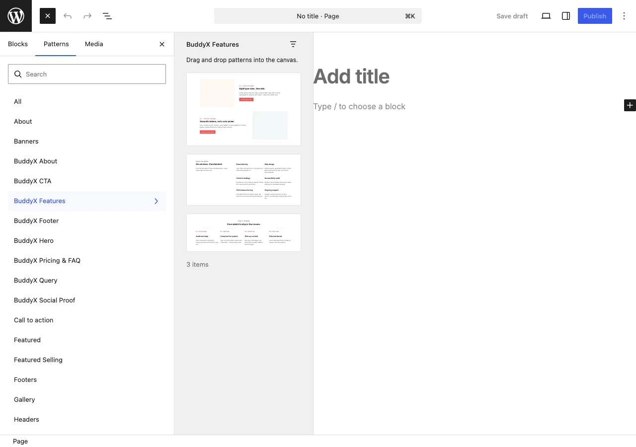
  1. Go to Pages > Add New and use the block inserter's Patterns tab to drop in ready-made sections (hero, pricing, footer, and more).
  2. Set your homepage under Settings > Reading > Your homepage displays > A static page.

Now you have a real page to brand instead of a blank canvas.


Step 5: Set your brand (logo, colors, fonts)

Everything visual lives in one place: Appearance > Customize. You do not need to touch most of it. Start with these three.

  1. Logo: open Site Identity, upload your logo, and set the site title and tagline.
  2. Colors: open Colors & Skin and pick a preset, or set 1-3 of your own colors. Most sites only need a primary color.
  3. Fonts: open Typography and choose a font preset. The defaults read well, so this is optional.

Click Publish to save. Your site now looks like yours.


Step 6: Set up your header and menus

  1. In the Customizer, open Site Header to choose how the top of every page looks (logo position, menu, search, and the cart or account icons).
  2. Go to Appearance > Menus (or the Customizer's Menus panel), create a menu, add your key pages, and assign it to the Primary location.

A clear menu is how visitors find their way around, so give this one a minute.


Step 7: Turn on dark mode (optional)

BuddyX ships a light and a dark mode with a visitor toggle.

  1. In the Customizer, open Colors & Skin and enable the dark-mode toggle.
  2. Load your site and click the toggle to confirm both modes look right.

Step 8: Go live and check the member journey

Before you share the site, walk through it the way a member will.

  1. Open your homepage logged out. It should look finished, not like a default install.
  2. Register a test account and confirm you can build a profile.
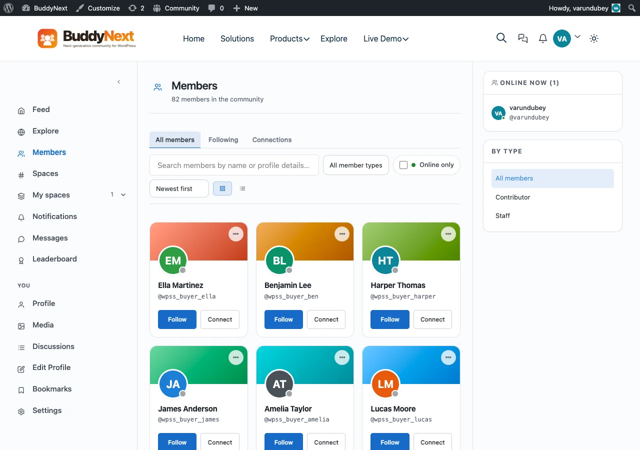
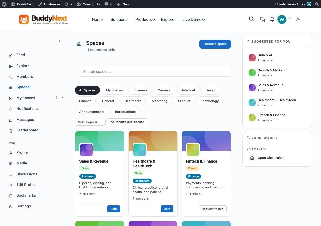
  3. Visit the members and Spaces pages to confirm the community renders correctly.
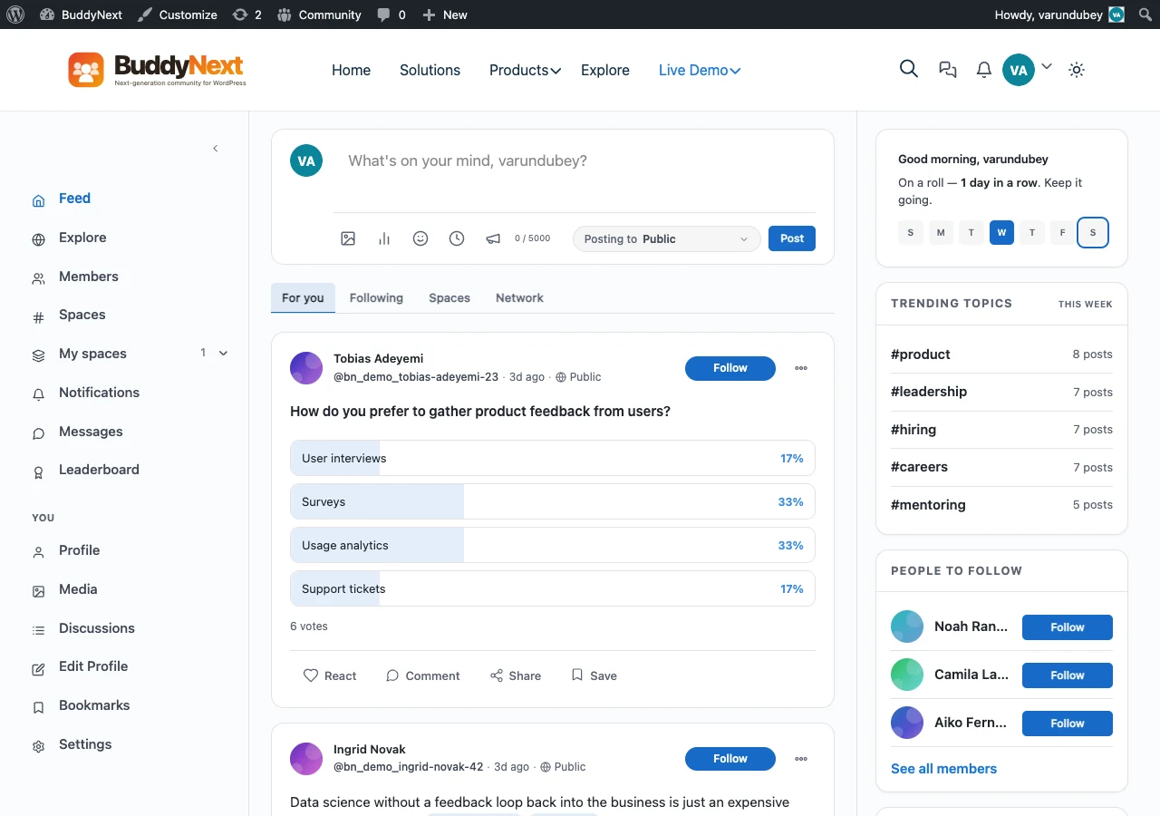
  4. Post to the activity feed to confirm posting works.

If every step above looks right, you are ready to invite real members.


Where to go next

  • Choose what to build - pick the kind of site (blog, store, courses, community) and the plugin that powers it.
  • Customizing - the full list of settings, panel by panel.
  • Recipes - short walkthroughs for common goals.
  • Wbcom Plugin Family - every first-party plugin that pairs with BuddyX.

Stuck on any step? See Troubleshooting or the FAQ.

What Kind of Site Are You Building?

You've installed BuddyX and finished the Quick Start first-time setup - logo, brand color, fonts, menu, footer, and your first pages are in place. Now pick your goal below. Each path names the exact in-house plugin(s) to install (free and Pro) and the BuddyX settings to touch, so you always know your next click.

Haven't done the Quick Start yet? Start there first. Every path below assumes the basics are already set.


First, one plugin every path uses

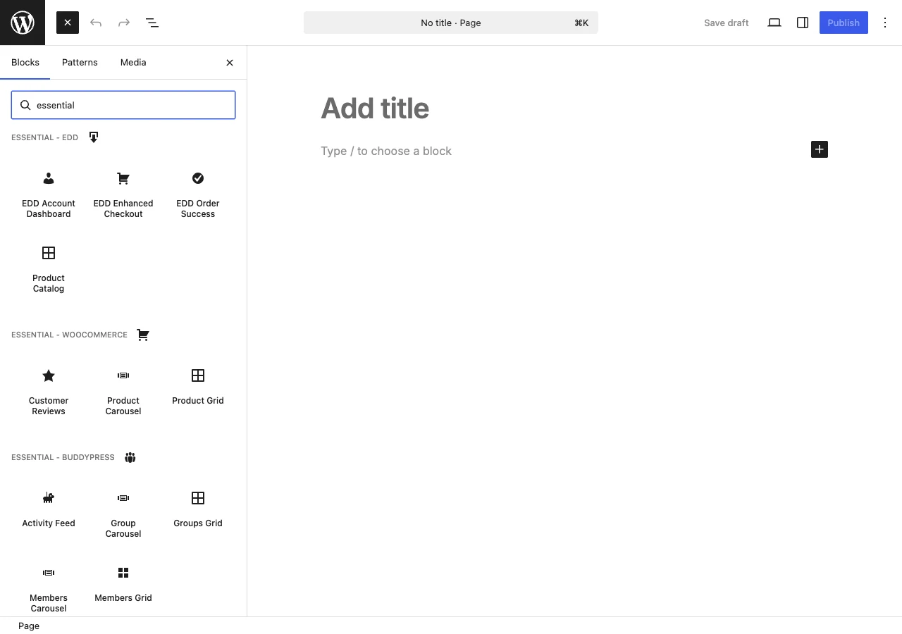
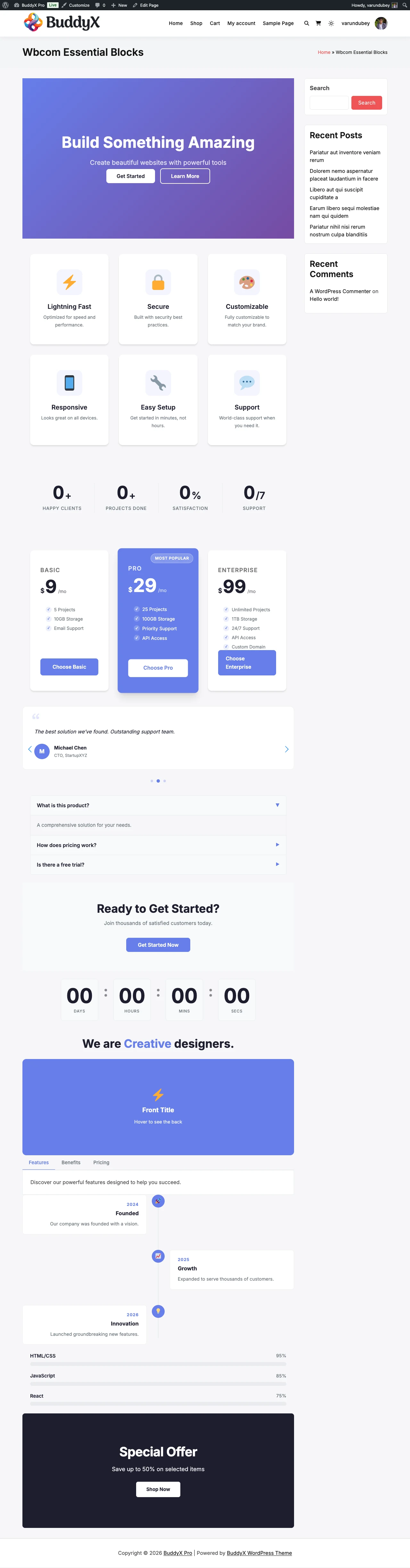
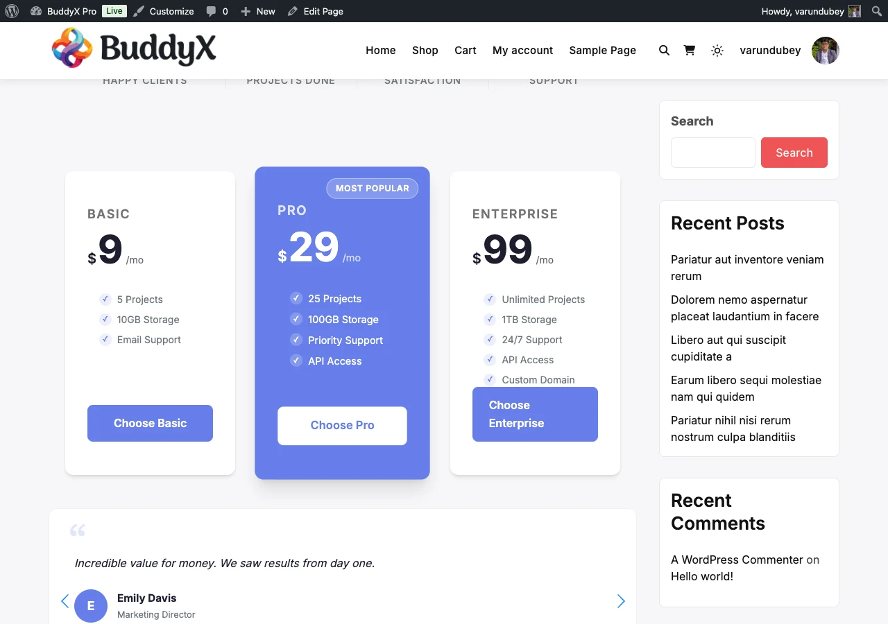
Right after the theme, install the free companion plugin Wbcom Essential. It adds Gutenberg blocks, Elementor widgets, and ready-made block patterns that inherit your BuddyX colors automatically, so your homepage and inner pages look on-brand with zero extra styling. It's free, and it helps on every path below.

Where do plugin names link? Every product mentioned here lives in one place: the BuddyX plugin family. That page has the full free-vs-Pro breakdown and download links. This page just tells you which one to grab for your goal.


Pick your goal

Your goal Jump to Install (in-house)
Publish articles - blog or magazine Blog / magazine Wbcom Essential
Show your work - portfolio or one-pager Portfolio / one-page Wbcom Essential
Explain a business or agency Business / agency Wbcom Essential
Build a member community Community / social BuddyNext or BuddyPress
Sell physical or digital products Online store WooCommerce + BuddyX Pro
Teach online courses Online courses Learnomy
Run events with tickets Events Eventonomy
Post jobs and take applications Job board WP Career Board
Run a freelance services marketplace Services marketplace WP Sell Services
List businesses, places, or members Directory Listora

My site is a mix of these. That's normal, and BuddyX handles it. Read the My site is a mix note at the end - pick your main goal now, add a second path later.


Blog / magazine

Outcome: A site whose front page is your latest articles. Readers come for the writing.

Install these:

  • Wbcom Essential (free) - block patterns for a magazine-style homepage and post layouts.
  • That's it. Blogging is built into WordPress and BuddyX - you don't need a paid plugin to start.

Then set:

  • Appearance -> Customize -> Site Blog - pick a blog layout (Default, List, Grid, or Masonry) and choose excerpts vs full posts. See Blog layout.
  • Appearance -> Customize -> Site Sidebar - a right sidebar is the common blog choice. See Sidebars.
  • Appearance -> Customize -> Typography - set your heading and body fonts for comfortable reading. See Typography.

Want a paid-newsletter or membership angle later? You can add a community layer on top - see Community / social.


Portfolio / one-page

Outcome: A site that showcases your work. Big images, minimal chrome. Often a single scrolling page.

Install these:

  • Wbcom Essential (free) - hero, gallery, and call-to-action patterns to assemble a one-page layout without code.

Then set:

  • Appearance -> Customize -> Site Blog -> Layout - use Grid or Masonry so each piece leads with its image. See Blog layout.
  • Appearance -> Customize -> Site Sidebar - set No sidebar so work fills the width. See Sidebars.
  • Appearance -> Customize -> Site Skin - keep the palette to 1-2 colors so the work, not the theme, stands out. See Color scheme.

Want per-page control (one layout for the homepage, another for project pages)? Per-page settings are a BuddyX Pro feature. Free works fine for a consistent one-pager.


Business / agency

Outcome: A focused site that explains what you offer, builds trust, and sends visitors to contact you.

Install these:

  • Wbcom Essential (free) - hero, features grid, pricing, testimonial, and CTA patterns to build service pages fast.

Then set:

  • Appearance -> Customize -> Homepage / Static Front Page - point your homepage at a designed page, not the blog feed. See Match the demo.
  • Appearance -> Customize -> Site Header - a clean header with your logo and a clear menu. See Header.
  • Appearance -> Customize -> Site Sidebar -> No sidebar - landing pages read better full-width. See Sidebars.

Need header layouts, a top bar, or a sign-in popup for a client login? Those are BuddyX Pro additions. The free header is enough for a standard brochure site.


Community / social

Outcome: A site where the value is the members - profiles, feeds, groups, messaging.

Install these - pick one community engine:

  • BuddyNext (free, with a Pro upgrade) - our modern, faster community engine: profiles, feeds, Spaces, and messaging. Choose this for a fresh build - it's what BuddyX is tuned for going forward.
  • BuddyPress (free, from WordPress.org) - the long-established community plugin with a huge add-on ecosystem. Choose this if you're migrating an existing BuddyPress site or already rely on a specific BuddyPress add-on.

Which one? New community, no legacy data - go BuddyNext. Existing BuddyPress site or a must-have BuddyPress add-on - stay on BuddyPress. BuddyX supports both. See BuddyNext with BuddyX for the full comparison.

Then add depth (optional, each free + Pro):

  • Jetonomy - forums, Q&A, and an ideas roadmap.
  • MediaVerse - photo and video albums for members.
  • WB Gamification - points, badges, and leaderboards to keep members active.

Then set:

  • Appearance -> Customize -> Community - avatar style and community display options (this panel appears once your community engine is active). See Community integration.
  • Appearance -> Customize -> Site Sidebar - set sidebars for the member directory, groups, and activity feed. See Sidebars.

BuddyX free covers the essentials; BuddyX Pro adds full directory, header, and navigation layouts, activity share and reactions, a side panel, and a sign-in popup. Start free - upgrade when you want the polish.


Online store

Outcome: A shop that takes orders for physical or digital products.

Install these:

  • WooCommerce (free, from WordPress.org) - the store engine (products, cart, checkout, payments). This one is not an in-house plugin; it's the WordPress standard, and BuddyX supports it.
  • BuddyX Pro (optional) - adds WooCommerce shop styling so your product grid, cart, and checkout match your theme. BuddyX free displays WooCommerce correctly; Pro makes it look designed.

Then set:

  • Appearance -> Customize -> Site Skin - set your brand colors; the shop inherits them. See Color scheme.
  • Appearance -> Customize -> Site Sidebar - many stores use No sidebar on product pages for a cleaner buy flow. See Sidebars.

Selling your own time or freelance work rather than products? Look at Services marketplace instead.


Online courses

Outcome: A learning site with courses, lessons, quizzes, certificates, and paid enrollment.

Install these:

  • Learnomy (free, with a Pro upgrade) - our in-house LMS: courses, lessons, quizzes, certificates, and paid enrollments.

Then set:

  • Appearance -> Customize -> Site Sidebar - set No sidebar on lessons so learners focus on the content. See Sidebars.
  • Appearance -> Customize -> Typography - readable body type matters for long lessons. See Typography.
  • Appearance -> Customize -> Site Skin - your brand colors carry into course pages and buttons. See Color scheme.

Running a course community too (student discussions, cohorts)? Pair Learnomy with a Community / social engine.


Events

Outcome: A site that lists events, takes RSVPs, sells tickets, and checks people in.

Install these:

  • Eventonomy (free, with a Pro upgrade) - RSVPs, paid ticketing, venues, and QR check-in.

Then set:

  • Appearance -> Customize -> Site Blog / Archive layout - a Grid layout suits an events listing. See Blog layout.
  • Appearance -> Customize -> Site Skin - brand colors flow into event cards and ticket buttons. See Color scheme.

Events inside a members community? Run Eventonomy alongside a Community / social engine so members RSVP with their profile.


Job board

Outcome: A site where employers post jobs and candidates apply with resumes.

Install these:

  • WP Career Board (free, with a Pro upgrade) - job listings, company profiles, resumes, and applications.

Then set:

  • Appearance -> Customize -> Site Sidebar - a sidebar with job filters helps candidates browse. See Sidebars.
  • Appearance -> Customize -> Site Header - keep a clear "Post a Job" call-to-action in the menu. See Header.

Want employers and candidates to have full member profiles? Add a Community / social engine so a job board becomes a career network.


Services marketplace

Outcome: A marketplace where freelancers sell services, take orders, and get paid out.

Install these:

  • WP Sell Services (free, with a Pro upgrade) - vendor storefronts, orders, and payouts.

Then set:

  • Appearance -> Customize -> Site Skin - vendor storefronts and buttons inherit your palette. See Color scheme.
  • Appearance -> Customize -> Site Sidebar - category and price filters help buyers search. See Sidebars.

Vendors need public profiles and messaging? Pair WP Sell Services with a Community / social engine so each vendor gets a member profile.


Directory

Outcome: A searchable directory of businesses, places, or members - with claims, reviews, and paid listings.

Install these:

  • Listora (free, with a Pro upgrade) - member listings, listing claims, reviews, and monetization.

Then set:

  • Appearance -> Customize -> Site Sidebar - a filter sidebar is essential for a browsable directory. See Sidebars.
  • Appearance -> Customize -> Site Skin - listing cards inherit your brand colors. See Color scheme.

Want listing owners to have accounts and profiles? Add a Community / social engine so each listing links to a member.


My site is a mix

Most real sites blend two or three of the paths above, and BuddyX is built to stack them. A few common combinations:

  • Blog + community - articles plus member discussions. Set your blog layout, then add BuddyNext or BuddyPress.
  • Business + store - a brochure site that also sells. Business path for the pages, WooCommerce for checkout.
  • Community + courses + events - a full membership site. BuddyNext for the social layer, Learnomy for courses, Eventonomy for meetups.
  • Directory + services marketplace - listings that also transact. Listora plus WP Sell Services.

Every one of these is an in-house plugin from Wbcom Designs, each with a free tier and an optional Pro upgrade, and each inherits your BuddyX colors and fonts automatically. See the full lineup on the plugin family page.

How to approach a mix: set up your main goal completely first, launch it, then add the second path when you're ready. You don't have to build everything on day one.


Next: Found your path? Open the plugin family page, install the plugin named in your path (start with the free version), then come back and apply the "Then set" settings for your goal.

Installation Guide

Three install paths - pick whichever fits your setup.

Just want the short version? Quick Start Step 1 covers install in 2 minutes, then walks through first-time setup.


What you need

Requirement Minimum (theme header) Recommended
WordPress 5.4 6.0+ for full feature support
PHP 8.0 8.1+
MySQL 5.7 8.0+
Memory limit 64 MB 256 MB

Note: BuddyX requires WordPress 6.5+ / PHP 8.0+ as the hard minimum (the theme refuses to load below either).

Check what you have at Tools → Site Health → Info.


This is the easiest path and the one we recommend for most users.

  1. Log in to your WordPress admin (yoursite.com/wp-admin/)
  2. Go to Appearance → Themes → Add New
  3. Search for BuddyX
  4. Click Install on the BuddyX card (by wbcomdesigns)
  5. Click Activate when the button changes

Done. You should see BuddyX's default look when you visit your site front page.

Updates install via the same panel - Appearance → Themes → BuddyX → Update Available when a new version ships.


Path 2 - Upload a zip file

Use this if you downloaded BuddyX from GitHub or wbcomdesigns.com instead of WordPress.org.

  1. Download buddyx.zip from one of:
  2. Log in to WordPress admin
  3. Appearance → Themes → Add New → Upload Theme
  4. Choose buddyx.zipInstall Now
  5. After install completes, click Activate

Don't unzip the file before uploading - WordPress expects the zip itself.

Updates: when uploading a new version this way, WordPress will warn that a theme with the same name exists. Click Replace current with uploaded to update. Your Customizer settings and content are preserved.


Path 3 - Manual install via FTP/SFTP

Use this when you can't access the WordPress admin (e.g., debugging a broken site).

  1. Download buddyx.zip (see Path 2)
  2. Unzip it locally - you'll get a folder named buddyx
  3. Connect to your site via FTP/SFTP (use FileZilla, Cyberduck, or similar)
  4. Navigate to /wp-content/themes/
  5. Upload the entire buddyx folder
  6. Log in to WordPress admin → Appearance → Themes
  7. Click Activate on the BuddyX card

Whichever path you used, the very next step we recommend is installing Wbcom Essential - a free companion plugin from Wbcom Designs, the same team behind BuddyX. It adds 31 Gutenberg blocks (including 5 BuddyPress blocks), 43 Elementor widgets, and a set of ready-made block patterns, and it inherits your theme colors automatically so everything matches out of the box.

You do not have to install anything to use BuddyX - the theme is self-contained. Wbcom Essential is optional, but it is the fastest way to build pages that look like the theme demos.

To install it:

  1. Go to Plugins → Add New
  2. Search for Wbcom Essential
  3. Click Install Now, then Activate

First-time tip: Install Wbcom Essential before you start building pages. Its patterns and blocks are what most BuddyX demo layouts are built from, so having it active from the start saves rework later.

Learn more in Wbcom Essential blocks and patterns. For everything else Wbcom Designs makes for BuddyX - community, forums, courses, events, directories, and more - see the plugin family.


After install: required additional plugins

None. BuddyX is self-contained. It does not require Kirki, Redux, or any external framework.

In 5.0.x and earlier, BuddyX required the Kirki plugin for customizer controls. In 5.1.0, BuddyX ships its own in-theme customizer framework - Kirki is no longer needed.


Optional plugins by use case

Use case Plugins to install
Community site BuddyPress (free, buddypress.org)
Forums bbPress (free) or Jetonomy (free version, from wbcomdesigns.com)
Blog SEO Yoast SEO or Rank Math (free tiers fine)
E-commerce WooCommerce (free)
Caching WP Rocket (paid), W3 Total Cache (free), LiteSpeed Cache (free if on LiteSpeed host)
Image optimization EWWW Image Optimizer or Smush (free)
Forms WPForms Lite or Contact Form 7 (free)
Backups UpdraftPlus or BlogVault (free tiers)
Spam protection Akismet (free; included with WordPress)

None are theme dependencies; pick based on what your site needs. For the in-house Wbcom Designs alternatives that pair best with BuddyX (community, forums, courses, events, directories, gamification, and more), see the plugin family.


Verifying install

After activation, visit your site front page. You should see:

  • The BuddyX logo placeholder (or your site title in text) in a header
  • A primary menu (or "Add a menu" placeholder if you haven't built one)
  • The default red-on-soft-gray BuddyX palette
  • A footer with widget areas (empty until you add widgets)

If you see a "white screen of death" or PHP errors, see Troubleshooting → My site looks broken.


Upgrading from an older BuddyX version

From 5.0.x to 5.1.0

5.1.0 is a major release. Your Customizer settings, content, and BuddyPress configuration are preserved automatically; no manual migration needed.

Before upgrading on a production site:

  1. Take a backup - your hosting dashboard usually has a one-click backup; or use UpdraftPlus / BlogVault.
  2. Test on staging first if possible - most hosts offer a one-click staging site.
  3. Note any active child theme - child themes from 5.0.x continue working, but if your child theme overrode any of the Kirki-based files (now removed), you may see issues. Check after upgrade and remove obsolete child-theme overrides if needed.

To upgrade:

  1. Dashboard → Updates - if BuddyX shows an update, click Update.
  2. After update completes, clear all caches (caching plugin, host cache, CDN).
  3. Visit your front page in incognito to verify.

What changed in 5.1.0: Kirki removed (replaced by in-theme framework), unified design-token system, dark mode added with FOUC-free first paint, asset manifest, 8 style presets. See the 5.1.0 release notes for full details.

From 4.x or earlier

Same process as above, but expect a larger visual shift since you're skipping multiple major versions. Strongly recommend a staging test first.


Uninstalling BuddyX

Important: deactivating BuddyX doesn't delete your customizer settings or content. They're preserved in the database in case you reactivate later.

  1. Appearance → Themes
  2. Activate a different theme (you must have one active)
  3. Hover over the BuddyX card → Theme Details → Delete

This removes the theme files. Customizer settings remain in the database (wp_options table, theme_mods_buddyx row) - only relevant if you reinstall BuddyX later, in which case your old settings come back.


Common install issues

"Theme zip is invalid"

You're uploading a wrong zip. The zip from wordpress.org or GitHub is correct. If you downloaded from Wbcom Designs as a .zip from an "All Files" download, it may be a wrapper zip containing the real zip - unzip once, then upload the inner buddyx.zip.

"Memory exhausted" during install

Your PHP memory limit is too low. Either:

  1. Ask your host to raise WP_MEMORY_LIMIT to 256M
  2. Or add this to wp-config.php (above the "stop editing" line): define('WP_MEMORY_LIMIT', '256M');

"Style.css missing in stylesheet"

You uploaded the wrong zip or the wrong folder. Make sure you're uploading the buddyx.zip from wordpress.org or the contents of the buddyx folder (not a parent directory containing it).

After install, my customizer settings from another theme don't show up

Customizer settings are stored per-theme. Each theme has its own theme_mods_<slug> entry. BuddyX won't read settings saved under a different theme's name. To migrate settings between themes, you'd need to manually map equivalent settings using a plugin like Customizer Export/Import or a developer's WP-CLI command.


Introduction to BuddyX

Welcome to BuddyX - a beautiful, community-ready WordPress theme that works for any kind of site you want to build.


What BuddyX is

BuddyX is a free WordPress theme designed to look great out of the box and scale with your site as it grows. It's built on modern web foundations (CSS custom properties, responsive design, accessibility-first markup) and includes everything most sites need without requiring extra plugins or paid add-ons.

You can use BuddyX for:

  • A personal or company blog - clean reading experience with 4 layout choices
  • A portfolio - featured-image-led grids that showcase your work
  • A business landing site - block patterns for hero sections, pricing, contact
  • A community / social site - full BuddyPress integration for member profiles, groups, activity feeds, private messaging

The same theme handles all four - you don't need a different theme for each. Pick the layout and plugins that fit your site's purpose.

Built-in theme features

  • Member-ready community surface - BuddyPress works smoothly the moment you install it (no extra theme setup needed)
  • 4 blog layouts - Default (classic), List (image + text side-by-side), Grid (cards), Masonry (Pinterest-style)
  • 8 style presets - pick a ready-made palette (Cool, Dark, Editorial, Minimal, Monochrome, Pastel, Vibrant, Warm) as your starting look; any custom colors you set still take priority
  • Dark mode - light / dark color modes with a built-in toggle for visitors. First-paint correct (no flash on load)
  • Modern typography - Google Fonts catalog, customizable per heading level
  • Block patterns - pre-designed page sections you drop into pages to build them faster
  • WP Starter Content - fresh-install demo pages pre-populate the Customizer so you can see what your site could look like before touching settings
  • Responsive everywhere - mobile / tablet / desktop / large desktop all work out of the box
  • Translation-ready - full localization support via Loco Translate or WPML / Polylang
  • Performance-tuned - modern CSS architecture, conditional asset loading, minimal JavaScript

BuddyX free is enough to run a solid website

Everything you need to launch a real, professional site is in this free theme. Blog, portfolio, business site, community - all four work out of the box without any paid add-on. The features above (4 blog layouts, dark mode, BuddyPress integration, block patterns, modern typography, responsive design) are not "lite versions" of something better; they're the actual features that ship.

When you need more - the in-house plugin ecosystem

Each capability below is a separate plugin from Wbcom Designs (same team that builds BuddyX). Each plugin has a free version you can install anytime - and a pro version sold separately when you need premium features. You pick only what your site needs.

This is a short list to orient you; the full catalog (themes, the free companion, and every standalone product with free-vs-Pro details and links) lives on the BuddyX plugin family page.

Plugin What it adds Pricing
Wbcom Essential Gutenberg blocks, Elementor widgets, and block patterns that inherit your theme colors Free companion
BuddyNext Modern, faster community engine: profiles, feeds, Spaces, messaging Free + Pro (sold separately)
Jetonomy Forums, Q&A, ideas, trust levels - modern community surface Free + Pro (sold separately)
Learnomy First-party LMS: courses, lessons, quizzes, certificates Free + Pro (sold separately)
MediaVerse Media albums and galleries for members Free + Pro (sold separately)
WB Gamification Points, ranks, badges, leaderboards Free + Pro (sold separately)
WP Career Board Job board + resume management Free + Pro (sold separately)
WP Sell Services Freelance services marketplace: vendor storefronts, orders, payouts Free + Pro (sold separately)
Eventonomy Events and ticketing: RSVPs, paid tickets, venues, QR check-in Free + Pro (sold separately)
Listora Directory builder: member listings, claims, reviews Free + Pro (sold separately)
WB Ad Manager Display ad zones, sponsorship slots, ad rotation Free + Pro (sold separately)

You don't need any of these to launch a great-looking, functional site today - but they're there when your site grows into the kind that needs them. See the BuddyX plugin family for the complete lineup.

And BuddyX Pro (the theme)

BuddyX Pro is a separate product - the premium version of this theme, sold separately. It adds 14 color presets, 7 typography presets, sign-in popup, per-page settings, dark customizer surface, and extra customization options. It's optional. BuddyX free is a complete theme on its own.

See BuddyX Pro at wbcomdesigns.com when you're ready, or browse the Wbcom plugin catalog to see all in-house plugins.


Who BuddyX is for

You are BuddyX helps you
A blogger or content creator Publish articles with a clean reading experience + 4 layout options to match your style
A community builder Run a social network, fan community, alumni network, or hobby group - BuddyPress integration is first-class
A small-business owner Launch a fast, professional brochure site with hero pages, pricing, and contact
A designer or developer Use as a base for client sites - clean code, child-theme support, design-token system for easy customization

What you need

Requirement Minimum Recommended
WordPress 5.4 (theme header) 6.0+ for full feature support
PHP 8.0 8.1+
MySQL 5.7 8.0+

Required additional plugins: none. BuddyX ships its own customizer framework in-theme.

Optional plugins (for community features): BuddyPress (free, from buddypress.org or your WordPress plugin directory).


Get started

Quick Start (about 45 minutes)

The mandatory first-time setup - every site needs these basics regardless of what kind of site you're building.

  1. Install + activate the theme (2 min)
  2. Site identity (5 min) - logo, title, tagline, favicon
  3. Colors (5 min) - pick your brand color, button color, etc.
  4. Fonts (5 min) - pick a body font + heading font
  5. Header + menu (8 min)
  6. Footer (5 min)
  7. Essential pages (10 min) - Home, About, Contact, Privacy Policy
  8. Set your homepage (3 min)
  9. (Optional) Dark mode (2 min)

Full Quick Start Guide →

Choose your path

After the mandatory setup, pick what kind of site you're building:


Customizer overview

All theme settings live in Appearance → Customize:

Panel What it controls
Site Identity (core WP + BuddyX) Logo, Dark Mode Logo, site title, tagline, favicon
General Site layout, container width, border radius, page mapping, site loader
Typography Fonts per heading level, body font, menu font, site-title font
Site Header Header layout, sub-header, menu, header icons
Site Skin 8 style presets, 50+ color settings, dark mode + visitor toggle
Site Blog Blog layout (Default / List / Grid / Masonry), excerpt, post styles
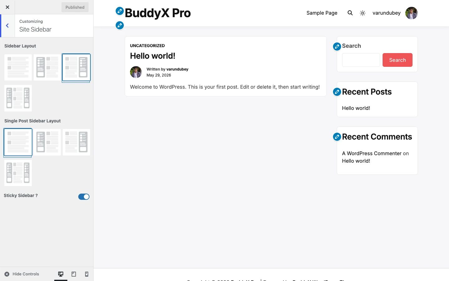
Site Sidebar Sidebar positions per content type
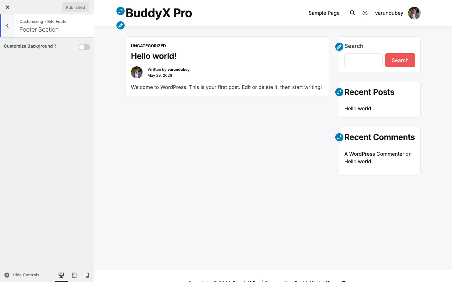
Site Footer Footer section + copyright section
Community Settings (when BuddyPress active) BuddyPress avatar style + community settings
Site Performance Local font hosting, preload, font-cache flush
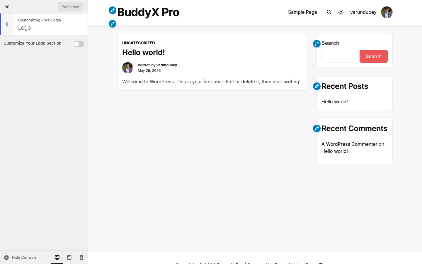
WP Login Custom login-page logo + title

Next steps


Got questions? Open an issue on the BuddyX GitHub repo, post on the WordPress.org support forum, or check the FAQ. Friendly help is one click away.

Quick Start - First-time setup

This is the walkthrough every BuddyX site needs, regardless of what kind of site you're building. It's 8 required steps plus 1 optional step (the dark-mode toggle), about 45 minutes start to finish. When you're done, your site looks professional and is ready for real visitors.

After this, jump to Choose Your Path to pick what kind of site you're building (blog / portfolio / business / community).

Build pages faster: install the free Wbcom Essential plugin right after the theme. It adds Gutenberg blocks, Elementor widgets, and BuddyPress blocks that inherit your theme colors automatically. Paired with BuddyX's 27 built-in block patterns (ready-made hero, pricing, contact, and feature sections you drop into any page), you can assemble a full site in minutes instead of building every section by hand.


Before you start

You need:

  • A WordPress site (WordPress 6.5 or newer, PHP 8.0 or newer)
  • Admin access (you can reach wp-admin)
  • About 45 minutes and a logo file ready (PNG or SVG, transparent background ideal)

Terms used here: "Customizer" = WordPress's live preview tool at Appearance → Customize. Every theme setting in BuddyX lives there. Changes don't go live until you click Publish.


Step 1 - Install + activate the theme (2 minutes)

Two install paths - pick whichever you prefer:

  1. Go to Appearance → Themes → Add New
  2. Search for BuddyX
  3. Click Install on the BuddyX card, then Activate when the button changes

Option B: Upload a zip

  1. Download buddyx.zip from wordpress.org/themes/buddyx or the GitHub release page
  2. Go to Appearance → Themes → Add New → Upload Theme
  3. Choose buddyx.zip → Install Now → Activate

Your site front page should now show BuddyX's default look. Don't worry if it looks generic - that's fixed in the steps below.


Step 2 - Site identity: logo, title, tagline, favicon (5 minutes)

Go to Appearance → Customize → Site Identity.

Customizer → Site Identity panel showing Logo, Dark Mode Logo, Site Title, Tagline, and Site Icon fields

Setting What to set Why
Logo Upload your logo (PNG/SVG with transparent background) Replaces the text site title in the header
Dark Mode Logo (BuddyX 5.1.0) Optional alternate logo that shows when the site is in dark mode Lets a dark-on-light logo flip to light-on-dark so it stays readable
Site title Your site's name Shows in the browser tab + search results, and as a fallback if you skip logo
Tagline A short one-line description (optional) Shows below the title on some layouts and in search-engine listings
Site icon (favicon) Square image, 512×512 recommended The tiny icon in browser tabs and bookmarks

Click Publish at the top.

First-time tip: A simple horizontal logo (PNG, transparent background, around 200px wide) works for almost any layout. If you don't have one yet, leave it blank and your Site Title will display as text - that's perfectly fine for now.

Dark Mode Logo tip: only set this if your main logo doesn't read well on a dark background. If you skip it, BuddyX uses your standard logo in both modes - fine for most logos.


Step 3 - Colors: pick your brand color (5 minutes)

Go to Appearance → Customize → Site Skin.

Customizer → Site Skin section showing Color mode (Light/Dark), Show color-mode toggle, Toggle position, and the Style preset picker (Default plus 8 presets)

You have two paths - pick one:

Path A - Use a style preset (fastest)

  1. Find the Style preset picker (Default + 8 presets, 9 options total: Default, Cool, Dark, Editorial, Minimal, Monochrome, Pastel, Vibrant, Warm)
  2. Click a preset - the preview updates immediately
  3. Click Publish

That's it. Each preset is a complete palette designed to look good together. If you want to fine-tune later, any custom color you set below the preset always takes priority over the preset's defaults.

Path B - Set custom colors

  1. Scroll to Brand → Site Primary Color (the default is the BuddyX red #ef5455)
  2. Pick your brand color from the color picker
  3. (Optional) Adjust the Buttons subsection - by default buttons inherit the primary color
  4. (Optional) Adjust Body, Headings, Header, Footer background and text colors if needed
  5. Click Publish

Don't overthink it: most sites only need to set 1-3 colors. The default palette already has good contrast everywhere. Set your brand color and move on - you can always come back later.

For the full color reference, see skin-colors/color-scheme.md.


Step 4 - Fonts: pick a body font + heading font (5 minutes)

Go to Appearance → Customize → Typography.

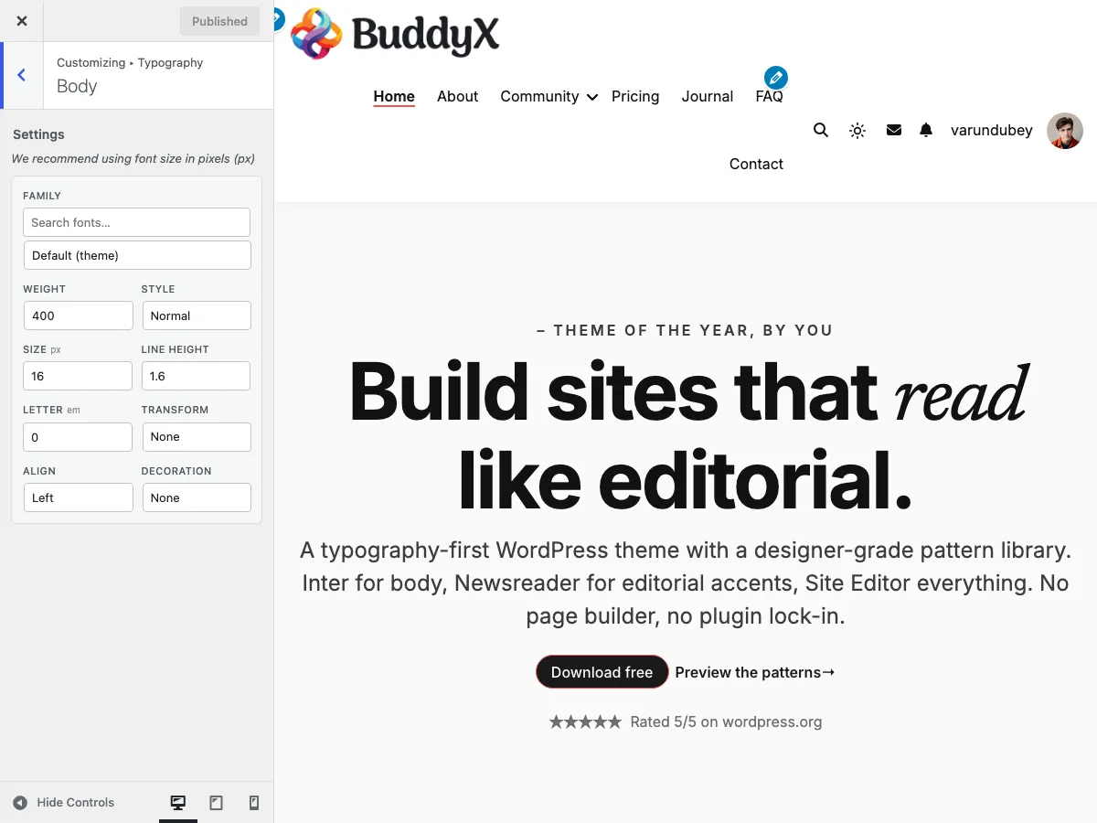
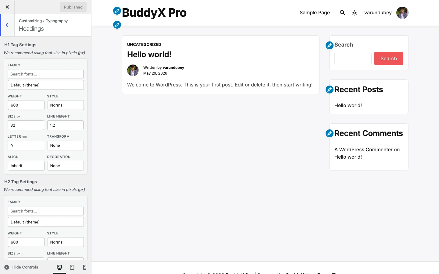
Customizer → Typography → Body showing Family / Weight / Style / Size / Line Height / Letter / Transform / Align / Decoration controls

Section What to set Recommended
Body Typography Font family + base size A readable sans-serif (Inter, Open Sans, Lato) at 16px
Headings → H1, H2, H3 Font family (often the same family or a contrasting one) Pair a serif for headings + sans-serif for body, OR one family for everything

BuddyX includes the entire Google Fonts catalog (1000+ fonts). All free. All licensed for commercial use.

Click Publish.

Two-font rule of thumb: pick one heading font + one body font. More than two fonts on a page looks chaotic. If unsure, set everything to the same family - that always looks clean.

Performance tip: After picking fonts, go to Customize → Site Performance and turn on Load Google Fonts locally - Google Fonts will be cached on your server instead of pulled from Google's CDN. Faster page loads, better privacy.


Step 5 - Header + menu (8 minutes)

Step 5a - Build the menu (5 minutes)

WordPress menus live at Appearance → Menus (not Customize). One-time setup:

  1. Appearance → Menus → Create a New Menu
  2. Name it Primary (or anything - it's just for your reference)
  3. From the left panel, add pages: Home, About, Blog, Contact (or whatever pages you have)
  4. Drag items to reorder. Indent an item to make it a sub-item (dropdown)
  5. Under Menu Settings → Display location, check Primary (the location BuddyX uses for the main header menu - mobile inherits this menu automatically)
  6. Click Save Menu

Don't have these pages yet? That's fine - see Step 7 below. You can come back and add them to the menu after.

Step 5b - Header layout + features (3 minutes)

Go to Appearance → Customize → Site Header.

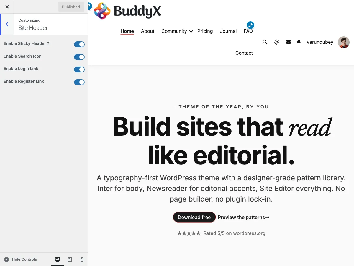
Customizer → Site Header section showing Sticky Header, Search Icon, Login Link, Register Link toggles - all ON by default

Setting What it does
Sticky header (on by default) The header stays visible as visitors scroll. Recommended on.
Search icon (on by default) Shows a search icon in the header so visitors can find content.
Sign-in / Register links (on by default) Shows "Sign in" / "Register" links in the header. Useful for community sites; turn off for purely brochure sites.
Cart icon (conditional) Shows only if WooCommerce/FluentCart/SureCart is active. Auto-hides on non-shop sites - that's why you won't see this toggle until you install one of those plugins.

Click Publish.


WordPress widgets live at Appearance → Widgets (not Customize).

  1. Go to Appearance → Widgets
  2. You'll see 4 footer widget areas: Footer 1, Footer 2, Footer 3, Footer 4
  3. Add what's relevant - common choices:
    • Footer 1: a "Search" widget or "About" text block
    • Footer 2: "Recent Posts" widget
    • Footer 3: a "Navigation Menu" widget pointing to a "Useful Links" menu
    • Footer 4: "Custom HTML" widget with your social-media icons or contact info

Leave any area empty and that column collapses. You're not required to fill all 4.

  1. Appearance → Customize → Site Footer → Copyright
  2. Edit the copyright line. The default © [year] [site name] is fine to start
  3. Click Publish

Step 7 - Essential pages (10 minutes)

Every professional site needs at least these 4 pages. Create them now even if you don't have full content yet - you can fill them in later.

For each, go to Pages → Add New:

Page Title Starting content
Home Home A few sentences about what your site does. Add a hero image + a "Learn more" button (or block patterns - see below)
About About Your story / company background. 2-4 paragraphs is plenty. Add a team photo if you have one
Contact Contact Your email, phone, optional address. Or embed a contact form (use a plugin like WPForms or Contact Form 7)
Privacy Policy Privacy Policy WordPress generates a draft for you at Settings → Privacy. Customize it for your site

Use BuddyX block patterns to build pages faster: when editing a page, click the + button → PatternsBuddyX. You'll see ready-made sections (hero, pricing, contact, features grid). Drop one in, replace the placeholder text with your content. Saves an hour vs. building from scratch.

Don't forget: set the Privacy Policy page

  1. Settings → Privacy → Select a Privacy Policy page → Privacy Policy (the page you just created)
  2. Save

Step 8 - Set your homepage (3 minutes)

By default, WordPress shows your latest blog posts at the root URL. For most sites, you want a static landing page instead.

  1. Settings → Reading
  2. Under Your homepage displays, choose A static page
  3. Homepage: pick the Home page you created in Step 7
  4. Posts page: pick a page named Blog (create one first if you don't have one - empty page, just titled Blog)
  5. Save Changes

When a visitor lands at yoursite.com/, they now see your Home page. The Blog page lists all your posts. Standard pro-site setup.

Want a blog-style homepage instead? (Latest posts at the root URL.) Skip this step entirely and choose Your latest posts instead of A static page.


Step 9 - (Optional) Dark mode toggle (2 minutes)

BuddyX includes a built-in dark mode. Visitors can switch between light and dark.

Go to Appearance → Customize → Site Skin → Color Mode (Color Mode is the first subsection of Site Skin - see the screenshot in Step 3).

Setting Default What it does
Default color mode Light What new visitors see (Light / Dark).
Show color-mode toggle On (Show) Adds a sun/moon button visitors can use to switch modes.
Toggle position Both Header (next to menu icons) / Mobile (mobile menu only) / Both.

The toggle is on by default - visitors get to choose. If you want a one-look-only site, set Show color-mode toggle to Hide.

Click Publish.

The sun/moon icon then appears in your header. Visitors clicking it toggle Light ↔ Dark and the choice is remembered across page loads.

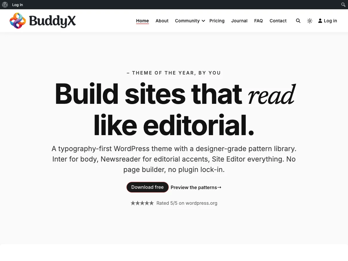
Front-end home page in light mode with sun toggle icon visible in the header

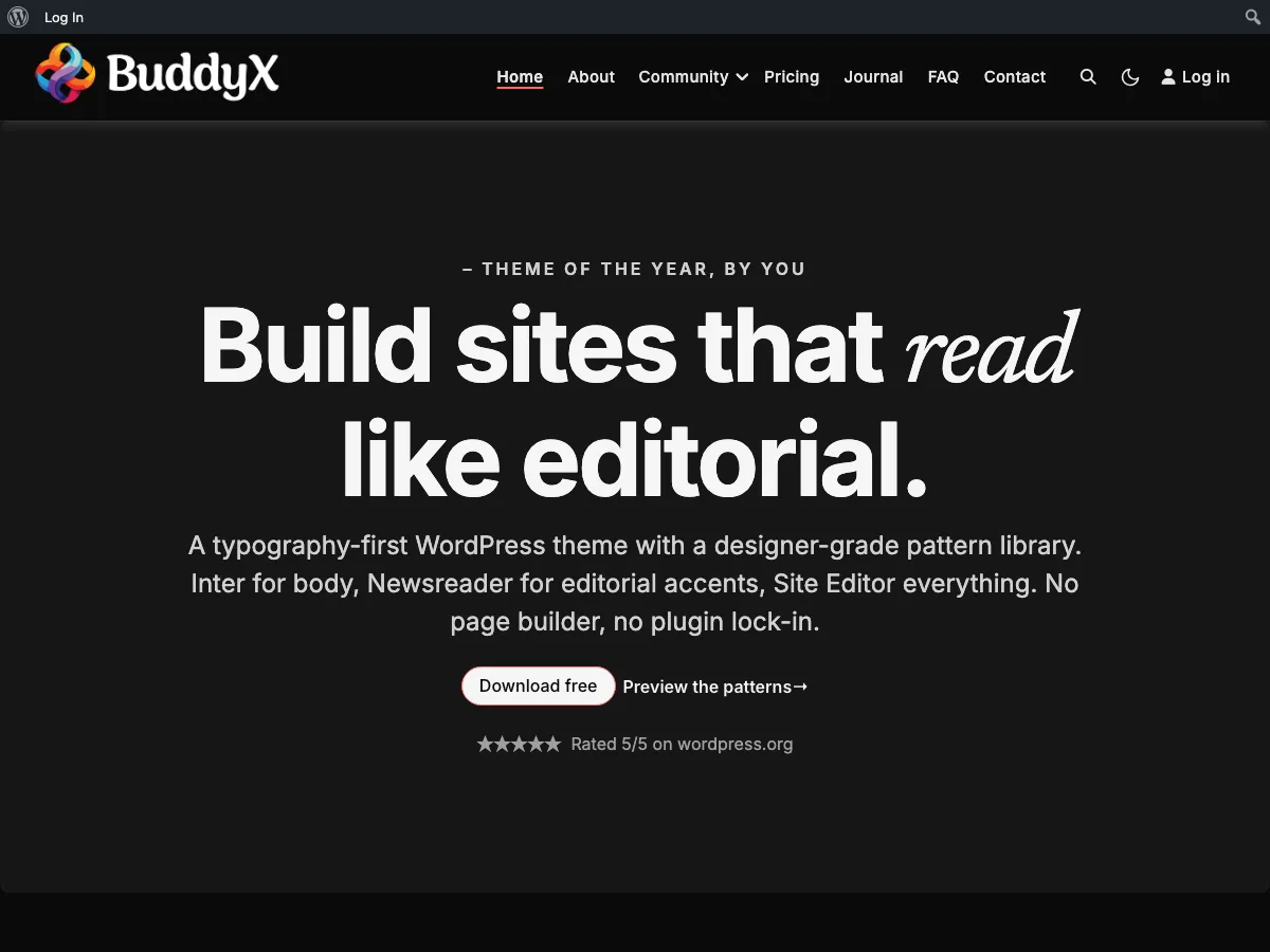
After click → dark mode applies and persists. No flash of light mode on subsequent page loads (FOUC-free first paint).

Same home page rendered in dark mode after toggle click - moon icon now shown in header, FOUC-free first paint

Dark mode is fully wired across every page: blog, BuddyPress community surfaces, WooCommerce (if active), comments, forms. No flash-of-wrong-color on page load. See skin-colors/dark-mode.md for the full reference.


You're done

Your site now has:

  • A logo, title, tagline, and favicon
  • A brand color (and a starting palette: Default + 8 presets, 9 options)
  • A primary body font + heading font
  • A working header + menu
  • A footer with widgets and copyright
  • Home, About, Contact, and Privacy Policy pages
  • A static homepage with a separate Blog page
  • Dark mode (if you enabled it)

Total time: ~45 minutes if you have a logo ready and don't get distracted picking fonts.


What's next?

Now that the basics are in place, pick what kind of site you're building. Each path has different next steps:

Choose Your Path

Common paths: personal/company blog, portfolio, business / brochure, community / social site.

Or browse focused recipes:

Recipe What you'll build
Match the demo design Your site looks like the published BuddyX demo
Customize colors and fonts A site that reflects your brand colors and typography

Common questions

My logo is huge / tiny. How do I resize it? WordPress's default logo size works for most logos. If yours doesn't fit, resize the source image (use Canva, Photoshop, or a free tool like Squoosh.app) before uploading. The most common good logo size is around 200×60 pixels for horizontal logos or 60×60 for square ones.

Where do I add my social media links? BuddyX doesn't ship a dedicated social-icons setting. Use a footer widget (Step 6a) with a "Custom HTML" widget containing your social links, OR install a free plugin like "Social Icons Widget" - the icons then go into any widget area.

I don't see the "Style preset" picker in Step 3. You're probably on an older version. The style presets (Default + 8 presets, 9 options) shipped in BuddyX 5.1.0. Update to the latest version at Dashboard → Updates if available, or download fresh from wordpress.org.

Can I undo a change? Yes - every Customizer change is staged in the preview until you click Publish. If you regret a change after publishing, just go back to that setting and change it again. There's no "version history" for Customizer changes, but every setting is editable forever.

Do I have to use BuddyPress? No. BuddyX works perfectly as a regular blog / business / portfolio theme without BuddyPress. The community features only activate when the BuddyPress plugin is installed. See Choose Your Path for non-community paths.


Stuck on a step? Post on the WordPress.org BuddyX support forum, open an issue at the BuddyX GitHub repo, or email support@wbcomdesigns.com. Friendly help is one click away.

What Kind of Site Are You Building?

You've installed BuddyX and finished the Quick Start first-time setup - logo, brand color, fonts, menu, footer, and your first pages are in place. Now pick your goal below. Each path names the exact in-house plugin(s) to install (free and Pro) and the BuddyX settings to touch, so you always know your next click.

Haven't done the Quick Start yet? Start there first. Every path below assumes the basics are already set.


First, one plugin every path uses

Right after the theme, install the free companion plugin Wbcom Essential. It adds Gutenberg blocks, Elementor widgets, and ready-made block patterns that inherit your BuddyX colors automatically, so your homepage and inner pages look on-brand with zero extra styling. It's free, and it helps on every path below.

Where do plugin names link? Every product mentioned here lives in one place: the BuddyX plugin family. That page has the full free-vs-Pro breakdown and download links. This page just tells you which one to grab for your goal.


Pick your goal

Your goal Jump to Install (in-house)
Publish articles - blog or magazine Blog / magazine Wbcom Essential
Show your work - portfolio or one-pager Portfolio / one-page Wbcom Essential
Explain a business or agency Business / agency Wbcom Essential
Build a member community Community / social BuddyNext or BuddyPress
Sell physical or digital products Online store WooCommerce + BuddyX Pro
Teach online courses Online courses Learnomy
Run events with tickets Events Eventonomy
Post jobs and take applications Job board WP Career Board
Run a freelance services marketplace Services marketplace WP Sell Services
List businesses, places, or members Directory Listora

My site is a mix of these. That's normal, and BuddyX handles it. Read the My site is a mix note at the end - pick your main goal now, add a second path later.


Blog / magazine

Outcome: A site whose front page is your latest articles. Readers come for the writing.

Install these:

  • Wbcom Essential (free) - block patterns for a magazine-style homepage and post layouts.
  • That's it. Blogging is built into WordPress and BuddyX - you don't need a paid plugin to start.

Then set:

  • Appearance -> Customize -> Site Blog - pick a blog layout (Default, List, Grid, or Masonry) and choose excerpts vs full posts. See Blog layout.
  • Appearance -> Customize -> Site Sidebar - a right sidebar is the common blog choice. See Sidebars.
  • Appearance -> Customize -> Typography - set your heading and body fonts for comfortable reading. See Typography.

Want a paid-newsletter or membership angle later? You can add a community layer on top - see Community / social.


Portfolio / one-page

Outcome: A site that showcases your work. Big images, minimal chrome. Often a single scrolling page.

Install these:

  • Wbcom Essential (free) - hero, gallery, and call-to-action patterns to assemble a one-page layout without code.

Then set:

  • Appearance -> Customize -> Site Blog -> Layout - use Grid or Masonry so each piece leads with its image. See Blog layout.
  • Appearance -> Customize -> Site Sidebar - set No sidebar so work fills the width. See Sidebars.
  • Appearance -> Customize -> Site Skin - keep the palette to 1-2 colors so the work, not the theme, stands out. See Color scheme.

Want per-page control (one layout for the homepage, another for project pages)? Per-page settings are a BuddyX Pro feature. Free works fine for a consistent one-pager.


Business / agency

Outcome: A focused site that explains what you offer, builds trust, and sends visitors to contact you.

Install these:

  • Wbcom Essential (free) - hero, features grid, pricing, testimonial, and CTA patterns to build service pages fast.

Then set:

  • Appearance -> Customize -> Homepage / Static Front Page - point your homepage at a designed page, not the blog feed. See Match the demo.
  • Appearance -> Customize -> Site Header - a clean header with your logo and a clear menu. See Header.
  • Appearance -> Customize -> Site Sidebar -> No sidebar - landing pages read better full-width. See Sidebars.

Need header layouts, a top bar, or a sign-in popup for a client login? Those are BuddyX Pro additions. The free header is enough for a standard brochure site.


Community / social

Outcome: A site where the value is the members - profiles, feeds, groups, messaging.

Install these - pick one community engine:

  • BuddyNext (free, with a Pro upgrade) - our modern, faster community engine: profiles, feeds, Spaces, and messaging. Choose this for a fresh build - it's what BuddyX is tuned for going forward.
  • BuddyPress (free, from WordPress.org) - the long-established community plugin with a huge add-on ecosystem. Choose this if you're migrating an existing BuddyPress site or already rely on a specific BuddyPress add-on.

Which one? New community, no legacy data - go BuddyNext. Existing BuddyPress site or a must-have BuddyPress add-on - stay on BuddyPress. BuddyX supports both. See BuddyNext with BuddyX for the full comparison.

Then add depth (optional, each free + Pro):

  • Jetonomy - forums, Q&A, and an ideas roadmap.
  • MediaVerse - photo and video albums for members.
  • WB Gamification - points, badges, and leaderboards to keep members active.

Then set:

  • Appearance -> Customize -> Community - avatar style and community display options (this panel appears once your community engine is active). See Community integration.
  • Appearance -> Customize -> Site Sidebar - set sidebars for the member directory, groups, and activity feed. See Sidebars.

BuddyX free covers the essentials; BuddyX Pro adds full directory, header, and navigation layouts, activity share and reactions, a side panel, and a sign-in popup. Start free - upgrade when you want the polish.


Online store

Outcome: A shop that takes orders for physical or digital products.

Install these:

  • WooCommerce (free, from WordPress.org) - the store engine (products, cart, checkout, payments). This one is not an in-house plugin; it's the WordPress standard, and BuddyX supports it.
  • BuddyX Pro (optional) - adds WooCommerce shop styling so your product grid, cart, and checkout match your theme. BuddyX free displays WooCommerce correctly; Pro makes it look designed.

Then set:

  • Appearance -> Customize -> Site Skin - set your brand colors; the shop inherits them. See Color scheme.
  • Appearance -> Customize -> Site Sidebar - many stores use No sidebar on product pages for a cleaner buy flow. See Sidebars.

Selling your own time or freelance work rather than products? Look at Services marketplace instead.


Online courses

Outcome: A learning site with courses, lessons, quizzes, certificates, and paid enrollment.

Install these:

  • Learnomy (free, with a Pro upgrade) - our in-house LMS: courses, lessons, quizzes, certificates, and paid enrollments.

Then set:

  • Appearance -> Customize -> Site Sidebar - set No sidebar on lessons so learners focus on the content. See Sidebars.
  • Appearance -> Customize -> Typography - readable body type matters for long lessons. See Typography.
  • Appearance -> Customize -> Site Skin - your brand colors carry into course pages and buttons. See Color scheme.

Running a course community too (student discussions, cohorts)? Pair Learnomy with a Community / social engine.


Events

Outcome: A site that lists events, takes RSVPs, sells tickets, and checks people in.

Install these:

  • Eventonomy (free, with a Pro upgrade) - RSVPs, paid ticketing, venues, and QR check-in.

Then set:

  • Appearance -> Customize -> Site Blog / Archive layout - a Grid layout suits an events listing. See Blog layout.
  • Appearance -> Customize -> Site Skin - brand colors flow into event cards and ticket buttons. See Color scheme.

Events inside a members community? Run Eventonomy alongside a Community / social engine so members RSVP with their profile.


Job board

Outcome: A site where employers post jobs and candidates apply with resumes.

Install these:

  • WP Career Board (free, with a Pro upgrade) - job listings, company profiles, resumes, and applications.

Then set:

  • Appearance -> Customize -> Site Sidebar - a sidebar with job filters helps candidates browse. See Sidebars.
  • Appearance -> Customize -> Site Header - keep a clear "Post a Job" call-to-action in the menu. See Header.

Want employers and candidates to have full member profiles? Add a Community / social engine so a job board becomes a career network.


Services marketplace

Outcome: A marketplace where freelancers sell services, take orders, and get paid out.

Install these:

  • WP Sell Services (free, with a Pro upgrade) - vendor storefronts, orders, and payouts.

Then set:

  • Appearance -> Customize -> Site Skin - vendor storefronts and buttons inherit your palette. See Color scheme.
  • Appearance -> Customize -> Site Sidebar - category and price filters help buyers search. See Sidebars.

Vendors need public profiles and messaging? Pair WP Sell Services with a Community / social engine so each vendor gets a member profile.


Directory

Outcome: A searchable directory of businesses, places, or members - with claims, reviews, and paid listings.

Install these:

  • Listora (free, with a Pro upgrade) - member listings, listing claims, reviews, and monetization.

Then set:

  • Appearance -> Customize -> Site Sidebar - a filter sidebar is essential for a browsable directory. See Sidebars.
  • Appearance -> Customize -> Site Skin - listing cards inherit your brand colors. See Color scheme.

Want listing owners to have accounts and profiles? Add a Community / social engine so each listing links to a member.


My site is a mix

Most real sites blend two or three of the paths above, and BuddyX is built to stack them. A few common combinations:

  • Blog + community - articles plus member discussions. Set your blog layout, then add BuddyNext or BuddyPress.
  • Business + store - a brochure site that also sells. Business path for the pages, WooCommerce for checkout.
  • Community + courses + events - a full membership site. BuddyNext for the social layer, Learnomy for courses, Eventonomy for meetups.
  • Directory + services marketplace - listings that also transact. Listora plus WP Sell Services.

Every one of these is an in-house plugin from Wbcom Designs, each with a free tier and an optional Pro upgrade, and each inherits your BuddyX colors and fonts automatically. See the full lineup on the plugin family page.

How to approach a mix: set up your main goal completely first, launch it, then add the second path when you're ready. You don't have to build everything on day one.


Next: Found your path? Open the plugin family page, install the plugin named in your path (start with the free version), then come back and apply the "Then set" settings for your goal.

Recipe: Translate BuddyX into your language

What you'll build: A BuddyX site whose theme text - buttons, labels, "Read more", search placeholders, footer strings - shows in your language instead of English, using the free Loco Translate plugin.

Time: ~20-40 minutes (depends on how many strings you translate; you can stop after the ones your visitors actually see).

Prerequisites:

  • BuddyX activated, Installation complete
  • Admin access to Plugins and Tools
  • Your target language decided (e.g., French, German, Arabic)

Good news before you start

BuddyX is already translation-ready. You are not editing code - you are filling in a template the theme ships for you:

  • Every visible string in the theme uses the buddyx text domain, so translation tools can find them all.
  • The theme bundles a template file (buddyx.pot) and a /languages folder in the theme, and it loads whatever translation it finds there automatically.
  • BuddyX is also RTL-ready, so right-to-left languages (Arabic, Hebrew, Farsi, Urdu) flip the layout correctly once WordPress is set to that language - no extra CSS from you.

Quick answer: If a translation for your language already exists on WordPress.org, you may not need this recipe at all. Set your site language at Settings -> General -> Site Language and reload. This recipe is for languages that are missing, incomplete, or that you want to word your own way.


Step 1 - Install Loco Translate (3 minutes)

Loco Translate is a free plugin that edits translations from inside wp-admin - no desktop software, no FTP.

  1. Go to Plugins -> Add New.
  2. Search for Loco Translate.
  3. Click Install Now, then Activate.

A new Loco Translate item appears in your admin menu.

First-time tip: Loco Translate saves its files safely so a theme update won't wipe them (more on that in Step 3). You only need the free version for this - there is nothing to buy.


Step 2 - Open BuddyX in Loco Translate (2 minutes)

  1. Go to Loco Translate -> Themes.
  2. Click BuddyX in the list.

You'll see the theme's translation overview: the buddyx.pot template plus any languages already present (the theme ships a few, such as German).


Step 3 - Create a translation for your language (3 minutes)

  1. Click New language.
  2. Under Choose a language, pick your language (e.g., French - fr_FR). For a region-specific variant, pick the exact one (e.g., Spanish (Mexico) - es_MX).
  3. Under Choose a location, select System (recommended).

Why "System"? It saves your translation in WordPress's own wp-content/languages/themes/ folder, so a BuddyX update never overwrites it. Saving inside the theme's own /languages folder works too, but a reinstall can replace it - System is the safe default.

  1. Click Start translating.

Step 4 - Translate the strings (10-30 minutes)

You're now in the Loco Translate editor. It has three parts: the list of source strings (English) at the top, the Source text in the middle, and your Translation box at the bottom.

  1. Click a string in the list.
  2. Type your translation in the Translation box.
  3. Move to the next string and repeat.

You do not have to translate everything at once:

  • Start with what visitors see most: navigation and button labels, "Read more", "Search", "Leave a comment", "Comments are closed", pagination ("Older posts" / "Newer posts"), and footer text.
  • Use the editor's search / filter box to jump to a specific word instead of scrolling the whole list.
  • Leave a string blank and it simply falls back to English - safe to skip anything you're unsure about and come back later.

Tip: Keep placeholders like %s or %1$s exactly as they appear in the English source - they get replaced with real values (a name, a count) at runtime. Translate the words around them, not the placeholder.


Step 5 - Save (this generates the .mo file) (1 minute)

Click Save (top of the editor).

Loco Translate writes two files for you:

  • a .po file - the human-readable translation you just edited, and
  • a .mo file - the compiled version WordPress actually reads at runtime.

You never edit the .mo by hand; Save compiles it every time.


Step 6 - Set your site language and check the front end (3 minutes)

Your translation only shows when WordPress is running in that language.

  1. Go to Settings -> General -> Site Language and choose your language.
  2. Click Save Changes.
  3. Open your site in an incognito window and look at the strings you translated - the menu, buttons, and footer should now be in your language.

For an RTL language, confirm the whole layout has flipped to right-to-left (header, menu, content). If it hasn't, double-check that Site Language is set to the RTL locale, not just the translation file.

Result: BuddyX theme text now displays in your language, stored safely outside the theme so updates won't erase it. Come back to Loco Translate any time to translate more strings or refine wording.


Translating vs. running a multilingual site

This recipe makes BuddyX speak one language. If you want your site to serve several languages at once (a language switcher, each post available in English and French, etc.), that's a different job - a multilingual plugin handles it, and BuddyX is compatible with the popular ones:

  • Polylang (has a free tier) - add languages, translate posts/pages, drop in a language switcher.
  • WPML (premium) - full multilingual management including WooCommerce and BuddyPress content.

You can combine the two approaches: use Polylang or WPML for your content, and use this recipe's Loco Translate flow to cover any theme strings the multilingual plugin doesn't translate for you.


Common questions

Plugins and BuddyPress are still in English - why? Loco Translate localizes one text domain at a time. This recipe covers the theme (buddyx). To translate BuddyPress, WooCommerce, or any plugin, repeat Step 2 onward under Loco Translate -> Plugins and pick that plugin. Each has its own strings.

Will a theme update delete my work? Not if you chose the System location in Step 3 - that stores files in wp-content/languages/themes/, outside the theme. That's exactly why we recommend it.

Some strings won't translate no matter what. Those usually belong to a plugin, not the theme. Confirm the string is a BuddyX string (it appears under Loco Translate -> Themes -> BuddyX). If it's not listed there, it comes from a plugin - translate it under Loco Translate -> Plugins.


Next: Choose what to build

Customizing

Site Blog

Control how your post list, archives, and single posts look - layout, tags, edit links, and the single-post header.


Site Blog controls

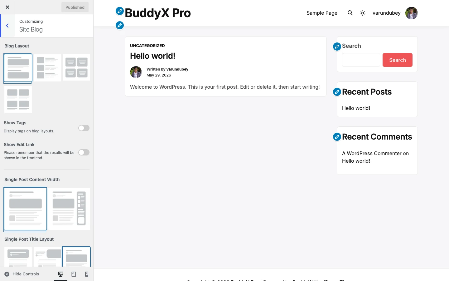
Open these controls at Appearance -> Customize -> Site Blog. The changes here affect two things: how your blog index and archive pages list posts, and how a single post displays its title and featured image.

Quick answer: if you just want a clean blog, leave everything on its default. The default layout with tags off and the "Above" single-post title reads well on any site. Come back and change it once you have a few posts published.

How the layout controls work together

The Blog Layout control is the parent. It has four options - Default, List, Grid, and Masonry - and each one reveals its own follow-up control right underneath it. You will only ever see the follow-up that matches the layout you picked:

  • Pick List, and an Image position control appears (put the thumbnail on the Left or the Right).
  • Pick Grid, and a Grid Columns control appears (One or Two).
  • Pick Masonry, and both a View control and a Post Per Row control appear (Two or Three per row).
  • Pick Default, and no extra control is needed.

So the table below lists every control in this section, but on screen you will only see the handful that apply to your chosen layout.

Settings

Setting Default What it does
Blog Layout Default Chooses how posts are listed on the blog index and archives: Default, List, Grid, or Masonry.
Image position Left List layout only. Places the post thumbnail on the Left or Right of the excerpt.
Grid Columns One Grid layout only. Shows posts in One or Two columns.
View Without Masonry Masonry layout only. Turns the staggered masonry effect on (With Masonry) or off (Without Masonry).
Post Per Row Two Masonry layout only. Displays Two or Three posts per row.
Show Tags Off Displays the post's tags on the blog and archive layouts.
Tags Style Default Appears when Show Tags is on. Styles the tags as Default, Badge, or Underline.
Show Edit Link Off Shows a front-end "Edit" link on posts (visible to logged-in users who can edit).
Single Post Content Width Small Sets the reading width of a single post's content: Small (narrower, easier to read) or Large (full width).
Single Post Title Layout Above Positions the single-post title and featured image: Title Over image, Half, Above the image, or Below the image.
Image Overlay Color rgba(0, 0, 0, 0.1) Appears only when Single Post Title Layout is "Title Over image". Adds a semi-transparent color over the featured image so the title stays readable. Supports transparency (alpha).

First-time tip: "Show Tags" and "Show Edit Link" are both off by default. Turn Show Tags on once you actually tag your posts, otherwise the control has nothing to display. The edit link only shows to users who can edit the post, so your visitors never see it.

The single-post title layouts

Single Post Title Layout decides where the post title sits relative to the featured image. "Title Over image" places the title on top of the image - that is the one case where Image Overlay Color matters, because you often need a dark overlay so white title text stays legible. The other three layouts (Half, Above, Below) put the title outside the image, so no overlay is needed and that control stays hidden.

Free vs Pro

BuddyX free gives you all four core blog layouts - Default, List, Grid, and Masonry - plus the Post Per Row control (Two or Three) on the masonry layout. That covers the large majority of blogs.

BuddyX Pro adds an extra blog layout style and finer post-per-row granularity on top of what free offers, for sites that want more control over how densely posts are packed. Plain Post Per Row already exists in free, so you are not blocked - Pro is only worth it if you have outgrown the built-in options. See BuddyX Pro.

Next: Color scheme - pick the one or two colors that carry your brand across the blog and the rest of the site.

Site Header and Site Sub Header

Control what shows in your top bar - search, cart, login/register - and the little sub-header strip that carries your page title and breadcrumbs.


Site Header controls

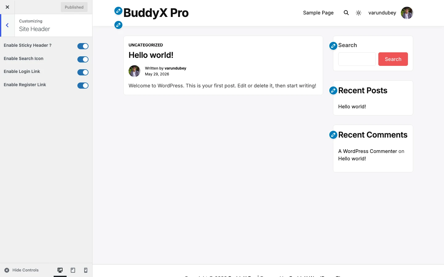
The Site Header section controls the icons and links that sit in your top bar. Go to Appearance -> Customize -> Site Header.

Every one of these is a simple on/off switch, and the defaults are already sensible - a brand-new site works out of the box with search, cart, login, and register all showing. You only need to touch these if you want to hide something.

Settings

Setting Default What it does
Enable Sticky Header? Yes Keeps the header fixed at the top of the screen as visitors scroll down the page.
Enable Search Icon Enable Shows the search icon in the header so visitors can search your site.
Enable Cart Icon Enable Shows the cart icon in the header. Shows only if WooCommerce, FluentCart, or SureCart is active - each registers this switch, so with none of them installed there is no cart to toggle.
Enable Login Link Enable Shows a Log In link in the header for logged-out visitors.
Enable Register Link Enable Shows a Register link in the header for logged-out visitors.

First-time tip: leave all five on. The sticky header keeps your navigation reachable on long pages, and the login/register links give community members an obvious way in. Come back and turn one off only if it clutters your design.

Two things people often look for here live in nearby sections, not in Site Header:

  • Your logo comes from Appearance -> Customize -> Site Identity (it is a WordPress core control). See First-time setup.
  • Your header background color lives in Appearance -> Customize -> Site Skin. See Colors and color scheme.

Site Sub Header

Sub Header controls

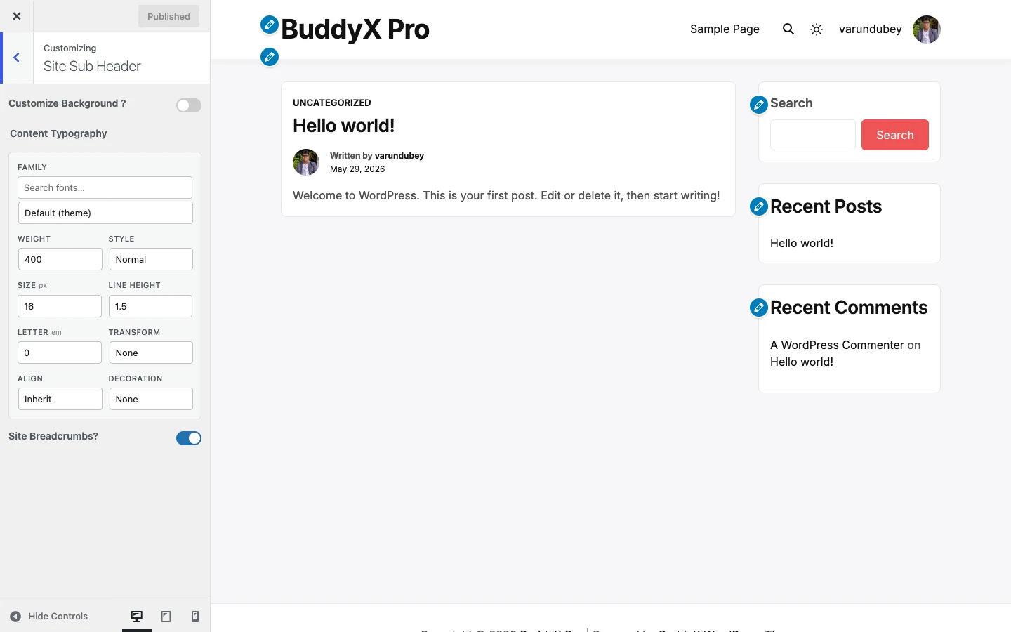
The sub-header is the strip directly under your main header - it usually carries the page title and the breadcrumb trail. Go to Appearance -> Customize -> Site Sub Header.

Settings

Setting Default What it does
Customize Background? Disable Turns on a custom background for the sub-header. Left off, the sub-header inherits its color from your theme skin and adapts to dark mode automatically.
Background Control Inherits theme color Pick a background color or image for the sub-header. Only shows once Customize Background is enabled.
Content Typography Theme default Sets the font family, size, weight, letter-spacing, and transform for the sub-header title and breadcrumbs.
Site Breadcrumbs? Enable Shows the breadcrumb trail (Home -> Section -> Page) inside the sub-header.

Quick answer: most sites can leave every sub-header setting at its default. Breadcrumbs help visitors and search engines understand where they are, so keep them on unless your design has no room for them.


BuddyX free vs BuddyX Pro

BuddyX free gives you the full set of header switches above - sticky header, search icon, cart icon, and login/register links - plus the sub-header background, typography, and breadcrumbs. That covers what most community and blog sites need.

BuddyX Pro adds an advanced header builder on top: multiple header layouts, a top bar above the header, a mega/More menu, menu position and hover effects, and dedicated styling for the search icon and the login/register buttons. If you want to design the header rather than just switch parts on and off, that is the BuddyX Pro upgrade. It is optional - nothing here is broken without it.


Next: Colors and color scheme

General - Layout, Loader, and Page Mapping

Set your site's overall shape - wide or boxed, how rounded the corners are, whether a loading animation shows, and which pages handle login, registration, and 404s.


The General panel holds three small-but-foundational sections: Site Layout (the frame everything sits in), Site Loader (an optional loading animation), and Page Mapping (point login/registration/404 at your own pages). You reach all three from Appearance -> Customize -> General.

Good news for first-time setup: every control here ships with a sensible default. You can leave this whole panel untouched and your site looks right. Come back when you want to fine-tune.

Site Layout

Path: Appearance -> Customize -> General -> Site Layout

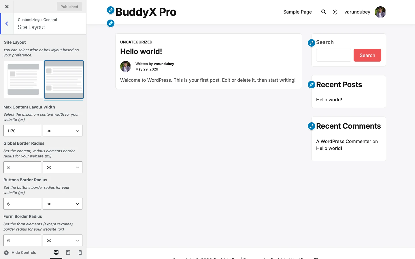
Site Layout controls

This is where you choose the frame. Wide lets your content stretch across the browser (the modern default most community and blog sites use). Boxed floats the whole site inside a centered card with a background around it - a more contained, classic look. The three border-radius controls set how rounded corners are, in pixels: one for content and general elements, one for buttons, and one for form fields.

A note on "Max Content Layout Width": this caps how wide your content area gets even in Wide layout. The default of 1170px is a comfortable reading width. Raise it for a more spacious feel on large screens; lower it to keep lines shorter.

Settings

Setting Default What it does
Site Layout Wide Choose Wide (content stretches to your max width) or Boxed (site sits in a centered card with a background around it).
Max Content Layout Width 1170px The maximum width, in pixels, of your content area.
Global Border Radius 8px Corner rounding for content and general elements, in pixels.
Buttons Border Radius 6px Corner rounding for buttons, in pixels.
Form Border Radius 6px Corner rounding for form fields, in pixels (does not affect textareas).

First-time tip: leave all five on their defaults. Wide layout and lightly rounded corners are the safe, modern choice. If you want a boxed look, switch Site Layout to Boxed and everything else keeps working.

Site Loader

Path: Appearance -> Customize -> General -> Site Loader

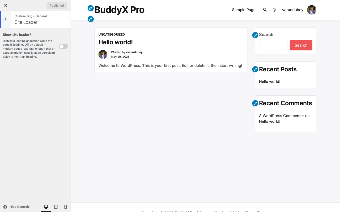
Site Loader controls

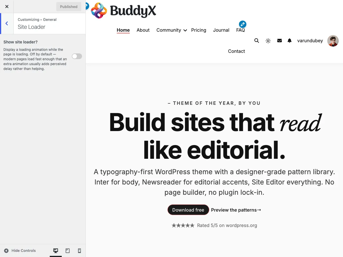
The loader is an animation that covers the page while it loads, then fades away. It is off by default on purpose - modern pages load fast enough that an extra animation usually adds perceived delay rather than helping. If your brand calls for one, turn it on and pick a style.

When you enable the loader, the rest of the controls appear: choose one of five animations (dots, spinner, pulse, bars, or your logo), set the background and element colors, add screen-reader-friendly loader text, upload a custom logo image (used only with the Logo animation), and set the animation speed.

Settings

Setting Default What it does
Show site loader? Disable (off) Master switch. Off by default; turn on to show a loading animation. The controls below appear only when this is on.
Loader animation Dots Pick the animation style: Dots, Spinner, Pulse, Bars, or Logo.
Background color #ef5455 Full-screen color behind the loader (supports transparency).
Element color #ffffff Color of the spinner, dots, or text. Ignored when using a logo.
Loader text Loading Screen-reader announcement (aria-label). Also shown on screen for the Logo animation.
Custom logo image (empty) Image to use as the loader; appears only with the Logo animation. Falls back to your site logo when empty.
Animation speed (seconds) 1.5 How long one animation cycle takes, from 0.5s to 3.0s.

Note: the loader, all five animation styles, the color controls, and the loader text are all part of BuddyX free - no upgrade needed to use any of it.

Page Mapping

Path: Appearance -> Customize -> General -> Page Mapping

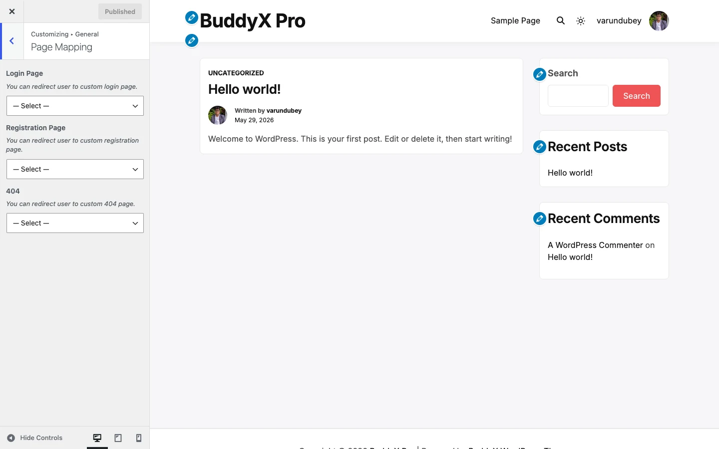
Page Mapping controls

Page Mapping lets you point three system pages at pages you have built yourself. Instead of the default WordPress screens, you can send visitors to a custom login page, a custom registration page, and a custom 404 (page-not-found) page. Leave a setting on its default and BuddyX uses the standard behavior for that page - which is perfectly fine for most sites.

Settings

Setting Default What it does
Login Page --- Select a Page --- (none) Redirect users to a custom login page you have created.
Registration Page --- Select a Page --- (none) Redirect users to a custom registration page you have created.
404 --- Select a Page --- (none) Show a custom page when a visitor hits a URL that does not exist.

Quick answer: you only need Page Mapping if you have designed your own login, registration, or 404 pages. If you have not, leave all three empty and WordPress handles them.

Free vs Pro

Everything on this page - Wide/Boxed layout, the three border-radius controls, the max content width, the full site loader with all five animation styles, and Page Mapping - is included in BuddyX free.

If you later want more control over the frame, BuddyX Pro adds header layouts and a top bar, a slide-out side panel, per-page layout settings, and a sign-in popup, among other things. Those are optional upgrades, not gaps in the free layout tools - the free controls above are complete on their own. See BuddyX Pro if you get there.

Next: Color scheme - colors and dark mode

Site Performance

Serve your fonts from your own server for a faster, more private site - no extra plugins needed.


Site Performance controls

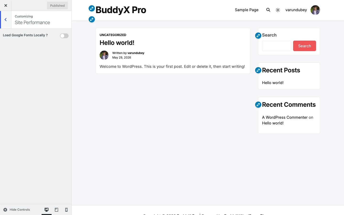
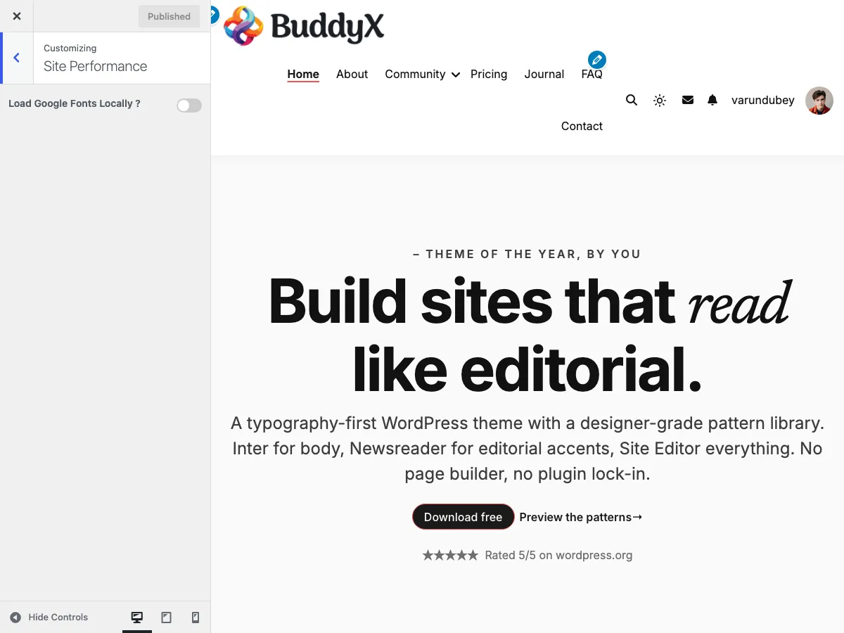
Out of the box, BuddyX already ships its interface fonts (Inter and Newsreader) self-hosted, so nothing is loaded from Google. The Site Performance section is for the case where your content, a child theme, or another plugin still pulls in Google Fonts. Turn one switch on and BuddyX downloads copies of those fonts to your own server, then serves them from there.

Find these controls at Appearance -> Customize -> Site Performance.

Why load fonts locally

When a font loads from Google's servers, every visitor's browser has to reach out to fonts.googleapis.com before your text can render. That does two things you may not want:

  • It sends each visitor's IP address to a third party, which many privacy and GDPR reviews flag.
  • It adds an extra network round-trip that can slow down how fast your text appears.

Loading fonts locally solves both. The font files sit on your own server, so nothing about your visitors is shared with Google, and the browser fetches everything from one place. For most sites this is a small but real speed and privacy win, and it is safe to leave on.

First-time tip: If you are not sure whether your site even uses Google Fonts, you can leave this whole section on Default (off) and move on. BuddyX's own fonts are already local. Come back and switch it on only if a privacy scan or speed test tells you Google Fonts are being requested.

Settings

Setting Default What it does
Load Google Fonts Locally ? Disable (off) Downloads any Google Fonts your site requests and serves them from your own server instead of Google. Turning this on reveals the two controls below.
Preload Local Fonts ? Disable (off) Adds a preload hint so the browser starts fetching your local font files earlier in page load, so text renders sooner. Only appears once "Load Google Fonts Locally" is enabled.
Flush Local Fonts Cache - (button) The "Flush Local Font Files" button clears the stored local font copies so BuddyX re-downloads fresh files. Use it if fonts change or look stale. Only appears once "Load Google Fonts Locally" is enabled.

Both switches are off by default, which keeps the default behavior unchanged until you opt in.

How to turn it on

  1. Go to Appearance -> Customize -> Site Performance.
  2. Set Load Google Fonts Locally ? to Enable.
  3. Set Preload Local Fonts ? to Enable for the extra speed hint (recommended once local loading is on).
  4. Click Publish.
  5. If you ever swap fonts and the old ones linger, come back and click Flush Local Font Files to force a fresh download.

Note: Every control on this page is included in BuddyX free - local Google Fonts, font preloading, and the cache flush all work without BuddyX Pro. BuddyX Pro adds different things (header layouts, sign-in popup, per-page settings, WooCommerce shop styling, and full BuddyPress control), not extra performance switches. So there is nothing to unlock here.

Next: First-time setup

Typography

Pick the fonts your site uses for its title, headings, menu, and body text - and fine-tune size, spacing, and weight for each.


Typography controls

The Typography panel groups every text control into four sections: Site Title, Headings, Menu, and Body. Each control lets you set a font family, a weight/style variant, font size, line height, letter spacing, and text transform for that part of the site. All of it is in BuddyX free.

To open it, go to Appearance -> Customize -> Typography, then pick the section you want to change.

First-time tip: you do not have to touch any of this. BuddyX ships with self-hosted Inter for UI and body text and Newsreader for a serif option, both tuned with sensible sizes and weights. Leaving every field on its default is perfectly fine - come back here only when you want a specific look.

The four sections

Section Controls What it styles
Site Title Site Title Settings, Site Tagline Settings Your site name and tagline in the header
Headings H1 to H6 Settings Every heading level across posts, pages, and archives
Menu Menu Settings, Sub Menu Settings Top-level navigation links and dropdown items
Body Settings Paragraph text, inputs, and the global body font

What each typography control does

Every section above opens the same set of fields. Set them per control - your H1 can use one font while your body uses another.

Setting Default What it does
Family Theme default (self-hosted) The font family. Choose from self-hosted theme fonts, the Google Fonts list, or any custom font you uploaded to the WordPress Font Library.
Variant Varies (600 for headings, 400 body, 500 menu, 700 title) The weight and style, for example 400 regular, 600 semibold, 700 bold, italic.
Font size Varies (40px title, 32px H1 down to 16px H6, 16px body) Text size. Use px for a fixed size or em to scale with the parent. We recommend px.
Line height Varies (1.1 to 1.6) Vertical spacing between lines. A unitless value like 1.6 scales with the font size.
Letter spacing Varies (-0.01em to 0.02em) Space between characters. Negative tightens, positive opens it up.
Text transform None Force UPPERCASE, lowercase, or Capitalize - or leave as None to keep the original casing.
Text align Left / inherit Horizontal alignment for that text block.

Text color is not set here - color lives under Appearance -> Customize -> Site Skin so all your colors stay in one place.

Fonts you can choose from

The Family picker groups fonts into three sets:

  • Self-hosted theme fonts - Inter and Newsreader ship with the theme and load from your own server, so there is no external request and nothing to configure.
  • Google Fonts - pick any family from the built-in Google Fonts list. BuddyX only requests the exact families you actually select.
  • Custom fonts from the WordPress Font Library - new in 5.1.4, any font you upload under Appearance -> Fonts shows up in the picker and is served as a self-hosted @font-face. This is a great way to use a brand or licensed font.

Privacy note: if you choose a Google Font and want to avoid calling Google's servers on every page load, BuddyX can download and serve those fonts locally. Turn on Load Google Fonts Locally under Appearance -> Customize -> Site Performance. Uploaded Font Library fonts are always self-hosted.

BuddyX free vs BuddyX Pro

Every typography control on this page - all four sections, font family (Google Fonts, self-hosted Inter and Newsreader, and Font Library uploads), size, line height, letter spacing, text transform, and per-level heading styling - is included in BuddyX free. You do not need Pro to control your fonts.

BuddyX Pro adds layout and styling features around your type - header layouts, mega menu, WooCommerce shop styling, per-page settings, and style presets - but the Typography panel itself is the same set of font controls in both.

Next: Site Skin - set your colors and dark mode

WP Login - Logo

Put your own logo on the WordPress login screen (wp-login.php) without touching a single line of code.


WP Login logo controls

By default, every WordPress site shows the WordPress "W" logo above the login form. BuddyX free lets you swap that for your own logo and control its size and spacing, so the page members and admins log in through actually looks like your site.

Where to find it

Appearance -> Customize -> WP Login -> Logo

Nothing here changes until you turn the section on. Flip Customize Your Logo Section to Yes and the rest of the controls appear.

First-time tip: If you are happy with the default WordPress logo, you can skip this whole section. It is optional, and leaving it off is perfectly fine.

Settings

Setting Default What it does
Customize Your Logo Section Off (No) Master switch for this section. Turn it On to reveal the logo controls below. While Off, the login page keeps the default WordPress logo.
Disable Logo? Off (No) Turn On to hide the logo area entirely, showing just the login form with no image. When On, the image and size controls are hidden.
Custom Logo Empty The image shown above the login form. Upload or pick from your media library.
Logo Width 84px Width of the logo image, in pixels.
Logo Height 84px Height of the logo image, in pixels.
Logo Space Bottom 0px Gap in pixels between the logo and the login form below it. Increase it to give the logo room to breathe.
Logo URL Empty Where clicking the logo takes the visitor. Leave empty to use your site home.
Logo Title Empty Tooltip text shown when hovering the logo.
Login Page Title Empty Text shown as the login page title. Leave empty to use the WordPress default.

Set a square logo? Keep Width and Height equal (the 84px x 84px default is square). For a wide, horizontal logo, raise the Width and lower the Height to match your image's shape so it does not stretch.

Quick answer: "Which ones do I actually need?" For most sites, just Custom Logo plus a matching Logo Width and Logo Height. The rest are optional polish.

BuddyX free vs BuddyX Pro

BuddyX free covers the login logo: your own image, its width, height, bottom spacing, click URL, hover title, and page title - plus a switch to hide the logo entirely. That is everything in this section.

BuddyX free does NOT restyle the login form itself. The input fields, the "Log In" button, the background, the "forgot password" screen, and ready-made login skins all keep their standard WordPress look.

Want to theme the whole login page - form styling, buttons, backgrounds, and login skins to match your brand? That is BuddyX Pro.

  • Docs home
  • First-time setup - set your site logo, title, and tagline for the front end
  • Header - navigation, logo placement, and header layout
  • BuddyX Pro - full WP login theming and more

Next: First-time setup

Skin & Colors

Color tokens, dark mode, style variations - everything that controls how BuddyX looks.

Color Scheme - Site Skin

The Site Skin panel at Appearance -> Customize -> Site Skin is where you control every color on your site. BuddyX gives you two approaches:

  1. Pick a style preset - Default + 8 presets (9 options), one click. Fastest path.
  2. Set custom colors - 50+ individual color settings if you need precise brand matching.

Both approaches work together. A preset sets a starting palette; any custom color you set overrides the preset for that specific element.

Quick start: Most sites only need to set 1-3 colors. The defaults already look good and meet WCAG-AA contrast. If you're in a rush, just pick a style preset and call it done.


Customizer -> Site Skin section showing Color mode (Light/Dark), Show color-mode toggle, Toggle position, and the Style preset picker (Default + 8 presets, 9 options)

Path 1 - Style presets (fastest)

BuddyX ships Default + 8 presets (9 options):

Preset Palette feel
Default BuddyX red (#ef5455) on soft-gray surfaces
Cool Sky-blue accents on cool-gray surfaces
Dark Light text on near-black surfaces (designed as a starting point for dark-first sites)
Editorial Restrained, magazine-style palette with strong contrast
Minimal Subtle accents, pared-down color use
Monochrome Black, white, and grays - no chromatic accents
Pastel Soft pastel palette with gentle contrast
Vibrant Saturated, energetic accent colors
Warm Earthy reds, oranges, and warm grays

How to apply a preset

  1. Appearance -> Customize -> Site Skin
  2. Find the Style preset picker (swatches at the top of the panel)
  3. Click a preset - preview updates immediately
  4. Click Publish

Each preset card previews the palette before you pick, so you can see what you're getting.

Custom colors win over presets

If you've already set custom colors and then apply a preset, your custom colors still take priority for those specific elements. The preset acts as the "starting layer"; the customizer is the "fine tune layer" on top.

This means you can:

  • Set your brand primary color manually
  • Then pick a preset for everything else
  • Your brand color stays; the preset only affects elements you didn't customize

Path 2 - Custom colors (precise brand match)

When you need an exact brand color, set the Site Primary Color first:

  1. Appearance -> Customize -> Site Skin -> Brand -> Site Primary Color
  2. Pick your brand color (e.g., #0066CC)
  3. Click Publish

The primary color is the most influential single setting - it controls:

  • Buttons (background, border, hover)
  • Menu hover + active states
  • Link hover
  • Site title hover
  • Footer / copyright link hover
  • Site loader background

For most sites, just changing Site Primary Color is enough - every other color is set to a sensible default that pairs with the primary.

When to go deeper

If you need finer control, BuddyX exposes 50+ individual color settings organized into clusters:

Cluster 1 - Color Mode (4 settings)

Setting Default What it does
Default color mode Light Light / Dark
Show color-mode toggle On Sun/moon button visitors can use to switch
Toggle position Both Header / Mobile / Both
Style preset Default Default + 8 presets (9 options), see above

See Dark Mode for details.

Cluster 2 - Brand (1 setting)

Setting Default Used for
Site Primary Color #ef5455 Buttons, menu hover, link hover, brand accents everywhere

Cluster 3 - Body (7 settings)

Setting Default Used for
Body background color #f7f7f9 Main page background
Content background color #f7f7f9 Behind post/page content
Box background color #ffffff Cards, post boxes, panels
Secondary background color #fafafa Subtle alternate-row backgrounds
Body text color (under Typography) #505050 Paragraph and body text
Site links color #111111 Default link color
Site links hover color #ef5455 Link hover (inherits primary)

Cluster 4 - Headings (6 settings)

Setting Default Used for
H1 color #111111 Page titles, single-post titles
H2 color #111111 Section headings
H3 color #111111 Sub-section headings
H4 color #111111 Smaller headings
H5 color #111111 Very small headings
H6 color #111111 Smallest headings

Most sites set all six to the same color. Set per-level only if you want a visual hierarchy beyond size alone.

Cluster 5 - Header (8 settings)

Setting Default Used for
Header background color #ffffff Top header bar background
Site title color #111111 Text site title (if no logo)
Site title hover color #ef5455 Hover state
Tagline color #757575 Tagline below title
Menu text color #111111 Primary menu links
Menu hover color #ef5455 Menu link hover
Menu active color #ef5455 Current-page menu link
Sub-header text color #111111 Optional secondary header row

Cluster 6 - Buttons (6 settings)

Setting Default Used for
Button background #ef5455 All primary buttons
Button background hover #f83939 Hover state
Button border #ef5455 Outline buttons
Button border hover #f83939 Outline hover
Button text #ffffff Button label
Button text hover #ffffff Hover label

Contrast tip: button text on button background must meet WCAG-AA contrast (4.5:1 for normal text, 3:1 for large text). The defaults pass. If you customize, test with a tool like WebAIM Contrast Checker.

Setting Default Used for
Footer title color #111111 Widget titles in footer
Footer content color #505050 Footer widget text
Footer links color #111111 Widget links
Footer links hover color #ef5455 Link hover

Footer background is set via Customize -> Site Footer -> Background (a background image / color combo, not just a color).

Setting Default Used for
Copyright background #ffffff Bottom copyright bar background
Copyright border #e8e8e8 Top border separating from footer
Copyright content #505050 Copyright text
Copyright links #111111 Links in copyright bar
Copyright links hover #ef5455 Hover state

"Set Custom Colors" toggle

Under Customize -> Site Skin there's a Set Custom Colors? switch (default Yes).

  • Yes - the custom color settings above are exposed and applied.
  • No - the customizer hides individual color settings; the theme uses its built-in palette (or the active style preset's palette) only.

Leave this On for most sites. Turn off only if you want to deliberately constrain yourself / a junior editor to the preset palettes.


How colors are wired internally

For developers + curious users:

BuddyX 5.1.0 uses CSS custom properties (design tokens) to keep colors consistent. The Customizer values you set get converted into tokens like:

  • --bx-color-primary <- Site Primary Color
  • --bx-color-bg-body <- Body Background
  • --bx-color-text-primary <- Body Text color
  • --bx-color-button-bg <- Button background
  • ...etc.

These tokens cascade through every stylesheet. When you change a color in the Customizer, only the token's value updates - every place that uses the token updates automatically.

This is also why dark mode can flip colors smoothly: dark mode swaps the same tokens to dark values. No double-set-everything-twice required.

See Design Tokens reference for the full token list.


Common scenarios

Set Site Primary Color. Everything else inherits automatically. Don't fiddle with individual button/link/hover settings unless you need a different shade.

"I want a dark mode with my own colors"

BuddyX free uses a theme-controlled dark palette - when dark mode is active, the theme applies a near-black background with light text. You can't set per-element dark colors in the free Customizer.

If you need full dark-mode color control, BuddyX Pro adds 30+ dark_* Customizer fields for that purpose. Or use a child theme to override the dark tokens directly.

"I want consistent colors across blog + BuddyPress + WooCommerce"

BuddyX is built on a single token system - every surface (blog, community, shop) reads from the same --bx-color-* tokens. Set your colors once; they apply everywhere.

"My color change isn't appearing"

See Troubleshooting -> I changed a Customizer setting but the front-end didn't update. Most often it's caching.


  • Dark Mode - color mode + visitor toggle
  • Customize your colors and fonts - walkthrough for customizing brand colors and fonts (heading colors are in Site Skin, font choices are in Customize -> Typography)
  • Design Tokens reference - full --bx-color-* token list (for developers)

Dark Mode

BuddyX includes a built-in dark mode that works across every page - blog, BuddyPress community surfaces, WooCommerce (if active), comments, forms, footer. No flash-of-wrong-color on page load. No external plugins required.

Quick answer: Dark mode is on by default in the visitor toggle (the sun/moon button in the header). Default look is Light. See Quick Start Step 9 for first-time setup.


The two color modes

BuddyX has two "Default color mode" choices at Appearance → Customize → Site Skin → Color Mode → Default color mode:

Mode What new visitors see
Light (default) Bright background, dark text - the traditional web look
Dark Dark background, light text - the modern alternative

Setting: site_color_mode (default light)

Most sites pick Light. Dark as a default is bold and best for content sites with mostly evening reading.


The visitor toggle

The sun/moon icon button in the header lets visitors switch modes on their own. Their choice persists across page loads (via localStorage) - so if a visitor toggles dark, every page they visit on your site stays dark.

Light mode (default): sun icon visible in the header.

Front-end home page in light mode with sun toggle icon in the header

After click → dark mode applies: moon icon shown, palette flips, choice saved to localStorage.

Same home page rendered in dark mode - moon icon in header, FOUC-free first paint

Toggle settings

At Customize → Site Skin → Color Mode:

Customizer → Site Skin showing Color mode buttons (Light/Dark), Show color-mode toggle switch, and Toggle position radio (Header/Mobile/Both)

Setting Default What it does
Show color-mode toggle On (Show) Adds a sun/moon button. Turn off if you want a one-look-only site.
Toggle position Both Where the button appears: Header (desktop nav), Mobile (mobile menu only), Both.

Settings: site_color_mode_toggle_show (default on), site_color_mode_toggle_position (default both)

Hiding the toggle entirely

If you want a "this site is always light" or "this site is always dark" look:

  1. Customize → Site Skin → Color Mode → Show color-mode toggleHide
  2. Set Default color mode to whatever you want everyone to see
  3. Publish

The toggle is gone; everyone sees the same look.


No flash on page load

A common dark-mode complaint on other themes is the "FOUC" (Flash of Unstyled Content) - a page briefly loads light, then snaps to dark.

BuddyX 5.1.0 specifically prevents this with a first-paint script in the <head> that:

  1. Reads the visitor's saved preference
  2. Adds the correct dark/light class to <html> before the page renders
  3. The browser paints the correct colors from the very first frame

You don't need to do anything to enable this - it's automatic. If you ever see a flash on a BuddyX 5.1.0+ site, see Troubleshooting → Dark mode flashes on page load.


The dark palette (in free)

When dark mode is active, BuddyX free applies a theme-controlled dark palette:

Element Dark color
Page background #0a0a0a (near-black)
Elevated surfaces (cards, modals) #161616
Subtle surfaces #101010
Primary text #f5f5f5 (off-white)
Muted text #a0a0a0
Accent / Primary #ff6b6b (slightly brighter red than light mode's #ef5455, for dark-bg contrast)
Button background #ff6b6b
Button text #0a0a0a (dark text on bright button)
Border / divider #2a2a2a

These values are designed to meet WCAG-AA contrast on the dark background and pair cleanly with the light-mode brand color.

Can I change the dark palette in free?

Not in the Customizer - BuddyX free does not expose per-element dark-mode color settings.

You have three options if you need different dark colors:

  1. Pick the "Dark" style preset - Customize → Site Skin → Style preset → Dark. This sets a dark-themed light-mode palette (so the site looks dark even in light mode); not the same as actual dark-mode customization, but works for "dark-first" sites where you don't need a separate light variant.

  2. Use BuddyX Pro - BuddyX Pro adds 30+ dark_* Customizer fields letting you set every dark color individually (dark body bg, dark heading colors, dark button colors, dark footer, etc.). Sold separately.

  3. Use a child theme - override the --bx-color-* tokens in a child theme's CSS, scoped to [data-color-mode="dark"]. Example:

    [data-color-mode="dark"] {
      --bx-color-accent: #00d4ff;
      --bx-color-bg: #001020;
    }
    

How dark mode works internally

For developers + curious users:

BuddyX uses CSS custom properties (tokens) to define every color. When dark mode is active, the same tokens get re-assigned to dark values.

:root {
  --bx-color-bg: #f7f7f9;       /* light mode */
  --bx-color-fg: #111111;
}

[data-color-mode="dark"] {
  --bx-color-bg: #0a0a0a;       /* dark mode */
  --bx-color-fg: #f5f5f5;
}

body {
  background: var(--bx-color-bg);   /* reads either, no duplication */
  color: var(--bx-color-fg);
}

The token system means every page picks up dark mode automatically - there's no per-page or per-component dark-mode code to maintain.

See Design Tokens reference for the full token list.


How dark mode persists

When a visitor clicks the toggle:

  1. Their choice is saved to localStorage (browser-side, no cookies, no server roundtrip)
  2. On every subsequent page load, the first-paint script reads localStorage and applies the correct class before rendering
  3. The choice survives navigation, tab close + reopen, and browser restart
  4. If the visitor clears their browser data, their choice resets to the site's default

This works for all visitors - logged in or guest. No user-account dependency.


Block patterns + dark mode

WordPress block patterns (Gutenberg patterns) use a separate color system: --wp--preset--color--*. BuddyX 5.1.0 specifically maps these block presets to its dark tokens, so block-pattern-built homepages render correctly in dark mode.

If you're using BuddyX block patterns or third-party patterns, they should "just work" in dark mode out of the box.

If you see a pattern that breaks in dark (e.g., dark text on dark background somewhere unexpected), file a GitHub issue with a screenshot.


Common scenarios

"I want my site to be always-dark"

  1. Customize → Site Skin → Color Mode → Default color modeDark
  2. Show color-mode toggleHide
  3. Publish

Everyone sees dark, no toggle.

"I want the toggle but only on mobile (not header)"

  1. Show color-mode toggleShow
  2. Toggle positionMobile
  3. Publish

Desktop visitors don't see the toggle; mobile visitors find it in the mobile menu.

"Dark mode breaks a specific plugin's UI"

Report it to us at support@wbcomdesigns.com with: (1) the plugin name + version, (2) the page URL where it breaks, (3) a screenshot in dark mode, (4) the BuddyX version. We test against BuddyPress, WooCommerce, FluentCart, SureCart, bbPress, and the WordPress core surfaces. BuddyX 5.1.4 also ships dark overrides for several popular add-ons out of the box - Better Messages, GamiPress, rtMedia, and BP Verified Member - loaded only when each plugin is active. Other plugins may have their own light-only color assumptions that need a small CSS bridge.


Blocks & Patterns

Block patterns - ready-made page sections built into BuddyX

BuddyX ships 27 block patterns: pre-built page sections (hero, about, services, testimonials, pricing, FAQ, call-to-action, blog listings, and footers) made entirely from core WordPress blocks, so you can drop a finished-looking section into any page and edit it in place.


The BuddyX Patterns tab in the WordPress block inserter

Quick answer: Edit any page, click the block inserter (the + button), open the Patterns tab, and pick a BuddyX category (Hero, About, Services, and so on). Click a pattern to drop it in. It already uses your theme colors and fonts, so you mostly just swap the text and images.

What a block pattern is

A block pattern is a ready-arranged group of standard WordPress blocks - headings, paragraphs, images, buttons, columns, query loops - saved as a single insertable layout. When you insert one, you get the whole section (spacing, structure, sample content) in one click, and every piece stays fully editable. Nothing is locked.

Two things make the BuddyX patterns worth reaching for first:

  • They are built from core blocks only. No page builder, no extra plugin, no shortcodes. If you ever switch these patterns work on plain WordPress.
  • They inherit your theme automatically. Colors come from Appearance -> Customize -> Site Skin, and fonts come from your theme typography. Set your brand color once and every pattern you insert already matches it. Change the color scheme later and the patterns follow - you are not restyling anything twice.

How to insert a pattern

You can reach the patterns two ways, and both land in the same place:

  1. From the block inserter. In the page or post editor, click the + button (top-left, or inline where you want the section). Switch to the Patterns tab, then pick a BuddyX category from the dropdown. Click any pattern to insert it at the cursor.
  2. From the inserter search. Open the + inserter and type what you want (for example "hero", "pricing", "footer"). Matching BuddyX patterns appear in the results - click to insert.

Once a pattern is on the page, edit it like any other blocks: click the text to rewrite it, replace the placeholder images with your own, adjust buttons, and delete any rows you do not need. Publish when it looks right, then check it at a phone-width preview so you can catch anything that needs a smaller-screen tweak.

First-time tip: Start with one hero pattern at the top, add a couple of body sections (about, services, or stats), and finish with a call-to-action. That is a complete landing page in a few minutes, and it is the fastest way to see how the patterns pick up your colors.

The 27 patterns, grouped by purpose

Every pattern below is real and lives in the theme. Titles are exactly as they appear in the Patterns tab.

Hero sections (3) - the top of a page

Pattern Good for
Hero - Image-led A large image with a headline over or beside it
Hero - Split Screen Text on one side, visual on the other
Hero - Typography-led A bold, text-first opener with no big image

About and team (3) - introduce yourself

Pattern Good for
About - Story A narrative "who we are" section
About - Founder Spotlight Highlight one person or founder
Team - 4-up Grid A four-across grid of team members

Features, services, and process (3) - explain what you offer

Pattern Good for
Features - Alternating Rows Feature rows that alternate image and text sides
Services - 3-up Grid Three service cards side by side
Steps - Numbered Process A numbered "how it works" walkthrough

Social proof (3) - build trust

Pattern Good for
Logo Cloud - Trusted by A row of client or partner logos
Stats Row Headline numbers (members, sales, downloads)
Testimonials - Editorial 3-up Three customer quotes in an editorial layout

Pricing and FAQ (2) - answer the buying questions

Pattern Good for
Pricing - 3-tier Editorial A three-column pricing table
FAQ - Editorial A clean question-and-answer section

Calls to action (3) - move people to the next step

Pattern Good for
CTA - Full-bleed Gradient A full-width, high-contrast call-to-action
CTA - Newsletter Signup A sign-up prompt for your list
Banner - Light Asymmetric A lighter, offset promo banner

Blog and post listings (5) - show your content

Pattern Good for
Posts - 3-up Editorial Grid Three latest posts in an editorial grid
Posts - Asymmetric Hero + Stack One featured post plus a stacked list
Posts - Horizontal List Split Wide horizontal post rows
Posts - 4-up Featured Cards Four featured post cards
Posts - Minimal Date + Title List A stripped-back date-and-title list

These five use the core Query Loop block, so they pull in your real posts automatically and respect your blog settings.

Footers (5) - close every page

Pattern Good for
Footer - Default Mega The full multi-column footer with everything
Footer - Mega 5-column A five-column mega footer
Footer - Central CTA A footer built around one central prompt
Footer - Simple Centered A clean, centered footer
Footer - Minimal Bar A single-line minimal footer

That is 27 patterns in total: 3 hero, 3 about/team, 3 features/services/process, 3 social proof, 2 pricing/FAQ, 3 calls to action, 5 blog listings, and 5 footers.

Dark mode and responsive behavior

Because the patterns use theme colors rather than fixed values, they switch with your site. If a visitor is in dark mode, the sections re-color themselves - you do not build a separate dark version. The layouts also stack down for phones on their own, so a three-column grid becomes a single column on a small screen. Always preview a new page at a narrow width before publishing to confirm the flow reads well for you.

Want even more sections?

The 27 patterns cover the common page-building needs, and they are free with the theme. If you want a larger library - more blocks, more layout variety, and BuddyPress-aware sections - install Wbcom Essential, our free companion plugin. It adds its own blocks and patterns that inherit your BuddyX colors the same way, so everything still matches without extra work.

Next: Color scheme - set your colors once so every pattern you insert matches your brand.

Wbcom Essential - the free companion plugin for BuddyX

Wbcom Essential is the free plugin we recommend you install right after activating BuddyX. It gives you a library of production-ready blocks and page patterns that automatically pick up your BuddyX colors, so you can build full pages in the WordPress editor without reaching for a separate page builder.


Quick answer: Install Wbcom Essential from wbcomdesigns.com/downloads/wbcom-essential/ (or search for it under Plugins -> Add New), activate it, then open any page and add its blocks from the editor. The blocks inherit your theme colors on their own - there is nothing extra to wire up.

What it is

Wbcom Essential is a free block and pattern library built to pair with BuddyX. Instead of hand-coding sections or installing a heavy page builder, you drop in ready-made blocks - hero sections, pricing tables, testimonials, team grids, call-to-action rows - and arrange them right inside the standard WordPress editor.

The part that saves you the most time: every block reads the colors you already set in Appearance -> Customize -> Site Skin. Set your primary color once on the theme, and Wbcom Essential blocks match it automatically. Change your color scheme later and the blocks follow. You are not restyling anything twice.

This is the fast path to a finished page. No page builder required, no separate design system to learn.

What you get

What How much Notes
Gutenberg blocks 31 Core content and layout blocks for the WordPress editor, across 7 categories
Elementor widgets 43 For sites that already use Elementor - optional, only load if you use it
BuddyPress blocks 5 One of the 7 categories - counted within the 31 above, not in addition to them

Every block ships with the details that matter on a real site:

  • Responsive controls at 3 breakpoints - tune spacing, columns, and visibility separately for desktop, tablet, and mobile.
  • RTL ready - lays out correctly for right-to-left languages.
  • FSE-compatible - works inside block themes and the Site Editor, not just classic templates.
  • Accessibility built in - semantic markup and keyboard-reachable controls come standard.
  • Conditional loading - a block's CSS and JavaScript load only on pages that actually use it, so your pages stay fast.

Note: The Elementor widgets and the WooCommerce and EDD blocks only come into play if those plugins are active on your site. If you are not running Elementor, WooCommerce, or EDD, you can ignore those and just use the Gutenberg and BuddyPress blocks. Nothing is forced on you.

The blocks in the editor

Wbcom Essential blocks in the editor

Open the block inserter and you will find all 31 Gutenberg blocks grouped into 7 categories, so the block you want is easy to spot. Here is the full catalog.

Marketing (7)

  • Hero Section - a full-width headline, subtext, and call-to-action band for the top of a page.
  • Pricing Table - side-by-side plan columns with features and a buy button.
  • CTA Section - a focused call-to-action row to drive sign-ups or clicks.
  • Feature Grid - icon-and-text cells that lay out your product's key features.
  • Countdown Timer - a live countdown for launches, sales, or events.
  • Promo Banner - a compact promotional strip for offers or announcements.
  • Testimonial Carousel - rotating customer quotes with names and avatars.

BuddyPress (5)

  • Members Grid - a grid of community members pulled from BuddyPress.
  • Members Carousel - the same members in a rotating slider.
  • Groups Grid - a grid of your BuddyPress groups.
  • Group Carousel - groups shown as a sliding carousel.
  • Activity Feed - a live stream of community activity on any page.

Content (5)

  • FAQ Accordion - expandable question-and-answer rows.
  • Tabs - tabbed panels for organizing content in a small space.
  • Timeline - a vertical, dated sequence of milestones or steps.
  • Portfolio Grid - a filterable grid for showcasing work or projects.
  • Login Form - a styled front-end login form you can place anywhere.

Design (4)

  • Flip Box - a card that flips on hover to reveal more detail.
  • Progress Bar - an animated bar for skills, stats, or completion.
  • Stats Counter - numbers that count up as they scroll into view.
  • Text Rotator - a headline where one word cycles through alternatives.

Blog (3)

  • Category Grid - a visual grid of your post categories.
  • Post Carousel - recent or selected posts in a sliding carousel.
  • Posts Ticker - a scrolling headline ticker of latest posts.

WooCommerce (3)

  • Product Grid - a grid of WooCommerce products with add-to-cart.
  • Product Carousel - products shown as a rotating slider.
  • Customer Reviews - a showcase of your store's product reviews.

EDD (4)

  • Product Catalog - a browsable grid of Easy Digital Downloads products.
  • EDD Enhanced Checkout - a cleaner, styled checkout for digital sales.
  • EDD Account Dashboard - a customer-facing dashboard for purchases and downloads.
  • EDD Order Success - a polished order-confirmation screen after a purchase.

Every one of these blocks auto-inherits your BuddyX colors, so it matches the rest of your site the moment you drop it in - no per-block restyling. Each also carries the same 3-breakpoint responsive controls, so you can adjust desktop, tablet, and mobile independently.

Note: The WooCommerce blocks appear only when WooCommerce is active, and the EDD blocks appear only when Easy Digital Downloads is active. This conditional loading keeps the inserter tidy and your pages light - you never load code for a store you are not running.

What the blocks look like

Here is a single page built entirely from Wbcom Essential blocks - hero, feature grid, stats counter, pricing table, testimonials, FAQ, call-to-action, countdown, text rotator, flip box, tabs, timeline, progress bars, and a promo banner - every one of them picking up the BuddyX theme colors automatically:

A full page built from Wbcom Essential blocks, styled by BuddyX

Each block ships with sensible default content, so it renders complete the moment you add it - no blank-slate setup. Here is the pricing table block on its own:

Wbcom Essential pricing table styled by BuddyX

How to install

You can install Wbcom Essential the same way you would any WordPress plugin. Pick whichever route is easier for you.

Option A - search from your dashboard

  1. Go to Plugins -> Add New.
  2. Search for Wbcom Essential.
  3. Click Install Now, then Activate.

Option B - download and upload

  1. Download the plugin from wbcomdesigns.com/downloads/wbcom-essential/.
  2. Go to Plugins -> Add New -> Upload Plugin and choose the zip file.
  3. Click Install Now, then Activate.

That is the whole setup. There is no license key to enter and no configuration screen you have to visit first - the blocks are available the moment the plugin is active. For where Wbcom Essential sits in the wider in-house lineup, see Plugin family.

Using the blocks

  1. Open any page or post and click the editor's block inserter (the + button).
  2. Scroll to the Wbcom Essential category, or type a block name into the search box.
  3. Click a block to drop it into your page.
  4. Select the block and use the right-hand settings panel to adjust content, layout, and the 3-breakpoint responsive controls.
  5. Prefer a pre-built section? Open the Patterns tab in the inserter and insert a complete, ready-styled layout you can edit in place.

Because the blocks inherit your BuddyX colors, a page you build this way already looks like the rest of your site. Publish when it looks right, then check it on mobile - the responsive controls let you fix anything that needs a different treatment on smaller screens.

Next: Color scheme - set your colors once so every block you add matches your brand.

Recipes

Step-by-step walkthroughs for the most common BuddyX projects.

Recipe: Customize your colors and fonts

What you'll build: A BuddyX site that reflects your brand - your color palette, your fonts, your visual identity. The site stops looking like "default BuddyX" and starts looking like your project.

Time: ~45 minutes (faster if you already have your brand decisions made)

Prerequisites:

  • BuddyX activated, Quick Start complete
  • Your brand color(s) decided (the main one matters most)
  • A logo file (PNG or SVG, transparent background)

Before you start - three brand decisions

If you don't have these decided yet, decide now (it'll save you Customizer time):

  1. Your primary brand color - one hex code (e.g., #0066CC for blue). This is the single most influential decision.
  2. Your heading font - should it match the body font or be different? Sans-serif everything is safest; serif headings + sans body is classic.
  3. Your body font - pick something legible. Inter, Open Sans, Source Sans, Lato, Roboto, IBM Plex are all safe sans-serif choices.

No designer / not sure? A safe default: one sans-serif font for everything (e.g., Inter at 16px body, Inter Bold for headings) + your brand color as the only accent. Looks professional, never wrong.


Step 1 - Site identity (5 minutes)

Customize → Site Identity:

Customizer Site Identity panel with Logo, Dark Mode Logo, Site Title, Tagline, and Site Icon fields

  1. Logo - upload your logo. Best as PNG (transparent background) or SVG, around 200×60 pixels for horizontal logos.
  2. Dark Mode Logo (optional) - alternate logo for when the site is in dark mode. Only set this if your main logo doesn't read well on dark backgrounds.
  3. Site title - your brand name (shows in browser tabs even when you have a logo).
  4. Tagline - your one-liner (or leave blank).
  5. Site icon (favicon) - upload a square 512×512 image.

Click Publish.


Step 2 - Pick your primary color (3 minutes)

Customize → Site Skin → Brand → Site Primary Color:

  1. Click the color swatch
  2. Either:
    • Paste your brand color's hex code (e.g., #0066CC)
    • Use the color picker to pick visually
  3. Watch the preview - buttons, menu hover, link hover all instantly take the new color

Click Publish to commit.

One color goes far: BuddyX uses the primary color across buttons, menu hover, link hover, site title hover, footer link hover, copyright link hover, and the site loader. You usually don't need to set anything else color-wise.


Step 3 - Pick (or pass on) a style preset (3 minutes)

Customize → Site Skin → Style preset:

You get Default plus 8 presets (9 options total). Each is a starting palette that pairs accent colors, surface colors, and contrast levels.

Preset When to pick it
Default You set your primary color and want everything else at BuddyX defaults
Cool Tech / SaaS / professional services - cool-blue feel
Dark Dark-first sites (designer portfolios, music, gaming)
Editorial Magazines, content publishers, news - restrained palette
Minimal Personal sites, portfolios - subtle and clean
Monochrome Pure black-white-gray. Designer / agency portfolios
Pastel Lifestyle, wellness, design - soft and approachable
Vibrant Energetic brands - saturated accent colors
Warm Hospitality, food, lifestyle - earthy palette

You don't have to pick one - leaving Style preset on Default is perfectly fine. Pick a preset if it's closer to your visual brand than the default palette.

Remember: your Site Primary Color from Step 2 stays the primary even if you pick a preset. The preset only fills in elements you haven't customized yet.

Click Publish.


Step 4 - Adjust button colors (3 minutes, optional)

By default, buttons use your Site Primary Color for background + border, white text. That's usually right.

But if your primary color is light (e.g., a pastel yellow), white button text on a light button is unreadable. Fix:

Customize → Site Skin → Buttons:

Setting Suggested
Button text A dark color (e.g., #111111) if your button background is light
Button text hover Same as above

For most brand colors (medium-to-dark), the defaults work. Only adjust if the contrast looks wrong.

Quick test: visit a page with a button. Can you read the button text clearly without squinting? If yes, you're good. If no, change button text color or background.


Step 5 - Pick your body font (5 minutes)

Customize → Typography → Body Typography:

Customizer Typography Body section with Family / Weight / Size / Line Height / Letter / Transform / Align / Decoration controls

  1. Font Family - pick from the Google Fonts dropdown (1000+ options)
    • Safe bets: Inter, Open Sans, Source Sans Pro, Lato, Roboto, IBM Plex Sans, DM Sans
    • Variable / personality: Outfit, Plus Jakarta Sans, Manrope
  2. Font Size - 16px is the standard body size. Don't go smaller; readability suffers.
  3. Line Height - 1.6 to 1.8 for prose; 1.4 is tight (good for UI text but not for reading).

Click Publish.

Don't see Google Fonts loading? See Troubleshooting → Fonts aren't loading.


Step 6 - Pick your heading font (5 minutes)

Customize → Typography → Headings Typography:

You can set H1-H6 individually. Most sites set them all to the same family + size scale.

Strategy What to do
One font everywhere Pick the same family as your body for H1-H6. Adjust font weight (e.g., 700 Bold) and font size for hierarchy.
Serif headings + sans body Pick a serif (e.g., Playfair Display, Lora, Cormorant) for H1-H3. Leave H4-H6 at body family or default.
Display font for hero, body for everything else Pick a display font (e.g., Bebas Neue, Anton, Oswald) only for H1. H2-H6 stay at body family.

For each H1-H6:

  • Font Family - your heading font
  • Font Size - H1 around 40-48px, H2 around 32-36px, H3 around 24-28px, H4-H6 progressively smaller
  • Font Weight - usually 600 or 700 for headings; some display fonts only come in 400

Click Publish.

Heading colors are in Site Skin, not Typography - H1-H6 colors live at Customize → Site Skin → Headings (default #111111 for all). Change there if you want headings in your brand color (though most sites keep them dark for readability).


Step 7 - Menu typography (3 minutes)

Customize → Typography → Menu Typography:

  • Font Family - usually the same as your body font (consistency reads professional)
  • Font Size - 14-16px works for desktop menus
  • Font Weight - 500 or 600 (slightly bolder than body for clarity)
  • Text transform - UPPERCASE feels assertive; standard case feels friendly

For sub-menu items, Sub Menu Typography has the same fields.

Click Publish.


Step 8 - Localize fonts for speed + privacy (2 minutes)

By default, BuddyX loads Google Fonts from Google's CDN. You can host them on your own server instead:

Customize → Site Performance:

Customizer Site Performance section showing Load Google Fonts Locally master toggle (off by default)

  1. Load Google Fonts LocallyOn (the master toggle - off by default)
  2. After step 1, two additional controls appear:
    • Preload Local FontsOn (tells the browser to start downloading fonts in parallel with HTML)
    • Flush Local Fonts Cache button - click after changing fonts so the cached files refresh

Click Publish.

This:

  • Faster page loads - no DNS lookup to Google
  • Better privacy - Google doesn't see your visitors loading fonts
  • Better GDPR compliance - no third-party request to a US-based CDN

Note: if you change fonts after enabling local hosting, BuddyX caches the new font files automatically. If you ever need to clear the cache, there's a Flush local font cache button on the same Customize → Site Performance panel.


Step 9 - Visual check (5 minutes)

Visit your site in an incognito window (so the admin bar doesn't distort the layout):

  1. Home page - does the hero feel like your brand?
  2. A blog post - is body text readable? Do headings stand out enough?
  3. A button - is the button text readable on the button background?
  4. The header menu - does the menu font look right with the logo?
  5. Footer - does the footer color scheme balance the header?
  6. Toggle dark mode - click the sun/moon icon. Does the dark version look ok? (If you customized button text to dark, it might disappear on a dark-mode button - adjust if needed.)
  7. Mobile - resize the browser narrow, or check on your phone. Anything broken?

Step 10 - Iterate

Brand customization is rarely one-shot. After living with your site for a few days:

  • A color might look "off" once it's on every button - adjust the primary
  • A font you loved in isolation might feel wrong for body - try a different one
  • The H1 size might be too big or small - adjust

Every Customizer setting is editable forever. Come back when you have feedback.


Common questions

Where's the "color preset" feature with 14 options? That's a BuddyX Pro feature (14 color presets + 7 typography presets). BuddyX free has Default + 8 style presets (9 options total) which combine palette ideas - see Step 3. If you need fine-grained preset control, BuddyX Pro is the upgrade path.

Can I use my own font (not a Google font)? Yes. Upload the font at Appearance → Fonts (WordPress's built-in Font Library), then pick it from Customize → Typography → Family - BuddyX lists every uploaded family alongside its bundled fonts and prints the @font-face rules for you.

My brand color is light-on-light or hard to read. You can't override physics. If your brand color is, say, light yellow, you'll need:

  • Dark button text (Step 4)
  • Darker hover states than your primary
  • Maybe don't use the brand color for body links - use a higher-contrast color and reserve brand color for buttons + accents only

Consider using a darker shade of your brand color for the Customizer (and the lighter version in your logo).

How do I save my brand setup to reuse on another site? WordPress has a built-in Tools → Export which includes Customizer settings. On the new site, Tools → Import. Or copy specific theme_mods via WP-CLI: wp option get theme_mods_buddyx > brand.txt on the source, wp option update theme_mods_buddyx "$(cat brand.txt)" on the destination.


Recipe: Match the demo design

What you'll build: Your site looks like the published BuddyX demo / screenshots at wordpress.org/themes/buddyx.

Time: ~30 minutes

Prerequisites:


What "match the demo" actually means

The BuddyX demo is the out-of-box look with sample content. On a fresh install with no customization, you're already 80% there. The remaining 20% is: loading the same starter content + leaving Customizer defaults alone.

This recipe walks through making sure you didn't accidentally drift from the demo look.


Step 1 - Verify you're on the latest BuddyX (1 minute)

  1. Dashboard → Updates - if BuddyX shows an update, install it
  2. Appearance → Themes → BuddyX → Theme Details - confirm version 5.1.0 or newer

The demo screenshots on wordpress.org/themes/buddyx are produced from the latest release. Older versions look slightly different.


Step 2 - Reset to defaults (if your site is already customized)

If you've been experimenting and want to start over:

Option A - Reset just the Customizer

Use the Customizer Reset plugin (free at wordpress.org):

  1. Plugins → Add New → search "Customizer Reset" → Install → Activate
  2. Appearance → Customize → Reset (now appears at bottom of the panel)
  3. Confirm

This wipes only Customizer settings; your posts, pages, widgets, and menus stay.

Option B - Reset everything (only do this on a test site)

If your site is a test install and you want a true fresh start, the easiest path is to reinstall. Don't do this on a production site.


Step 3 - Load WP Starter Content (5 minutes)

WordPress has a built-in starter content feature that BuddyX uses. On a fresh install, the Customizer shows demo pages, demo widgets, and demo Customizer values as a preview. Saving that preview locks it in as your real content.

How to trigger starter content

Starter content only shows when:

  1. Your site has no published pages or posts (other than the auto-generated "Sample Page" / "Hello World")
  2. You haven't already published any Customizer changes

If both are true:

  1. Appearance → Customize
  2. You'll see a banner offering to load starter content - accept it
  3. The preview will show: a Home page, About page, Contact page, Blog widgets, the BuddyX header + menu, default colors
  4. Click Publish to make it real

If the banner doesn't appear, your site has too much existing content. Either trash all pages/posts first or use a fresh install.

Already past this stage? That's fine. You can manually recreate the demo pages following Quick Start Step 7.


Step 4 - Leave Customizer settings at default (verify, 5 minutes)

Walk through these Customizer panels and make sure nothing's been changed from the default. If you don't remember changing something but it's not default - reset just that setting (clear the value or pick the default again).

Site Identity

Setting Default
Site title Your site name (set this to whatever you want - the demo uses the site title)
Tagline Either empty or your one-liner
Logo Empty (the demo uses just the text site title)

Site Skin

Setting Default
Default color mode Light
Show color-mode toggle On
Toggle position Both
Style preset Default (empty value) - no preset selected (Default + 8 presets = 9 options)
Site Primary Color #ef5455
Body background #f7f7f9
Box background #ffffff
Site links #111111
Header background #ffffff
Setting Default
Sticky header On
Search icon On
Cart icon On (auto-hides if no shop plugin active)
Sign-in link On
Register link On

Site Layout

Setting Default
Site layout Wide (wide)
Container width 1170px
Global border radius 8px
Button border radius 6px
Form border radius 6px

Site Loader

Customizer Site Loader section showing Show site loader = OFF (5.1.0 default)

Setting Default
Show site loader Off (5.1.0 default - the modern asset pipeline loads fast enough that a loader is optional)
Loader type Dots
Loader background #ef5455
Loader color #ffffff

Want the loader anyway? Turn it on at Customize → Site Loader → Show site loader. The default-off matches the wordpress.org demo (no loader). Some marketing screenshots show the loader; those reflect older releases or a customized demo.

Typography

The demo uses the default WordPress font stack. If you've picked a specific Google font, switch back to Default (the dropdown's first option) for each typography setting (Body, H1-H6, Menu).


Step 5 - Verify the menu structure (2 minutes)

The demo menu has these items:

  • Home
  • About
  • Blog
  • Contact

If you ran starter content (Step 3), these were auto-created. Verify at Appearance → Menus → Primary Menu.

If yours is different, edit the menu to add/remove items so it matches.


Step 6 - Verify the homepage is set (1 minute)

Settings → Reading:

  • Your homepage displaysA static page
  • HomepageHome (or whatever your Home page is named)
  • Posts pageBlog

If yours shows Your latest posts instead, the front page will be the blog feed, not the demo home. Change it.


Step 7 - Take a screenshot, compare to the demo (5 minutes)

  1. Visit your site front page in an incognito/private browser window (so you're not viewing it as a logged-in user with the admin bar showing)
  2. Compare to wordpress.org/themes/buddyx
  3. Spot the difference

Common drift you might see:

  • Logo where the demo has none - remove your logo if you want the demo look (or leave it if you want your logo, which is most sites' choice)
  • Different colors - verify Site Skin defaults from Step 4
  • No loader - turn on Site Loader (Step 4)
  • Different menu - verify menu items (Step 5)
  • Different homepage - verify static homepage setting (Step 6)

Step 8 - Optional: enable BuddyPress for the community demo

The demo screenshots on wordpress.org are the general-theme demo (no BuddyPress). If you want the community-flavored demo from the BuddyX product page:

  1. Plugins → Add New → BuddyPress → Install → Activate
  2. Settings → BuddyPress → Components → enable Activity, Members, Groups, Notifications, Friend Connections, Private Messaging, User Groups
  3. Settings → BuddyPress → Pages → make sure each component is mapped to its auto-created page
  4. Add Activity, Members, Groups to your Primary Menu (Appearance → Menus)
  5. Visit yoursite.com/members/ and yoursite.com/activity/ - you should see styled member/activity pages

Now your site has the community surfaces. Add a few test users to flesh out the member directory (or use a demo-user generator plugin).


You're done

Your site now matches (or closely matches) the BuddyX demo:

  • Out-of-box BuddyX colors (red primary on soft-gray)
  • Default WordPress fonts
  • Wide site layout, sticky header, optional loader
  • Light mode with visitor toggle
  • Home / About / Blog / Contact menu
  • Static homepage, separate blog page

Next steps

You probably want to NOT match the demo exactly - the demo is a baseline; your site should reflect your brand. So:


Common questions

Where's the "import demo content" button? BuddyX doesn't ship a one-click demo importer. WordPress's built-in starter content (Step 3) is the supported path. For richer demo data on community sites, BuddyPress + the BuddyX Pro release ships a Demo Importer; the free release doesn't.

Can I change the demo to look like a different BuddyX demo? The wordpress.org demo is the only official "demo" for free BuddyX. Wbcom Designs runs other showcase sites with different configurations - those use BuddyX Pro + extra plugins, not free BuddyX.

My demo doesn't match a screenshot I saw somewhere else. Make sure the screenshot is from the latest BuddyX free, not from a Wbcom Designs marketing page (which often shows Pro features). The official "this is what free BuddyX looks like" reference is wordpress.org/themes/buddyx.


Recipe: Build your homepage

What you'll build: A designed landing page as your front page - hero, a few body sections, a call to action - instead of the default blog feed of latest posts.

Time: ~30 minutes

Prerequisites:


What this changes

Out of the box, a fresh WordPress site shows your latest blog posts on the front page. That is fine for a pure blog, but most sites want a real homepage first: a headline, what you offer, and a clear next step, with the blog living on its own page.

You do not need a page builder for this. BuddyX ships 27 block patterns - ready-made page sections built from core WordPress blocks - that already use your theme colors and fonts. You will build a page out of a few of them, then tell WordPress to use that page as the front page.

Quick answer: Create a new Page, drop in a hero pattern + a couple of body patterns + a call-to-action pattern from the Patterns tab, then set it as your static front page at Settings -> Reading. Done.


Step 1 - Create the page (2 minutes)

  1. Go to Pages -> Add New Page.
  2. Give it a title (for example, Home). The title is for your reference; it does not have to show on the page.
  3. Leave the body empty for now - you will fill it with patterns in the next step.
  4. Click Save draft so you do not lose it.

First-time tip: If you also want a separate page for your blog posts, create a second empty page now and title it Blog. You will point WordPress at it in Step 4.


Step 2 - Build the page from BuddyX patterns (15 minutes)

Now assemble the page from ready-made sections. Every BuddyX pattern is built from core blocks and already inherits your colors from Appearance -> Customize -> Site Skin, so you mostly swap the text and images.

  1. In the page editor, click the + block inserter (top-left).
  2. Switch to the Patterns tab and pick a BuddyX category from the dropdown.
  3. Click a pattern to drop it onto the page, then edit the text and images in place.

A good landing-page order:

Section Pattern to reach for
Top of page A Hero pattern (Image-led, Split Screen, or Typography-led)
What you offer Services - 3-up Grid or Features - Alternating Rows
Build trust Stats Row, Logo Cloud - Trusted by, or Testimonials - Editorial 3-up
Show your posts A Posts pattern (these pull in your real posts automatically)
Next step A CTA pattern (Full-bleed Gradient or Newsletter Signup)

Repeat the insert-and-edit loop until the page reads top to bottom. You do not need every section - a hero, one body section, and a call to action is already a complete homepage.

For the full list of patterns and how they behave in dark mode and on mobile, see Block patterns.

First-time tip: Before you finish, preview the page at a phone-width so you can catch anything that needs a smaller-screen tweak. The patterns stack down on their own, but it is worth a look.

  1. When the page looks right, click Publish.

Step 3 - Want more sections? Install Wbcom Essential (5 minutes, optional)

The 27 built-in patterns cover the common homepage needs and are free with the theme. If you want a larger library - more blocks, more layout variety, and BuddyPress-aware sections - install Wbcom Essential, the free companion plugin. Its blocks and patterns inherit your BuddyX colors the same way, so everything still matches.

  1. Go to Plugins -> Add New Plugin.
  2. Search for Wbcom Essential, then Install and Activate.
  3. Back in the page editor, its blocks and patterns appear alongside the BuddyX ones in the + inserter.

This step is optional - skip it if the built-in patterns already give you what you need. See the plugin family for what Wbcom Essential adds.


Step 4 - Set the page as your front page (3 minutes)

Your page exists, but WordPress is still showing the blog feed. Point it at your new page. Either route works - pick one:

Option A - Settings -> Reading

  1. Go to Settings -> Reading.
  2. Under Your homepage displays, choose A static page.
  3. Set Homepage to the page you built (for example, Home).
  4. If you made a blog page in Step 1, set Posts page to it (for example, Blog).
  5. Click Save Changes.

Option B - Appearance -> Customize

  1. Go to Appearance -> Customize -> Homepage Settings.
  2. Choose A static page, then pick your homepage (and posts page, if you made one).
  3. Click Publish.

Both do exactly the same thing - Option B just lets you see the result in the live preview as you set it.


Result

Visit your site's front page in a private browser window (so the admin bar is not in the way). Instead of a list of latest posts, you now see your designed landing page - hero, your sections, and a call to action - all in your theme colors, working in dark mode and on mobile. Your blog, if you set one up, now lives on its own page.


Next: Customize your brand colors and fonts - make every section match your brand.

Recipe: Set up your community

What you'll build: A working community on your BuddyX site - member profiles, an activity feed, and groups - that people can join and post in.

Time: ~45 minutes

Prerequisites:


What this changes

BuddyX is community-ready, but the theme does not run the community on its own - a community plugin does. You install that plugin, turn on the parts you want, let people register, and BuddyX styles all of it automatically (profiles, directories, activity feed, groups) in your theme colors and dark mode.

You have two in-house choices:

  • BuddyPress - the classic, free, widely-used community plugin. Pick this if you want the standard BuddyPress ecosystem.
  • BuddyNext - the in-house, modern, faster alternative to BuddyPress and BuddyBoss (profiles, feeds, Spaces, messaging). See the plugin family.

This recipe uses BuddyPress because it is free and the most common starting point. The steps are the same idea either way.

Quick answer: Install BuddyPress, enable the Components you want at Settings -> BuddyPress -> Components, turn on registration at Settings -> General -> Membership, then send people to /members and /activity. BuddyX styles it all for you.

Step 1 - Install a community engine (5 minutes)

  1. Go to Plugins -> Add New.
  2. Search for BuddyPress, then Install and Activate it.

That is enough for BuddyX to start styling member and activity pages. For how BuddyX themes each surface, see Community integration.

Step 2 - Turn on the components you need (5 minutes)

  1. Go to Settings -> BuddyPress -> Components.
  2. Enable the pieces your community needs. Common choices:
    • Member Profiles - always on; the heart of the community.
    • Activity Streams - the shared feed where members post.
    • User Groups - lets members create and join groups.
    • Friend Connections and Private Messaging - optional social features.
  3. Save.

Tip: Start small. You can turn more components on later. Fewer active components means fewer pages and a lighter site.

Step 3 - Let people register (5 minutes)

  1. Go to Settings -> General.
  2. Under Membership, tick Anyone can register.
  3. Save.

New visitors can now create an account at /register and get a profile.

Step 4 - Confirm the community pages (5 minutes)

BuddyPress creates its pages automatically. Check them at Settings -> BuddyPress -> Pages - you should see a Members page, an Activity page, and (if enabled) a Groups and Register page. Add these to your menu at Appearance -> Menus so members can find them.

Step 5 - Set the community sidebar layouts (10 minutes)

BuddyX lets you choose the sidebar layout for each community surface independently.

  1. Go to Appearance -> Customize -> Site Sidebar.
  2. Set the layout (no sidebar / left / right) for the Members, Groups, and Activity directories.

See Sidebars for every context you can control.

Result

Visitors can register, get a member profile, post to the activity feed, and join groups - all styled by BuddyX in your colors and dark mode. Visit /members and /activity to see it live.

Where to go next

  • Want a members-only community where only logged-in users see content? That gate lives in a plugin - see the plugin family for the in-house privacy option.
  • Want richer profiles, moderation, or gamification? Those are separate in-house plugins - browse the plugin family.

Wbcom Plugin Family

BuddyNext

BuddyNext is the modern, faster in-house alternative to BuddyPress and BuddyBoss - profiles, feeds, Spaces, and messaging - and BuddyX styles all of it automatically the moment you turn it on.

Where to get it: Learn more - Get it

BuddyNext community styled by BuddyX


What this covers

If you are building a social network, an intranet, or any place where members have profiles and post to a feed, BuddyNext is the modern in-house engine for it - lighter and quicker than BuddyPress, with the same core ideas. BuddyX supports it out of the box: the theme's header, user menu, colors, sidebars, and dark mode all line up with it automatically, and there is nothing to configure on the theme side.

Quick answer: BuddyX detects BuddyNext on its own. There are no BuddyNext settings in the Customizer. The one thing worth doing is assigning a menu to the User Menu location (Appearance -> Menus), which BuddyX feeds into the BuddyNext profile dropdown.

How BuddyX styles it (automatically)

You do not touch a single community stylesheet. When you set your theme colors, choose light or dark mode, and pick your sidebar layout, BuddyX carries all of that straight into the BuddyNext screens:

What you set Where it applies in BuddyNext
Theme colors Buttons, links, tabs, and active states across feeds, directories, and profiles
Light / Dark mode Every card, header, and menu follows the mode
Sidebars Member, Space, and directory pages inherit your sidebar layout

That is the whole job on the theme side. Turn BuddyNext on, and the community looks like the rest of your site.

When the integration loads

BuddyX loads its BuddyNext support only when both of these are true:

Condition Why
BuddyNext is active The integration has nothing to talk to otherwise
BuddyPress is not active BuddyNext and BuddyPress are mutually exclusive at runtime - only one community engine runs at a time

If you are running BuddyPress, none of this applies and BuddyX uses its normal BuddyPress integration instead.


Two extras BuddyX adds

BuddyNext ships its own header user section (notification bell, messages, avatar dropdown), and BuddyX renders it for logged-in members. On top of that, the theme closes two gaps that BuddyNext leaves open.

1. Your "User Menu" appears in the profile dropdown

By default, the BuddyNext avatar dropdown shows BuddyNext's own quick links. BuddyX lets you replace those with a real menu you control:

  1. Go to Appearance -> Menus
  2. Build the menu you want members to see
  3. Assign it to the User Menu location
  4. Save

Those items now become the dropdown's links.

Worth knowing:

  • Top-level items only. The header dropdown is a single-level list, so submenu items are skipped.
  • Log Out is never lost. BuddyNext appends it regardless of what your menu contains.
  • No menu assigned? BuddyNext's own default quick links stay in place - nothing breaks.
  • Items carry no icons. The dropdown reserves the icon column so labels still line up.

2. Log in / Register / Forgot password point at BuddyNext

BuddyNext serves a single auth hub page, where signup and password reset are endpoints on that one page rather than separate published pages. Left alone, WordPress's default login links would bypass that hub and drop members on wp-login.php instead.

BuddyX routes them to the right place:

Link Goes to
Log in The BuddyNext auth hub
Register The BuddyNext signup endpoint
Forgot password The BuddyNext reset endpoint

The URLs are read from BuddyNext's own API rather than hard-coded, so a custom auth slug is honoured automatically. Where a redirect applies (log in, forgot password), the destination is preserved through the trip.

Front-end only. Admin sign-in, wp-login.php itself, AJAX, REST, and cron are all left on WordPress core - so administrator log-in and the reset-password-from-email flow keep working exactly as they always did.

A mapped page still wins. If you have set a Login or Registration page under Customize -> General, that page takes priority and this routing never comes into play. It is a fallback, not an override.


Troubleshooting

The dropdown still shows BuddyNext's default links. No menu is assigned to the User Menu location, or the assigned menu is empty. Check Appearance -> Menus and confirm the location checkbox is ticked.

Only some of my menu items show up. The dropdown is single-level - child items are skipped by design. Promote the items you need to the top level.

Log in still goes to wp-login.php. You most likely have a Login page mapped at Customize -> General, which intentionally takes priority. Clear it if you want members on the BuddyNext auth hub instead.


BuddyNext or BuddyPress?

Both are in-house, and BuddyX styles them the same way, so you can pick on features rather than looks.

  • BuddyNext - the modern, faster alternative to BuddyPress and BuddyBoss. Same core ideas (profiles, feeds, Spaces, messaging) with a lighter, quicker build. Start here if you are building fresh. See BuddyNext and the plugin family.
  • BuddyPress - the classic, widely used free community plugin, with a huge add-on ecosystem. Stay here if you already run it or rely on specific BuddyPress add-ons.

First-time tip: If you are starting from scratch, BuddyNext is the modern path. Either way the theme side is done for you - there is nothing to style by hand.

Free vs Pro

BuddyX free already covers the whole community surface - directories, profiles, feeds, Spaces, and messaging all get themed, and the User Menu and auth routing above are free too. What free gives you is a Limited set of directory, header, and navigation layout options: enough to look right out of the box, but one layout choice per area.

BuddyX Pro unlocks the full multiple-layout control - several directory layouts, header styles, and navigation arrangements you can switch between. See BuddyX Pro for the full list.

Want more layout choice? BuddyX free is genuinely fine for most community sites - the default layouts are clean and complete. Reach for BuddyX Pro only when you want to pick between multiple directory or header layouts.


Next: BuddyX Pro

Community (BuddyPress and BuddyNext)

BuddyX gives your community first-class styling: member directories, profiles, activity feeds, groups and Spaces, and messaging are all themed automatically the moment you turn the community plugin on.


What this covers

If your site is a social network, an intranet, or any place where members have profiles and post to a feed, this page is for you. BuddyX was built for exactly this. You do not style the community by hand - the theme reads your colors, sidebars, and dark mode setting and applies them across every community screen.

Quick answer: Install a community plugin (BuddyPress or BuddyNext), and BuddyX styles the whole thing for you. No extra setup on the theme side.

Activity feed

The feed is where members post updates, reply, and follow along. BuddyX styles the composer, each activity card, and the comment threads to match your theme.

Activity feed styled by BuddyX

Member directory

The directory lists everyone on your site with search, filters, and follow buttons. BuddyX themes the cards, avatars, and the directory header for you.

Member directory styled by BuddyX

Spaces and groups

Groups (called Spaces in BuddyNext) are smaller hubs inside your community, each with its own members, feed, and settings. BuddyX styles the group directory, the group header, and the inside-group navigation automatically.

Spaces / groups styled by BuddyX


How BuddyX styles it (automatically)

You do not touch a single community stylesheet. When you set your theme colors, choose light or dark mode, and pick your sidebar layout, BuddyX carries all of that straight into the community screens:

What you set Where it applies in the community
Theme colors Buttons, links, tabs, active states across feeds, directories, and profiles
Light / Dark mode Every community card, header, and menu follows the mode
Sidebars Member, group, and directory pages inherit your sidebar layout

That is the whole job on the theme side. Turn the plugin on, and the community looks like the rest of your site.

Which community plugin should you use?

You have two in-house choices. Both are styled by BuddyX the same way.

  • BuddyPress - the classic, widely used free community plugin. A safe, well-known choice with a huge add-on ecosystem.
  • BuddyNext - the modern, faster in-house alternative to BuddyPress. Same core ideas (profiles, feeds, Spaces, messaging) with a lighter, quicker build. See BuddyNext in the plugin family.

First-time tip: If you are starting fresh, BuddyNext is the modern path. If you already run BuddyPress or rely on specific BuddyPress add-ons, stay on BuddyPress - BuddyX styles it exactly the same.

The screenshots above were captured from a BuddyNext-powered demo. BuddyX styles a BuddyPress site the same way, so what you see here is what you get either way.

Using Youzify?

If you run Youzify on top of BuddyPress, BuddyX has dedicated handling for it. The theme loads a Youzify-specific compatibility stylesheet (buddyx-youzify.min.css) only when Youzify is active, and because Youzify supplies its own profile and community UI, BuddyX steps back and skips its standard BuddyPress stylesheet while Youzify is present - so the two never fight over the same components. Youzify drives the layout, and the compatibility sheet blends it into your theme colors and dark mode. Nothing to configure - it kicks in automatically when Youzify is detected.

Free vs Pro

BuddyX free already covers the whole community surface - directories, profiles, feeds, Spaces, and messaging all get themed. What free gives you is a Limited set of directory, header, and navigation layout options: enough to look right out of the box, but only one layout choice per area.

BuddyX Pro unlocks the full multiple-layout control - several directory layouts, header styles, and navigation arrangements you can switch between per your design. See BuddyX Pro for the full list.

Want more layout choice? BuddyX free is genuinely fine for most community sites - the default layouts are clean and complete. Reach for BuddyX Pro only when you want to pick between multiple directory or header layouts.


  • BuddyX Pro - full multiple-layout control for the community
  • Plugin family - BuddyNext and the rest of the in-house lineup

Next: BuddyX Pro

Online Courses (LMS)

Want to sell or run online courses on your BuddyX site? An LMS turns your community into a place where members enroll, watch lessons, take quizzes, and earn certificates - and BuddyX styles the whole thing to match your theme.

Where to get it: Learn more - Get it


The in-house pick: Learnomy

Learnomy is the Wbcom Designs course platform: courses, lessons, quizzes, certificates, and paid enrollments, all built to feel at home inside a BuddyX community.

Course catalog styled by BuddyX

Because Learnomy is made by the same team, its course catalog, lesson pages, and student dashboards pick up your BuddyX colors, sidebars, and dark mode with zero extra setup. Learn more on the ecosystem page.


BuddyX styles it automatically

You do not need to touch any CSS. When you install a course plugin, BuddyX applies the same theme it uses everywhere else:

What you set Where What happens on course pages
Theme colors Appearance -> Customize -> Colors Buttons, links, progress bars, and badges follow your palette
Sidebar layout Appearance -> Customize -> Sidebars Course archives and lesson pages inherit your global sidebar layout
Dark mode Appearance -> Customize -> Dark Mode Catalog, lessons, and quizzes render cleanly in dark

First-time tip: set your colors and dark mode once during theme setup. Every course page inherits them - you never style the LMS separately.

How it works: BuddyX ships integration stylesheets for LearnDash, LearnPress, and LifterLMS that load only when the matching plugin is active. They map each plugin's course, lesson, and catalog markup onto the theme's design tokens, so course pages pick up your palette and dark mode automatically. There is no separate LMS sidebar - course screens use the same global sidebar layout as the rest of your site.


Not only Learnomy

BuddyX plays nicely with the popular third-party LMS plugins too, so if you already run one, you can keep it:

  • LearnDash
  • LearnPress
  • LifterLMS

Each of these inherits BuddyX styling through the theme's shipped integration CSS - your theme colors and dark mode carry across their course pages, with no separate LMS styling step. You are free to pick the LMS that fits your budget and workflow; BuddyX styles whichever one you choose.

Want the tightest fit? Learnomy is built alongside BuddyX, so it needs the least configuration. The third-party plugins work well too - the difference is how much fine-tuning you do yourself.


Next: The Wbcom ecosystem - pick the right in-house product for your goal.

Directory with Listora

Listora turns your community into a searchable directory - member listings people can claim, review, and pay to feature.

Where to get it: Learn more - Get it


Directory styled by BuddyX

What Listora adds

Listora is the in-house directory plugin from Wbcom Designs. Members submit listings, owners claim and manage them, visitors leave reviews, and you can monetize placement with paid or featured listings. It is a good fit if you are building a business directory, a member marketplace, a local guide, or any site where the content is a browsable list of entries.

You can read the full feature list and grab the download on the Listora product page.

BuddyX styles it automatically

You do not configure anything special to make Listora look right. As soon as it is active, BuddyX applies your theme styling to every Listora screen:

What BuddyX handles What you see
Theme colors Listing cards, category filters, and buttons pick up the colors you set in Appearance -> Customize -> Site Skin.
Sidebars Directory archives and single listings drop into your theme layout with the correct sidebar and content width.
Dark mode Listing grids, review blocks, and claim forms follow your Light/Dark setting, so nothing stays bright when the rest of the site goes dark.
Typography and spacing Listing titles and body text use the same Inter and Newsreader fonts as the rest of your site.

First-time tip: activate Listora, open one of its directory pages, and check it in both light and dark mode. It should already match your site. If a color looks off, it almost always traces back to your Site Skin color settings, not to Listora itself.

The result is a directory that feels like part of your community instead of a bolted-on plugin.

Next: Community with BuddyNext

Discussions and forums with Jetonomy

Add discussion spaces, threaded Q&A, an ideas roadmap, and polls to your BuddyX community with Jetonomy, and it inherits your theme look automatically.

Where to get it: Learn more - Get it


Jetonomy gives your members a place to talk: forums, threaded Q&A, an ideas roadmap they can vote on, and polls, all in one plugin.

Jetonomy discussions styled by BuddyX

BuddyX styles it for you

You do not set up any of this styling by hand. When Jetonomy is active on a BuddyX site, its discussion lists, thread pages, reply forms, and vote controls pick up your theme automatically:

  • Theme colors - forum links, buttons, and vote arrows use the accent color you set in Appearance -> Customize -> Colors.
  • Sidebars - discussion pages sit inside the same content-plus-sidebar layout as the rest of your site, so widgets and navigation stay consistent.
  • Dark mode - threads, cards, and reply boxes switch cleanly between Light and Dark along with the rest of your theme.

Set your colors once for BuddyX and Jetonomy matches. There is nothing extra to configure for the two to look like one site.

First-time tip: install and activate Jetonomy, create your first space, and it already looks at home in BuddyX. You can come back to fine-tune colors later.

Also styles bbPress

Already running bbPress forums? BuddyX styles those too, so your existing forums fit the theme without extra work. Jetonomy is the modern in-house option if you are starting fresh or want threaded Q&A, an ideas roadmap, and polls in one place, but you are not forced to switch.

Get Jetonomy

Jetonomy comes in a free and a Pro version. See the plugin family for the full lineup and where each product fits.

Next: Community and social with BuddyNext

Events and Ticketing

Run events on your BuddyX site - RSVPs, paid ticketing, venues, and QR check-in - with Eventonomy, and BuddyX styles the whole thing to match your community out of the box.

Where to get it: Learn more - Get it


Events styled by BuddyX

What Eventonomy does

Eventonomy is the in-house Wbcom Designs plugin for running events. Members browse an events calendar, RSVP for free events, buy tickets for paid ones, see the venue details, and get scanned in at the door with a QR code. Organizers manage listings, ticket types, and attendee lists from the backend.

How BuddyX styles it

You do not need to touch any CSS. When Eventonomy is active, BuddyX applies your theme automatically:

  • Theme colors - event cards, buttons, ticket badges, and the RSVP controls all pick up your Appearance -> Customize -> Colors palette.
  • Sidebars and layout - event archives and single-event pages sit inside the same content-plus-sidebar width your other pages use, so they never look bolted on.
  • Dark mode - if you have dark mode enabled, the calendar, cards, and ticket screens follow it along with the rest of the site.

First-time tip: install Eventonomy, activate it, and open an event page. There is nothing to configure on the theme side - the styling is already applied. Spend your time on the event content instead.

The Events Calendar also works

If you already use The Events Calendar, BuddyX styles that too. Its calendar grid, event lists, and single-event templates inherit your theme colors, container widths, and dark mode the same way. You are not locked into one plugin - pick whichever fits your workflow, and BuddyX makes it look native either way.

Note: BuddyX free handles the styling for both plugins. Eventonomy is a separate plugin with its own free and Pro tiers - see Eventonomy for what each tier includes. The theme does not gate any of this behind BuddyX Pro.

  • The Wbcom plugin family - every in-house plugin BuddyX is built to style, including Eventonomy
  • Colors - set the palette your event pages inherit
  • Dark mode - turn on the light/dark toggle your calendar follows

Next: The Wbcom plugin family

Gamification with BuddyX

WB Gamification adds points, badges, levels, and leaderboards to your community so members earn recognition for taking part.

Where to get it: Get it


Leaderboard styled by BuddyX

What it does

WB Gamification rewards activity on your site. Members earn points for actions you choose (posting, commenting, joining groups, completing a profile), climb through levels, unlock badges, and show up on public leaderboards. It gives people a reason to come back, and it gives you a simple way to celebrate your most active members.

BuddyX also styles the popular GamiPress plugin, so if you already run GamiPress, everything on this page applies to that too. You do not have to switch.

BuddyX styles it automatically

You do not need to touch any gamification CSS. As soon as the plugin is active, BuddyX picks up its points widgets, badge grids, level bars, and leaderboard tables and paints them with your theme:

  • Theme colors - points totals, badge frames, and leaderboard highlights use the accent color you set in the Customizer, so rankings match the rest of your site.
  • Sidebars and widgets - leaderboard and "my points" blocks sit cleanly in your community sidebars with the same card styling as everything else.
  • Dark mode - badges, tables, and progress bars stay readable when a member switches to dark mode. No washed-out cards, no unreadable text.

First-time tip: pick your accent color once under Appearance -> Customize -> Colors, and your leaderboard, badges, and level bars all fall in line with it. Most sites only need 1-3 colors.

Free vs Pro

This is about the gamification plugin, not the theme. BuddyX free styles WB Gamification (and GamiPress) out of the box - you get themed points, badges, levels, and leaderboards with no extra setup. The plugin's own free and Pro tiers decide which rules, triggers, and reward types you can configure. Check WB Gamification below for what each tier includes.

Get WB Gamification: see WB Gamification in the plugin family.

  • Plugin family - the full in-house lineup and where WB Gamification fits
  • Colors - set the accent color your leaderboard and badges inherit
  • Dark mode - how the Light and Dark toggle affects styled plugins

Next: Plugin family

Job Board with WP Career Board

WP Career Board turns your BuddyX site into a job board - job listings, company profiles, resumes, and applications, all in one place.

Where to get it: Learn more - Get it


Job board styled by BuddyX

What you get

WP Career Board is the in-house job board from Wbcom Designs. It adds the pieces a hiring site needs:

  • Job listings members and companies can post and browse
  • Company profiles so employers have a home page on your site
  • Resumes candidates can build and attach to applications
  • Applications that connect job seekers to the roles they want

Members already have BuddyX profiles, so a job board sits naturally on top of your community - the same people, now hiring and getting hired.

BuddyX styles it automatically

You do not need to touch a line of CSS. As soon as WP Career Board is active, BuddyX applies your theme look to every job board screen:

  • Theme colors flow into buttons, links, and job cards from your Site Skin
  • Sidebars on the archive and single-job pages match the rest of your site
  • Dark mode carries through - if a visitor is in dark mode, the job board is too

So the listings grid, company pages, and application forms all feel like part of your site instead of a bolted-on plugin.

First-time tip: set your theme colors once under Appearance -> Customize -> Site Skin, and the job board picks them up. There is no separate color setting to configure inside WP Career Board.

Free vs Pro

WP Career Board is free to start, with a Pro version for sites that need more. Whichever you run, BuddyX styles it the same way - the theme integration is not a paid feature. See the plugin family page for the full free-vs-Pro picture and the link to WP Career Board.

Next: The BuddyX plugin family

Services Marketplace Integration

Run a marketplace on your community and BuddyX gives the vendor pages, order screens, and payout dashboards the same look as the rest of your site.

Where to get it: Learn more - Get it


WP Sell Services turns your site into a freelance services marketplace: each vendor gets a storefront, buyers place orders, and earnings flow through to payouts. BuddyX styles all of it for you.

Services marketplace styled by BuddyX

Quick answer: There is nothing to configure. Install WP Sell Services, and its storefronts, order tables, and payout screens pick up your theme colors, fonts, sidebars, and dark mode automatically.


What BuddyX styles for you

You do not set anything up on the theme side. When a marketplace plugin is active, BuddyX applies the same design it uses everywhere else:

Surface What BuddyX does
Vendor storefronts Cards, avatars, and buttons take your primary color and heading/body fonts
Order and dashboard tables Rows, badges, and status pills match the theme's spacing and borders
Payout screens Forms and inputs use your border radius and button styling
Sidebars Marketplace pages get the same sidebar layout as your other content
Dark mode Every marketplace screen flips to dark when a visitor picks dark mode, with no extra work

Because the styling is inherited from your theme settings, changing a color or font in the Customizer updates the marketplace right along with the rest of your site.


Marketplaces BuddyX works with

BuddyX is built to style WP Sell Services as the in-house pick, and it also styles the two most common WordPress multi-vendor plugins so you are covered whichever route you take:

  • WP Sell Services - the in-house freelance services marketplace (vendor storefronts, orders, payouts).
  • Dokan - multi-vendor storefronts and vendor dashboards.
  • WC Vendors - vendor commissions and product management.

All three inherit your theme colors, fonts, sidebars, and dark mode the same way.

First-time tip: If you are choosing a marketplace and want the tightest fit with BuddyX and the rest of the Wbcom ecosystem, start with WP Sell Services. It is free to start, with a Pro upgrade when you need more.


Getting the marketplace

WP Sell Services is one of the in-house products made by the same team as BuddyX. See the full write-up and download link in the plugin family page, under "Freelance services marketplace."


  • The BuddyX plugin family - every in-house product, free and Pro, in one place
  • Dark Mode - how the light and dark modes your marketplace inherits are set
  • Color Scheme - set the theme colors your marketplace pages pick up
  • Sidebars - control the sidebar layout marketplace pages use

Next: The BuddyX plugin family

WooCommerce

WooCommerce turns your BuddyX site into a full store, and BuddyX styles every part of it - shop, single product, cart, checkout, and account pages - out of the box.


WooCommerce shop styled by BuddyX

What you get automatically

The moment WooCommerce is active, BuddyX matches it to the rest of your site. You do not touch a single WooCommerce template.

  • Shop and product pages pick up your theme colors, typography, and buttons, so the "Add to cart" button looks like every other button on the site.
  • A dedicated WooCommerce sidebar layout gives your shop and product archives a proper store layout instead of the default full-width blog look.
  • A cart icon in the header shows up automatically, with the live item count, so shoppers can always see and reach their cart.
  • Cart, checkout, and account pages inherit the same spacing, form styles, and borders as the rest of BuddyX.
  • Dark mode carries through to the store - if a visitor is browsing in dark mode, the shop respects it too.

First-time tip: You do not need a WooCommerce-specific theme or a "storefront" child theme. Activate WooCommerce, and BuddyX handles the styling. Leaving the shop layout on its default is perfectly fine for most stores.


The single product page

Product pages get the same treatment - image gallery, star ratings, price, quantity and add-to-cart controls, and the description and reviews tabs, all in your theme's colors and type.

WooCommerce single product styled by BuddyX

Free vs Pro

BuddyX free styles WooCommerce fully - the shop, products, cart, checkout, and account are all themed and ready to sell with. Nothing is broken or half-styled in the free theme.

BuddyX Pro adds a shop customization panel on top, so you can control how the store looks without code:

Pro control What it does
Product listing style Switch between listing styles for the shop grid
Products per page Set how many products show on each shop page
Filter button Show a filter button on the shop archive
Sale-badge styles Choose how the "Sale" badge looks on products

If you want those shop controls, see BuddyX Pro. If you are happy with the default shop, the free theme already has you covered.


Selling services, not just products

If your goal is a freelance or services marketplace on top of WooCommerce - vendor storefronts, orders, and payouts - the in-house WP Sell Services is built for exactly that. It is one of the Wbcom products BuddyX is designed to sit alongside. See the full lineup in The Wbcom plugin family.


Next: The Wbcom plugin family

BuddyX free vs BuddyX Pro

BuddyX free is a complete, community-ready theme you can launch a real site with today. BuddyX Pro is the same theme with extra finishing controls for people who want deeper design and community styling.


The honest short version

You do not need BuddyX Pro to run a professional site. The free theme ships dark mode, custom colors, style presets, a sticky header, BuddyPress support, block patterns, and modern typography - everything most sites use. Pro is for when you have outgrown the defaults and want finer control over the header, the login experience, WooCommerce styling, and the deeper BuddyPress layouts.

Quick answer: Start on free. Move to Pro only when you hit a specific thing you cannot do - a multi-layout header, a branded login page, styled WooCommerce archives, or the full (not "Limited") BuddyPress directory layouts. Everything else you can build on free.


What BuddyX Pro unlocks

These are the genuine Pro-only additions. Each one is a finishing control layered on top of the free theme, not a replacement for it.

An advanced header builder

Free gives you a working header with a sticky option. Pro turns the header into a builder:

  • Multiple header layouts - pick from several ready-made header arrangements instead of the single free layout.
  • Top bar - a secondary strip above the main header for announcements, contact details, or social links.
  • Mega "More" menu - collapse overflow navigation into a rich, multi-column dropdown.
  • Menu effects - hover and reveal animations for your navigation.

Branded WordPress login

Free already lets you set your login-page logo and title. Pro styles the rest of the sign-in experience so it matches your brand end to end:

  • Login and forgot-password form theming - fields, spacing, and layout.
  • Button theming - colors and styling for the login buttons.
  • Login skins - ready-made looks for the whole login screen.

Full BuddyPress control

BuddyX free renders BuddyPress cleanly but exposes a Limited set of directory, header, and navigation layout choices. Pro opens the complete set:

  • Full member and group directory layouts - the complete choice of grid and list arrangements, not the limited free subset.
  • Full member and group header layouts.
  • Full profile and group navigation layouts.
  • Activity share and reactions - let members share activity items and react to them.

WooCommerce shop styling

If you sell products, Pro adds dedicated styling controls for your WooCommerce shop and archive pages so the store matches the rest of your site.

Extra site-wide finishing controls

  • Side panel - an off-canvas panel for extra navigation, widgets, or account links.
  • Ready-made color and typography presets - a larger library of one-click design starting points beyond the free style presets.
  • Sign-in popup - let visitors log in from a modal instead of leaving the page.
  • Per-page settings - override theme options (layout, header, sidebar) on individual pages.

Already in free - do not pay twice for these

A few things are commonly assumed to be Pro. They are not - they ship in BuddyX free:

  • Dark mode (Light and Dark, with a visitor toggle)
  • Custom colors (50+ color settings)
  • Style presets (Default plus 8 presets, 9 options total)
  • Border radius (global, button, and form)
  • Sticky header
  • Loader text (custom site-loader message)
  • Posts per row on blog and archive grids
  • The WP-login logo and title section

If your only goal is one of the above, stay on free.


Category comparison

Category BuddyX free BuddyX Pro
Design Custom colors, Default + 8 style presets, border radius, dark mode Everything in free, plus a larger color and typography preset library, side panel, per-page settings
Header Single header layout, sticky header Multiple header layouts, top bar, mega "More" menu, menu effects
BuddyPress Clean rendering with a "Limited" set of directory, header, and nav layouts Full directory, header, and nav layouts, plus activity share and reactions
WooCommerce Works with WooCommerce out of the box Dedicated shop and archive styling controls
Login Login-page logo and title Login and forgot-form theming, button theming, login skins, sign-in popup

When you are ready for Pro

BuddyX Pro is a separate product from the same team (Wbcom Designs). It installs alongside the free theme and adds the controls above to your existing Customizer - your current settings carry over.

Get it here: BuddyX Pro at wbcomdesigns.com


Next: happy on free for now? Head to Quick Start and finish your setup. Come back to this page the day you hit a limit.

BuddyPress Community Bundle

The BuddyPress Community Bundle is 26 premium BuddyPress add-ons in a single purchase - moderation, richer profiles, a better activity feed, engagement tools, access control, and member commerce, all in one download.

Where to get it: Get it

BuddyPress Community Bundle add-ons running on a BuddyX-powered community

BuddyX styles every one of these add-ons automatically. Because they hook into BuddyPress activity streams, profile screens, and directory templates - and BuddyX already themes those - each add-on inherits your theme colors, sidebar layout, and dark mode with no extra work. Install one, install all 26, or add them over time, and they all match your community.


Quick answer: This is an optional Pro bundle. You do not need it to run BuddyX or a BuddyPress community. It is for site owners who already have a community going and want to add moderation, engagement, and profile features on top. Every plugin below is also sold individually, so you can start with just the one you need.

What the bundle layers on top of

The bundle assumes you already have a BuddyPress community. If you are still choosing your community engine, see the community options in plugin-family.md first (BuddyNext is the modern, in-house route). Once members can sign up, post to the activity feed, and visit profiles, these 26 add-ons extend what they can do.

The 26 add-ons, grouped by purpose

Moderation and safety (5)

Add-on What it does
Moderation Pro Let members report activity, groups, and other members, and give moderators a queue to act on.
Profanity Filter offensive words out of activity, comments, and messages automatically.
Anonymous Activity Allow members to post to the feed without revealing their name.
Restrict Email Domain Limit new registrations to approved email domains.
Advanced Username Manager Control, reserve, and block usernames at signup.

Profiles (5)

Add-on What it does
Profile Pro Add richer profile fields, tabs, and layouts beyond the BuddyPress default.
Business Profile Give members a business or company profile type alongside personal ones.
Who Viewed My Profile Show members who has been looking at their profile.
Member Blog Pro Let each member run their own blog from inside the community.
Statistics Surface per-member activity stats and community-wide numbers.

Activity feed (9)

Add-on What it does
Newsfeed Enhance the activity stream with a richer, more social feed layout.
Edit Activity Let members edit an update after they have posted it.
Schedule Activity Let members schedule updates to publish later.
Sticky Post Pin important activity to the top of the feed.
Status Add a status or mood to member updates.
Quotes Post styled quote updates to the feed.
Giphy Add animated GIFs to activity posts.
WP Stories Bring Instagram-style stories to the community.
Hashtags Turn #tags into clickable, filterable topics across the feed.

Engagement (5)

Add-on What it does
Auto Friends Auto-connect new members so nobody lands on an empty network.
Friend & Follow Suggestion Suggest people for members to connect with or follow.
Polls Add polls to the activity feed for quick community votes.
Check-ins Pro Let members check in from a location and share it.
Shortcodes for BuddyPress Pro Place BuddyPress content anywhere on your site with shortcodes.

Access control (1)

Add-on What it does
Private Community Pro Lock the whole community behind login so only members can browse it.

Commerce (1)

Add-on What it does
BuddyVendor Give members their own storefronts to sell from inside the community.

First-time tip: Do not install all 26 at once. Pick the one problem you have today - too much spam, empty feeds, thin profiles - add that add-on, and confirm it looks right in your community. Because each one is sold individually, the bundle only pays off once you know you want several.

How BuddyX fits in

BuddyX free already themes BuddyPress directories, member headers, and the activity feed with your colors and dark mode, so bundle add-ons that build on those screens inherit the same styling. BuddyX Pro adds full (not "Limited") BuddyPress directory, header, and navigation layouts plus activity share and reactions - useful once your community and these add-ons are busy. See the theme's free-vs-Pro split in plugin-family.md.

You buy the bundle from Wbcom Designs here: BuddyPress Community Bundle.

Next: plugin-family.md

The BuddyX Product Family

Everything you might want to add to your BuddyX site is made in-house by Wbcom Designs, so you never have to guess which plugin to trust. This page is the one place that lists them all - other docs pages link here instead of repeating the list.


Quick answer: Start with the free BuddyX theme and the free Wbcom Essential plugin. Add one standalone product only when you have a specific goal (a forum, a course, events, a directory, and so on). Every product below is free to start - you upgrade to Pro later only if you need the Pro-only pieces.

Themes

BuddyX is the theme you already have. Here is the full theme set.

Product What it is Free / Pro Link
BuddyX This theme. A general-purpose, community-ready WordPress theme with dark mode, custom colors, sticky header, and 27 block patterns. Free buddyxtheme.com
BuddyX Pro Adds header layouts, mega menu, sign-in popup, per-page settings, WP login theming, WooCommerce shop styling, and full BuddyPress directory control. Pro BuddyX Pro
BuddyX Child Theme A safe place to keep your custom CSS and template edits so they survive theme updates. Free buddyx-child on GitHub

First-time tip: You do not need the child theme unless you plan to edit template files or add custom code. For color and layout changes, the Customizer is enough - see Getting Started. For the full BuddyX vs BuddyX Pro breakdown, see BuddyX Pro.

The free companion plugin

Install this right after the theme. It is the one plugin every BuddyX site benefits from.

Product What it gives you Free / Pro Link
Wbcom Essential 31 Gutenberg blocks (including 5 BuddyPress blocks) and 43 Elementor widgets, plus block patterns. It inherits your theme colors automatically, so blocks match your site with zero setup. Free Wbcom Essential

Note: Wbcom Essential is free and pairs directly with BuddyX. If you only ever install one plugin, make it this one.

Pick a product by what you're building

Do not install all of these. Pick the single product that matches your goal - each one is free to start and adds a Pro tier later if you need more.

Your goal Product What it does Free / Pro Link
Community / social network BuddyNext A modern, faster alternative to BuddyPress and BuddyBoss: profiles, feeds, Spaces, messaging. Free to start, Pro available buddynext.com
Discussions / forums / Q&A Jetonomy Forums, threaded Q&A, an ideas roadmap, and polls. Free to start, Pro available jetonomy.org
Online courses (LMS) Learnomy Courses, lessons, quizzes, certificates, and paid enrollments. Free to start, Pro available learnomy.app
Media albums / galleries MediaVerse Media albums and galleries your members can create and share. Free to start, Pro available MediaVerse
Gamification WB Gamification Points, badges, levels, and leaderboards to reward members. Free to start, Pro available WB Gamification
Job board WP Career Board Job listings, company profiles, resumes, and applications. Free to start, Pro available wpcareerboard.com
Freelance services marketplace WP Sell Services Vendor storefronts, orders, and payouts. Free to start, Pro available wpsellservices.com
Events / ticketing Eventonomy RSVPs, paid ticketing, venues, and QR check-in. Free to start, Pro available eventonomy.org
Directory Listora Member listings, claims, reviews, and monetization. Free to start, Pro available listora.org
Ads / monetization WB Ad Manager Display ad zones, sponsorship slots, and ad rotation. Free to start, Pro available WB Ad Manager

Want a full community suite instead of picking one plugin at a time? The BuddyPress Community Bundle collects 26 premium add-ons in a single purchase - moderation, hashtags, polls, member blogs, check-ins, and more. See the Community Bundle for the full list.

Every product, one by one

The tables above are the quick view. If another docs page linked you straight to a specific product, here is each one on its own so the link lands in the right place.

BuddyX Pro

The Pro tier of the theme you already have. Adds header layouts, mega menu, sign-in popup, per-page settings, WP login theming, WooCommerce shop styling, and full BuddyPress directory control. Pro. BuddyX Pro

Wbcom Essential

The free companion plugin for BuddyX: 31 Gutenberg blocks (including 5 BuddyPress blocks) and 43 Elementor widgets, plus block patterns that inherit your theme colors automatically. Free. Wbcom Essential

Where to get it: Get it

BuddyNext

A modern, faster alternative to BuddyPress and BuddyBoss for building a community or social network: profiles, feeds, Spaces, and messaging. Free to start, Pro available. buddynext.com

Where to get it: Learn more - Get it

Jetonomy

Discussions, forums, and Q&A: threaded Q&A, an ideas roadmap, and polls. Free to start, Pro available. jetonomy.org

Where to get it: Learn more - Get it

Learnomy

An online course platform (LMS): courses, lessons, quizzes, certificates, and paid enrollments. Free to start, Pro available. learnomy.app

Where to get it: Learn more - Get it

MediaVerse

Media albums and galleries your members can create and share. Free to start, Pro available. MediaVerse

Where to get it: Get it

WB Gamification

Points, badges, levels, and leaderboards to reward members. Free to start, Pro available. WB Gamification

Where to get it: Get it

WP Career Board

A job board: job listings, company profiles, resumes, and applications. Free to start, Pro available. wpcareerboard.com

Where to get it: Learn more - Get it

WP Sell Services

A freelance services marketplace: vendor storefronts, orders, and payouts. Free to start, Pro available. wpsellservices.com

Where to get it: Learn more - Get it

Eventonomy

Events and ticketing: RSVPs, paid ticketing, venues, and QR check-in. Free to start, Pro available. eventonomy.org

Where to get it: Learn more - Get it

Listora

A directory: member listings, claims, reviews, and monetization. Free to start, Pro available. listora.org

Where to get it: Learn more - Get it

WB Ad Manager

Ads and monetization: display ad zones, sponsorship slots, and ad rotation. Free to start, Pro available. WB Ad Manager

Where to get it: Get it

Which page next?

Next: BuddyX Pro - free vs Pro

Developer

Action Hooks

Reference for the 70 action hooks BuddyX fires, where each one runs, and how to attach your own markup or logic. Requires PHP 8.0+.


BuddyX prefers filters for data customization (#filter-hooks-bx)), but it also fires a set of do_action() events at fixed points in the page skeleton, header, content, footer, and its BuddyPress and WooCommerce template overrides. Actions are for genuinely side-effecting work: printing markup, enqueuing an asset conditionally, or triggering a callback at a known render position.

Attach to any hook from your child theme's functions.php or a plugin:

add_action( 'buddyx_body_top', 'my_prefix_body_top' );
function my_prefix_body_top() {
    // your markup or logic here
}

Rules of the road

  • Every hook below is real and extracted from the theme. Do not rely on hooks not listed here.
  • The "Fires at" column is the first template location that runs the hook, taken from the theme's hook inventory. Skeleton hooks (head, body, header, footer) live in header.php / footer.php, so they run on every front-end request; content and entry hooks run wherever the matching template part is loaded.
  • All buddyx_* action hooks pass 0 arguments. Read request state with WordPress conditionals (is_singular(), is_archive(), is_buddypress()) inside your callback instead.
  • BuddyX loads its templates with standard get_template_part(), so you can also override any template part by copying the file into your child theme at the same relative path. Hooks are the lighter-touch option when you only need to inject at a point, not rewrite the markup.

Document and body

Structural hooks that bracket <head>, the opening <body>, and the outer page wrapper. These fire on every page, which makes them the right place for site-wide analytics, banners, skip links, or wrapper markup.

Hook Args Fires at
buddyx_head_top 0 header.php:18
buddyx_head_bottom 0 header.php:24
buddyx_wp_body_open 0 inc/wordpress-shims.php:18
buddyx_body_top 0 header.php:30
buddyx_page_top 0 header.php:35
buddyx_page_bottom 0 footer.php:51
buddyx_body_bottom 0 footer.php:57

buddyx_wp_body_open is a compatibility shim that runs alongside core wp_body_open; use core wp_body_open for portable code and this only for BuddyX-specific placement.


Wrap or extend the site header and its action area. buddyx_header_actions is the cluster next to the header (search toggle, cart, account); buddyx_mobile_menu_actions is its mobile-menu counterpart.

Hook Args Fires at
buddyx_header_before 0 header.php:38
buddyx_header_after 0 header.php:54
buddyx_header_actions 0 inc/extra.php:266
buddyx_mobile_menu_actions 0 template-parts/header/navigation.php:119
buddyx_sub_header 0 index.php:40

Content and entry

Injection points around the main content column, the sidebar, and individual post entries. Use these for content-adjacent widgets, per-post metadata, ad slots, or author bios.

Hook Args Fires at
buddyx_before_content 0 404.php:17
buddyx_after_content 0 404.php:25
buddyx_entry_before 0 template-parts/content/entry-post.php:12
buddyx_entry_after 0 template-parts/content/entry-post.php:48
buddyx_entry_content_before 0 template-parts/content-buddypress.php:12
buddyx_entry_content_after 0 template-parts/content-buddypress.php:48
buddyx_sidebar_before 0 sidebar-buddypress.php:18
buddyx_sidebar_after 0 sidebar-buddypress.php:81

buddyx_before_content / buddyx_after_content bracket the main content region across templates (the inventory records 404.php as the first occurrence). buddyx_entry_before / buddyx_entry_after run once per post in a loop, so guard against duplicate output if you only want a single instance.


Extend the footer widget region and the copyright bar. Pair these with the buddyx_footer_copyright_text filter (#filter-hooks-bx)) when you want to change the copyright string itself rather than add around it.

Hook Args Fires at
buddyx_footer_before 0 footer.php:22
buddyx_footer_after 0 footer.php:49
buddyx_copyright_before 0 template-parts/footer/info.php:12
buddyx_copyright_after 0 template-parts/footer/info.php:26

Fire immediately around BuddyX's breadcrumb trail. The inventory records these first in the WooCommerce archive template; they bracket the trail wherever the breadcrumb renders.

Hook Args Fires at
buddyx_before_breadcrumb 0 woocommerce/archive-product.php:36
buddyx_after_breadcrumb 0 woocommerce/archive-product.php:42

To change the trail contents rather than wrap it, use the buddyx_breadcrumb_trail_items / buddyx_breadcrumb_trail filters instead.


BuddyPress directory

Theme-owned hooks inside the member and group directory loops, fired just before each avatar. Use them to badge, flag, or annotate directory cards.

Hook Args Fires at
buddyx_before_member_avatar_member_directory 0 bb-buddypress/members/members-loop.php:128
buddyx_before_group_avatar_group_directory 0 bb-buddypress/groups/groups-loop.php:55

Integration hooks fired from BuddyX templates

BuddyX overrides a number of BuddyPress, BuddyBoss-style, rtMedia, and WooCommerce templates. Because those overrides preserve the upstream do_action() calls, third-party hooks keep firing from BuddyX's copies. These are not BuddyX-owned hooks; they belong to BuddyPress/rtMedia/WooCommerce and are documented by those projects. Listed here so you know they still run under BuddyX.

BuddyPress and rtMedia

Hook Args Fires at
bb_group_single_top_header_action 0 bb-buddypress/groups/single/cover-image-header.php:177
bb_group_single_bottom_header_action 0 bb-buddypress/groups/single/cover-image-header.php:185
bp_before_single_activity_content 0 bb-buddypress/activity/single/home.php:31
bp_after_single_activity_content 0 bb-buddypress/activity/single/home.php:70
bp_before_member_body 0 rtmedia/main.php:95
bp_after_member_body 0 rtmedia/main.php:111
bp_before_member_media 0 rtmedia/main.php:96
bp_after_member_media 0 rtmedia/main.php:110
bp_before_member_home_content 0 rtmedia/main.php:276
bp_after_member_home_content 0 rtmedia/main.php:265
bp_member_options_nav 0 rtmedia/main.php:298
bp_before_group_body 0 rtmedia/main.php:181
bp_after_group_body 0 rtmedia/main.php:220
bp_before_group_media 0 rtmedia/main.php:182
bp_after_group_media 0 rtmedia/main.php:219
bp_before_group_status_message 0 rtmedia/main.php:191
bp_after_group_status_message 0 rtmedia/main.php:205
bp_before_group_home_content 0 rtmedia/main.php:338
bp_after_group_home_content 0 rtmedia/main.php:262
bp_group_options_nav 0 rtmedia/main.php:360
rtmedia_sub_nav 0 rtmedia/main.php:102

WooCommerce

BuddyX ships styled overrides of the WooCommerce cart, single-product, and shop-archive templates. The standard WooCommerce action hooks fire from these copies, so WooCommerce extensions that hook them continue to work.

Hook Args Fires at
woocommerce_before_main_content 0 woocommerce/single-product.php:49
woocommerce_after_main_content 0 woocommerce/single-product.php:68
woocommerce_sidebar 0 woocommerce/single-product.php:77
woocommerce_before_shop_loop 0 woocommerce/archive-product.php:94
woocommerce_after_shop_loop 0 woocommerce/archive-product.php:118
woocommerce_shop_loop 0 woocommerce/archive-product.php:105
woocommerce_archive_description 0 woocommerce/archive-product.php:53
woocommerce_no_products_found 0 woocommerce/archive-product.php:125
woocommerce_before_cart 0 woocommerce/cart/cart.php:20
woocommerce_after_cart 0 woocommerce/cart/cart.php:224
woocommerce_before_cart_table 0 woocommerce/cart/cart.php:25
woocommerce_after_cart_table 0 woocommerce/cart/cart.php:203
woocommerce_before_cart_contents 0 woocommerce/cart/cart.php:39
woocommerce_cart_contents 0 woocommerce/cart/cart.php:180
woocommerce_after_cart_contents 0 woocommerce/cart/cart.php:200
woocommerce_after_cart_item_name 2 woocommerce/cart/cart.php:125
woocommerce_cart_actions 0 woocommerce/cart/cart.php:194
woocommerce_cart_coupon 0 woocommerce/cart/cart.php:188
woocommerce_after_cart_form 0 woocommerce/cart/cart.php:205
woocommerce_before_cart_collaterals 0 woocommerce/cart/cart.php:207
woocommerce_cart_collaterals 0 woocommerce/cart/cart.php:218

woocommerce_after_cart_item_name is the only action here that passes arguments (the cart item and its cart item key). All others pass 0.


Where are the image, column, and Customizer hooks?

Those extension points exist, but they are filters, not actions - BuddyX exposes them as data you transform rather than events you attach to:

  • Featured-image and grid-column sizing: buddyx_featured_width, buddyx_col_two_width, buddyx_col_three_height, and their siblings.
  • Customizer registration: buddyx_customizer_field_args, buddyx_customizer_field_type_map, buddyx_customizer_settings.

See Filters for the full list and examples.


Worked examples

1. Inject an announcement bar at the top of every page

buddyx_body_top runs from header.php on every front-end request, right after the opening <body>.

add_action( 'buddyx_body_top', 'my_prefix_announcement_bar' );
function my_prefix_announcement_bar() {
    // Only on the front end, and skip if a dismiss cookie is set.
    if ( is_admin() || isset( $_COOKIE['my_announce_dismissed'] ) ) {
        return;
    }
    ?>
    <div class="my-announcement-bar" role="region" aria-label="<?php esc_attr_e( 'Site announcement', 'my-textdomain' ); ?>">
        <?php esc_html_e( 'Free shipping this week only.', 'my-textdomain' ); ?>
    </div>
    <?php
}

2. Add a call to action after the main content

buddyx_after_content closes the main content region. Guard with a conditional so the block only shows where you want it.

add_action( 'buddyx_after_content', 'my_prefix_post_cta' );
function my_prefix_post_cta() {
    if ( ! is_singular( 'post' ) ) {
        return;
    }
    ?>
    <aside class="my-post-cta">
        <h2><?php esc_html_e( 'Enjoyed this article?', 'my-textdomain' ); ?></h2>
        <a class="my-post-cta__button" href="<?php echo esc_url( home_url( '/subscribe/' ) ); ?>">
            <?php esc_html_e( 'Subscribe for more', 'my-textdomain' ); ?>
        </a>
    </aside>
    <?php
}
add_action( 'buddyx_copyright_after', function () {
    echo ' <span class="my-footer-note">' . esc_html__( 'Built with care.', 'my-textdomain' ) . '</span>';
} );

Assets, Enqueue, and Build

How BuddyX registers, conditionally loads, and builds its CSS and JavaScript, and how to add your own child-theme assets after the parent.


BuddyX drives every front-end stylesheet and script through two manifest classes rather than scattered wp_enqueue_*() calls. Per the theme audit manifest, BuddyX can emit 37 CSS handles and 21 JS handles, most of them loaded conditionally. This page covers where the manifests live, how handles are named, when each loads, where source vs. built assets sit, the build commands, and the correct way to enqueue after BuddyX.

Requires PHP 8.0+.


The two manifest classes

Concern Class file Core array Filter
Stylesheets inc/Styles/Component.php $css_files (in get_css_files()) buddyx_css_files
Scripts inc/Scripts/Component.php $js_files (in get_js_files()) buddyx_js_files

Both hook wp_enqueue_scripts. Styles\Component additionally hooks wp_head (preload emission), after_setup_theme (editor styles), and style_loader_tag (critical-CSS preload). Handle names are stable across releases, so any wp_dequeue_*() you write keeps working after an update.


CSS handle structure

Core manifest handles

These nine are declared in get_css_files() and are the filterable base set. global handles enqueue on every request; the rest are registered and emitted only when their preload_callback returns true (or unconditionally when preloading is disabled).

Handle File (assets/css/) Loads when
buddyx-global global.min.css Always (global)
buddyx-tokens-applied bx-tokens-applied.css Always (global), depends on buddyx-global
buddyx-site-loader loaders.min.css Always (global)
buddyx-load-fontawesome fontawesome.min.css Always (global)
buddyx-comments comments.min.css Singular view with comments open or present
buddyx-content content.min.css Registered only (opt-in via print_styles())
buddyx-sidebar sidebar.min.css On demand
buddyx-widgets widgets.min.css On demand
buddyx-front-page front-page.min.css When the active template is front-page.php

Conditional integration handles

The remainder of the 37 are enqueued directly inside action_enqueue_styles() (and three integration methods that run at priority 99), each guarded by a class_exists() / function_exists() / defined() check. A representative set:

Handle Guard
buddyx-buddypress BuddyPress active and Youzify not active
buddyx-bbpress is_bbpress() / BuddyBoss Platform
buddyx-platform BuddyBoss Platform
buddyx-woocommerce WooCommerce
buddyx-wc-vendor WC_Vendors
multivendorx MVX
buddyx-learnpress / buddyx-lifterlms / buddyx-learndash LearnPress / LifterLMS / SFWD_LMS
buddyx-eventscalendar Tribe__Events__Main (priority 99)
buddyx-dokan WeDevs_Dokan (priority 99)
buddyx-surecart / buddyx-fluentcart SURECART_PLUGIN_FILE / FLUENTCART_PLUGIN_FILE_PATH
buddyx-better-messages / buddyx-gamipress / buddyx-rtmedia / buddyx-bp-verified-member Respective plugin class present
buddyx-slick Always (carousel library)
buddyx-dark-mode Always (dark token overrides)
buddyx-rtl is_rtl()
buddyx-amp AMP endpoint

Non-critical stylesheets (buddyx-slick, buddyx-eventscalendar, buddyx-dokan, buddyx-youzify, buddyx-wpjobmanager, multivendorx) are rewritten by add_preload_for_critical_css() on style_loader_tag to load with media="print" onload="this.media='all'" plus a <noscript> fallback, so they never block first paint.

CSS manifest entry shape

Each core entry is normalized to these keys:

'buddyx-front-page' => array(
    'file'             => 'front-page.min.css', // relative to assets/css/
    'global'           => false,                // true = enqueue on every request
    'preload_callback' => function () {         // decides per-request when global is false
        global $template;
        return $template && 'front-page.php' === basename( $template );
    },
    'media'            => 'all',
    'deps'             => array( 'buddyx-global' ),
),
Key Meaning
file Path under assets/css/. Manifest references the built .min.css
global true enqueues immediately; false registers for conditional/on-demand use
preload_callback Callable deciding emission when global is false (e.g. is_singular(), class_exists())
media Media attribute, default all
deps Other handles loaded first

Versions are computed per file via buddyx()->get_asset_version() for cache busting, so you never hand-maintain a version string. Preloading itself can be toggled with the buddyx_preloading_styles_enabled filter (it is disabled automatically under AMP).


JS handle structure

get_js_files() declares seven base handles, all global, footer-loaded, and dependent on jquery:

Handle File (assets/js/) Loading Notes
buddyx-superfish superfish.min.js defer Menu behaviour
buddyx-isotope-pkgd isotope.pkgd.min.js defer Masonry/grid layout
buddyx-fitvids fitvids.min.js defer Responsive video
buddyx-sticky-kit sticky-kit.min.js defer Sticky sidebar
buddyx-jquery-cookie jquery-cookie.min.js defer Cookie helper
buddyx-slick slick.min.js defer Carousels
buddyx-custom custom.min.js normal Main theme JS; localizes buddyx_ajax (nonce, ajaxurl)

Conditional handles are appended when their integration is active:

Handle Guard
buddyx-gamipress GamiPress
buddyx-buddypress BuddyPress
buddyx-learndash SFWD_LMS

loading maps to wp_script_add_data() (async or defer); footer controls in-footer output; localize feeds wp_localize_script(). The buddyx_js_files filter lets you disable, replace, or add entries the same way as CSS.


Source vs. built assets

Source files are authored under src/; the build tools compile them to minified siblings one level up, which is what the manifests enqueue.

Type Source Built output Compiler
CSS assets/css/src/*.css assets/css/*.min.css lightningcss
JS assets/js/src/*.{js,tsx} assets/js/*.min.js esbuild
JS vendor assets/js/src/**/*.cjs copied to assets/js/*.min.js copied as-is (UMD bundles)
Editor CSS assets/css/src/… assets/css/editor/editor-styles.min.css lightningcss (added via add_editor_style())

The CSS build resolves @import statements manually and prepends the theme's @custom-media breakpoint definitions (--narrow-menu-query, --wide-menu-query, --content-query, --sidebar-query) before minifying, so partials such as _header.css and _typography.css collapse into single output files.

Edit the src/ files, never the .min output. A rebuild overwrites anything you change in the built files.


Build commands

Defined in package.json (scripts). Node >=20.13.1, npm >=10.5.2.

Command Runs Purpose
npm run build:css node scripts/build-css.js Compile + minify all CSS (lightningcss)
npm run build:js node scripts/build-js.js Bundle + minify all JS (esbuild)
npm run dev:css build-css.js --dev Unminified CSS for debugging
npm run dev:js build-js.js --dev Unminified JS for debugging
npm run build node scripts/cli.js build Full build (CSS + JS + assets)
npm run dev node scripts/cli.js dev Watch mode with BrowserSync
npm run build:blocks node scripts/build-all-blocks.js Build bundled block assets
npm run lint:css / lint:js stylelint / eslint on src/ Lint before building

Typical loop:

npm install          # first time
npm run dev          # watch + live reload while editing src/
npm run build        # produce final .min.css / .min.js before commit

The pre-commit hook (lint-staged) auto-fixes staged assets/css/src/** with stylelint and assets/js/src/** with eslint, so keep edits in src/.


Enqueue your own child-theme assets after BuddyX

BuddyX loads templates with standard get_template_part(), and its handles are stable, so child-theme assets follow the normal WordPress pattern: hook wp_enqueue_scripts at a priority above 10 (BuddyX enqueues at the default 10) and declare a BuddyX handle as a dependency so your file loads last.

Child-theme stylesheet after the parent

add_action( 'wp_enqueue_scripts', function () {
    wp_enqueue_style(
        'buddyx-child',
        get_stylesheet_uri(),            // child theme style.css
        array( 'buddyx-global' ),        // load after BuddyX core CSS
        wp_get_theme()->get( 'Version' )
    );
}, 20 );

Child-theme script depending on theme JS

add_action( 'wp_enqueue_scripts', function () {
    wp_enqueue_script(
        'buddyx-child-scripts',
        get_stylesheet_directory_uri() . '/assets/js/child.js',
        array( 'jquery', 'buddyx-custom' ), // after BuddyX main JS
        wp_get_theme()->get( 'Version' ),
        true                                 // in footer
    );
}, 20 );

Remove a BuddyX asset you do not want

Because handles are stable, dequeue the WordPress-native way at priority 20 (after BuddyX's 10):

add_action( 'wp_enqueue_scripts', function () {
    wp_dequeue_style( 'buddyx-slick' );  // e.g. you are not using carousels
}, 20 );

Extend the manifest instead (theme-level / plugin authors)

For conditional orchestration rather than an unconditional enqueue, filter the manifest so your entry inherits BuddyX's preload and dependency handling:

add_filter( 'buddyx_css_files', function ( $css_files ) {
    $css_files['my-feature'] = array(
        'file'             => 'my-feature.min.css', // under assets/css/
        'global'           => false,
        'preload_callback' => function () { return is_page( 'pricing' ); },
        'media'            => 'all',
        'deps'             => array( 'buddyx-global' ),
    );
    return $css_files;
} );

Use the manifest filter when your asset lives inside the theme's assets/css/ (or assets/js/) tree and you want BuddyX's conditional loading. Use plain wp_enqueue_*() at priority 20 for child-theme files that live in the child theme directory. Both approaches respect the stable handle names.


Debugging what loads

To confirm which handles fire on a page:

add_action( 'wp_print_styles', function () {
    global $wp_styles;
    error_log( 'Enqueued styles: ' . implode( ', ', $wp_styles->queue ) );
} );

Or open the browser Network tab and filter by .css / .js: BuddyX handle names are encoded in the built paths (for example buddypress.min.css, custom.min.js).


Create a BuddyX child theme

The safe, upgrade-proof home for every customization you make to BuddyX.


Why a child theme

BuddyX ships updates. If you edit the theme's own files - functions.php, a template part, style.css - your next update overwrites every change you made. A child theme solves this permanently: it is a separate, tiny theme that inherits everything from BuddyX (the "parent") and lets you override only the pieces you want. Updates to the parent never touch your child theme.

Use a child theme for all of the following:

Customization Goes in the child theme
Custom CSS style.css (or a separate enqueued stylesheet)
Custom PHP - hooks, filters, functions functions.php
Template overrides a copy of the parent's template file at the same relative path
Extra assets - images, fonts, scripts any folder inside the child theme

Requirements: PHP 8.0 or newer (same floor as the parent theme) and BuddyX installed and present. The child does not replace the parent - both must stay installed, and the parent stays inactive-but-present while the child is the active theme.


Option A: Download the ready-made child theme

The fastest start. Wbcom maintains a blank BuddyX child theme with the header and enqueue already wired:

github.com/wbcomdesigns/buddyx-child

  1. Download the ZIP from the repository.
  2. Go to Appearance -> Themes -> Add New -> Upload Theme and upload it.
  3. Make sure the BuddyX parent theme is also installed (do not delete it).
  4. Activate BuddyX Child.

Your site looks identical to before - the child inherits everything. Now add your CSS and PHP into style.css and functions.php.


Option B: Build the minimal child theme by hand

A working BuddyX child theme is exactly two files in a new folder under wp-content/themes/.

wp-content/themes/
├── buddyx/            <- the parent (do not edit)
└── buddyx-child/      <- your child theme
    ├── style.css
    └── functions.php

1. style.css - the header that binds child to parent

The Template: line is the one that matters. It must be the folder name of the parent theme, exactly buddyx. Without it WordPress treats this as a standalone theme, not a child.

/*
Theme Name:   BuddyX Child
Theme URI:    https://github.com/wbcomdesigns/buddyx-child
Description:  Child theme for BuddyX. All customizations live here.
Author:       Your Name
Author URI:   https://example.com
Template:     buddyx
Version:      1.0.0
Requires PHP: 8.0
Text Domain:  buddyx-child
*/

/* Your custom CSS goes below this line. */

2. functions.php - load the parent styles, then yours

BuddyX serves its compiled CSS through a manifest (#assets-bx)); its always-on global stylesheet is registered under the handle buddyx-global. Enqueue your child stylesheet with that handle as a dependency so your rules load after the parent's and win the cascade.

<?php
/**
 * BuddyX Child - functions and definitions.
 *
 * @package buddyx-child
 */

// Prevent direct access.
if ( ! defined( 'ABSPATH' ) ) {
	exit;
}

/**
 * Enqueue the child theme stylesheet after the parent's global styles.
 */
add_action( 'wp_enqueue_scripts', function () {
	wp_enqueue_style(
		'buddyx-child-style',
		get_stylesheet_uri(),                       // the child's own style.css
		array( 'buddyx-global' ),                   // load after the parent global stylesheet
		wp_get_theme()->get( 'Version' )            // cache-bust on child version bump
	);
}, 20 ); // priority 20 = after the parent enqueues at the default 10.

Notes:

  • get_stylesheet_uri() always resolves to the child style.css. get_stylesheet_directory() is the child folder; get_template_directory() is the parent folder. Use the right one for the file you mean.
  • If the buddyx-global handle is ever missing on a page (for example a stripped template), the dependency is simply skipped - your stylesheet still loads. You do not need to enqueue the parent style.css itself; the parent's root style.css holds only the theme header, not the compiled CSS.
  • Priority 20 guarantees your enqueue runs after BuddyX's own enqueue, which registers at the default priority 10.

3. Activate

Appearance -> Themes, hover BuddyX Child, click Activate. Done - you now have a safe place for every change.


Where each kind of customization goes

Custom CSS

Put small overrides directly in the child style.css. For anything larger, enqueue a dedicated file so your style.css stays a clean entry point:

add_action( 'wp_enqueue_scripts', function () {
	wp_enqueue_style(
		'buddyx-child-extras',
		get_stylesheet_directory_uri() . '/assets/css/extras.css',
		array( 'buddyx-global' ),
		wp_get_theme()->get( 'Version' )
	);
}, 20 );

Style with the theme's CSS custom properties rather than hard-coded colors so your overrides track the active color preset and dark mode automatically:

.my-callout {
	background: var(--bx-color-bg-elevated);
	color: var(--bx-color-fg);
	border: 1px solid var(--bx-color-accent);
	border-radius: var(--bx-radius-md);
}

The full variable contract is in Design tokens.

Custom PHP - hooks and filters

The child functions.php loads before the parent's, and both run. Add your add_action() / add_filter() calls here. BuddyX exposes named action and filter hooks throughout its templates - for example, replace the footer copyright:

add_filter( 'buddyx_footer_copyright_text', function ( $text ) {
	return '&copy; ' . date( 'Y' ) . ' My Company. All rights reserved.';
} );

Or inject markup after the site header using a theme action hook:

add_action( 'buddyx_header_after', function () {
	echo '<div class="site-announcement">Free shipping this week.</div>';
} );

See Action hooks and Filter hooks for the full inventory of hooks and where each one fires.

Template overrides

BuddyX loads its markup with standard WordPress get_template_part() and the normal template hierarchy, so overrides work the ordinary WordPress way: copy the parent template file into your child theme at the same relative path, then edit the copy. WordPress loads the child copy instead of the parent's.

For example, to customize the footer info template part:

Parent: wp-content/themes/buddyx/template-parts/footer/info.php
Child:  wp-content/themes/buddyx-child/template-parts/footer/info.php

Copy the file, keep the folder structure identical, and change only what you need. Template structure and overrides covers the rules, the safe files to copy, and how to keep overrides maintainable across parent updates.

Extra assets

Images, fonts, and scripts can live anywhere inside the child folder. Reference them with get_stylesheet_directory_uri():

$logo = get_stylesheet_directory_uri() . '/assets/img/my-logo.svg';

Ground rules

  1. Never edit the parent theme. Every change belongs in the child. If you find yourself editing wp-content/themes/buddyx/..., stop and move it to the child.
  2. Keep the parent installed. A child cannot render without its parent present.
  3. Match relative paths exactly when overriding templates - template-parts/footer/info.php in the parent must be template-parts/footer/info.php in the child.
  4. Prefer hooks and filters over template copies. A filter callback survives parent template rewrites; a copied template can silently go stale when the parent's version changes. Copy a template only when no hook exposes the point you need.
  5. Use tokens, not raw colors, so your CSS respects presets and dark mode.

Design Tokens

The CSS custom-property contract BuddyX exposes for theme CSS, child themes, and plugin integrations. Reference these --bx-* variables instead of hard-coded colors, radii, or spacing so your styles inherit the customizer, the active style variation, and light/dark mode automatically.


What tokens are

BuddyX emits a single block of CSS custom properties into an inline stylesheet on every front-end render. inc/Tokens/Component.php reads customizer theme_mod values, merges them with framework defaults, and prints a :root { … } rule (plus a dark override rule). Every stylesheet in the theme, and everything you write in a child theme, should consume the token names rather than raw values:

.my-card {
  background: var(--bx-color-bg-elevated);
  color: var(--bx-color-fg);
  border: 1px solid var(--bx-color-border);
  border-radius: var(--bx-radius-card);
  padding: var(--bx-space-card);
  box-shadow: var(--bx-shadow-card-md);
}

Because the value lives in one variable, a brand change in the customizer, a style-variation swap, or a dark-mode toggle repaints your CSS with no further work.

Naming convention

--bx-{kind}-{role}-{state?}
Segment Values
kind color, radius, space, shadow, duration, easing, z
role semantic identifier (accent, fg, bg, link, button, header, card, …)
state optional suffix (-hover, -active, -bg, -fg, -strong, -muted)

Reference tokens by name only. Never copy the resolved hex or px value into your CSS. That is the one rule that keeps mode swaps and rebrands to a single variable change.


The 3-layer model

The final value of any token is resolved through three layers that build_token_css() prints in cascade order. Later layers win.

Layer Source Emitted Purpose
1. Framework defaults $framework_tokens in inc/Tokens/Component.php Always, regardless of settings Guarantees every token is present (neutrals, spacing, shadows, motion, z-index) so consumer CSS never hits an undefined variable.
2. Customizer values theme_mods mapped in $simple_color_tokens, $typography_color_tokens, $dimension_tokens When site_custom_colors is enabled and the customer saved a non-default value The site owner's colors, radii, and typography colors override the framework baseline.
3. Mode + variation overlay $dark_defaults and the active style variation Dark set via :root[data-bx-mode="dark"]; a dark style variation routes its palette into the same block Repaints tokens for dark mode / the selected preset without touching consumer CSS.

A fourth, non-authoritative surface rides alongside these: legacy aliases (see below) that point old variable names at the canonical --bx-* tokens for backward compatibility.

Data flow:

theme_mod  ->  Tokens::collect_mods()  ->  build_token_css()  ->  <style>:root { --bx-… : …; }
                                                              ->  <style>:root[data-bx-mode="dark"] { --bx-… : …; }

Framework tokens emit even when the site_custom_colors master toggle is off, so neutrals, spacing, shadows, and motion are always available.


Token families

Color - brand and buttons

Token Customizer setting Purpose
--bx-color-accent site_primary_color Primary brand color
--bx-color-button-bg site_buttons_background_color Button surface
--bx-color-button-bg-hover site_buttons_background_hover_color Button hover surface
--bx-color-button-fg site_buttons_text_color Button text
--bx-color-button-fg-hover site_buttons_text_hover_color Button hover text
--bx-color-button-border site_buttons_border_color Button border (defaults to button bg)
--bx-color-button-border-hover site_buttons_border_hover_color Button hover border
--bx-color-accent-secondary framework default Variation accent slot (teal)
--bx-color-accent-tertiary framework default Variation accent slot (yellow)

Brand-driven bases (--bx-color-accent, --bx-color-button-bg, --bx-color-link, --bx-color-bg, --bx-color-bg-elevated, --bx-color-header-bg) also emit derived -rgb / -hover / -active / -focus / -bg / -border / -disabled / -inverse variants, so hover and focus states follow a rebrand automatically.

Color - surfaces

Token Source Purpose
--bx-color-bg body_background_color Page background
--bx-color-bg-page content_background_color Centered content frame
--bx-color-bg-elevated box_background_color Cards / boxes
--bx-color-bg-muted secondary_background_color Quiet panels
--bx-color-bg-subtle framework default Very-light surface tint
--bx-color-bg-overlay framework default Modal / mobile-menu scrim
Token Source Purpose
--bx-color-fg typography_option[color] Body text
--bx-color-fg-muted framework default Mid-tone / meta text (WCAG AA on white)
--bx-color-fg-subtle framework default Placeholder / subtle text
--bx-color-fg-inverse framework default Text on a color surface
--bx-color-link site_links_color Hyperlink default
--bx-color-link-hover site_links_focus_hover_color Hyperlink hover
--bx-color-h1--bx-color-h6 h1-h6_typography_option[color] Heading colors
Token Source Purpose
--bx-color-header-bg site_header_bg_color Site header surface
--bx-color-site-title site_title_typography_option[color] Site title text
--bx-color-site-title-hover site_title_hover_color Site title hover
--bx-color-site-tagline site_tagline_typography_option[color] Tagline
--bx-color-menu-fg menu_typography_option[color] Menu link
--bx-color-menu-hover menu_hover_color Menu hover
--bx-color-menu-active menu_active_color Menu active
--bx-color-subheader-fg site_sub_header_typography[color] Sub-header text
--bx-color-loader-bg site_loader_bg Page loader background
--bx-color-footer-title site_footer_title_color Footer titles
--bx-color-footer-fg site_footer_content_color Footer body text
--bx-color-footer-link site_footer_links_color Footer link
--bx-color-footer-link-hover site_footer_links_hover_color Footer link hover
--bx-color-copyright-bg site_copyright_background_color Copyright surface
--bx-color-copyright-border site_copyright_border_color Copyright divider
--bx-color-copyright-fg site_copyright_content_color Copyright text
--bx-color-copyright-link site_copyright_links_color Copyright link
--bx-color-copyright-link-hover site_copyright_links_hover_color Copyright link hover

Color - structural, state, forms

These have no customizer field. They are framework-supplied neutrals introduced to remove hard-coded hex values from the stylesheets, and each has a dark counterpart.

Group Tokens
Structural --bx-color-border, --bx-color-border-strong, --bx-color-divider, --bx-color-shadow, --bx-color-shadow-strong
State --bx-color-success / -bg, --bx-color-warning / -bg, --bx-color-error / -bg, --bx-color-info / -bg
Community / presence --bx-color-presence-online, --bx-color-presence-away, --bx-color-presence-busy, --bx-color-presence-offline, --bx-color-bp-friend, --bx-color-bp-favorite
Forms --bx-color-input-bg, --bx-color-input-border, --bx-color-input-focus-border, --bx-color-input-fg, --bx-color-input-placeholder

Radius

Token Source Default
--bx-radius-global site_global_border_radius Global UI radius
--bx-radius-button site_button_border_radius Button radius
--bx-radius-form site_form_border_radius Form input radius
--bx-radius-card framework default 12px
--bx-radius-pill framework default 999px

Spacing

Token Default Purpose
--bx-space-section clamp(40px, 8vw, 80px) Vertical rhythm between sections
--bx-space-card 24px Card / panel padding
--bx-space-stack 12px Vertical gap between siblings
--bx-space-inline 8px Inline gap (icon + text)

Shadows

Token Default
--bx-shadow-card-sm 0 1px 2px 0 var(--bx-color-shadow)
--bx-shadow-card-md 0 4px 12px -2px var(--bx-color-shadow)
--bx-shadow-card-lg 0 12px 32px -4px var(--bx-color-shadow-strong)

The shadow ladder references the --bx-color-shadow* color tokens, so shadows deepen automatically in dark mode.

Motion

Token Default
--bx-duration-fast 120ms
--bx-duration-base 200ms
--bx-duration-slow 400ms
--bx-easing-base cubic-bezier(0.4, 0, 0.2, 1)
--bx-easing-bounce cubic-bezier(0.68, -0.55, 0.265, 1.55)

Z-index

Token Default Layer
--bx-z-base 1 Baseline
--bx-z-dropdown 100 Dropdowns
--bx-z-sticky-header 999 Sticky header
--bx-z-overlay 9999 Overlays / modals
--bx-z-loader 999991 Page loader
--bx-z-toast 999999 Toasts / notices

Light and dark mode

The same token names power both modes. build_token_css() prints the light values into :root { … } and the dark values into :root[data-bx-mode="dark"] { … } from $dark_defaults. Because your CSS references only the token name, a mode swap is a single variable change, never a stylesheet swap.

:root                        { --bx-color-bg: #f7f7f9; --bx-color-fg: #505050; }
:root[data-bx-mode="dark"]   { --bx-color-bg: #0a0a0a; --bx-color-fg: #f5f5f5; }

How the mode is chosen:

  • The customizer field site_color_mode sets the site default (light or dark). The auto / system option was retired in 5.1.4; a legacy saved auto resolves to light.
  • An inline bootstrap script (emit_mode_script(), printed at wp_head priority 1) stamps data-bx-mode on <html> before first paint, reading the visitor's saved choice from localStorage['bx-color-mode'] and falling back to the site default. This prevents a flash of the wrong mode.
  • A dark style variation forces the dark default; a visitor can still toggle to light.

If you add custom colors, define both modes so your UI does not break under the dark cascade:

:root {
  --my-plugin-panel-bg: var(--bx-color-bg-elevated);
  --my-plugin-panel-fg: var(--bx-color-fg);
}
/* No override needed - the referenced tokens already flip in dark mode. */

Only hard-code a dark override when your value does not map to an existing token:

:root[data-bx-mode="dark"] {
  --my-plugin-custom-glow: rgba(255, 107, 107, 0.25);
}

Overriding tokens in a child theme

Tokens are plain CSS custom properties, so a child theme overrides them with ordinary CSS specificity. Because the theme prints its token block as an inline style attached to the buddyx-global stylesheet, enqueue your child stylesheet as a dependent of that handle so your :root rule loads afterward and wins.

functions.php in your child theme:

add_action( 'wp_enqueue_scripts', function () {
    wp_enqueue_style(
        'buddyx-child',
        get_stylesheet_directory_uri() . '/style.css',
        array( 'buddyx-global' ), // Load after BuddyX tokens.
        wp_get_theme()->get( 'Version' )
    );
}, 20 );

style.css in your child theme:

:root {
  --bx-color-accent: #6d28d9;         /* Brand purple */
  --bx-color-link: #6d28d9;
  --bx-radius-card: 20px;
  --bx-space-card: 32px;
}

/* Keep dark mode intentional - override there too when the value is fixed. */
:root[data-bx-mode="dark"] {
  --bx-color-accent: #a78bfa;
}

Guidance:

  • Prefer the customizer for anything a site owner should control (colors, radii, typography colors). Reach for a child-theme :root override only for values with no customizer field, or to lock a brand value regardless of customizer state.
  • Override at :root, not on individual elements, so every consumer that references the token inherits your value.
  • To override a color for dark mode only, target :root[data-bx-mode="dark"].
  • Template overrides work the standard WordPress way. BuddyX loads its parts with get_template_part(), so copying a template-part file into your child theme at the same relative path replaces it. Tokens are unaffected by template overrides.

Legacy aliases

Through the 5.2.x line, every canonical token also emits a legacy alias (for example --color-theme-primary, --global-border-radius, --color-footer-link) so pre-token stylesheets and third-party CSS keep working. Aliases are printed as --legacy: var(--bx-token);, so they flip light/dark through the canonical token automatically.

:root {
  --bx-color-accent: #ef5455;         /* Canonical - use this. */
  --color-theme-primary: var(--bx-color-accent); /* Legacy alias. */
}

The alias maps live in $simple_color_tokens, $typography_color_tokens, $dimension_tokens, and $legacy_aliases in inc/Tokens/Component.php. Aliases are deprecated and slated for removal in 5.3.0. Migrate any consumers to the --bx-* names before then.


Reading tokens in PHP

Usually CSS is the right consumer. When you need the underlying value in PHP, read the customizer setting directly:

$accent = get_theme_mod( 'site_primary_color', '#ef5455' );

Or iterate the token map:

$tokens = \BuddyX\Buddyx\Tokens\Component::get_simple_color_tokens();
foreach ( $tokens as $mod_key => $cfg ) {
    echo $cfg['token'];        // e.g. '--bx-color-accent'
    echo $cfg['aliases'][0];   // e.g. '--color-theme-primary'
}

You can force the dark-scheme decision for a custom style variation with the buddyx_variation_is_dark_scheme filter (receives the variation slug as its second argument).


Filter Hooks Reference

Every apply_filters() seam BuddyX 5.1.4 exposes, so you can transform theme data from a child theme or plugin without editing core theme files.


BuddyX fires 67 filter hooks. This page groups the theme-owned buddyx_* / bp_* filters by area, then lists the third-party (WooCommerce, WordPress core, rtMedia) filters that BuddyX re-applies inside its template overrides.

Requires PHP 8.0+. Every filter listed here is extracted from the theme source. Signatures occasionally change between minor releases, so verify before you ship:

# From the theme root, confirm a filter and its argument count:
grep -rn "apply_filters( 'buddyx_css_files'" inc/

Filter vs action. BuddyX prefers filters (data passes through, you transform it and return it) over actions (a bare event) wherever a customization point produces a value. Filters compose - many plugins can layer on one filter without stepping on each other. If you want a side effect at a point exposed only as a filter, run it inside the filter callback and return the value unchanged.

Customer using the theme? You do not need this page. Filters are for plugin authors and child-theme developers.


How to use a filter

Add your callback on after_setup_theme or later (most BuddyX filters fire during template rendering or wp_enqueue_scripts):

add_filter( 'buddyx_footer_copyright_text', function ( $text ) {
    return '&copy; ' . date_i18n( 'Y' ) . ' My Company. All rights reserved.';
} );

Always return a value from a filter callback. Match the declared argument count with the 3rd/4th add_filter() arguments when you need more than the first value:

add_filter( 'buddyx_customizer_field_args', 'my_force_postmessage', 10, 2 );
function my_force_postmessage( $args, $wp_customize ) {
    // $args is the field config, $wp_customize is the manager instance.
    return $args;
}

Everything the breadcrumb trail builds passes through these. Defined in inc/class-buddyx-breadcrumbs.php.

Filter Args Applied at What it filters
buddyx_breadcrumb_trail_args 1 inc/class-buddyx-breadcrumbs.php:84 The full breadcrumb args array before the trail is built
buddyx_breadcrumb_trail_object 2 inc/class-buddyx-breadcrumbs.php:86 The breadcrumb builder object and its args (swap in a custom builder)
buddyx_breadcrumb_trail_labels 1 inc/class-buddyx-breadcrumbs.php:378 The label strings (Home, 404, Search, Pagination, etc.)
buddyx_breadcrumb_trail_post_taxonomy 1 inc/class-buddyx-breadcrumbs.php:398 Which taxonomy supplies the ancestor crumbs for a post type
buddyx_breadcrumb_trail_items 2 inc/class-buddyx-breadcrumbs.php:491 The assembled array of trail items before markup
buddyx_breadcrumb_trail 2 inc/class-buddyx-breadcrumbs.php:331 The final breadcrumb HTML string
buddyx_attr_{$context} 3 inc/class-buddyx-breadcrumbs.php:62 The attribute array for a dynamic context (e.g. buddyx_attr_breadcrumb-buddyx-trail-items-num-meta). Args: $attr, $context, $args
buddyx_attr_{$context}_output 4 inc/class-buddyx-breadcrumbs.php:35 The final attribute string for a context. Args: $output, $context, $attr, $args

buddyx_attr_{$context} / buddyx_attr_{$context}_output are dynamic - the {$context} segment is filled at runtime, so you hook the specific context you want to target.


Customizer filters

Register controls, mutate field args, or reshape the whole settings config.

Filter Args Applied at What it filters
buddyx_customizer_settings 1 inc/EZ_Customizer/Component.php:94 The decoded Customizer settings config (sections, panels, fields) loaded from themeCustomizeSettings.json
buddyx_customizer_field_args 2 inc/Customizer_Framework/Field.php:99 Per-field args when a control is registered. Args: $args, $wp_customize. Use to force postMessage transport, defaults, sanitize callbacks
buddyx_customizer_field_type_map 1 inc/Customizer_Framework/Field.php:23 The map of field type string to its control class. Register or override control types here
buddyx_custom_background_args 1 inc/Custom_Background/Component.php:43 Args passed to add_theme_support( 'custom-background' )
buddyx_custom_header_args 1 inc/Custom_Header/Component.php:49 Args passed to add_theme_support( 'custom-header' )
buddyx_custom_logo_args 1 inc/Custom_Logo/Component.php:65 Args passed to add_theme_support( 'custom-logo' )
buddyx_variation_is_dark_scheme 2 inc/Custom_Logo/Component.php:156 Whether a given style variation is a dark scheme. Args: $is_dark, $slug. Override per variation slug

Example: register a control type used by a plugin

add_filter( 'buddyx_customizer_field_type_map', function ( $type_map ) {
    $type_map['my-range'] = 'My_Plugin_Customize_Range_Control';
    return $type_map;
} );

Example: add a section to the Customizer config

add_filter( 'buddyx_customizer_settings', function ( $config ) {
    // $config is the array decoded from themeCustomizeSettings.json.
    // Add or adjust sections/fields, then return the whole array.
    $config['sections']['my_plugin_section'] = array(
        'title'    => __( 'My Plugin', 'my-plugin' ),
        'priority' => 200,
    );
    return $config;
} );

Columns and image-size filters

BuddyX registers thumbnail sizes for its blog layouts (Default, List, Grid 2-col, Grid 3-col, Large, Featured). Each dimension is filterable. All defined in inc/Post_Thumbnails/Component.php, each takes 1 arg.

Filter Applied at Default Purpose
buddyx_enable_post_thumbnails inc/Post_Thumbnails/Component.php:50 true Whether featured images render on archives / posts
buddyx_featured_width :63 900 Single-post featured image width
buddyx_featured_height :64 515 Single-post featured image height
buddyx_featured_crop :65 true Featured crop behavior
buddyx_large_width :70 1024 Large card width
buddyx_large_height :71 508 Large card height
buddyx_large_crop :72 false Large crop behavior
buddyx_list_width :77 300 List-layout image width
buddyx_list_height :78 250 List-layout image height
buddyx_list_crop :79 true List crop behavior
buddyx_col_two_width :84 450 Grid 2-column width
buddyx_col_two_height :85 300 Grid 2-column height
buddyx_col_two_crop :86 true Grid 2-column crop behavior
buddyx_col_three_width :91 350 Grid 3-column width
buddyx_col_three_height :92 250 Grid 3-column height
buddyx_col_three_crop :93 true Grid 3-column crop behavior

Verify defaults before relying on them: grep -A3 "buddyx_featured_width" inc/Post_Thumbnails/Component.php. Most sites never need these - use them only when your image strategy conflicts with BuddyX defaults (e.g. a site-wide 16:9 ratio).

add_filter( 'buddyx_enable_post_thumbnails', function ( $enabled ) {
    return is_archive() ? false : $enabled;
} );

Entry and content filters

Header, footer, and search-toggle output. Defined in inc/extra.php.

Filter Args Applied at What it filters
buddyx_footer_copyright_text 1 inc/extra.php:315 The final footer copyright string. Supports [current_year], [site_title], [theme_author] placeholders
buddyx_search_slide_toggle_data_attrs 1 inc/extra.php:248 Data attributes printed on the sliding search wrapper
buddyx_search_field_toggle_data_attrs 1 inc/extra.php:252 Data attributes printed on the search field container
add_filter( 'buddyx_footer_copyright_text', function ( $text ) {
    return '&copy; [current_year] [site_title]. Built with care.';
} );

CSS, JS, and font filters

Asset orchestration and web-font loading. The CSS/JS manifests are the single source of truth for conditional enqueues - see the Asset Manifest page for the entry schema.

Filter Args Applied at What it filters
buddyx_css_files 1 inc/Styles/Component.php:442 The full CSS manifest (handle to entry map). Disable, replace, or add stylesheets
buddyx_js_files 1 inc/Scripts/Component.php:274 The full JS manifest
buddyx_preloading_styles_enabled 1 inc/Styles/Component.php:372 Whether <link rel="preload"> tags are emitted for theme stylesheets
buddyx_google_fonts 1 inc/Fonts/Component.php:295 The list of Google fonts to load. Add or remove families
buddyx_local_google_fonts_format 1 inc/Webfont/class-buddyx-webfont-loader.php:566 Font format for locally cached fonts (default woff2)
buddyx_local_font_file_name 1 inc/Webfont/class-buddyx-webfont-loader.php:554 Filename used when caching Google Fonts locally
buddyx_local_fonts_base_path 1 inc/Webfont/class-buddyx-webfont-loader.php:589 Filesystem path for cached local fonts
buddyx_local_fonts_base_url 1 inc/Webfont/class-buddyx-webfont-loader.php:603 URL for cached local fonts
buddyx_local_fonts_directory_name 1 inc/Webfont/class-buddyx-webfont-loader.php:617 Directory name (under wp-content/uploads/) for cached fonts
buddyx_speculation_rules 1 inc/Speculation_Rules/Component.php:115 The Speculation Rules API config (predictive prefetch/prerender)

Example: add a Google font family

add_filter( 'buddyx_google_fonts', function ( $fonts ) {
    $fonts['Geist'] = array( '400', '500', '600', '700' );
    return $fonts;
} );

Example: remove a stylesheet from the manifest

add_filter( 'buddyx_css_files', function ( $css_files ) {
    unset( $css_files['buddyx-loader'] );
    return $css_files;
} );

To simply dequeue one stylesheet, prefer the WordPress-native way - wp_dequeue_style( 'buddyx-google-fonts' ) on wp_enqueue_scripts at priority 20. Reach for buddyx_css_files when you are doing conditional asset orchestration across many handles.


BuddyPress and community filters

These fire only when the relevant integration is active (BuddyPress, rtMedia).

Filter Args Applied at What it filters
bp_get_activity_content 2 inc/extra.php:1044 Activity item content rendered by the theme. Re-applied via apply_filters_ref_array() with $excerpt, $activity
bp_activity_excerpt_append_text 1 inc/extra.php:1078 Text appended to a truncated activity excerpt (default ellipsis)
buddyx_add_feature_image_blog_post_as_activity_content 2 inc/extra.php:1021 Whether a blog post's featured image is injected into its activity entry
buddyx_bp_get_activity_css_first_class 2 inc/compatibility/buddypress/buddypress-functions.php:75 The first CSS class applied to an activity item
buddyx_user_badges_limit 1 inc/compatibility/buddypress/buddypress-functions.php:190 Max number of member badges shown
bp_buddyx_user_progress 1 inc/widgets/bp-profile-completion-widget.php:309 Raw profile-completion percentage for the widget
bp_buddyx_user_progress_formatted 1 inc/widgets/bp-profile-completion-widget.php:397 Formatted profile-completion string
buddyx_rtmedia_filter_enabled 1 inc/compatibility/rtmedia/rtmedia-functions.php:25 Whether the rtMedia to BuddyX bridge is active

Example: raise the member badge limit

add_filter( 'buddyx_user_badges_limit', function ( $limit ) {
    return 8;
} );

Third-party filters applied in template overrides

BuddyX ships template overrides for WooCommerce, search, and rtMedia. The following filters appear in those overrides but are owned by WooCommerce / WordPress core / rtMedia, not BuddyX. Hook them the same way, but consult the upstream plugin's docs for their contracts - BuddyX only re-applies them at the standard override points.

Filter Args Applied at Owner
woocommerce_show_page_title 1 woocommerce/archive-product.php:31 WooCommerce
woocommerce_cart_item_class 3 woocommerce/cart/cart.php:68 WooCommerce
woocommerce_cart_item_product 3 woocommerce/cart/cart.php:43 WooCommerce
woocommerce_cart_item_product_id 3 woocommerce/cart/cart.php:44 WooCommerce
woocommerce_cart_item_visible 3 woocommerce/cart/cart.php:54 WooCommerce
woocommerce_cart_item_name 3 woocommerce/cart/cart.php:65 WooCommerce
woocommerce_cart_item_permalink 3 woocommerce/cart/cart.php:66 WooCommerce
woocommerce_cart_item_thumbnail 3 woocommerce/cart/cart.php:102 WooCommerce
woocommerce_cart_item_backorder_notification 2 woocommerce/cart/cart.php:132 WooCommerce
woocommerce_cart_item_price 3 woocommerce/cart/cart.php:139 WooCommerce
woocommerce_cart_item_quantity 3 woocommerce/cart/cart.php:165 WooCommerce
woocommerce_cart_item_subtotal 3 woocommerce/cart/cart.php:171 WooCommerce
post_type_archive_title 2 inc/class-buddyx-breadcrumbs.php:721 WordPress core
search_placeholder 1 searchform.php:11 WordPress core (theme-defined)
rtm_main_template_buddypress_enable 1 rtmedia/main.php:38 rtMedia

Finding more

List every filter call site with file and line:

grep -rn "apply_filters" inc/ --include="*.php"

Inspect one filter's context:

grep -rn "buddyx_search_field_toggle_data_attrs" inc/

Template Structure and Overrides

How BuddyX organizes its templates and template parts, and how to override any of them safely from a child theme.


BuddyX loads every template and partial through WordPress core functions (get_template_part(), get_header(), get_footer(), comments_template()). Nothing custom sits between WordPress and the file system. That means overriding a BuddyX template is the ordinary WordPress child-theme workflow: copy the file from the parent theme into your child theme at the same relative path and edit the copy. WordPress loads the child-theme version first and never touches the parent's original.

Requires PHP 8.0+.

Two kinds of files

BuddyX splits its markup into two layers:

Layer Location Role
Root templates Theme root (single.php, archive.php, page.php, ...) Chosen by the WordPress template hierarchy for a given request. They set up the page shell and pull in partials.
Template parts template-parts/ Small, reusable partials loaded by root templates (and by each other) with get_template_part(). This is where most of the actual output lives.

Because both layers are plain PHP files loaded by core functions, both are overridable the same way.

Root templates

The files WordPress selects directly for a request. Copy any of these into your child theme root to replace it.

File Renders
index.php Fallback for the blog home, archives, and search. Dispatches to a layout part.
single.php A single post or custom post type entry.
page.php A static page.
archive.php Category, tag, taxonomy, date, and author archives.
search.php (via index.php) Search results reuse the index.php flow.
404.php The "not found" page.
500.php / offline.php Server-error and offline (PWA) fallbacks.
header.php / footer.php Site head/top chrome and footer/bottom chrome.
sidebar.php The default widget sidebar.
sidebar-buddypress.php The BuddyPress-specific sidebar.
buddypress.php / bbpress.php Wrappers for BuddyPress and bbPress screens.
comments.php The comment list and comment form.
searchform.php The search form markup.
single-fluent-products.php Single template for the Fluent products post type.

Template-part folders

Everything under template-parts/ is a partial. Override an individual partial to change one piece of the page without touching the root template that loads it.

Folder / file Renders
template-parts/layout/ The four blog/archive list layouts: entry-default-layout.php, entry-list-layout.php, entry-grid-layout.php, entry-masonry-layout.php. index.php picks one based on the customizer layout setting.
template-parts/content/ The building blocks of a single entry: entry_title.php, entry_meta.php, entry_content.php, entry_summary.php, entry_thumbnail.php, entry_media.php, entry_categories.php, entry_tags.php, entry_taxonomies.php, entry_footer.php, entry_actions.php, plus the per-context wrappers entry-post.php, entry-page.php, entry-full-width.php, entry-attachment.php, entry-header-post.php.
template-parts/content/ (utility) pagination.php, page_header.php, and the error states error.php, error-404.php, error-500.php, error-offline.php.
template-parts/header/ Header pieces: branding.php (logo/site title), navigation.php (primary and mobile menu), custom_header.php, buddypress-profile.php.
template-parts/footer/ info.php, the copyright/credit row.
template-parts/post-format/ Per-format entry output: entry-audio.php, entry-video.php, entry-image.php, entry-gallery.php, entry-quote.php, entry-link.php.
template-parts/content-buddypress.php Wrapper for BuddyPress content areas.
template-parts/content-bbpress.php Wrapper for bbPress content areas.

How part loading resolves the file

get_template_part() takes a slug and an optional name, and looks for {slug}-{name}.php first, then falls back to {slug}.php. BuddyX uses this in two common ways:

// From index.php - loads template-parts/layout/entry-grid-layout.php
// (or entry-default-layout.php, entry-list-layout.php, entry-masonry-layout.php).
get_template_part( 'template-parts/layout/entry', $post_layout, $args );

// From entry-grid-layout.php - loads template-parts/content/entry_meta.php,
// unless a post-type-specific entry_meta-{post_type}.php exists.
get_template_part( 'template-parts/content/entry_meta', get_post_type() );

Two consequences for overriding:

  • To replace a partial for all post types, override the base file (for example entry_meta.php).
  • To replace it for one post type only, add a name-suffixed file at the same path (for example entry_meta-product.php). BuddyX does not ship that variant, but core will load it if your child theme provides it.

Data passed as the third argument ($args) is available inside the loaded part as $args, so overrides keep the same variables the parent relied on.

Overriding a template: worked example

Goal: change the post meta line (author + date) shown on blog entries. That markup lives in template-parts/content/entry_meta.php.

1. Have a child theme. A minimal child theme is a folder with a style.css header and a functions.php:

buddyx-child/
├── style.css
└── functions.php
/* style.css */
/*
Theme Name: BuddyX Child
Template:   buddyx
*/
<?php
// functions.php - load the parent stylesheet.
add_action( 'wp_enqueue_scripts', function () {
	wp_enqueue_style( 'buddyx-parent', get_template_directory_uri() . '/style.css' );
}, 20 );

2. Copy the file at the same relative path. From the parent theme, copy:

themes/buddyx/template-parts/content/entry_meta.php

into the child theme, preserving the path:

themes/buddyx-child/template-parts/content/entry_meta.php

3. Edit the copy. For example, drop the author avatar and show a plain "Posted on" date. Keep the namespace BuddyX\Buddyx; line at the top - the part runs in that namespace, and functions like buddyx_is_truthy() are resolved against it:

<?php
/**
 * Child override: simplified post meta.
 *
 * @package buddyx
 */

namespace BuddyX\Buddyx;

?>
<div class="entry-meta">
	<span class="posted-on">
		<a href="<?php echo esc_url( get_permalink() ); ?>" rel="bookmark">
			<time class="entry-date published" datetime="<?php echo esc_attr( get_the_date( 'c' ) ); ?>">
				<?php echo esc_html( get_the_date() ); ?>
			</time>
		</a>
	</span>
</div><!-- .entry-meta -->

4. Reload. WordPress now loads the child-theme entry_meta.php everywhere BuddyX calls get_template_part( 'template-parts/content/entry_meta', ... ) - blog, grid, list, and masonry layouts all pick it up automatically, because they all resolve through the same slug.

The same three steps work for any file in the tables above: match the relative path, copy, edit.

Prefer hooks and filters when they exist

Copying a template part means you own that markup - if a future BuddyX release changes the original, your copy will not pick up the change. Before overriding, check whether a hook or filter already exposes the behavior you need, and use that instead. BuddyX fires action hooks around most structural regions (for example buddyx_entry_before / buddyx_entry_after in entry-post.php, and buddyx_before_content / buddyx_after_content) and exposes filters for meta such as copyright text (buddyx_footer_copyright_text) and image crops. A hook survives theme updates; a template copy does not. See the hooks and filters references for the full inventory.

Do not edit the parent theme

Never edit files inside themes/buddyx/ directly.

  • Any BuddyX update overwrites the parent theme wholesale, silently discarding your edits.
  • Direct edits are invisible to the next developer - there is no diff against a pristine parent to review.
  • A syntax slip in the parent can take down every site running the theme, not just yours.

Every change belongs in a child theme (template overrides, functions.php, extra CSS) or in a companion plugin (hook and filter callbacks). Treat the parent theme as read-only.

FAQ & Support

Quick answers, troubleshooting, and a plain-English glossary of WordPress + BuddyX terms.

Frequently Asked Questions

Quick answers to the most-asked questions. For deeper topics, see Troubleshooting or Glossary. Still stuck? Email support@wbcomdesigns.com.


About BuddyX

Is BuddyX really free?

Yes. BuddyX is 100% free on WordPress.org. No required paid add-ons, no "lite" version trick. Every feature you see in the docs ships in the free theme.

BuddyX Pro (the premium theme, sold separately) adds extra features on top - 14 color presets, 7 typography presets, sign-in popup, per-page settings, dark customizer surface. Optional.

Do I need BuddyPress to use BuddyX?

No. BuddyX works fine as a regular blog / portfolio / business theme without BuddyPress. The community features only activate when BuddyPress is installed. See Choose Your Path for non-community use cases.

What's the difference between BuddyX (free) and BuddyX Pro?

Feature Free Pro
8 style presets (palette) Yes Yes (14 color presets)
Typography presets No 7 typography presets
Dark mode + visitor toggle Yes Yes
Per-element dark color customization No 30+ dark_* customizer fields
Sign-in popup No Yes
Per-page settings No Yes
Dark customizer surface No Yes
BuddyPress integration Yes (full) Yes (full)
WooCommerce / FluentCart / SureCart Yes Yes
LearnDash / Dokan / WCFM Integration CSS (base styling) Deep integration
Block patterns Yes More patterns
Google Fonts Yes (1000+) Yes (1000+)
Translation-ready Yes Yes
4 blog layouts Yes Yes

The free theme is enough for most use cases. Upgrade to Pro when you've outgrown the free customization surface.

How is BuddyX different from BuddyBoss Theme?

Both are community-ready WordPress themes. BuddyBoss Theme is a paid theme (~$228/yr) bundled with the BuddyBoss Platform plugin (paid alternative to BuddyPress). BuddyX (free) works with both BuddyPress (free) and BuddyBoss Platform.

If you want a single all-in-one paid product, BuddyBoss is your option. If you prefer free + add-ons-only-when-needed, BuddyX (+ free BuddyPress + the Wbcom Designs in-house plugin catalog) is the path.

Does BuddyX support Full Site Editing (FSE)?

BuddyX is a classic (non-FSE) theme with strong block-editor support for pages and posts. Block patterns, the block editor for content, theme.json for design tokens - all supported. But the header, footer, and templates are PHP-rendered (not block-rendered like FSE themes).

If you specifically need a block theme with the full Site Editor, BuddyX is not it. For block-based community work, the WordPress ecosystem doesn't yet have a strong FSE-native community theme. Most community sites continue using classic themes.


Setup + Customization

How long does first-time setup take?

About 45 minutes if you have a logo + brand color ready. See Quick Start - 8 required steps plus 1 optional (dark mode).

Where do I set my colors?

Appearance → Customize → Site Skin. See Color Scheme.

Where do I set my fonts?

Appearance → Customize → Typography. See Customize your colors and fonts.

Appearance → Customize → Site Identity → Logo. See Quick Start Step 2.

Can I change the layout per page?

The free theme uses global layout settings - your sidebar option, container width, etc. apply across all pages of a given type (all blog archives, all single posts, all default pages).

Per-page settings (the ability to override the global setting on a single page) is a BuddyX Pro feature.

Can I use a child theme?

Yes. Standard WordPress child theme rules apply. Create a child theme with at least:

  • style.css declaring Template: buddyx
  • functions.php enqueuing parent + child styles

Most users don't need a child theme - BuddyX covers customization through the Customizer. Use a child theme only if you need to edit PHP templates or add complex custom CSS.

How do I import the demo content?

BuddyX free doesn't ship a one-click demo importer. Use WordPress's built-in starter content on a fresh install - the Customizer previews demo pages, menu, and widgets, and clicking Publish keeps them. Full walkthrough: Match the demo design → Step 3. Richer BuddyPress demo data ships with the BuddyX Pro Demo Importer.

How do I build a homepage that isn't the blog feed?

Create a Page, drop in a few BuddyX block patterns (a hero + a body section + a call-to-action), then set it as your static front page at Settings → Reading. Step-by-step: Build your homepage.

My Customizer changes aren't showing on the site - why?

Two usual causes: you previewed a change but didn't click the blue Publish button in the Customizer, or a cache is serving the old CSS. Publish first, then clear your caching plugin / host cache / CDN and hard-refresh. Full steps: Troubleshooting.

How do I translate BuddyX?

BuddyX is translation-ready. Install the free Loco Translate plugin, open Loco Translate → Themes → BuddyX, and translate the strings your visitors see. If a translation for your language already exists on WordPress.org, just set Settings → General → Site Language and reload. Full recipe: Translate BuddyX.

Does BuddyX support RTL languages?

Yes. BuddyX is RTL-ready. Set your site language to a right-to-left locale (Arabic, Hebrew, Farsi, Urdu) at Settings → General → Site Language and the whole layout flips automatically - no custom CSS from you. See Translate BuddyX.


BuddyPress + community

How do I set up members and groups?

Install a community plugin - BuddyPress (free) or BuddyNext - and enable its Members, Groups, and Activity components. BuddyX styles every member directory, profile, group, and feed automatically; there's nothing to configure on the theme side. See Community (BuddyPress and BuddyNext).

Does BuddyX work with the latest BuddyPress?

Yes. BuddyX 5.1.0 is tested with BuddyPress 12.x and 14.x. The BuddyX team uses BuddyPress on our own sites and tests every major BuddyPress release.

Does BuddyX support BuddyBoss Platform?

Yes. BuddyX's BuddyPress integration applies to both BuddyPress (free) and BuddyBoss Platform (paid). Use whichever fits your needs.

Can I make my community members-only?

Yes, but you'll need a third-party privacy plugin. Options:

  • BP Private Site (free) - basic redirect-to-login for community URLs
  • MemberPress / Paid Memberships Pro / Restrict Content Pro - full membership platforms with paid tiers, content gating, recurring billing

BuddyX's theme features work with all of these.


E-commerce

Does BuddyX work with WooCommerce?

Yes. BuddyX includes full WooCommerce styling out of the box - shop page, single product, cart, checkout, account. Configure shop layout at Customize → Site Sidebar → WooCommerce Sidebar.

Does it support digital downloads / subscriptions?

WooCommerce + the right extensions handles digital downloads, subscriptions, etc. BuddyX styles the standard WooCommerce templates; specialized add-on UIs (like Subscriptions account pages) usually inherit WooCommerce's defaults and look fine.

For lighter-weight digital-goods alternatives, BuddyX also includes FluentCart and SureCart styling.

What about marketplace plugins (Dokan, WCFM)?

The free BuddyX theme ships integration CSS for Dokan, WC Vendors, and MultiVendorX (loaded only when the plugin is active), so marketplace pages inherit theme colors and dark mode on top of the WooCommerce templates underneath. For polished vendor-dashboard styling specifically tuned to Dokan / WCFM / MultiVendorX, BuddyX Pro adds deeper integration.


Performance + SEO

Is BuddyX fast?

Yes. BuddyX 5.1.0 has a modern asset pipeline: conditional CSS loading (only loads what each page needs), font preloading, minimal JavaScript, FOUC-free dark mode. Pair with a caching plugin for production-grade speed.

Does BuddyX hurt SEO?

No. BuddyX outputs clean, semantic HTML with proper heading hierarchy, accessible markup, and mobile-responsive layouts. It works with any SEO plugin (Yoast, Rank Math, SEOPress, All in One SEO).

Does BuddyX support Core Web Vitals optimization?

The theme defaults already score well on Core Web Vitals (LCP, FID/INP, CLS). For top-tier scores, add a caching plugin, optimize images (EWWW / Smush), and enable Load Google Fonts locally in Customize → Site Performance.


Updates + Support

How often is BuddyX updated?

Major releases (5.x → 5.y) ship 2-4 times a year. Minor releases (5.1.0 → 5.1.1) ship as needed for bug fixes - often within a week of a reported issue.

How do I get support?

Channel Best for
WordPress.org BuddyX forum Public Q&A, free, community-supported
GitHub issues Bug reports, developer-level questions
support@wbcomdesigns.com Direct email, response within 1 business day

How do I report a bug?

GitHub issues is best for bug reports - include:

  • BuddyX version + WordPress version + PHP version
  • Active plugins list
  • Reproduction steps
  • Screenshot / screen recording if visual

How do I request a feature?

Open a GitHub discussion or email support@wbcomdesigns.com with what you're trying to do. Feature requests with a clear use case (not just "add X") get traction faster.

How do I follow BuddyX development?


Licensing + commercial use

Can I use BuddyX on a client site?

Yes. BuddyX is licensed GPL v2 or later - same as WordPress. You can install it on any site (yours, client, multisite), modify it, redistribute it. No license keys, no per-site limits.

Can I sell sites built with BuddyX?

Yes. Building a site for a client using BuddyX is fully allowed. You can keep the theme on the client's site indefinitely.

Can I use the BuddyX brand / logo / screenshots in my own marketing?

The BuddyX name and Wbcom Designs logo are trademarks. You may say "built with BuddyX" or "uses BuddyX theme" in your client work attribution. Don't claim BuddyX is your own product or use the Wbcom Designs logo on your own marketing as if endorsed.


Plugin catalog

What's the Wbcom Designs plugin catalog?

Wbcom Designs (the team behind BuddyX) builds in-house WordPress plugins, each with a free version and a pro version sold separately. They're designed to work cleanly with BuddyX. A few examples:

Plugin What it adds
Jetonomy Forums, threaded Q&A, ideas roadmap, polls
Learnomy Courses, lessons, quizzes, certificates, paid enrollments
Eventonomy RSVPs, paid ticketing, venues, QR check-in

Install the free Wbcom Essential companion plugin right after the theme, then add standalone products (BuddyNext, MediaVerse, WB Gamification, WP Career Board, WP Sell Services, Listora, WB Ad Manager, and more) as your site grows. Both Listora and Learnomy are launched and available now. See every product, with free and pro links, in Plugin Family.

Are these plugins required for BuddyX?

No. BuddyX is a complete theme on its own. The plugin catalog gives you optional features when your site grows beyond what the theme alone covers.

Do I have to use BuddyX Pro to use these plugins?

No. The plugins work with the free BuddyX, with BuddyX Pro, and with most other WordPress themes. They're independent products.


Glossary

Plain-English definitions of WordPress, BuddyX, and related terms you'll encounter in these docs. Listed alphabetically - use Cmd+F (Mac) / Ctrl+F (Windows) to find a term quickly.

If a term isn't defined here and isn't obvious from context, email support@wbcomdesigns.com and we'll add it.


A

Activity Stream (BuddyPress) - The shared feed of recent posts, replies, comments, and updates from all members of your community. Similar to Twitter's home timeline or Facebook's news feed. Available when BuddyPress is active.

Admin (WordPress user role) - A user with full control over your site. Can install plugins, change themes, edit content, manage other users. The first user you create when installing WordPress is an Admin.

Akismet - A free spam-filtering plugin built into WordPress. Catches spam comments and registrations. Needs a free API key (sign up at akismet.com) to activate.


B

bbPress - A free WordPress plugin that adds discussion forums. Used for traditional forum-style sites where members create topics and reply to each other. Often paired with BuddyPress for full community sites.

Block (WordPress) - The building unit of the modern WordPress editor. Each paragraph, image, heading, button, or video is a "block" you can move around. Replaced the older "classic editor" in WordPress 5.0.

Block Editor (WordPress) - The modern editor used when you create or edit a page/post. Also called "Gutenberg" (the project codename). Lets you drag-and-drop blocks to build pages. The default WordPress experience since 2018.

Block Pattern (WordPress) - A pre-designed group of blocks you can insert with one click. BuddyX ships several patterns for hero sections, features grids, and call-to-action sections. Access via the block editor: Patterns → BuddyX.

Brand color - A specific color (usually a "hex code" like #FF5733) that represents your company or project. Used consistently across your site for buttons, links, accents. Set via Customize → Site Skin → Site Primary Color.

BuddyNext (Wbcom Designs plugin) - A modern, faster alternative to BuddyPress and BuddyBoss from the BuddyX team: profiles, feeds, Spaces, and messaging. Free version + pro version sold separately. See the full lineup in the BuddyX plugin family.

BuddyPress - A free, open-source WordPress plugin that adds community features: user registration, member profiles, activity feeds, groups, private messaging. The most popular choice for community sites on WordPress. Free at buddypress.org. BuddyX is built community-first to work with it.

BuddyX Pro - The paid premium version of this theme. Adds style presets, sign-in popup, per-page settings, header layouts, WP login theming, WooCommerce shop styling, and full BuddyPress control. Sold separately at wbcomdesigns.com. The free BuddyX is a complete theme on its own - Pro is optional.


C

Cache - Saved copies of web pages or data, kept to avoid recomputing them. Browsers cache pages so revisits load faster. WordPress can use page caching (via plugins like WP Rocket, W3 Total Cache, LiteSpeed Cache) to serve pages without running PHP each time. After making changes, you may need to clear (or "purge") your cache to see updates.

Capability (WordPress) - A specific permission, like "can publish posts" or "can install plugins." User roles (Admin / Editor / Author / Subscriber) are bundles of capabilities.

Category (WordPress) - A way to group blog posts by broad topic (e.g. "News", "Tutorials"). One post can belong to multiple categories. Categories typically appear in navigation. Different from Tags which are finer-grained keywords.

CDN (Content Delivery Network) - A network of servers worldwide that store copies of your site's files (images, CSS, JS). When a visitor in Australia loads your site, the CDN serves files from a nearby server instead of your origin server - faster page loads. Common CDNs: Cloudflare, Bunny, KeyCDN.

Child Theme - A custom version of a theme that inherits from a "parent" theme (BuddyX, in this case). Lets you customize without losing your changes when the parent updates. Recommended only if you plan to edit PHP or CSS files directly.

Color Mode (BuddyX 5.1.0) - One of two settings for how your site displays: Light or Dark. Light always uses bright colors; Dark always uses dark. See Dark Mode.

Cookie (web browser) - A small piece of data your site stores in the visitor's browser. BuddyX uses cookies (and localStorage) to remember a visitor's color-mode choice across page loads. Subject to consent laws in some jurisdictions (GDPR, CCPA).

Custom Post Type (CPT) (WordPress) - A custom kind of content beyond the built-in Posts and Pages. Example: WooCommerce adds a "Product" custom post type.

Customizer (WordPress Customizer) - The visual settings panel at Appearance → Customize in your WordPress admin. Lets you change colors, fonts, header layout, etc. with a live preview on the right. The main place you'll spend time configuring BuddyX. Changes don't go live until you click Publish.

Customizer Framework (BuddyX 5.1.0) - The in-theme framework that powers BuddyX's Customizer controls. Pre-5.1.0, BuddyX used the third-party Kirki plugin; 5.1.0 ships its own framework, so no extra plugin is needed.


D

Dark Mode - A version of your site that uses dark backgrounds + light text (instead of the traditional light backgrounds + dark text). Easier on the eyes in low light. BuddyX includes built-in dark mode + a visitor toggle. See Dark Mode.

Dashboard (WordPress) - The back-end admin area you see after logging in to your site. The URL is yoursite.com/wp-admin/. Distinct from the "front-end" which is what visitors see.

Database (WordPress) - Where WordPress stores all your content (posts, pages, settings, comments, users). Usually MySQL or MariaDB. You don't need to touch the database directly for normal use.

Demo Content / Starter Content - Pre-built example pages and Customizer values that WordPress shows on a fresh install. BuddyX ships starter content so a brand-new install previews like a real site before you configure anything. See the Match the demo recipe → Step 3 for how to trigger it.


E

Editor (WordPress user role) - A user who can write, edit, and publish posts and pages - including other users' content. One step below Admin (can't install plugins or change themes).

Eventonomy (Wbcom Designs plugin) - An events and ticketing plugin from the BuddyX team: RSVPs, paid ticketing, venues, and QR check-in. Free version + pro version sold separately. See the BuddyX plugin family.

Excerpt (WordPress) - A short summary of a blog post used in archive listings (the page that lists multiple posts). Either WordPress auto-generates it from the post's opening, or you write a custom one.


F

Favicon / Site Icon - The small icon shown next to your site title in browser tabs, bookmarks, and mobile home-screen shortcuts. Must be a 512×512 square image. Set in Appearance → Customize → Site Identity.

Featured Image (WordPress) - The main image attached to a blog post. Shown in archive listings, social shares (Facebook/Twitter preview), and at the top of single-post pages. Set in the right-side panel when editing a post.

Footer - The bottom section of every page, usually holding copyright text, site links, social icons, and widgets like recent posts or contact info. Configure via Customize → Site Footer and Appearance → Widgets.

Forum (community feature) - A traditional discussion area where members create topics and others reply. Usually organized by category. WordPress supports forums via plugins like bbPress (free) or Jetonomy (from Wbcom Designs, free + pro version sold separately).

FOUC (Flash of Unstyled Content) - The brief flash visitors see when a page loads in the "wrong" colors (e.g., light then snaps to dark). BuddyX 5.1.0 specifically prevents this - dark-mode visitors see dark from the very first paint, no flash. See Dark Mode.

Front-end - The public side of your site that visitors see. Opposite of "back-end" / "dashboard" (the admin side at /wp-admin/).


G

GDPR - The European Union's General Data Protection Regulation. Requires sites to disclose what visitor data they collect, get consent for tracking, and let visitors request data deletion. If your site serves any EU traffic (it probably does), you need a Privacy Policy page and (depending on what tracking you use) a cookie consent banner.

Google Fonts - A library of 1000+ free fonts hosted by Google. BuddyX ships full integration - pick any font from the Google library in Customize → Typography. Optionally, BuddyX can host the fonts on your own server (Customize → Site Performance → Load Google Fonts locally) for faster loads and better privacy.

Group (BuddyPress) - A sub-community within your site. Members join groups based on shared interest, like a Facebook group. Each group has its own activity feed, members list, and (optionally) forum. Different from a bbPress Forum, which is topic-based not membership-based.

Gutenberg - The project codename for WordPress's modern Block Editor. See Block Editor.


H

Header - The top section of every page, holding your logo, main menu, and possibly a search icon, cart icon, color-mode toggle, etc. Configure via Customize → Site Header.

Hex code (color) - A 6-character code that represents a specific color, like #ef5455 (BuddyX's default red). Prefixed with #. Most color pickers accept hex codes.

Homepage (WordPress) - The page visitors see at your domain root (e.g. yoursite.com/). By default, WordPress shows your latest blog posts here. Most sites override this with a custom "Home" page via Settings → Reading.

Host / Web hosting - The company whose servers your WordPress site runs on. Examples: SiteGround, Cloudways, WP Engine, Kinsta. Different from your "domain registrar" (where you bought your site's URL).

HTTPS / SSL - Encrypted, secure version of HTTP. A site at https:// (with the padlock icon in the browser) has an SSL certificate that encrypts data between visitor and server. Required by Google for SEO; essential for any site collecting payments or logins. Most hosts provide free SSL via Let's Encrypt.


J

Jetonomy (Wbcom Designs plugin) - A modern community plugin from the same team that builds BuddyX. Adds forums, Q&A, ideas, and trust levels. Free version + pro version sold separately. Designed to integrate cleanly with BuddyX.

Jetpack - A WordPress plugin from Automattic (the company that makes WordPress.com). Offers traffic stats, related posts, social sharing, image optimization, and security features.


K

Kirki - An older third-party WordPress Customizer framework. BuddyX used Kirki pre-5.1.0. In 5.1.0, BuddyX replaced Kirki with its own in-theme Customizer Framework - fewer plugin dependencies, faster customizer load, smaller asset footprint.


L

Landing page - A standalone page designed to convert visitors to take a specific action (sign up, buy, download). Usually has a hero section, key benefits, social proof, and a clear call-to-action. Build with BuddyX's block patterns.

Learnomy (Wbcom Designs plugin) - A launched LMS plugin from the BuddyX team: courses, lessons, quizzes, certificates, and paid enrollments. Free version + pro version sold separately. See the BuddyX plugin family.

Light Mode - The traditional "bright background, dark text" appearance of most websites. Opposite of Dark Mode. See Color Mode.

Listora (Wbcom Designs plugin) - A launched directory plugin from the BuddyX team: member listings, claims, reviews, and monetization. Free version + pro version sold separately. See the BuddyX plugin family.

Live Preview (WordPress Customizer) - The right-side panel in the Customizer that shows what your settings will look like, updated as you change them. Changes don't apply to the live site until you click Publish.

Loco Translate - A free WordPress plugin for translating themes and plugins into other languages without writing code. Edit translations directly in your WordPress admin. BuddyX is fully translation-ready.

Logo - The image (usually with your brand name) shown in the header instead of (or alongside) the text site title. Upload via Customize → Site Identity → Logo. Best as a transparent PNG or SVG, 200-300px wide.


M

MediaVerse (Wbcom Designs plugin) - A plugin for media albums and galleries for community members, from Wbcom Designs (BuddyX team). Free version + pro version sold separately.

Member Directory (BuddyPress) - The public page listing all the members of your community. Visitors browse member cards, filter, search. URL is typically /members/.

Member Profile (BuddyPress) - A page representing a single community member with their avatar, name, bio, activity, and social connections. URL is typically /members/<username>/.

Menu (WordPress) - The list of links shown in your header (or elsewhere). Built at Appearance → Menus. You can have multiple menus assigned to different "locations" (Primary, Footer, etc.).


P

Page (WordPress) - Static content like Home, About, Contact, Privacy Policy. Unlike Posts, Pages don't have categories, tags, or chronological order. Used for site furniture, not articles.

Patterns (Block Patterns) - See Block Pattern.

Permalink - The full URL of a page or post (e.g. yoursite.com/blog/my-first-post/). WordPress lets you choose the URL pattern at Settings → Permalinks.

PHP - The programming language WordPress is written in. BuddyX requires PHP 8.0 or newer. You don't need to know PHP for normal use; it's relevant only if you're building a custom plugin or child theme.

Plugin - A WordPress add-on that adds features. Install via Plugins → Add New. Most popular plugins are free; some are paid or have free + paid tiers.

Polylang / WPML - Plugins that turn WordPress into a multilingual site. WPML is paid + comprehensive; Polylang has a free tier. Different from Loco Translate, which translates the theme/plugin text but not your content.

Post (WordPress) - A blog entry with date, author, and (usually) categories + tags. Listed chronologically on your blog page. Different from a Page, which is static.

Primary Color / Site Primary Color (BuddyX Site Skin) - Your main brand color, used across buttons, links, and accent UI. Set via Customize → Site Skin → Site Primary Color. The default is #ef5455 (BuddyX red). The most influential single color setting in the theme.

Primary Menu (WordPress) - A "menu location" - a named slot in your header where one of your menus appears. BuddyX registers two menu locations: Primary (the main header menu, also used on mobile) and User Menu (only when BuddyPress is active, controls the logged-in user dropdown). Footer content lives in widget areas, not a menu location.

Privacy Policy - A page disclosing what data your site collects, how it's used, and how visitors can request deletion. Required by GDPR, CCPA, and similar laws. WordPress ships a template at Settings → Privacy → Create New Page - customize the template to match what your specific site actually does.

Publish (WordPress / Customizer) - The action that makes your changes live to visitors. Drafts are saved-but-not-public; Published content is live. In the Customizer, the Publish button (top right) commits your changes; the Preview area shows them before you publish.


R

Rank Math - A free + paid WordPress SEO plugin, alternative to Yoast SEO. Helps your articles rank in Google by analyzing titles, content length, keywords, and metadata.

Responsive design - A design that adapts to different screen sizes - looks right on desktop, tablet, and phone. BuddyX is fully responsive out of the box.

RTL (Right-to-Left) - The text direction of languages like Arabic, Hebrew, Farsi, and Urdu, which read right-to-left instead of left-to-right. BuddyX is RTL-ready: set your site to an RTL locale at Settings → General → Site Language and the whole layout (header, menu, content) flips automatically, with no custom CSS. See Translate BuddyX.


S

Sidebar (WordPress) - A column beside your main content where widgets appear (recent posts, search box, social links, etc.). BuddyX lets you choose left / right / none / both per content type (blog archive, single post, page, BuddyPress, WooCommerce, bbPress) via Customize → Site Sidebar.

Site Icon - See Favicon.

Site Identity (WordPress Customizer) - The Customizer section where you set your site title, tagline, logo, and favicon. Customize → Site Identity. The first place to visit when setting up a new site.

Site Loader (BuddyX) - An optional animated loader shown briefly while a page loads. Off by default in 5.1.0 (the modern asset pipeline loads fast enough not to need it). Enable + customize via Customize → Site Loader.

Site Skin (BuddyX) - The Customizer section where you control all the site's colors, including the 8 style presets, the 50+ individual color settings, and the Color Mode toggle. Customize → Site Skin. Pre-5.1.0 this was called "Skin Settings"; renamed for clarity.

Slug - The URL-friendly part of a title. The page titled "About Our Company" might have slug about-our-company and URL /about-our-company/. WordPress generates slugs automatically; you can edit them when creating or editing content.

SSL - See HTTPS.

Starter Content - See Demo Content.

Static page - A page set as your homepage (instead of WordPress showing your latest blog posts). Set via Settings → Reading → Your homepage displays → A static page. Most sites use a static "Home" page.

Sticky header (BuddyX header setting) - Makes the header stay visible as the visitor scrolls (instead of scrolling off-screen). On by default. Toggle via Customize → Site Header.

Style preset / Style variation (BuddyX 5.1.0) - A pre-tuned palette you apply with one click. BuddyX free ships 8 style presets (Cool, Dark, Editorial, Minimal, Monochrome, Pastel, Vibrant, Warm) plus the Default look. Pick a preset as your starting palette; any custom color you set below still takes priority. See Color Scheme.


T

Tag (WordPress) - A keyword associated with a blog post (e.g. "react", "tutorial", "beginner"). More granular than Categories; one post can have many tags. Visitors can browse posts by tag.

Tagline (WordPress Site Identity) - A short one-line description of your site that appears below or near the site title. The default tagline is "Just another WordPress site" - change it via Customize → Site Identity.

Taxonomy (WordPress) - A way to organize content. Categories and Tags are the two built-in taxonomies. Plugins can add custom taxonomies (e.g. WooCommerce adds "Product Category" and "Product Tag").

Template - A PHP file that defines how a specific type of page is displayed (single posts, blog archive, search results, etc.). Themes ship templates; you customize them via child themes.

Theme - The visual + structural foundation of your WordPress site. Controls layout, typography, colors, and the templates for different page types. BuddyX is a theme. Only one theme is active at a time; switch via Appearance → Themes.

Theme Mod (WordPress) - The technical name for a value saved by the Customizer. Stored in the WordPress database under theme_mods_<theme_slug> option. Customizer settings are "theme mods"; widgets/posts/pages are not.

Token (CSS Custom Property) (BuddyX 5.1.0 architecture) - A CSS variable used to keep colors consistent across the site. BuddyX uses tokens like --bx-color-primary, --bx-color-bg-body, --bx-color-text-primary. Customizer values are resolved into tokens, then tokens are referenced throughout the stylesheets. See Design Tokens reference.


W

WB Ad Manager (Wbcom Designs plugin) - A plugin for display ad zones, sponsorship slots, and ad rotation from the BuddyX team. Free version + pro version sold separately. See the BuddyX plugin family.

WB Gamification (Wbcom Designs plugin) - A points / ranks / badges / leaderboards plugin from the BuddyX team. Free version + pro version sold separately.

Wbcom Essential (Wbcom Designs plugin) - The free companion plugin most BuddyX sites install right after the theme: Gutenberg blocks, Elementor widgets, BuddyPress blocks, and block patterns that inherit your theme colors automatically. See the BuddyX plugin family.

Widget (WordPress) - A reusable content block (like Recent Posts, Search, Tag Cloud) you can drop into your sidebar or footer widget areas. Configure at Appearance → Widgets.

WooCommerce - The free, industry-standard WordPress plugin for selling things online. Handles cart, checkout, payments (via gateways like Stripe and PayPal), shipping, inventory, taxes, and order management. BuddyX supports WooCommerce out of the box (shop layout, product layouts, sidebars).

WP Admin / WordPress Admin / Dashboard - The back-end area at yoursite.com/wp-admin/. Where you write posts, manage settings, install plugins. Only logged-in users with appropriate roles see this.

WP Career Board (Wbcom Designs plugin) - A job board + resume management plugin from the BuddyX team. Free version + pro version sold separately.

WP Sell Services (Wbcom Designs plugin) - A freelance services marketplace plugin from the BuddyX team: vendor storefronts, orders, and payouts. Free version + pro version sold separately. See the BuddyX plugin family.

WPML - A paid plugin for building multilingual WordPress sites. The most full-featured multilingual solution; alternative to Polylang.


Y

Yoast SEO - A free + paid WordPress SEO plugin, the most widely-used. Helps your articles rank in Google by analyzing titles, content length, keywords, readability, and metadata.


A note on terminology

WordPress and its ecosystem use a lot of overlapping or interchangeable words. A "Customizer" is technically the "WordPress Customizer". "Site Skin" is BuddyX's name for the customizer section that controls colors; some other themes call this "Theme Options" or "Styling". A "dashboard" usually means the WP Admin area.

When in doubt, search the WordPress documentation at wordpress.org/documentation/ or ask us at support@wbcomdesigns.com - we're happy to clarify any term that's not covered here.

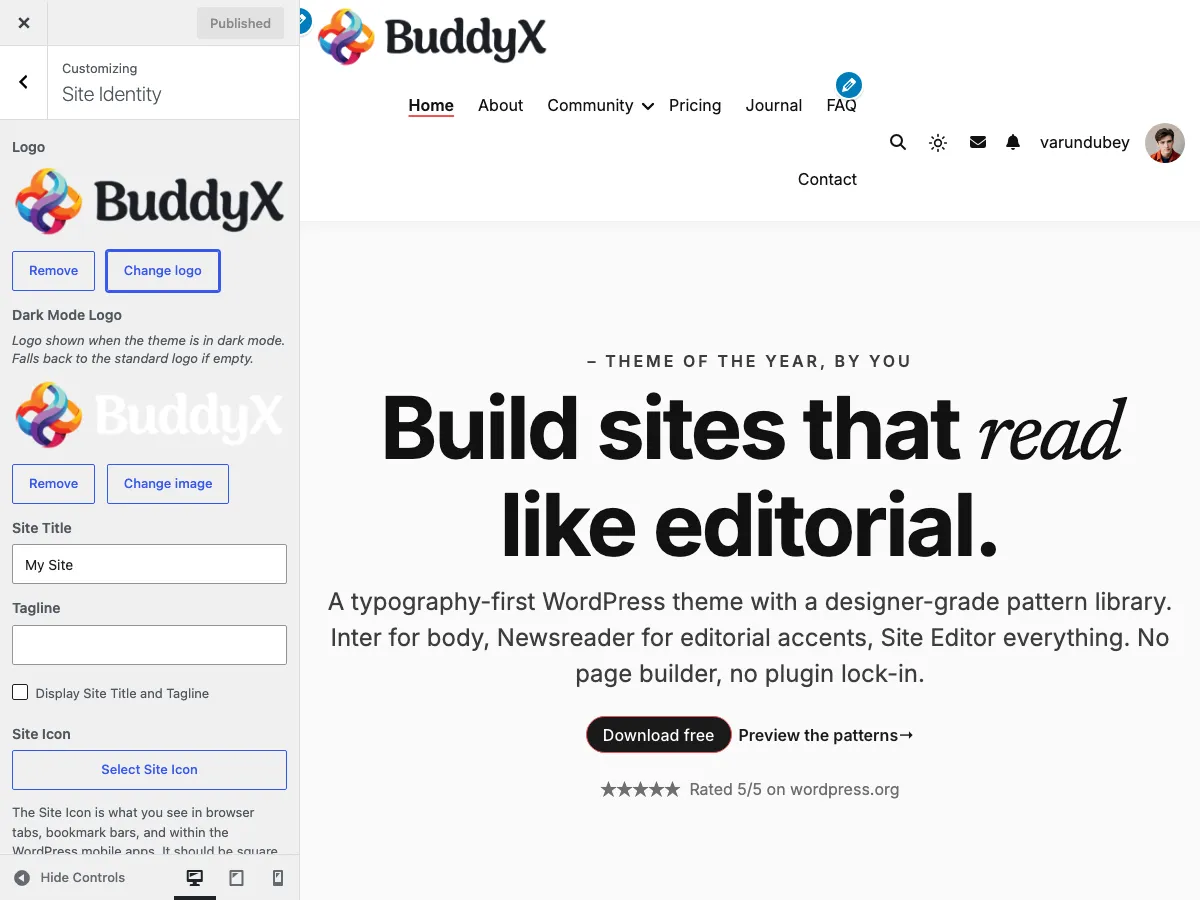
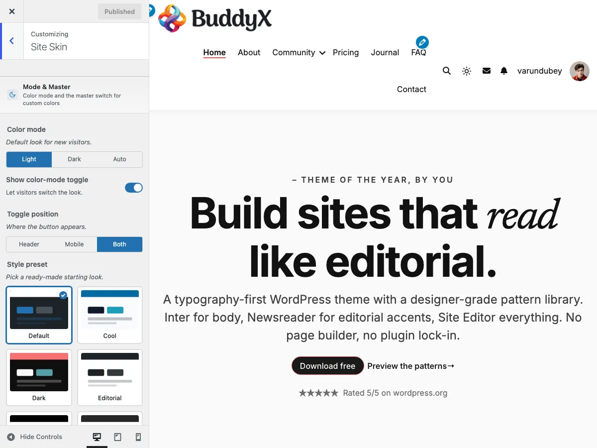
Troubleshooting

Common issues and how to fix them. If your issue isn't here, see FAQ or email support@wbcomdesigns.com.


My site looks broken / unstyled

Symptom: After activating BuddyX, your site shows raw HTML - no colors, no fonts, layout is broken.

Most likely cause: A caching plugin or your hosting cache is serving stale CSS from the previous theme.

Fix:

  1. Clear your caching plugin's cache (WP Rocket → Settings → Clear Cache, etc.)
  2. Clear your host's server cache (in your hosting dashboard, or the host's caching plugin if they install one)
  3. Hard-refresh your browser: Cmd+Shift+R (Mac) or Ctrl+Shift+R (Windows)
  4. Try a different browser or an incognito/private window to bypass your browser cache entirely
  5. If using a CDN (Cloudflare etc.), purge its cache too

Still broken? Open browser developer tools (F12 → Network tab → reload) and check whether buddyx-styles.css returns 200 OK or 404. A 404 means file-permission issues - contact your host.


I changed a Customizer setting but the front-end didn't update

Symptom: Set a color in Customize → Site Skin, clicked Publish, but the live site still shows the old color.

Most likely cause: Caching, again.

Fix:

  1. In the Customizer: make sure you clicked the blue Publish button at the top (not just hit Esc). Until you publish, settings exist only in the preview.
  2. Clear all caches (see above - caching plugin → host cache → browser → CDN)
  3. Hard-refresh the front-end page

Still not updating? A child theme or another plugin may be overriding the setting. Temporarily switch to the current default Twenty Twenty-* theme - does the color appear correctly there? If yes, return to BuddyX. If no, the issue is plugin-related.


The color-mode toggle (sun/moon icon) isn't showing

Symptom: You expect a dark/light toggle button in the header but don't see one.

Check:

  1. Customize → Site Skin → Color Mode - is Show color-mode toggle set to Show? (It's on by default.)
  2. Customize → Site Skin → Color Mode → Toggle position - is it set to Header, Mobile, or Both? If set to Mobile, it only appears in the mobile menu (you won't see it on desktop). Change to Header or Both to make it visible on desktop.
  3. Is your header layout overriding the icons? Some custom header configurations may hide icon slots.

My logo is huge / tiny / cropped

Symptom: After uploading a logo in Customize → Site Identity, it displays at an unexpected size.

Cause: WordPress doesn't resize your logo - it uses your image's source dimensions (scaled responsively).

Fix:

  1. Resize your logo to a sensible size before uploading - most horizontal logos work at around 200×60 pixels; most square logos at around 60×60.
  2. Use a tool like Squoosh.app, Canva, Photoshop, or Preview (Mac) to resize.
  3. Use a transparent PNG or SVG so it sits cleanly over any header background color.
  4. After uploading a smaller version, clear caches and hard-refresh.

BuddyX free doesn't have a "logo size" Customizer setting (Pro does). The fix is to resize the source image.


Fonts aren't loading

Symptom: You picked a Google font in Customize → Typography, but the site still shows the default sans-serif.

Possible causes:

  1. Caching - clear caches and hard-refresh first.
  2. Wrong setting - make sure you selected a font in the Font Family dropdown (not just changed the size or weight).
  3. Google Fonts blocked - if you have Customize → Site Performance → Load Google Fonts locally turned on, the fonts are pulled from your own server. Make sure your server has write permissions to wp-content/uploads/ (where BuddyX caches the local font files).
  4. Browser console errors - open developer tools (F12 → Console). If you see CORS errors or font 404s, that points to a server-config issue with your host.

Fix:

  1. Turn off Load Google Fonts locally temporarily (to test if Google's CDN itself works for your server)
  2. If that fixes it, your server has a write-permission issue on wp-content/uploads/. Contact your host.
  3. If the font still doesn't load even from Google's CDN, your server may be blocking fonts.gstatic.com. Whitelist that domain (your host can help).

My BuddyPress activity feed / member directory isn't styled

Symptom: After installing BuddyPress, the activity, members, or groups pages look unstyled or off.

Check:

  1. BuddyPress version - BuddyX is tested with the latest BuddyPress. Update via Plugins → Installed Plugins.
  2. BuddyPress Components - Settings → BuddyPress → Components. Make sure Activity, Members, Groups, etc. are enabled.
  3. BuddyPress Pages - Settings → BuddyPress → Pages. Each component must be mapped to a real page (BuddyPress auto-creates these on first activation).
  4. Cache - community page caches are notorious. Clear caches.

The site loader spins forever (or shows a brief flash)

Symptom: When loading a page, a spinning loader appears and either never goes away, OR shows for a fraction of a second then disappears.

Check:

  1. Appearance → Customize → General → Site Loader - is Show site loader turned on? The 5.1.0 default is off (the loader is optional). If it's on and looks wrong, try turning it off.
  2. JavaScript error - open browser developer tools (F12 → Console). If you see red errors, a plugin or custom code may be breaking JS. The loader hides itself when the page finishes loading; if JS is broken, it can hang.

Fix:

  1. Turn off the loader if you don't need it (5.1.0 default).
  2. If you need it, troubleshoot the JS error - disable plugins one at a time to find the culprit.

Dark mode flashes on page load

Symptom: When loading a page as a dark-mode visitor, the page briefly shows light before snapping to dark.

Cause: This shouldn't happen on BuddyX 5.1.0+ - the FOUC-free first paint specifically prevents it. If you're seeing it, you're on an older version OR a plugin is delaying the inline dark-mode script.

Fix:

  1. Update BuddyX to the latest 5.1.x - Appearance → Themes → BuddyX → Update Available (if shown), or upload the latest zip from wordpress.org.
  2. If a caching plugin is HTML-minifying the inline <script> that BuddyX puts in <head> for first-paint, that script may run later than it should. Exclude head inline scripts from minification in your caching plugin's settings.
  3. Hard-refresh and test in incognito.

My header / menu disappears on mobile

Symptom: On a phone-sized screen, the menu doesn't appear (or the whole header looks empty).

Check:

  1. Appearance → Menus → Menu Settings → Display location - make sure your menu is assigned to Primary. (BuddyX registers two menu locations: Primary and User Menu - the latter only when BuddyPress is active. Mobile uses the Primary menu automatically; footer content uses widgets.)
  2. Customize → Site Header - verify your header layout option supports mobile (all BuddyX header layouts do).
  3. Resize your browser window from wide → narrow to see the breakpoint. The mobile menu (hamburger) usually appears around 1024px.

Symptom: You added widgets at Appearance → Widgets → Footer 1/2/3/4 but the footer is blank or shows different widgets.

Check:

  1. Right widget area - BuddyX has 4 footer columns: Footer 1, 2, 3, 4. Make sure you added widgets to the right one(s).
  2. Cache - clear caches.
  3. Theme override - if you're using a child theme that customized the footer template, it may be ignoring BuddyX's widget areas. Switch off the child theme temporarily to test.

I uploaded a file but it doesn't appear

Symptom: Tried to upload an image, video, or file but it fails (or only sometimes works).

Most likely cause: Hosting upload limits.

Fix:

  1. WordPress upload limit - varies by host. Check at Media → Add New (you'll see "Maximum upload file size: XX MB" at the bottom).
  2. Your file is over the limit - either reduce the file size (use Squoosh.app, Handbrake for videos), OR ask your host to raise the limit (usually they need to bump upload_max_filesize in php.ini).
  3. PHP errors - large uploads may hit PHP timeout or memory limits. Look in your hosting dashboard for PHP error logs.

I can't see the Customizer / settings panel

Symptom: Appearance → Customize is missing, or clicking it shows an error.

Check:

  1. User role - only Administrators can access the Customizer by default. Are you logged in as Admin?
  2. JS error - open browser developer tools (F12 → Console). Customizer relies on JavaScript; a JS error from a plugin can break it. Disable plugins one at a time.
  3. Caching/CDN - sometimes the Customizer fails when JS is aggressively minified. Exclude /wp-admin/ from caching in your caching plugin.

After updating BuddyX, my customization is gone

Symptom: Just updated to a new BuddyX version and the colors, fonts, or layouts look reset.

Most likely cause: Caching, not actual data loss. WordPress updates don't delete Customizer settings.

Fix:

  1. Clear all caches (caching plugin, host cache, browser cache, CDN)
  2. Hard-refresh
  3. Go to Appearance → Customize - your saved settings should still be there, just not visually applied yet due to old cached CSS

If a setting is actually missing, you may have upgraded from a pre-5.1.0 version that used a slightly different setting name. The 5.1.0 release carefully migrates old setting IDs - but if you see a specific setting reset, email support with the setting name and we'll investigate.


Block patterns aren't showing up in the editor

Symptom: When editing a page, you click + → Patterns and don't see BuddyX patterns.

Check:

  1. WordPress version - block patterns require WordPress 6.0+. Update at Dashboard → Updates.
  2. Patterns category - in the patterns dropdown, look under the BuddyX category specifically. There may also be a WordPress core patterns category - don't confuse them.
  3. Plugin conflicts - some "block library" plugins override the patterns UI. Try deactivating them.

Where do I report a bug?

If your issue isn't here and you've ruled out caching, plugin conflicts, and theme-version mismatch:

  1. WordPress.org BuddyX support forum - wordpress.org/support/theme/buddyx/. Community-supported, public.
  2. GitHub issues - github.com/vapvarun/buddyx/issues. Best for technical / developer bugs.
  3. Email support - support@wbcomdesigns.com. We respond within 1 business day.

Helpful info to include:

  • Your WordPress version (Dashboard → At a Glance, or Tools → Site Health → Info)
  • Your BuddyX version (Appearance → Themes → BuddyX → Theme Details)
  • Your PHP version (Tools → Site Health → Info)
  • A list of active plugins
  • A clear description of the symptom + screenshot if visual
  • Steps you've already tried

Something unclear? Open a support ticket → · Refund policy

Buy BuddyX